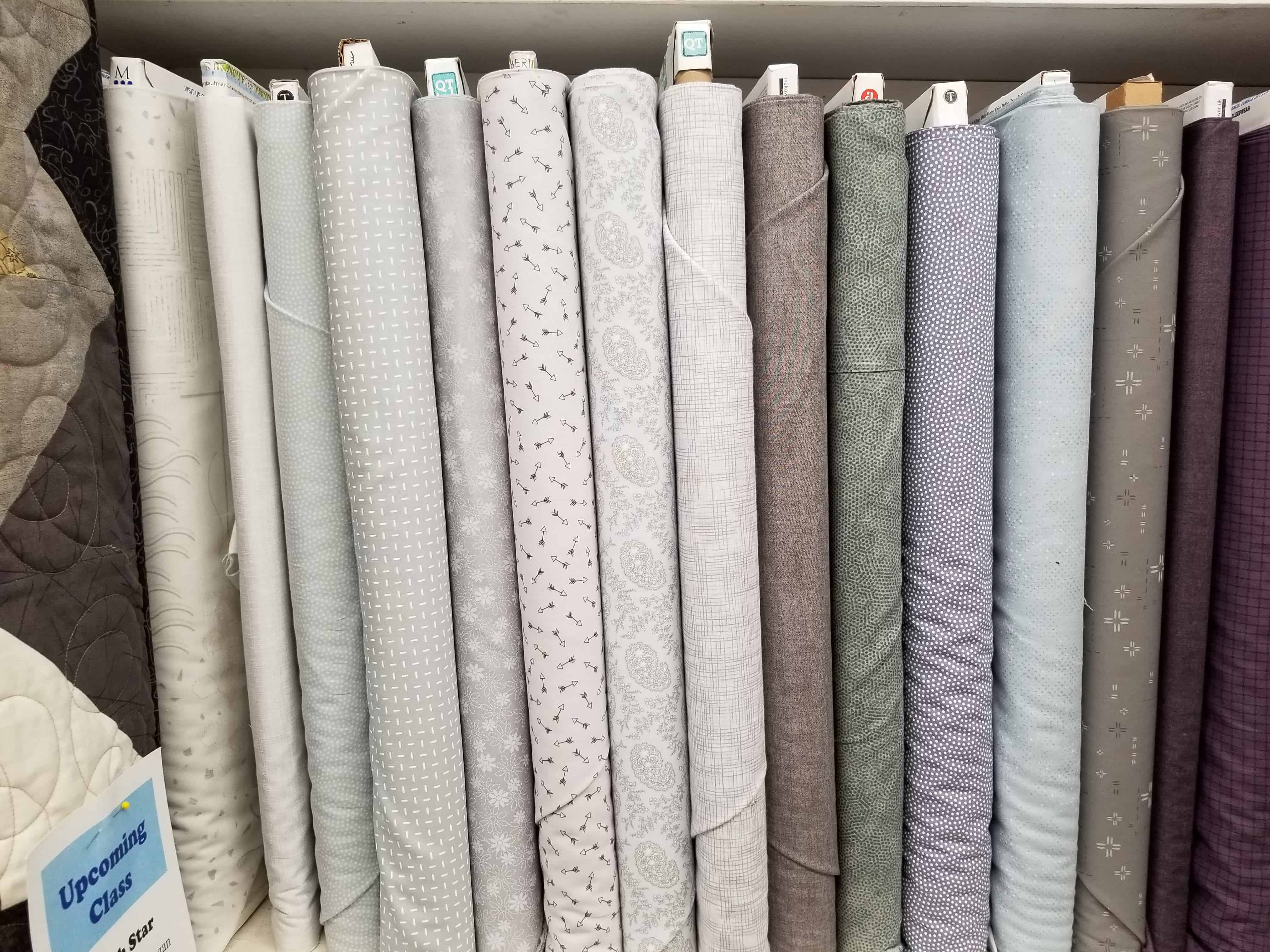
I went to The Granary the other day and Friend Julie pointed out a row of greys. She called it the “problem with greys.” I thought the photo explained the ‘problem’ beautifully.
The colors in the photo look different from when I saw them with my eyes, but it doesn’t matter, because you, dear Reader, can still see the difference.
None of the colors would be called anything but grey. The bolt on the far right looks black but was a charcoal (you’ll have to trust me). The shelf sports a wide variety.
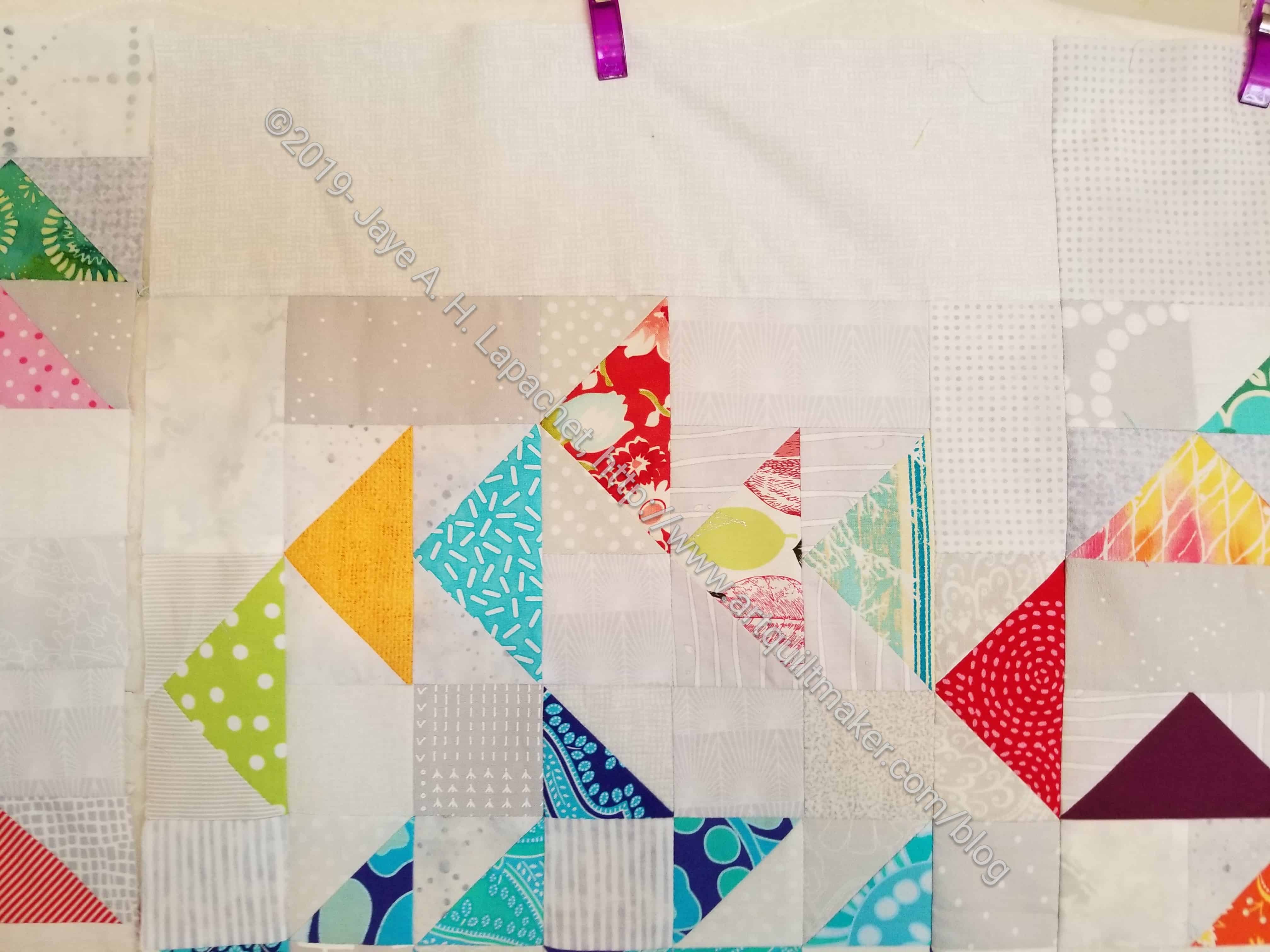
I like using a variety of greys as background on my quilts and it is a happy chore to find the right ones. You can see the variety in Flying Around. Mostly I like to use greys that are very close in tone to each other so there is no grey that obviously stands out. Also, I don’t like the taupe based greys. I am sure I have said that before.
In the photo of the Flying Around background, I have more variety. It might be because I want the eye to move around the background as well as the foreground or it might be laziness. Not sure or not admitting to anything. 😉
This is an example of why my rule of ‘make visual decisions visually’ is so important. It is impossible to match any color, perhaps particularly greys, without putting the bolts or pieces next to each other.
That is a good photo. When grays don’t work together, they really don’t. I don’t mind the taupey grays, but they don’t go with most of what I have. And I just finished using up a couple that had a lavender tinge.
I am trying to use up the various greys that don’t go with what I like to use. I think the taupey greys look dirty….sometimes. I like light greys that are very clear.