|
Tag: Color
Work Doesn’t Seem Like Work
Yes, I have been working on the Tarts, but often the work I am doing seems like no progress rather than actually work.
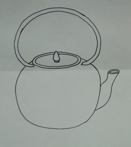
I started out with this drawing for the last block, presumably for the space in the lower left hand corner. I found a drawing as inspiration and once I had that crutch to get me started, I took it off in my own direction. I kept thinking about a tea kettle I once knew in Austria.
Once I had a drawing I liked, I had to pick fabric which turned out to be much harder than I thought. I think I have said before that there just aren’t enough colors for me. I thought a pinky-orange would look good, but couldn’t find he appropriate shade in my fabrics, so I tried others. As Lorraine Torrence says “make visual decisions visually.”
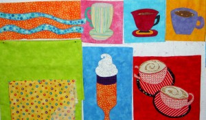
I started with a green as background even though I really thought the pinky-orange would be better.
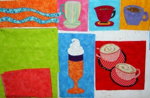
The green is okay, but the kettle color isn’t quite right.
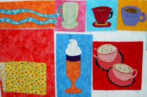
Moving on and trying other colors. Finally tried a pinky-orange I had. It wasn’t quite right with the reds near it.
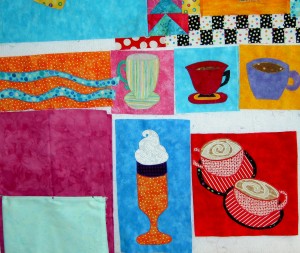
Still not right, though I liked the purply-pink background better.
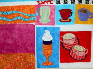
The orange is a little too brown!
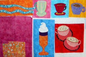
I am no longer having fun.
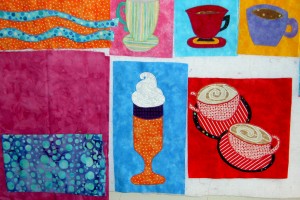
Will this torment ever end?
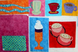
A bit closer???
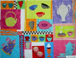
Finally, I decided on the purply-pink hand-dye with space alien lime green. It was okay at the bottom of the quilt, though I kept thinking that the thermos-like block might be better at the bottom. I changes a lot, but I am trying it out.
Various and Sundry Saturday
Can you tell I am just desperate to catch up on everything? All of my posts lately are entitled “Various and Sundry.” I hope it gives you an idea from the title what kind of post it will be.
- I am doing a project (another one? you say) called 31 Days to Building a Better Blog. You can find it and play along at ProBlogger. I am already 3 days behind, so we’ll see how it goes. When I first saw the ad for this project, I was arrogant enough to think I didn’t need such a thing. Immediately after that thought, I signed up, because thinking I couldn’t improve Artquiltmaker blog is a sure sign I need help. If I can make a few improvements, I’ll be happy. If I learn, I’ll be happier.
- Reviews and comments about Handmade Nation are all over the blogosphere. I would like to see it as it sounds interesting. I haven’t, however, seen it playing anywhere nearby. I’ll keep looking.
- Be*Mused had a lovely array of colors up on her blog the other day. She and I are thinking along the same color lines. Here color palette is the look I am going for with the fabrics that I bought at Always Quilting. I want to add something a bit dark just to take the edge off the bubblegum-i-ness. Not sure what, but I’ll have to look around.
- I started listening to another episode of the CraftSanity podcast today. It turned out to be a joint podcast with Jennifer and Sister Diane of Craftypod. Essentially the two podcasters interviewed each other to give tips and pointers on starting your own podcast. Listen to CraftSanity podcast #14 and Craftypod podcast #24 to hear the different takes on the same discussion/interview. I love this kind of collaboration facilitated by the web.
- I am cutting 6.5″ squares of blue fabric (like the Thoughts on Dots project) for a project and I have lost about 3/4s of the ones I have cut so far somewhere in my workroom. They will turn up, but it made me realize that I need to have some way of organizing projects that are in the germination stage. There are a number of projects for which I need to gather fabrics while I prepare to sew. I want a system where I can put fabrics and supplies in one place until I am ready for them to be front and center. I am envisioning a system like Jan at Be*Mused put up. She used IKEA’s Expedit shelves. I am not sure these shelves would work for me. I also need a bed in my workroom for guests, so I think my ideal would be the IKEA Billy system with a bed somehow integrated into it. In the meantime, I may just get some POTs and use those.
- Linda Hughes of From A Vineyard Garden blog has posted a list, paraphrased from the New Creative Artist book by Nita Leland about creativity. It is a good and interesting list and that book might be worth checking out.
- Finally, Retro Mama made a pattern f or fabric eggs and put it up on her blog. I love these eggs and want to make some to decorate for Easter/the Spring. It won’t work for this Easter, but I could make them for next year. We will see. There are just so many wonderful blogs out there!
Color Theory by Vicki Welsh
Vicki is one of my blog readers and a wonderful colorist. If you are familar with the Quiltmaker’s Color Workshop by Kerr and Ringle (review), then you would enjoy Vicki’s blog, Field Trips in Fiber, and especially her work on color theory.
Her color theory work was done a couple of years ago, but she has some very astute comments about the different color theory systems and color wheels. Lately she has been dyeing groups of related colors. I think that this current work must come out of her color theory studies. She posts the groups of colors next to each other (as Kerr and Ringle do in their book, above) as she dyes them, including, occasionally, the inspirational picture. Her postings illustrates perfectly the Kerr/Ringle “Big Idea.”
Blues are Back
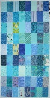
Remember the Hop, Skip and Jump pattern I tried in December?
I thought I was, but I am, apparently, not done with the blues. And there is that rectangle shape again (2.5’x4.5, FYI). While the Tarts Come to Tea has been on the design wall, these blue rectangles have been up there, too. They are actually taking too much space (both physically and mentally), so they are coming off the wall and will go back up later.
Last weekend I had a little time and wasn’t organized enough to work on an actual project, so I cut blue rectangles. I have to be honest, though. I was trying to prevent a fabric avalanche and decided to fill in some space in the fabric bins. It is much easier and more accessible to stack fabric up on the sides of the closet. Sadly, four foot stacks eventually end up in fabric avalanches. Appropriate for this time of the year, though…
A fabric avalanche was definitely imminent and by moving fabric around and pulling out the blues, I felt like I was actually working on a project rather than organizing.
Some of the fabrics I cut from the scraps that appeared after I made the back for the Crazy Test . It was interesting to see some of those older fabrics mixed in with the newer turquoises.
Fabrics Not to Pass Up
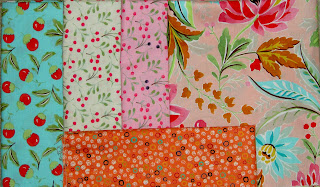
I was at Always Quilting last week for my longarm class and bought these fabrics. I saw separate fat quarter packs with the orange fabrics and its friends (Fresh Paint by Moda, I think), as well as the fabrics related to the cherries. I wanted to buy both, but settled on what you see above. There was an icky green fabric like the orange one, but they didn’t have it on the bolt. I am thinking about making a quilt like Yellow Brick Road by Atkinson Designs with the cherries fabrics and some others. I’ll have to put it on the list behind all the other projects I want to do!
Bright and Cheerful Prints From Melody Johnson
|
|
Trying out Inks
|
Flower Tote Bag
I loved this fabric, which I bought back in November. As I mentioned last week, I finally got to making a tote bag out of it.
I am pretty pleased with how it came out. I love the bright cheerfulness of these splashy flowers. I think it is a good way to use those big prints.
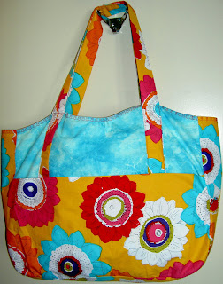
On one of the last bags, I didn’t like the way I couldn’t see the pocket and the straps, so this time I used a blue for one side of the outside of the bag so that the pocket was highlighted. It means that the bag sides were different fabrics, but who cares? I am pleased with the way the flower fabric stands out.
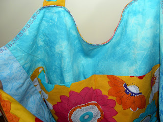 I used a tulip stitch for the top stitching on the edge around the top. It is ok. There were parts where I had to sew over a lot of layers and the spacing got a bit wrecked. I am going to keep this bag for myself, because it is cheerful and I didn’t put any interfacing in it.
Hop, Skip & Jump by Denyse Schmidt Project
I decided to work on the Hop Skip and Jump pattern by Denyse Schmidt (Denyse Schmidt Quilts book) as my next project right now. I rarely sew from patterns, but this one seemed like a good one to use with the blues that I had weeded out from my new fabrics. I had thought of modifying the pattern so that there were no curved pieces, but I didn’t. I am not afraid of curved piecing (note Flowering Snowballs/Cross Blocks), but each of the 16 pieces required for each block must be cut out separately. It is an arduous task, but I am into it now and will just continue on.
One problem I already had was with the copy place. The pattern directs the maker to enlarge the pattern by 400%. I have terrible problems with office equipment, copiers in particular, so I went to an office shop and they offered to do it for me. The girl couldn’t get the entire pattern on an 11″x17″ sheet of paper. She asked me at one point if it would be a problem to have the top of the pieces cut off. Finally, I told her she could reduce the size slightly and that seemed to work. It doesn’t bother me to have slightly smaller blocks. I can make a few more with no problem.
For once I have cut all the blue pieces for 6 blocks before I have sewed any of them together. I haven’t decided on the background yet, so I haven’t cut background pieces. I thought I had just bought a white on white that I would use, but I can’t find it so either it was my imagination, it is hiding from me or it isn’t washed yet.
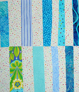 This is my favorite. The background is a very cheerful dot print where the dots are irregular and a variety of different colors. I am all about cheerful, you know. 😉
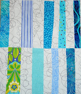 The above is my second favorite. I don’t have enough of this particular black on white print, so I would have to use a variety of different black on white prints with the same weight/ratio of black to white. I wouldn’t want it to be too overly black.
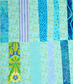 I really wanted a very calm looking quilt, thus all the blues. This background is one of the P&B New Basics from 2000. I recently bought a yard of it and have at least a fat quarter somewhere else. The problem is that it is very close to some of the value of the other fabrics so the pieces blend together. I think they blend together a little too much.
There are a couple of factors for the background: one is that it has to have the look that I want. Another is that I have to have enough of the chosen fabric to use as a background. The bottom line is that I want this to be a quick quilt. I don’t want to spend weeks on picking the background. I also, however, don’t want to hate it when I am halfway through the sewing. I am happy to hear what you think.
Tidying Up My Mind
Yesterday was a gossamer or chiffon dress and drifting around Manderley kind of day. I mean that I drifted around the house from thing to project to computer to laundry not really accomplishing much as if I were a lady of leisure with servants to pick up after me.
The house is kind of suffering from my drifting, but I did accomplish a couple of things. First and foremost, I finished the Basket top. It was challenging to sew together. Somehow I couldn’t wrap my mind around a sensible way to put it together. I think the sashing tripped me up a bit. It is together now and nobody will know how much unsewing I did once it is quilted and hung.
It has now been named Cheerful #1: Baskets. TFQ thought up that name and I like it. It also implies that we will make more cheerful quilts together.
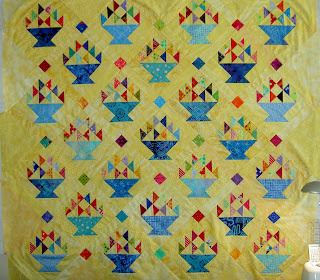 I need to make the back, which TFQ suggested be made out of a spring green fabric. I probably don’t have enough of one to make it, but I will collect a few spring greens and make it up. Then I will send it up to her and she will have Angie from the Quilting Loft quilt it. TFQ suggested it and I like the idea. I have a feeling quilt tops are going to pile up around here as my free time expands and we work through our financial issues.
Although I could have gone straight to working on a WIP such as the Spiderweb or the Tarts Come to Tea, I went, instead for a new project. The Eye Spy quilt for which TFQ, Julie and I have worked so hard cutting pieces has been on my mind lately. The offspring is probably too old now to appreciate the Eye Spy game, but I still wanted to put the quilt together, so I started.
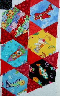
My first impression of the piecing: FUN FUN FUN!!! I sewed a triangle on to a hexagon on opposite sides of the hexagon. I wanted to make sure I knew how this thing was going together, so I sewed the airplane to the yellow umbrella drink and it was really easy to put together. I couldn’t stop piecing last night and stayed up way too late. I just hope I have enough of the red triangles. I also have no idea what to do with the edges, but I will worry about that later. Right now Girls Just Want to Have Fun!
I have also been reading Ringle and Kerr’s Quiltmaker’s Color Workshop: The FunQuilts’ Guide to Understanding Color and Choosing Fabrics. I especially got into the text yesterday morning before I got up. I think my mind was in the mood for food, because when I went to the workroom a group of fabrics waiting to be ironed caught my attention. They were fanned out in a certain appealing way and I just had to take note.
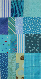 I ironed them and cut the pieces I needed. These are the pieces I need for the FOTY 2008 quilt and they are currently on my design wall where I can admire them together. The blues are not completely matchy-matchy. There is something calming and/or restful about the color combination. I think I have good scale variations and may just have to do some project with just these fabrics. I am tempted to sew them together and keep them in a group in the FOTY quilt. We’ll see.
Finishing To Do List:
- Sleeve for Nosegay
- Back for Making Cheerful Quilts #1: Baskets
- Back for Crazy Quilt Test
- Handwork, binding and sleeve on Pamela Allen House quilt (no name yet)
So, I think I have tidied up my mind enough to get moving on some other issues – real issues – but I am glad that I was able to clear out these ideas. I would love to hear your thoughts!
Book Review: Quiltmaker’s Color Workshop
I have also been reading Ringle and Kerr’s Quiltmaker’s Color Workshop: The FunQuilts’ Guide to Understanding Color and Choosing Fabrics. I especially got into the text yesterday morning before I got up. I haven’t completely finished the book, but here is my review, such that it is. When I update it, it will be updated here.
 Quiltmaker’s Color Workshop: The FunQuilts’ Guide to Understanding Color and Choosing Fabrics by Weeks Ringle
My review
rating: 4 of 5 stars
This book gives quiltmakers points and tools for selecting colors. It does not steer you towards the accepted methods of selecting colors, such as the ‘focus fabric’ method. Weeks Ringle and Bill Kerr bring their experience from outside the quilt world to quiltmakers by introducing techniques and methods that quiltmakers are not normally taught. Lstening to instrumental music and identifying the colors the reader sees in it as well as trying to replicate textures in color are two methods discussed. There numerous other suggestions by the authors for methods of selecting a unique palette.
Selecting fabrics is just the start, however.
One of the best things about this book is the definitions. They have definitions of hue and value and color that actually make sense; definitions that the average reader can take away and use.
After the definitions section come the exercises. These exercises are made up of three parts: color variations, individual exercises and group exercises. The pages where Weeks Ringle and Bill Kerr display color variations in quilt format gives the reader a practical sense of the use of color. Part of this exercise shows the proportion of color used in a quilt and what happens to the overall look of the quilt when colors are added and removed.
I haven’t done any of the individual exercises, but they are quite accessible and one of them (listing all the colors I can think of and then marking my favorites) is quite tempting.
The group exercises, which took me awhile to notice, make me think of a class where, over the course of a period of time, a group could explore color together.
The three parts of this book made me look at colors in a new way this morning after reading several sections.
As with all quilt books, there are projects and patterns. These don’t annoy me as much as patterns in other books, because the authors discuss their Big Idea in the course of the pattern.
This is a book that I would encourage people to read and keep near by for easy and frequent referral.
Cleaning up the Junk Drawer of my Blog
The title is paraphrased and re-imagined from a phrase that DebR uses on her blog, Red Shoe Rambling. I have a lot of little bits to pass on and thought this would be a good time to do it.
More on Gabrielle Swain
I forgot my camera on the second day of class. Karen, a fellow student in the Gabrielle Swain class, was kind enough to share her photos with me. We had a little session on features of her camera, which was fun and then we took some pictures. Karen let me look over her shoulder while she took photos.
In the above piece, you can see the color placement issue that I described in Gabrielle Swain Class, Day 2. The leaf is made up of separate pieces. If you can see how the veins divide the leaf, know that each of those sections is a separate piece of fabric. In placing the fabric, Swain explained to us how to fussy cut the fabric (using the light box) so that there are no huge breaks in the color of the leaf. I think the above leaf has more color breaks than I would expect there to be in a piece, but since GS did it, there must be a reason.
You can also see the quilting pretty well in the above photo. All of this quilting is done by hand.
I liked this quilt, because of the way she breaks up the leaves and the branches. I also think the few letters add a lot of interest.
My favorite quilt of Ms. Swain’s was called Even Change (not above, click the link). I think the one on her website might be different than the one she brought to class. Still, I like the idea of temperature that she used in this quilt. The idea was that if she used a cool tone on the background, Swain appliqued a leaf (piece of fabric) in a warm tone on top of that background, then she used a cool tone for the veins. Very successful.
Thinking about Proportion
Periodically, some technique that has been rumbling around in my mind as I try and understand it, clicks into place. What is rumbling around in my mind lately is proportion.
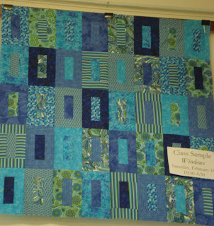 TFQ and I saw this class sample at Black Cat Quilts when she was visiting in April. It is from the Weeks Ringle and Bill Kerr book, Quiltmaker’s Color Workshop: the FunQuilts’ Guide to Understanding Color and Choosing Fabrics. Gretchen was out of the book so I had to buy it from somewhere else. That meant that we couldn’t look at the book or the directions for the quilt.The pattern is pretty easy, so it doesn’t really require a class or a pattern.
I was shocked when I did buy the book, because 1) the colors were a shockingly ugly combination (TO ME). I have little to no appreciation for the colors in quilts made from reproduction fabrics; 2) they put that ugly quilt on the cover; and 3) how small the blocks actually were in the pattern in the book. The above picture shows blocks that are approximately 8″x4″. It was high up on the wall and there wasn’t a ladder available for me to climb and measure the blocks. Also, I forgot my tape measure. Anyway, in the book the pattern directions tell you to create blocks that are about 3″x5″ (the size of an index card). Huh???
Well, obviously, the maker of the class sample was perfectly able to enlarge the pattern. This where I started to think about proportion. I find that the proportion of the blocks in the picture above to be good. I haven’t made one of the smaller blocks, so I can’t say whether I would like that size.*
My thoughts about proportion, which started with this book/class sample encounter, have to do with how to figure out how to find the right proportions (without a lot of complicated math, thanks) of a block. It is easy to say “ok, the pattern says to make this block 3×5, so it would be easy to blow the block up to 6×10”, but what about if I want the block to be 8x something. I have a little fraction to decimal cheatsheet and I want a proportion cheatsheet as well. Let me know if you know of one.
I do have EQ6 and will probably work on it there.
Note we did get permission to take the photo.
*Aside: the smaller blocks might be a good FOTY project.
Prismacolors
At work and personally, I am doing a lot of self examination. In the course of this, we were talking about Myers-Briggs types and how some types don’t like opening gifts in front of people. That brought up a discussion of gifts and how I would really like a super large set of Prismacolors. Gabrielle Swain suggested getting the large set so that I would have every color I ever needed. I have been using a set of colored pencils that were part of my school supplies list when I lived in Austria. They are a few years old, but they have great names like hellgruen and dunkelblau and they do the job. The friend subsequently mentioned that Aaron Bros was having a monster sale and I could get a set for half off. I went to Aaron Bros last night while I was running an errand at Target and looked.
First, I was shocked at how few art supplies Aaron Bros actually has now. Their whole upper floor was filled with framing services and ready made frames. I had no idea frames were such good business.
Anyway, I didn’t buy any Prismacolors, because the 40% off sale was over. Dick Blick has the set of 132 pencils (list $190.00+) for $89. That seems like a good deal.
Swain also mentioned the Prismacolor Art stix. She made them sound like they were some special/new kind of pencil. I looked at them at Aaron Bros and they looked more like pastels to me. I am not into messy, so I don’t know if they are for me. I think I bought a couple last week and will try them out.
I am also interested in the Derwent Inktense pencils. I suppose I should learn some techniques for colored pencils, so I can really test the various pencils in an informed manner.
Making Many Bags
I figured out why it is a GREAT idea to have multiple tote bags hanging around. To date, I have made 6 bags and have 2 or 3 cut out and the fabric ready for at least one more. I have been thinking, and discussing with TFQ, the point of making many bags. The obvious answer is that it is fun to make bags. It is great fun to use large pieces of different fabrics than I wouldn’t normally use for quilts. It is also fun to buy fabrics, such as the cupcake fabric for a purpose. I came across the true answer last Friday, as I prepared to go on a trip.
The true answer is that you need extra bags so you don’t have to clear out the other bag you haven’t unloaded!
Yes, life has been crazy and I haven’t unloaded the dot/flower bag, so when I went to pack for the trip to the lake, my choices were to unload the bag or do something else. I was, as usual, in a rush and late, so I just grabbed the Alexander Henry bag, filled it up and left. Right now, I have two bags laying on the floor of the workroom full of various activities. I guess I am already packed for another trip!
The dot/flower bag also needs to be fixed. I didn’t catch all of the hem when I hemmed the top, so I need to resew that. I started to unsew it and resew it, but haven’t finished.
Bold graphics
I know I should be writing about the Gabrielle (pronounced Gob-Ree-Yell) Swain class. In short, it was fantastic. More on that tomorrow; I am making it an early night.
|
|
Heart Idea
|
|


