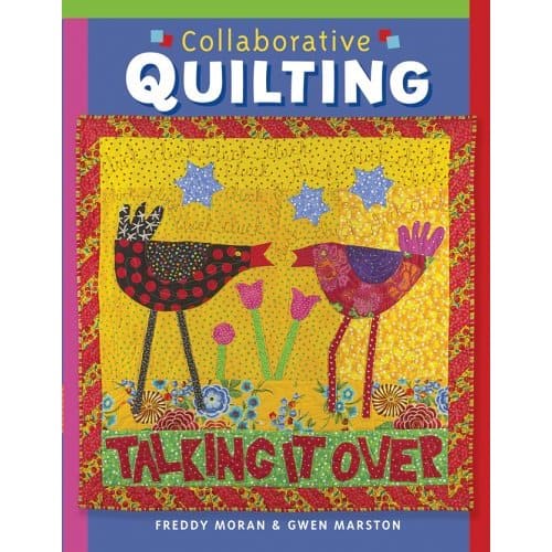
I attended the Pacific International Quilt Festival and took a few photos. If you’d like to see them, click on one of the links below:
PIQF Pt.1
PIQF Pt.2
PIQF Pt.3
I stayed down in Santa Clara and went to the show Thursday, Friday and Saturday morning. My first impression was that the quilts were reflecting the mood of the world: grim. Lots of brown and grey and beige. I always walk through the quilts first and then go back a second time to take photos. This time some of the photos came out poorly, so I went back to some quilts a third time. I think it is important for me to go through the quilts at least twice. Only on the second viewing did I begin to appreciate some of the finer details of the works. I was able to appreciate some of the quilts the second time around that turned me off for some reason or another the first time through.
I think design is still a challenge for people. While I am not an expert, I think it is something that people in the quilt world really need to work on. As we break out of the block format, it becomes more important to know the principles of design and consider them when making your quilt. Without the block/linear, grid-based format, we don’t have a ready made format for balance, repetition and some of the other elements of a good design.
I think part of my poor attitude on Thursday was that I was pretty uptight from the general things that make you uptight. After a day and a half of being away from the demands, the routine and the money pit I call home, I was relaxed enough to be able to appreciate the details and the overall effect. My one plea after LEARN DESIGN? USE COLOR!!!!
Before PIQF, St. JCN and I also took in the Quilt National exhibit, currently at the San Jose Museum of Quilts and Textiles. After seeing it, but BEFORE seeing PIQF, I was, again, less than impressed (hard to please, aren’t I?). With the perspective of PIQF, I realized that there are some great quilts in QN. There were a few, though that made me wonder what the judges were thinking.
We also took in Gee’s Bend at the deYoung in San Francisco. This was my second look. I never blogged about the first one, because I was annoyed at all of the art snobs who were there. Then I was annoyed at my mom for saying they were doing the right thing by looking long and hard at the quilts. Oh how I hate to be wrong! Another thing to work on. I may still blog about it. Better late than never, eh?
The deYoung was supposed to switch out some of the Gee’s Bend quilts at the end of September, so I made a special effort to go before the switch and after, except that they didn’t switch them out! If they did, I couldn’t tell and that means my mother is RIGHT and I didn’t look at the quilts! The quilts will be there through the end of December, so perhaps I will make it again?
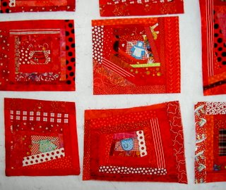
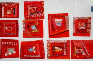
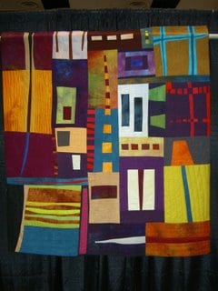
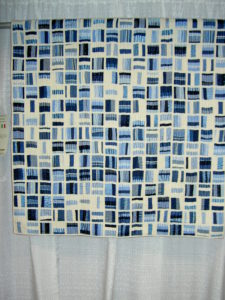
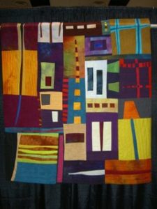
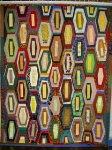
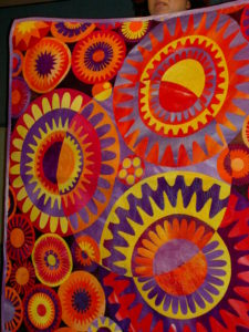
St. JCN and I decided after seeing Gee’s Bend and QN that we would try to figure out if a) quilts at PIQF were influenced by the Gee’s Bend quilts and b) whether or not grid-based linear design was making a comeback in art quilts. We found that many of the quilts said in their statements that they had seen the Gee’s Bend exhibit and were inspired or influenced by it. Some of the quilts that looked like the Gee’s Bend quilts are:

 I think it is good to be inspired by other quiltmakers. We learn from imitation. IMO, one of the important parts is to identify your inspiration AND to move on from your inspiration.
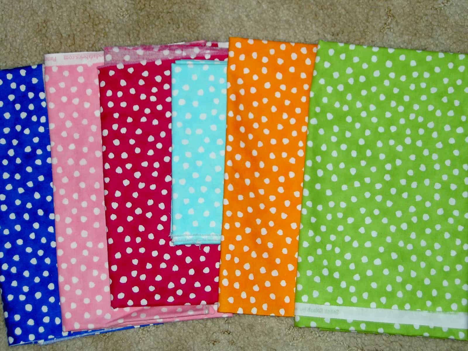
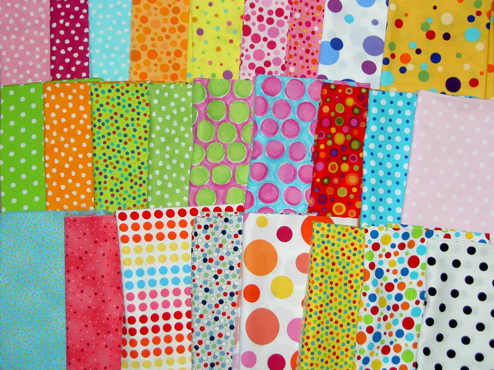
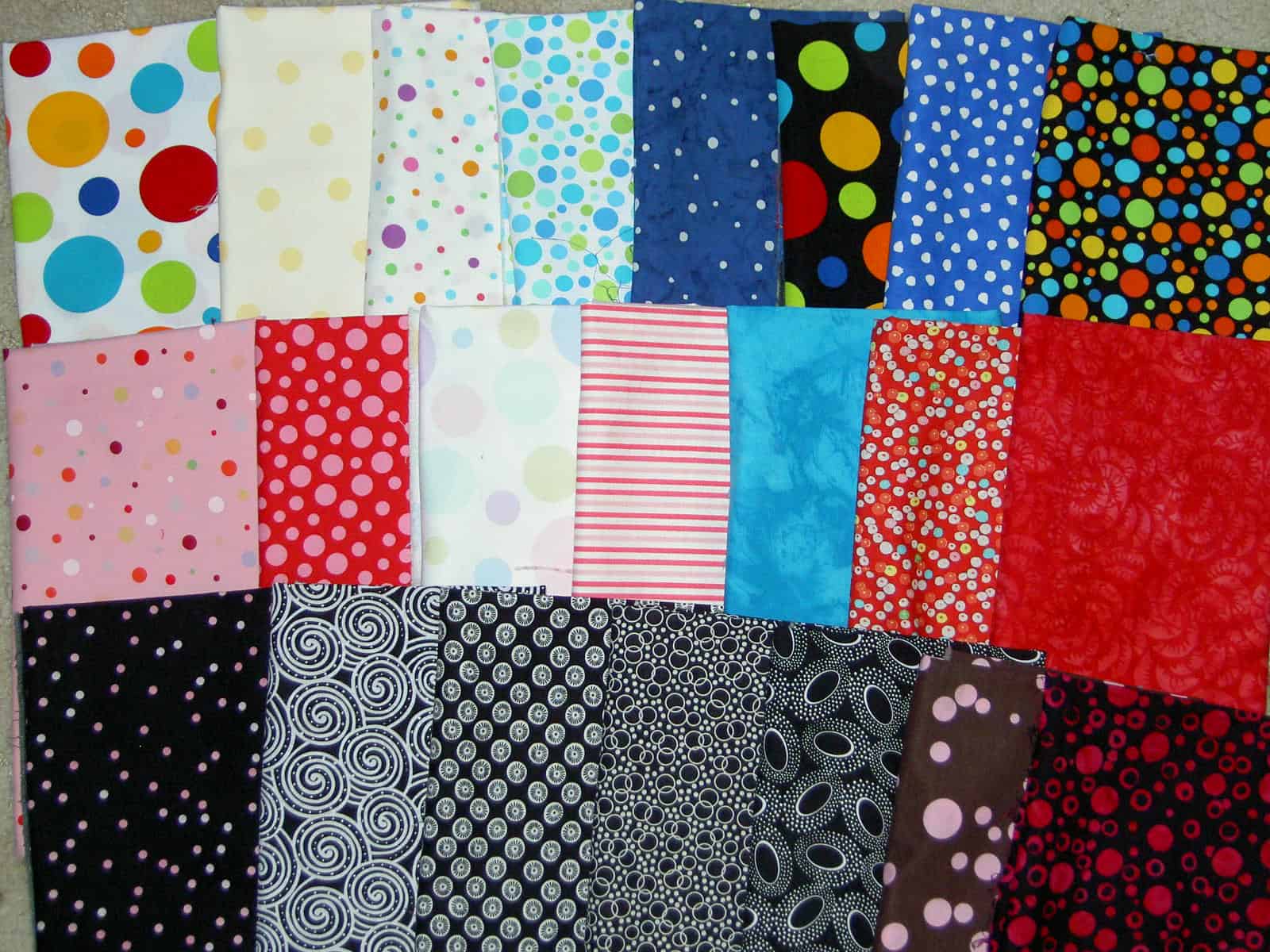
One of the biggest disappointments was the dearth of fabric. Normally, we buy a lot between us. This time, I barely bought any and St. JCN did not have to ship her fabric back. There were no fabulous fabrics. The new Robbi Joy fabrics weren’t there, the new P&B Serendipity, the new colorways from Denyse Schmidt were all absent and we saw very few dots. We were told that two printing plants in South Korea had abruptly shut down leaving some of the fabric manufacturers high and dry for their new lines of fabric. I haven’t tried very hard to verify this story, but heard it in two different places. Whatever the reason, it was a disappointment, though my wallet appreciated it. Still, I did manage to find some dots that are finding their way into Thoughts on Dots.
The other problem was that many, many of the fabrics were packaged into packs or into 1 yard sizes. I passed many fabrics by, because I did not want to buy a yard. how many backs does a person need? Graphic Impressions was one booth that had great fabrics in reasonable sizes. Sadly they do not have a website that I have, thus far, been able to find. We were told in no uncertain terms that most quiltmakers don’t want to bother with picking out their own colors for their quilts. I saw packages with patterns and fabrics flying out of the booths. It is a sad day if quiltmakers no longer want to put colors together or choose their patterns. To each his own, I suppose.
One highlight was the lectures. We usually attend the lectures rather than the classes, though we have taken classes as well. We attended Robbi Joy Eklow’s lecture which followed a lecture by Rosario Casanovas.
Rosario Casanovas is a Spanish quilt shop owner and teacher. She is also one of the founding members of the Spanish quilt guild. She lectured on the history of quiltmaking in Spain and about the contemporary work being done. It was very interesting to see their work, becuase there is a tradition of quiltmaking in Spain. The log cabin, though with a larger center than we are used to, is he patern that is the most well known. It is exciting to see their work, too, because of the interesting take on design. It is a sort of no fear approach.
Robbi Joy, as usual, was her funny funny self. She did the whole lecture sitting on the floor directing her slideshow and technology from her computer. She is quite hilarious. She went through a lot of her quilts and showed us a video, which is a quilt geek video. It is for those of us who know nothing about Brittany Spears and would much rather know everything about Robbi Joy and our other quilt celebrities. Apparently, Robbi’s son, Josh, does a video of her every year. His blog is New Roach Motel. The video can be seen there. You have to scroll down to September 25th.
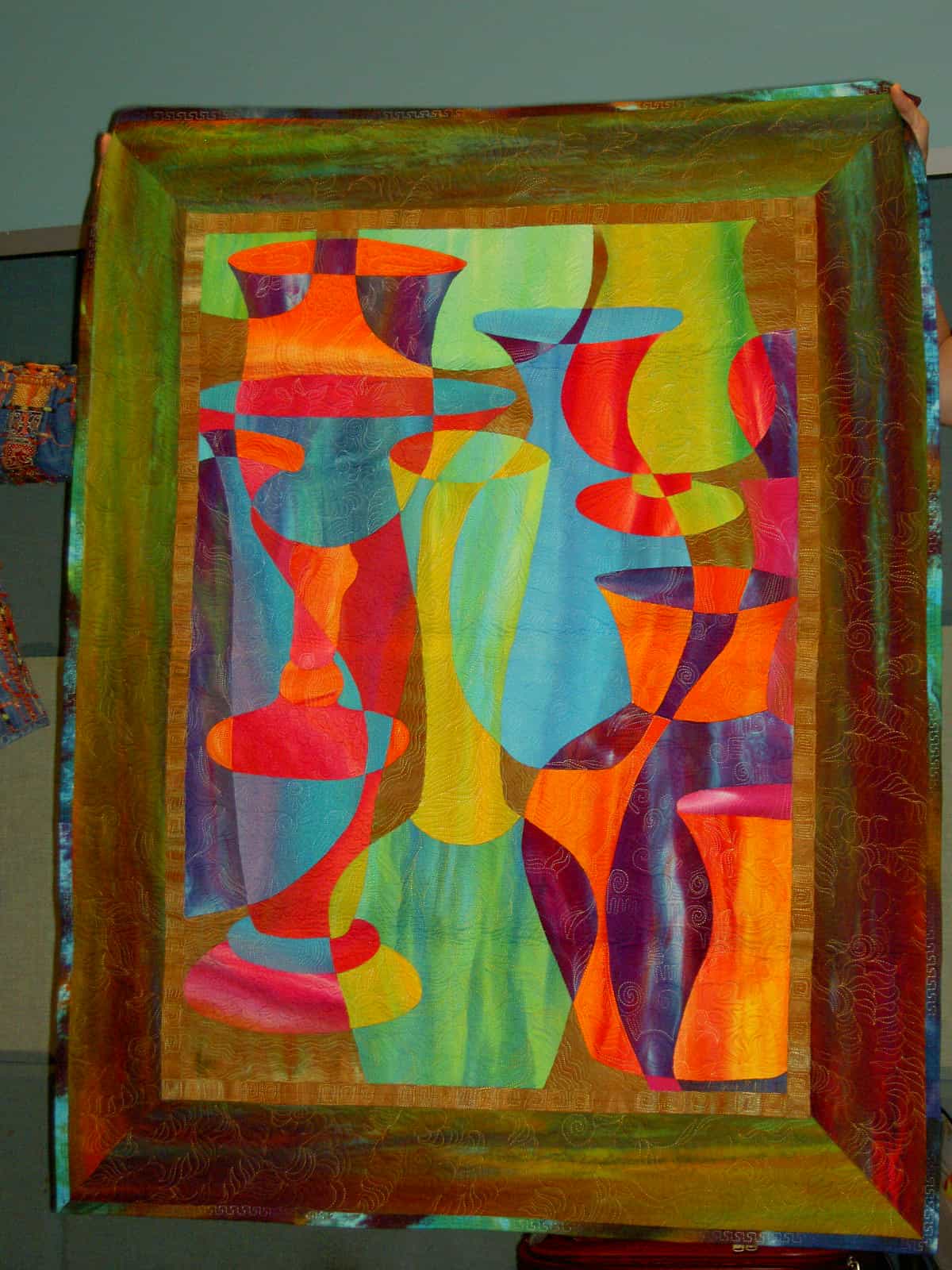
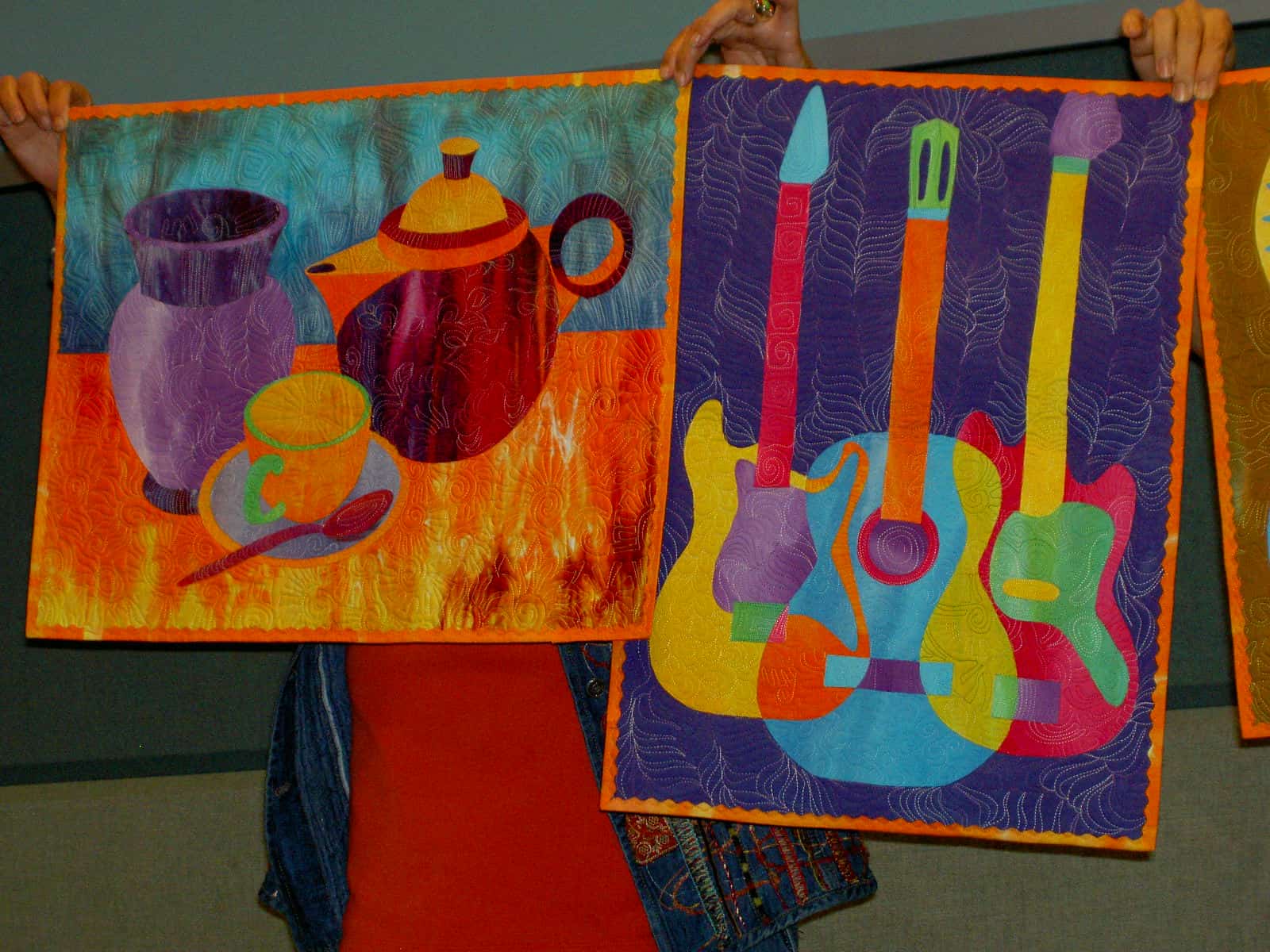
Robbi showed us a number of her quilts.


I guess I like the lectures because we get a small taste of a teacher. I would love to see Mancuso podcast these lectures.
St. JCN is much more eloquent than I on various topics of design, etc. Her thoughts are also much more organized than mine. I steal her ideas occasionally for this blog, because she can describe well what I am thinking and feeling about art, quilts, art quilts and design. I try to get her to write guest spots, but she won’t, so I am forced to do it. 😉 Perhaps someday…. Anyway for more on Gee’s Bend, design and QN, see my post AKA rant from a few days ago.
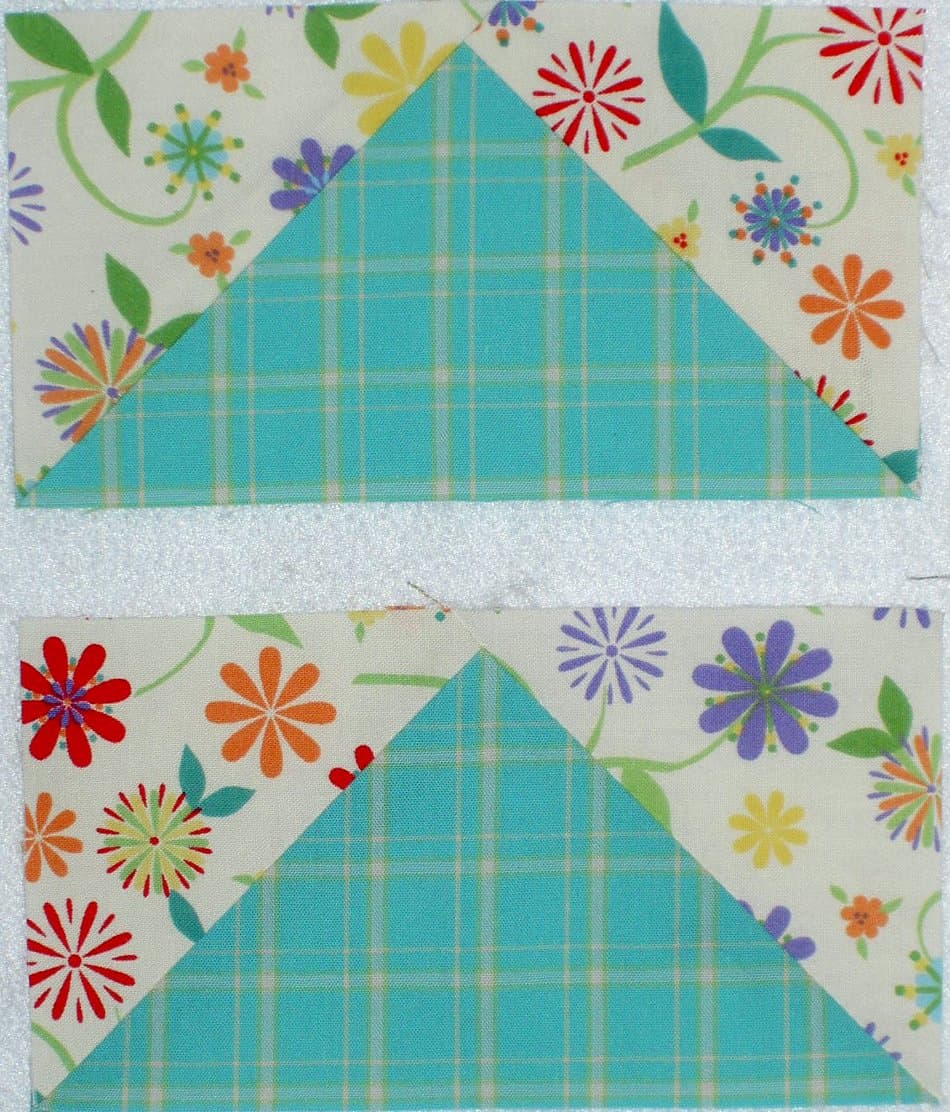
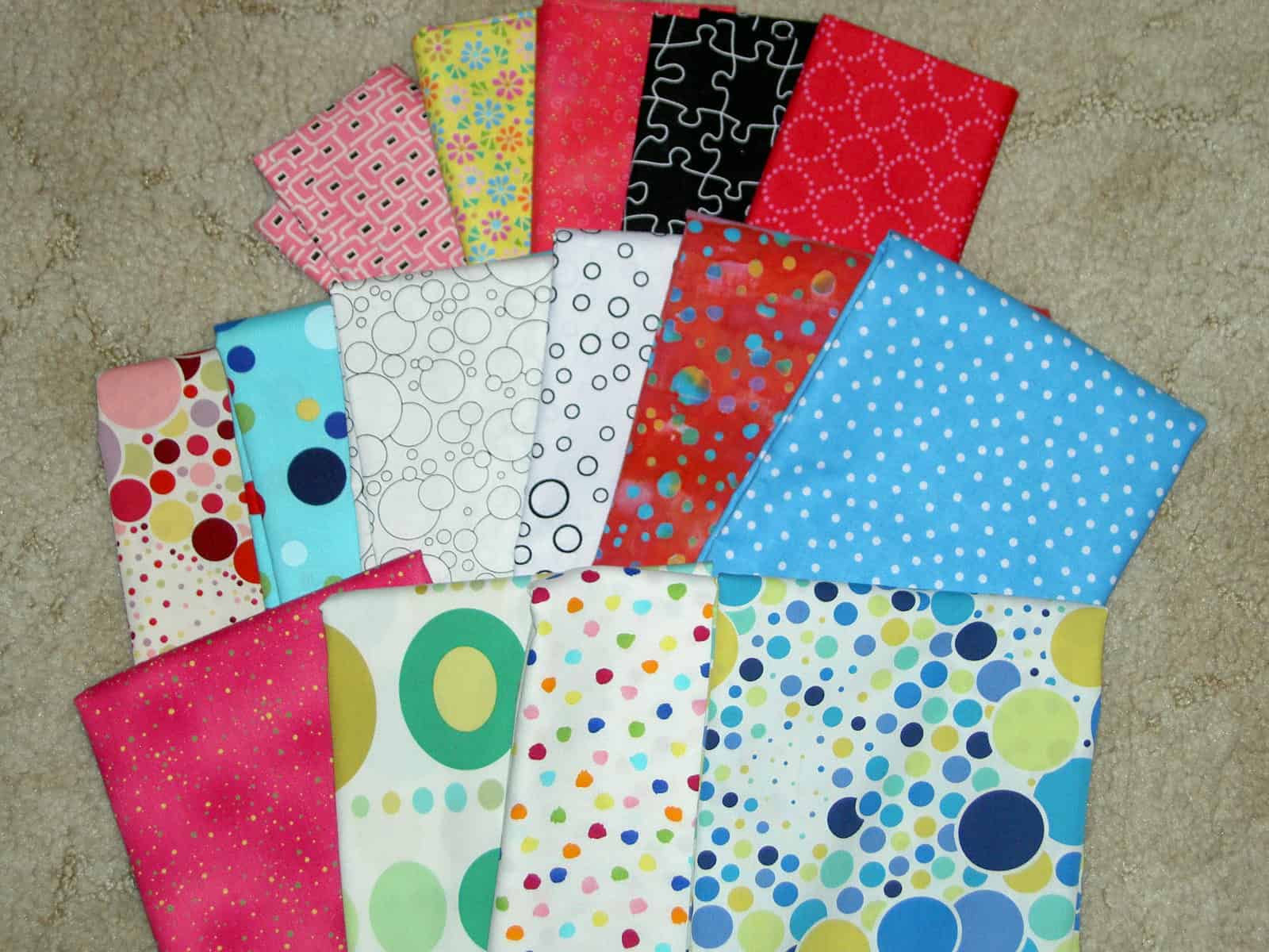
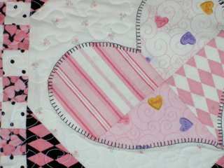
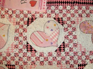
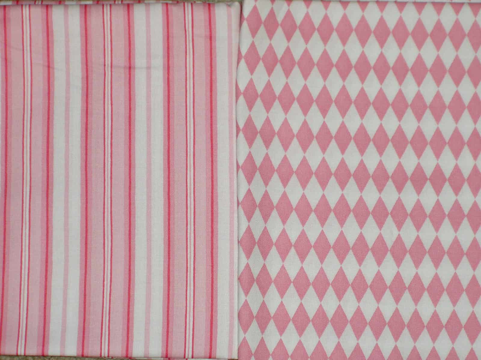
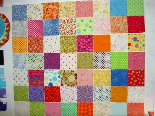
 In the above photo you can see that I have cut and selected some of the fabrics in preparation for piecing.
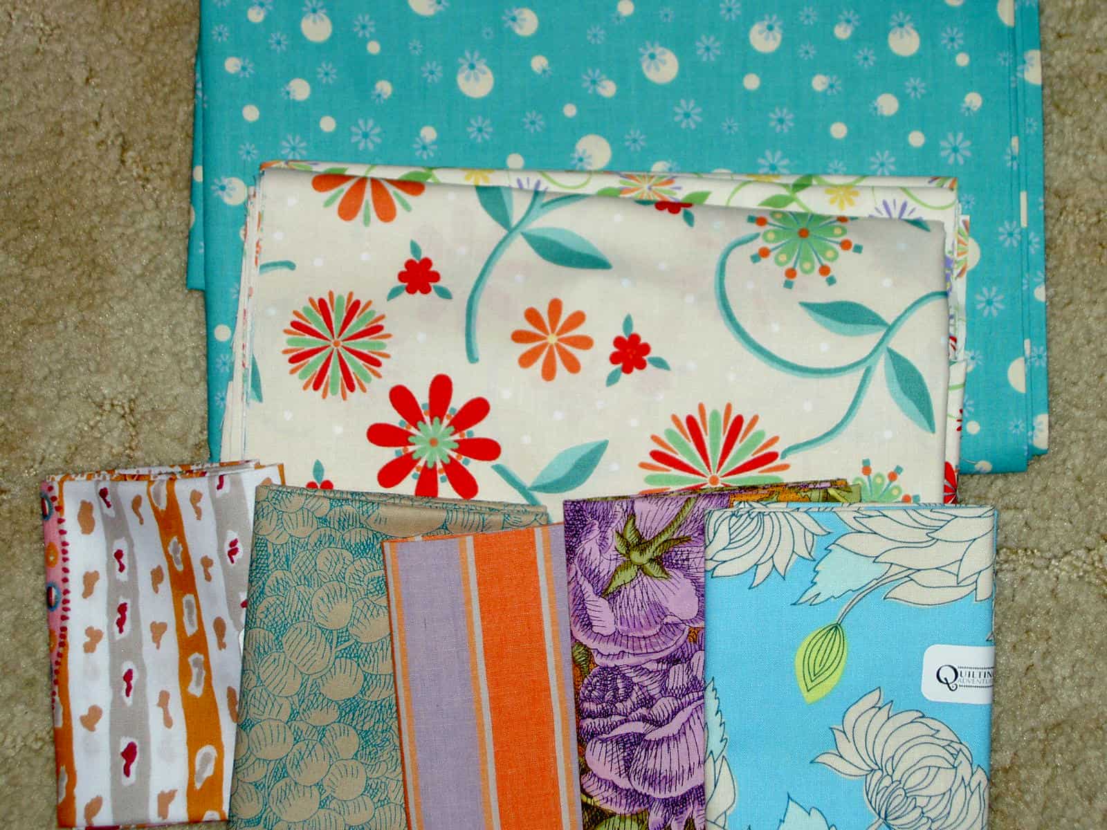
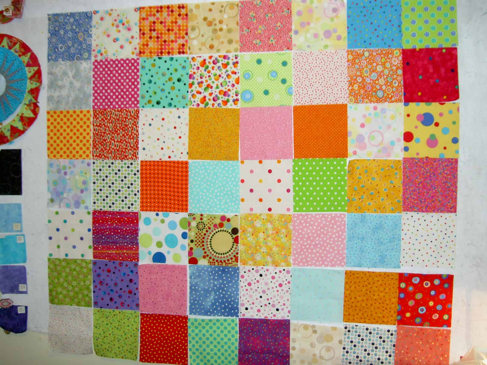
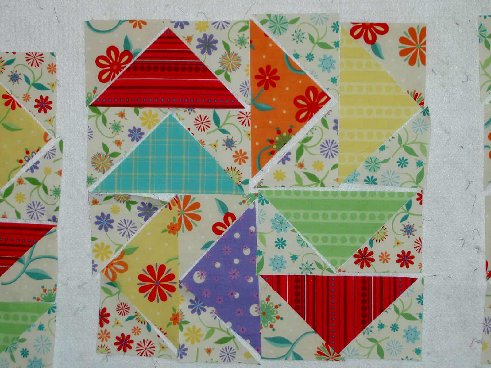 Above is a detail of the center block.
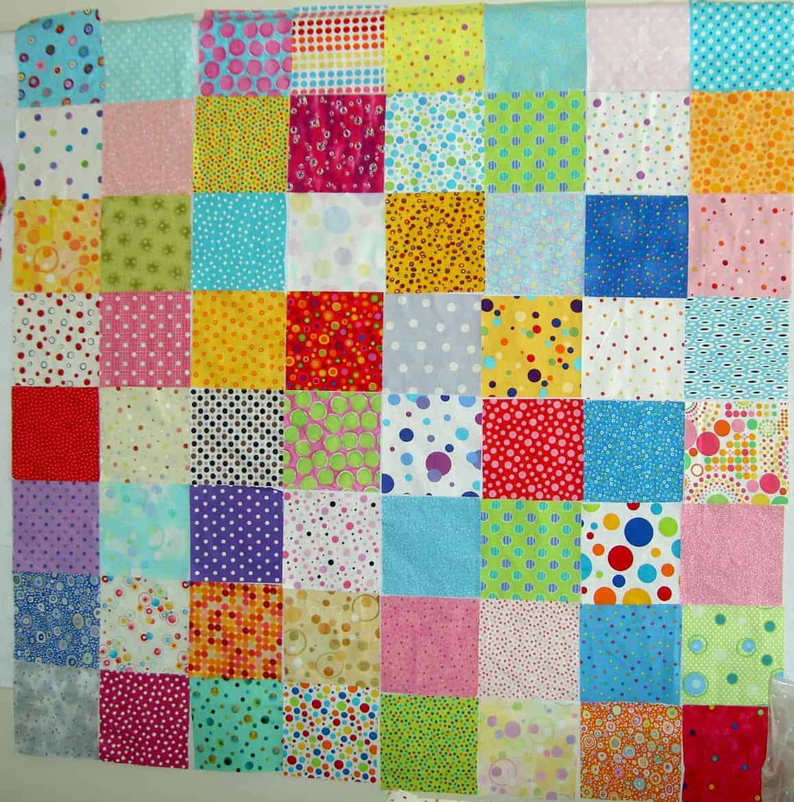
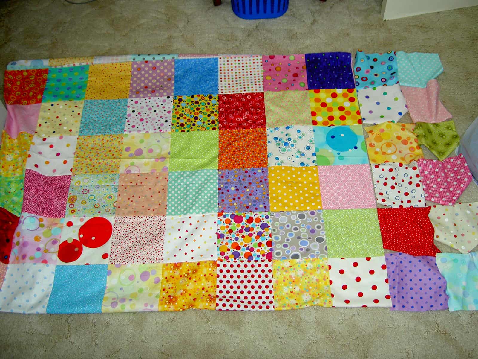
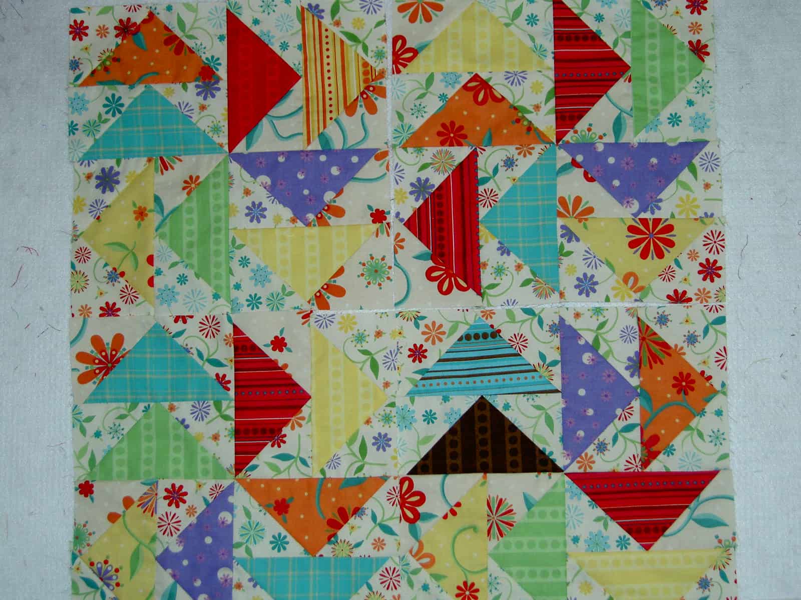 On and off since the second week of November, I sewed a few seams as time permitted, steadily making progress. I don’t plan on setting the blocks this way, but wanted to see how they would look together. This also allows me to review the use of fabric and identify any problems that may be developing. As you can see, I have several blocks and have still not used all of the fabrics from the line. I flipped over the stack of fat quarters so I would cut some new ones the next time I cut the larger triangles.