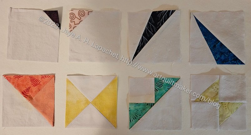
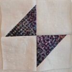
As mentioned, I made about 15 of these blocks while on Retreat. The pattern called for sets of Flying Geese and Half Square Triangles ( HSTs), so slapping them together any old which way didn’t work. As you saw in my initial efforts, I had to choose the sets carefully. Surprisingly, it mattered which turquoise Flying Geese star legs went with the pink ring made up of Flying Geese and HSTs.
I call this type of work ‘controlled scrappy’. The paper bag method alone doesn’t work for me. I want a scrappy look, but I want the quilt to be cohesive.
I ended up coordinating the fabrics that make up the pink ring of Flying Geese and HSTs. Then I would match the lavender so that it wasn’t too dark or light in relation to the pink ring. I got a lot of different looks. I think it will make the viewer’s eyes move around the quilt.
Your first design choice is to choose your own colors. If you buy a pattern and use the fabrics you enjoy (not the fabrics in the pattern) you have made the first step in designing your own quilts.
Munsell color system: An artist and an educator, Munsell developed his color theory to bring clarity to color communication by establishing an orderly system for accurately identifying every color that exists. Munsell based his system on what he defined as “perceived equidistance” — the human visual system’s perception of color. (Munsell color, http://munsell.com/about-munsell-color/)
“Professor Albert H. Munsell, an artist and art teacher, developed the basic principles of his color order system mainly for the purpose of bringing order to the study of color. Munsell wanted the study of color to be similar to the study of music, which had order so that one could “hear” how a composition would sound by reading the notes. Likewise, Munsell wanted one to “see” color based on its three-dimensional attributes of hue, value and chroma.” (Development of the Munsell Color order System http://munsell.com/about-munsell-color/development-of-the-munsell-color-order-system/)
Munsell color order system is based on a three-dimensional model depicted in the Munsell color tree. Each color has three qualities or attributes:
Hue – color such as red, orange, yellow, etc.
Value – the lightness or darkness of a color
Chroma – the saturation or brilliance of a color
Hue, value and chroma are also referred to as (HVC)
Munsell Color Theory is based on a three-dimensional model in which each color is comprised of three attributes of hue (color itself), value (lightness/darkness) and chroma (color saturation or brilliance)
“The Munsell color-order system has gained international acceptance. It is described in unabridged dictionaries and encyclopedias as well as in specialized publications on art, design, color photography, television, printing, paint, textiles and plastics. It is recognized as a standard system of color specification in standard Z138.2 of the American National Standards Institute, Japanese Industrial Standard for Color JIS Z 8721, the German Standard Color System, DIN 6164 and several British national standards.” (Development of Munsell Color Order System http://munsell.com/about-munsell-color/development-of-the-munsell-color-order-system/)
“Up until the mid-19th century, bright colors were the preserve of the wealthy, the only people who could afford them. Yet the dyes used in even the most expensive items were so unstable that they often faded or discolored. The development of chemical dyes, like Perkin’s, enabled more shades to be created in brighter, longer lasting hues. People responded by choosing the vivid colors that had until then been denied them when clothing themselves and furnishing their homes, prompting the upper classes to choose subtler shades as a form of snobbish protest. ” (New York Times, 50 Shades of Color: How the Evolution of Palettes Changed the World, By ALICE RAWSTHORN, Published: September 23, 2012 http://nyti.ms/RZj53N)
In the TQS episode 313 with Jinny Beyer, she talks about her color system, which is way of picking colors different than the systems we have talked about above. Her idea is to shade from one set of colors to another in order to keep the transitions smooth. She uses her Portable Palette tool, which uses Beyer’s fabrics. This is a good system, but you might be unduly influenced by Beyer’s color palette, which has, in my opinion, an East Coast look to it. Try to create your own portable palette with colors you have in your stash.
“By the 1910s, the scientific approach to management advocated by theoreticians like Frederick Winslow Taylor was becoming increasingly popular, and color was identified as a problematic area, because of its unpredictability. If a manufacturer of furniture or dresses ordered fabric and trimmings, which were both described as “scarlet,” they often turned out to be different hues. The problem worsened with the development of new types of paints and dyes after World War I, and the U.S. government encouraged various industries to standardize colors in an attempt to reduce wastage.” (New York Times, 50 Shades of Color: How the Evolution of Palettes Changed the World, By ALICE RAWSTHORN, Published: September 23, 2012 http://nyti.ms/RZj53N)
Most of us love precuts, because, well, they are PRE cut, e.g. you don’t have to cut them. Keep in mind when you actually want to use them in a quilt, as opposed to using them for decoration, that pre-cuts (Jelly Rolls, Layer cakes, honey buns, etc., as well as Fat Quarter packs) are marketing tools. Pre-cuts are marketing tools. They are small, fun, look great on your shelves and are easy to purchase. They are all-in-one and don’t need much thinking when buying them.
When you are using these for a quilt you need to look at the colors/fabrics included in the selection. IF you need the contrast as part of the design of your quilt, make sure you have enough contrast. Many of the pre-cuts are heavy on medium colors, which we all love to buy, but can create a mushy looking quilt when you don’t want it to be mushy. Joanna Figueroa of Fig Tree Quilts has (or had) a publication called Fresh Vintage and in many of her issues, she says to take 20% of the pre selected pre-cuts out and replaces them with something else. Not only with this give you more control over your light and dark, but it will also make your quilt your own. You can see a good variety of sizes of prints in the 2025 video introducing the new Tula Pink True Colors.
A profile of Alicia Merret in Quilting Arts includes “Her appreciation for color theory greatly informs her work. ‘I have found that it is incredibly important to understand how colors interact with each, and how one color can look quite different depending on the colors that are next to it.’ ” (Quilting Arts Magazine, April/May 2012, Artist Profile: Alicia Merrett, pg. 33)
One way to figure out your own palette is to look at the world around you. Remember the glossy expensive fashion magazines we discussed before? Ms. Brackett, in Scrap Basket Sensations, writes “Be alert for color combinations that catch your eye in clothing, magazines, nature, and the quilts of others (pg.10).” This is a great way to learn about color. I keep an idea book where bits and pieces are pasted. Some are shapes I want to remember and others are color combinations that would make great quilts. Once you identify color groups you like, check the color wheel and try to identify the type of color scheme it is (primary, secondary, split complimentary, monochromatic, etc). This exercise will help you to become familiar with the different ways to use the color wheel to make successful quilts.
Homework:
Exercise #1: Create a palette
1. Choose a favorite photo.
2. Look carefully at the photo to try to identify the unique colors. You don’t need to isolate periwinkle, violet and lavender. Unless you are making a purple family quilt, just pick one from the purple family. Be sure to look at the very thin lines, if any, and include those colors.
3. Select fabrics (or paper or another craft supply) that match the colors you have selected.
4. Create a palette of 5-9 fabrics and take a photo. Share the photo.
5. Optional: make a quilt from your palette and give the group your thoughts.
–> I was inspired to create the above exercise by the Palette Chasing feature in Modern Quilts Illustrated.
Exercise #2
Please note that this not a weekend project and it will be easier the more fabrics you have to work with.
1. Cut a 2.5″ square from every fabric you have.
2. When you have a good number of squares sort them into color families, e.g. heap all blues together, all reds together.
3. Once you have the colors in color families, place them on the design wall in color order from dark (upper left hand corner) to light (lower right hand corner.
4. Work on rearranging the squares until there is a smooth transition between the color families.
Questions to answer:
What do you notice about prints and colors?
How does the ratio of one color to another in a print affect how the color ‘reads’?
What colors are most prevalent in your stash? What do you think about that? What did you expect the answer to be?
I was scrolling IG the other evening and found yet another Color of the Year announced.
Pantone Color of the Year 2025: Mocha Mousse
Kona Color of the Year 2025
We have Mocha Mousse from Pantone and Nocturne from Kona, both of which I talked about the other week. Could these two colors be more different?
KitchenAid Color of the Year 2025 – Butter
Now, we have KitchenAid’s Color of the Year, Butter, joining the party.
If you are thinking, enough is enough, wait there are more! Better Homes and Gardens has a whole article about Colors of the Year as does House Beautiful. A lot of these companies are paint companies. Sherwin-Williams was not satisfied with one color, but chose nine, yes NINE, in their “first ever color capsules of the year.” Most of the colors are brown and purple tones.
N.B. Kona and KitchenAid were not included in the article, which was written in December.
Separately, Diamond Vogel, a paint company I have never heard of, announced their color of the year: Rediscover 0408. It could be just 0408. It is a green color.
I think a lot of these colors are depressing and dark. Perhaps it reflects the times?
Young House Love provides a recap of all the paint colors of the year for 2025. This is a nice post, even without Kona and KitchenAid, as it provides the new CotY next to the previous several years for each company. You could use these for quilt color palettes assuming you like darker colors.
What is your color of the year? I am struggling to choose between turquoise and pink.
The reason I love it is the color. I need to remember these photos and use them when I redo rooms in my house.
The exuberance and color start on the outside before you even enter the shop. Then it continues on in all of the rooms and the goods (gifts, fabric, yarn, paint, etc) they offer. The walls are amazing: turquoise, yellow, violet and then bright white to show everything off. Fabulous.
Kaffe and friends fabrics
I didn’t read my previous review before I visited, but I remembered they had a lot of Kaffe. They don’t have a lot. They have ALL the Kaffe, ALL of the Philip Jacobs prints and all of the Brandon’s designs. ALL. OF. THEM. Roxanne’s also had all the dots. I bought one I had never seen before. They had all of the stripes, Shark’s teeth and all of the colorways.
Of course, I wanted it all, but I restrained myself. I bought quite a bit on my Portland trip and, though I have used a lot of it, I still want to use another 50 yards before the end of the year. What I really want is a place to store all of the fabric I want and a large space to work on all of the projects I want when I want. I guess I should play the lottery.
Roxanne’s Tula prints
Roxanne’s has all the latest and best designer fabric. Yes, Kaffe, but also Tula.
Check out all the Tula True Colors: the large dots, the tiny dots, the tiny stripes plus pre-cuts of ALL of them. How come I don’t see these in other shops? Is it because California is so expensive? If I am going to move somewhere the are near this shop is a contender.
Roxanne’s solids
Not only did the shop have Free Spirit solids, but they also had the Moda Bella solids and Grunge. There were also some Grunge dots. I looked for that certain violet I like from Free Spirit but I didn’t see it.
Do you see the great turquoise wall in the background? Isn’t it fabulous?
Roxanne’s bag pattern area
I looked for hat patterns, too. I am not happy with the pattern I am using for the Sun Hat. I probably did something wrong, but it isn’t working out the way I had hoped.
I didn’t find any hat patterns, but I did find A LOT of bag patterns. The shop also had quite a few samples. I liked the one in the center. I thought it was kind of like a file box, but it turns out to be more of a bag with bamboo or stick-like handles. The sample of the Mondo Bag uses great colors.
The bag area also had a lot of kits. Kits are very popular, it’s kind of surprising. I guess people want to just sew. I can relate, but I love shopping for fabric, so I’ll leave the kits to others.
Roxanne’s Kaffe room
I want to decorate one of my rooms like this, though maybe with the same print in cool colors. I do like the combination of the yellow with the Chrysanthemum print.
I know these colors work, because they are bold, but also because they have the right lighting and they are balanced with a great white on the ceilings and on the trim.
Roxanne’s Kaffe room
You can see more detail in the photo from the other side of the room.
The pre-cuts are fat quarter bundles and some charm packs.
There are also more nice quilts. Look how the quilts go with the decor!
Roxanne’s bolts
This room had a lot of quilts for sale, but also had quite a few pre-cuts. I was also amazed to see bolts for sale.
I have never seen bolts for sale like this. They were wrapped up in Saran Wrap-like plastic wrap ensuring that you buy the whole bolt. There were a lot of Kaffe prints, some Tula, including the goldfish, my man Phil and some Anna Maria prints. I saw the grey dots that I use for some of the Fabric of the Year bindings. I wanted one, but I didn’t buy one. I have no idea how much they cost.
Roxanne’s towards the Kaffe
This is the view towards the Kaffe fabric. There was some Tilda fabric behind this shelf..
Out of the picture is a large selection of Anna Maria fabrics. Across from the fabrics shown were the most amazing selection of pre-cuts. I mentioned it before, but these pre-cuts really made me want to buy one, especially when I saw that they had a free bag pattern if you bought a Jelly Roll.
Roxanne’s free bag pattern
I liked the bag. I think what I liked most was the selection of Kaffe strips. I looked at the piece long and hard and decided that I could cut strips off that fabrics I have and make a similar bag. Perhaps it could even be a guild project?
I thought I could use SIL2’s demonstration of Quilt as you Go for the outside. I’d prefer the interfacing was Soft & Stable** so the bag would stand up. I am sure I could make the outside this way and then insert the lining separately. It’s worth thinking about.
Roxanne’s notions
The shop also had a good selection of notions. i always lok for Chenille needles, but I didn’t find the 24s and 26s that I like. it doesn’t matter since they had a lot of other cool notions, like several different types of tweezers.
On the back wall were rulers, including one that helped square up corners and make round corners. I think I have something similar at home, so I didn’t buy it.
Roxanne’s Featherweights
Roxanne’s Featherweight accessories
The shop also refurbishes and sells Featherweights. I saw one that was turquoise. I didn’t look at the prices of it or of any of them. I might have liked the look of the turquoise Featherweight, but I don’t need one.
Roxanne’s yarn room
The shop does not just have fabric. They also have yarn and this was a beautiful yarn room. I took a quick look and then walked away as I don’t want to buy more yarn.
I couldn’t help enjoy the beauty of the room, however. Doesn’t it make you want to buy everything?
Roxanne’s purchases 2024
I bought one Charley Harper print. They were $16.99/yard!! Fortunately, the shop was having a sale. $16.99 is a lot even for me.
The dots are Kaffe dots in a colorway I have never seen. I may never use it (joke), but I liked it.
The red-violet is for a project and I will use it right away, or nearly right away. I was annoyed at some tweezers I bought recently, so I got a different pair and will try those.
**N. B. : Obviously, you should shop at local quilt shops and small businesses. However, if you are too busy or can’t find what you need there, I use Amazon affiliate links and may be paid for your purchase of an item when you click on an item’s link in my post. There is no additional cost to you for clicking or purchasing items I recommend. I appreciate your clicks and purchases as it helps support this blog.
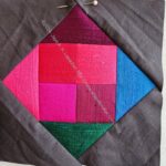
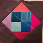
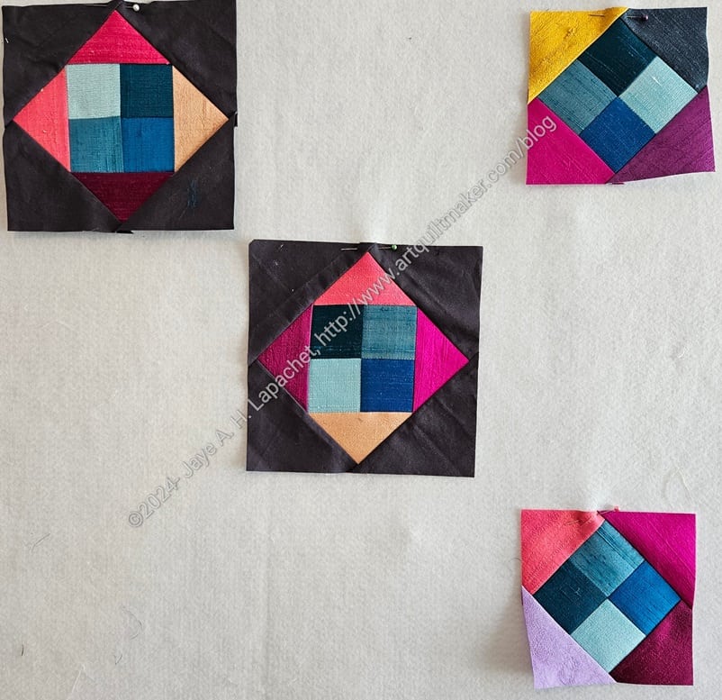
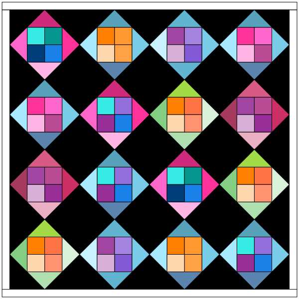
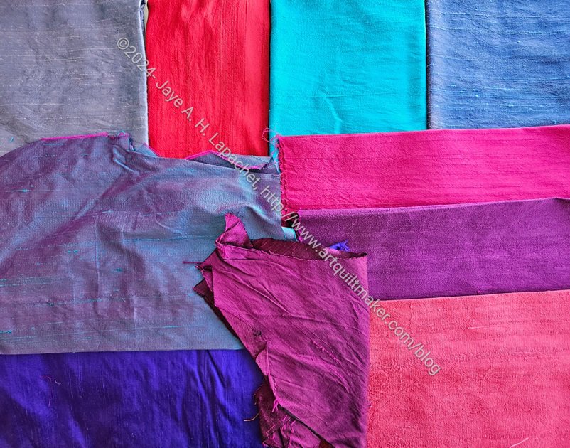
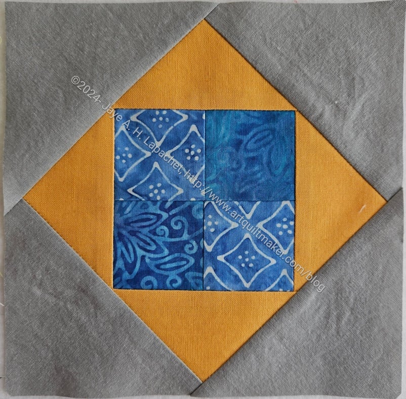
I made some progress on the Colorblocks 3 quilt. I started making blocks using the Square in a Square ruler**. My YM helped with basic directions for that ruler. I used silk I have had for making this quilt since 2003 or so.
Colorblocks 3-laying out blocks
I had a plan to make 16 blocks only and began laying out the blocks as I finished them.
I started using a limited amount of colors but it soon felt like the silk FQs were multiplying. I kept finding new and different colors in the stack. I had a little of each color, but mostly pink and blues. No big surprise there.
The blocks went together quickly and the Square in a Square ruler was pretty easy to use. I was disappointed that the blocks ended up all being on the bias. I have to check and see if I missed something about how to cut the fabric so the outside wasn’t on the bias. I was careful not to stretch them unless I needed a little ease.
**N. B. : Obviously, you should shop at local quilt shops and small businesses. However, if you are too busy or can’t find what you need there, I use Amazon affiliate links and may be paid for your purchase of an item when you click on an item’s link in my post. There is no additional cost to you for clicking or purchasing items I recommend. I appreciate your clicks and purchases as it helps support this blog.
Cyndi W suggested we all do a challenge for the Fair. This year it is a color challenge.
For fun, I looked in EQ8 to see if I had any old designs from the previous quilts. Colorblocks is way too old for there to be an EQ8 file. I made that quilt in 1990.
Silk FQs
I wasn’t going to do it, because I have enough on my plate at the moment. Eventually, I decided I would. I decided that it would be a good opportunity to finally use up that silk fabric I bought a long time ago. Back in the day, I had the intention of making another Colorblocks quilt, then never did. This project has been on my Dream Project list for awhile AND it will qualify for the President’s challenge this year. If I finish it, I will get a lot of bang for my quilt buck.
Colorblocks 3 tester block
I am using the Square in a Square ruler I bought through the guild last year. I made a test block out of scraps to get a feel for how it would work. I am pretty happy with the way it turned out. Except for the bias on the edges, I think it looks great.
I have some time and the piece will be small. Fingers crossed!
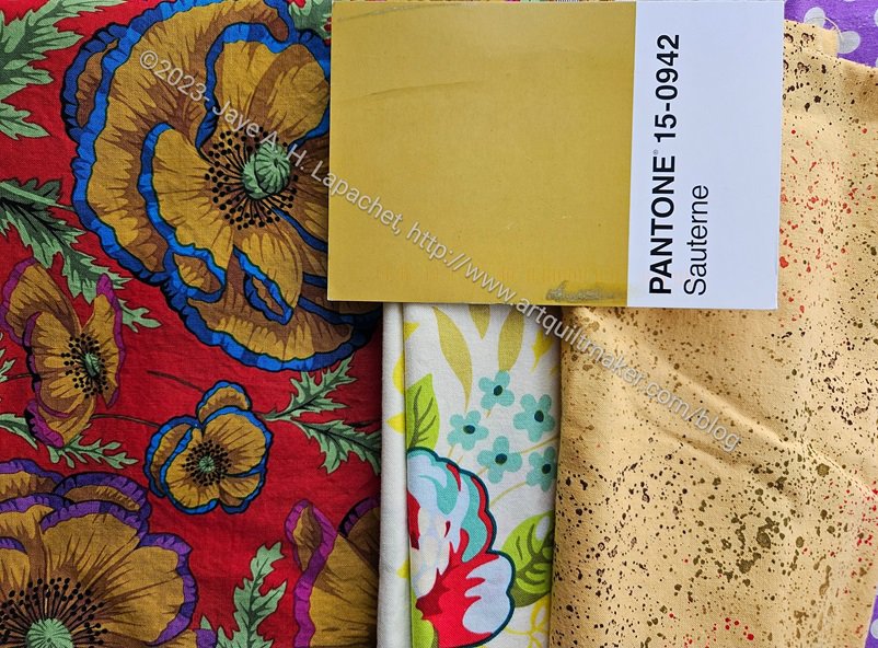
I received Sauterne with a heavy heart. Not for the message, which I always anticipate, but for the color. Another color I almost never use and never buy. Amazingly, I found a Philip Jacobs print with that color used for some flowers. It was almost perfect.
This print was the third one I found. The speckle gold is a good type to use for this project, but definitely the wrong color.
In the middle is a Heather Bailey print. Again, those tiny leaves right under the postcard are the perfect color, but so small. I didn’t think it was right.
Pantone: Sauterne in Half Night & Noon
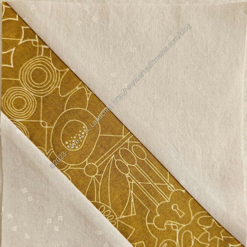
Finally, I found a 10×10 square (I wonder where that came from?) of an Alison Glass print that actually was the perfect color and also the perfect type of print – a tone-on-tone.
I received another postcard today, so back to the fabric closet for more hunting and gathering.
I decided I needed to be diligent about the Pantone Project blocks. I put my nose to the machine and started working hard on them. I want to have another group to give to Julie on Sew Day. I don’t know that I will be able to make them all. I can try.
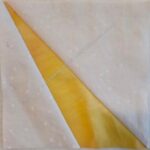
Pantone: Peaky & Spike
Pantone: Peaky & Spike
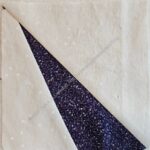
Pantone: Wingy Things
Pantone: Sliver Right
Pantone: Sliver Right
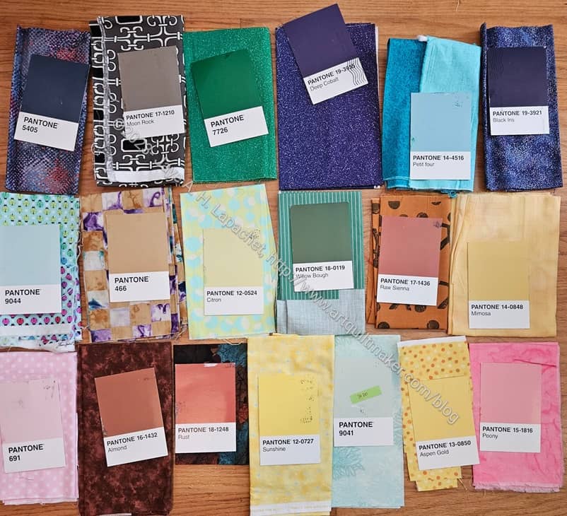
New Year’s Pantone selection
I am in the process of making a second batch. On New Year’s Day, I got all the postcards together and selected fabrics for each of the cards, then, interspersed with sashing the Grey Strip donation top, I started making blocks. I did change out the light blue, Pantone 9044, in the middle on the left. You can see the replacement fabric above in the Peaky & Spike block.
I am selecting blocks to make based what I have already made. I have a sort of plan in mind for the final quilt that requires even numbers of blocks.
Before I started working on the Disco Double Zip Pouch last Sunday, I decided I needed to select some fabrics for The Pantone Project. I felt like I had about 20 cards, but I could only find 8.
I think I brought down at least 20 fabric boxes, which is always the thing that keeps me from picking out fabrics as the postcards arrive. It always ends up being fun, however and I seem to have a hard time remembering that. I always find fabrics that I remember buying, but had forgotten about.
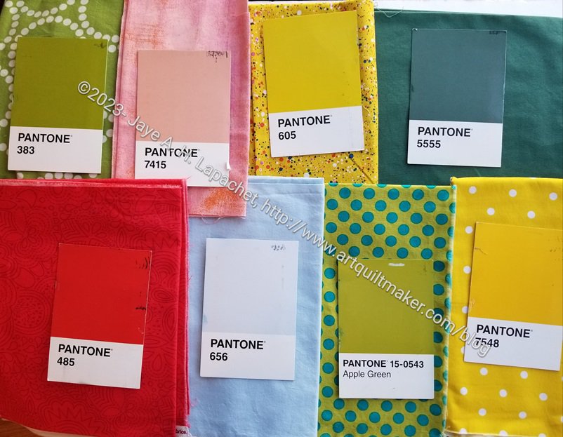
Pantone Project fabric selections – Oct 2023
I was only able to choose the fabrics. I didn’t have a chance to make the blocks yet. I might be able to make them before the next Sew Day.
I am only a little sure about the Apple Green. The background is perfect, but I don’t know what the blue dots do to the overall effect.
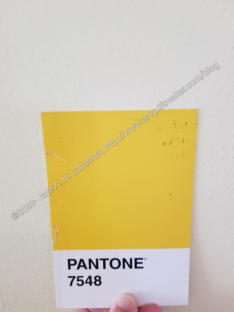
Friend Julie sent me another Pantone Project color postcard last week. On the reverse she wrote that she thought of the color as ‘butter’. I completely lost my mind. I started thinking I was in line for cataract surgery or something, because to me the color looked more like margarine.
As a result, I started running around the house taking photos. I know that all sorts of things -lighting, weather, etc – affect how the camera sees the color, but I have to say that the color in the photo (left) looks pretty true to the color on the postcard.
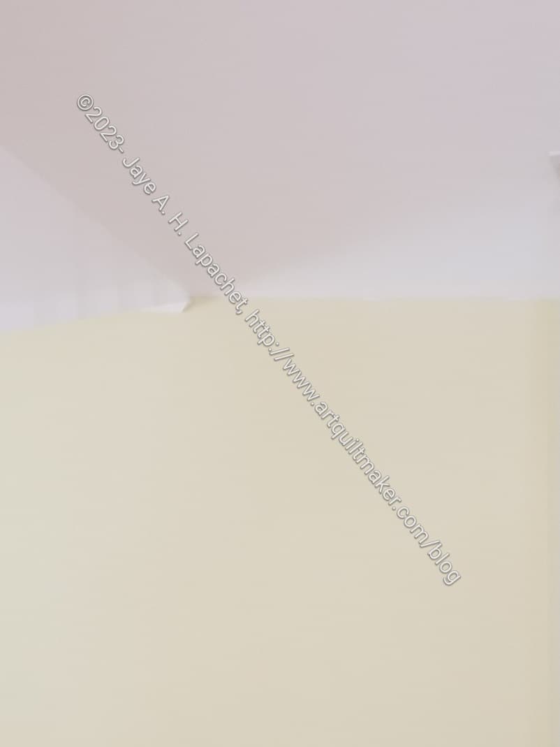
Living room ceiling and walls
My living room has, what I think of as, butter colored walls. It was hard to tell unless I took a photo of the ceiling (white) and the wall (butter yellow). I was pleased to see that I could see a contrast.
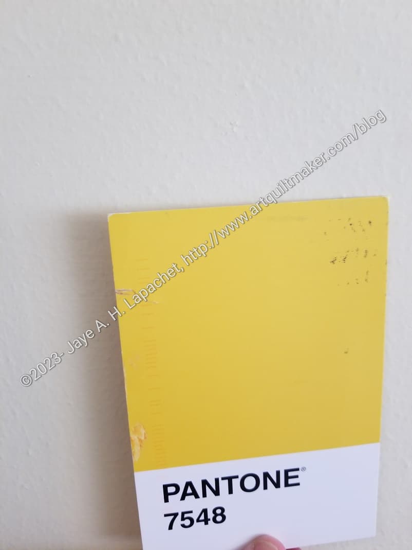
Pantone 7548 against living room wall
Then I took a photo of the Pantone postcard against the wall. I wasn’t thrilled with the way the paint looked in the second photo. The yellow/butter paint looked white compared to Pantone 7548, but what can a person do? I wasn’t about to set up studio lighting.
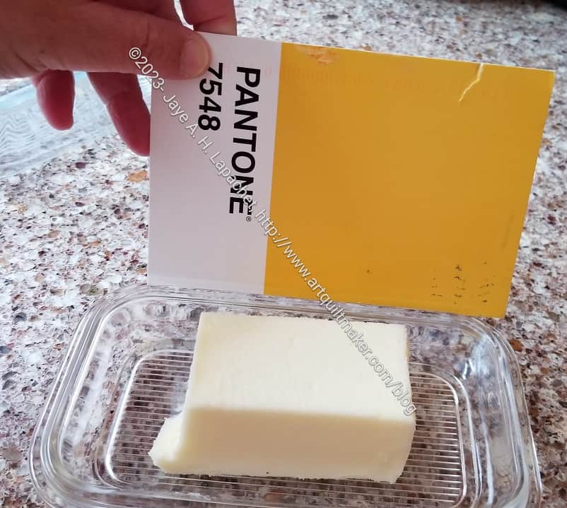
Pantone 7548 with butter
I actually have butter (as in the food), so I went into my kitchen and compared the postcard to actual butter. Unless I am in need of cataract surgery, I think the yellow in the postcard is brighter.
I don’t mind Friend Julie calling this butter. I am just glad I don’t have any eye problem at the moment.
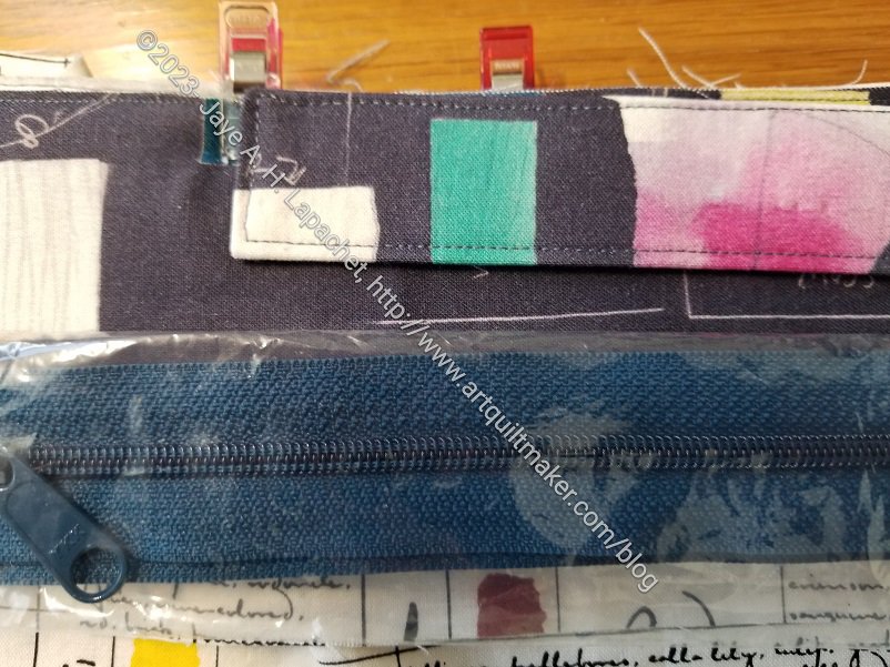
I am making another Hackney with some of the Carrie Bloomston fabric. While I was in the North Coast, I saw a ByAnnie zipper in the color called Twilight**. It’s a dark greeny blue, but more blue than green (maybe).
Hackney Color Choices
I thought it would go well with the Carrie Bloomston fabric, but when I got it home, I wasn’t so sure. The background of the fabric is less blue than charcoal, though the zipper doesn’t not go. I liked the contrasting zipper for the Hand Bone Hackney. This one isn’t exactly contrasting, though, and I might just look like I made a bad choice.
What do you think?
**Obviously, you should shop at local quilt shops and small businesses. However, if you are too busy or can’t find what you need there, I use Amazon affiliate links and may be paid for your purchase of an item when you click on an item’s link in my post. There is no additional cost to you for clicking or purchasing items I recommend. I appreciate your clicks and purchases as it helps support this blog.
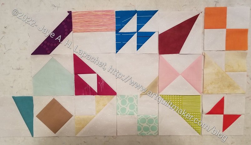
I made more Pantone Project blocks. I am not caught up, but am getting there. Julie had a great post about her blocks and playing with our combined blocks on the design wall.
Making these blocks is providing me with little snippets of sewing now that I am finished with Pies & Points. I still want to get in a groove like I did with the Flying Geese project a million years ago (2015), but I am not there yet.
This is really the first time I have looked carefully at Pantone colors. I am not sure what they are trying to do. They have a LOT of beiges and other neutrals. They don’t have many bright, clear colors – or as many as I would like. I guess I should go read their website.
I finally (FINALLY!) made some Pantone Project blocks and handed them off to Julie when we were at PIQF.
I know there are a small number shown here, but along with the fabrics I have selected, I feel like I have made a good start. I am in the process of making the other blocks. Once I do that I will be caught up and should be able to make a couple of blocks per week. Fingers crossed.