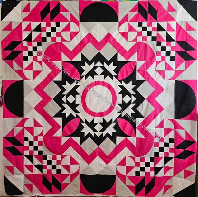
I am pleased that this top is done. If you didn’t notice, I enjoyed the process quite a bit. I am already thinking about making another one. I need to watch the sessions again to take better notes on the dice throwing.
This is the first all solids quilt I have made in a long time, if ever. It is also probably the largest all solid quilt I have made. Lots of firsts. I want to keep the focus on the solids, which means that I may need the quilt quilted in a couple of colors. I am even contemplating quilting it myself as insane as that seems.
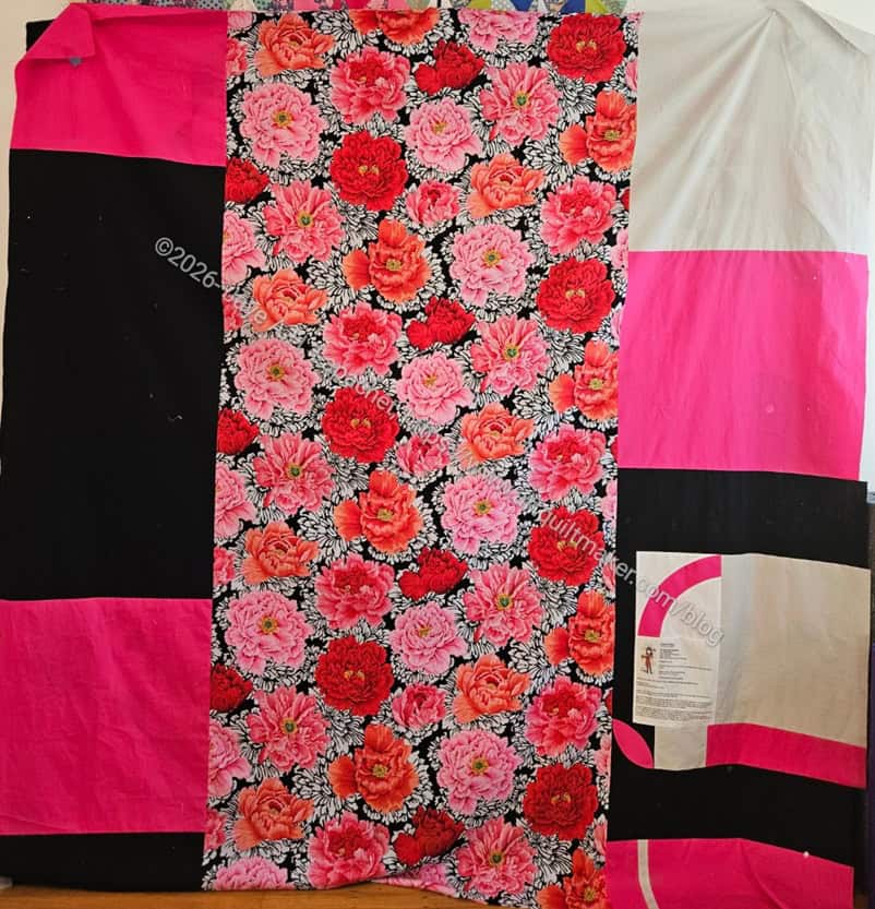
Chaos with a Twist back
The back has some prints. I need my Philip Jacobs prints!
More insanity is how I am looking forward to entering this original design (!!!) into next year’s Fair.
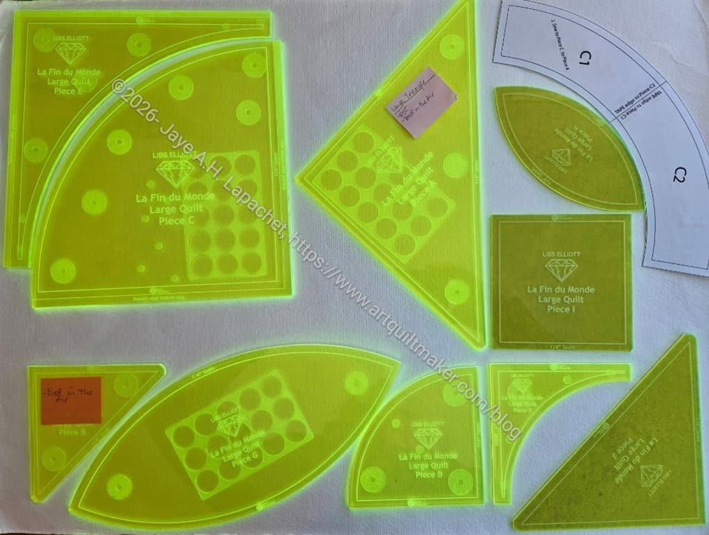
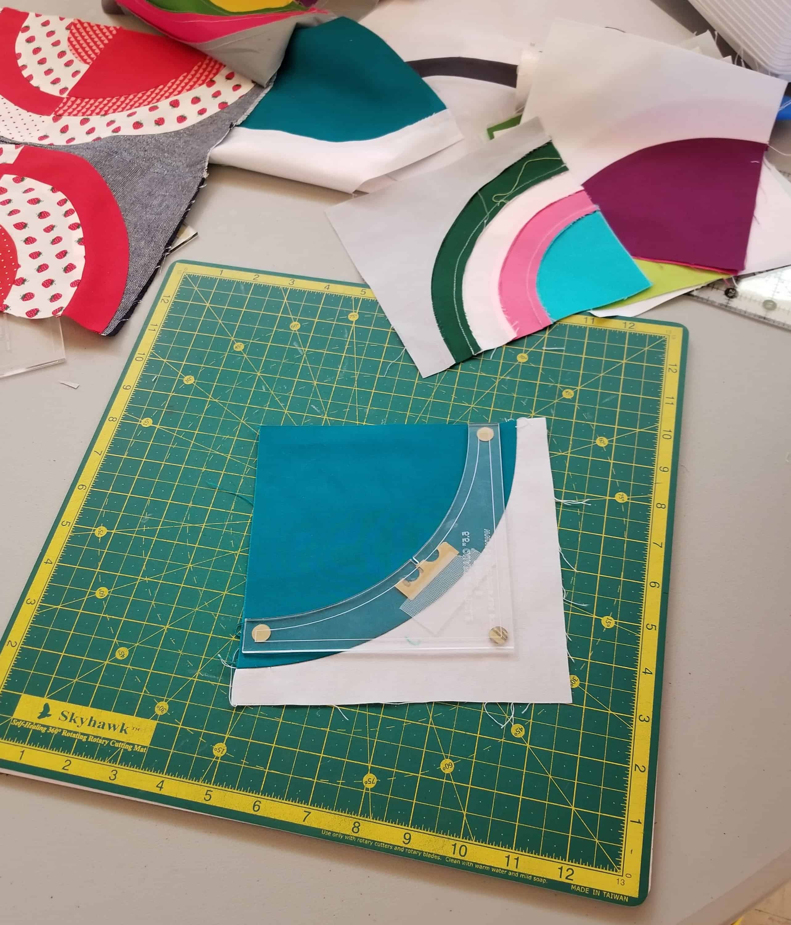
There is no acrylic template for the rainbow block included in the Chaos with a Twist template set. Libs has repurposed these templates from other patterns, Bloem and La Fin Du Monde. It is great that the same templates can be used for all patterns, but I would really like that rainbow block template.
I have placed True Grips** on the back of my templates as it keeps them from sliding around. You can see them through the bright green. My paper Rainbow template is in the upper right hand corner. I made using the tried and true paper and template plastic** method. Not ideal, but it will work.
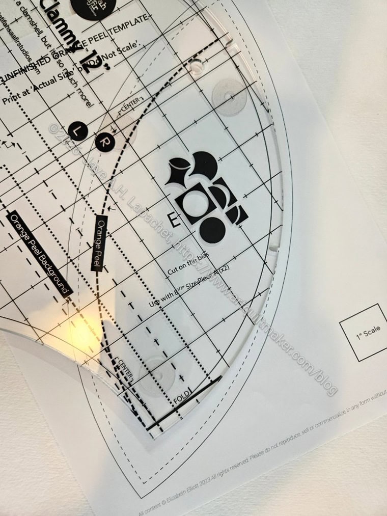
Testing the Clammy for Chaos
Before I put the Rainbow arch template together, I tried different specialty rulers to see if one of them would work.
The Clammy (left) is the wrong shape for this quilt. I tried to use it for the Orange Peel block and it is just too small. As a result, it won’t work for the Rainbow block, either.
JCB Options
I also pulled out my Jen Carlton Bailly templates from the class in 2019. One of the blocks she shows was a Rainbow block. It might not be the exact right shape, but if I do them all the same, it should work.
Looking at the photo I took, it may also work to make a regular quarter circle then use the background template to make the Rainbow. I am going to try this and see what happens.
The second session of the Chaos with a Twist class was interesting. I had already shown my design in the chat group, so I mostly looked at what other people showed and made comments.
Libs is very encouraging and upbeat. She works in a warehouse type space, which makes me envious. We could see parts of it during the sewing portion of the class.
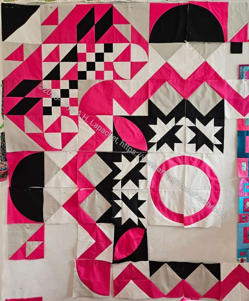
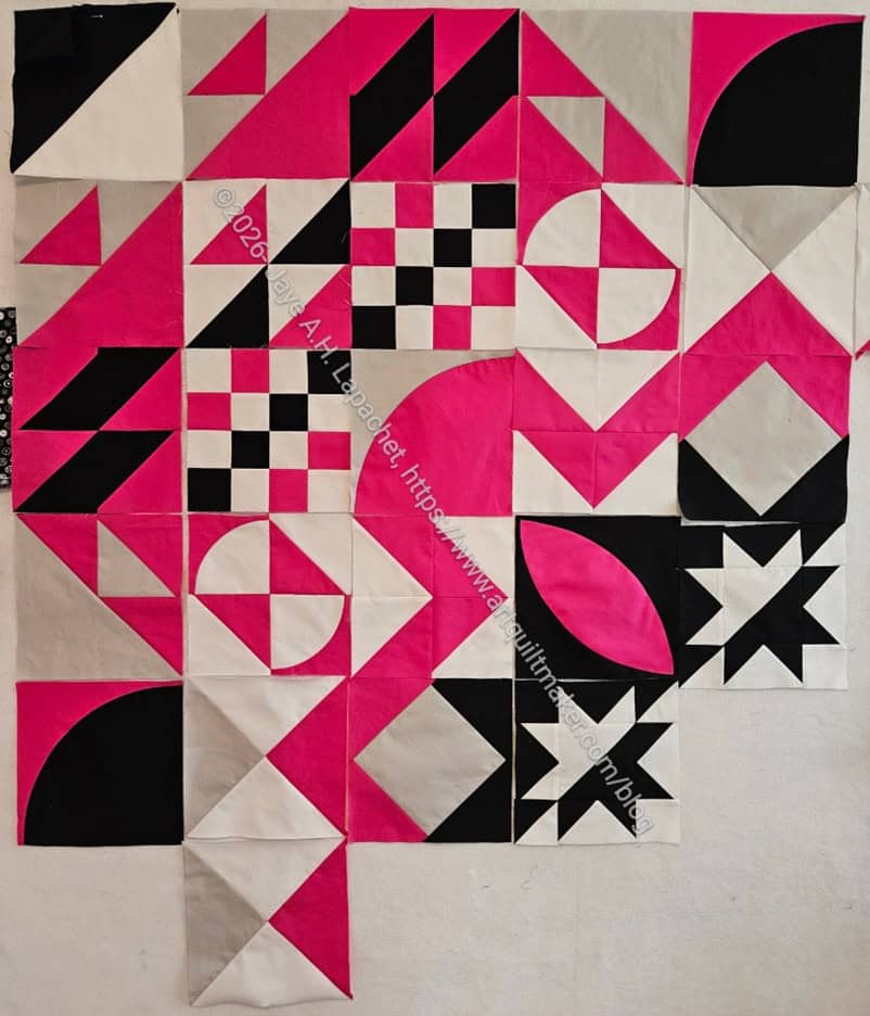
Chaos: first quadrant in process
I sewed 6 blocks during class and then continued sewing additional blocks for the rest of the day. I really wanted to finish one of the quadrants, which is what she told us to work on first. I wanted to get a whole quadrant done before I left for vacation.
I almost succeeded. Minus one block, I was able to sew all the blocks for one quadrant together. I still have to sew the Rainbow block for the center. I did make a couple of extra blocks (all the corner HSTs needed and two more Hourglass blocks), so net I have enough for a quadrant.
My plan is to make all the Rainbow blocks for the center at one time to get them done.
If you would like to watch the (pre-recorded) intro about Libs’ work and process, you can view it on YouTube.
I am not going to tell you the secrets of Chaos with a Twist. It will be well worth your while to take the class from Libs Elliott when she offers it.
I talked about my design the other day. I could fiddle with it endlessly, both the design itself, the placement of the blocks and the colors. I will tell you one secret. Using a 10-side die can help the process. The YM is an avid Dungeons and Dragons player, so I thought there had to be at least one 10-side die in the house despite the fact that he hasn’t lived with us for several years. I rummaged through his night table, his desk drawers for one die. I found a lot of change, old gift cards, a multitude of pens and pencils, but no 10-sided die anywhere. 🙁
I went looking online and saw they all come in sets of ~7 to ~100. I really didn’t want 7 die much less 100, so I reached out for advice. In the meantime, I went to play with the blocks as best I could.
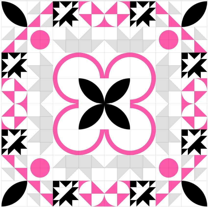
Chaos with a Twist Color #2
For the first round of the second quilt design I chose the smaller grid and chose blocks I liked.
Then I expanded the design as Libs instructed in the class.
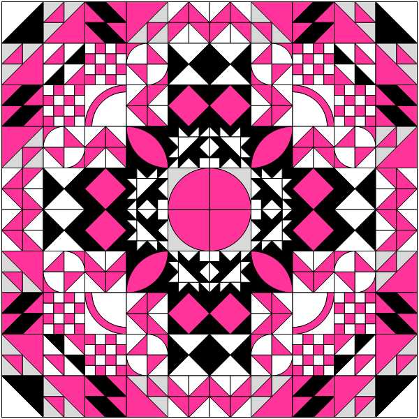
I don’t think this design is as successful even if I change the colors to the pink, black, white and grey I used in the first design. It is possible that if I fiddled around the second design some more that it would be improved.
Chaos Design 2 Colorway 1
I think the random aspect really adds to the interest of the design process.
I also think the larger grid is more appealing.
I made a larger version of this design, which meant adding blocks and I had some problems. First, I didn’t like randomly adding blocks just to fill in a space. The decision felt like too much pressure. I know that sounds dumb, but there we are. Also, my mind has a certain aesthetic it likes. Without the randomness factor, I lean into that aesthetic. I think the larger version is more interesting, but not as interesting as the first design.
SueG had good results in a class she took with Libs Elliott. Remember I took a class from her at QuiltCon? While I wasn’t excited about the class, I did think she was a good teacher.
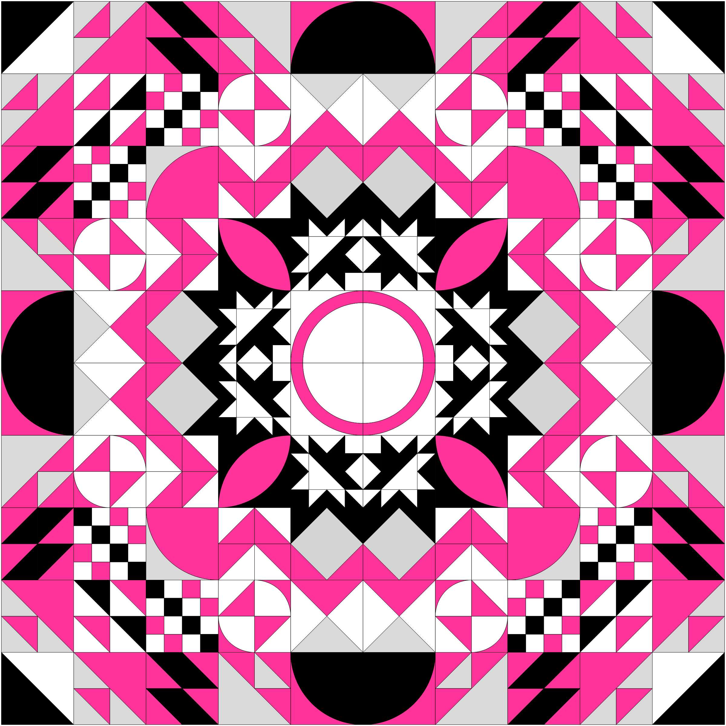
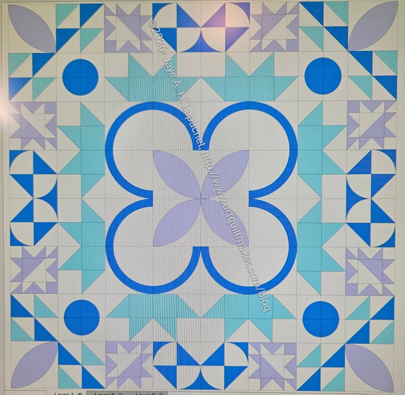
Now I am taking her Chaos with a Twist class, which is a Zoom class, so I can do it from the comfort of my workroom. This class has about 4 sessions and after the first (non-intro) session, I am in love. This process creates super modern, super creative quilts out of basic blocks. It truly exemplifies why I love blocks. You have to take the class to get all the details. After going through Libs’ process I came up with the following design:
Chaos with a Twist – out of the box
We started out on paper cutting and pasting and drawing with pencil and the quilt above is what I came up with after putting the basic blocks into EQ8.
I moved blocks around and recolored some and came up with two versions of basically the same quilt top:
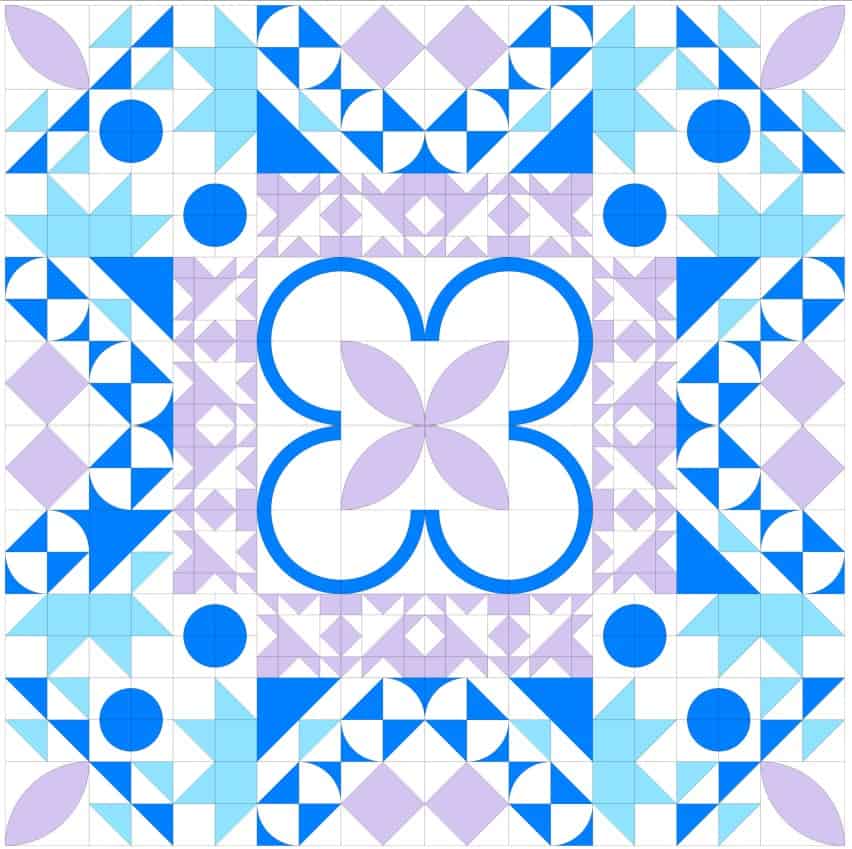
Chaos with a Twist #15
Chaos with a Twist #14
I like the circles on the edges better than the chevrons (above photo). Having them in black looks a bit like a black hole, so I tried some aqua. EQ8 didn’t really have the turquoise I wanted, but you get the idea.
I was annoyed at some of the students who were afraid of various parts of the process, but everyone has to go through their own process, right?
I want to start cutting fabric now and there are two more classes before we get to that point! I might just go for it and see what happens. None of these blocks are difficult to piece.
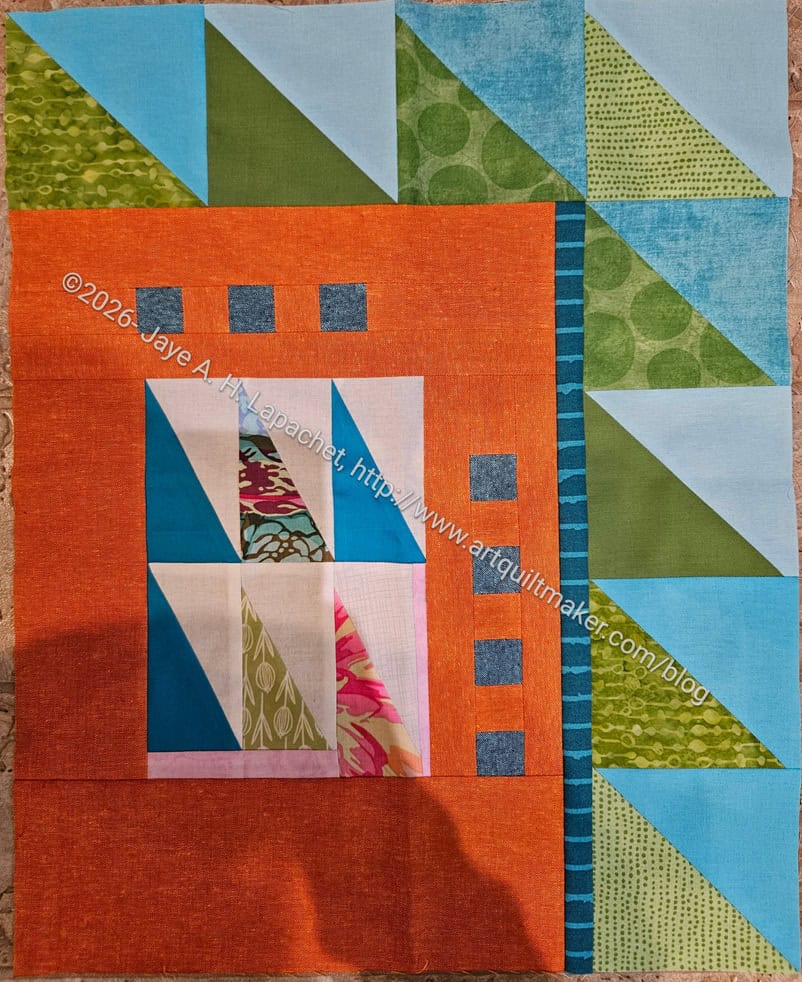
I started a project at the guild called Creative Play. This was loosely based on a concept I had during COVID that kind of petered out. It was also inspired by a quote I read in Libs Elliott’s newsletter. The quote is “I have made a promise to myself that I will make time for creative play in 2026. Because, when work gets overwhelming, I find joy in taking even just a bit of time for myself to experiment and try something different without an end goal in mind.”
I am determined to have it take off this time and so far, so good.
I started out by handing out the rectangles in the center. Cyndi took it and added the orange border. That is an amazing choice. I don’t think I would have thought of it, but I love it. The orange has an interesting texture as well.
I handed the piece to Sue next and she added the half square triangles. I am really pleased with the work so far.
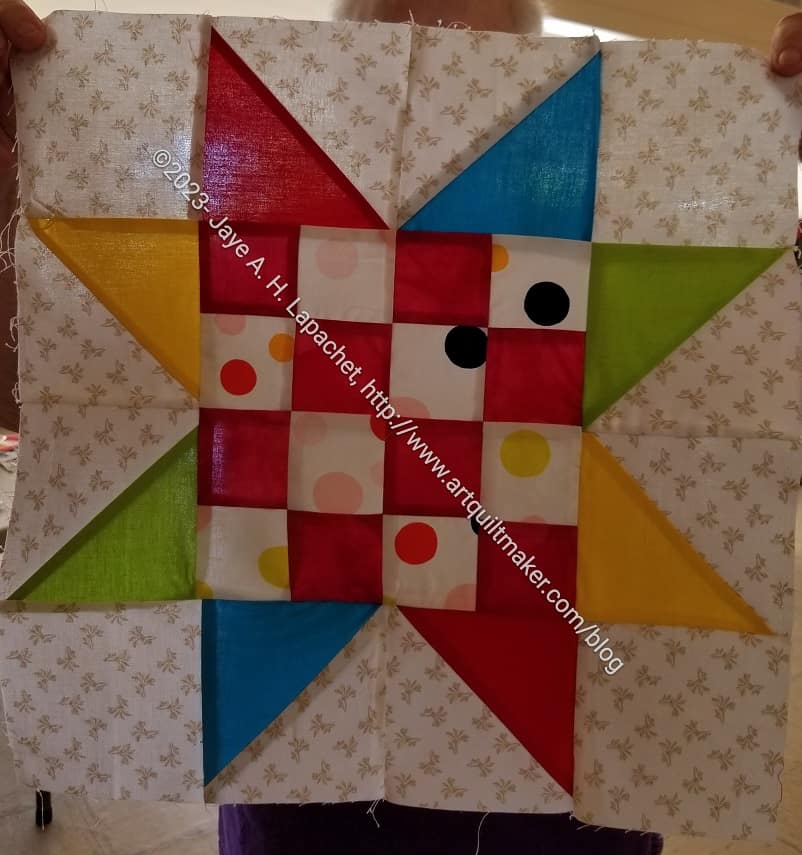
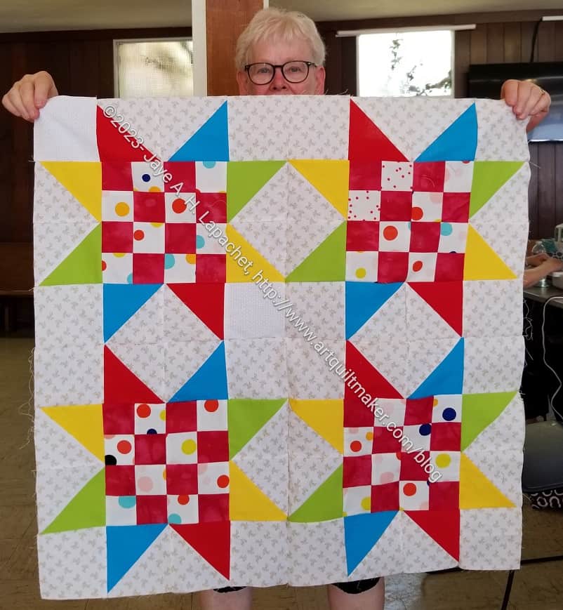
The other day I showed some red and dot donation blocks. I brought them to hand in at sew day and Peggy immediately grabbed them. Very quickly, she came up with a block with my donation blocks at the center.
This is such a cheerful block. I love the way she used HSTs instead of Flying Geese to vary the color of the rays of the star. I would say the block is probably 16″ in this form, but I didn’t measure.
Sawtooth Star donation top
As the day wore on, Peggy continued to work. Midafternoon, she came up and showed me the quilt top made with my block at the center.
I know I say this all the time. I love this about the guild community quilt program. I can hand in something half finished and Peggy or someone will take it and make something fabulous.
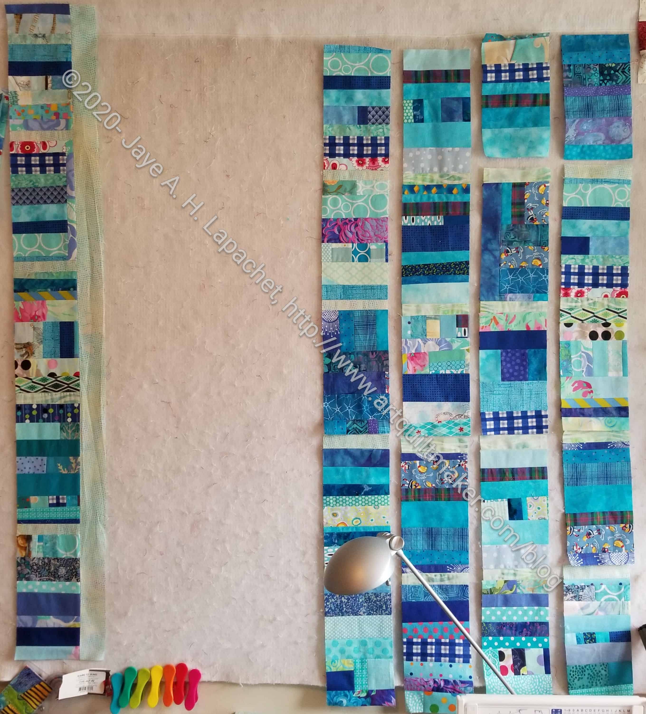
Blue Strips #2 is progressing, though slowly as I have reached critical mass of projects/steps in projects.
The blocks are done. I sewed the blocks into rows with small pieces of sashing making up the columns.I chose the size of the horizontal sashing based on the amount of fabric I had. Now, it is hard to tell where the blocks are and where the divider/sashing is. It is an interesting look. Different. I don’t dislike it.
Blue Strips #2 – adding sashing
Now, I am adding sashing. I was thrilled when the first piece of sashing fit perfectly!!!
The vertical sashing is larger, because I cut it first and I liked the width. I didn’t think about ratios to the size of the blocks this time. I wanted something light and green. I think I am still go for that calm feeling.
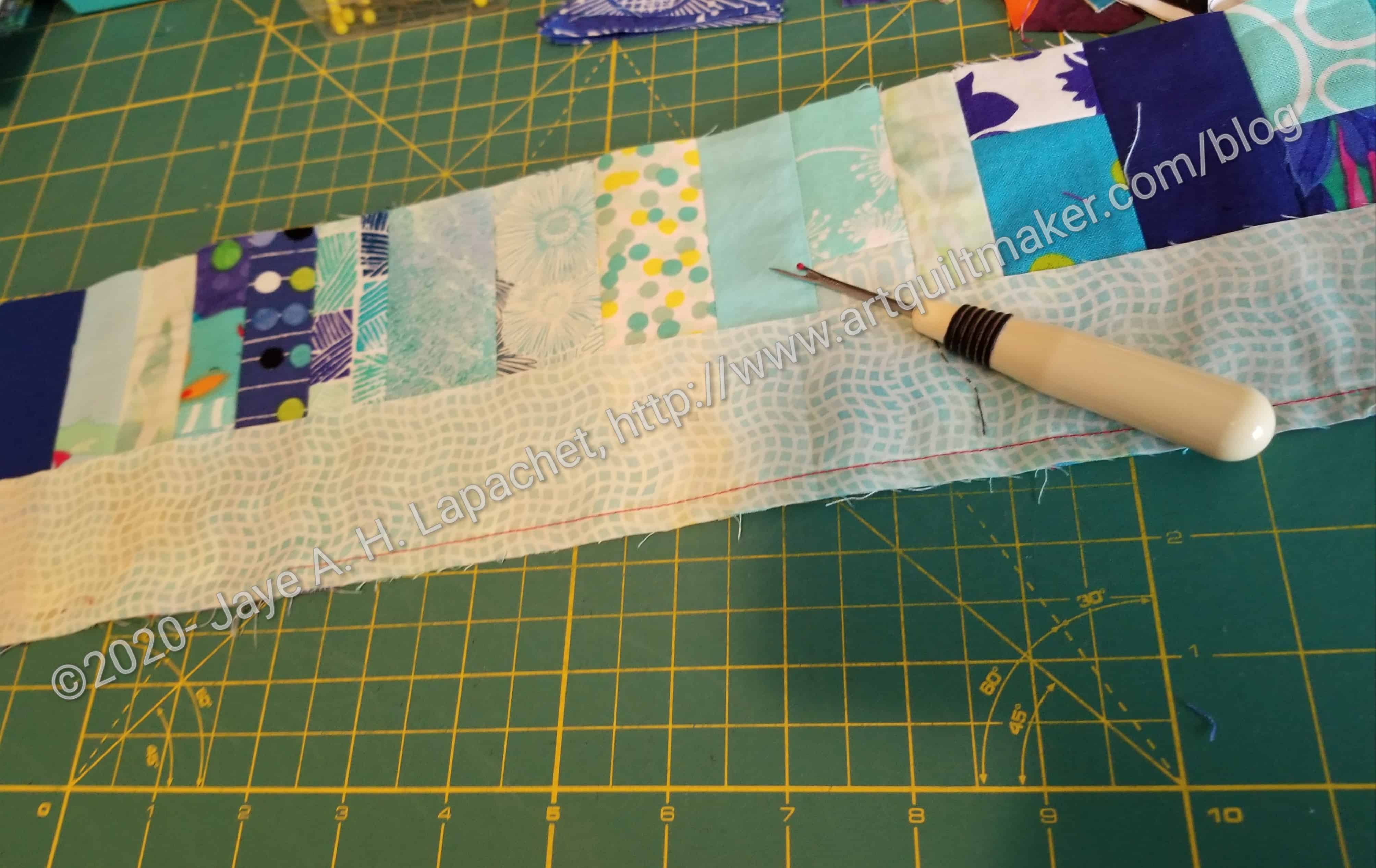
Ripping Column 2- Blue Strips #2
There is a big space in my photo, because the second piece of sashing did not fit perfectly and I have to rip.
I am using red thread because I am also working on sewing down the bias strips and I want to work on both projects at the same time.
Friend Julie posted a quiz to tell creativity types. I am always curious about what these quizzes say about me.
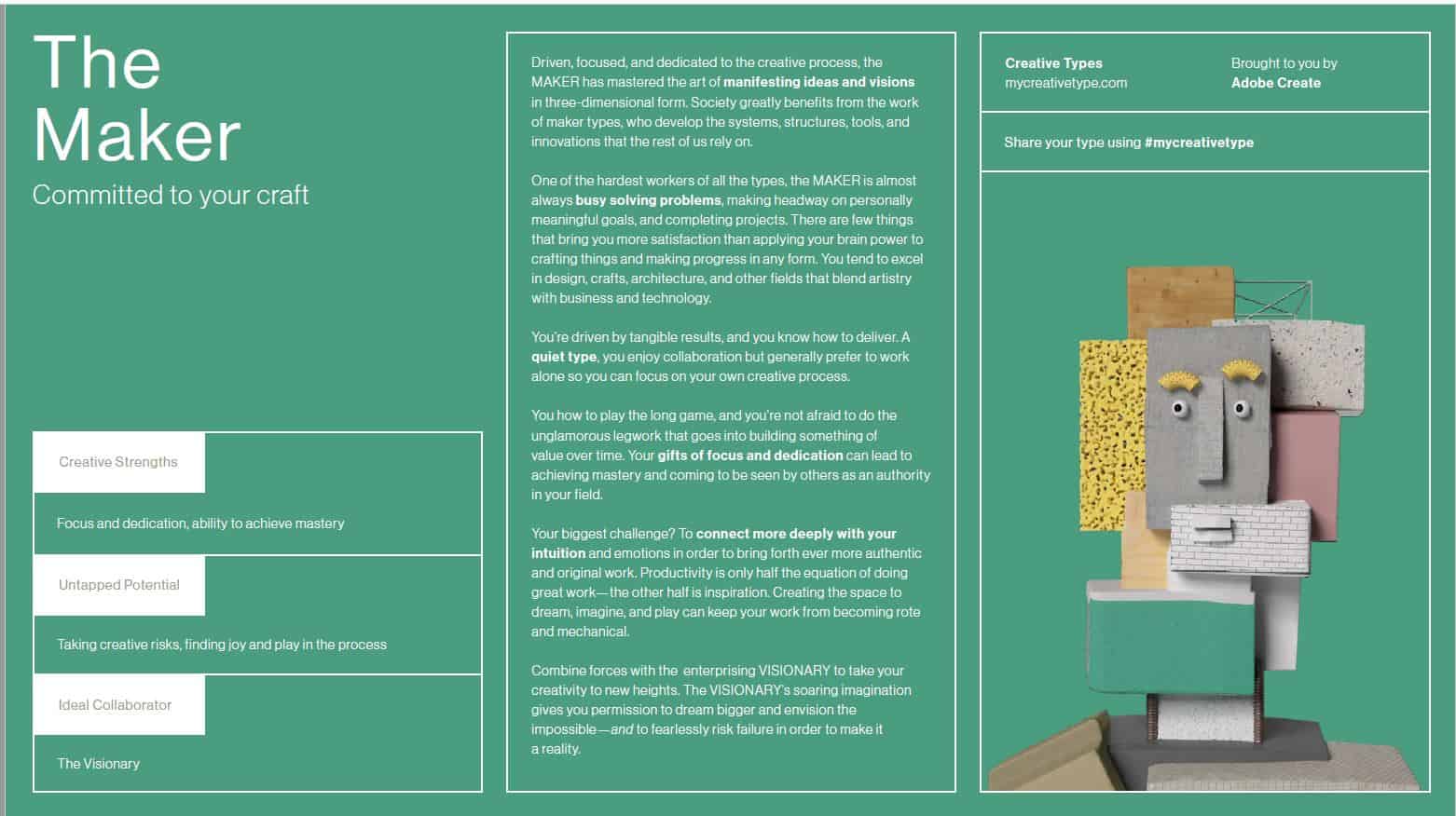
Apparently, my type is The Maker. The image associated with The Maker looks a bit geezerly. It moves on the website, which is kind of cool.
Some of the questions forced me to think hard. I often had to select something that might have been more of an ‘it depends’ answer, if that had been a choice.
In reading the essay associated with my creative type, I think that what it says is true. I do like to focus on my own process. While I enjoy events like Sew Day, I plan carefully so my task fits in with my creative goals.
The Maker
I do think what the test says about my biggest challenge is true: “Your biggest challenge? To connect more deeply with your intuition and emotions in order to bring forth ever more authentic and original work. Productivity is only half the equation of doing great work—the other half is inspiration. Creating the space to dream, imagine, and play can keep your work from becoming rote and mechanical.” I often want to make a pattern. My normal process would be to make the pattern as close to the original as I could. As I make the piece, it becomes more a part of me, or I become more engaged in it and find things I would like to change. I have a lot of things on my to do list, so I don’t always make a second or third version. Looking that this essay, I might have to consider rethinking and moving towards making projects multiple times more often.
Of course, this test could just be made up bull&*^% trying to get my information. I like to think there is some truth in it.
Life is busy right at the moment. I’ll get back on track next week. In the meantime, I read an article* in the Wall Street Journal about Julianne Moore called “Julianne Moore is fighting for safer kids.” The article is by Jason Gay, and was posted Nov. 6, 2019 8:34 am ET
“I ask Moore about winning her Oscar, and what it meant—if, after being nominated four times, including twice in 2003, for supporting actress in The Hours and best actress in Far From Heaven, it loomed, perhaps heavily, as a goal. “You can’t have it as a goal,” she says. “It can’t be. It’s a marker. I remember somebody asked Jodie Foster about winning an Oscar, and she said, ‘Oh, my God, it was such a relief.’ ” Moore smiles. “I laughed, because that is how it feels. You have to work for the work. You have to like the process and like doing it because you like doing it. And yet our culture has these competitions and these prizes…so on one hand, it feels like, Phew.”
I left in the surrounding text so you would understand the context, but I have highlighted the sentences that spoke to me.
Hope you are doing well!
*The link will probably bring you to a paywall. Logon to your public or university library and get access to the WSJ through them.
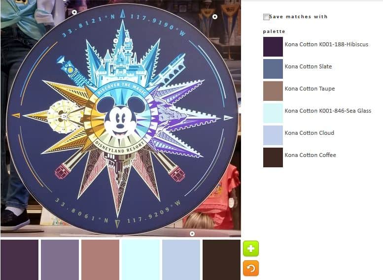
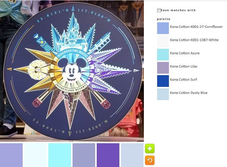
More imagery from my Disney trip. This was a new image that I had never seen before and it really appealed. The detail is fabulous. In hunting around for an image for today, I thought of this. It didn’t turn out to be great for color, but I think some of the palettes are interesting.
ColorPlay-Compass-default
Of course the default palette is neutral heavy! Still there is that Sea Glass (great name, don’t you think?) fabric that lightens up the piece. Also some of the other colors have blue and purple twinges (undertones?), which makes the palette look at little less dark and depressing.
ColorPlay-Compass-n1
The first palette I made is a little all over the place. It isn’t very cohesive. Of course, I like the Lake and Niagra fabrics. It is interesting that the color names are related to water, though perhaps not surprising. I am not a fan of the Rose. It looks sick to me.
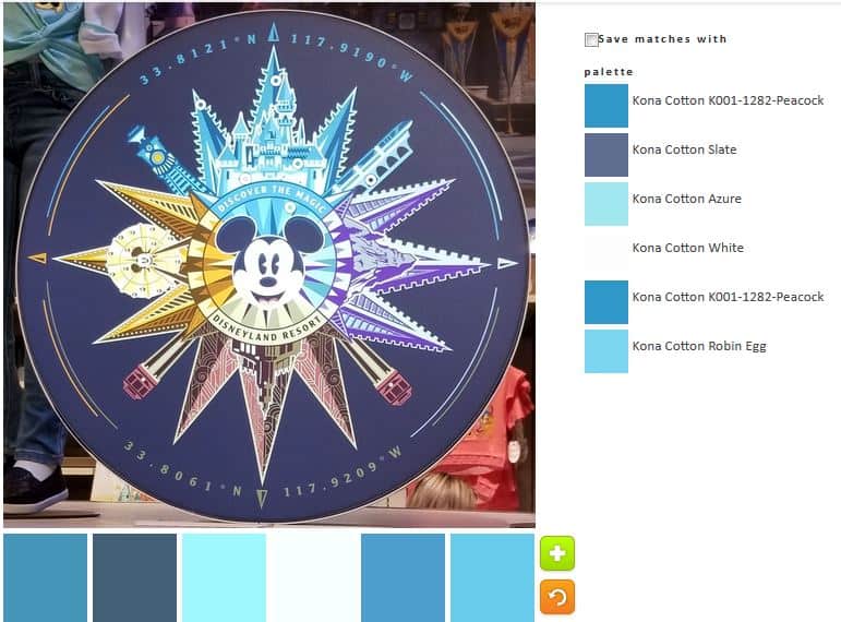
ColorPlay-Compass-n2
I went straight to monochromatic, which was marginally successful. I ended up with two of the same fabrics. C’est la vie. I do like the blues. I think my favorite is the Azure, but the Robin’s Egg is nice, too.
ColorPlay-Compass-n3
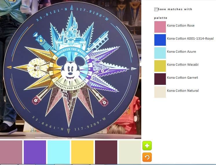
Palette n.3 is all over the place as well, though not a mess, I think. I don’t remember seeing Natural before. I have done a lot of palettes, so I could just not be remembering. The Wasabi looks like sunshine yellow on the bottom, which I like. It has more a green tinge on the side. The Garnet does not have enough red to look Garnet to me. I think it looks more plummy.
ColorPlay-Compass-n4
N.4 might be my favorite. It isn’t quite monochromatic, but stays well in the cool shades realm. I like the way Surf looks more purple on the bottom. I think it adds to the palette even though I think one of the websites used to create this might be off. I think the lights look really good.
ColorPlay-Compass-n5
Finally, I decided to get out of my comfort zone and create something with more gold. Palette n.5 heads into the neutrals pretty quickly. I am not a very big fan of this particular palette, but it is different and it does remind me of Mrs. K’s gold Spiky 16 Patch.
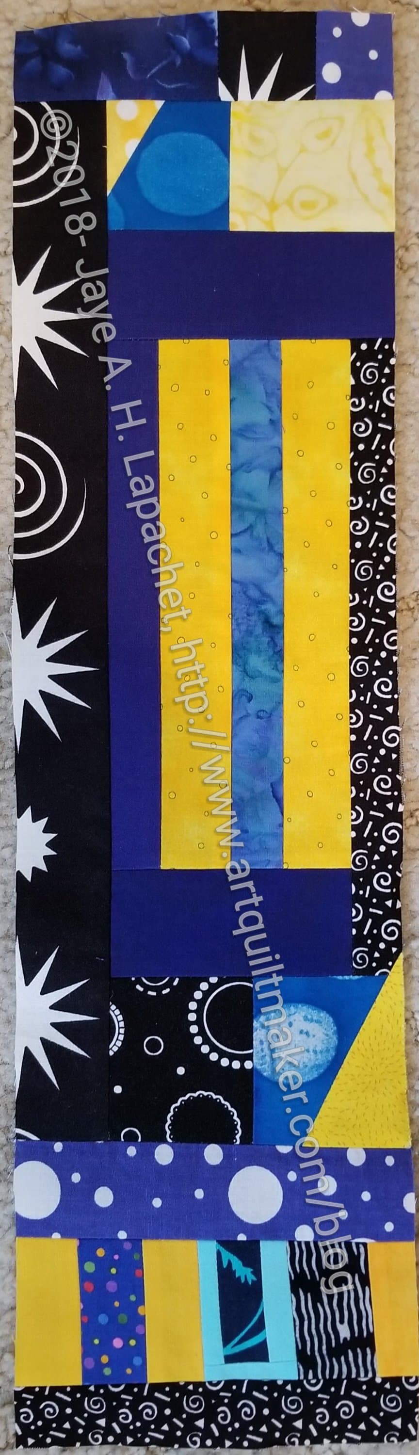
I did my piece at almost the last minute, but not quite.
Nicole asked for a dark, kind of Moon and Stars theme. I used scraps and this was what i came up with. I didn’t have the dark batiks in the example. Others might and mine will provide a bit of night-shiny brightness to the quilt. I hope…
I got back from a trip with my SILs and nieces to Disneyland and California Adventure on Sunday. As usual, I was overwhelmed by visual stimulation. I have previously written in couple of places about the colors and motifs I see at the parks.
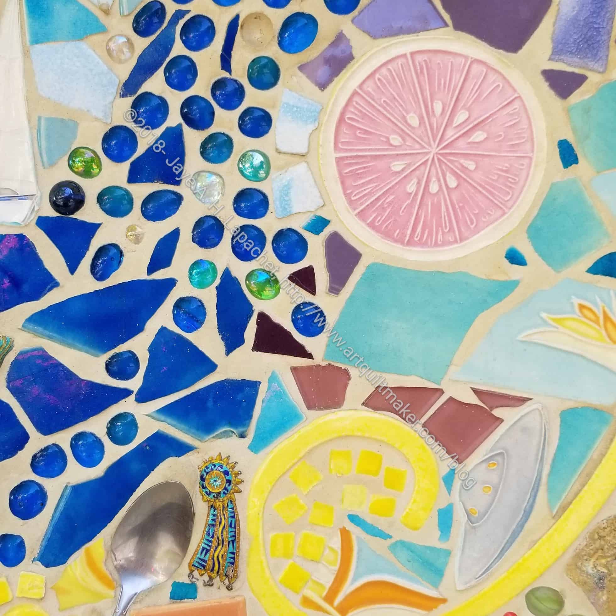
California Adventure Mosaic/Tile
I do think I posted a photo of this mosaic/tile before, but I can’t find it, so we are doing it again with PlayCrafts, though we will just be using a small piece as I may need to use another piece in the future.
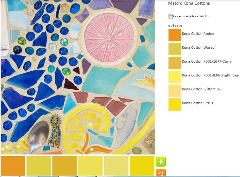
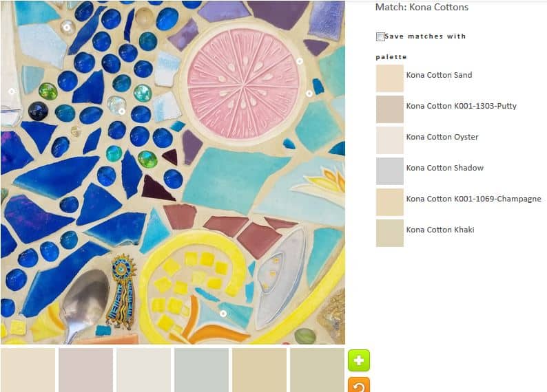
California Adventure “The Grapefruit Experience” (anno)
I will call the piece we are using the ‘Grapefruit Experience’.
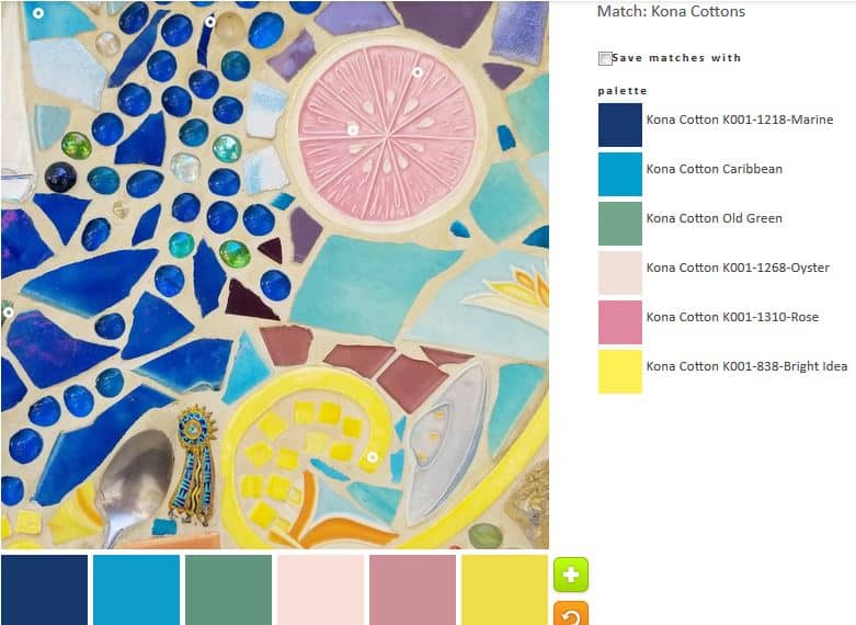
ColorPlay default – Mosaics/Tile
The default, surprisingly, was not all neutrals and included some quite lovely blues.
ColorPlay n.1 – Mosaics/Tile
The first palette was created with just a few tweaks to the default palette. I like the Kona Marine and Caribbean combination. I am not very fond of the other colors, though Bright Idea is interesting.
ColorPlay n.2 – Mosaics/Tile
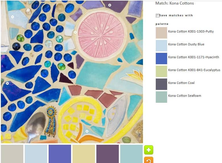
In palette n.2, I tried to go for a light palette without being a neutral palette. In the end I kept the Hyacinth and Coal. I like both of those hues, which look like tones of purple to me.
ColorPlay n.3 – Mosaics/Tile
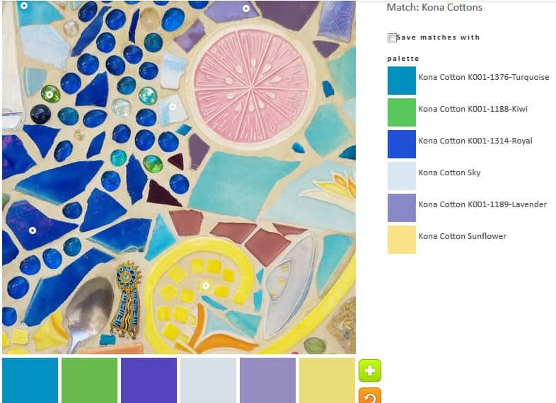
The green I added to palette n.3 was inspired by the #GirlScoutHearts project on Instagram. I am not much of a green fan, but this palette might be a favorite. I like the Turquoise, the Royal and the Lavender, especially. I think the whole palette hangs together well.
ColorPlay n.4 – Mosaics/Tile
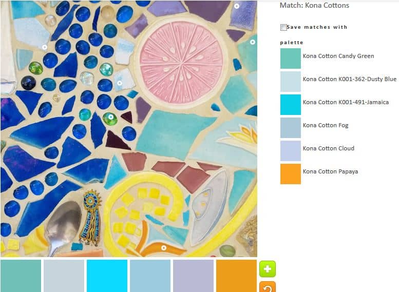
With a little tweaking, I got a nice golden yellow. It goes well with the Kona Jamaica, which is one of my favorite tones.
This image had just the right amount of opportunity for playing with color.
ColorPlay n-5 – Mosaics/Tile
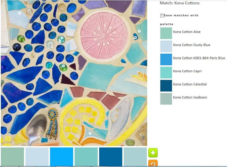
I really, REALLY wish Kona had less ravely greige goods. some of their blues are fantastic, even adjusting for computer differences. N.5 is the monochromatic effort.
ColorPlay n.7 – Mosaics/Tile
I realized I would be able to create a yellow palette as well.
ColorPlay n.6 – Mosaics/Tile
I also tried on a neutral palette. I could resist.