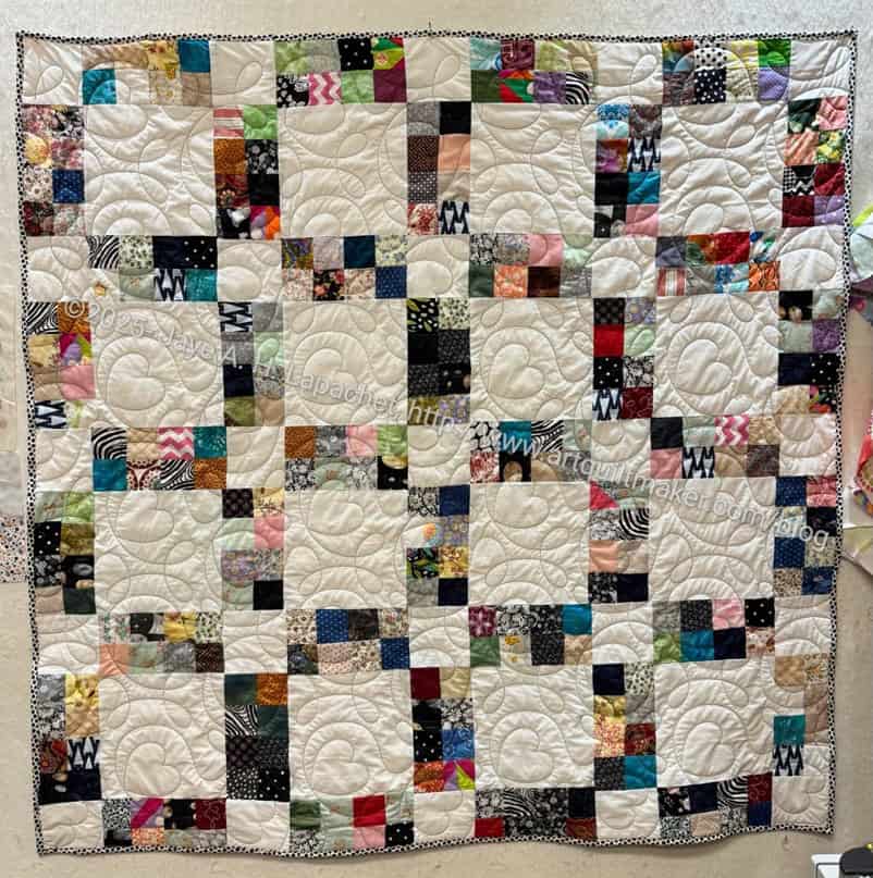
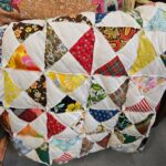
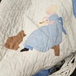
I was so excited to see that Laura was inspired to make a Sidewalk quilt when she saw one of mine in the batch of BAM quilts given to her for quilting.
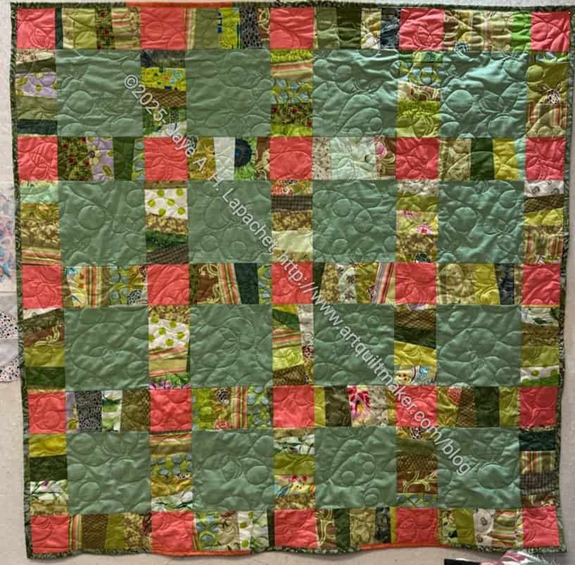
Green Sidewalk by LauraM
At Sew Day, we talked about it and she was excited that I had made the original one (aside from the one I saw at the Fair). She showed me a picture of one with a green background. I have been thinking about making one with a color for a background. I am not done with the white background yet. I can see where white strip blocks would work well with some kind of colored background.
We talked about making it bigger and it occurred to me to make a 12″ version. I can easily adjust the pattern, but I would have to find a new ruler if I actually pieced a larger quilt!
I was reminded of it when I was sewing the Triumphant Block 1. The designs aren’t exactly the same, but this one reminds me of what is going on with the Triumphant quilt.
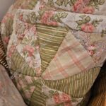
Last year I went to the Sonoma County Fair with friends from Austria. They
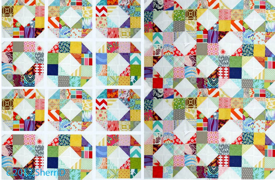
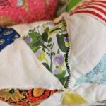
2.5 inch square sashing quilt
have something similar in Austria, but it isn’t exactly the same. Of course, I visited the quilts and found one that I am going to try as a new design for a donation top.
I don’t know what to call this design and don’t know if it is actual pattern or not.
2.5 inch square sashing quilt – detail
The piecing is in the sashing and the blocks are plain. The maker of this quilt, Elysha Ozanian, did a great job making the sashing really stand out. I drew out the quilt and found that instead of making the normal guild donation block, I could make half of one and that would be the pieced part of the quilt. I tried to make a block out of the plain block and the pieced sashing, but it didn’t work, so I will just build the quilt using individual units of the small plain block, the large plain block and the pieced portion using chunking.
The units comprising one plain block, 4 small plain blocks and the pieced sections are over 14 inches. I am not quite sure how big I will make my version. Maybe 4 plain blocks wide with the sashing units on the outside? I’ll have to see.
This might be another option for the guild to make as a donation quilt design.
I go to a hairdresser near Castro and 18th in San Francisco. Each time I go, I visit a hardware/variety shop (do you remember TG&Y?) called Cliff’s Variety. It is great place to get stocking stuffers. They have some fabric and craft supplies. I also get postcards there when I am running low on SF postcards. They have a nice toy department and wonderful housewares. It is the kind of place you can find that weird thing you need.
Their strength is creativity and creative problem solving. I have seen the most wonderful window displays and endcaps in their stores. I have brought them a number of things to help me repair. The most notable was the YM’s bassoon case (rented from his school). The handle broke off and I didn’t want to spend the money on a new case. Three awesome guys at Cliff’s worked out a way to fix the handle and didn’t even charge us for their time.
Cliff’s bags
Monday I saw the display of lunch boxes and bags above. It reminded me of selecting a lunchbox at the beginning of each school year. I was also reminded that I had seen a similar day after last month’s cut. Aren’t they fun?
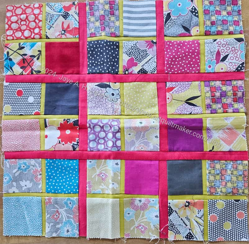
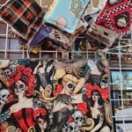
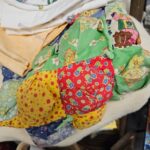
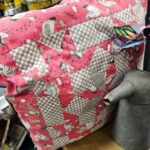
I saw this block on Saturday at the guild meeting. The blocks is very appealing. I suspect it is all that pink, but it could also be the combination of pink and green.
I didn’t get the specs, but think the patches are 2.5 inches (cut), the pink sashing is probably .75 inches (cut) and the green sashing is probably 5/8 inches (cut). Once I get some of my other projects out of the way, I might try one of these blocks.
Claire is really doing a good job trying to inspire everyone to participate in the guild donation project. She always has something new to inspire us.
Although I don’t need more ideas for donation blocks, I can’t help thinking about them. After yesterday’s post about the new block Claire has put forward, I was somehow reminded that I have been thinking about the Patchwork Wheel blocks the guild collected in 2012.
As I said in a post back in the day, I just used the kits I was given to make the blocks. I could definitely make more of these blocks using some of the 2.5 inch squares I have collected. The blocks would be small and I would need a lot of them to make a whole quilt. I think I used 5 inch squares in the quilt I made before.
This is a different pattern and worth thinking about making again.
Knowing other librarians is a good thing! I have a new acquaintance who works at the Fine Arts Museums of San Francisco. These museums include the deYoung and the Legion of Honor. I recently saw that the deYoung was exhibiting Fashioning San Francisco: A Century of Style. It is about haute couture worn in San Francisco. I love seeing these types of dresses, so when we were emailing back and forth I mentioned a forthcoming (mythical) trip. My acquaintance offered FREE tickets. I was thrilled and took her up on it right away.
Of course, the day we chose turned out to be one of the worst weather days of the season. We went anyway. We drove carefully and at a moderate speed. We had no problems on the way there or back. I appreciated the all wheel drive of my Subaru and the fact that I didn’t have to drive on dirt roads.
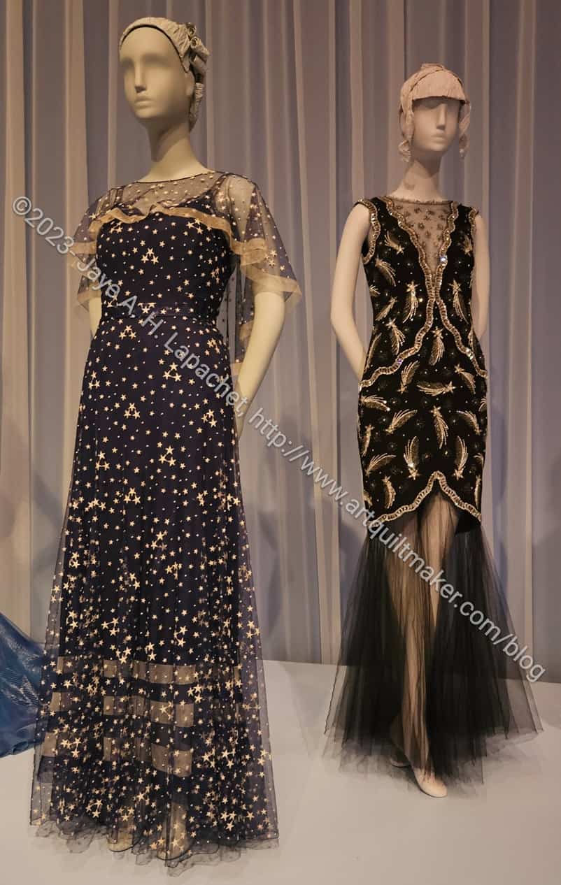
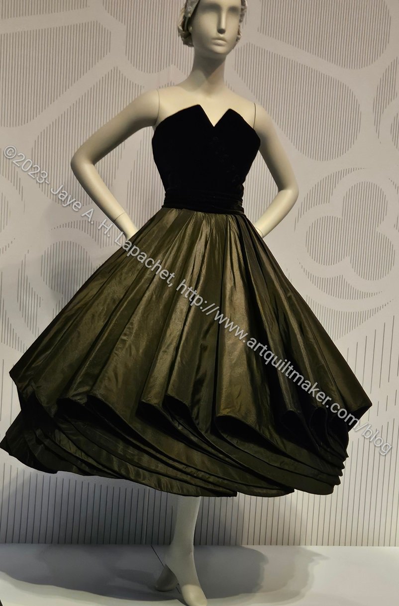
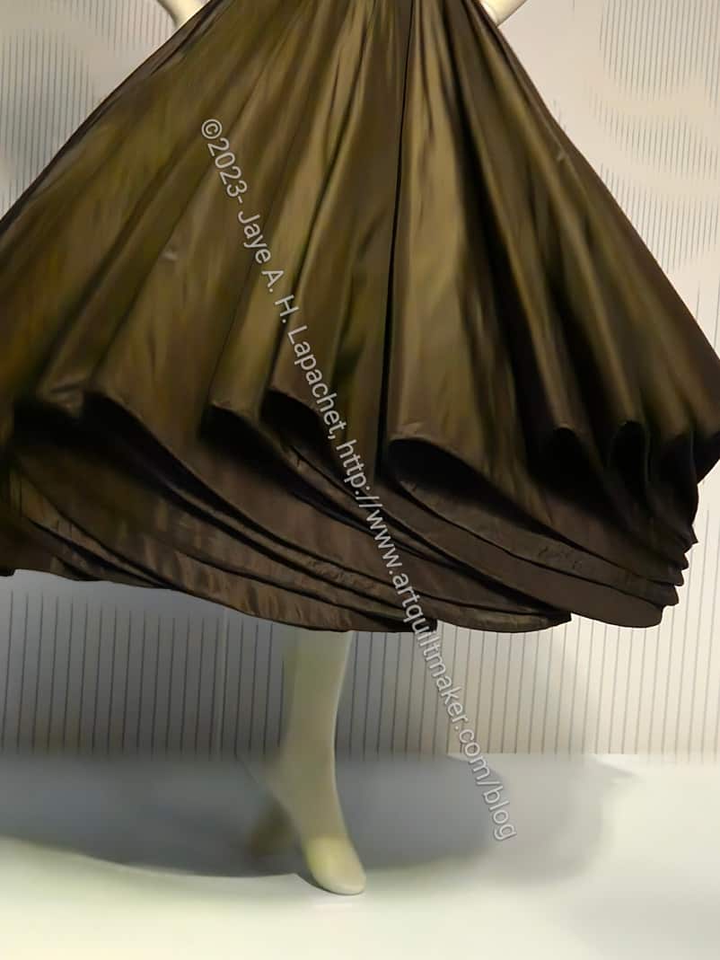
de Young: Moon and Stars dresses
The exhibit was nominally arranged by time period. That was clear at the beginning and at the end, but the time period of ball gowns are hard to pinpoint.
I really liked the use of sheer fabrics such as tulle in the various dresses. I think the technique provides structure and wearability to gowns, but also adds interest. Skating dresses use this technique a lot to show off skin without encouraging a wardrobe malfunction.
The neck insert in the dress above on the right gives the idea that cleavage is being shown off, without providing any access. Am I slightly prudish? Yes, a bit. I don’t like men leering at me and that affects the type of dresses I like and want to wear. I prefer an air of mystery when I dress up.
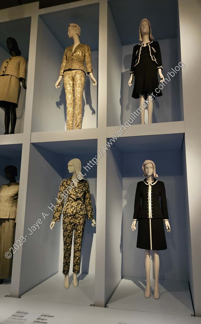
Christian Dior at FSF exhibit
I am definitely a Christian Dior girl. I really liked the simple lines of the designs they exhibited.
The dress in the center is wonderful! I am not a fan of the color, but really like the design. I’d love a cocktail length dress with the same design as the bodice.
I also like the dress on the left. I can do without the color, but the simple lines in turquoise would be fabulous.
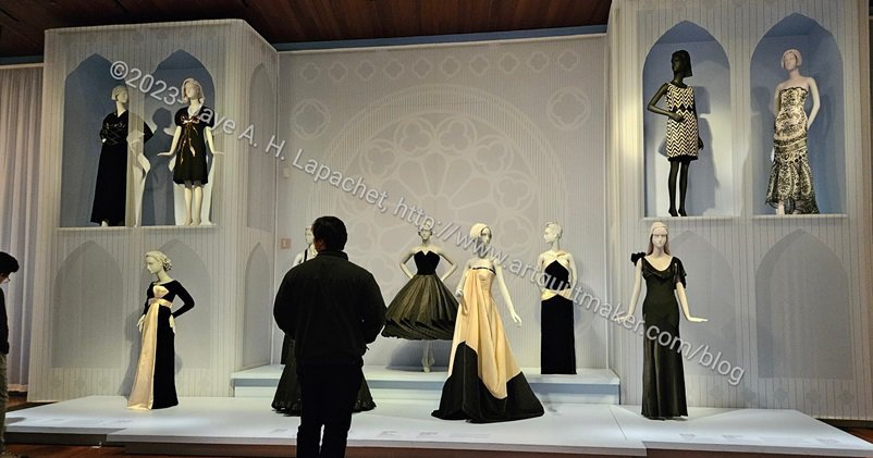
Little Black Dresses at FSF exhibit
I also like Little Black Dresses. There was a description of how they came about, which I thought was interesting. I liked most of the more form fitting examples of these LBDs. I could do without the center dress that is super drapey. I know these are all art, but I can’t help, but think about wearing them. All of these dresses were worn, but I can’t imagine wearing the cream and black one in the center above without a couple of pages to hold up my hem.
de Young: little black dress with cool hem
When I was running my most recent quilt class, I wanted to add more classes so my students would be well prepared for designing their own quilts. I kept trying to think of quilt blocks that required different techniques. One block they did not want to learn was Cathedral Windows. Next time I teach the class, I’ll teach that technique as a pincushion rather than a block. I think that will be more appealing and pincushions are also fun.
de Young: little black dress with cool hem – detail
One of the dresses made me think about whether or not I could add a technique that looked like the hem of the dress. First, I love the simplicity of this dress. While I don’t love strapless dresses, this one has structure, so I might even wear it.
I suspect, however, that the star is the skirt and that someone taller than me would really do this dress justice. What embellishment does the skirt remind you about?
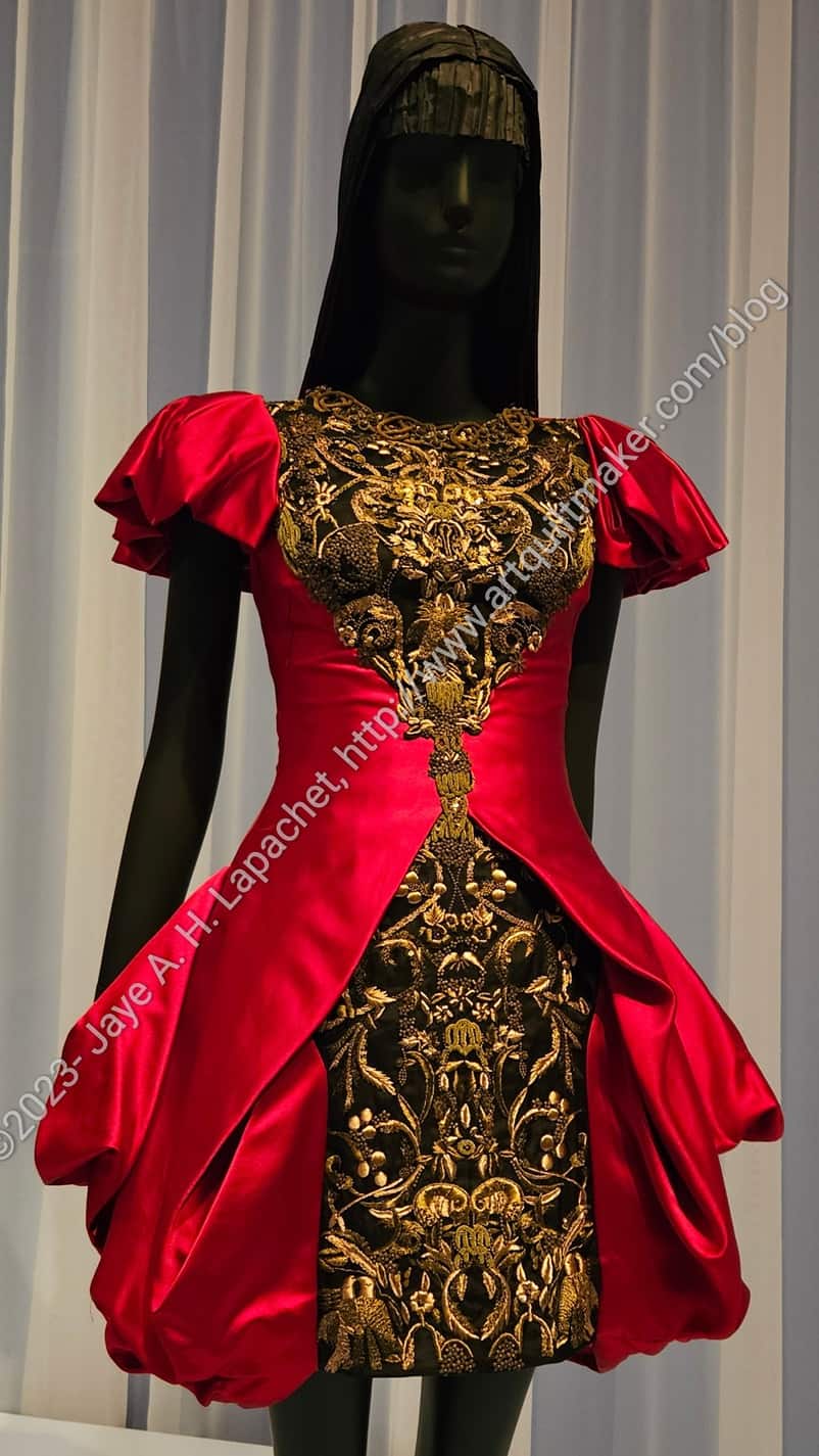
Alexander McQueen mini dress
I wasn’t a fan of the more modern arty dress designs. One dress had no stitching. It was held together with staples and grommets. As mentioned, I can’t help thinking about wearability. That being said, I did like this Alexander McQueen mini dress.
It looks fairly wearable. It is short, but not TOO short. I like that it has a rounded neckline close to the neck, isn’t strapless and has sleeves.
I also like the texture of the lace contrasted with the red ‘coat’ over it. The shininess of both materials make it look perfect for a black tie event.
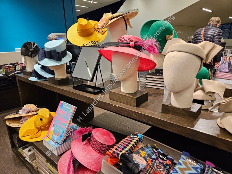
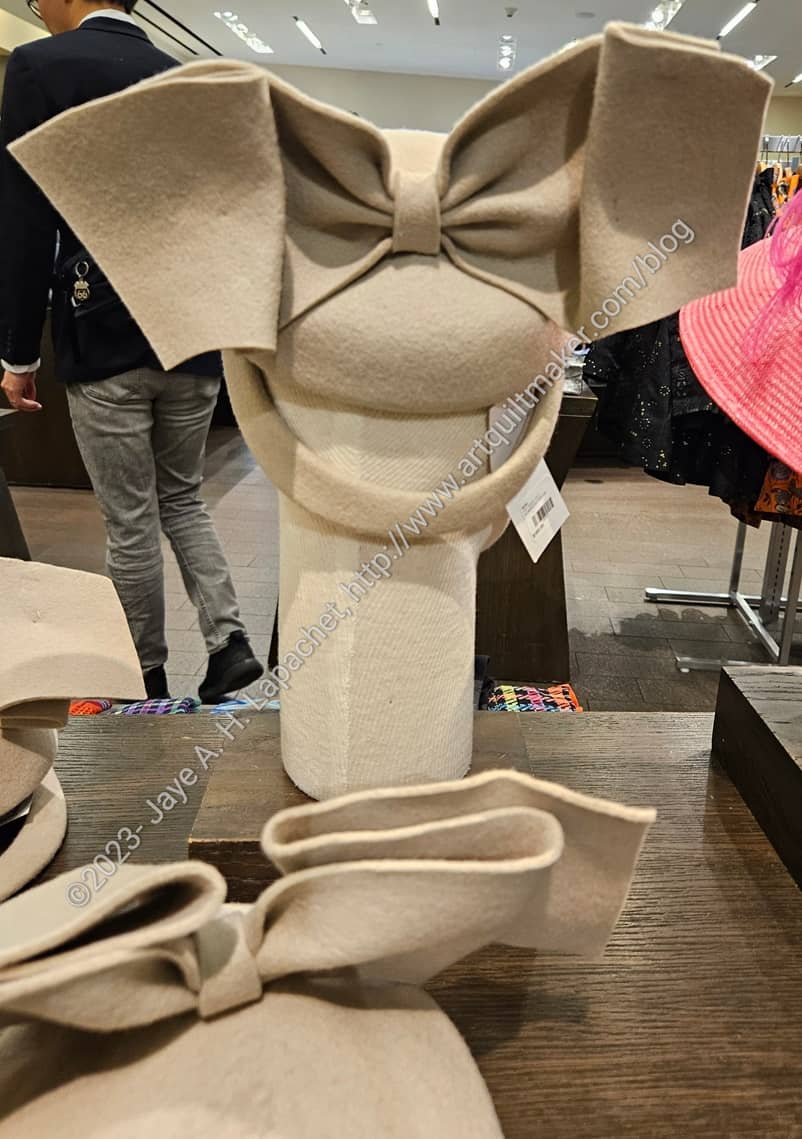
Hats in the deYoung gift shop
I had to look at the gift shop. I am always on the hunt for postcards. I found a few, but they never seem to have the ones I really want. I did see a display of 1940s style HATS in the gift shop. I was amused, but also tempted.
deYoung: beige hat detail
The beige hat, right side, in the photo above would be great in black. It has a fantastic bow on the back. I took a photo, because I wondered if I could use the shape as an embellishment for a bag or pouch.
Yes, I wanted the catalog, because it was big lush and fabulous. Also, I love these kinds of books that mesh fashion or pop culture with history. I knew I would only look at it a few times and wouldn’t really read it until I was old and grey. I’ll check it out of the library.
I mourned the loss of sewing time, but really got inspired by viewing the exhibit. I did enjoy spending time with DH as well.
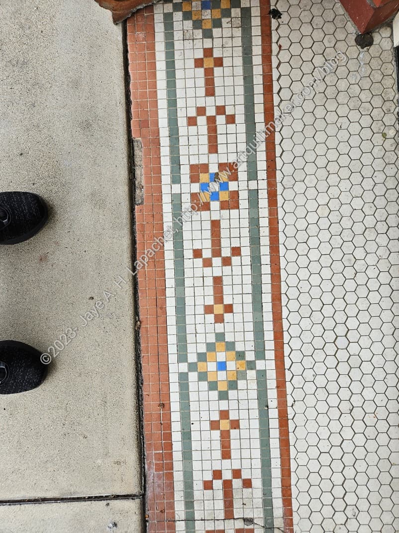
Traveling is a good time to get inspiration. Last weekend we went to Jackson for the Native Sons event, Discovery of Gold. I enjoy visiting these small towns in the boonies of California. I always find something interesting.
I thought the tile at one closed storefront would make an interesting row quilt – or the start of a row quilt. Look at the different elements between the ‘blocks’. I wonder if they relate to the shop’s original owner or wares?
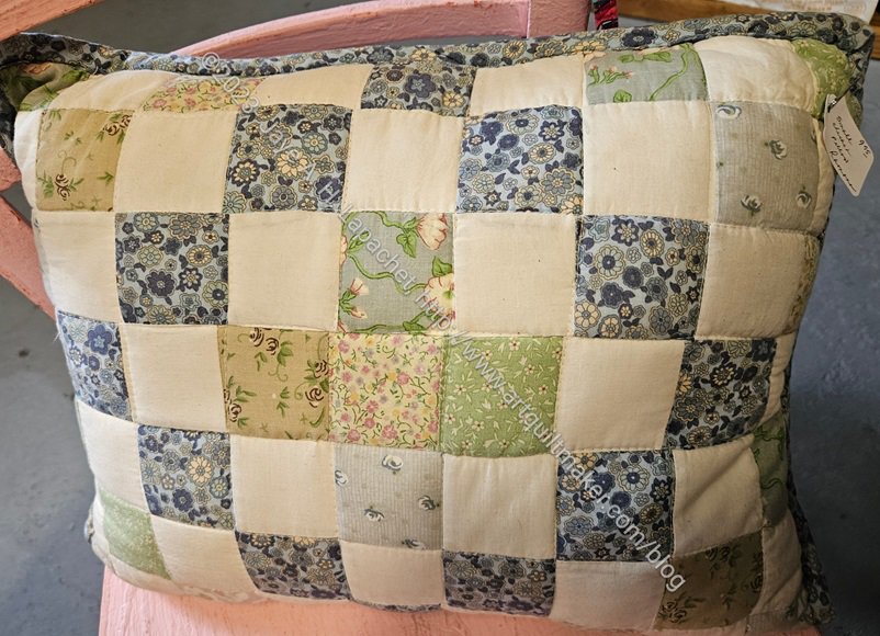
‘Checkerboard’ pillow
This trip, I spent a lot of time on my own because DH had a lot of meetings crammed into one day. Jackson has quite a few ‘antique’ shops. Some are more curated than others. I wanted to visit a quilt shop, but the closest one was 40 minutes away in Placerville and I wasn’t up for the drive. It was fun to wander around Jackson. I found a few gifts, especially a teapot I have been looking for for years.
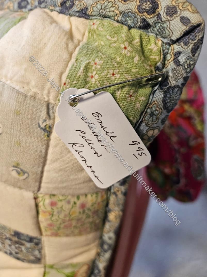
‘Checkerboard’ pillow detail
As I wandered around, my thoughts around Women’s Work and its value (or lack of monetary value) were rekindled. The cushion above had a very depressing price tag on it. I blame Walmart and the Dollar Store, fast fashion and always wanting a deal. $9.95! I couldn’t really take it in, though this kind of thing is why I don’t have a quilt business.
Really, I kept seeing a lot of quilts and quilt related items. I also saw a lot of crochet, but I can’t take photos of everything.
One thing I noticed was a lot of quilts. Not art quilts or high quality quilts, but a noticeable number of utilitarian quilts. After seeing the first few, I started photographing them and thinking about Women’s Work again. I’ll try to stay off of my soapbox, but the prices and the cavalier way in which most of them were displayed makes me wonder again about the value of women’s work. I also can’t help wondering if my work will end up in antique-thrift-junk shops. If the YM doesn’t want my quilts, I hope my nieces and nephews will divvy them up.
Sponges and placemats (?)
Aprons & trivets
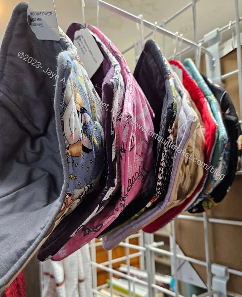
Bowl Cozies for sale
Someone clearly sews in one of the shops as there were a number of sewn items for sale, including bowl cozies ($8). You’d have to have a well oiled production line going to make it worth selling these for $8. It is, however, a great way to justify making stuff. I am not sure I would be satisfied making hundreds of bowl cozies, but to each his/her own.
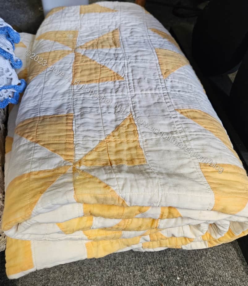
Yellow Pinwheel quilt, folded
I enjoyed the simplicity of many of the quilt designs I saw. One of my favorites was a yellow pinwheel quilt. I made a basket quilt with a yellow background once, called Cheerful Baskets, so I have a fondness for certain tints of yellow. The simplicity of this quilt really grabbed me. I think those blocks are about 5 inches, but possibly four inches since they are a 4 patch. The sashing gives the pinwheels space to breathe. The eye can see each pinwheel clearly.
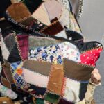
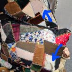
Crazy quilt cushion
Crazy quilt cushion (damage)
I saw some cushions made with a crazy quilt design that were in bad condition, but still pretty. I wonder if they could have been cut from a crazy quilt?
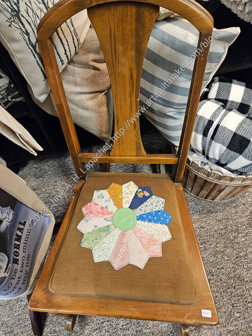
Dresden Plate Chair
Someone had the clever idea to reupholster a chair with a Dresden Plate. I am not a fan of that type of oak furniture, but I think the seat looks cool.
I saw this not in an antique-junk-thrift shop, but a higher end store that takes some stuff from antique-junk-thrift shops and upcycles it. There was only one of these chairs, but it might make a nice start to a collection of them in different woods and styles. The Dresden Plate could unify them.
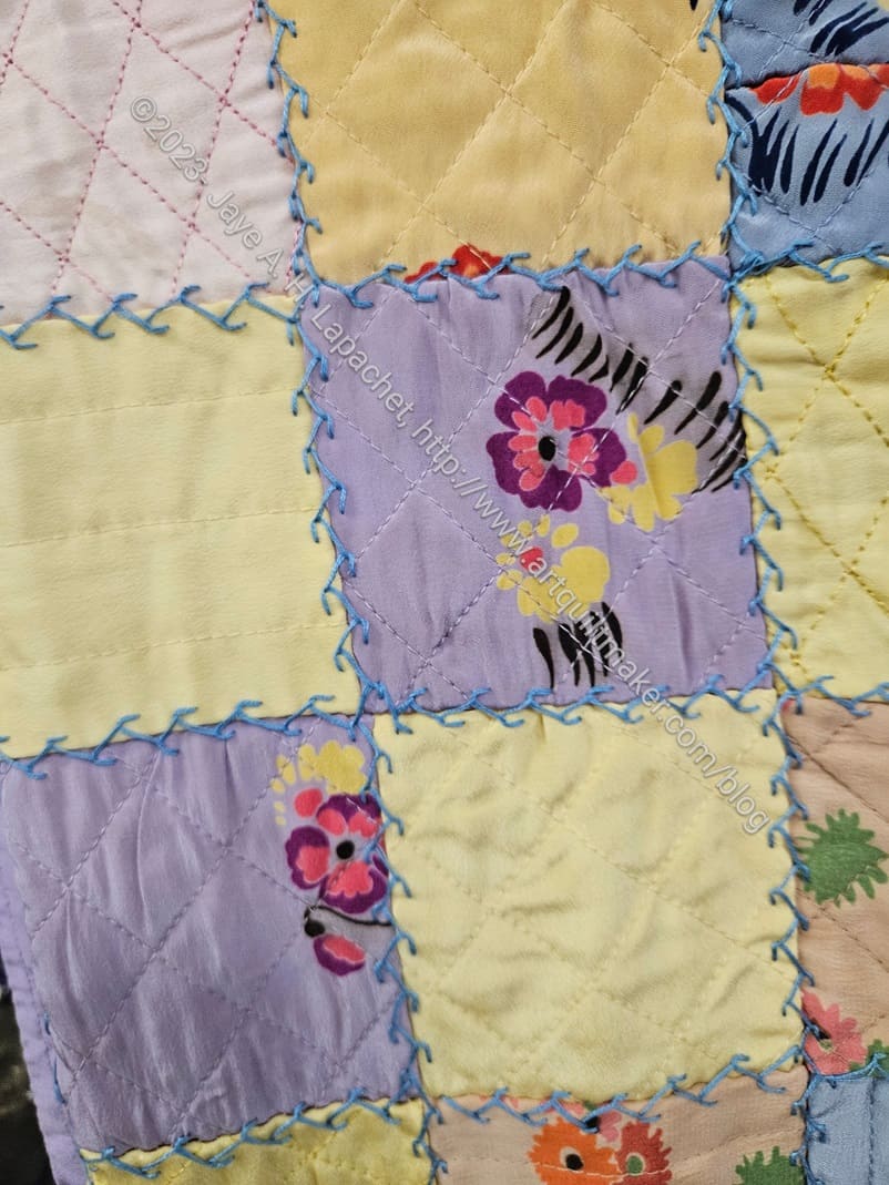
Squares with embroidery quilt
There was a sweet child looking quilt that reminded me of the Laura Ashley quilt I made for a friend a million years ago when there was a Laura Ashley store in downtown San Francisco. I had just started quiltmaking then and found an early charm pack there. Charm packs as a concept didn’t exist as they do now, so it was really novel to find a pack of pre-cut squares.
Squares with embroidery quilt – detail
The quilt isn’t exactly like mine, but it does remind me of the one I made.
The embroidery is some kind of vine or edge stitch. I like it. It adds interest to the simple design of the quilt, as do the flowers in the fabric. They looked like they were painted on, but I think it was just the printing process of the fabric used.
That violet (or lavender) with the yellow is a good combination.
Yo-Yo looking quilt in Jackson
There was also, what I think was, a yo-yo quilt. It looked different than other yo-yo quilts I have seen. It could be that the gathered side was face down in the display and I couldn’t see them. It is possible that people don’t know that yo-yos are mostly displayed/used with the gathered side up. On the other hand, this could be a completely different type of quilt or a yo-yo variation.
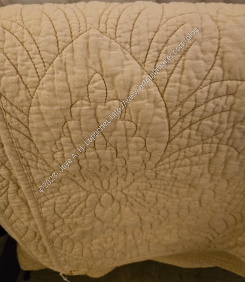
Welsh-style whole cloth quilt in Jackson
I also saw, what looked like, a Welsh-style quilt. Of course, it could be a regular whole cloth quilt using a color similar to those used in Welsh whole cloth quilts. I couldn’t see much more than the picture shows, though I did take another photo from farther away that shows a little more of the design. The vines and leaves are really nice.
It is clear that this quilt has been washed, if not used, but it looked to be in good condition.
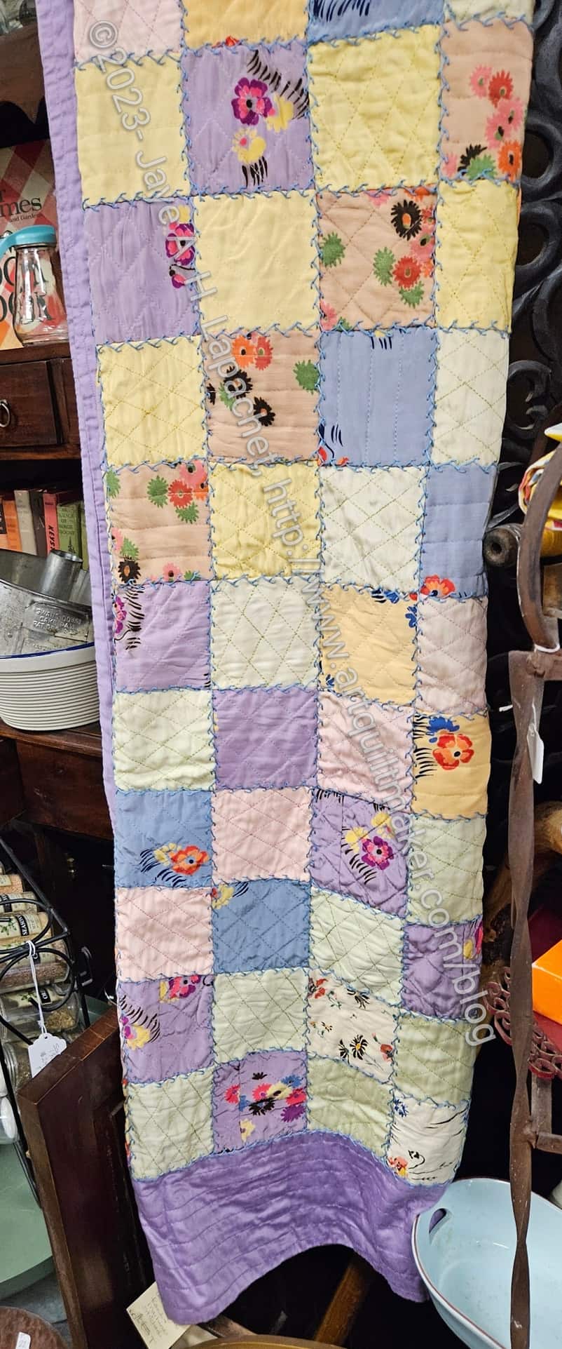
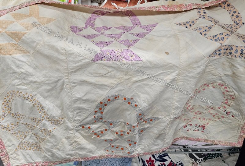
Basket quilt top
I also saw a Basket quilt top. Again, this quilt has lavender. I wonder if that was a popular color in a certain era? 1930s? I know that a lot of 1930s reproduction fabric lines include a lavender colorway. One of the nice things about this design is how some of the baskets fade into the background. It could be from fading or it could have been designed that way. No way to tell.
I really like basket block quilts and have only made one. So many designs so little time!
QST quilt in Jackson
QST quilt in Jackson – detail
This Quarter Square Triangle quilt is sewn together in a interesting manner. I am not sure if the quilt was pieced and then embellished with a blanket-type stitch or if it was sewn together with the blanket-type stitch. I can see both types of stitching on the detail photo. The scraps used in this quilt are quite bright and cheerful. It might be a newer quilt without fading or it is older and well taken care of.
Puffy squares quilt in Jackson
Burgundy quilt in Jackson
Applique’ quilt in Jackson
Kaleidoscope quilt in Jackson
Pink Star cushion in Jackson
Various in Jackson
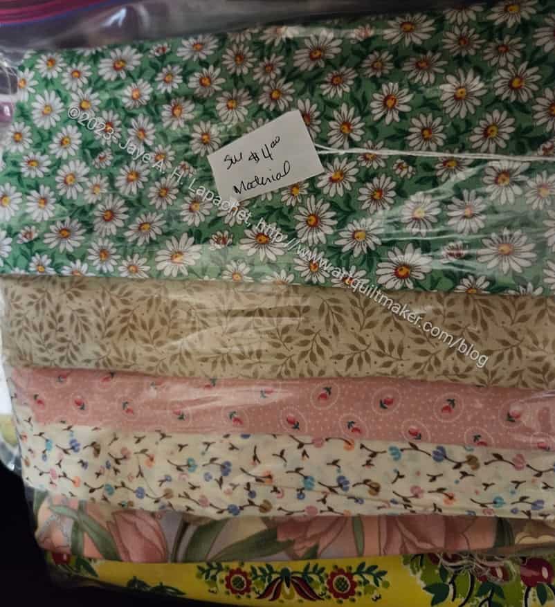
$4 for ~6 yards
Finally, this is what is going to happen to all of my fabric when I die.
I don’t know that there are definitely 6 yards in there as I didn’t open the package. I do know that there were multiple similar packets of fabric. The fabric isn’t to my taste, but if you want some of it go to Jackson and visit Antiques On Main,1 Main St, Jackson, CA 95642. There are multiple vendors with a lot of different stuff. The one in the front on the right side of the aisle is where the fabric was.
One lesson? Label your quilts. Even stitch lettering with your name and the year are better than ‘artist unknown’.
I am sure I have said this before. One of the things I love about my cell phone is always having a camera handy. I don’t think I say it enough, however, because it is a fabulous tool for inspiration.
Lettuce?
Cabbage?
I saw these plants (cabbages?) while I was traveling and thought of Philip Jacobs and his fabric designs. Philip included these particular designs in the Brassica collection. Free Spirit categorizes these as classics, which, I hope, means they will always be in print. Fingers crossed!
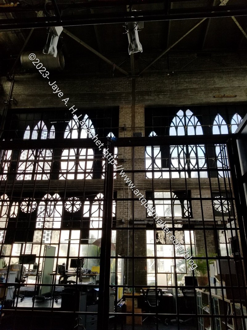
I went to a read-through of a new play yesterday. It was held at a place called Z Space, which has theater and related productions. I don’t know what this space was before, but I really liked the windows.
I went out with my mom the other day for lunch and a day out. We meet halfway between our two houses in a town with a great cafe, good streets for walking and a quilt shop. Almost perfect!
The crowning glory was the gluten free cafe. Yes, walking around is great. Yes, visiting a quilt shop is great. However, it is really fantastic to walk into a restaurant and not have to ask what ingredients are in every single item.
Austin-Healy
While we were having coffee and catching up, someone drove up and parked their Austin-Healy at the curb. My mom is a sucker for vintage sports cars. She always wanted a Porsche Speedster until she rode in one and found it to be uncomfortable.
After lunch, we went to Wooden Gate. They have moved, as I mentioned a few months ago. Mom hadn’t been there since they moved and she really liked it.
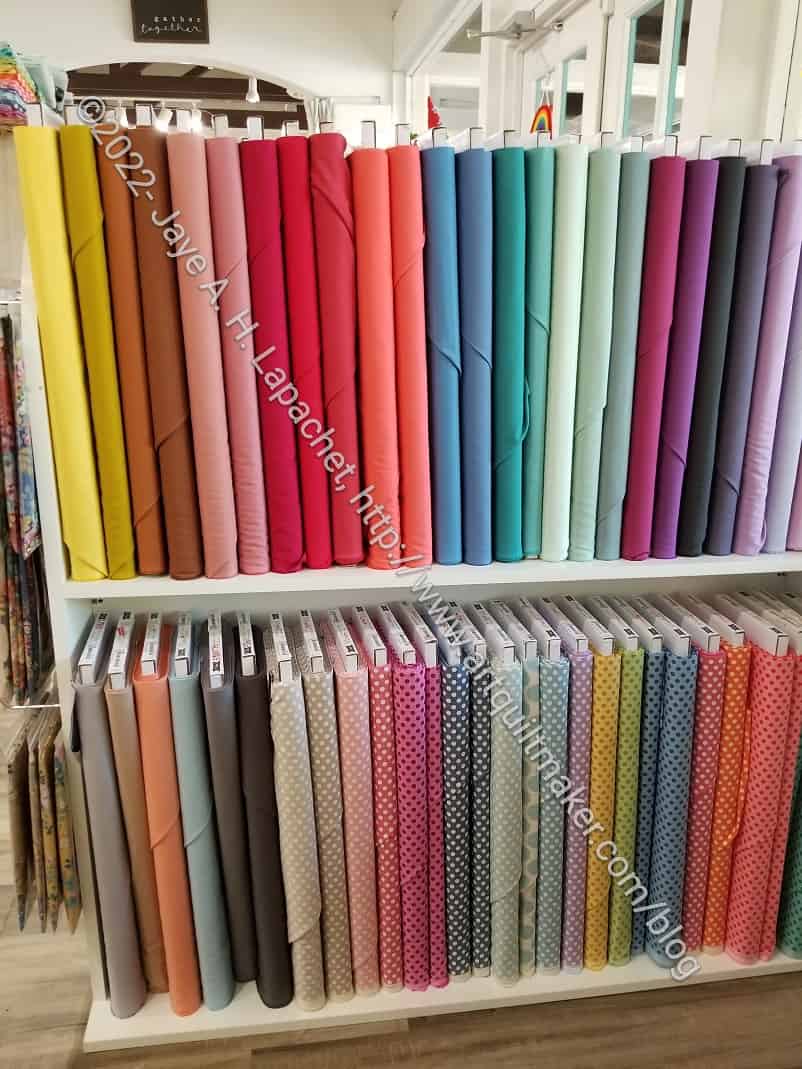
Tilda solids at Wooden Gate
I resolved not to buy anything, but couldn’t resist one of the new Tilda solids and a luscious pink. Yes, those ding my fabric usage. I feel like I was very restrained. I also bought some gifts for the holidays, but you’ll have to wait to see those.
I really like the Tilda solids. They have a nice hand and seem pretty tightly woven. I still have to wash and try them, so we will see. I wish these various solid lines that I like would expand their color ranges.
Tilda has new range of dots as well. There were a couple of fat quarter packs including the dot fabrics that tempted me, but since I didn’t have a project I could think to use them in, I passed.
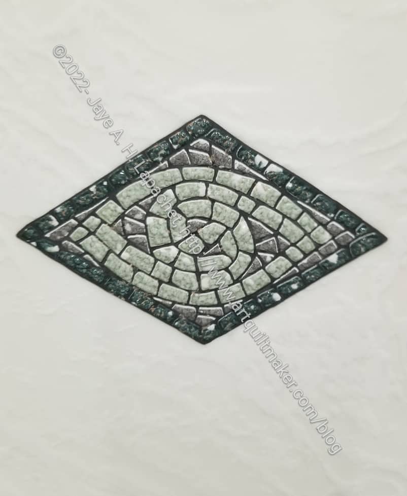
Danville tile motif
I saw a cool mosaic motif in one of the stores, which could make a great quilt design. It would definitely have to be EPP or applique’.
I really struggled with the metadata to apply to this post. It is not about quiltmaking per se, but more about surrounding yourself with beauty to enhance everything you do in that room/workroom/studio.
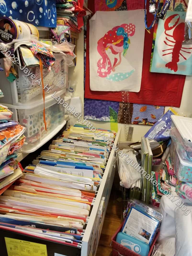
Secrets of the fabric closet
I had a stack of papers to file. It was a large stack starting from right before the pandemic started – December 2019/January 2020 to the present. I didn’t realize that I hadn’t done any filing since then. It isn’t easy to file, because my fabric closet is so crammed. I have to move a lot of stuff out in order to file. The task was on my to do list, because the giant stack of papers was interfering with my ability to put everything in the closet (that is where the cutting table goes when we guests or I have to clean my workroom for some reason).
That was depressing enough, but when I opened the drawer I was confronted with the terribly ugly horrible green hanging folders (files?). I like green in nature, but it is not a favorite in quiltmaking. I don’t sincerely dislike it; it is just not a favorite. I like icky green and lime, but only as accents. I have only made a few green quilts. I decided that they had to go. I would love to replace them with turquoise hanging files, but I didn’t have turquoise, so the newish yellow, red and blue would have to do. I took out all of the horrible green files I could and replaced them. They all went in the donation pile (now I have to find a box and put them there. Bleah! if it isn’t one thing, it is another).
I was very clear about what was staying and what was going when we did the workroom refresh last year. DH was a little annoyed with me, because some of the stuff I wanted gone was perfectly serviceable. I didn’t care. When I spend 12 hours per day in a room, it has to be fabulous. The horrible green files were going.
This doesn’t make everything 100% better, but at least I don’t want to barf when I look in my file cabinet. Already a not-fun experience, the fresh new red, yellow and blue hanging files make it better.
I think it is important to embrace beauty especially in small things. I mean who really cares about folders in a filing cabinet? Nobody, but me sees them. That is actually the point. I felt better not having to look at those horrible green hanging files. Maybe next time I won’t wait 2-3 years to file the health insurance receipts.
I think I need to eradicate anything that is ugly or merely functional and replace it with something that doesn’t make me cringe.