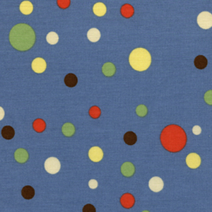
The Pineapple class, about which I have been talking on and off for the past week, is today. I began packing my supplies and materials and got into a panic that I don’t have enough dots in enough different scales and colors. I want to have a wide variety to provide interest. I rummaged through everything to find more and came up with two that I had washed last week, but needed to be ironed. I ironed them, but the stack still looks pathetic. One of them is a Michael Miller fabric similar to the one below, but with more of a sky blue background than the soldier blue depicted below.
I hope I am just having the last minute jitters and really do have enough fabric.
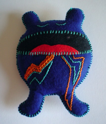
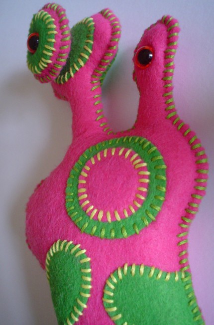
I saw these plush critters on Etsy. While I like the “wild abandon design,” I also like the color choices. The red and blue critter doesn’t look too Fourth of July-ish and the pink and green is just the right shade not to be too preppy. I am also enamoured with the stitching. I have often struggled with how to put stuffed items (mostly pillows) together and have them look good. This London artist does it very well.
I am back in study mode and reading a couple of books on quiltmaking and art. One of them is Itten: the elements of color: a treatise on the color system of Johannes Itten based on his book the Art of Color.
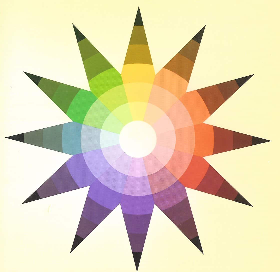
If you have not seen Itten’s color wheel, it looks like
Itten’s Color Star
.
If you buy the color wheel (or Color Star as Itten calls it), it comes as a set with covers for the color wheel that allow you to see the complements, split complements and the triads, etc without the interference of the other colors. Buy it at Amazon or your favorite local art store. Expensive, but totally worth the money.
Anyway, The Elements of Color is a condensed version of the The Art of Color. I haven’t yet read the entire book and may not before I have to take it back to the library, but found a few tidbits that are worth thinking about.
pg.8: “Knowledge of the laws of design need not imprison, it can liberate from indecision and vacillating perception. What we call laws of color, obviously, can be no more than fragmentary, given the complexity and irrationality of color effects.”
It seems to be that the author is saying that by knowing the laws of design and color, we can use all or parts or none to liberate us from indecision in the design process. This seems to be that old adage about knowing the rules allows you to make a conscious decision to break them.
pg.12: “Developments in color chemistry, fashion, and color photography have aroused a broad general interest in colors, and the color sensitivity of the individual has been greatly refined. But this contemporary interest in color is almost wholly visual, material in character and not grounded in intellectual and emotional experience. It is a superficial, external toying with metalphysical forces.”
I think this is an interesting statement because it implies that there is more to seeing color that the visual-sensory perception. In fact, Itten talks a lot about the study of color including how color is used, what it means, how other artists used color and the various implications of the use of color. This brings me back to other books I have read about colors being associated with emotion, the meanings of color in different cultures, etc. It also made me think about how colors are associated with different aspects of religion (blue for the Virgin Mary) and different events in our lives (black for death in the West, white for death in the East).
WARNING: If you plan to read this blog entry, you have to be prepared to think outside the box. I plan to play with your mind and disregard most of the ‘accepted’ color rules. I will also have more questions than answers.
Definitions for this post only: Color: notblack, grey, beige, brown, tan, white Neutral: black, grey, beige, brown, tan, white
I have been thinking color as a neutral. The basic question is: can a color be a neutral. Related to this question is another question: can a color act like a neutral?
I have made a number of quilts that do not use a neutral as a background or main color.
The Punk Rock Quilt uses hot pink/fuschia as the background color. In this case, my test didn’t work so well. I like the quilt, but as far as using fuschia as a neutral, it didn’t work. I think the failure had to do with the proportion of pink to black/white.
Additionally, if you use enough of a color, will the ‘rules’ of hot/cold colors force it to not recede or not jump forward? Again, is this a proportion thing?
I actually think proportion may be the key. I haven’t had time to further investigate, so stay tuned. Comments are welcome.