The Trees

Some time ago, I talked about organizing my quilt photos on Flickr. For a number of photos, where I saw themes emerging, I used sets. This means that a variety of quilts from different shows might end up in the same set because they have a similar theme. I meant to talk about each set and highlight them for you and haven’t yet gotten to it.

Since I haven’t been sewing much (though I do have a few things to show you and talk about), I thought I would show you the trees. Trees have been on my mind lately, because they, IRL, are all nearly naked, though there are a few that still have some straggling red leaves on them.

When I was organizing the photos, I didn’t set out to have a set of trees. As I was looking through the photos, I saw a number of trees and thought there were enough to create a set. Mostly there are quilts, but there is one inspiration for a quilt photo as well. I thought it was really interesting to see the different interpretations of trees. Some of you are probably remembering that I pointed you to these photos already. You are correct. I am really not being lame. I just have trees on the mind. If you have a quilt photo depicting a tree that you would like to include, let me know.

Winter Houses

Since I can’t seem to think of anything of my own to write, I have been surfing looking at things for inspiration and to show you. PamDora’s Box is always great, but I saw these houses and immediately thought of winter. I am not sure why as there is no snow, but the dots in the sky remind me of snow flurries and the pale lavender might be snow in a sunrise. Enjoy!

Flickring All Weekend

I spent a lot of Sunday uploading quilt photos to Flickr. I also spent Monday night, Tuesday night and a little while this evening on the project. I believe that I now have all of my digital quilt photos up on Flickr. In any case, there are about 3500 pictures of quilts.

Some observations:
1. I used to take a lot fewer photos than I do now.
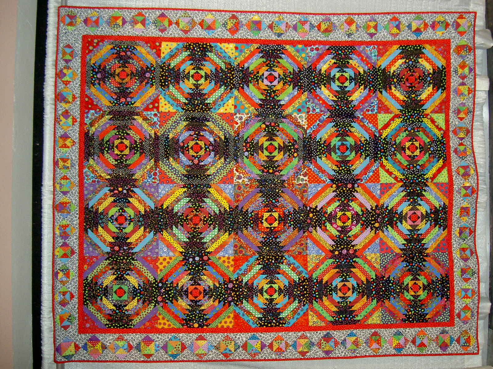
2. Adding the digital photos to Flickr is wonderful, because you can organize them in sets. Each photo can be in multiple sets. This means that the Pineapple photo on the right (as usual, if this is your quilt, I will be THRILLED to put your name here!) is in the PIQF 2003 set as well as the Pineapple set (kind of like iTunes allows you to have one song in multiple playlists). I love this! It allows me to think about quilts in a number of different ways.
3. 2003 and three was a good year for quilts. The quilts are more vibrant (less brown, I guess) than now. The designs are good and the techniques are top notch.
4. I scrolled through many, many of the photos as I tried to organize them and it is quite wonderful just to look at a bunch of different quilts.
5. My photography has gotten better.
6. I was also able to discover interesting quilts about which I had forgotten, including a few more Pineapples hidden in the dark corners of my hard drive. .
7. I wish I could blog sets of photos, but it doesn’t seem like I can. Perhaps I can add a link to an entire set of quilts, so you can see them as I blog about them? Here is a link to a set of tree quilts. You can tell me if it works.

I am considering sending my prints off to someplace like Shoebox reprints and getting rid of the boxes and boxes of quilt photos that I have under my desk and in my bottom drawer. I really don’t know what I will do in the long run with all of these quilts on Flickr, but for the moment it is interesting to me. We’ll see what develops.

Thanks for reading and have a nice day.

Back!

I am back from the wilds of Monterey where I was well taken care of, refreshed and rejuvenated.
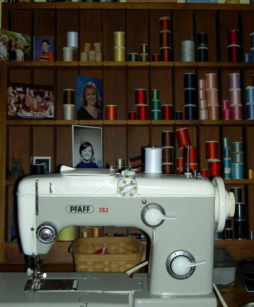
This is a little scene that I saw at my friend’s house. I loved the machine in front of the thread. She has a wonderful eye and everything in her house is subtlely colorful, beautifully arranged and restful.

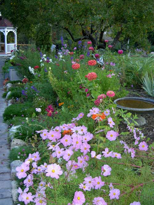
Her garden is wonderfully wild. Also restful.

Visual Journals Meet Technology

Deirdre passed this link on to me. Pamdora has written a post about journals. In it she links to YouTube videos of artists sharing their visual journals. I did look at a couple of the videos.

The videos show page after page of the artists’ drawing books. It is cool to see what they are drawing, because it gives me ideas for what I can draw if I ever become regular in working on a visual journal. I was bolstered in my efforts by looking at Paula Scher’s video, because she draws letters in different ways. She decorates the shapes and encloses them in different vessels. What a simple idea for getting starting on a visual journal journey. Start with the basics!

Her fonts get more elaborate as the video goes on and the audience begins to see the border treatment that she does on the pages of her journal. Her work kind of reminds me of writing your name over and over on your notebook in 6th grade.

Celia Squire, a London artist, does very detailed pictures of what looks like the world around her. The figures are elaborate and rich. The details made me want to look closer. I really like the first page of the woman sitting at a cafe table.

Stefano Faravelli’s journal is wonderful. Pamdora writes “A beautiful travel-style journal that folds out out into one long composition.” Her words do not do justice to the fantastic watercolors on each page or the cleverness of the way the pages fold out to one long painting. I really like the way he has incorporated words into his compositions. perhaps I don’t need a visual journal, because Stefano has done what I want to do!

One of the things I hadn’t thought of until I saw Remy Bardin’s journal were foldouts and pockets. I could make little secret hiding places in my visual journal. Perhaps I should call it the mythical visual journal?

The videos are accompanied, except for Paul Dewis, by a strange clapping/rustling of tracing paper sound. I turned off the sound on my computer, so I could concentrate on the art.

It is obvious that these artists:

  • are in the habit of creating visual journals
  • have the perfect supplies
  • are committed

There are many more videos of this project. Go take a look. You will be inspired!

What a great idea.

Two New Blogs to Look At

SF Girl By the Bay is a homey, nice feeling blog. She has some great pincushions she posted recently and a beautiful lamp made from trash.

Patterns and designs are the basic “food” of quiltmaking. Print & Pattern shows all sorts of different designs from stationary, gift wrap, cards, etc. It has a bit of a Japanesy/cartoony feel, but interesting for inspiration.

Enjoy!

New Inspirations (and A New Danger to You)

As you may remember from a previous post that I am teaching a class at work (other life). Above is the gorgeous quilt from one of my students. The photo is not so gorgeous, unfortunately. Alice has used all batiks and the quilt just glows.

I got a new phone for work and it has a camera. Danger! Now I have a camera with me AT ALL TIMES. WOW! This is great for me, because every time I see something I can snap a picture. The color isn’t as good as my other camera, but at least I have it with me all the time.

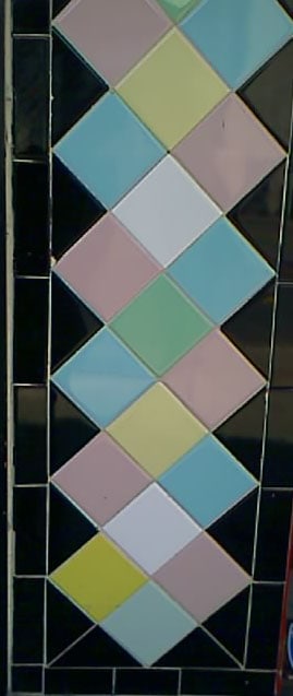
These are tiles I have been walking past for years. Finally, I was able to take a photo. This is a simple tile pattern, but I love the contrast between black and the pastels.

I stopped by Stone Mountain and Daughter to buy some fabric for pants. While, I was there I saw this quilt (yes, I asked and received permission to photograph). It reminds me of the Piece O’Cake pattern (below-pic from APNQ 2006). I like the subtlety of the fabrics that the maker chose.

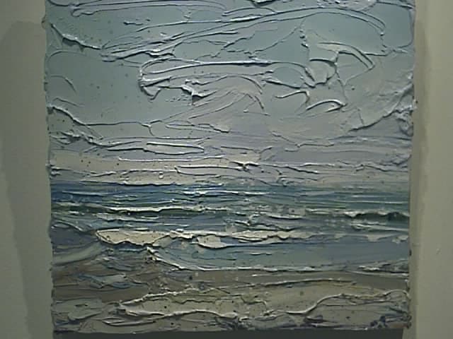
This is painting by Carolyn Meyer. Ms. Meyer is the Assistant Director of Fine Art at the Academy of Art. The Academy of Art gallery was one that I went to visit a few weeks ago. I went back, because I love this painting. It has some qualities of Wayne Thiebaud’s work, but this painting is very restful to me. It is called Summer and I would love to have this piece to hang in my house. Unfortunately, it is $1900 and I don’t have it to spent on a painting right now.

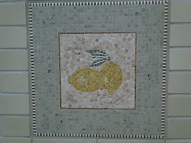
One of the mosaics in the building where I work.


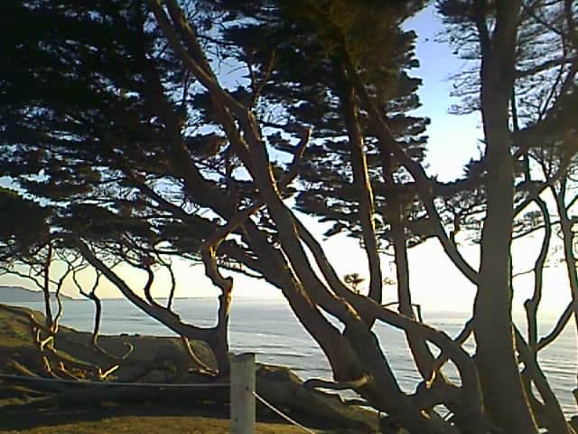
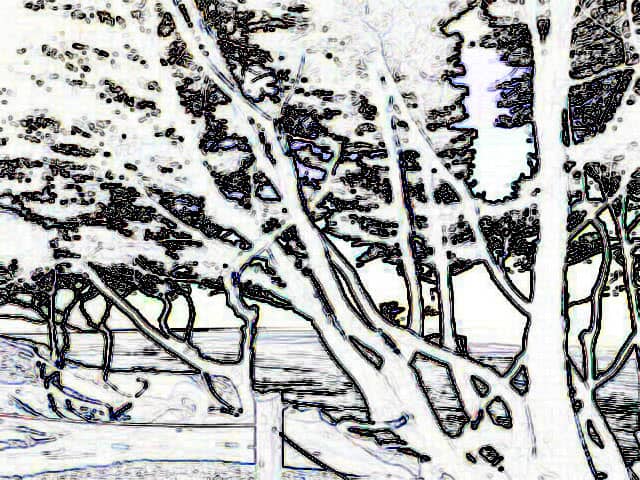
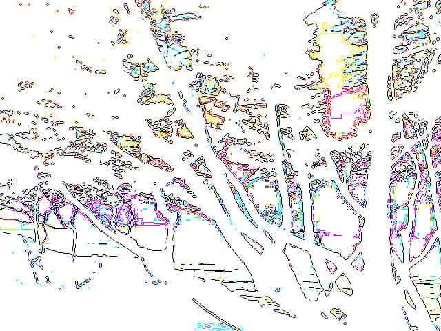
September and October provide some of the best weather in my area. One day, after work, I couldn’t shake the need to go and sit by the ocean for a few minutes. Despite the weird looks that Darling Boy gave me and the several questions about what exactly this action meant for his future, we went. We went to a place where they have recently remodeled a few benches and a parking lot at the top of one of the cliffs. While there I saw this tree. I couldn’t shake the idea that the trunks would make a wonderful quilting pattern.
I applied some filters to the photo to try and outline the pattern of the trunks.

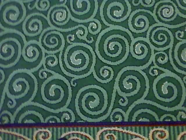
Rugs – good quilt patterns?
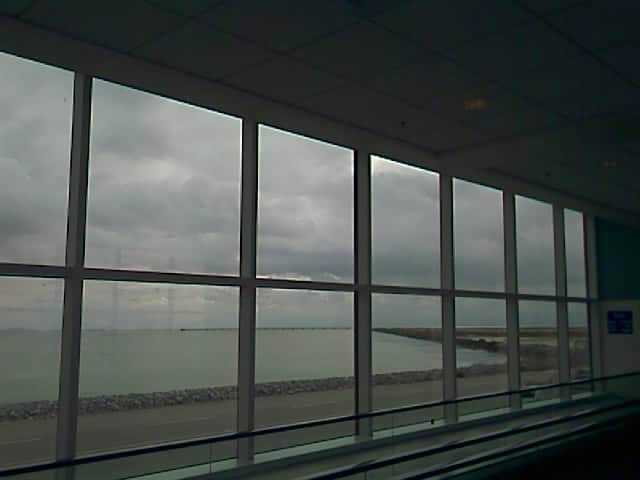
I like the repetition of the windows with the estuary in the background. The color didn’t come through very well, though.

Wallpaper as a Design Resource

While I was stumbling around my other life, I read ResearchBuzz. At ResearchBuzz, Tara reviews a variety of different sites, tools and features that the Internet throws at us. In today’s newsletter, she reviews a historic wallpaper site called Wallpaper in New England. Ever on the hunt for design sources, I took a look.

There are lots of flowers and border prints. The thumbnails are small. Many are muted colors, but design and layout inspiration abound. I took a look at Accession Number: 1985.26.685, which would be a good layout for a quilt. Take a look and get inspiration from a new place.

New Inspiration

The seasons are changing here. I think we are past late summer and entering early Fall. The clouds are changing and the air feels different. Work got me a new device, which has a camera. It is not as good a camera as my regular one, but for quick shots while I am out and about, it is fantastic! I would often want to take a quick pic and not have my camera with me. Now I have something with which to record things as I wander through the City.


Morning. Thursday. Looking East.

Afternoon/Early Evening. Thursday. Looking West.

Afternoon/Early Evening. Thursday. Looking West.

Coffee Art. My barista does great coffee art. I have long admired it. Finally, I have a way to record it.

Go and Make Stuff!

Sharing with Like Minded Creative People

Today was the CQFA meeting. There are six meetings per year and they are held in Santa Clara, which is about an hour from my house. It is always a big effort (I usually stay up too late the previous night and am tired from the week of racing around) for me to get the to the meetings and I have missed a number of them this year. I was richly rewarded by attending today as the show and tell was fantastic. Also, nobody was being an attention hog or annoying me. Everyone was wonderfully supportive of one woman who is experiencing a series of losses in her life. Not only was the work wonderful, but inspirational as well. Check the website for the meeting and I am sure the photos will be posted soon.

The workshop was put on by Virginia Schnalle, who is a wonderfully creative quiltmaker. I admire her work, her fearlessness in art and her quiet manner. She has taught a couple of workshops for the group and they always yield wonderful results for me. It was in her class that I made the Eye of God. That quilt is now in the collection of another quiltmaker, but I consider it to be one of my most successful quilts.

Today we worked on getting started when your muse has gone on vacation or your well has run dry. First VS gave out a basket of words, from which we each chose three. We weren’t able to tell what the words were before we chose them. From these words we had to draw simple drawings that came to mind when we saw the words. My words were:

wisdom
release
freedom

I thought the words were good choices for me at this point in time and space. The drawings I made were not very satisfactory, but I think if I were stuck, I would be able to use them to get the muse.

The good thing about this exercise (and my lack of organization) is that, in looking for supplies on the supply list, I found two wonderful pencils. They are very smooth and easy to use. They are called Berol Karismacolor. I have no memory of buying them, but must have sometime in the distant past of my art days. I am putting them in the pile of possible supplies for my visual journal.


After discussing different kinds of balance: symmetrical/formal, assymetrical/informal, horizontal, circular or radial balance and crystallographic balance and the Rule of Thirds, we went to work on our own pieces. My first one is above. It is made out of cut up magazine pictures. I didn’t pay attention to the subject of the pictures…much, but concentrated mostly on the color and the pattern. The first one wasn’t terribly successful IMO.

I didn’t pay attention to the Rule of Thirds direction and just made the one above because I was inspired to do so. Very symmetrical.Same as above. I didn’t have any red to start out with, but scrounged some from the garbage pile and made this piece. Again, very symmetrical. I can see working with this design to make other pieces.
And TA DA! Here is the piece d’resistance. I think this one came out the best. I added the words (see first exercise) at the end on a whim as well as the #1. I like to mix characters and imagery. I am not sure what I would do with this, but I can see tracing the main lines and going on from there with it.

During show and tell and the announcements, I also worked on this piece from the Laura Wasilowski class. I worked on the handwork using Laura’s hand-dyed thread. Adding the thread is similar to Pamela’s techniques. I like the process, but I also like making progress. I have a few too many handwork projects in the pipeline right at the moment and would like to move a couple of them out. Goals are good!

Creative Journals

I have been feeling, for a long time, how I would like to work on a visual journal – painting, sketching, colored pencils…something. I am an inveterate journal keeper. I have been keeping a journal since about 1980. Perhaps earlier. I have scads of them everywhere. I used to put snippets of things in them and they would get quite fat and I would have to keep it in a big ziploc bag in order to ensure that the bits and pieces wouldn’t fall out. An old boyfriend spent the day reading my journals once and that was the end of him. Jerk. My journals are for my mental health and NOT for sharing. They are not nice, not always pretty, but they are a fantastic exercise.

Anyway, enough boring background.

Lately I have been writing bits and notes in my journal about Thr3fold journal in order to remind myself what I want to write in the review. Putting the notes in my journal keeps all the parts together. Today, I was reading an article in Cloth Paper Scissors. Jane Lafazio, Keeping Creative Sketchbooks, pg.24-27, March/April 2007 issue, writes a little lesson on drawing and the whole article is illustrated with pages from her notebooks. The images are fresh, alive, colorful drawings. They make me want to get closer, to know more. She also writes “The journaling makes my sketchbook more than a series of paintings; it becomes my illustrated personal story.” What a lovely thought. I love the thought of something being my personal story.

Darling Boy made a deal with me to draw every day. This is his picture. Of course it is about war, but I love the little alien in the upper right hand corner. I am tempted to enlarge it and paint it. Something about it appeals to me, perhaps the googly eyes.

Tonya showed a picture of one of her visual sketchbooks, so I have been reinspired all day to figure out how to do this.

And finally, I finished another Cross Block (Flowering Snowball). Two in one week! I am thrilled!

How do you like the fabric with the faces?