Serendipity Puzzle

Serendipity Puzzle is my new project. It uses the latest group of Piece O’ Cake fabrics, called Serendipity, plus some of the woven plaids from their 4th plaids collection. The plaids I am using are POCP 437G, POCP 437O, POCP 437R, POCP 437T, and POCP 437Z. I bought these fabrics in June at Quilting Adventures during my trip to Maryland and Virginia.

This project is a follow-up to Thoughts on Dots as I am still using color and giving myself some limits (using, basically, one line of fabric). This time however, I am doing more piecing. Initially I am finding that piecing blocks allows me to sew a few seams, even if I have only a few minutes, thus making progress. Thoughts on Dots required larger blocks of time for the staring and arranging part as well as once I started sewing. Neither is bad, just different. It is satisfying to be mindful of the process.

P&B offered a free pattern for this line of fabric, which I liked and provided inspiration. Ultimately, however, I decided not to use it. I am doing a variation on the triangles theme from the free pattern but using the Dutchman’s Puzzle design. I think the Dutchman’s Puzzle pattern is more organized than the pattern they offer. The free pattern has a nice look, just not for me at this time. I guess I need order in my life!

I plan to use the turquoise for the sashing and borders like P&B/Piece O’ Cake does, but am thinking of slight variation. Stay tuned for more info as that part of the project develops.

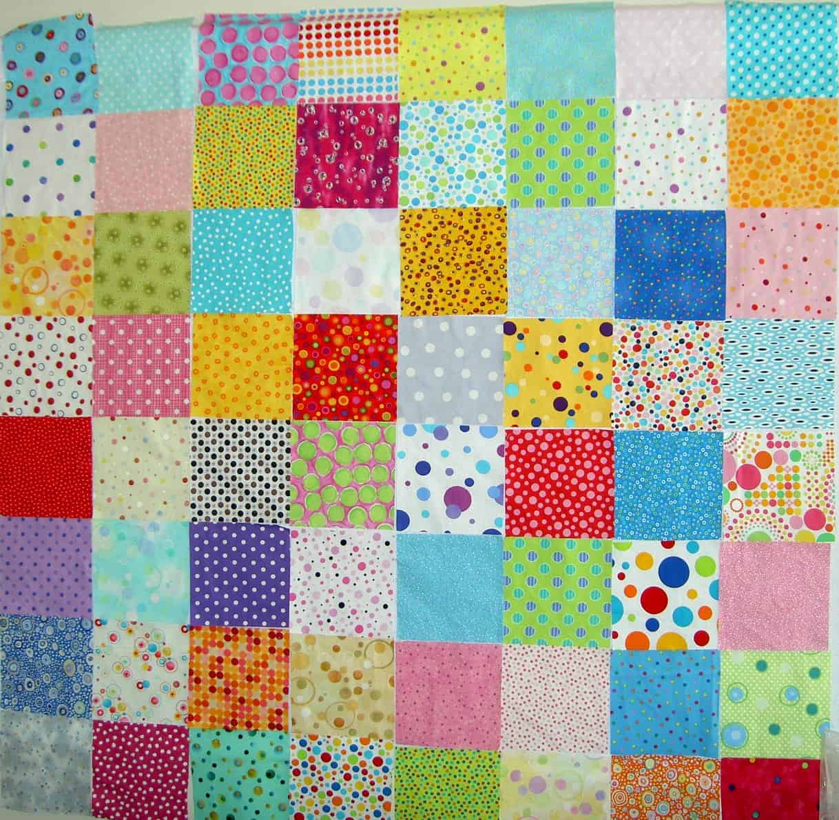
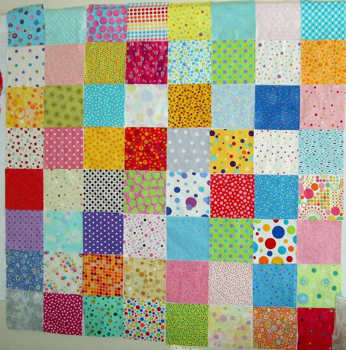
In the above photo you can see that I have cut and selected some of the fabrics in preparation for piecing.

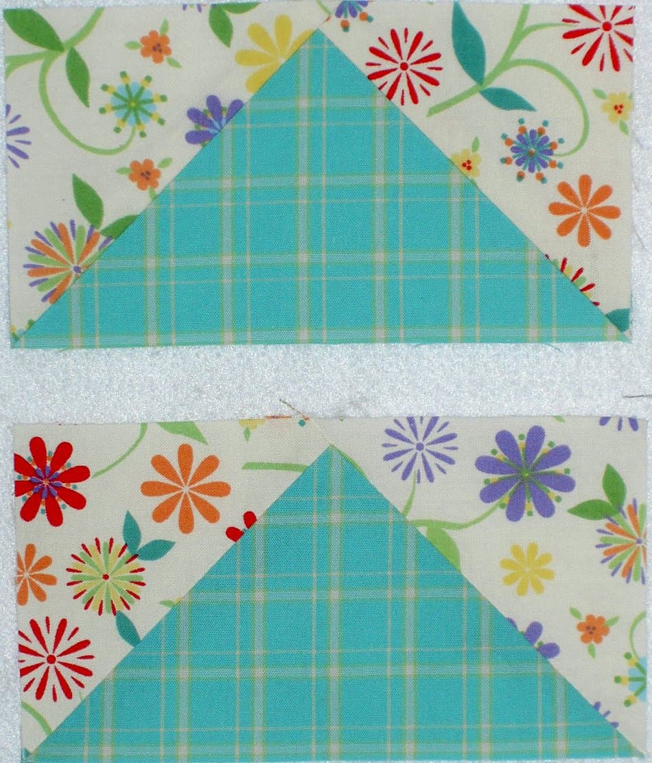
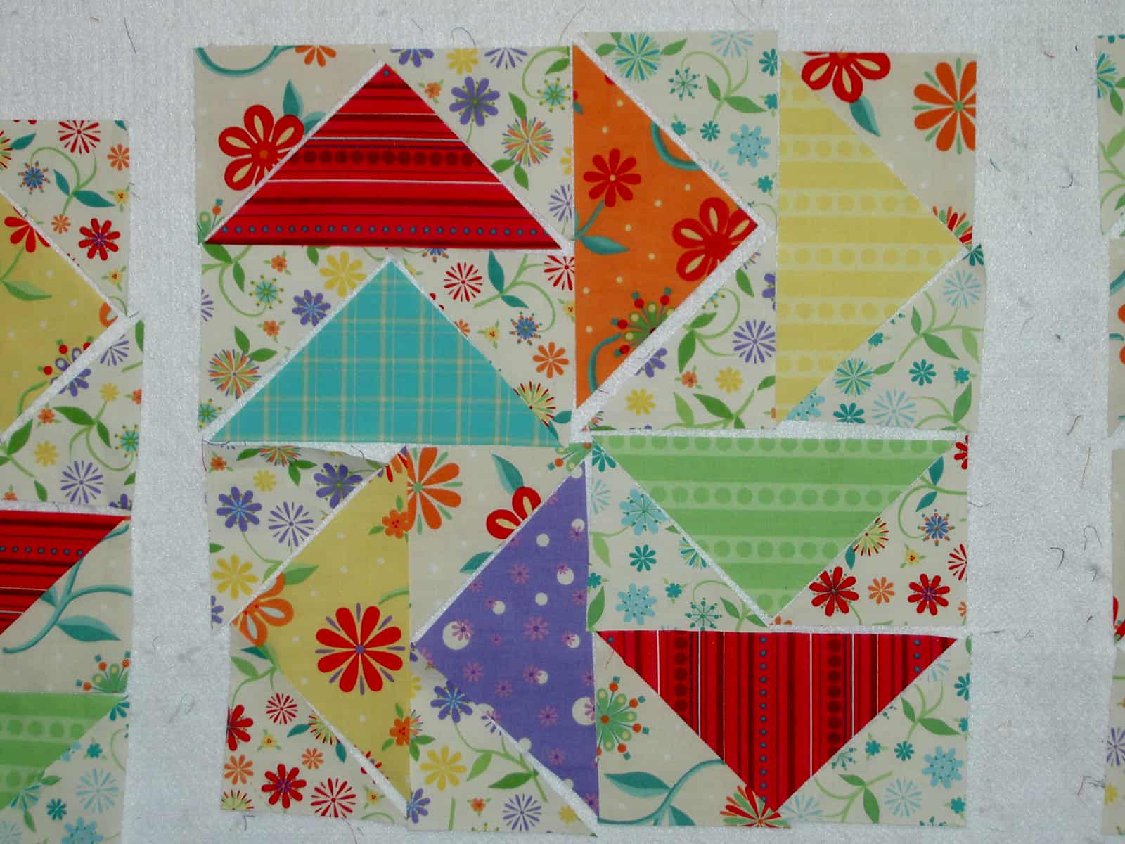
Above is a detail of the center block.

Several days pass….

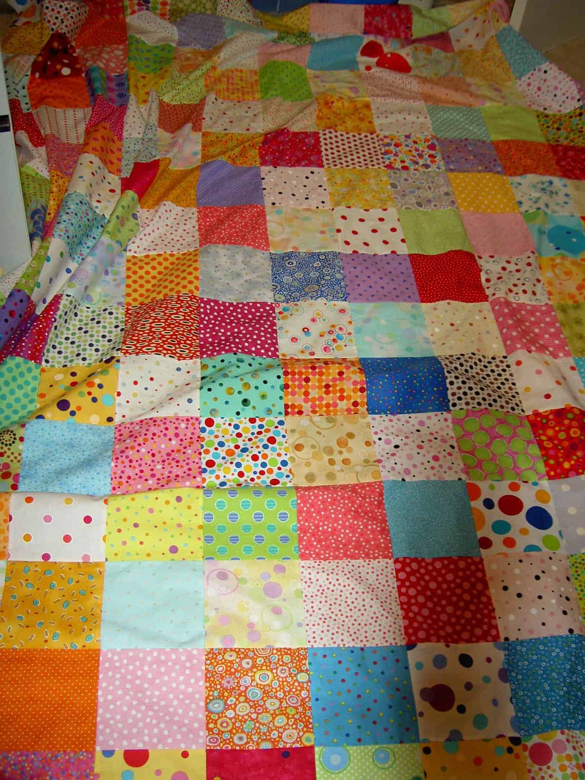
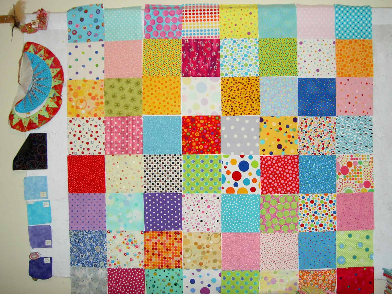
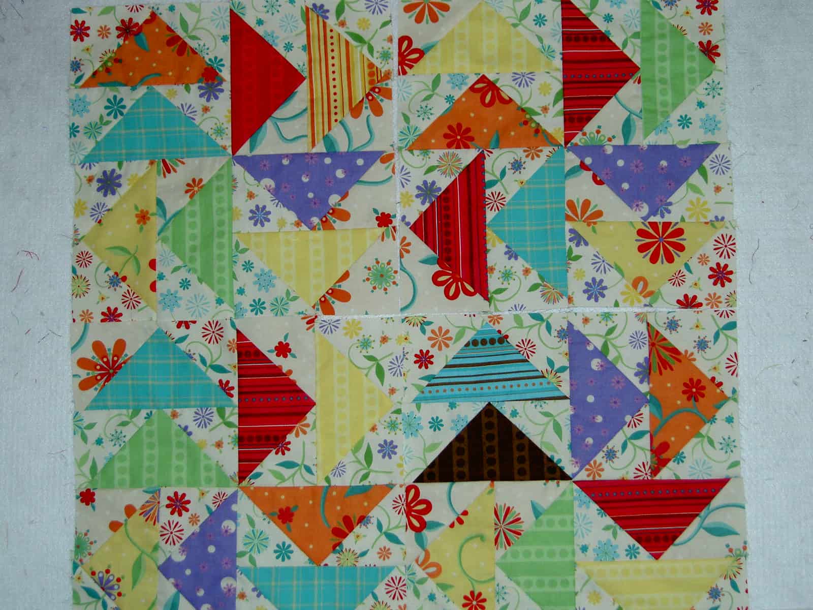
On and off since the second week of November, I sewed a few seams as time permitted, steadily making progress. I don’t plan on setting the blocks this way, but wanted to see how they would look together. This also allows me to review the use of fabric and identify any problems that may be developing. As you can see, I have several blocks and have still not used all of the fabrics from the line. I flipped over the stack of fat quarters so I would cut some new ones the next time I cut the larger triangles.

Some issues I want to work through with this piece:

1. Distribution of the red: I think that the red is necessary, at least at this point in the piece, but it seems to be a bit dominant, so I need to take care where I place it. I also want to use different reds. There are 3 or 4 in this group.

2. Mixing up the various prints: I need to think about whether to place duplicates of fabrics in one block or to ensure that all the blocks have different fabrics. This depends on the number of different fabrics that I cut as well as similar colorways in different patterns.

3. Brown: I am afraid that the brown will be a dark hole, but like the chocolately feel of it. I may, in the end, take it out (yes, that means unsewing), but I want to wait to see how it looks when I have more blocks.

4. Number of blocks: I am not sure. I think I will make at least 9 and possibly 16. I am thinking that this will be a baby quilt for a friend. We will see.

5. Variation in blocks? : I am thinking about mixing 1-3 regular pinwheels in with the Dutchman’s Puzzle blocks to add interest. I may make a couple just to see how they look. As Lorraine Torrence says in her design classes “Make visual decisions visually.”

What is the Difference?

I experimented with pressing on two of the blocks. One I pressed towards the white (example: top) and one I pressed towards the color (example: bottom). I think it is hard to tell the difference online, but in person, if you look, you can tell that the color pops forward more on the bottom one. Ruth McDowell talks about this in her classes and her Piecing book. I don’t think it is relevant for this piece, but it is an interesting exercise.

Itten: The Elements of Color

I am back in study mode and reading a couple of books on quiltmaking and art. One of them is Itten: the elements of color: a treatise on the color system of Johannes Itten based on his book the Art of Color.

If you have not seen Itten’s color wheel, it looks like

Itten's Color Star
Itten’s Color Star

.

If you buy the color wheel (or Color Star as Itten calls it), it comes as a set with covers for the color wheel that allow you to see the complements, split complements and the triads, etc without the interference of the other colors. Buy it at Amazon or your favorite local art store. Expensive, but totally worth the money.

Anyway, The Elements of Color is a condensed version of the The Art of Color. I haven’t yet read the entire book and may not before I have to take it back to the library, but found a few tidbits that are worth thinking about.

pg.8: “Knowledge of the laws of design need not imprison, it can liberate from indecision and vacillating perception. What we call laws of color, obviously, can be no more than fragmentary, given the complexity and irrationality of color effects.”

It seems to be that the author is saying that by knowing the laws of design and color, we can use all or parts or none to liberate us from indecision in the design process. This seems to be that old adage about knowing the rules allows you to make a conscious decision to break them.

pg.12: “Developments in color chemistry, fashion, and color photography have aroused a broad general interest in colors, and the color sensitivity of the individual has been greatly refined. But this contemporary interest in color is almost wholly visual, material in character and not grounded in intellectual and emotional experience. It is a superficial, external toying with metalphysical forces.”

I think this is an interesting statement because it implies that there is more to seeing color that the visual-sensory perception. In fact, Itten talks a lot about the study of color including how color is used, what it means, how other artists used color and the various implications of the use of color. This brings me back to other books I have read about colors being associated with emotion, the meanings of color in different cultures, etc. It also made me think about how colors are associated with different aspects of religion (blue for the Virgin Mary) and different events in our lives (black for death in the West, white for death in the East).

TaDa!!! Thoughts on Dots COMPLETE

Below is the last iteration of the corner I was working on. It was amazing that when I woke up and looked at it on Sunday morning I REALLY liked the piece. I was lukewarm (and somewhat worried) about it on Saturday, but kept working through it and feel like the work paid off.

I realize that the changes are subtle and those of you in blogland will have to study them to see the differences, but here IRL, there were differences that mattered.


The piece is a monster, so, without help, this is the best photo I could take. I’ll get a better one up.

Thoughts on Dots Nearly Complete


The two photos above are how I left Thoughts on Dots before Halloween and my trip to Arizona. One fabric (Top photo: 4th from the bottom and 3rd from the right) looked like a plaid and had to be removed. Fabrics that were too beige had to go as well. I did leave a couple that were beige-ish, but still very “dotty.”
The problem with the above layout is that the white background fabrics I added are too active. In this entire piece the white, IMO, is acting like a resting point for the viewer’s eyes. In this section the whites are not doing their job. I separated some of them before I took this photo, but it still wasn’t working quite right.

I think the other problem was the differences in sizes of the dots. I didn’t have them mixed up enough.


This photo is a bit wonky. I am really having some problems taking photos of this large piece, because of the construction and all the stuff being where it is not supposed to be. In any case, I think that this is nearly the end of the design phase. The piece is really coming together, which is great, because I was really unhappy with the layout when I got back to it last night.