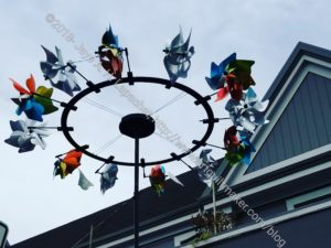
I saw this wind sculpture when I went to get my hair cut on Saturday. I have walked by it numerous times and finally stopped to take a photo.
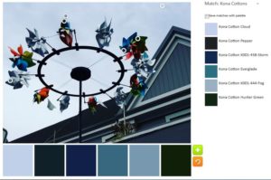
The default was great! NO neutrals this time. I found it to be a very appealing palette, if a little too monochromatic.
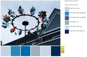
I took the opportunity of a great default to try a monochromatic palette. I tried to go for sea tones and I think I got a blustery day sort of look.
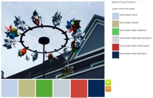
With the second palette, I tried to pull out the colors in the image. There are quite a few colors and I wanted a variety. The only one I don’t like is the Kona Parsley. It doesn’t look like parsley at all to me. It looks like one of those life-sucking beige relatives.
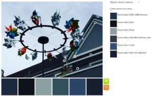
In the third palette, I went back to blues, but expanded to darks. I like the colors together. In a quilt, however, I don’t think there would be enough contrast.
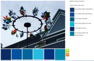
I really got a lot of mileage out of the default blue-centric palette. I continued with the monochromatic theme in the fourth palette, but went with brighter and happier blues. There are some darks and it was hard to find places in the images where the tool registered the location as a different color/fabric.
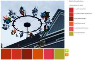
With n.5 I tried to find every spec of warm colors in the whole image. The pickle is the only cool color, but it has a tinge of warmth to it, I think.
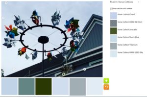
With the last palette, I decided to stick with blue, but go light, even venturing into grey. The Avocado was kind of a desperation choice, but the others stuck with my idea.
What will you make?