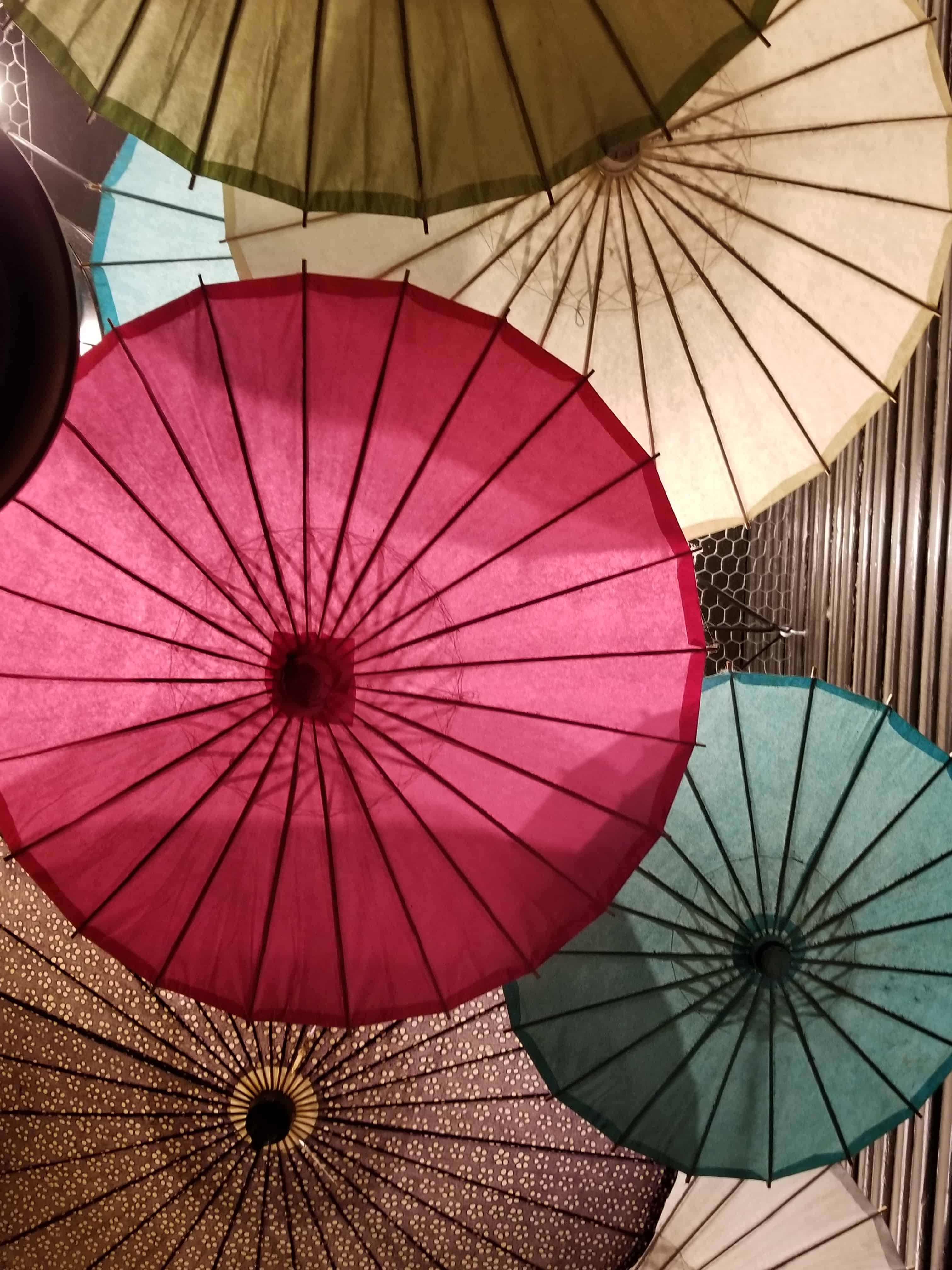
I’m always looking for photos with the most color possibilities. This week is no exception. I took this photo in Portland. The umbrellas were hanging down from the ceiling, covering the ceiling.
It doesn’t have as many colors as I would like, but until I start playing with the Palette Builder, I always think the photo I chose has more colors than it really does.
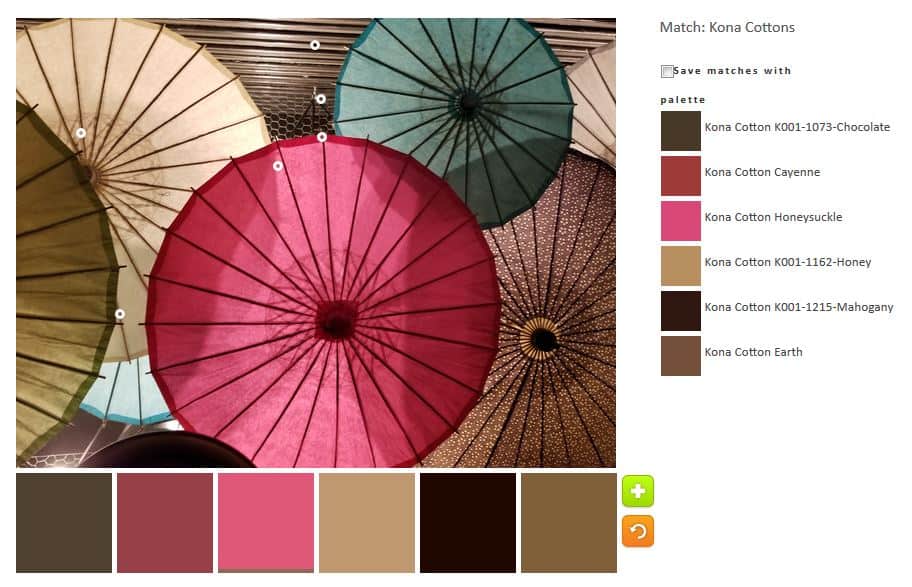
The Kona Earth looks like a cocoa color to me. Surprisingly the tool put some color into the default palette. I suppose it would have been really weird if it ignored the pink umbrella completely. It didn’t do much with the green umbrella.
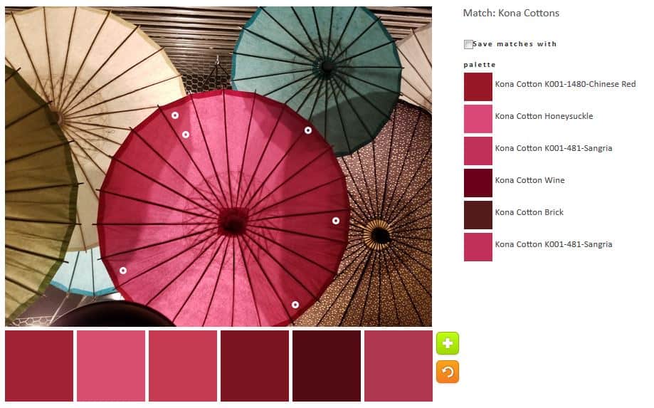
I took charge of the pink to see how much pink I could get out of the one photo. I was surprised that I got quite a lot. You can see all the dots are only on the pink umbrella.
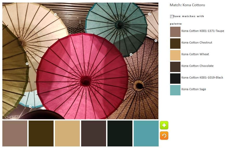
I went a little broader in my second palette. I like that Cotton Sage blue. Sage is green to me, but whatever that color is, it lends a brightness to an otherwise neutral palette.
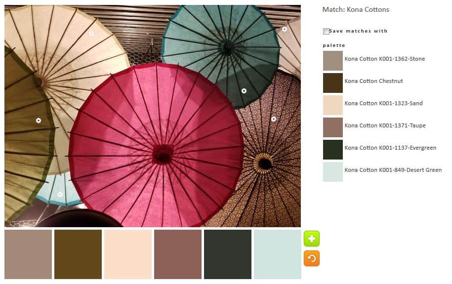
This 3rd palette is virtually the same as the one above except for a few tweaks. I wanted to just move the circles a little bit and see what came up. The green created Evergreen, which really looks black. I suppose I agree with the Desert Green name. Colors in the desert can be very pale, bleaches looking. The neutral palette is softer, I think.

The fourth palette reminds me of dessert. The neutrals have a richness to them, especially the Kona Cinnamon.
In general, this photo is primarily generating neutral palettes with me teasing out the least bit of color to make them my own.