Continuing to Sparkle

With Spark #30, we finished working our way through Carrie Bloomston’s book, The Little Spark. Buy it. Support the artist. Our journey here is done, but the posts will remain and you can work through the book and my comments at your own pace. There is much more to each spark than what I wrote. The original chapters will help you.

Included on the very last page of the book was a list of books and movies that Carrie suggests we read. I am listing some of them:

I haven’t read any of the books listed above. I have seen a couple of the books she lists, but would watch them again. Go buy Carrie Bloomston’s book, so you get the full benefit of her fabulousness!

Creative Spark #30: Trust Yourself

This is the last spark of the book and it is incredibly short. Carrie Blooms ton writes “Now that you have read this book, let me tell you one last thing to take with you on your adventure:

NOTHING YOU NEED

TO KNOW IS IN THIS

BOOK OR ANY OTHER.

Nothing you need is in a class or at the museum or at the art supply store. Everything you need is within you” (pg.124).

This is hard for me. I always think that if I get a better machine, or that new fabric, or a variety of zippers, my work will be better. I have to learn that my work is good enough with what I have and if I keep striving as discussed last week, then I will move towards perfection.

The author ends with “Trust yourself and you will awaken to the potential inside you. You already have everything you need (pg.124).

You can see the last post on this topic from last week.

Nota bene: we are working through Carrie Bloomston’s book, The Little Spark. Buy it. Support the artist. Play along. There is much more to each spark than what I am writing. The original chapters will help you. Go buy Carrie Bloomston’s book, so you get the full benefit of her fabulousness! You can see my book review, which is what started this flight of fancy.

Creative Spark #29: Leave it on the Field

“I am proud of what you did out there. You did your best. You left it all on the field” (pg.122).

What this quote says to me is something that I try to live by, but need reminding about periodically. I always says that I need to show up and do the work. That isn’t enough and this quote reminds me of it. Yes, I need to show up. Yes, I need to do the work. I can’t, however, do it in a desultory way. I need to give it my all. I need to look at my work throughout the process. I need to think about what I am doing. I need to try different things and do my best work. It might not actually end up being my best work, but I need to give quiltmaking my all and not hold back.

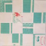
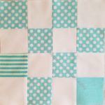
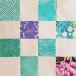
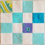
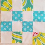
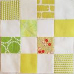
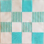
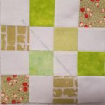
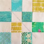
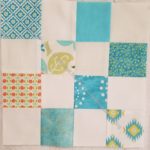
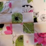
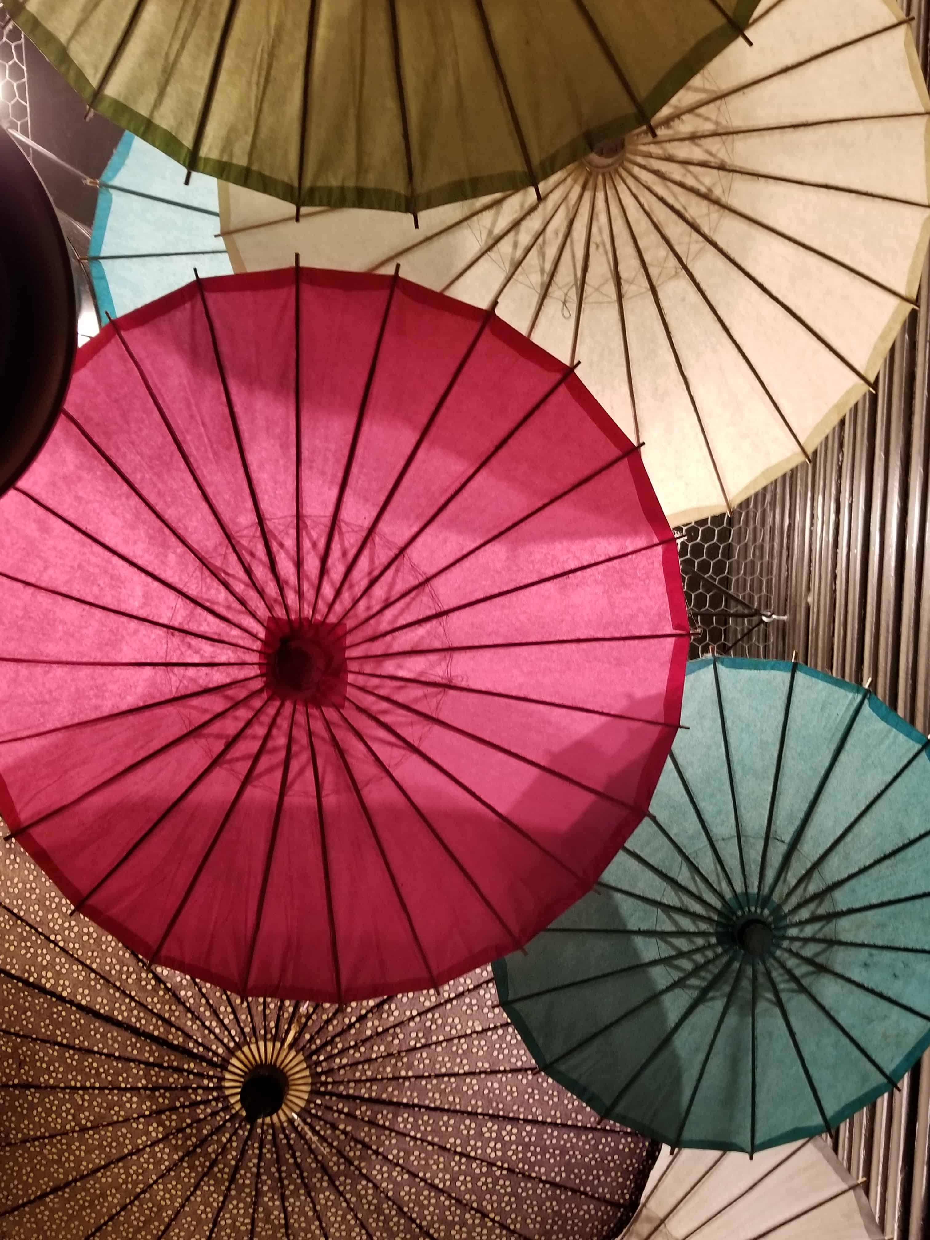
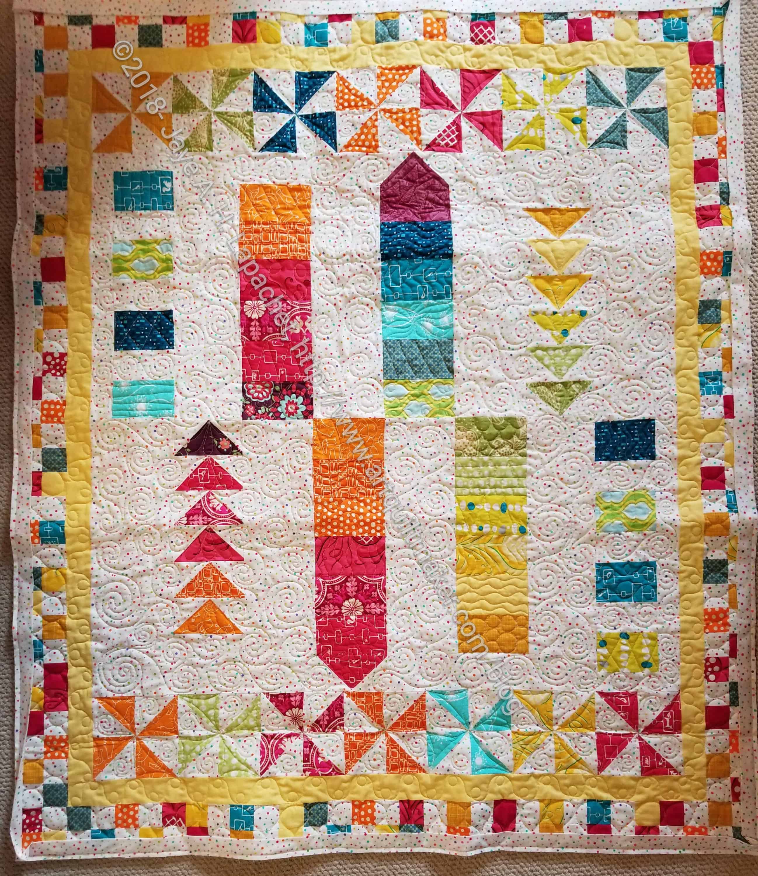
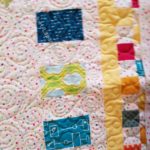
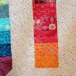
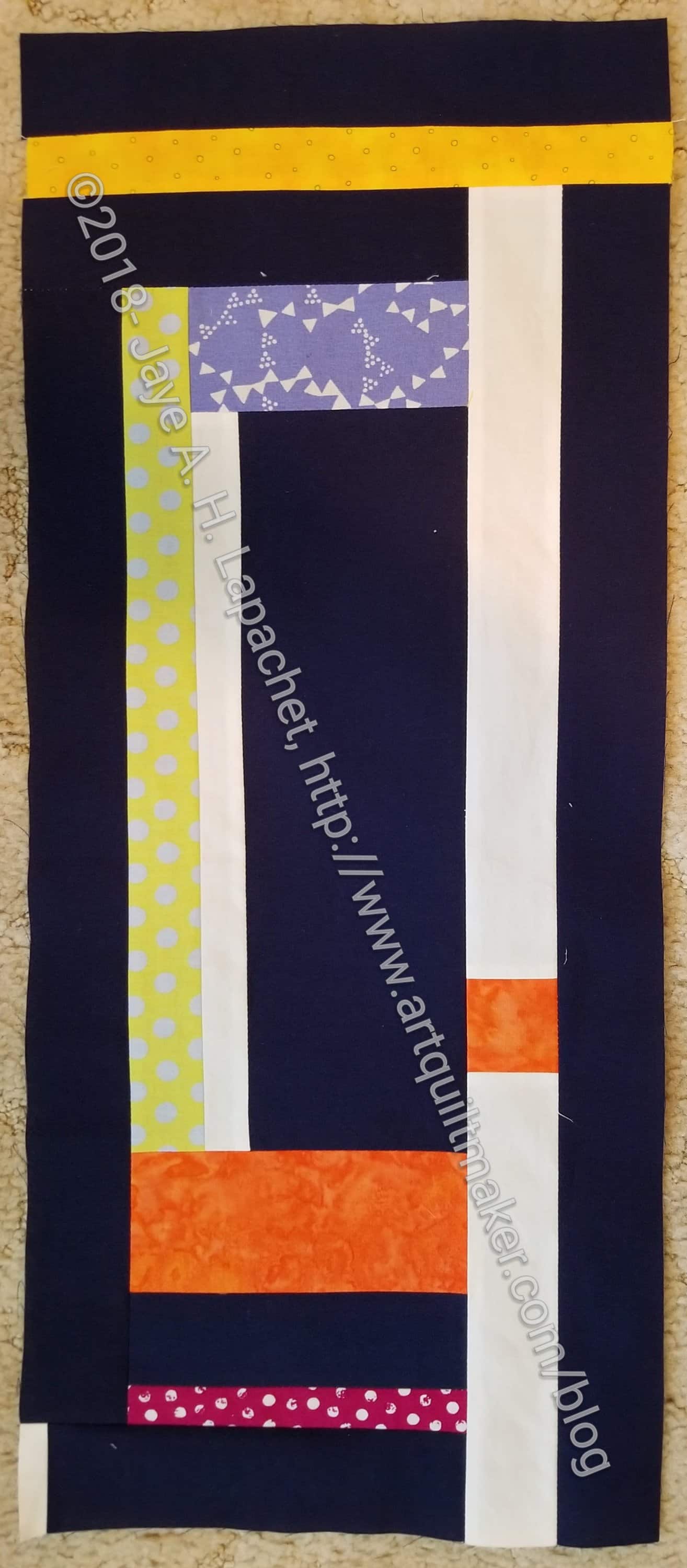
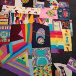
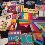
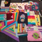
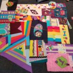
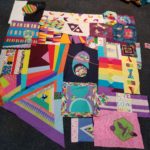
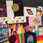
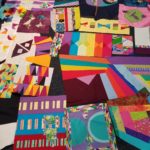
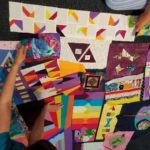
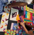
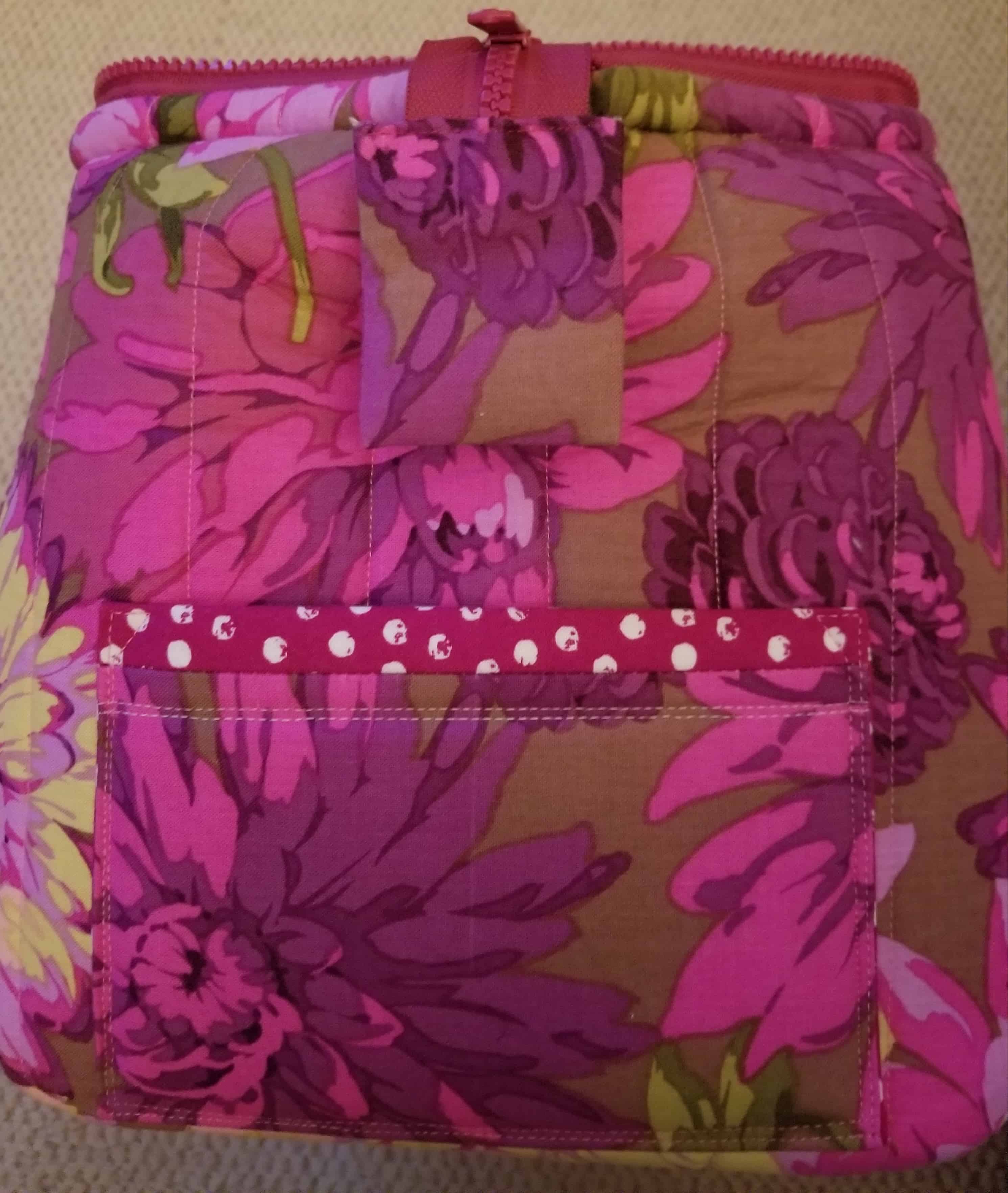
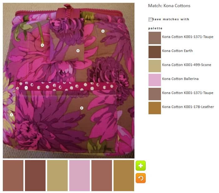
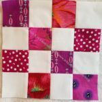
“I used to think I had to save it all up for this or that” (pg.122) speaks to me. I recently bought some Tula Pink dots and stripes and in September I started to use them. Using my good fabrics is FANTASTIC! I have done this a couple of times lately and I have to say that saving fabrics for the perfect project is horrible for me. I have fabrics I used to love and now I don’t even remember why I bought I them. It is sad. Using my good fabrics means that I can see them in my house and use the quilts and enjoy the fabrics.

In this context, Carrie Bloomston means herself. She compartmentalized herself and doled parts of herself out as she saw fit. She writes “some knew me as a mom, some as an artist, some as a spiritual seeker, some as a kniiter, glassblower, a painter, a designer…I finally let go of that a few years ago when I began the process of letting go of control” (pg.122).

I know the examples are different, but I believe that using my fabric now is the first step in stopping the compartmentalization we, as humans, are prone to engage in. Letting go of control or planning isn’t easy. We all have busy lives and like to squeeze a lot into our days. “Befriend incidents, accidents, and mishaps. They are your greatest teachers” (pg.123).

“No matter what form your creativity takes, you have to let go of expectation and perfection. For the record, there is no such thing as perfect. …if you ever finally made the perfect quilt or painting or cake, you’d never need to make another one, right?” (pg.123). This quote is profound to me. I know that there is no such thing as perfection. Every project I make sparks a ‘what if’ moment. What if I made the blocks bigger? What if I used pink instead of green? There is an endless number of what ifs that populate my mind as I work on quilts and other projects.

For me, trying my best (despite what Yoda says) and working towards my best work and towards perfection is what I have to do, what I have been doing and what I will continue to do.

Carrie says the same thing when she writes “There is only trying, doing your best, and leaving it all on the field. If you do your best, honor your journey, and love yourself along the way, then you will find the pot of gold at the end of your rainbow. The pot of gold is everywhere when you go with the flow, surrender to the process, stop controlling, and let yourself be filled with joy and love” (pg.123).

She ends the Spark with “I hope you have learned that no matter what, you are good enough exactly as you are right now, and your lief experience will fill your work with your spirit” (pg.123).

You can see the last post on this topic from several weeks ago.

Nota bene: we are working through Carrie Bloomston’s book, The Little Spark. Buy it. Support the artist. Play along. There is much more to each spark than what I am writing. The original chapters will help you. Go buy Carrie Bloomston’s book, so you get the full benefit of her fabulousness! You can see my book review, which is what started this flight of fancy.

September Donation Blocks

As usual I added to the stash of donation blocks that the guild needs to keep our charities well supplied.

As mentioned, I spent some time with the Accuquilt cutting 2.5 inch squares. I have to cut more scraps as my scrap drawers are overflowing. Aside from cutting with the Accuquilt, that is something I can do it bits and pieces of time I find while dinner is cooking or when I am waiting for DH to be ready to leave.

A number of the blocks were made at the BAM Retreat.

ColorPlay: Windspinner

ColorPlay: Windspinner original

I took this photo in Tahoe. I really like those Windspinners.I can’t buy one, because DH gets sick.

There are a lot of colors, if a person is careful with the little Palette Builder circles. I had fun looking for them.

ColorPlay-Windspinners-default

Despite my efforts, the default palette is still a bunch of neutrals.  It is really dark, but somehow strangely appealing. The Kona Earth is a nice brown.

ACK! I can’t believe I said that about brown.

ColorPlay: Windspinner-n.1

I went for totally bright and cheerful in the first palette. The green in this palette is really a good addition. I like the Grasshopper with the Papaya even though I am not much of a green person.

ColorPlay: Windspinner-n.2

I went for a cool colors palette. Isn’t it fun? I kept the Grasshopper. It is a nice dark with the other colors.

ColorPlay: Windspinner-n.3

Palette number 3 is the monochromatic palette that weighs heavily towards turquoise. 😉 I did add in the darks to make it a little different. The Kona Carribean and Breakers are two great darks.

ColorPlay: Windspinner-n.4

I had to get out of my favorite cool colors, so I went with warms. This is a nice combinations of pinks and golds, I think.

ColorPlay: Windspinner-n.5

I couldn’t get away from the cools, even though I tried. I added some lavender and those greens – more mossy and sagey – add something, especially with the Breakers.

ColorPlay: Windspinner-n.6

I dragged myself away from the cools again and went back to warms, though I couldn’t stay completely away and that Jade Green combined with the Kona Cotton Red and the Pomegranate is awesome.

ColorPlay: Windspinner-n.7

I did a backwards version of n.6 in that I used mostly cools with a warm.

What will you make?


New Donation Blocks

I made a couple of donation blocks over the weekend. Just a couple. I can’t seem to get away from the turquoise, though green is definitely forcing its way into the mix.

I found a whole bunch of Bonnie and Camille 2.5 inch squares leftover from the Stepping Stones n.2 quilt. That means more turquoise, though some red and pink as well.

ColorPlay: Umbrellas

ColorPlay-umbrellas-Original

I’m always looking for photos with the most color possibilities. This week is no exception. I took this photo in Portland. The umbrellas were hanging down from the ceiling, covering the ceiling.

It doesn’t have as many colors as I would like, but until I start playing with the Palette Builder, I always think the photo I chose has more colors than it really does.

ColorPlay-Umbrellas-default

The Kona Earth looks like a cocoa color to me. Surprisingly the tool put some color into the default palette. I suppose it would have been really weird if it ignored the pink umbrella completely. It didn’t do much with the green umbrella.

ColorPlay-Umbrellas-n1

I took charge of the pink to see how much pink I could get out of the one photo. I was surprised that I got quite a lot. You can see all the dots are only on the pink umbrella.

ColorPlay-Umbrellas-n2

I went a little broader in my second palette. I like that Cotton Sage blue. Sage is green to me, but whatever that color is, it lends a brightness to an otherwise neutral palette.

ColorPlay-Umbrellas-n3

This 3rd palette is virtually the same as the one above except for a few tweaks. I wanted to just move the circles a little bit and see what came up. The green created Evergreen, which really looks black. I suppose I agree with the Desert Green name. Colors in the desert can be very pale, bleaches looking. The neutral palette is softer, I think.

ColorPlay-Umbrellas-n4

The fourth palette reminds me of dessert. The neutrals have a richness to them, especially the Kona Cinnamon.

In general, this photo is primarily generating neutral palettes with me teasing out the least bit of color to make them my own.


BAMaQG Color Round Robin Returns

BAMaQG Color Round Robin

Along with the Octagon 9 Patch, the BAMaQG Color Round Robin came back from my quilter. I really like the quilting. There are different motifs in most of the non-background areas. I have to sew down the binding and then send it off to its new owner.

I don’t dislike this quilt, however it is not a favorite. I do really like the quilting that Colleen did.

The bits in each of the areas with printed fabric look great.

Color My Quilt: Gerre

Color My Quilt: Gerre's shard
Color My Quilt: Gerre’s shard

Gerre brought her blocks to the meeting last month and laid them out. I talked about this process earlier in the week (better late than never!). During that process, I realized that my shard was not among the ones she brought. I looked up all the Color My Quilt posts and don’t think I ever made her a piece. I was really sad about that, so I got busy.

This one isn’t as long as I thought it would be and is more buttoned up than the other shards, but I hope she will be able to use it.

Color My Quilt: Marty

Color My Quilt: Marty (Sept. 2018)

Marty tried to torture me this month with her request.

Brown.

Yep. Brown.

I couldn’t believe it, but it was true. Fortunately, I didn’t have go to the indignity of beige or baby poop brown. I had a chocolate fabric with the most fabulous lime, turquoise and orange dots. Haha!

The shard is a little bit of an odd shape, but that is ok. Marty will just have to deal. I hope she likes it.

Color My Quilt: Marty - Brown made fabric
Color My Quilt: Marty – Brown made fabric

I had made some fabric using browns sometime ago. I can’t remember for what reason, so I just decided to toss that into the pile for Marty as well. Despite my best intentions, I am not going to make a journal cover from browns. I might have been thinking of making another Henry, but that can wait. I want to make a white one first.

Color My Quilt: Gerre’s Shards

Last month, Gerre brought her shards to we could all look at them. Gerre has left her handbag at home, so didn’t have her phone and couldn’t take photos. I volunteered and texted her photos as I took them. There are a lot of photos!

Being the opinionated ladies that we are, we all had opinions about placement. It was kind of fun to work with other people moving shards around. I think Gerre was kind of excited, too, as it gave her ideas about placement.

I had issues with the plum (see upper part of first photo, left). I thought the plum should be dispersed throughout the quilt.

We also tried to move the white around so it wasn’t all clustered in one place (see bottom two rows).

There was advice about putting the pieces together into chunks and cutting pieces up. I think it got people excited about layout.

ColorPlay: Tool Tote

ColorPlay: Tool Tote

I really like the Philip Jacobs fabric in the Tool Tote and decided to do a ColorPlay using one of the photos from the post.

ColorPlay: Tool Tote -default

Again, the default is not all neutral. There are quite a number of violets.

ColorPlay: Tool Tote -n.1

This palette provides another group of violets with some neutrals included. It is kind of dark palette, but the Honeysuckle makes it slightly more cheerful.

ColorPlay: Tool Tote -n.2

I am not sure how different n.2 is from the two above. I like the Lupine in the palette above.

ColorPlay: Tool Tote -n.3

I couldn’t go without a neutral palette. I still got a lavender.

ColorPlay: Tool Tote -n.4

I really tried to make this one green. I think the greens look uglier in the palette than they do in the fabric. Granted there isn’t much green in the fabric.

ColorPlay: Tool Tote -n.5

Different grouping of colors, but the same colors as the first couple of palettes.

Surprisingly, this group of fabric offered up fewer opportunities for interesting palettes than I would have expected.


Donation Blocks – August 2018

More donation blocks. I keep making them.

Not as many as last month, but each one counts.

ColorPlay: Tile

ColorPlay: Tile - original
ColorPlay: Tile – original

I saw this quilt-like pattern of tile on one of my daily walks.

ColorPlay: Tile -default

The default is less neutral than normal. It actually looks somewhat beachy.

ColorPlay: Tile -n.1

I went for my usual monochromatic palette and came up with a series of blues.

Sadly, the website was having a problem despite me switching browsers, so there are only two palettes today.

What will you make?

I use the Palette Builder Tool on the Play-Crafts site. Thanks to Anne Sullivan for making it available.

Color My Quilt – Mary C

Color My Quilt - Mary
Color My Quilt – Mary

Mary put out her Color My Quilt directions at the last meeting and I was able to get it done while I was working on Who Am I? a couple of weekends ago.

I am still going with long thin pieces as I think they help people put the quilts together, though most don’t know it yet since only two finished pieces have been sewn.