ColorPlay: Bar Color

Sobo Ramen Bar
Sobo Ramen Bar

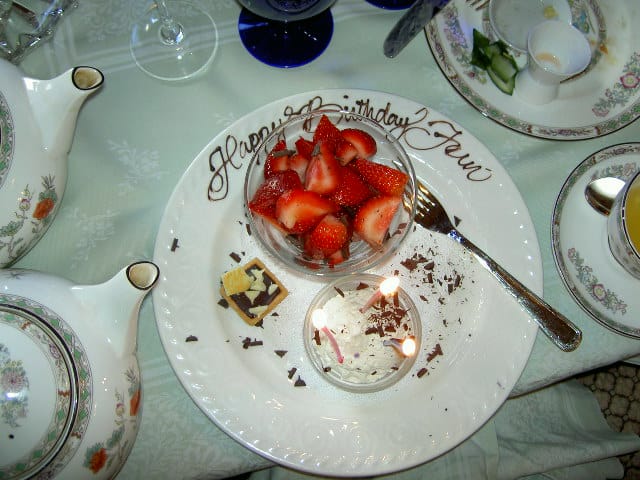
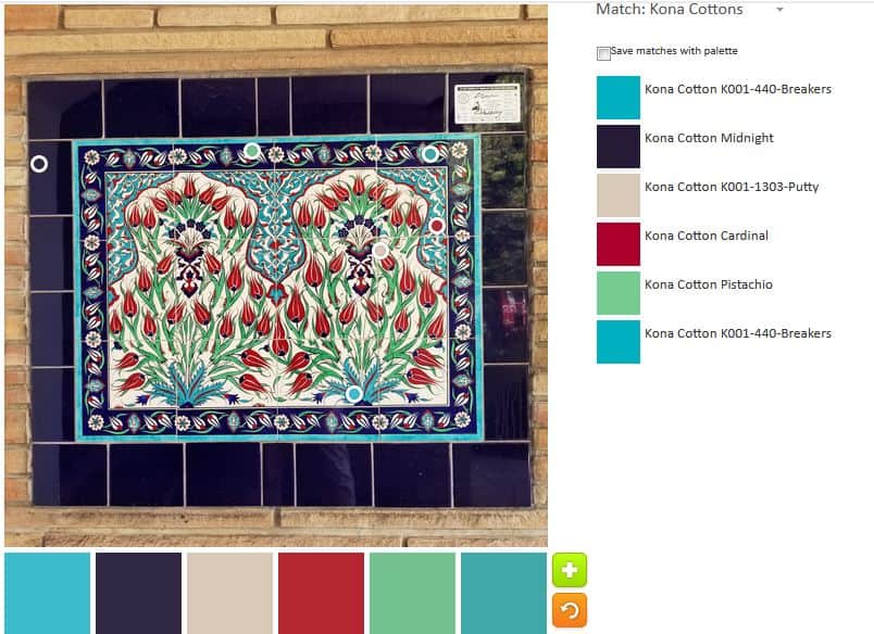
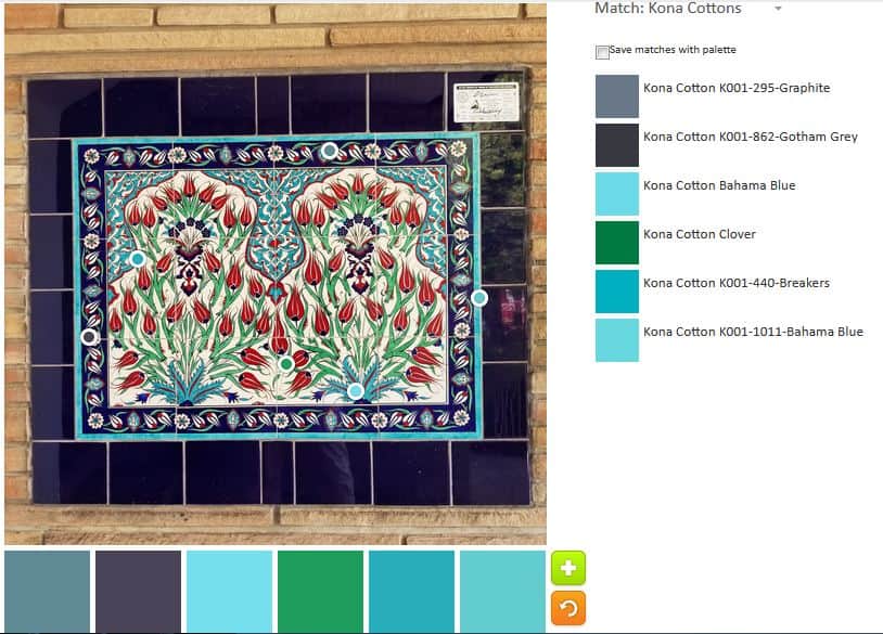
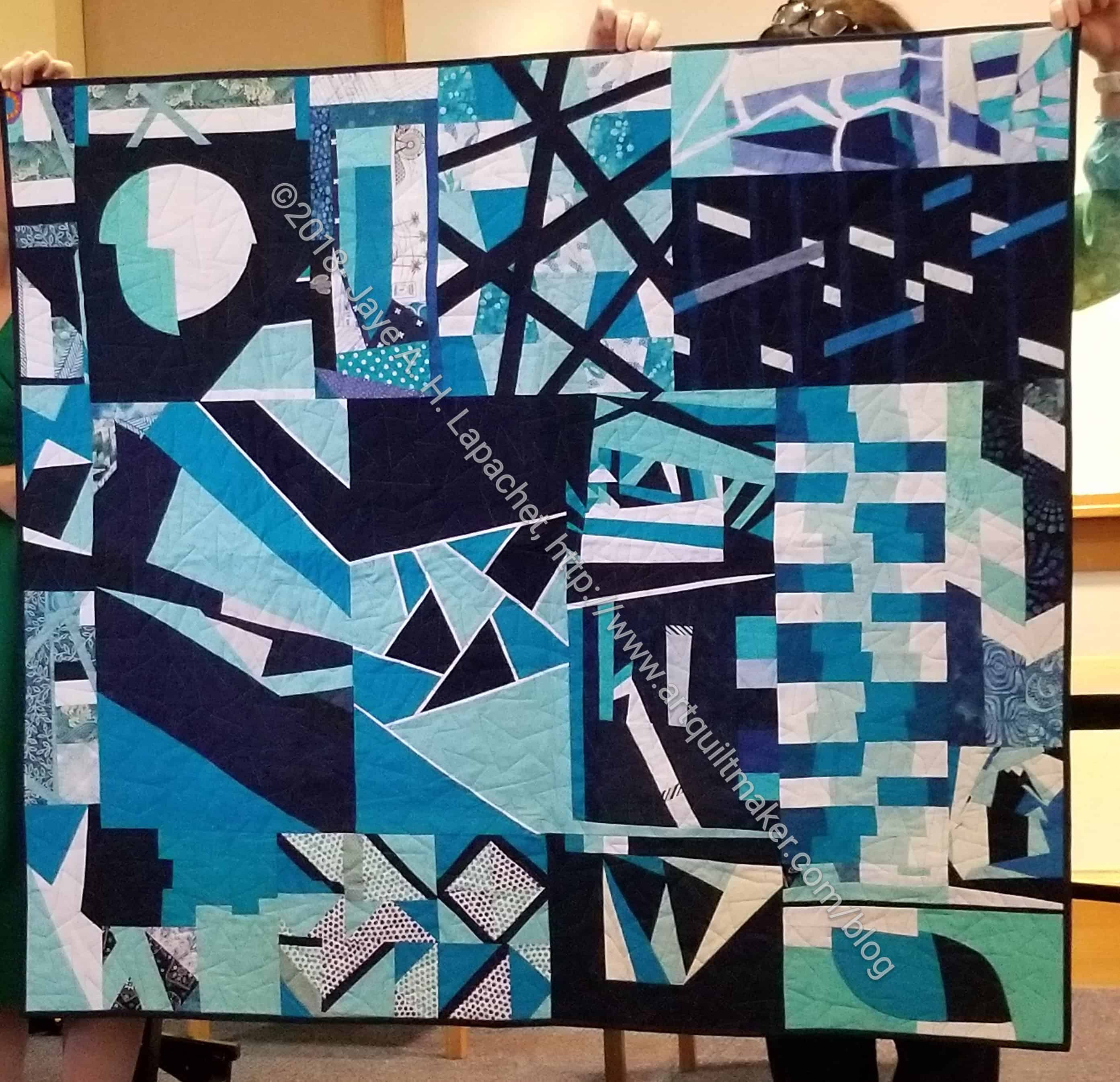
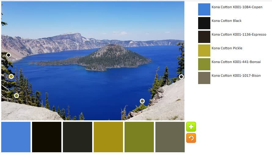
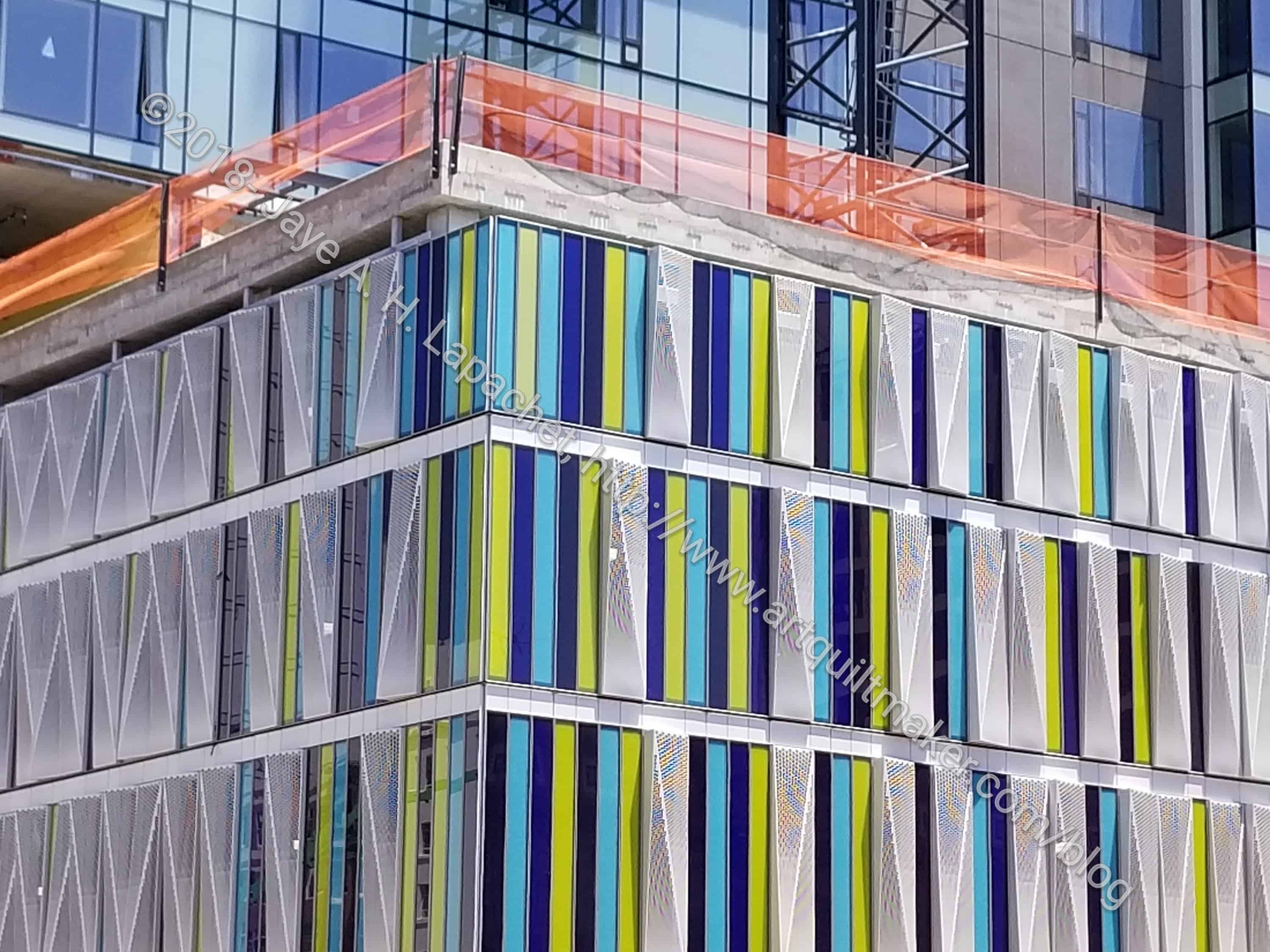
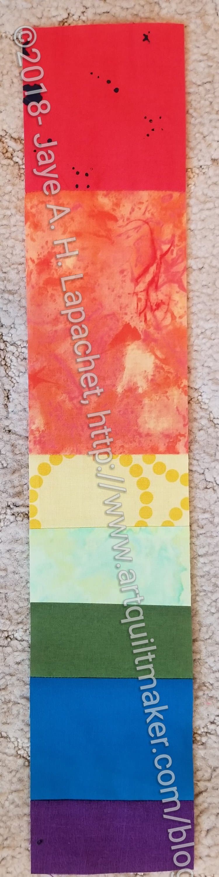
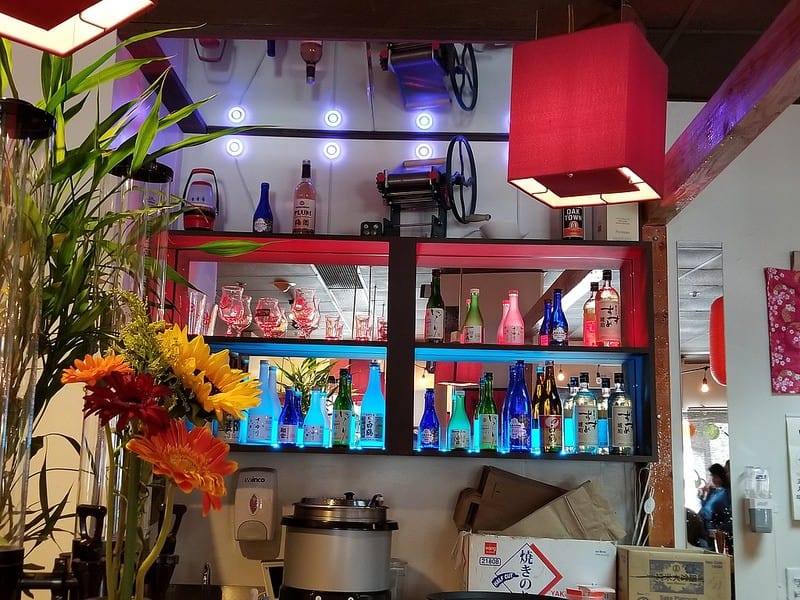
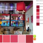
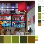
I took a picture of this bar area before this restaurant stopped carrying gluten free noodles. I finally dug the photo out, because of the bright and cheerful nature and had some fun creating palettes.

ColorPlay: Bar default

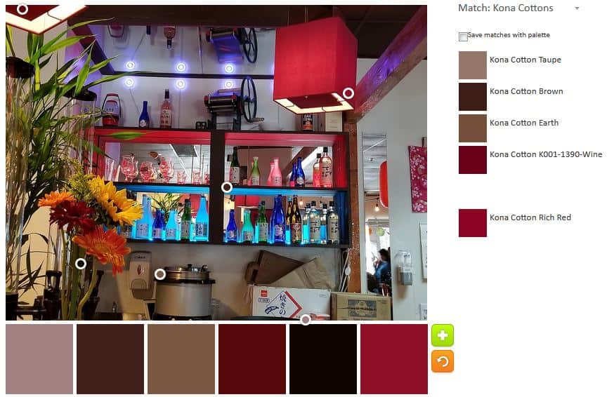
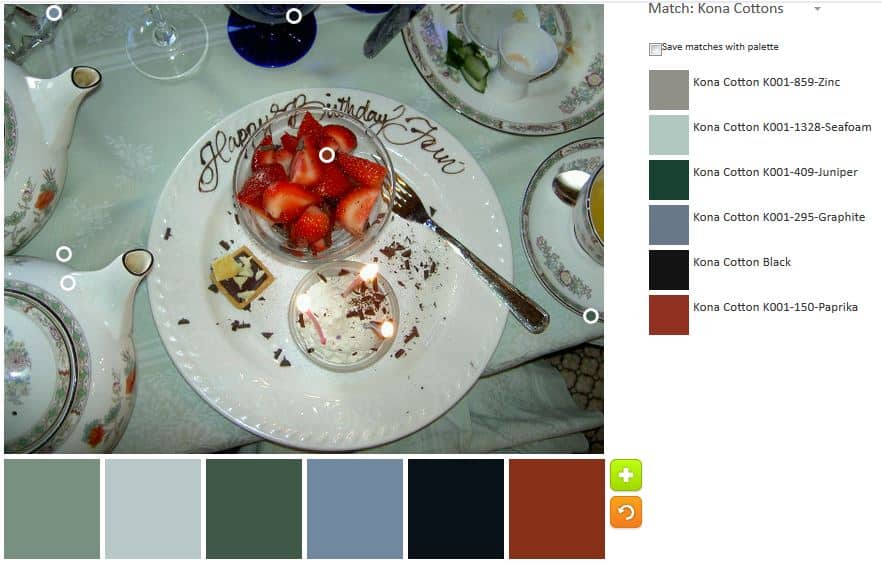
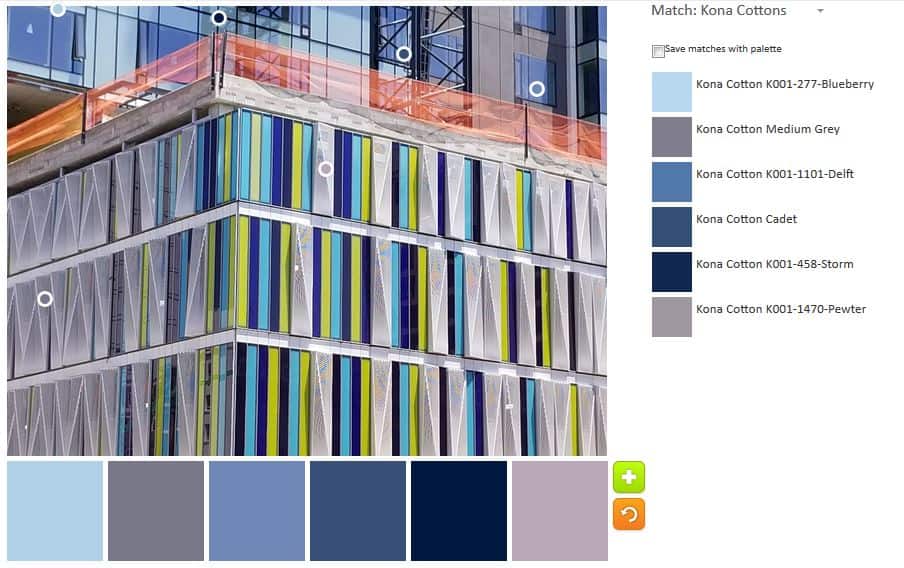
The default palette was less neutral-y than usual, which was a pleasant surprise. The red tones are an interesting addition. I also noticed that the program didn’t stick exclusively to the edges.

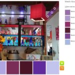
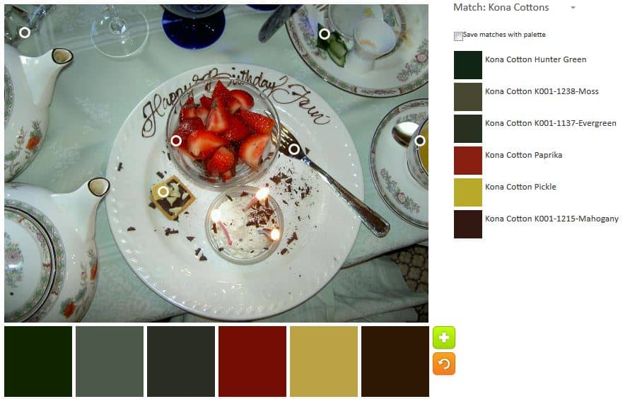
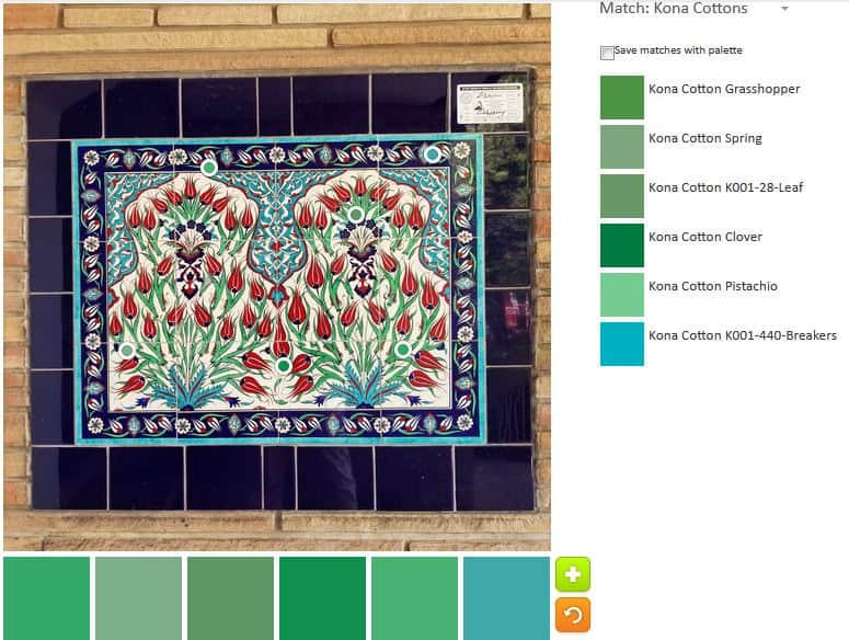
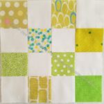
The monochromatic palettes were interesting. Yes, I made more than one this time. As you can see there are both cools and warms. I know the green is not warm, but it has a kind of warm feel to it – a bit mossy, I guess. Perhaps there is a yellow undertone giving it a bit of a warm feel.

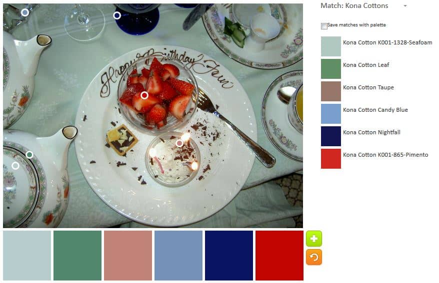
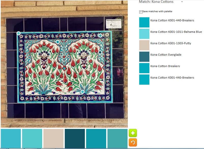
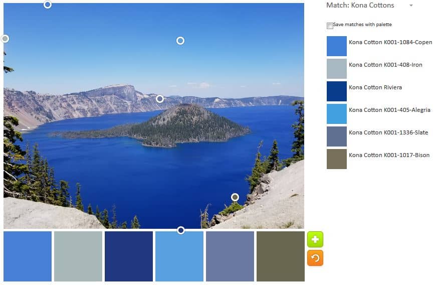
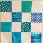
I like some of the blues in the blue palette quite a bit.

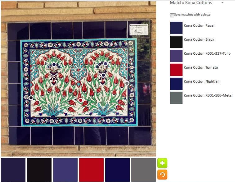
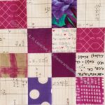
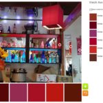
The two pink-red palates are similar, but a little different. As usual, I was really surprised at the colors that came out of the tool.

ColorPlay: Bar n.2
ColorPlay: Bar n.2

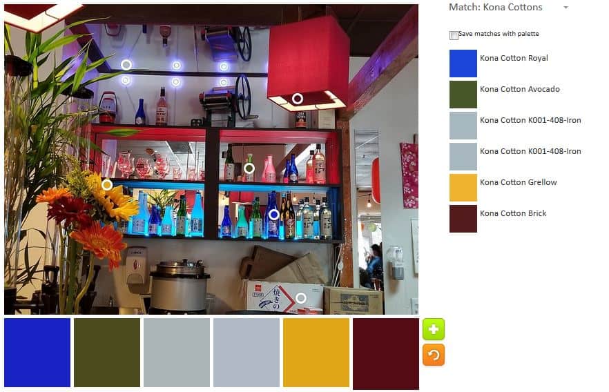
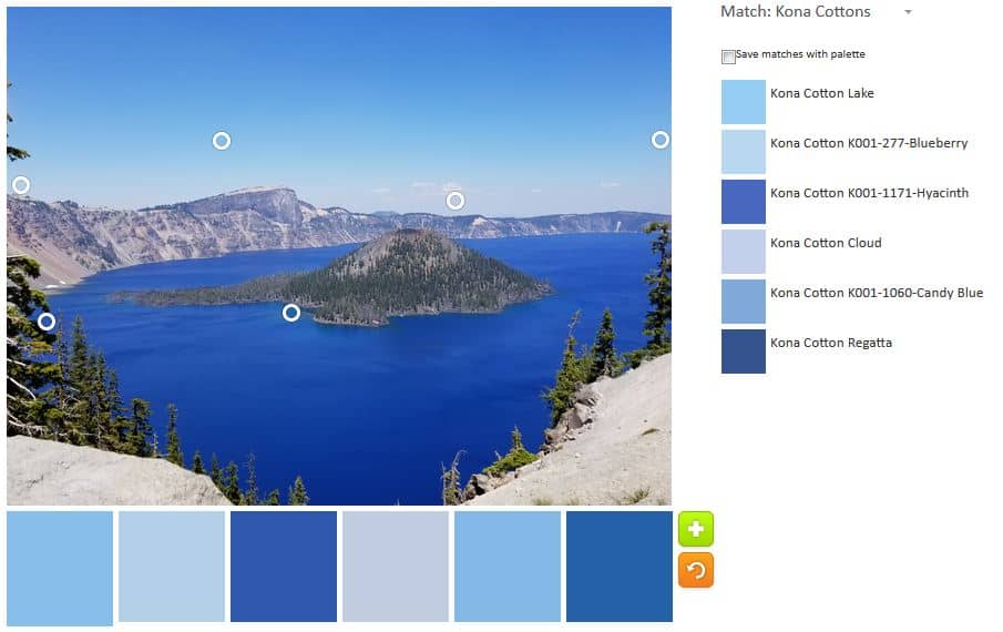
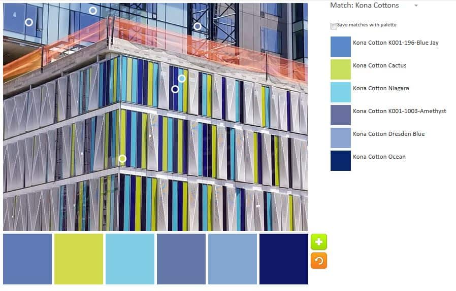
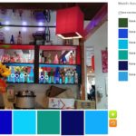
I really played around with the other palettes. I really like the blue and gold in palette n.2. The rest of the colors are kind of meh, though the greys alone or as a background would probably be great.

ColorPlay: Bar n.1
ColorPlay: Bar n.1

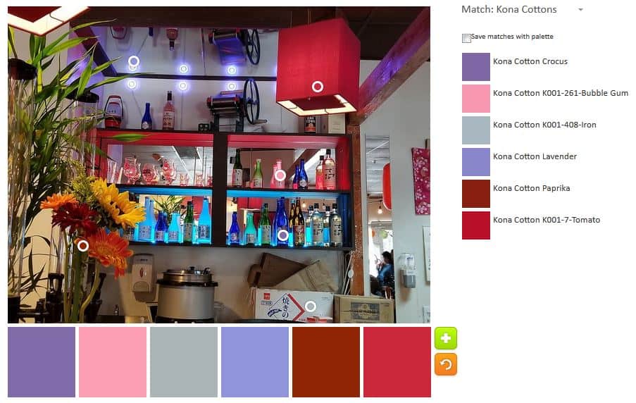
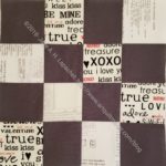
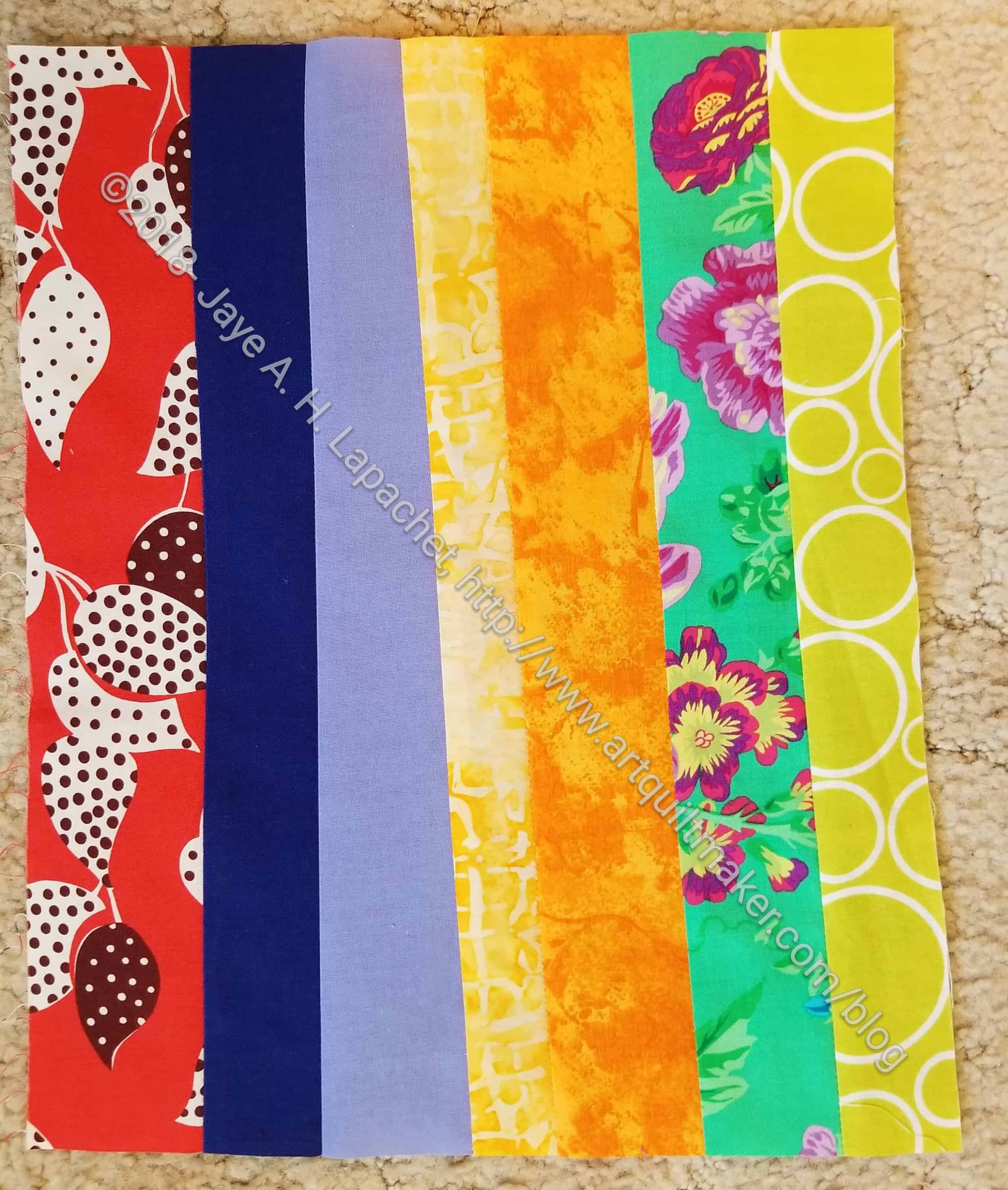
The one above looks like a Japanese stationery store or a bag of sweets or a girl’s party when she is just getting out of the pink stage.

ColorPlay: Bar n.8
ColorPlay: Bar n.8

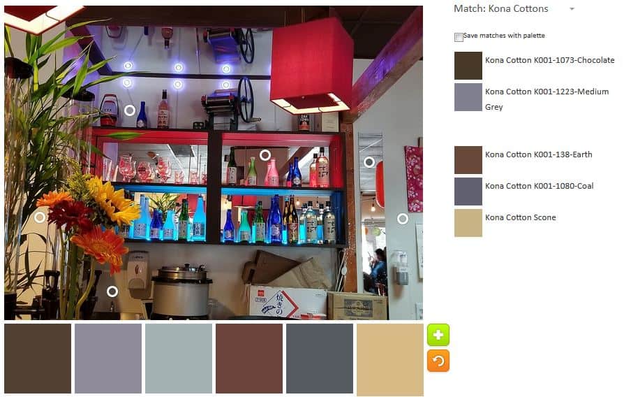
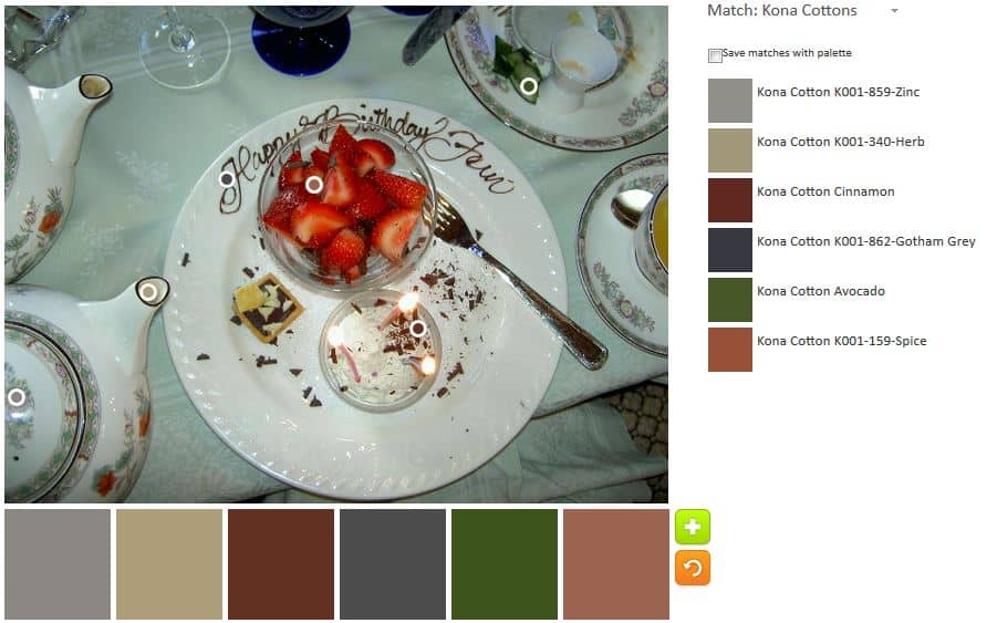
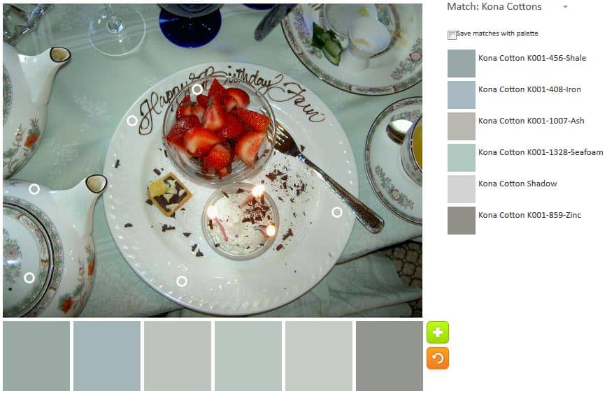
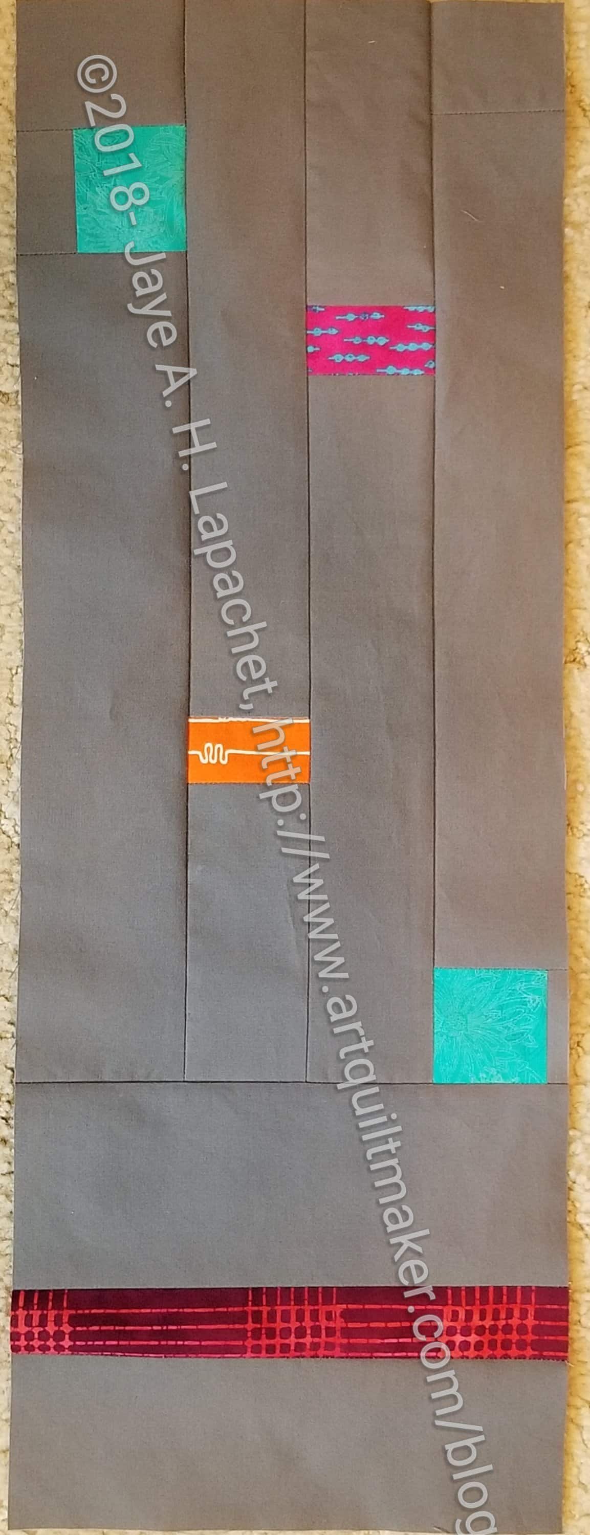
I thought I had better create a palette of neutrals. I know there are some of you out there who love neutrals (well done they can be great). I think this one is much more interesting than some I have seen. I won’t make a quilt – or anything – from the colors, though.
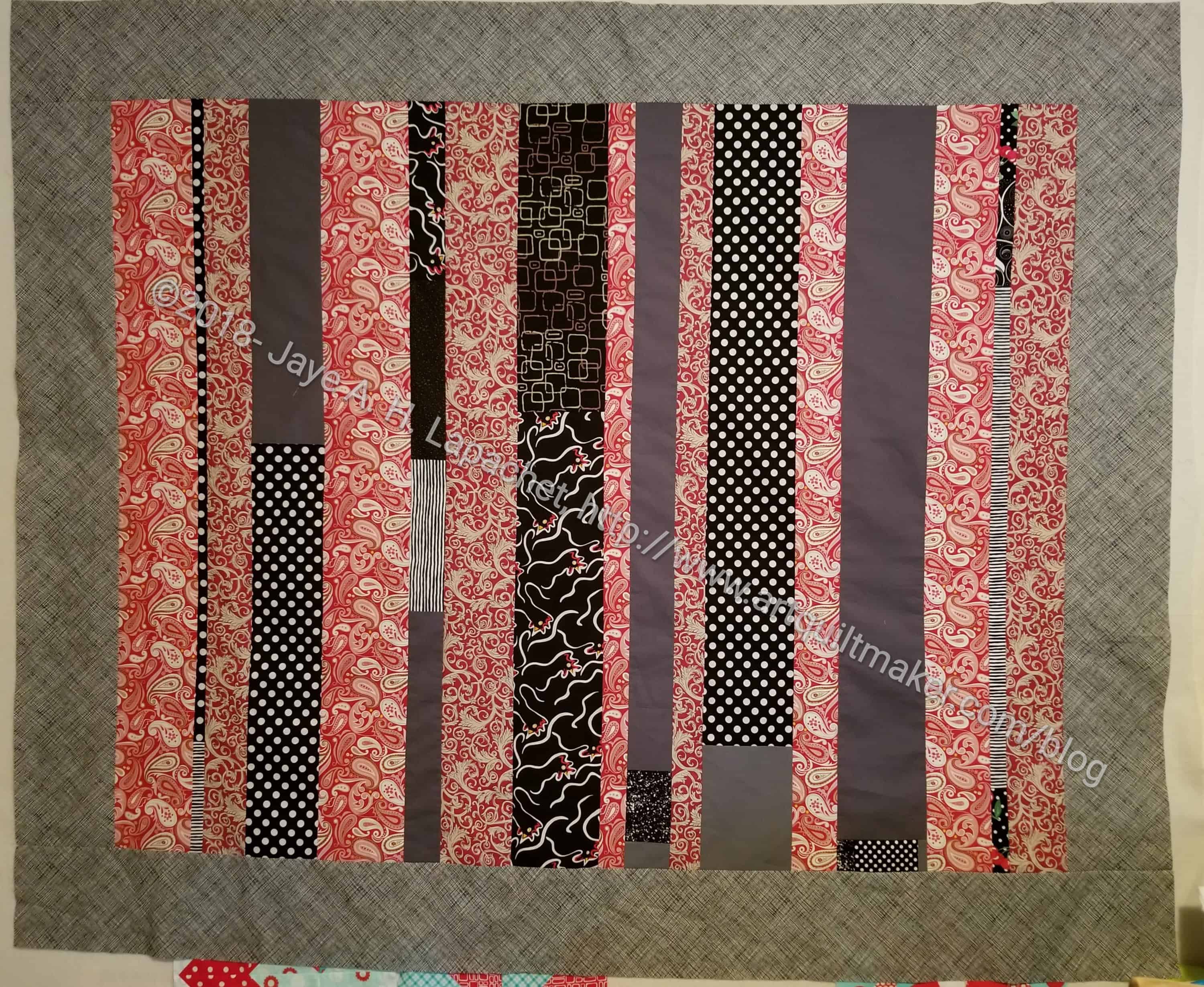
What will you make?

I use the Palette Builder Tool on the Play-Crafts site. Thanks to Anne Sullivan for making it available.

ColorPlay: Afternoon Tea

Afternoon Tea: September 2004

I came across this photo as I was perusing possible ColorPlay photos. In 2004 I went to afternoon tea at the Ritz with my mom, grandmother and mother-in-law. It was nominally for my grandmother’s birthday and one of the first times she had come to see me.

This was not a great photo choice as the colors aren’t the tropical paradise I like.

ColorPlay: Afternoon Tea- default

The default is more colorful than I expected. There are lots of dull colors, but that reddish-brown, Paprika, isn’t terrible.

ColorPlay: Afternoon Tea- 1

I moved the bubbles around slightly and came up with a slightly brighter palette. I don’t think the colors go together that well, but the Pimento and Nightfall look pretty nice.

ColorPlay: Afternoon Tea- 2

Palette number 2 is where I gave in to neutrals. I didn’t want to do a monochromatic neutral palette out of the gate, but I admitted that most of the colors in the photo would be some kind of neutral.

ColorPlay: Afternoon Tea- 3

Palette number 3 is a slight variation of palette number 2. More and darker neutrals.

ColorPlay: Afternoon Tea- 4

The grey palette is my monochromatic attempt.

ColorPlay: Afternoon Tea- 5

I thought I would finish up with palette n.4, but then I saw a bit of yellow and wanted to use that in a palette. The first attempt at adding the yellow resulted in Kona Moss. For whatever weird technological issue, I couldn’t get close enough to the edge to capture the yellow. I tried again and Pickle based on the little pastry on the plate. I was going for scarlett from the strawberries, but ended up with Paprika again.

Let me know what you think of these palettes and if you make anything.

(L to R) MIL, Me, Mom, Grama

ColorPlay:Tile

ColorPlay: Tile - original
ColorPlay: Tile – original

I take walks at lunch and there is a lot of construction going on around my office, which means I can’t walk the same way every day. I also don’t know the neighborhood very well and I walk on different streets every day, so I see different things every day.

ColorPlay: Tile-default

I thought about cropping out that beige brick, but, frankly, I was too lazy. It is interesting how it came out in the default palette. The default goes for neutrals again. Two of the colors in the default palette are neutrals! That is crazy!

ColorPlay: Time -n.1

I went sort of random for the first palette. I am not sure that red works really well.

ColorPlay: Tile -n.2

This is my monochromatic palette. I like the variety of turquoises in this palette.

ColorPlay: Tile -n.3

I did another monochromatic palette – this time in green. I think combining palette two and three might be interesting.

ColorPlay: Tile-n.4
ColorPlay: Tile-n.4

The fourth palette is completely random. I tried to make one that was completely different and used different colors than showed up in some of the other palettes.

ColorPlay: Tile -n.5

I had to do one more mostly turquoise palette. i wanted to make it different than n.2, but there are some similarities.

What is your favorite?


Donation Blocks

Outside of the Sisters Retreat, I have had very little time to sew. We have a lot of house stuff to do and we can only do it all on the weekends. None of it involves a sewing machine. :(.

Saturday, we had a party to attend, but I a had time between a haircut and making food for the party to sew a little. I also had almost all day on Sunday, so I got a bit of work done. It was awesome.

I worked on finishing the Ends Donation Quilt n.5, but I also worked on some donation blocks.  Since I haven’t had much time to sew I also haven’t had much time to make donation blocks. I’ll have some time before the next meeting to get a few more finished.

I made the black with the leftover black scraps from the back of the Ends n.5 Donation back. I used the greys as the alternate and I know that isn’t very popular, but it is a good way to make some other people push their own envelopes.

I think I’ll use the aqua block for part of another Spiky Stars donation quilt.

Ends Donation Quilt n.5

Ends donation quilt n.5

This process is going painfully slowly, but I took some time during the week to sew on the last two borders. I think the addition of borders looks good for this quilt. It kind of frames the strips and makes them look like a picture.

As I have said before, I am kind of thrilled that the leavings from backs can become something useful. Yes, I added some half yards of fabric to the dark grey and black leavings. I was going to donate that fabric anyway, so it is a win overall.

I can’t believe I have done five of these quilts so far. There are probably more in my future. You can see them all:

Creative Spark #28: Give it Away

“We are often able to rise to our highest self if it is for someone else” (pg.118). This quote had a profound effect on me this week I worked very hard for the past month on a work project. In the past week, I spent every spare work moment on this project. I gave it my all. The effect was that my personal life was a bit of a mess. Two appointments snuck up on me. I paid the YM’s tuition at the last minute. I didn’t plan for a dish we needed to make for a party tomorrow.

The point of this chapter is that we go all out when we have something due for someone else. We let ourselves go. I think this has resulted in the self-care movement, which is good IMO, but also promotes the feeling of guilt in many of us.

We are, inherently, creative people. Before you even think that you are not creative, I will remind you about all of the creative ways you coerce…uh…encourage your children and pets to go outside, eat their dinner and a million other things. While you may not have picked out fabric for a new quilt, you are being creative.

Combine these creative problem solving skills with your making- your quiltmaking, knitting, whatever art or craft – and give the product away. I find yarn I like, knit a scarf and give it to my mom for the gift baskets her church makes for a local domestic violence organization. I get to knit, someone gets a gift and I don’t have a thousand scarves laying around my house.

Carrie talks about getting to yes. She points out that ‘no’ is about the parent. Extrapolating out, since I no longer have young children at home, how can we use creative problem solving to get to yes in our making? How can YOU have time for a few seams or to see a few inches of binding?

I am not going to recommend that you sit down for 15 minutes a day and just do it. That doesn’t work for me. There are too many things that people want me to do for just 15 minutes a day and none of them are sitting with my DH watching TV. ?

Figure out what works for you. Also, recognize the creativity you already employ in your life and celebrate that.

You can see the last post on this topic from a few weeks ago.

Nota bene: we are working through Carrie Bloomston’s book, The Little Spark. Buy it. Support the artist. Play along. There is much more to each spark than what I am writing. The original chapters will help you. Go buy Carrie Bloomston’s book, so you get the full benefit of her fabulousness! You can see my book review, which is what started this flight of fancy.

Color My Quilt Results

Joelle's Color My Quilt
Joelle’s Color My Quilt

Some time ago, I wrote about the shard I made for Joelle. Last Saturday I went to the guild  meeting and Joelle brought her finished quilt to the meeting.

This is a fantastic piece. I love the way Joelle pieced the shards together. Also, the colors go really well together.

Joelle's Color My Quilt
Joelle’s Color My Quilt

My shard is on the top towards the left next to the circle piece. Joelle said she cut the shards up in a lot of cases. You really have to do it to make the quilt fit together. I think mine survived intact. It is so exciting to see the quilts finished. I hope Joelle enters the quilt into a show.

ColorPlay: Crater Lake

Crater Lake, 2018 (original)

Someone really should try to make dresses out of the blue that is this lake. It is an unbelievable color.

ColorPlay: Crater Lake-default

Default: look! not all neutrals, though the tool couldn’t avoid neutrals completely.

ColorPlay: Crater Lake- n.1

Palette 1: monochromatic. I worked hard to make sure the blues were different. One good thing about Kona is they have a lot of shades and tones.

ColorPlay: Crater Lake- n.2

Palette 2: also monochromatic. There are so many different blues in this photo.

ColorPlay: Crater Lake- n.4

Palette 4: cools and neutrals. I was going for an all green palette, but couldn’t quite make it.

What will you make?

June Donation Blocks

Yes, I am behind in reporting on June. Life is busy and I am heading to a week long quilt retreat with Friend Julie, so I am preparing to have a whole bunch of posts for you to peruse.

It is fun to see all the different blocks I make. I like remembering where the fabric came from and what I used it for.

Donation Blocks turned in at June meeting

The group of blocks are the blocks I turned in at the June meeting. I know you have seen all of these blocks before, but I thought it would be great to show all of them together.

My donation block production has slowed as my work schedule has ramped up. I am spending less time at the machine, which affects my production. Still, I have money, which is nice. Don’t worry, I am not giving up, but other guild members will have to step up and fill in the gaps.ell

ColorPlay: Modern Building

ColorPlay: Modern Building - Original
ColorPlay: Modern Building – Original

There is a lot of building going on near my office. Barely moving my head, I can see at least 5 cranes when I get off the train without having to turn my head. The sound of jackhammers, hammering and other construction noises fill the air all day.

I walk around at lunch trying to get to know the neighborhood. It is hard, because it is changing rapidly. The other day I across this building. I love the windows and thought it would be great for this exercise. It is so whimsical.

ColorPlay: Modern Building-default

I wanted to stop at this default palette. The blues are great, even without any turquoise and the Pewter makes a nice background. It is almost a perfect palette. Looking at it, however, I see that that green wasn’t touched or the orange.

ColorPlay: Modern Building 2

I had to do another monochromatic palette to see how many blues I could include. I moved the circles, but some of the colors chosen are the same as the previous palette.

I admit that it isn’t quite monchromatic, but it is analgous. That green with the brighter blues looks really good.

ColorPlay: Modern Building-2

I couldn’t avoid the orange. It is clearly some kind of construction fencing, which are, traditionally, that super bright orange. No matter where I moved the circles the brightest I could get was the Mango. I decided to embrace the vagaries of the computer and see what happened. This isn’t a palette I would have put together myself, but I think it works. It is definitely interesting.

ColorPlay: Modern Building-3

I liked the Mango and wanted to keep it in. I also liked the green and turquoise, so I kept those. The others aren’t as successful this time. All extra grey, even the Graphite, which my eyes tell me is actually blue.

Let me know what you think of these palettes and if you make anything.


Creative Spark #27: Share Your Work

“Artist Marcel Duchamp believed that his work wasn’t finished until it was seen by people–that the viewing completed the work” (pg.113).

This is an interesting quote and it makes me think. I always show my quilts, at least to the guild, before they go wherever their final destination ends up. As much as possible, I try to show them in shows. I like to win, but I am not daunted by not winning.

Once my quilt Spiky Stars won Judge’s Choice at the Marin Needle Arts Guild show (now defunct). I was VERY excited and stood unobtrusively near my quilt for quite awhile listening to people talk about it. Not all of the comments were nice, but the ones that were warmed my heart.

Ms. Bloomston advocates selling work via a ‘lemonade stand’ and by that she means a low entry overhead venue such as a local craft fair or farmers’ market. She also mentions online retail. I am not interested in making much of an effort to sell my work. I have had offers, but they have been laughably low and not worth me not having the quilt. I make quilts for the pleasure of making them.

Carrie also mentions sharing via social media. I think this is important, but I think live viewings are more important. I do both, as you know. Use social media for yourself. Don’t expect the world to flock to your site or account. If  they do, it is an added bonus.

She give some tips for showing work as well, which is a nice bonus.

Go forth and share!

You can see the last post on this topic from a few weeks ago.

Nota bene: we are working through Carrie Bloomston’s book, The Little Spark. Buy it. Support the artist. Play along. There is much more to each spark than what I am writing. The original chapters will help you. Go buy Carrie Bloomston’s book, so you get the full benefit of her fabulousness! You can see my book review, which is what started this flight of fancy.

Color My Quilt – Ruth

Ruth's Color My Quilt
Ruth’s Color My Quilt

Ruth gave out her sheet of instructions for her Color My Quilt at the last meeting and I got right down to business. I was going for sparks of color on a dark-ish background.

I may not be quite done with the piece. I wanted all the color contained so I am contemplating that plum/burgundy strip. I have a few weeks to decide.

Again, all of these were from my scrap pile or bins.

Color My Quilt – Leeann

As I have probably mentioned 300 times, I was super behind on the Color My Quilt project. I worked through the 5 I had to do methodically.  I didn’t do anything crazy and was able to make some progress.

Leann's Color My Quilt Shard - June 2018
Leann’s Color My Quilt Shard – June 2018

Leeann had a landscape theme and I just copied the colors into a big chunk.

I am not sure if this is what she wanted, but it will work in some capacity. She can cut it up to fill in spaces, though I wonder if people actually feel ok about cutting up the shards?

I should have mentioned earlier in the week a reminder about the parameters of Color My Quilt. This project started last year with Karen’s idea. It is a guild challenge where one person per month volunteers to receive shards. The selected person provides a sheet with an idea, colors, poetry, a quote – basically some kind of inspiration to willing participants. The participants make a shard. It can be a block or a chunk of scraps in the right colors or almost anything. I think it is interesting to see what the chunks look like together. So far only one quilt has been made. I am curious to see if others get made.

Color My Quilt – Helen’s Rainbow

Helen's Rainbow
Helen’s Rainbow

Yes, this is Color My Quilt week.

I wasn’t sure what to do with Helen’s prompt. I thought about it and considered different options for a long time. Finally, I gave up and decided not to do it.

I think that was what I needed to do, because, shortly thereafter, I thought about ROYGBIV. I decided that making a long strip in color order would be the thing to do. It would fulfill Helen’s wish and it would be consistent with my effort to provide a different shape for people to work with.

I just pulled pieces out of my scrap bin and that seemed to work well.