Creative Spark #12: Go Window Shopping

“Retail, in our capitalist society, has cornered the market on creativity in so many ways” (pg.53). I have to say that the opening line makes me happy and sad. Sad, because retail=shopping=spending money, sometimes unnecessarily. Happy, because creative people work in retail who create beautiful environments that are free to peruse. We have to just keep a tight hold on handbags and wallets. The opening line is a double edged sword throughout the discussion of this topic.

ColorPlay: Tableware original

I always look into windows as I go past, especially in areas where there are small shops rather than chains. Some chains have great displays, but other all look the same.

The photo, left, used in a recent ColorPlay post, is an example of a great display I saw in Graz. In a way, it is an interesting example of repetition with variety. It is a display I enjoy looking at a fantasizing about buying and using at my house.

Additionally, “[t]he creative aspect of consumerism is that we are all curating our own story through the things we buy” (pg.53). While we can all curate our own story, stories from others creep in. Great Grandmother’s sewing cabinet has sentimental value. The antimacassars lovingly tatted by Aunt Margaret take up space in the linen cupboard. If you have someone with whom you have merged your life, their stories take up visual space as well. Also, we, usually, can’t buy everything in a line, so we have to fit in bits and pieces with the story we have already been creating at home. Sometimes, we get something home and it doesn’t fit at all with the story we have previously created. Then we have a choice of changing out everything or adding in an incongruous piece.

I find this to be true with fabrics. I love French General, but the colors don’t fit with my other fabrics. I get some of their dusky rose red home and find it looks dull and unappealing. I think this is why people like to buy lines of fabric. They know everything would go together.

I really like just wandering around a new city, looking in windows, checking out the various streets, photographing facades of buildings new to me.

Regardless, looking is free. Look, take a photo and be inspired by those who get paid to create beautiful environments. Commercial things I like to look at:

  • signs
  • window displays
  • whole display ‘rooms’ of furniture
  • wrapping paper
  • gift bags
  • repetition of items – like jars of candy, rolls of ribbon

I can’t use inspiration of the things around me if I don’t see them. “Being creative means wandering through your life like an openhearted warrior, paying attention to the world around you.” (pg.54).

Nota bene: we are working through Carrie Bloomston’s book, The Little Spark. Buy it. Support the artist. There is a lot more to each spark than what I am writing and the original chapters will help you. Go buy Carrie Bloomston’s book, so you get the full benefit of her fabulousness! You can see my book review, which is what started this flight of fancy.

You can find the last spark on the blog a few weeks ago.
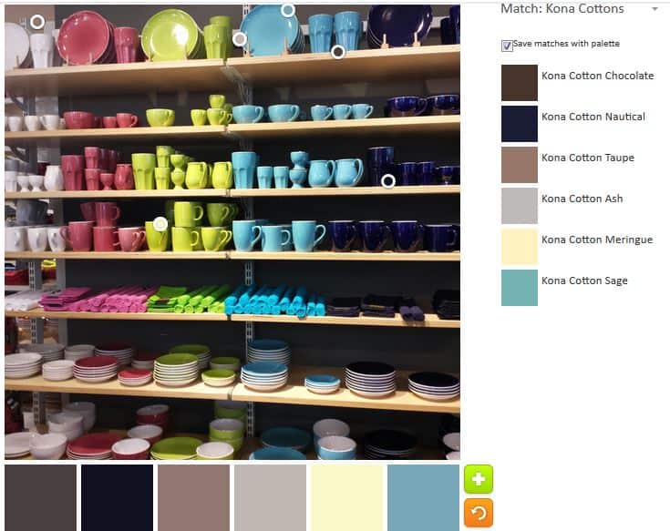
ColorPlay: Tableware

ColorPlay: Tableware original

I am working on the next Creative Spark, but am not quite finished. I thought I would give you a preview with today’s ColorPlay Inspiration photo.

ColorPlay: Tableware default

Once again the default was a disappointment. More neutrals. This is a colorful photo and all I get are neutrals.

I wonder what the algorithm has against colors? Of course, it could be that the algorithm clusters together towards the top automatically. I noticed that the circles don’t go towards the bottom in the default.

ColorPlay: Tableware 2

The second option was much better. Of course, I moved the circles around and picked the colors that I like and moved the circles around and came up with a very nice palette. I want to just stop and rest on my laurels.

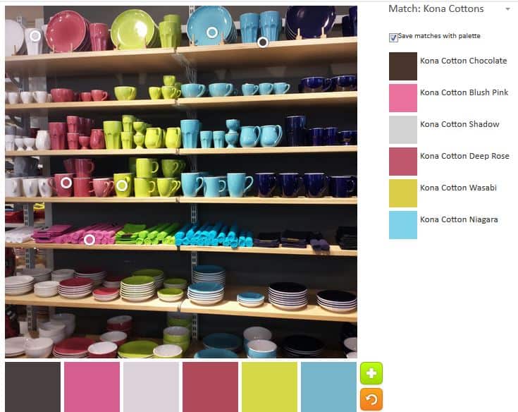
Look at those pinks and the turquoise! The Kona Wasabi is an added bonus.

ColorPlay: Tableware 3

With the third palette, I tried to get different shades and tones of the same hues as in the second palette. I was moderately successful.

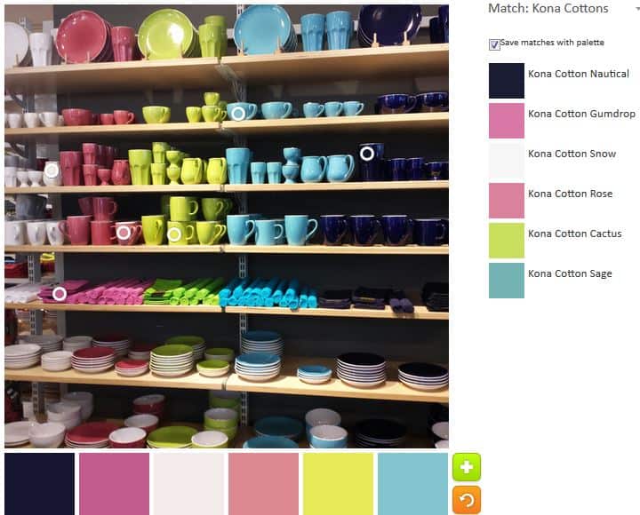
The Sage and Cactus are a good combination, though the Cactus looks a bit yellow in the lower part of the picture. I also like the combination of Deep Rose, shadow and Blush Pink. I like the three of them together.

ColorPlay: Tableware 4

I made some minor adjustments to the fourth palette. The colors are a little dustier than I normally like, but I think this might be my favorite palette. the Regatta blue is a very good addition.

It occurs to me that I could make a palette out of many or all of the colors from all of these palettes.

The Palette Builder is a great and fun tool. Try it out! Let me know if you make anything with any of these palettes.

Creative Spark #11: Jar of Markers

The picture on the title page of this chapter speak to me in a way that is hard to explain. The picture is of two full pottery jars, one of felt markers and one of colored pencils. The jars are full and the variety of each says that the person who sits near them has whatever they need to draw or color whatever they want to draw or color. Carrie Bloomston calls them ‘artful bouquets’ (pg.48), which I think is a fitting description.

Bloomston writes “No matter if your creative passion is playing guitar or glassblowing, you need a jar of markets or colored pencils on your dining table (or some other table that you sit at regularly)…..They sit in the center of the dining table where we eat every day, three times a day…., like an artful bouquet of creative possibility.” (pg.49) I adore this idea. I am sad I didn’t think of it when the YM was small. We had pens, felt tip markers, paint and paper galore, but we always had to get it out. There was never a moment of whim that could be fulfilled in an instant. “No matter what your creative fantasy is, you need ready access to writing, doodling, planning, and sketching tools. Creativity can strike at any moment, and you want to be ready for it when it does.” (pg.49)

She goes on to say that creative ideas are ephemeral and flit away as easily as they came. I am sure you have seen shower noteboards, which must mean that that rote activity is what people need to churn out ideas. I am amazed that office blocks don’t have shower cubicles yet. “the jar of pencils is a butterfly net for those fleeting thoughts and ideas. If you can capture them in their pure, raw state, you have the makings of a new idea, a new beginning.” (pg.49)

Carrie tells us that the jar of pens is an emblem, but it is also a reminder…”they “will quietly call to you, gently reminding you to listen to the call of your heart.” (pg.49). She shows reminders in other people’s studios: rolls of fabric, a bowl of embroidery floss.

I find that my cell phone camera is a wonderful tool, not for the pictures that it takes but for the reminder that I can take pictures and, therefore, must look at things I see in my daily travels in order to notice them so I could photograph them. Although Instagram can be a little bit of a competition, it is a tool that can be used to post reminders, if that works for you. Scrolling through the photos always reminds me to go and be creative, if for no other reason than so I can show something.

As with other chapters/sparks, this one has a to do list of things we must do to remind us to be creative.

Nota bene: we are working through Carrie Bloomston’s book, The Little Spark. Buy it. Support the artist. There is a lot more to each spark than what I am writing and the original chapters will help you. Go buy Carrie Bloomston’s book, so you get the full benefit of her fabulousness! You can see my book review, which is what started this flight of fancy.

You can find the last spark on the blog about a month ago.
ColorPlay Pitcher

Grass Valley Pitcher

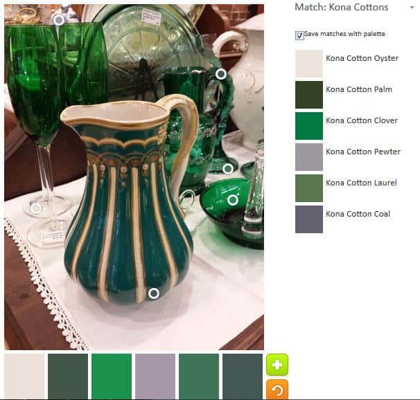
I saw this pitcher at an antique store in Grass Valley. Along with the green glass in the background, I thought it would make an interesting ColorPlay. There still aren’t very many colors, but the greens are varied, which makes them somewhat interesting.

I have no idea what time period this pitcher is from, but I imagine it is the pitcher from a wash basin set. I didn’t see the basin anywhere, but I also didn’t look very hard.

ColorPlay March 31-default

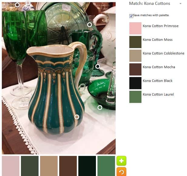
I settled down with the Palette Builder by Play-Crafts and got to work. The first palette, the default, was predictably neutral.

It is a mystery to me how so little of this palette can be green. I know our eyes are much more finely tuned than any kind of technology, but still. It is so strange how these default palettes gravitate towards the neutral.

Onward.

ColorPlay March 31 n.1

I had to try and get some joy with those greens. I was really curious to know what the various greens were in Quiltlandia.

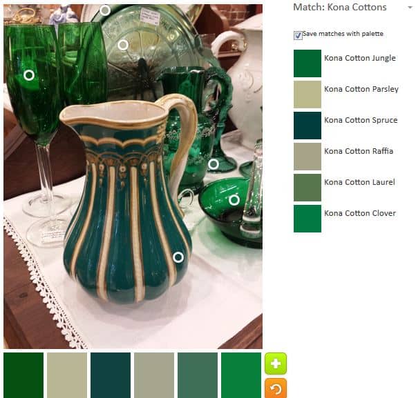
In the second palette, you can see that I moved the circles around to every green I possibly could.

My palette is pretty green and I am pretty happy with the choices. I think the Kona Spruce does a pretty good rendition of the green of the pitcher.

ColorPlay March 31 n.2

I decided to be ornery and see what kind of palette I could come up with that had no green. Predictably (or just my luck): neutrals.

This is actually a pretty sophisticated palette. It would make a great palette for a house you wanted to sell. I can see a realtor choosing this palette for a house s/he was about to list. I think the Kona Pearl Pink and the Kona Ivory keep it from being too neutral.

ColorPlay March31 n.3

That was fun, but I decided to get back to the greens. I wasn’t very successful, because there are only so many spaces in the photo and a limited number of greens. I came up with a slightly – very slightly – different palette from the one above.

There is some overlap in the greens, but they are in different places in the picture. This is about the time I start thinking I am getting towards the end of the exercise.

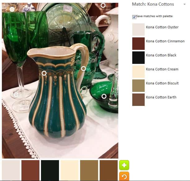
Next, I decided to try to capture that gold. It was an interesting challenge that resulted in more neutrals.

That Kona Cinnamon is interesting. I am not sure I have seen it before. I couldn’t get a good white, but I was able to tease out Kona Cotton Cream, another nice pinky shade, and Kona Oyster, which tends towards the greys.

I would never make a quilt with these colors, but it is interesting.

ColorPlay March 31 n.5

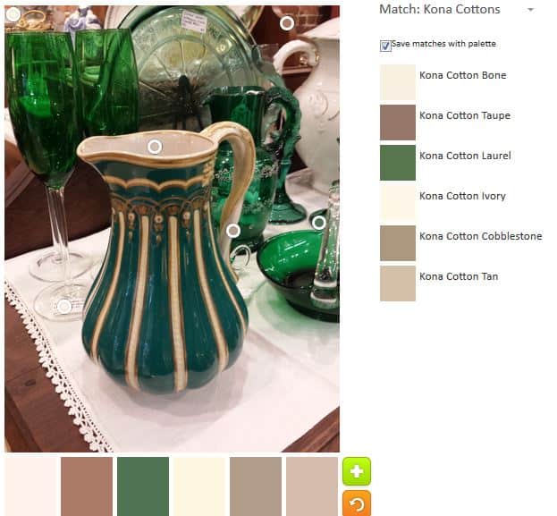
Finally, more neutrals. What else is there to say?

This palette tends towards the grey. I think it also might reflect the truest palette, if comparing the photograph and the palette with a quick look.

Let me know if you make anything with any of these palettes.


ColorPlay Ferry Building

ColorPlay March - original
ColorPlay March – original

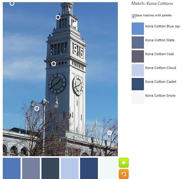
For a number of years (3-4), I took a picture of the Ferry Building in SF every day as I went to work. I had read an article about a guy who took a photograph of the same NY shop every day around the same time. Somewhere in the article the author (or, perhaps, the photographer) commented on the subtle differences that can me seen in such a project.

This sort of subtle project appealed to me. While I took photos from different angles, there are still differences. Periodically, when I am downtown near the Ferry Building, I will take a new photo for old times sake. Photos to use for my ColoPlay posts are getting thin so it seemed like a good time to dig out a Ferry Building photo.

ColorPlay March n.2
ColorPlay March n.2

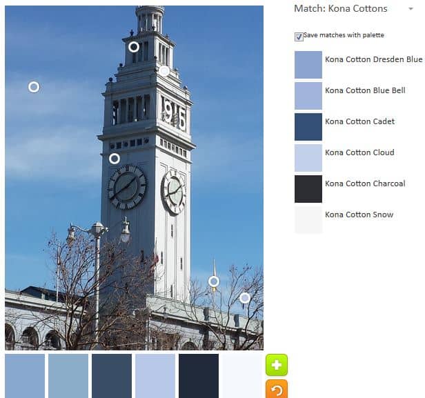
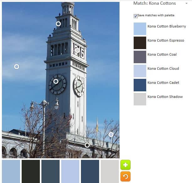
The default effort actually turned out quite nicely. No nasty or ugly neutrals. I got a palette that would look great for a boy. I like the addition of Kona Blue Jay. Not because of the same, but because I think it reflects the color of the sky almost perfectly.

ColorPlay March n.3
ColorPlay March n.3

I do like the lighter blues shown in the example above.

ColorPlay March n.4
ColorPlay March n.4

The above palette tends more towards the greys and is very San Francisco-like. The Kona Shadow is particularly good for representing fog.

The photo really doesn’t have enough color data points to get very many palettes. All of them seem to have a variation on the same group of hues.

Try out the Palette Builder by Play-Crafts to make your own palettes.

ColorPlay Workroom

Some things take time. I know that in our house, if something comes in it is difficult to dislodge it. This has a number of effects. Nothing temporary may come in. Temporary has no meaning in our house, so only things that we want to keep forever may come in.

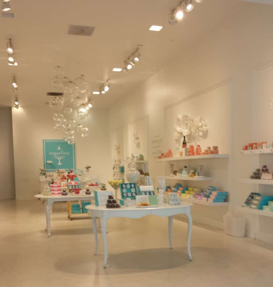
As I work towards my ideal workroom, I have to work with this stricture. Thus when I walked by a new shop downtown and saw the sweets shop with the look and feel I wanted, I had to take a photo. Knowing the look and feel I want helps to weed out anything that doesn’t fit.


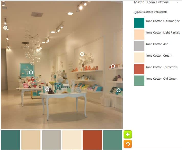
ColorPlay: Dream Workroom original

I decided to use this photo as our ColorPlay this week. What is the dominant color you see? And the secondary?

For me, I see a white domination with a turquoise, or, perhaps pink (salmon) secondary color.

ColorPlay: Dream Workroom default

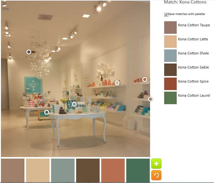
I do NOT see a preponderance of neutrals! The above is the default palette. Are you kidding me? No white. No turquoise. This is a big failure to me. If we were matching up palettes with original pictures, nobody would pick this palette to go with my picture. Can you tell I am miffed?

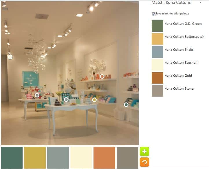
ColorPlay March 17 first attempt

My first attempt to stack the deck is not much better. The colors are slightly nicer, but still no white, pink or turquoise. I know this is because of the shadows, but I am still annoyed.

ColorPlay March 17, 2d attempt

My second attempt is, at least, slightly more palatable (HA!). The colors are a bit lighter and a bit fresher. Still no white or turquoise.

ColorPlay March 17 n.5

Despite the fact that the Kona Emerald doesn’t look anything like any emeralds I have seen, this palette is slightly better. At least there is a pinky-red included.


I absolutely will not use any of these palettes for my workroom. If you haven’t tried the Palette Builder by Play-Crafts, go and try it — after you leave a comment ;-).

Creative Spark #10: Break Your Own Rules

The title should make a post unnecessary, but I am going to write anyway.

“You must disrupt your normal patterns so you can see the world with new eyes” (pg.45)

I don’t know about you, but I have a routine. Several, actually. I have a routine to get my day started, though it varies depending on the day. I have an evening routine and a work routine. If someone were to look at the week overall, they would see a larger routine overlaid on top of these other, daily, routines.

I am not sure about disrupting these patterns right at the moment, but my patterns for working on my quilts can, and, according to Bloomston, should be disrupted. One of the things Bloomston learned in her Drawing 101 class was to “seek surprises” (pg.45). I took down my design wall in order to sell it. The sale didn’t go through and I haven’t put it back up yet. It is a hindrance, but the surprising thing is that I am finding I work on more projects simultaneously than I did with the design wall up.

Huh.

Don’t get me wrong, I need my design wall. It is a vital tool, but at the stage I am in with my various projects, I can do without it.

Seeking surprises could mean using different fabrics. My SIL did this recently. She made a GREAT quilt, which is totally not in her colors.

There is a section in the chapter where Bloomston relates her experience learning to see art or a piece of art on which she was working ina  different way. “We dove beneath expectation, convention, intention, and ego. We spoke about art as liberation from conscious thought. We discussed abstraction and pure form-pure mark making” (pg.46). I get a new view when I hear people talk about their perceptions of art.

“…seek the unexpected” (pg.46). This is the best advice.

There is another worksheet that is all about doing the unexpected. Do the unexpected. What does that mean for you?

Nota bene: we are working through Carrie Bloomston’s book, The Little Spark. Buy it. There is a lot more to each spark than what I am writing and the original chapters will help you. Go buy Carrie Bloomston’s book, so you get the full benefit of the fabulousness! You can see my book review, which is what started this flight of fancy.

You can find the last spark on the blog about a month ago.
ColorPlay Hawaii

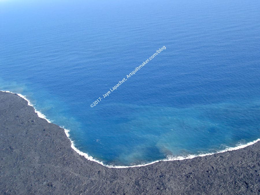
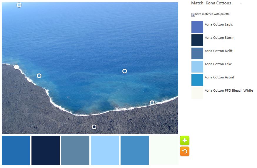
Available photos to use for the ColorPlay are feeling thin on the ground. I dug deep and chose a photo from our trip to Hawaii a few years ago and took it to the Palette Builder for some play. I can certainly get my blue fix from Hawaii, right?

ColorPlay March 3
ColorPlay March 3

The original photo is quite simple. I would guess not that interesting.

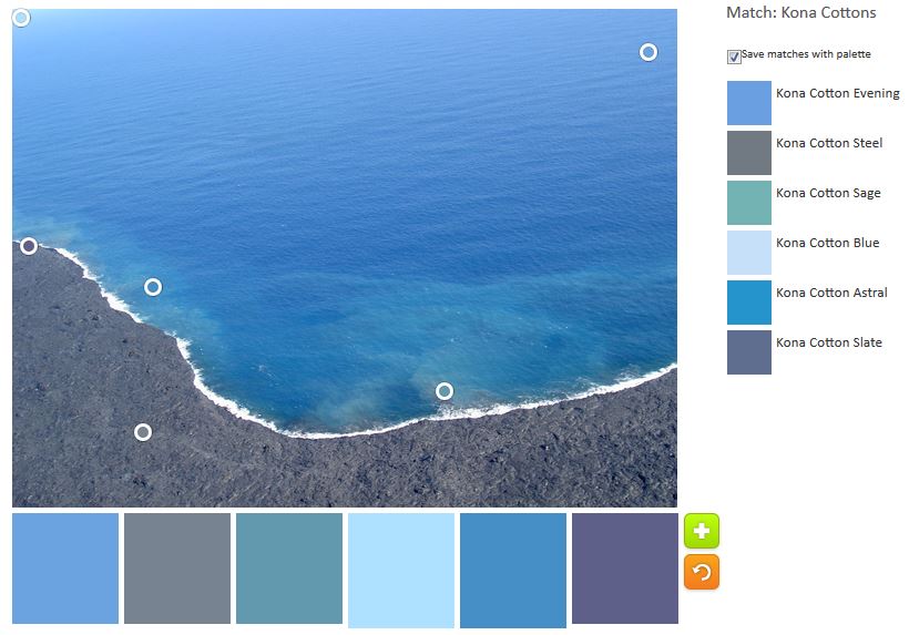
ColorPlay March 3 n.1

However, I found I was wrong. Even the default palette is interesting. It is a nice array of blues and even the grey of the lava fits right in.

ColorPlay March n.2
ColorPlay March n.2

There is not a lot to do with a simple photo primarily in monochromatic colors. Still, I made an effort and came up with a different palette that is similar, but a little different.

ColorPlay March 3 n.3

The third palette is only a slight variation. Some of the choices repeat, but the overall look is different than the other two.

I am only doing three today, because of the simplicity of the photo. All three give an excellent overview of the Kona blue variations available. As usual, let me know if you make anything from one of these palettes.


ColorPlay: Tulips

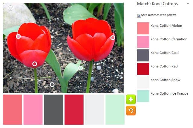
ColorPlay: Tulips original

Tulips are, possibly, my favorite flower. I am pretty partial to spring flowers, such as daffodils, hyacinth and narcissus, so it is hard to say. One reason I like them is that florists don’t tend to pair tulips with baby’s breath. I sincerely dislike baby’s breath. I had white tulips for my wedding bouquet and DH often gives me white tulips when he wants to give me flowers. They are also delicate and simple.

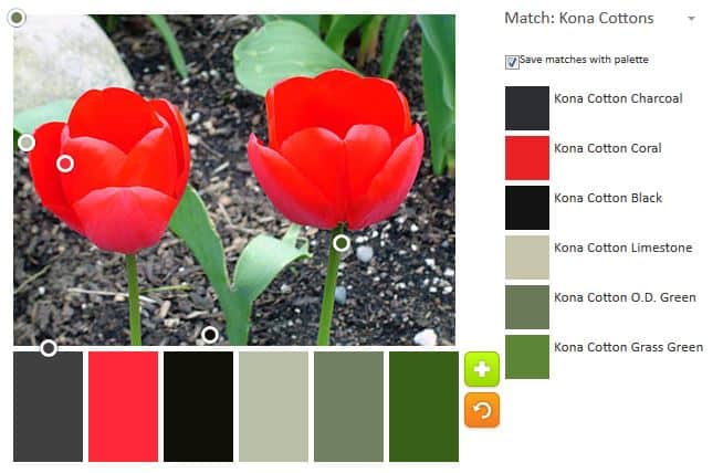
Above is the original image I uploaded to the Playcrafts Palette Builder tool. I can’t remember where I took it.

The first palette is appealing. I like the Coral and Black combination with the other neutrals included.

ColorPlay Feb 24 n.3

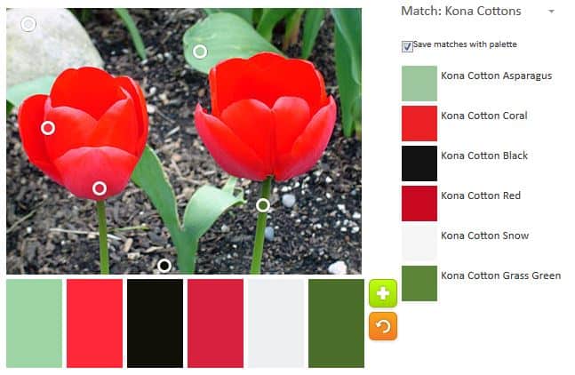
Since I have to mess around with the palettes, I moved the little circles and came up with a slightly brighter palette. I love the addition of Kona Red and the Kona Snow to this option.

ColorPlay Feb 24 n.4

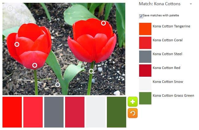
Fiddling further allowed me to add another warm hue, Kona Tangerine to the mix. This grouping is getting quite warm.

ColorPlay Feb 24 n.5

The Kona Snow and the Kona Coal seemed to want to stick to the palette. This palette has no more greens, but includes an icy blue called Frappe.

ColorPlay Feb 24 n.6

This final palette is probably my favorite. I was excited to be able to move the circles in such a way as to add Kona Carnation. I have been using Aurifil 2479, a lovely carnation-like pink for another project, and loving it. It was so nice to see a similar hue show up in this palette.

Let me know if you make anything with these palettes. Thanks to Anne over at Play-crafts for her tool.

North Coast Inspiration pt.2

Misty scenery
Misty scenery

This post will make a lot more sense if you go and read part 1 first. That post has pretty pictures as well.

Down the street from the Humboldt Parlor Hall is the Clark Historical Museum. It is housed in an old Bank of Eureka/Crocker Bank building, which was purchased by Cecile Clark for her collection of items related to the area. The museum is small, but very well done. They had a special exhibit of 1960s fashion when we visited.

The museum also has one of the largest collections of Native American baskets in the US. I thought the designs on some of the baskets shared similarities with quiltmaking.

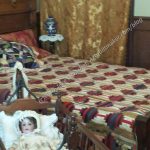
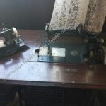
The museum also had a suite of rooms depicting a Victorian parlor and bedroom. Several vintage sewing machines were displayed along with a couple of quilts – two crazy quilts and a beautiful log cabin. I am concerned about the scrunched up display of the crazy quilts and hope they are replicas.

Eureka is a very nice city and there is a lot to do, wonderful restaurants and many historical sites. It is well worth a trip.

Part 1

Bunny Hop Quilt Shop Review

Stitch Quilt Shop Review

Ocean Waves Quilt Shop Review (previous review, not 2017)

North Coast Inspiration

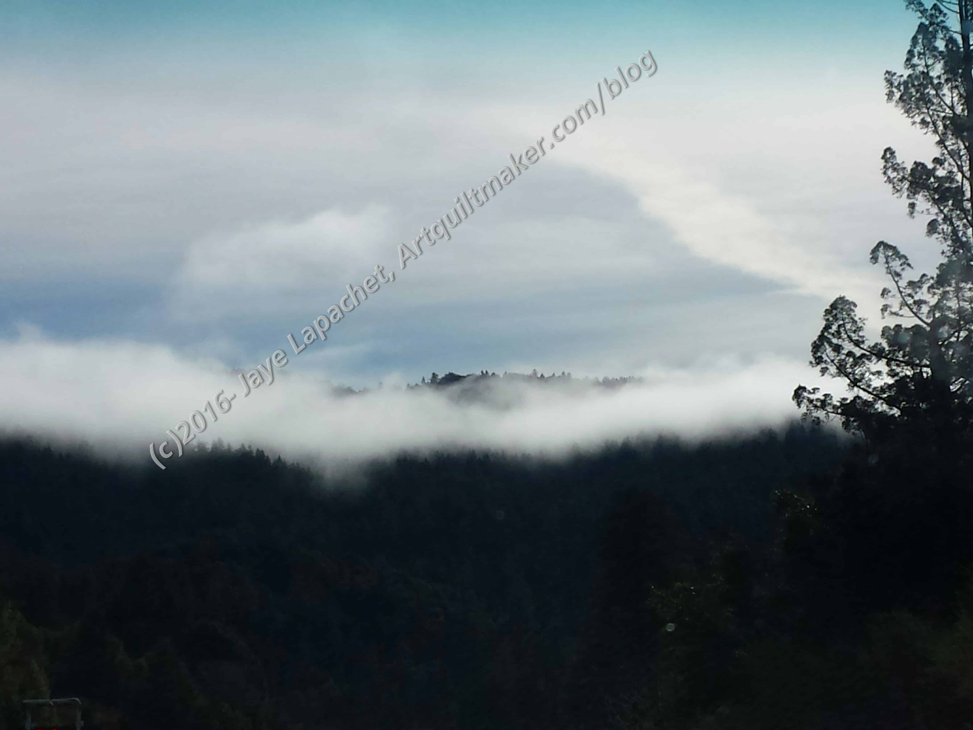
The trip did not rest on my visits to Stitch and Bunny Hop. Eureka and the surrounding is beautiful. I found it to be especially beautiful on this trip because we have had enough rain to make the hills green and everything seem clean and fresh. Aside from the quilt shops, there is a lot of history and they have done a nice job making the downtown appealing, so it is well worth a visit.

Watercolor Sky
Watercolor Sky

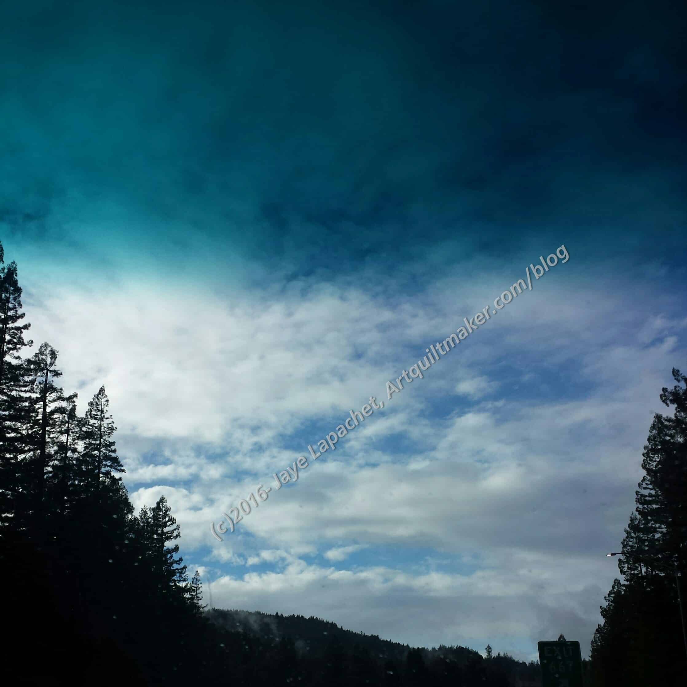
The drive up (about 6 hours) was beautiful after we crossed the Golden Gate Bridge with blue sky and green hills. We were pleased and a bit relieved to see some blue sky after the crazy hard rain we had on Thursday. We stopped in Willits for lunch and then it rained on and off the rest of the way to Fortuna. The rain clouds make for some beautiful sky photos.

I thought the blue of the sky in the first photo (right, above) looked like a particularly good watercolor.

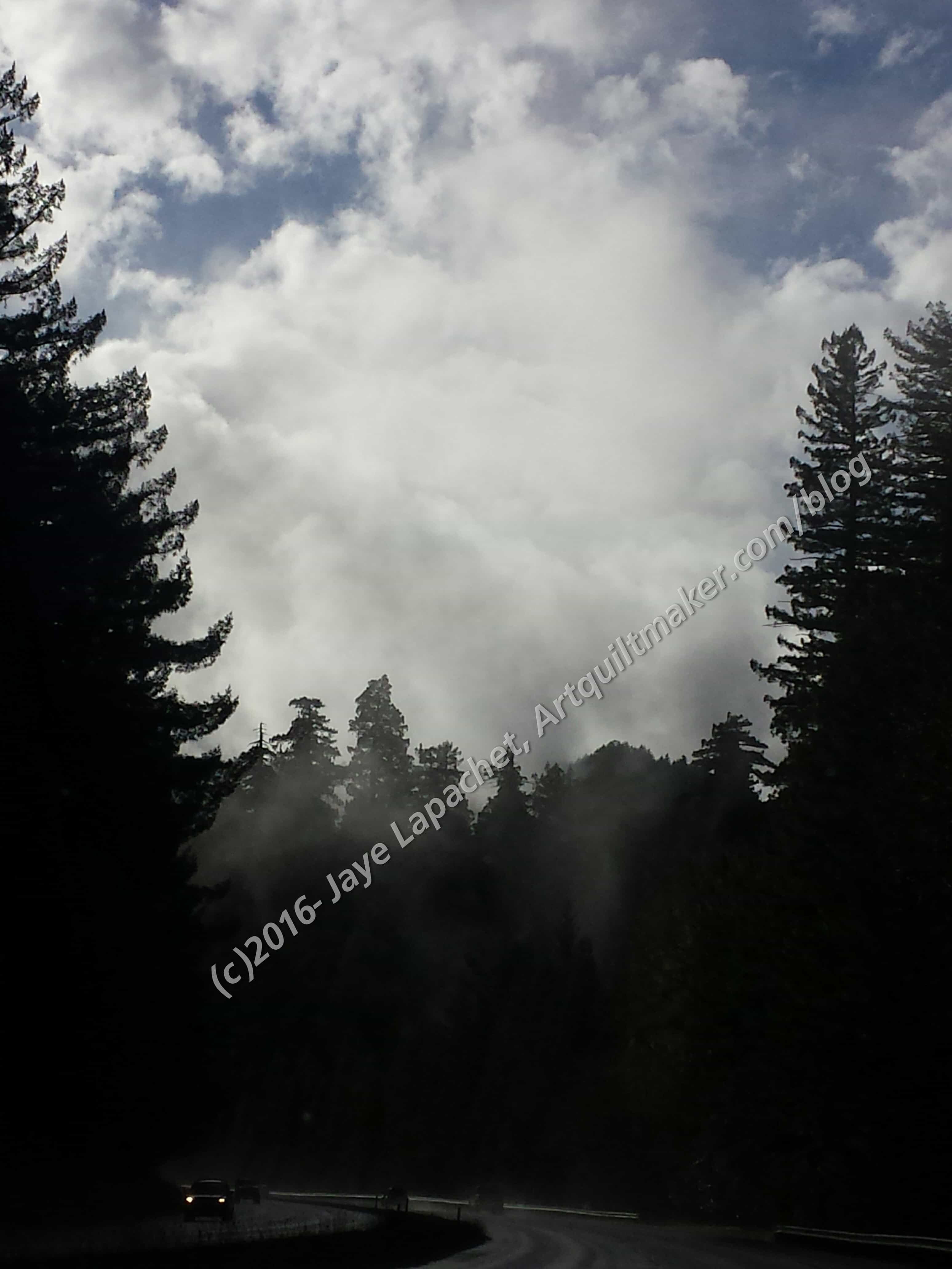
Trees and mist on Hwy 101

The area was known for logging at one time. There are tons of Redwoods that have grown back or been preserved. These trees with their mist also made for some nice views as well. As mentioned, the weather was rainy on Thursday at our house and the highway did not escape the pounding. there were a couple of places where we had to detour off the main highway to get around work being done.

On Saturday, DH dedicated Fire Station #6 on J Street. It is now a fire museum and the Friends are working on restoring the building and preserving fire equipment. It was a very nice ceremony, one of the best I have attended. Humboldt Parlor did a great job organizing the event and even had a TV reporter along side newspaper photographers.

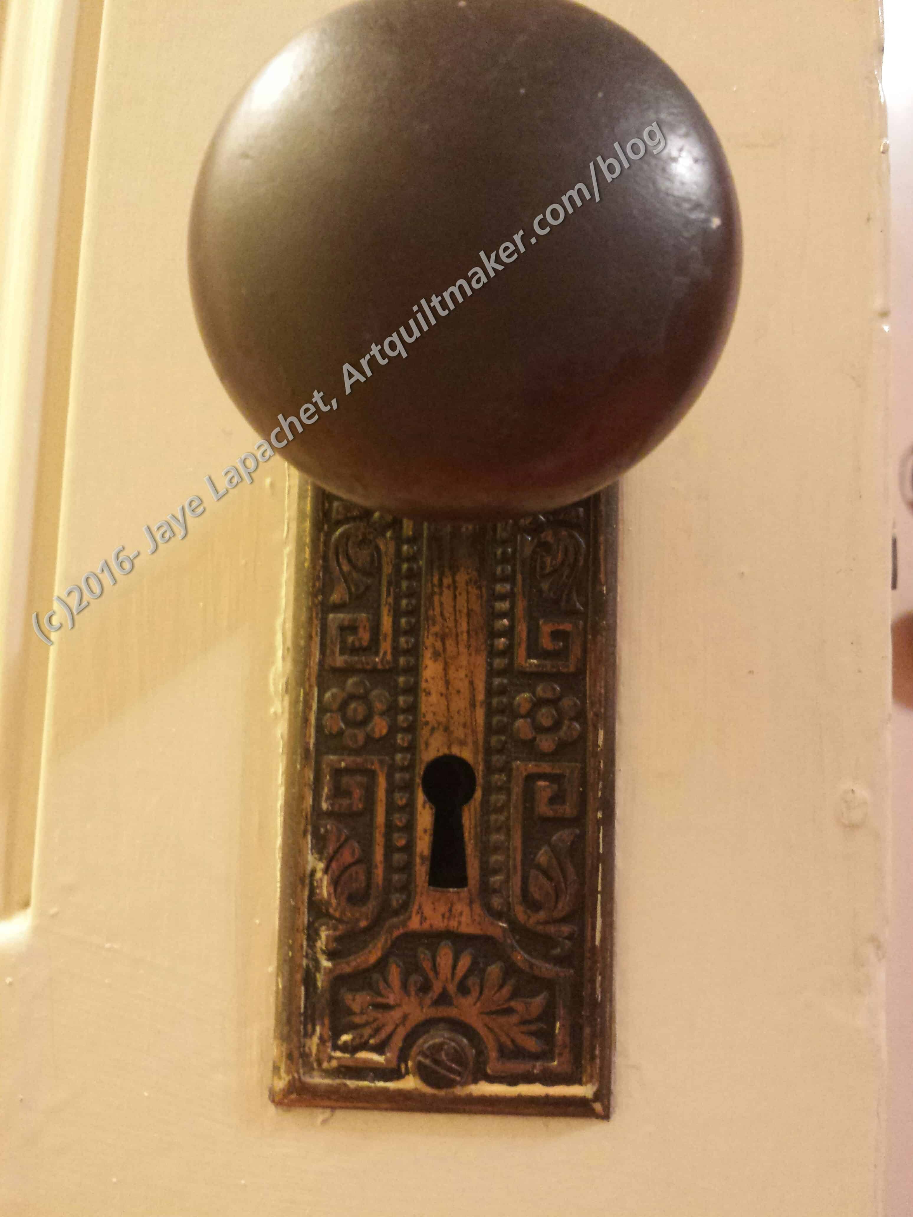
Parlor Hall doorknob

After the dedication we were invited for lunch at the Parlor’s hall, which is in downtown Eureka. I always wish DH’s Parlor had a hall, but there are a lot of issues with owning property, not the least of which is buying it.

One of the things I noticed was the artistry of the doorknob plate. This could be a quilt design with a little reworking.

I love this kind of detail and, though I wouldn’t want this exact doorknob assembly, I do think the plate would be fabulous.

Building decoration, Eureka

We walked around a little bit on Saturday after the dedication and I saw various details that made my brain spin with ideas. The photo left is an interesting version of a spiral. It is one of  many that decorated one part of the building. It made me think of Friend Julie, as she is my spiral girl.

I am not sure what it is made of, but it looks somewhat soft, in terms of stone being soft.

Check back for part 2 in a few days.

ColorPlay Travel

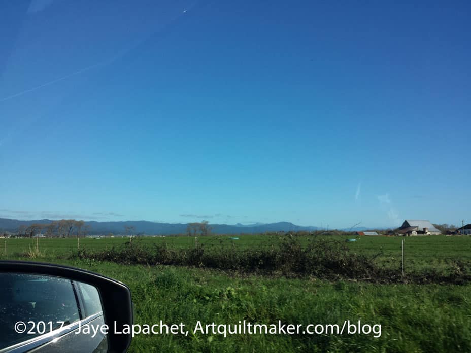
View towards Fortuna

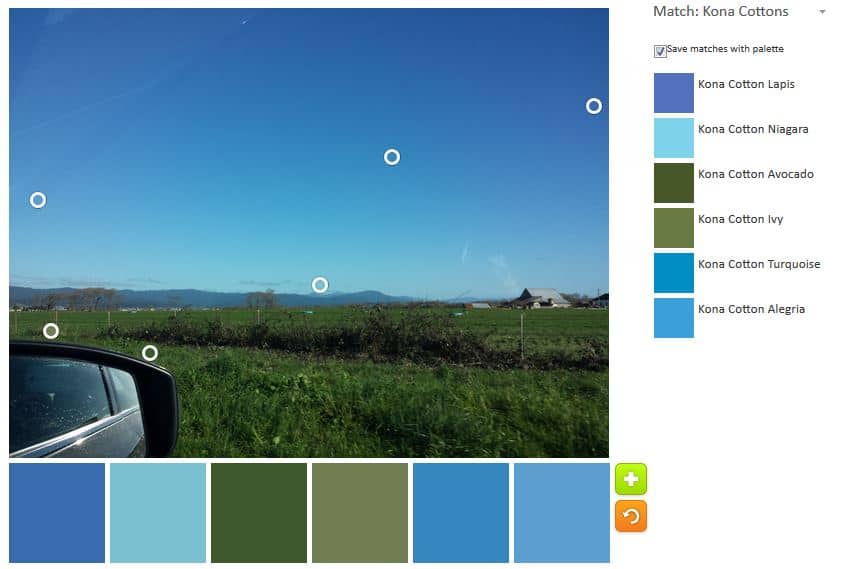
Last weekend we went on another #politicalwifery trip for the Native Sons. We headed up to the North Coast. After, what seemed like, days of pouring rain, Saturday dawned beautifully clear. DH pointed out a gorgeous view so I am using that view, on our way back from Stitch in Ferndale as today’s ColorPlay.

You can see why I picked this. Last time I was trying to get a nice blue palette. Today, I’ll be hard pressed NOT to get a nice blue palette.

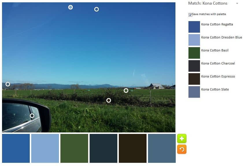
ColorPlay Feb 17 n.1

Today I remembered to save the ‘auto color’ image. The tool seems to cluster the images into the dark. It is interesting. This isn’t the perfect palette, but I do like the Kona Regatta and the Dresden Blue (top two).

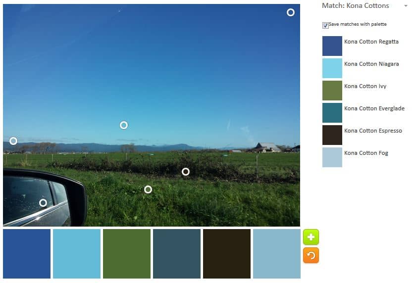
ColorPlay Feb 17 n.2

This might be my favorite. I am not 100% sure, but it has Kona Niagra, which is close to Kona Jamaica, a sure favorite. There are also a sufficient balance between light and dark.

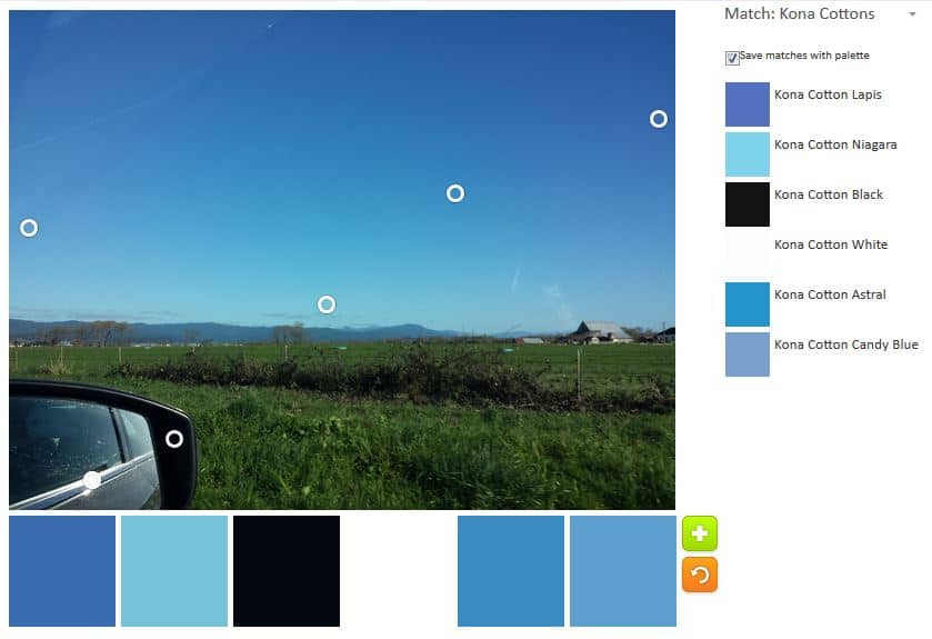
ColorPlay Feb 17 n.3

N.2 was my favorite until I saw n.3. Still no Jamaica, but the Lapis with the Niagra work really well together. The medium blues really make this subtle.

ColorPlay Feb 17 n.4

I added in the greens to see what would happen. they are more mossy than I like, but the balance works. I think n.4 is probably the most successful palette.

Try the Palette Builder out yourself and show me what make.


Creative Spark #9: Grace

Grace is something that I skitter around when I come across it. Grace is, of course, a name – a name used often in our family, by the way, though not in my branch – but I am talking about the personality trait. It is also a trait, or, perhaps, a series of traits that seems old fashioned in our fast-paced, car driving, mobile phone wielding, kid juggling life.

The definition of grace from Merriam Webster online is 1a :  unmerited divine assistance given humans for their regeneration or sanctification; b :  a virtue coming from God; c :  a state of sanctification enjoyed through divine assistance.

I prefer the American Heritage definition. It is more what was on my mind. It came up when I performed a search for ‘grace definition’:  “n. Seemingly effortless beauty or charm of movement, form, or proportion. n. A characteristic or quality pleasing for its charm or refinement. n. A sense of fitness or propriety.” This is more of what I was thinking. I think of well bred English ladies from the Edwardian and, possibly, the Victorian era who were strong, but had pleasing manners, welcomed visitors warmly, etc. I don’t mean this in a judgmental way.

I also think that thinking about grace and striving towards it as individuals is important -right now more than ever. Bloomston writes “we are programmed to think that work has to be hard to be valuable – that we are supposed to struggle in order to yield the most prized outcome….Creativity is a flowing thing. You can’t white-knuckle it into existence. Loosen your grip and give some space to flow” (pg. 41). I find a physical manifestation of this when I am doing balancing exercises in Pilates. If I am standing on one foot and completely tense, I tend to teeter and am more likely to fall. If I concentrate on loosening my muscles one a at a time, not only does the time of the drill melt away, but I am more stable.

I have felt tense and uptight as I worked through The Peacock. Mostly, I wanted the piece done and off the design wall so I could move on to something else. I was having a hard time giving myself over to the process. I talked a little about working on too many projects at once, trying to make sense of it. Stopping that, and finishing a couple of tops by a self imposed deadline helped a lot. Feeling tense and uptight does not make for good work. After The Morass, I tried to focus on the piece. First, I thought about what I was trying to achieve. Second, I thought about whether I wanted to finish it; whether it was worthwhile. Third, I recommitted to the piece and the process. For me, this was a glimmer of grace.

Bloomston writes “grace comes from not only being filled with purposefulness and spirit as we work, but also enjoying the moment and being present with the process” (pg.42). Of all she says in this spark, this hit me the hardest and has a lot of meaning for me. I often think about what is next, leaving the moment for the future. This makes moments go by unnoticed, which is sad. My interim talk with myself (above) for the Peacock helped me to find the purpose in the piece and be in moment as I worked on it.

I am still trying to get a firm image of grace in my mind. Bloomston provides several metaphors which inch me closer. “Grace is the hinge between effort and effortless. There is a moment in our creative flow in which we are utterly absorbed, content, focused, and present with the moment and everything in it” (pg.42). This is the place I strive for. I do think, however, that we can get snatches of it within each project when the stars align, but that actions we take outside of each project, though including each project help make those moments more and more frequent. For example, how we tidy up, where we find that one scrap we need, etc.

There is also an element of coats in this spark. “I told her that I was afraid to design my first line of fabric (and write my first book) because everyone I spoke to said it was hard when they did it. She looked at me, with her water-clear blue eyes, and said, ‘That’s their story-their experience: Each time someone tells you her story, you put it on and wear it like a coat. Many of those coast don’t fit you and yet you are wearing them. Why are you wearing everyone else’s coat?” (pg.42). This is amazing! How much do we not do because someone else had trouble with it? This reminds me of some of the technique tutorials I have in my quilt sampler class. I worked hard to show how to do Y seams, how to do machine applique’, how to put hexagons together and many other techniques. *I* feel these are valuable and can help when one wants to make a vision into a quilt. So often I hear that they are too hard so the quiltmaker won’t try. I suspect she has heard from her friend, who heard from another friend that Y seams are too difficult. Wear your own coat. Figure out your own story.

Like others, this spark has some worksheets.

Nota bene: we are working through Carrie Bloomston’s book, The Little Spark. Buy it. There is a lot more to each spark than what I am writing and the original chapters will help you. Go buy Carrie Bloomston’s book, so you get the full benefit of the fabulousness! You can see my book review, which is what started this flight of fancy. Also, take a look at Carrie’s website.

You can find the last spark on the blog about a month ago.
ColorPlay – February 3

ColorPlay Feb 3- original

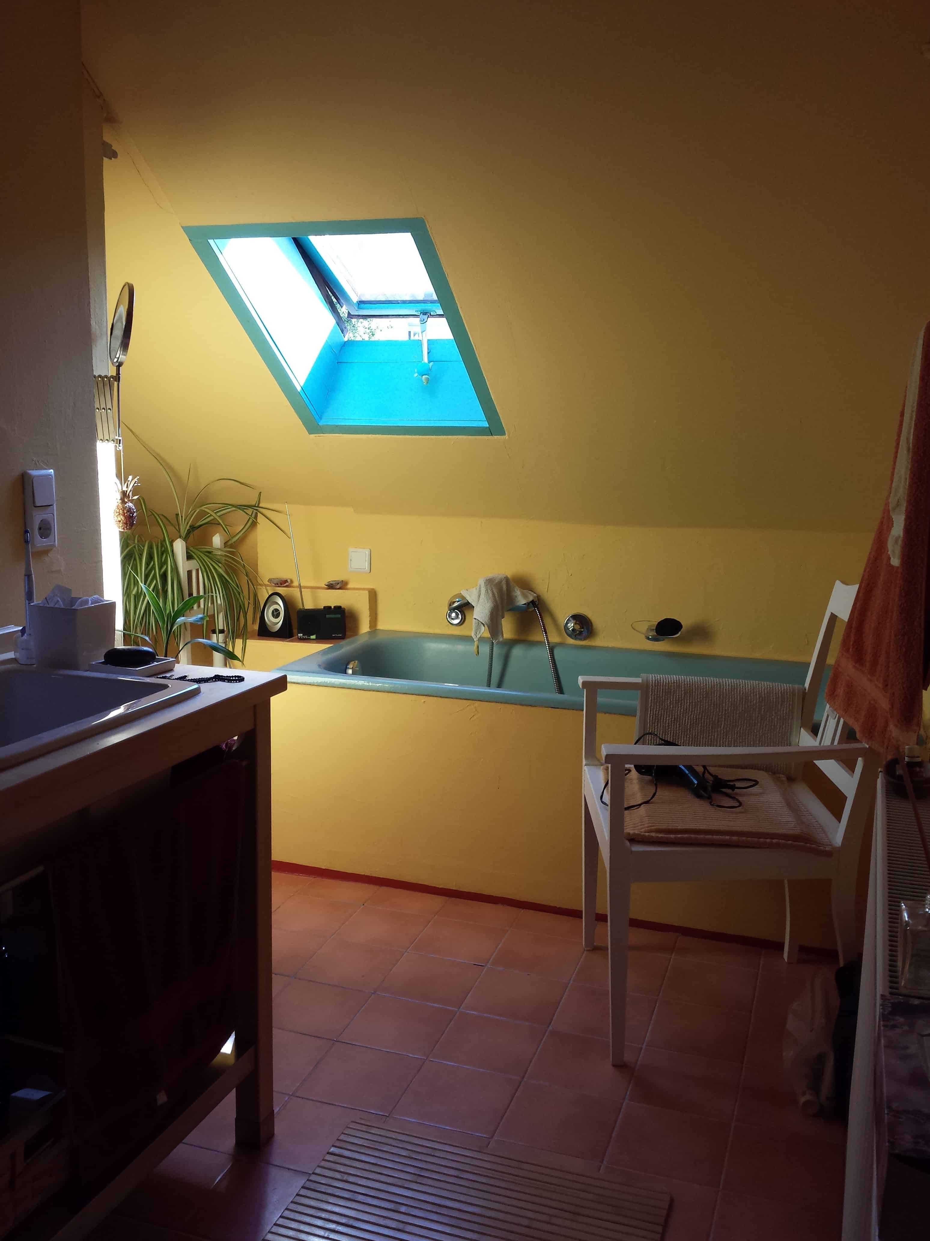
I have been thinking about my trip a lot lately, so I am back to one of my Austria photos. I wanted an image that was bright and cheerful. This is my friend’s bath. I have to say that one of the things I looked forward to on my trip was a deep soak in that tub. It is is easily 3 feet deep and after a 5 year California drought, a long soak in a tub filled to the brim with water seemed like a fantasy.
When the YM was about 4 we visited and I kept a strict eye on him in that tub in case of drowning. He was a good swimmer, but that tub holds a lot of water.

ColorPlay Feb 3- n.1

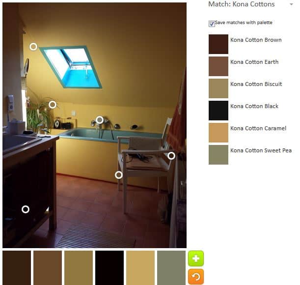
While I wouldn’t say that the yellow in the photo is neon, I would say that it is bright and dominates the room, thus you can imagine my shock when I saw the first iteration of the color palette for this post.

Talk about neutral!?!? This palette has no color! I can’t even think about whether this neutral palette is interesting or not. It needs pink and yellow.

ColorPlay Feb 3- n.2

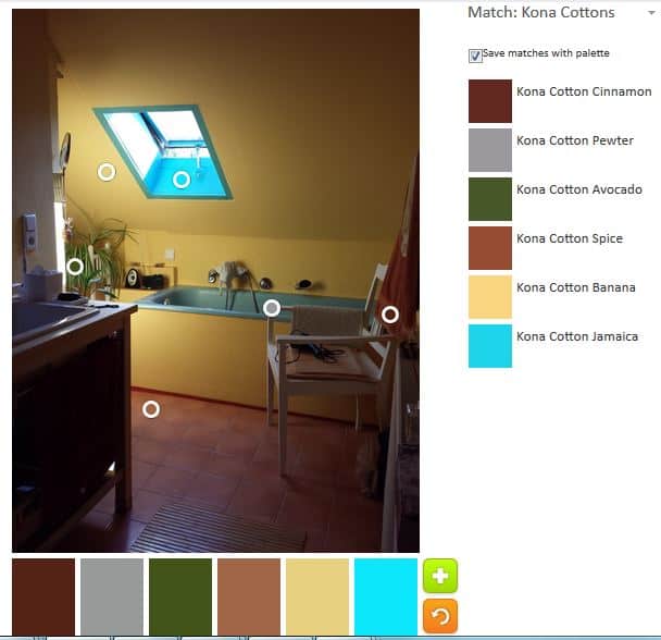
My second attempt was marginally better. Kona Banana was the closest I could get to the yellow, which is decidedly not the color of a banana. The choice isn’t terrible and it is better than the Kona Caramel in my first attempt. I was pleased that the turquoise showed up as Kona Jamaica. The towel is no better than Kona Spice, which is not pink and I could get a nice white (chair and radiator) to save my life.

ColorPlay Feb 3- n.3

I made one more attempt. I made sure to keep the Kona Jamaica, but tried for a better yellow. Banana is probably the best as the only actual yellow alternative I could come up with was Kona Butterscotch, which is only marginally yellow in my mind. The Grass Green is a good addition.

I think, in general, the shadows in this photo obscure the true colors.

Let me know about your efforts as creating a palette.


Updated Gift Ideas

In 2015, I created a list of gift ideas. As mentioned at that time, I like the idea of giving and making sets of gifts: choosing a fabric and then making a number of items from that fabric. Since then there are lots of new patterns and ideas. I came across a few other items that I thought would make great additions to my list and be useful as well. I decided to update this list and get the ideas out to you again.

The point is not to use the patterns I use, but to make the gifts in whatever pattern YOU like. This is a gift idea.

You might be wondering why I am talking about this in January when you just finished with the holidays. Simply, you will need time to make everything without getting stressed out.

Pincushion – Fig Tree Quilts Petit Gateau pincushion pattern. I like this pattern, because the pattern makes sense, is not difficult and looks like a pincushion. I have made several and they go together very quickly. I use wool roving and some of the Beanie Baby plastic pellets to fill it. I buy both at Beverly’s when they are on sale and keep a supply on hand. The pellets give the pincushion some weight. I don’t use walnut shells, because so many people are allergic to nuts. The only issue I ever have with this pattern is to find an appropriate button to put on top and bottom. Often I make these and don’t think ahead and then find myself wanting to finish, but have no appropriate buttons. Of course, there are plenty of pincushion patterns out there and you should use your favorite.

Needle case – many people don’t do handwork and so this is an inappropriate gift, but it is so cute! Regardless, I find that a bit of hand sewing is needed at various times. I found the pattern in the Spring 2013 issue of Modern Patchwork. It was designed by Rashida Coleman-Hale of IHeartLinen. I wasn’t able to find a pattern for it on her blog or the web. The pattern is in RCH’s book, Zakka Style, according to Frances Newcombe from Belly Buttons Boutique. You may be able to find I copy of that magazine on Etsy or eBay. I am sure there are other needlecase patterns out there.

Tissue case – This isn’t something that I would really use, though that might change. It is a nice stocking stuffer or small hostess gift. I got the idea to make them from Valerie over at Evening in the Garden blog. I made a few, which you can see in December gift posts. I used the YouTube tutorial that Valerie used. I found that these make great boutique or Secret Santa Shop items since they are very quick to make.

Lanyard – these are great for guild meetings, but also for hanging scissor sheaths, keys, pens, etc. Think of a chatelaine’s key ring.

Scissor Sheath – as mentioned above, a scissor sheath can be added to the gift pile and adding a ribbon or fabric hanging loop on it enables the owner to hang it from a lanyard.

Project bag – Jeni Baker Drawstring bag (pattern to purchase). The pattern has multiple sizes. This is good to keep project supplies together. She also has a tutorial for one size – Example

Tote bag – There are lots of different tote bags that I have made. I really like the Jane Market Tote (pattern to purchase). I also like the Eco Market Tote from Favorite things (pattern to purchase). I made a version of that bag with Heart fabric and it is still a great pattern. I have another one in mind. Including a tote bag in your gift selection is a nice way to package all the gifts. Choose any pattern that you like.

One Hour Basket – An alternative to a tote bag, especially for a group of small gifts is the One Hour Basket. This is a free pattern by Hearts and Bees which you can download from Craftsy. She has a new pattern with different sizes as well.

Journal/Sketchbook Cover – you can adjust the pattern to accommodate a number of sizes of journals. This pattern, as you have seen many times on this blog, is for a 6.5in x 8in Miquelrius journal.

Pencil roll – I love the pattern by Pink Chalk, but it is no longer available. If you can find it somewhere, such as Etsy, buy it and keep it safe. It is useful and fun even if you are not pen hog like I am. I have made, perhaps, a dozen of them and I want everyone to love them. I always put a few pens in to give people an idea of how to use them. I reported on one of my pencil roll posts that this project took me about 3 hours to make. (updated 1-26-2017)

An Alternative to the pencil roll is a tool holder. I haven’t actually made one of these yet, but I do like the pattern. I like the idea of having my most used items all in one place and viewable to so I don’t have to dig for them.

You could also add a Sidekick from Jinny Beyer’s store. It is good for handwork and I could have used it on my trip this past weekend. I have the pattern, but haven’t made it yet.

You can also think up themes and find patterns that fit the theme. For example:

  • Kitchen: apron, potholders, kitchen towels, casserole carrier, roll basket
  • Bath: makeup bag (zipper pouch), towels, tissue cover, stiff holder for TP and such

Get sewing!