Last time I did a ColorPlay it was last year. HA! I was trying, again, to make a colorful palette and was moderately successful. This time I think I have done it!
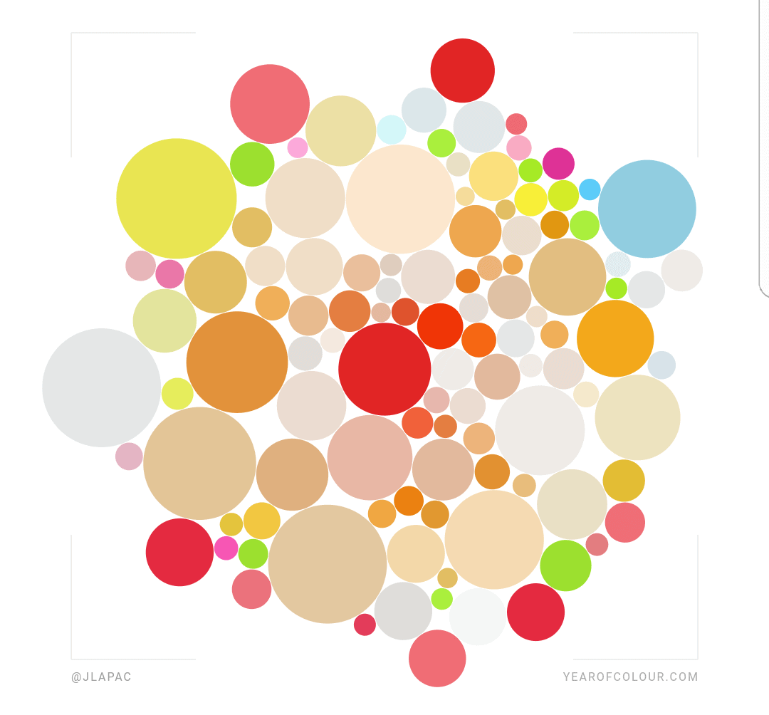
I used one of the iterations of my Year of Colour report. I have no idea how so much beige got into the report, though I presume it is from my landscape and neighborhood photos. My neighborhood definitely needs more pink and turquoise houses.
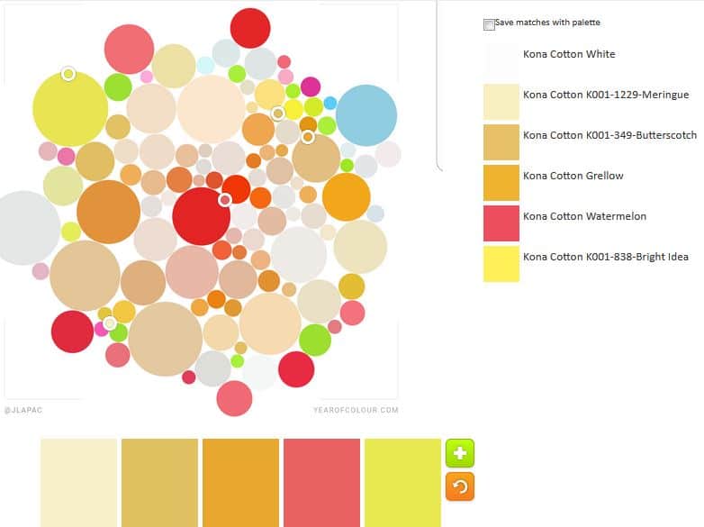
Even the default is fabulous! I do like the Grellow paired with the Watermelon.
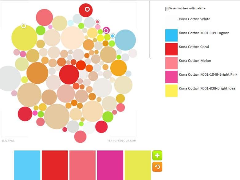
My first try was very fun and the result pleased me. I like the Coral, Melon and Bright pink combination. I think those colors would look great with the Grellow from above. I thought the Bright Pink would be more violet, a color I am enamoured with lately. Not so much, but I still like it.
I started from one edge to see what I could make. This image has the potential for a lot of palettes. Don’t worry, I won’t make you suffer through hundreds of iterations. 😉
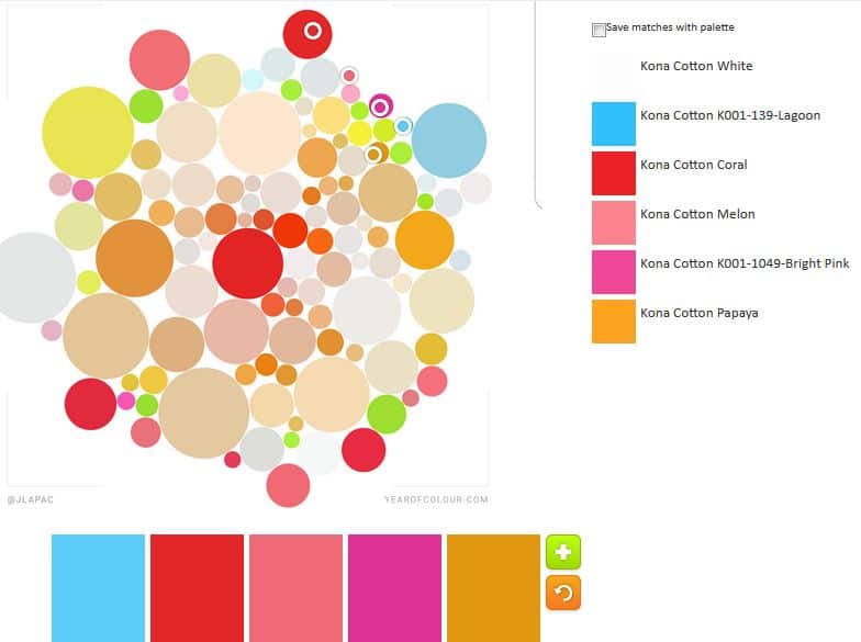
My second try is even more fun. I would think it would be circusy, but it isn’t. I have to admit hunting around for the Papaya. I was actually looking for Grellow, as from above, but found the Papaya and really liked it with the various pinks.

Not sure what I was going for with n.3, but it is pleasing. It inspired me to try for an all blue palette.
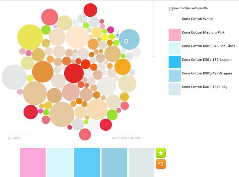
I thought the all blue palette was too boring so I kept the Medium Pink. I like the combination, especially the Lagoon and the Medium Pink.
There are tons of opportunities for more from this image. I’ll post more next week.