I am not being a snob by spelling color as “colour”. That is how it is spelled on the app/website. You can try it out Year of Colour and find out what colors you post most.
I have been actively seeking out brightly colored images so my palettes would be virtually neutral free. The one from last week was too much fun to limit to one week. Also, I was busy and had to get on.
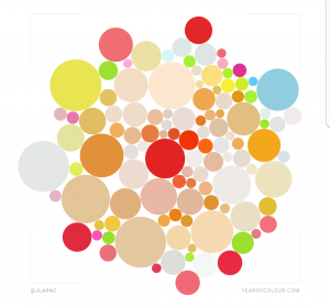
Last week I started with one of my iterations of my own Year of Colour. I finished with a mostly blue palette last time.
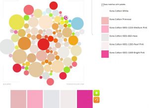
The blue led me to try an all pink palette. I threw in some very light purplish colors as well – Haze and Pearl Pink – before I got to all pink, because I thought they were pink circles. They, as I said, turned out to be very light purplish colors.
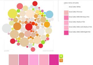
I did make it to an all pink palette. Very cheerful!
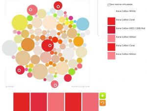
The pinks made me think of red. The palette above has some more pinky-reds/dusty rose colors – Coral and Melon – thrown in with the reds.
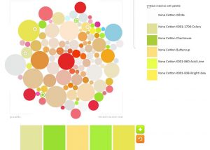
I tried an all green palette and couldn’t find/use enough greens. I barely use green in my quilts anymore. I had to add in the yellow so I didn’t have duplicates.
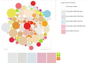
The pink and light purple palette from above made me think that there might still be possibilities, so I tried to go very light. Think this would make a lovely baby quilts.
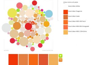
As I said, I could have gone on forever, but I made one last orange palette for your quiltmaking pleasure. the oranges aren’t very bright, so the whole palette looks very Autumnal rather than Creamsicle
You might see this image again. I don’t think I even scratched the surface of this image. I think I can make many more palettes.