Periodically, I am actually able to take advantage of some of the benefits of my MQG membership. Last week, I watched a webinar with Malka Dubrawsky on using prints called Creative Webinar: Printed and Patched: Designing with Patterned Fabric with Malka Dubrawsky.
My overall first impression was that there is an assumption that modern quiltmakers don’t use prints. I see a lot of MQG people buy lots of FQ collections. Wasn’t there some crazy hullabaloo over Heather Ross and some castle/princess collection a few years? Blueberry Park is pretty popular as well.
I tried to take this weird impression and set it off to the side so I could gain some knowledge from the webinar.
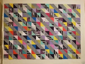
Malka said that prints have graphic information. There seemed to be another assumption that we are used to using small scale prints because they read as colors. She talked about using larger scale prints as graphic messaging. Dubrawsky said that using a variety, both large and small scale prints, creates interest.
She divided the presentation up into points:
- spaces
- movement
- color/color contrast
- common print
- random
I think that I may have missed one or two points, but I got some good information out of these, so the webinar was worth my time.
When Malka talked about spaces she was talking about dividing up the quilt’s surface into different spaces. She, then, talked about using prints in those spaces. You can also organize blocks as spaces or into spaces to use prints.
Movement went right past me.
She used Color / Color Contrast as a different type of organizing tool, which I thought was interesting. One example was dividing up a quilt into warm/cool. Again the idea was about organizing fabrics on the surface of the quilt so you can use printed fabrics. I don’t find this to be necessary in my work, but I thought the concept was interesting and it might be worth trying.
She encouraged makers to create rules for ourselves to use prints so they make sense across the surface. I do this with my quilts in general.
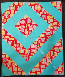
I had no idea what Dubawsky meant by Common Print. She was referring to using different colorways of the same prints all together. I have always loved this concept. I often like having all the prints in all the colors. Remember my Half Moon Modern drama? Malka says that it allows for easier color and shape focus.
She said that using prints can produce ‘hidden treasures’ that don’t show up when you use solids. Prints create another point of interest, more to look at.
Random: hard to make work, but can work. This was difficult for the presenter to explain and I can understand why. She threw out:
“Simple shapes, colors go together, big spaces. Active background electrify prints rather than toning them down. Focus is on color rather than design.”
Overall message is that makers need to organize your fabrics and design so that they work on the surface. She said that design is really important and I was thrilled.
She encourages people to make their own FQ packs.
Yay! She uses batiks all the time. She calls them modern batiks – modern, bold, graphic designs. Malka also said that she doesn’t really like the older style, watercolor-y batiks. I got the impression that it was the motifs on the surface of the fabric rather than the batik process she didn’t like.
To start: Pick (buy or create) a fabric collection you really love – she buys entire FQ bundle- and then play around with different ways of organizing fabrics. Small/large prints or warm/cool colors. Use a simple geometric design. Challenge yourself. I also got the impression that she was saying to be brave.
Her new designs will be available on Feb 1 on her website as PDFs. Printed patterns will be available Feb 20. She is also doing kits.
A recording of this webinar is on the MQG site for your viewing pleasure, if you are a member.
