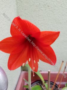
DH and I went over to my MIL’s house last night to get the mail and take out the garbage. On my way up the stairs, I saw that one of her flowers had bloomed. Better late than never, I suppose. It was still perfect.
I thought I would use it as my ColorPlay image of the week. Even though I already did a sort of tribute to her, this one seems appropriate as well.
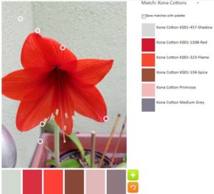
The default palette was actually pretty good this time. I guess the tool couldn’t ignore all of that red-orange.
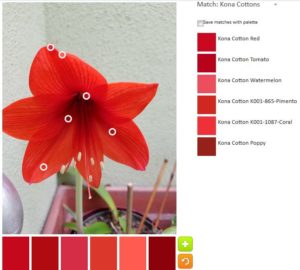
My first original palette was all about the various reds, pinks and red-oranges. I couldn’t resist trying to find as many as possible in that photo.
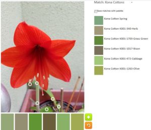
Can I vary the colors? Yes! Can I create a balanced palette that would make a good set of colors for a quilt? Apparently, only if that quilt palette is monochromatic. This time I went with green. I like green in plants, but not so much in fabric. This palette is not a favorite.
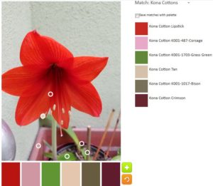
I decided to create a balanced palette move one circle to each main section of the image. I did come up with a lot of different colors, but am not sure if the palette would make a good group of colors for a quilt. I think not.
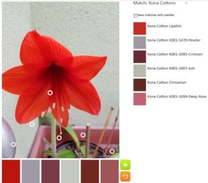
I made a last effort and actually looked for opportunities to add in some neutrals. This one has both Kona Cinnamon and Kona Crimson. They look the same to me and the latter looks nothing like Crimson.
What will you make?