Book Review: Threads of Resistance

Threads of Resistance: a juried exhibition of fiber art created to protest the {45}* administration's actions and policiesThreads of Resistance: a juried exhibition of fiber art created to protest the {45}* administration’s actions and policies by The Artist Circle Alliance

This is a catalog of works created for the Threads of Resistance exhibit that opened at the NEQM earlier this year. I was first made aware of the show when I saw Sarah Ann Smith’s piece. As you know, Sarah’s piece sent me on a continuation of the resistance/politcal art quilt journey which had laid dormant since 2001. That journey included the purchase of this catalog.

This catalog is filled with recognizable names such as Mel Beach, Judy Coates Perez, Victoria Findlay Wolfe, Lyric Montgomery Kinard, Melanie Testa, Kathy York and, of course Sarah Ann Smith. There are many names I don’t recognize and was glad to see their work. The book includes an index (Hooray for indices!) of the names of all of the artists along with their websites at the end (pg.130-131).

The cover acts as the title page as well, at least the librarian in me presumes that is the case. There is a title page verso, but no identifiable title page. This affects you, perhaps because there is nowhere to sign the book if you meet one of the artists.

The introduction (pg.3) starts out discussing the goal of addressing current issues with the words “The Artist Circle presents ‘Threads of Resistance,’ a juried exhibition of fiber art created to protest the {45}* administration’s action and policies” (pg.3). It continues by briefly discussing quilts used in historical protests. The introduction sums up by offering an invitation to share readers’ viewpoint in an effort to “gain a better understanding of one another’s perspectives….(pg.3).

After the, relatively brief, introduction, the images and descriptions of the quilts start. As with a lot of art, not all of these pieces are easy to look at. The full frontal nudity and f**k off gesture of Neroli Henderson’s Dear Mr. T***p (pg.50-51) is hard for me to look at. Why, after millennia, should a woman’s body still have the power to shock me/our society? For me, it is clearly a learned reaction, especially since I have one of those bodies with similar features and functionality.

As 45 has made sex and womens’ bodies a major part of the presidency, a lot of seemingly sex-related symbols fill this catalog. I mentioned Henderson’s piece, which is probably the most graphic. The assault on a woman’s right to make her own choices about her own body is represented by “My Body My Rules” (pg.14-15) by Sue Bleiweiss. “Not So Safe” by Amy Dame (pg.38-39) evokes coat hangers, an innocent, useful household item, like the safety pin, which holds much meaning that has nothing to do with clothing. “Political Power Grab” by Sara Mika (pg.70-71) displays a uterus and many vaginas, symbols/images that invite comment when (if?) shown in the popular media. “Hands Off” (pg.74-75) is a graphic image representing how many women go about their daily lives in protection mode. The statement that goes with this quilt,”The message I received growing up was that I was less because I was female and that misogynist acts against me were my fault” (pg.75),  is true for many of us even if it was never said explicitly.

The imagery in “Work in Progress” (pg.76-77) is also disturbing to me. The style of the images is hard for me to look at. This is another quilt explicitly showing genitalia. Though it is a difficult piece for me, I celebrate this quilt’s inclusion in the catalog. It forces me to look at things that I wouldn’t normally look at and, thus, explore my discomfort.

Finally, “Roe v. Wade Must Stand” (pg.106-107) makes me equal parts sad and angry. Why are we still discussing this issue? Aren’t there more important issues to discuss? Fundamentally, it has very little to do with politics and should not be decided in the halls of Congress. Women’s issues should be decided by women.

I know my politics are coming out in this review. It is not my intention to alienate anyone, but this catalog offers up a good summary and review of the assault on women’s rights. Whether your politics veer right or left we should all be able to agree that women need to be able to and have the right to decide issues that have to do with her own body without the interference of politicians. I don’t want to live a country where The Handmaid’s Tale is true.

Unlike women’s bodies, which are still, seemingly, taboo, phrases from the past year such as “Nevertheless, She Persisted” (pg.4-5) have made it into our culture and are part of this catalog. This catalog not only documents a phase (I hope it is just a phase) in US history, but evokes past history through the imagery of some of the quilts, such as Dawn Patrol (pg.6-7). Julia M. Arden’s pieces makes me think of a disturbing visit to Dachau, the shadow of which is burned into my memory.

Jessica Levitt’s piece, Equal Means Equal (pg.66-67) reminds me of the constant struggles in which women engage to gain some semblance of equality in pay, gender roles and so many other things.

A lot of issues, education, violence, choice, the right to protest, are represented by quilts in this book. Protest is represented by all of the quilts, but well represented by a couple of individual quilts including “Speak Up, Speak Out” (pg.110-111), Women’s Rally (pg.116-117) and “A Day to Remember (pg.104-105) all show imagery of women peacefully protesting. Most of the images show many, many participants. “Capitol Guns” (pg.80-81) reminds me of the struggle to find the balance between the right to keep and bear arms and the mass shootings such as the most recent terror in Las Vegas not to mention the various president who have been shot.

If you have not seen this show, try to go somewhere and see it. The imagery is hard to look at, but very powerful. The quilt format evokes the softness often attributed to women while the imagery denotes strength, fierceness and hardness. If you can’t make it to an exhibit, buy the catalog. Not only with you be supporting the artists, but you will add something to your library that will inspire you.

Art is meant to challenge the viewer. This art definitely challenges me.

PUBLIC SERVICE ANNOUNCEMENT: Regardless of your politics or opinions, contract your federal, state and local representatives and make your voice heard.


*I refuse to include the name of the current President on my blog or in any location associated with me, so I have substituted 45 for the name.

View all my reviews

Various & Sundry 2017 #14

Check out the sale page, but don’t just check it out: Contact me to buy something! 😉

Patterns, Tutorials and Projects

QuiltnSew (Pitcher’s Boutique) on Instagram is selling a new foundation piecing of the Disney Sleeping Beauty’s Castle and the old version of the Disneyland sign. I am not a foundation piecing fan, but I love these designs and bought them immediately.

Kevin the Quilter just posted the conclusion of his summer mystery series called Sapphire Stars. I don’t know whether he will keep the steps up on his blog. Go and check his blog and get the steps if you like and want to make the quilt. He will also being doing a lecture and trunk show in Missouri, if you are in the area.

Other Artists

Thanks to Stashed for letting me know about Nancy Zieman. They wrote “Nancy Zieman, beloved doyenne of sewists and quilters around the world, has retired, following the diagnosis of terminal cancer.” She has posted some final words in a blog post. The post includes heartfelt words and pictures of the studio. She is very open about her illness.

As you may have seen on my latest Design Wall Monday post, Judy at the Patchwork Times is no longer hosting this ‘community event’. It is now being hosted by another Judy at Small Quilts and Doll Quilts.

I think I first saw Kathy York’s quilts at PIQF. As I recall, the piece had many little squares made from brightly colored fabric, mostly solids or tone-on-tones. I recently had the opportunity to go to her blog and saw her piece, Floating in a Sea of Symbols. I love the layers shown in the water.

I was pleased to see that my friend, Pamela Allen, had a piece in Quilt National 2017.

Wanda of Exuberant Color has some great propeller (??) blocks posted.

Tools, Notions & Supplies

I needed a new Acufeed foot, because I couldn’t see what I needed to see when trying to quilt my tablemat. I was unsuccessful locating one locally, so Gerre recommended SewVac Direct. I was really happy with their service. They were quick and answered my questions quickly and efficiently. I would recommend them.

Media

I noticed that Quilt National no longer has catalogs on Amazon. You can buy the 2015 catalog bundle and the 2017 catalog bundle through the Dairy Barn.

I know many of you do not subscribe to American Quilter. Through a series of magazine closures, I got a long, long subscription that will end soon, but has been going on for 10 years or more. I haven’t decided whether I will renew once my subscription ends next year, but I was nudged towards yes when I received (AND actually read!) this month’s issue.Much of what I like has to do with quilt world news. Most magazines just have projects, but I like to know what shows are coming, what new products are out and who is doing what as well as articles on *techniques* rather than just projects. AQ has made a lot of changes. They now include newer designers and the colors they use in the mag are brighter. AQ still has too many projects (I have enough on my ‘want to do list’ already), but one of their projects shows how to use a 45 degree wedge triangle ruler and gives instructions on testing what you already have at home to see if it will work. I was pleased that they didn’t automatically ask the maker to buy something new. The article on Pam Holland is interesting as well. Her style is contemporary and the description of her creative process is interesting. I was also interested to see the article on the Row by Row Experience. I didn’t know how that started and was glad to read about it. Kimberly Einmo’s column talks about reviewing and getting UFOs finished. The November 2017 issue is well worth looking at.

Doing Good

Sadly, there are lots of opportunities to provide some comfort to those in distress. Take a look at the post from the Las Vegas Modern Quilt Guild, calling for blocks and quilts. Also, Quilts of Compassion is collecting quilts for Houston. Take a look at the quilt Valerie made for Las Vegas.

I saw the Palmateer Point Linky Party and immediately liked the pattern. I think this design could be great in modern fabrics. It would work very well with the 2.5″ squares our guild uses for donation blocks, though a smaller version would look great as well.

Kathy talks about the 70273 project in her Brainworm post. She writes in a very moving manner about the lists and her reaction to seeing her name on the list of blockmakers. Dachau really affected me when I went there. I look at what is going on in the world around me and wonder if there is a Holocaust going on now that we won’t know about for years. There is another moving post on Quilt 219 on the 70273 Project site.

Articles & Information

SewVac Direct has article on sewing room safety.

Starting a Shirt

Cal Shirt Start
Cal Shirt Start

I started another shirt. The last one I made was the California shirt I entered into the San Mateo County Fair.

Like many of my quilts, I think these shirts are part of a series. The California shirt from last year is the best yet. The judges weren’t 100% happy with my entry and they were correct. I needed to finish the seams. This failure has been on my mind. A series of events made me decide to make DH a Cal shirt. He says he has enough button down casual type shirts, but he is getting this one anyway.

I had some Cal fabric that I used for various things, but I bought some more at PIQF. It turned out that when I cut out the shirt on Monday, I had enough from my previous purchase to cut the pieces.

I also decided that I would use some dark blue solid on the shirt so that motifs would stand out. I didn’t want the overall effect to be too chaotic.

The cutting went really well. I modified the pattern last time and that took a lot of time. I didn’t have to do that this time, so I was able to cut out the shirt and fuse interfacing to the front of the shirt all during Craft Night. I still need to fuse some ShapeFlex to the pocket to keep it from being floopy.


October CQFA Meeting

CQFA is currently homeless, so we met outside at the Campbell Community Center. The plan was to listen to the lecture at Penwag after our meeting and they meet at the Campbell Community Center. Maureen brought quilts for some of us to sit on. Others sat on benches. We were a small group, but the weather was good so it all worked out.

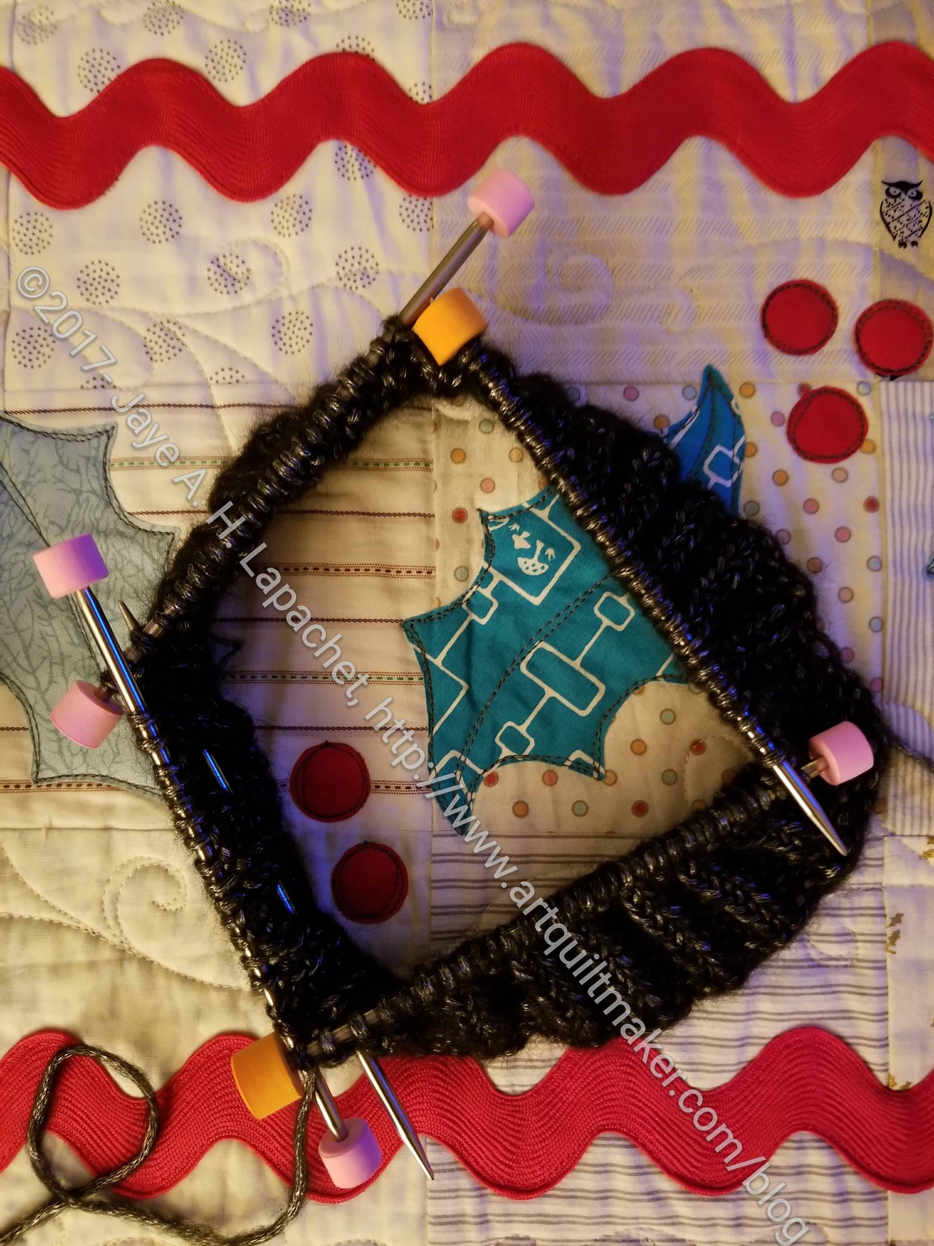
Being a small group, there wasn’t much show and tell. I showed my in process Cosmic Wonder Dust scarf. Rhonda showed some pieces she is appliqueing for the Social Justice Sewing Academy and Marie S. showed some of her indigo work. Maureen brought a new magazine called Curated Quilts. It has no ads. That means it is a bit pricier, but has very nice photos.

October 2017 ATCs for CQFA

I was pretty pleased with my ATCs, then disappointed to find that nobody else had made any. 🙁 No exchange this time, though I am ready for next time.

I am now trying to start on them early so I am not working on them at the last minute. I did start these right after the August meeting, however I only cut the background pieces and the interfacing. I still had all the sewing to do. I did get to work on them during the week before the meeting here and there, but I finished them the night before the meeting. Yes, I left the finishing until the last minute. Again.

This time my goal was to try out using the tulle over other motifs like I plan to do for the CQFA show piece that is in my head, but not yet made. It worked pretty well. I used schnibbles under the tulle and was pleased with the effect.

I thought I would just toss some schnibbles in there, but ended up trying to focus on the turquoise and pink schnibbles. I did add in one piece of leftover Lichen yarn from the Lichen scarf.

We went to the John Marshall lecture at Penwag after our meeting and I thought it was enjoyable. He is a white guy who grew up in a Japanese community near Sacramento and apprenticed to a dollmaker, I think, in Japan. His background is really different and his About page reflects his interesting bacground. He is also a good speaker and very personable.

It was fun to do something different during the CQFA meeting.

SIL Works

I have to say it is great to live around the corner from another quiltmaker. It is even better that she is my SIL. We had Craft Night on Monday, as usual, and I got to see some of her new works.

SIL MassDrop Donation Quilt

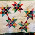
In terms of donations, she is on fire. She took one (or, perhaps, more) of the MassDrop fat quarter packs given out at the Retreat and has made two quilts so far from it.

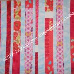
The first one has a self-bordering effect, but the ‘border’ is  is part of the design. I like the larger and smaller squares for the design. She made another version as part of her seasons series using Pointillist fabric that is super cool. I’ll have to take a photo and post it sometime.

The other donation quilt, which I failed to photograph, is brilliant. She is using the stitch and flip method with Jelly Roll like strips, so the piece is quilted at the same time as sewn. The design comes out like a giant log cabin. This technique would be great for a charity Sew Day activity and would produce a lot of small quilts quickly.

SIL Design Wall, October 2017

SIL also has the Terrain quilt on her design wall. She has a layered effect going on on her design wall. The right arrow is pointing to it. You can also see some of the large back I made (arrow on the left is pointing to it) for the Terrain .

One of the good things about having a quiltmaker nearby is the almost instantaneous dose of inspiration. I can walk over, see what is on SIL’s design wall, go home and be reinvigorated.

Mostly Manor Lozenge Top Finished

I had an evening of sewing to myself last Friday night while everyone else was at the Cal football game. I started out with a goal of adding a column of blocks to En Provence. I ended up finishing the Mostly Manor top instead.

Mostly Manor Lozenge Top

I made the blocks last Fall, put them together at the recent BAM retreat, cut the borders at Craft Night and now they are a quilt top.

I had the borders cut and when I ran out of Triple Star pieces to use as leaders and enders, I realized I could add the borders as leaders and enders in between sewing the En Provence blocks together.

Once the borders were on, I further realized that the back wouldn’t be much more work. I had some hoops to jump through (making the label), but with that done quickly and a few large pieces of backing fabric on hand, I had the quilt ready to take to Colleen.

I brought the quilt with me to PIQF and dropped it off at her booth, which saves me a drive. YAY! I am so glad this project is moving along. Perhaps it will be ready for the giftee for Christmas or shortly thereafter.

PIQF 2017 Recap n.2

I spent the day at PIQF yesterday with my SIL n.2. I only had one full day to see the show, which isn’t quite enough. We spent most of the day looking at quilts and I didn’t get to see all of them. I missed most of the Threads of Resistance exhibit and all of the modern exhibit, which disappointed me once I realized it. We stopped at about 4pm to look at vendors, though we had visited Colleen to buy solids and drop off a quilt and The Batty Lady to buy Sue Spargo embroidery thread (oooh la la!!!) early in the day as we were heading to the next section of quilts.

The show has the same look it has in the past. There are a lot of landscapes and they are still using black drapes. The move to shake up the vendors by adding new ones and moving continuing ones I discussed on Thursday was good. Colleen was, again, in the front half of the show and seemed to be doing a brisk trade when I stopped by yesterday.

The Peacock in situ
The Peacock in situ

I noticed an unofficial bird theme. Of course, the Peacock is a bird, but I also saw quail, swans, a variety of Australian birds in the World Quilt Competition, some imaginary birds as well as many others. It is always interesting to me to see what snags people’s imagination enough to take the time to make a quilt using that motif.

I didn’t take as many photos as I have in the past. I didn’t see a quilt that stands out in my mind, either. There were a lot of nice quilts with excellent workmanship and interesting motifs. Of course, there were a number that were not to my taste as well.

Pamela Allen's Sleeping Beauty, 2017
Pamela Allen’s Sleeping Beauty, 2017

I was pleased to see Pamela Allen’s Sleeping Beauty quilt. She always enters PIQF and I had forgotten. This quilt has a much more subdued color palette than some of her other work. Her workmanship and quilting have improved so much over the years. It has been a joy to watch her evolve.

Speak Up, Speak Out by Sarah Ann Smith, 2017

Although, I didn’t not look at the Threads of Resistance exhibit, I did get to see Sarah Ann Smith’s quilt in person. I was so pleased since, as you know, she was a huge influence and support on my Down the Drain quilt. I was able to look at the details and take some detail shots, which really pleased me. this is a wonderful quilt. It says so much to me about the strength of women, about the importance of our fundamental rights such as the right to peacefully assemble.

A technique theme I noticed was people inserting a very tiny slice of color into blocks. One of the quilts that included this technique was Eifersucht (Envy) from Martina Hilgert-Vervoort of Germany and another was by Joan B. Dyer of Grass Valley, Calif called Waves. There were more examples, but these were two that caught my attention.

Machine work continues to be a focus. Many of the quilts had lots of tiny machine work in areas around the piecing. There was a fair number of all over long arm quilting designs, which was a shame as they get the quilt done, but don’t always contribute to the overall design look of the quilt.

PIQF 2017 Purchases
PIQF 2017 Purchases

Yes, I bought a few things. All in all, it was a good day.

Design Wall Monday

Design Wall 10/16/2017

I have been writing about En Provence and the Triple Stars a lot. They are the main projects, though I slip in other sewing here and there.

My design wall doesn’t have a lot on it at present, though I thought it would be interesting to show you how I work with a smaller design wall and a larger quilt.

Off hand I don’t know how large En Provence will be. I am doing the large version, so I am sure those of you who have made it know. I am not, usually focused on sizes. Regardless of the final size, it won’t fit on my design wall after a few more rows and columns.

Design Wall, October 15, 2017, annotated

1 – En Provence. I am working from the left bottom corner up towards the right top corner. This is the usual way I put a quilt together, because then I can be sure that, at least, the bottom will be on the design wall.

2 – En Provence fold. I fold the quilt and cover part of the quilt I don’t need to see right at the moment. Since I am working on adding a column on the right, the middle part isn’t needed, except for reference right now. (You might have to enlarge the photo to see the fold.

3 – Triple Star. This is my reference block.

4 – Triple Star. This is my current block in progress, n.12.

The last design wall Monday was back in March. Take a look at that post to see my progress. I am linking up with Patchwork Times, uh Small Quilts and Doll Quilts, the new hosting site of Design Wall Monday. Since I haven’t posted a Design Wall Monday in awhile, this is the first I have heard of this.

FOTY 2017 – More Rectangles

FOTY 2017 - mid October 2017
FOTY 2017 – mid October 2017

The FOTY 2017 is not dead, though I haven’t worked on it much beyond cutting a few pieces here and there. As you know from my En Provence and Triple Star posts, I am not cutting a lot, which means no new FOTY pieces to show.

This group shows fabrics from the back of the Terrain donation quilt, the back of the Stars n.3 donation top, a couple of the Little Cell Phone Wallets, a few pieces from the Triple Star.

Four Low Volume Backgrounds

I have always liked to use a variety of fabrics to add interest. This means that I like scrap quilts, but I also like to use a variety of fabrics in the same colors in my quilts.

I learned this technique from Mary Mashuta. Many of you modern quiltmakers probably think she is old time and her techniques are not a useful addition to your modern arsenal. Mary is a really good teacher. She trained as a teacher and taught at SF High Schools for years before she left to become a quilt teacher. Her ideas are easily translatable to different fabrics and styles. I took a class from her about “pushed neutrals,” which had to do with making a background from a variety of neutrals rather than just using one fabric. I extrapolated that idea out to include non-neutrals as well, which evolved into using a variety of fabrics in the same colors for backgrounds. I have since used this technique for foregrounds as well.

Kay V, a longtime reader, made a comment that made me think about my low volume background for En Provence. As you know, the background is a variety of text fabrics. These are, mostly, the same fabrics I used for the Carpenter’s Wheel.


Jennifers Quilt
Jennifers Quilt

Jennifer’s Quilt is a quilt I made for my acupuncturist who really helped me get back on the road to health. When she died, I got the quilt back. Bittersweet. I would rather have her and never see the quilt again.

It is the first quilt, I think, I made using a variety of black and white fabrics for the background. Some of the pieces are a little heavy and I probably wouldn’t use them again. I also used the same technique for the foreground – the pinks, blues and limes are all a variety of fabrics in the same tones/shades. The blues have more contrast than the pinks and limes.

Flowering Snowball Finished

Flowering Snowball was primarily supposed to be a handwork project – something to take around with me when I needed a to-go project. At that point, I didn’t think as much about the background. In general this is not as successful an exercise in using different fabrics for the background. Some of the prints read grey rather than white. Others have too heavy a hand in the print department.

Carpenter's Wheel top finished
Carpenter’s Wheel top finished

I got better with the Carpenter’s Wheel. I was focusing on using text prints and, thus, tried hard to make the background work. The scale of the different fabrics all vary, but the overall effect works.

En Provence - October 8, 2017
En Provence – October 8, 2017

From close up, the background of En Provence looks somewhat chaotic. The foreground fabrics can handle the chaos, however, because there is no bleeding of color into the background. I like the little bit of chaos as it seems to move my eye around the quilt.

As an added bonus, this technique does not require one to have a zillion yards of one fabric to use as a background. 😉

ColorPlay: Shirt

ColorPlay: Shirt
ColorPlay: Shirt

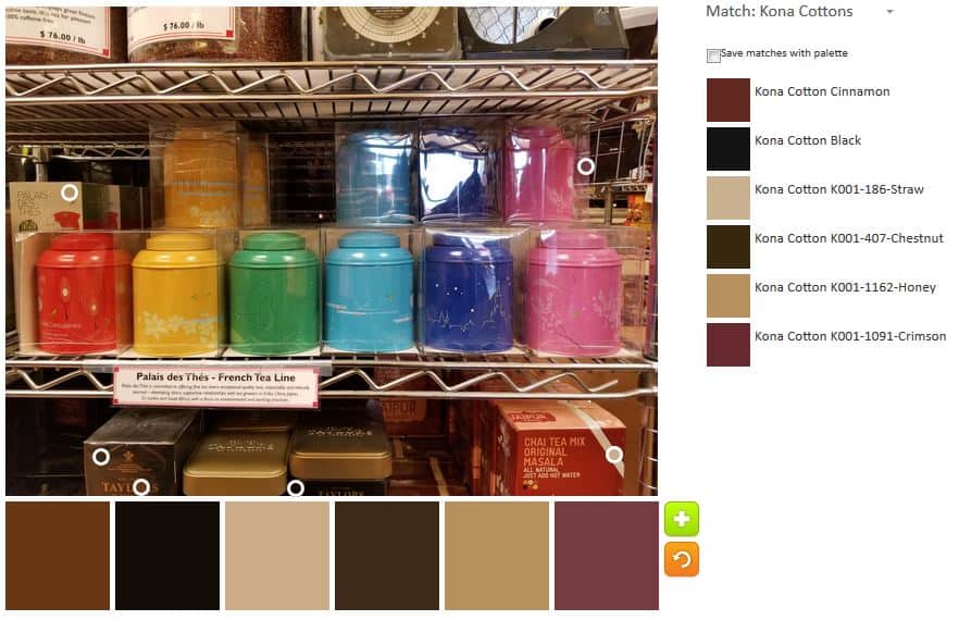
I went to the Retreat last weekend. While there, SIL suggested I do a ColorPlay post on G’s shirt. I thought it would be great because there were a lot of bright-ish colors.

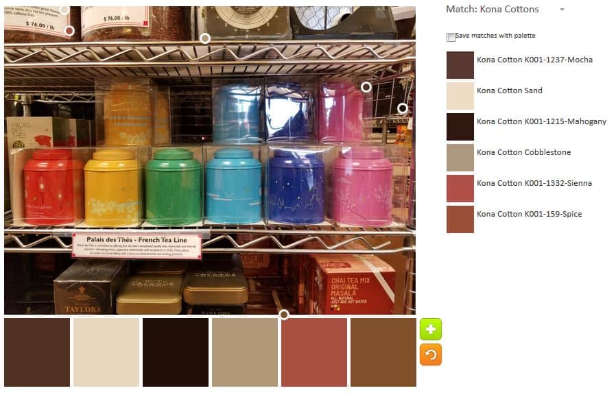
ColorPlay shirt default

The default was …neutral, as usual. The Earth looks a little purple.

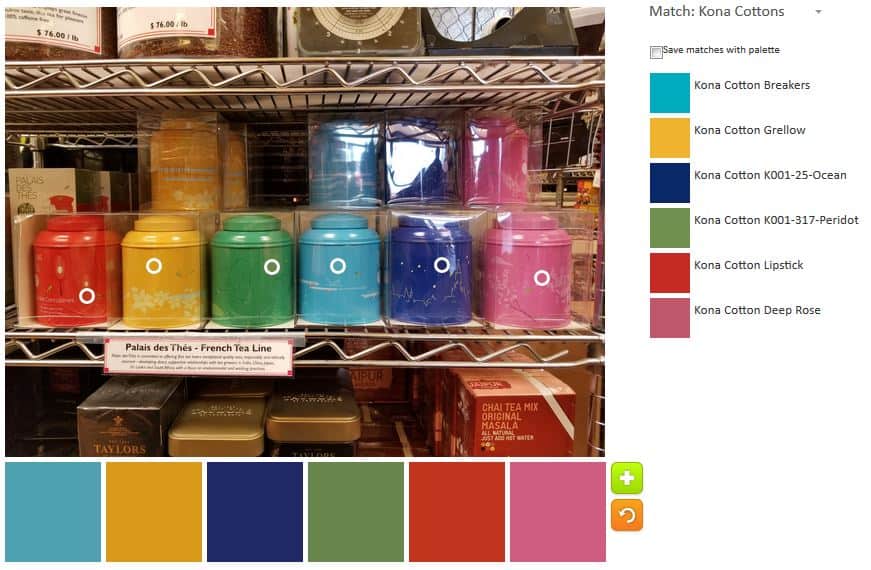
ColorPlay Shirt n.1
ColorPlay Shirt n.1

The first non-default palette is my favorite. I went to towards the turquoise. Ok, it isn’t really turquoise, it is Candy Green. I have never heard of Candy Green and that name kind of scares me.

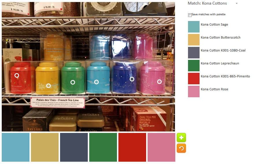
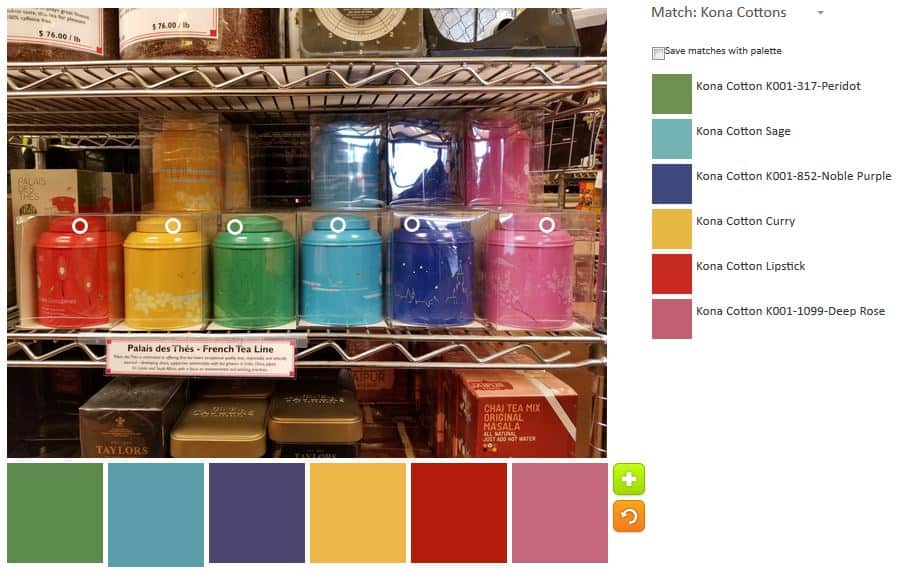
ColorPlay Shirt n.2
ColorPlay Shirt n.2

Palette n.2 is an extension of palette n.1. I added a couple of neutrals. I am a fan of the gold, but it works well with the Ultramarine and the Deep Rose.

ColorPlay Shirt n.3
ColorPlay Shirt n.3

Palette n.3 is a combination of the neutral palette and my favorite, palette n.1. The Ultramarine stands out in this crowd. I also like the name of the Spice color.

ColorPlay Shirt n.4
ColorPlay Shirt n.4

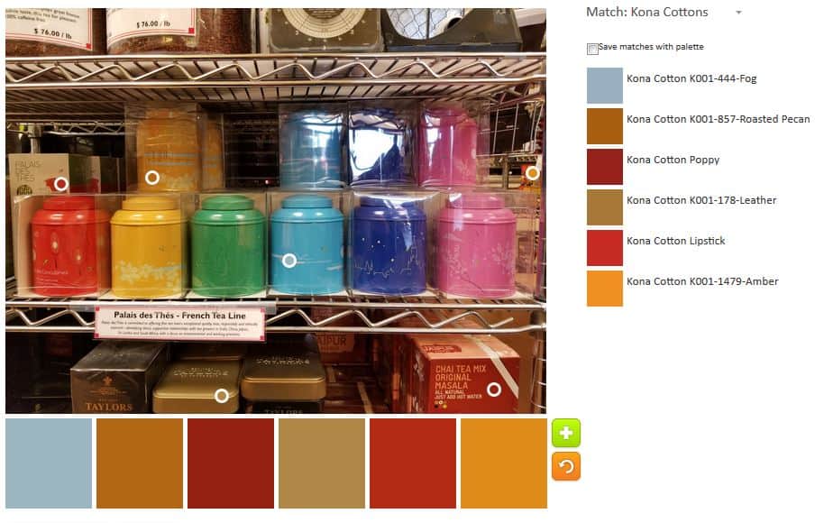
Palette n.4 has colors that show up in other palettes. Although I see this as a more colorful image, I also realized that the embroidery was all of the same colors.

Have you made any interesting palettes lately? Please share.

Quick PIQF 2017 Report

The Peacock at PIQF
The Peacock at PIQF

I went to the preview of the Pacific International Quilt Show 2017 last night.

The Preview is an hour and a half long. Preview attendees can look at quilts and interact with vendors as on the normal days. The bonus is that it is really empty, so it is much easier to take pictures of quilts that will be mobbed once the show opens. also, if you can find that one thing you want at a vendor booth, it will be there and you won’t have to fight for it.

I did a quick survey of the vendors and, yes, bought a few things. I saw as many of the quilts as I could, but I really didn’t see anywhere near all of them. I didn’t get a chance to look at the special exhibits.

Quick impressions:

  • many vendors were in different places
  • lots of new vendors
  • same types of quilts – look and feel of the show was the same

I was really pleased to see some new vendors. I didn’t get to look at all of the wares the new vendors had available. I got an idea of what I might want to buy when I go back.

I was disappointed by the New Quilts of Northern California. I didn’t see anything new and must not understand that point of that exhibit anymore.

The Peacock in situ
The Peacock in situ

The Peacock was hanging there. I was pleased with the location. I was pleased to get a good photo of it.

En Provence Progresses Slowly

En Provence - October 8, 2017
En Provence – October 8, 2017

I am slowly making progress on En Provence. You can compare my progress to the previous post’s picture.

I was able to spend time working on it on Saturday night and some of the day on Sunday. I was able to add a short row vertically on the right and put together a row that I will be able to add to the top soon.
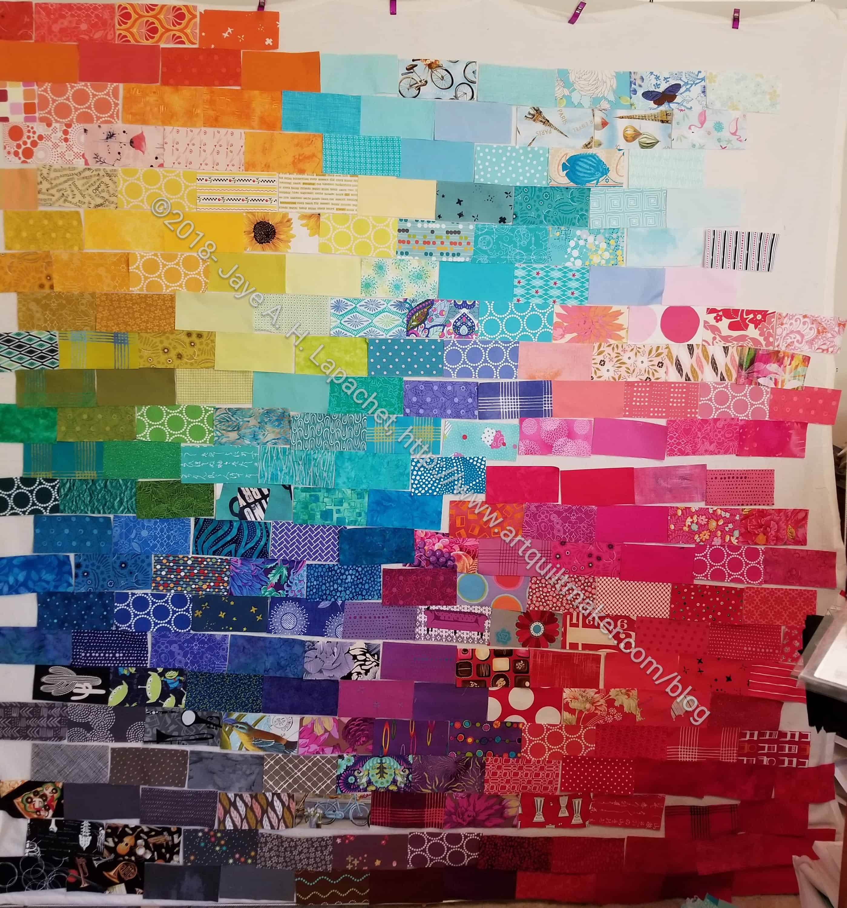
You might be wondering why this piece is taking me forever. I haven’t yet put together blocks, so I have to put the blocks together before I can put together the rows. I need to watch placement of the fabrics. While the piece is scrappy, it is not a charm quilt and I’d like to keep like fabrics away from each other as much as possible.

This quilt definitely has fewer colors than I like, but the controlled palette really enhances the curved look of the piecing. I am so pleased with how this piecing is looking that I can’t stop looking at it. That surprises me since it is just a pattern, not much original.

3 Triple Stars

In between working on putting together the En Provence quilt, I have been sewing Triple Star blocks together. I use the blocks as leaders and enders.

While I am concerned that using the blocks as leaders and enders means I am not as engaged with the quilt, I really have to have something in between the En Provence pieces to keep them in order. While I could make make more donation blocks, I want to make progress on other projects as well, so the Triple Star blocks are the leaders and enders.

Unlike Fresh Fruit, I have to pick a lot of colors for the blocks. I also have a lot more seams to sew, so I do pay attention.
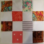
What Else We Did at the BAMaQG Retreat

BAM 2017 Scrap Attack

I wasn’t the only one busy at Retreat. A lot of charity blocks and tops were made. People also worked on their own projects.

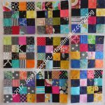
MassDrop gave the guild a bunch of fat quarter packs to use to make charity quilts. The group did not disappoint. Right there, at least 5 were made. There were only about 4 packs left at the end of the day on Sunday, so I think others are in process.

Yellow Donation Quilt

Gerre had taken my Yellow Donation quilt and quilted it. She was working on the binding on Friday at the Retreat. She finished it and, thus, finished the quilt at the Retreat. I was pleased that she had worked on the top I made. I always feel happy when Gerre and I collaborate, especially when she says nice things about my color combinations. 😉

Michelle S' map quilt
Michelle S’ map quilt

Michelle S was working on, what I think of as, a map quilt. She had a different name for it, but I thought the blocks looks like a map or aerial photo.

Retreat 2017 Workspace

I didn’t take as many photos as I expected to. I was focused on sewing and getting as much done as possible. There was a lot of moving around to shared cutting tables and ironing stations. People were also very chatty and interested in what other people were working on. It is always interesting to be in a Retreat situation because you get to see how other people work, what they are working on and how they interact with other.