I know the Nighthawk Scarf was barely cold in the box of gifts when I went and bought more yarn. There are not many yarn shops near me, so I have to take advantage when I can.
There is one near my hairdresser and since I was getting a cut, I stopped and bought yarn as well.
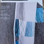
I bought two skeins of the yarn shown, which is Madeleine Tosh Lichen. The person receiving this scarf-to-be likes dark green. I couldn’t find an all dark green skein, so this is what she is getting. I am not a huge green fan, so the purple and grey will relieve me a little bit.
This is knit on size 6 needles, but I cast on to size 7s and then purl on to the size 6s to keep the curve from developing, like on the Nighthawk scarf. I really wanted to get started, but forgot my size 6 needles, so I haven’t gotten to it yet. Soon.
I was tempted to buy two additional skeins as well, but resisted. I really don’t want to start a yarn stash. I have a fabric stash and that is my limit.
I am pleased to say that I finished the Nighthawk scarf. I started it just about a month ago and finished it over the weekend. I wove in the ends at Craft Night, so done and dusted.
As I almost always say, I am pleased with how this scarf came out. I was also pleased with the size and feel of the yarn. As I said in a previous post, it has a kind of springy feel.
The finished scarf is rather heavy. It is also long, but I wanted it to be long. This scarf, the Monarch scarf and the next few scarves will go to the YM’s friends who helped take care of him this summer.
Back in May, or perhaps the beginning of June, I went to Sutter Creek with DH for a Native Sons event. There was a wonderful parade in the town where people drove their minivans filled with costumed poodles, the local dance troupe danced along the town square and the Shriners drove go carts like crazy people all over the main street.
NSGW Quilt -Sutter Creek, California
It was pretty warm, so we spent most of the time inside the Parlor building. As I was wandering around, I noticed an amazing crazy quilt! It is made of various ribbons along with velvets and other fancy fabrics, embroidery and event ribbons. It is framed and behind glass, so I couldn’t see all the details. From what I could see, it is in great shape and well protected.
NSGW Quilt – detail
The ribbons are NSGW ribbons, political ribbons and there is a judge’s ribbon for a California Admission Day Celebration in Stotckton (yellow). Some of the ribbons are dated in the 1880s and there is a definite Stockton theme, though other Parlor ribbons can also be seen.
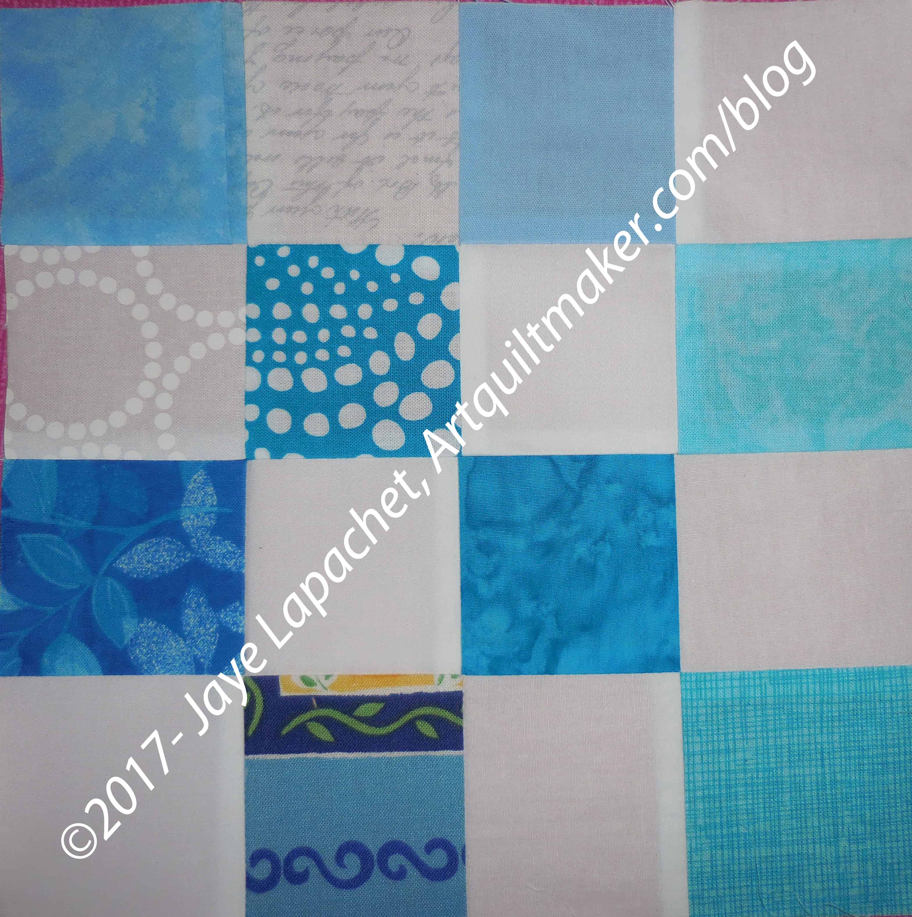
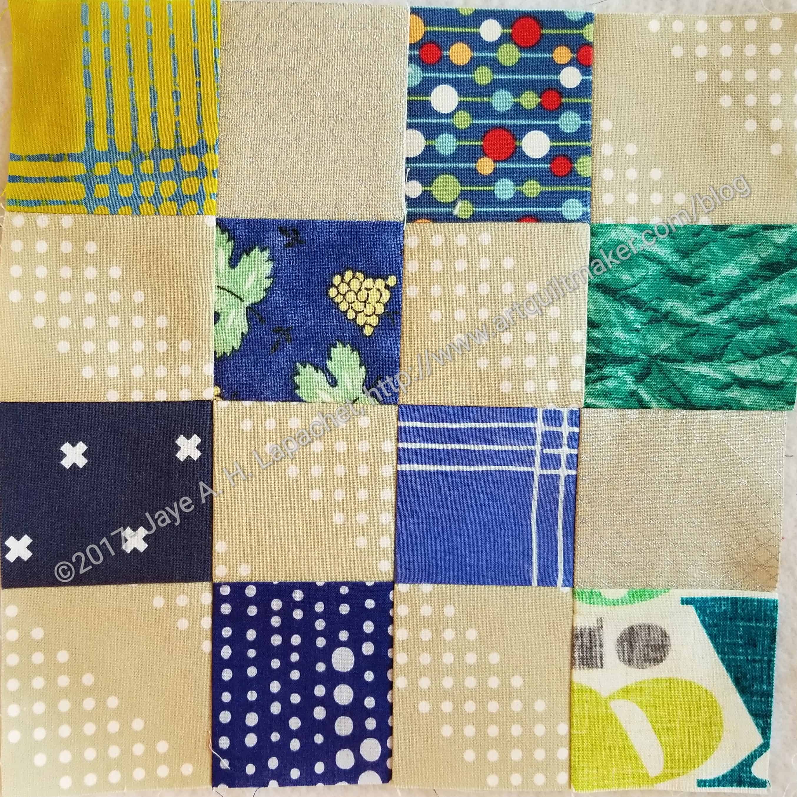
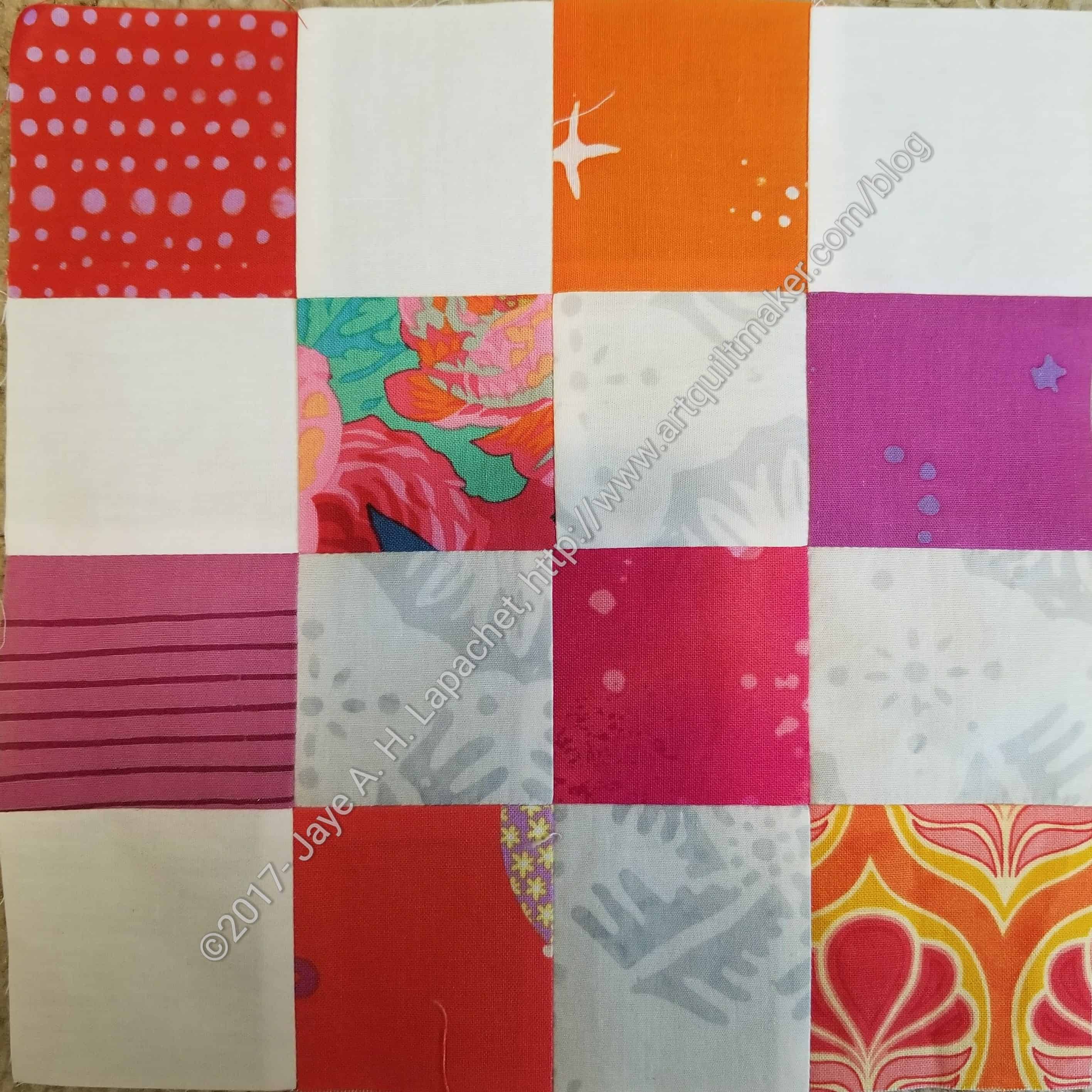
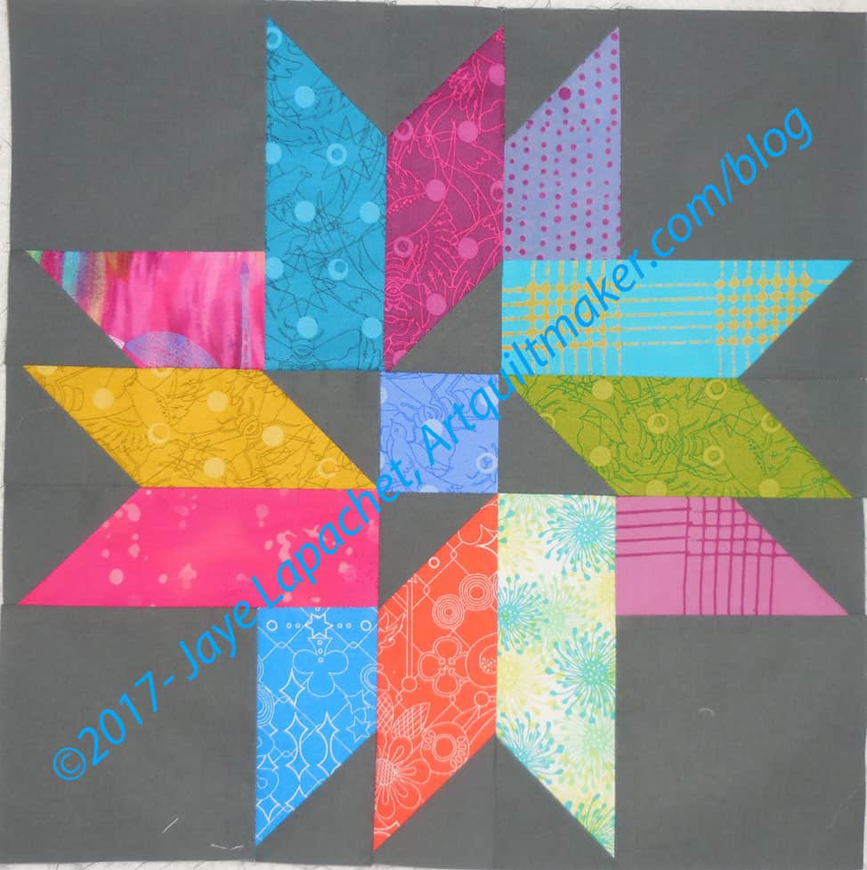
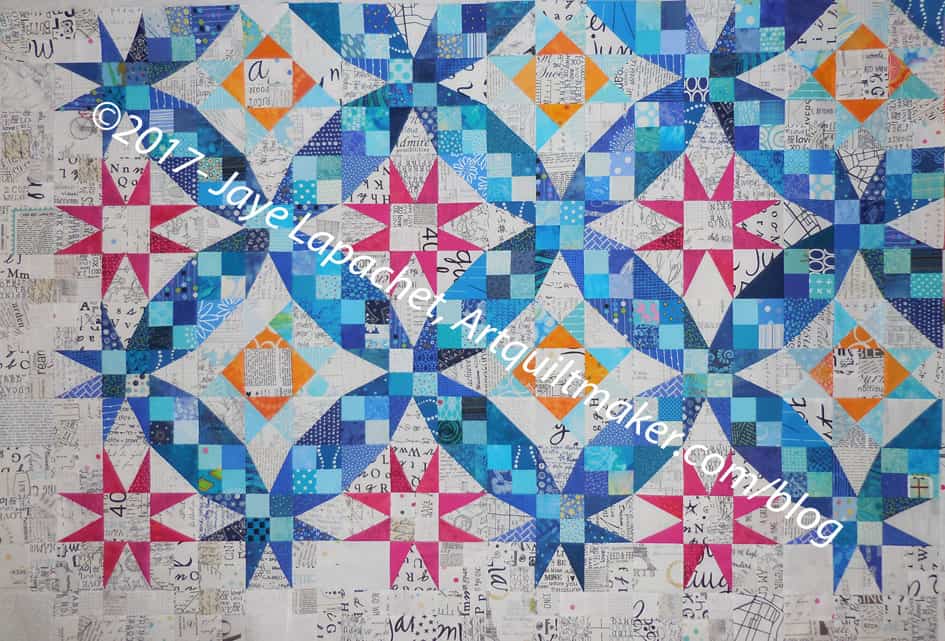
Yep, I finally finished all of those Peaky and Spikes I talked about in July.
I thought I would never finish and while I was taking a piecing break last weekend I put all the rest of the undone pieces together and sewed.
I never thought I would finish this clue. I have to admit that I am getting sick of all of this prep and would like to sew some blocks together. I am fighting with myself about whether to sew a block or two together or to just follow the clues.
I just looked in the folder and I have two more clues, then I will be, presumably, finished.
The next thing I need to do is make a bunch of half square triangles. Now to figure out the colors.
In the process of cutting for the Triple Star, I also cut some pieces for FOTY 2017. Some of the other (non-Triple Star) have been on the wall for awhile. I seem to go in waves: cutting a lot and then not cutting anything.
I really like the plaids in the Chroma line. They are more fun than regular plaids.
After hearing Karen talk about her quilt, I decided that I would do more of a strip piece for Amy, so she would have some pieces she could use to connect other pieces. I tried to keep the pieces long and thin-ish.
Amy’s Color My Quilt piece in process
Partway through the process, as I mentioned, I took out the piece and took a look at it.
I was trying very hard to adhere to the spirit of the words, but color balance kept creeping in to my work. In the case of color balance, left, of the in process piece, I thought it needed more blue towards the top.
After working through all of my thoughts and feelings, I am pleased with the way this came out. I worked on it over the course of several weeks in between other things until I ran out of time. I also focused on the placement of the color rather than the width of the strips, etc. I did try to keep the strips from getting to wide, though I really wanted it to be long, so some are quite wide.
Amy’s Color My Quilt piece
I wanted to make it about a foot longer, but ran out of time. I am pleased and hope Amy will be, too.
I decided to use this photo again and try to make palettes with Kona colors and see the differences. Obviously, I am going to try to put the dots in the same place.
You can see my first effort, from last week. I used Bella Solids on last week’s post. It was an accident. I meant to use Kona, but Bella was turned on so I went with it.
Leaded Glass-default-Kona
The default palette is very similar to last week’s default. I guess if there are no neutral colored areas in the uploaded image, it goes with similar colors or as close to neutral as possible.
I do like that very dark, Kona Espresso as an addition to the pinks. I think I would swap out the Crimson, though it looks more purple than crimson to me, to allow the Espresso to shine more.
Leaded Glass – palette n.1-Kona
The obvious differences in my first palette are the first red is darker and pink is more blush than grape. The first three colors (from left) are the stars as they were in the first Bella palette.
Kona Pool is such a great color and the yellow, Kona Wasabi, though looking much brighter on the bottom is a nice addition. I am not fond of the sand, but I am sure it would be a good unobtrusive hue to help the others shine.
Leaded Glass n.2-Kona
I gave up doing a scientific experiment and just had some fun. The next palette had a circus feel.
The colors are not pure primaries, so I don’t think it looks kid-like. I think it looks very cheerful. The Baby Pink as well as the Tomato keep the whole palette from being too much like a young child’s playroom.
Leaded Glass n.3-Kona
I tried for another cheerful palette and got one similar to the circus palette above, but with greyer hues. Not completely, because Pool and the Citrus are VERY cheerful. I am not sure I have seen citrus show up in a palette before (it must have and I didn’t notice). The Ultramarine and Grass Green make this palette into one that the parents of the children above could use.
Leaded Glass n.4-Kona
The blues stood out to me. Since I can resist them I made a palette with blues and greens – towards the darker, tending towards neutral.
The plum was an unexpected addition. I can’t pretend it just happened, because I put the circles in place. I was surprised at how well it went with the greens, especially the Celadon.
Leaded Glass n.6-Kona
I guess the neutrals have gotten to me, because I couldn’t finish the exercise without a neutral palette.
One thing I noticed is that I have to really notice all the colors when I made so many palettes. I didn’t notice the dark brown, actually Cocoa, when I started on this exercise last week. The Kona Pepper looks more dark blue to me than black, but it adds a tinge of optimism to the palette.
Leaded Glass n.5-Kona
The Pepper with its blue tinges sent me off to make one more blue palette.
The Ivy, which isn’t a favorite allows the Oasis and the Holly colors to shine. This might be might favorite palette, but I am also partial to n.2 above.
It is really a lot more fun to use a photo with many colors. I’ll have to find some others to use and do it again.
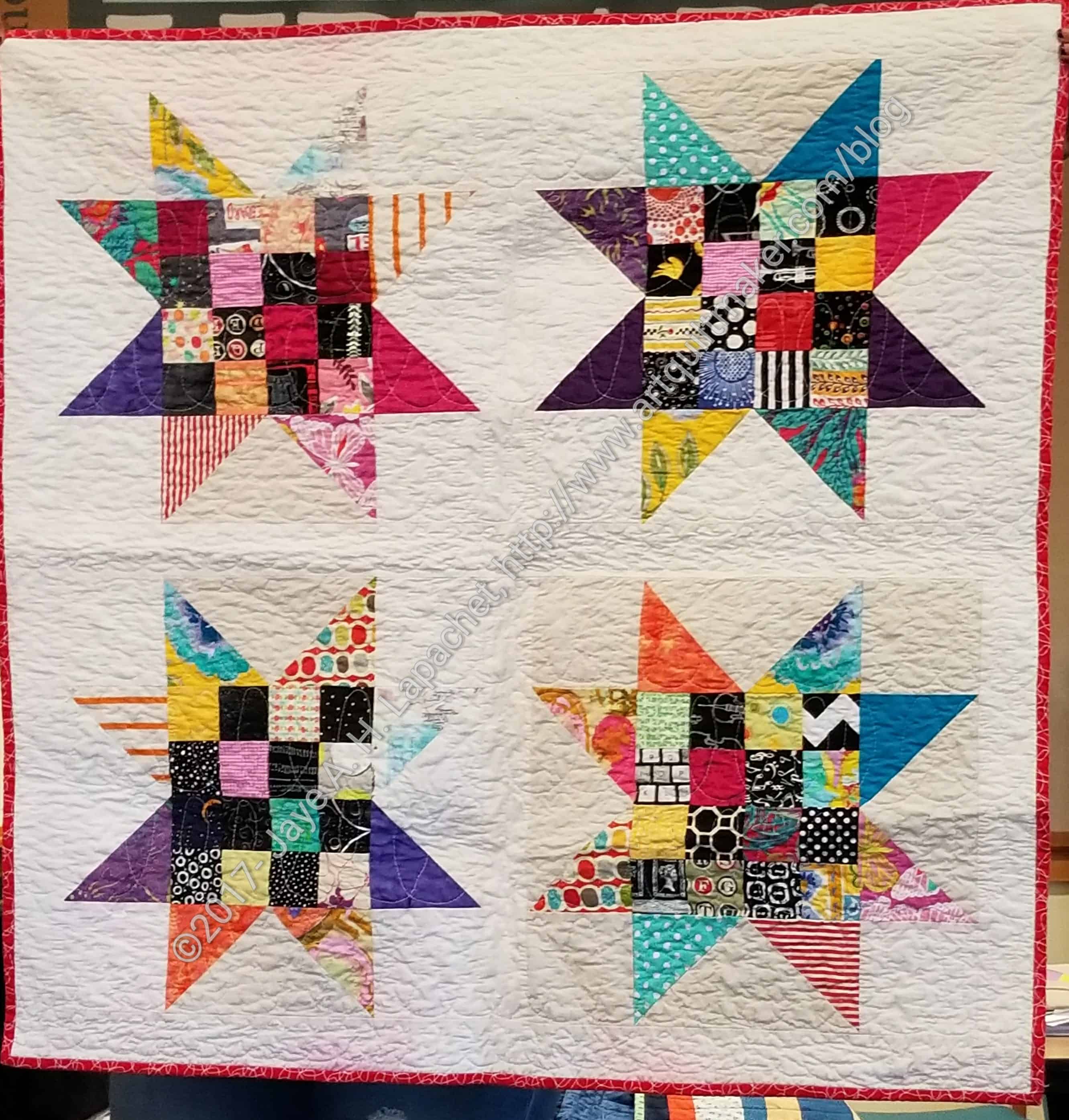
I had a few minutes to sew on Friday night after work and I blew through about 30 pieces for the Triple Star quilt. Not tons, but some progress, which felt good.
Triple Star – August 2017
I have to admit I was avoiding quilting on the art quilt. I had taken off the walking foot in order to finish the star donation quilt and just drifted over to piecing rather than be disciplined about quilting. I have to give myself a break. This is supposed to be fun and I have been driving myself.
I was pleased to do some piecing. I received the Chroma finally, so I could cut the rest of the large rectangles. Now I am in the process of sewing (using the flippy corners method) 2.5″ squares onto two sides of the rectangles to make a parallelogram. I need a lot of them so it is taking forever. I might sew a sample block just to ease the mindlessness. I have no excuse to be bored 1) because I can switch to other projects and 2) I just started!
On a whim, I pre-ordered some Chroma FQs from Hawthorne Threads. I wanted to use some of the pieces for the Triple Star and I had some time to cut at the end of June.
They were expected at the end of June, which was perfect timing. Sadly, the fabric didn’t arrive until nearly the end of July.
Poor Hawthorne Threads. They were beside themselves and incredibly apologetic. Good thing I had plenty to do.
Some of the colors are great, but I don’t like that mustard yellow or the super icky green. I am an icky green girl, but that is a little too icky for me. the blues are the nicest followed by some of the pinks and lavenders. I already started cutting and the fabric is batik-esque and VERY thin.
Aurifil 28 wt.
I also started machine quilting with the 28 weight Aurifil thread. I liked it and decided to use it for the art quilt. I bought a few spools in colors I needed from Red Rock Threads*. What a great place! I ordered the thread in the evening one day and two days later it was on my dining room table. I didn’t even pay for expedited shipping. Their site isn’t super fancy, but it works well, is easy to understand and they ship fast. I can’t ask for more than that.
You saw the other day that I had finished the first layer, or perhaps it was the second layer?
I really kind of liked this look despite the slightly depressing look, but I was on a mission.
I used a satin stitch, but not a dense one stitch down the River. In some cases I will straight stitch first, but I didn’t in this case. I try to keep track of the settings so I can use the same density again. I often start with the density I used to sew on Merit Badges and then adjust from there. Despite the siren call of temptation, I always test the density before I sew on the actual piece. Have you every tried to rip out a satin stitch. It is doable, but I don’t find it to be fun.
After applique’ing down the River shape, I moved on to the broken hearts.
Art Quilt: with hearts in progress
After making some hearts some time ago I have a trick, so I used it to make the heart shape then cut into them with very sharp scissors (should have used my Karen Kay Buckley scissors) and made the broken part. I put fusible on the back of the hearts and pressed them down. I use Soft Fuse. I have used other products, but that is my current favorite.
I had to play around with the placement of the hearts. I wanted them on the background, not on the borders or covering the River. Once they were placed where I wanted them I satin stitched them down and added the tears. I think tears coming off of a heart is powerful imagery.
Art Quilt: Signs in process
The signs took a lot longer. I needed to add sticks and get the placement right, trim the shapes and write the messages.
I don’t know why I wanted these Easter Egg colors, but they seemed right. I didn’t even have to hunt for them as they magically appeared in a convenient stack of fabric.
Weird.
I fused the sticks, then found they didn’t show up very well, so I stitch around them to highlight them. I still don’t think they show up as much as I wanted, but I am okay with the look.
Art Quilt: Top finished
This is very much a quilt where you get one view from afar and need to come closer to get a more detailed view.
A friend sent me this link and it made me sad. A group is selling off Eli Leon’s collection of quilts and aprons to help pay for his care. There wasn’t much detail about whether he is ill or just old and unable to live alone or what. The sale was last weekend, but there are photos at the link of interesting quilts.
Tools, Notions & Supplies
I saw an interesting sewing table on MassDrop. They don’t have a drop on currently. One can always be requested or you can buy it directly. The sewing table is by Merrow and it is small and compact and comes in a lot of delicious colors. if you have one, I’d love to know what you think.
Fabric, Thread, and Batting
I have recently received two unexpected magazines in the mail. The most recent one was from Craftsy. While there is a lot of scope for inspiration, I guess it is basically a catalog. They are touting their holiday patterns, kits, classes and fabrics. The fabrics all seem to be from the ‘Boundless’ line, which I think is a Craftsy brand? A lot of the items are marked down (is that a real sale or just standard marketing?), which is attractive, but makes me wonder if they ever were really sold for the MSRP. My favorite pattern in this catalog is the Puzzle Mixer Quilt Kit. I am not a fan of the fabric, but I like the dimensionality of the design.
Keeping on with the theme of catalogs, I also received a Keepsake Quilting catalog lately. I haven’t bought a lot from them lately, but always like to look at their tools and notions. I meant to write about it a couple of months ago when I received the last one, but didn’t get to it. Keepsake Quilting has changed the look of their catalog slightly. They still have the traditional fabrics, 1930s prints and ‘Call of the Wild’ panels and projects. The catalog, however, looks brighter and more cheerful. They also have a new section called Keepsake Modern. This section has the new Elizabeth Hartman Ocean quilt. Chroma from Alison Glass, along with the patterns, Cobblestone Quilt and Luminary, is featured as well. Sara Lawson has some patterns listed, Heather Givans has some fabrics on sale. The list goes on and on. This is not just a nod to modern. The company has done some investing and seem to be committed to the fabrics and patterns that modern quiltmakers want. Additionally, modern patterns show up in other sections, showing how modern patterns aren’t just for modern fabrics. There was one ‘…of the month’ subscription I considered. If you read Sandy’s blog, you know how popular these boxes and subscriptions have become. KQ has an Aurifil Modern Quilter Thread of the Month Club. the customer receives 4 spools a month and the cost is $49.99+ shipping. Including shipping, that is $13.49 per spool. Red Rock Threads is slightly less at $12.75 for four spools. Their shipping is slightly higher at $5. I found their shipping to be super quick. I ordered some thread and had it two days later even though I didn’t pay for expedited shipping. Still, getting fun mail is, well, fun and I wouldn’t have to do anything except pay. If I could be guaranteed not to receive any brown or beige I would join.
Projects
Did you make a hand? No? Me neither, but it is on my list. Make a hand! I need to make a hand!
Exhibits & Exhibitions
Threads of Resistance will be at PIQF October 12-15, 2017 in Santa Clara. You can sign up for workshops and lectures on their site. Online entry for quilts and wearables is also available now. Deadline is August 29, 2017.
Technique
Charlotte of the Slightly Mad Quilt Lady talks about stippling and gives a nice list of why it is a good quilt pattern.
After sewing the background together, I thought there might be a small chance I was done and could move on. No dice. I would like to say that my Muse gently stroked my hand encouragingly. No such luck. The VIMH #2 was impatient and insistent. “keep going,” she said (loudly). She has no patience because she knows I know what I am supposed to do. When I don’t do it she has no patience for my prevaricating.
I thought the piece needed an inner border to keep the center motifs contained. I thought a dark border would work. Not being done with those 1.5″ squares yet, I cut about a gazillion more out of black and white fabrics. The fabrics were mostly dark, but the white provides a little space.
Down the Drain with border #2
I cut enough for two rows, then put them up on the wall.
Down the Drain with border #2- different sizes
The effect seemed kind of heavy to me, so I put one row up and compared the two. One row seemed best to me, so I sewed those together and put them on to the quilt.
Except.
River of Sorrow and border n.1
I really wanted the ‘River‘ to go underneath the border. I fiddled with that concept a lot, then finally gave up.
Part of the problem was that I was going to have to applique some of the squares and I really didn’t want to do that. I also didn’t think it added anything to the quilt overall. It was hard to tell, though, and it made me sad not to be able to work out the technical details.
Down the Drain: River of Sorrow-detail
I got busy trimming the River as I didn’t want a 20 inch third border.
I needed to make the water filtering into the drain end up in the corner but not on the edge, otherwise I wouldn’t be able to applique the drain.
I was still trying to figure out how to get the inner border over the River shape. This point in the process decided me, because I was already thinking about quilting and how I would manage that with this border on top.
Trimming the bottom of the water going down the drain was also a problem because of the angle of the viewer. I looked at water sluicing into a drain, which didn’t help me, because I was looking at it from on top. Even if I stood on my head **in** the sink, I wouldn’t have been able to get the same angle. Finally, I decided that my viewers weren’t stupid and would figure out what I was trying to say. I am not 100% happy with the outcome, but sometimes one has to make compromises.
Down the Drain: River of Sorrow complete
After trimming, sewing, ripping and sewing again, I finished the second layer.
The weather has been very gray lately, so the quilt, being predominantly grey at this point, looks depressing. It isn’t really. The grey made into the second border is a bright clear grey. Even thought I don’t get the interwoven feel I was trying for, I am pleased with how this came out.
Rhonda brought my BAMQG Round Robin back to me when we met at the CQFA meeting. I had to hunt around the blog for which challenge it came as I couldn’t remember. I also wanted to see the changes. I remembered that Kathleen worked on it and Kelly had it, but I couldn’t remember anything else about it. 🙁 Kelly had it for a long time and since she is much more into quilting than piecing, I wasn’t surprised to see no changes.
BAMaQG Round Robin
I remember Kathleen and I talking about ways to make the piece more horizontal as it started out very vertical. As it is now, it is very traditional in layout. It is turning into a medallion quilt, which I don’t find that interesting.
Round Robin detail
The piecing is really good. I have asked for some other volunteers to work on the piece. We’ll see if anyone volunteers. If not, I will finish it and give it to a kid I know, I think. I don’t think I am really interested in working on it anymore.
Today, I decided to try a photo that was super colorful. This is a leaded glass window I saw in a house on Guerrero Street. It is an AirBnB and my friend stayed there. I saw it when I dropped her off. the female shape in front of it is a statue. I am going to focus on the glass.
The first palette, always the default, is very grape heavy. It isn’t unpleasant at all. I am struck at the similarities in the colors chosen by the program. Although, the hues provided tend to be somewhat dusky, the Bella Off-White seems have a pink tone when put next to the grapes and pink fabrics.
My first palette looks very circus-y. The Bella Sunflower next to the Little Boy Blue looks very cheerful. I got the red – actually Mango – by moving the dot very slightly up on the same piece of glass.
Leaded Glass – palette n.2
The Bella Sprout really makes the second of my palettes. I wanted something different than the yellow, but was concerned about that Longhorn (gold-yellow). with the other colors, I think it works. This palette is probably my favorite.
Leaded Glass – palette n.3
My immediate reaction to the third of my palettes was that I didn’t like it. However, I looked again and while I have concerns about the Bella Avocado, I think, overall, it works.
The colors come from one flower and I know the light affected the colors appeared.
I might do this exercise again with Konas just to see the difference.
Kind of dramatic, huh? I am not sure what else to call the shape. I have used this shape two other times – both on political quilts.
I knew the approximate shape I wanted, so I made a paper template by taping a bunch of pieces of newsprint together.
Then I cut out the fabric. Then I trimmed the fabric. Then I shaped the piece until I had it the way I wanted it.
Down the Drain: River of Sorrow
Finally, I was able to put it on the wall. It didn’t stick, so there are pins you can’t see.
Down the Drain: River of Sorrow-detail
I wanted to make the shape look like it was going down a drain. I needed it to look like it was constrained in some way and forced to flow down.
I wanted the black border squares to go on top of the Shape. At this stage, I pinned the border over the shape to move in that direction.
The part of the ‘water’ that goes down a drain was hard to approximate. The shape you see in this picture is what I ended up with.
After I got the approximate shape, I took fabric ink and a rubber stamp alphabet and wrote on the shape. I wrote words that described what I observed was going down the drain.
I always have a hard time naming my political quilts. Their names end up being straightforward and somewhat unsophisticated. I guess I have learned to go with that.