Stitch Chart Online

As you may know, I have been coveting a new machine for awhile. It didn’t happen last year and this year isn’t looking that good either. Still, I can dream and look and make my choice.

Janome just came out with the 11K Special edition and they put a stitch chart on their website. I used this to see if my favorite stitches will still be available and if the one stitch I didn’t get (kind of a serpentine stitch was available. Also, my favorite star stitch is still available. Hooray. The chart is small, but it is a great idea.

Back to my regularly scheduled dreaming..

clipped from janomespecials.com
Stitch Chart
  blog it

Walking Around and Looking

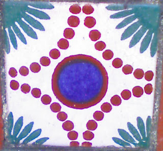
Sometimes the easiest thing to do it just look at the world around you. I was doing this yesterday and happened upon some really nice tiles. They are on Chenery Street near Church in SF.

One of the things I like about tiles is that, often, the designs of groups of tiles create a pattern I can replicate in fabric. The design is usually made of of different colored titles placed precisely. In this case (above), an ordinary terracotta tiled staircase has been dressed up using these textured and painted tiles. I like the idea of coming home each night and getting a little inspiration as I walk up the stairs. I also am interested in the designs and how they relate to quilt patterns.

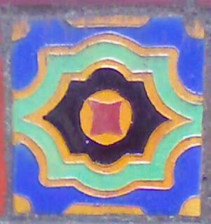
I saw this one and immediately thought of a New York Beauty. It is not exactly a New York Beauty as we in quiltmaking know that pattern, but it gives the impression of a New York Beauty.

The tile above isn’t a quilt pattern that I have seen, but it would make an interesting applique’.

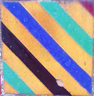
I really like the colors in this bold striped tile. It could easily be the basis of a quilt or one quilt block.

Progress on Bullseyes- YES!!

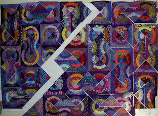
Last week I noted that I wanted to get moving on the Bullseye, because I wanted to get it off the design wall and to the quilter. Yesterday, I got busy and began sewing blocks together. This is a project, because I need – well, want – to keep the patches in the order I have laid them out. As TFQ pointed out, in the future nobody will notice and I won’t remember, but there is no sense in laying them out and not, at least, trying to keep them in order.

I spent several hours yesterday sewing blocks together, trimming applique and squaring up the blocks. I decided that it would be a lot easier to square the blocks as I went along rather than waiting. It did take longer, but I am happy that I am trimming and squaring now since it will be a lot easier to put the blocks together later.

The sewing part is a little tricky, because, while I was sewing blocks, the blocks I was sewing together have nothing to do with the design on the quilt. Groups of blocks make up the design.

You can see from the photo, above, how much the piece will shrink once all of the sewing is completed. Right now there is about a 2″ gap between the sewn block (left) and the unsewn blocks (right). It never ceases to amaze me how much fabric seam allowances take up. There will be more once I start sewing blocks together.

More “Bags” to make for Your Amusement

The ever ingenious Deirdre sent me a link to this blog post where the writer shows you how to make personalized bubble mailers. I tried to clip using Clipmarks, but it didn’t work, so definitely click on the link to see them.

Seeing as how I never have the right sized bubble mailers and have copious amounts of fabric and bubble wrap, it is a possibility that I might actually make a few. I don’t usually have time to put together something like this when I want to get a package off, but I can see the uses. Something to consider, regardless. I love the web and how you get to see a lot of different types of creativity.

1000 Journals Project Visits SF Weekend of August 1, 2008

You are probably wondering why it took me so long to get to this post.

Life.
Travel.
Back to School.

You know how it goes.

Still, I wanted to post some photos from the actual journals. The Roxie in SF showed the 1000 Journals movie. It was the first commercial showing in the country.

The 1000 Journals project is coming to the SFMOMA as an exhibit starting in November and the exhibit will be open through ~ April 2009.

I think that the images I was able to snap are from the most photographed journals (because they are in possession of Someguy), but I thought I would post some images anyway.


Some entries are homages. Some entries look like a mess, but that is one of the beauties of the project: everyone can express themselves anyway they want regardless of age or ability.

The artistry of some of the pages is remarkable.
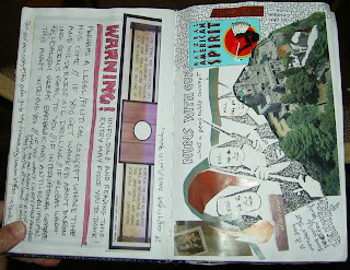

I like the way these entries were created in landscape format.

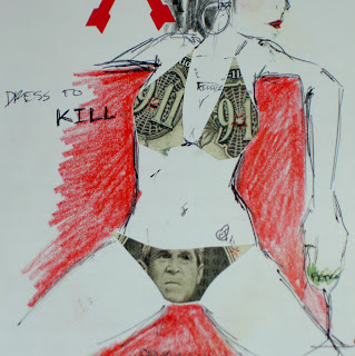
WARNING: Political images next. Stop reading if you may be offended.
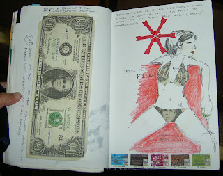
I am not exactly sure what these images are saying (remember the journals went out right around the time of 9/11 so there is a lot of 9/11 imagery included), but I admire the creativity and thoughtfulness (especially the double entendre) regardless of whether you think it is positive or not.

Parakeets’ Expression


This is a quilt that TFQ and I saw at the APNQ show. It has been on mind because of the expressiveness of the little parakeets. I think that this quilt tells a story because of the implied movement of the birds. I can appreciate realistic quilts, but don’t always see the point in reproducing a photo in quilt format. This one, however, tells a story.

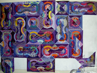
Towards Final Bullseye Arrangement

After magnificiently struggling with the layout for the Bullseye, I believe I have settled on a shape I can live with and one that is successful. The difference between this and the others I have done is that the ‘knots’ I have created are self contained. I keep thinking of them as Lovers’ Knots, but I know that term may confuse people who know the actual Lovers’ Knot quilt pattern.

I have more patches on the wall and am finalizing fabric placement now. I hope to get to sewing today as I would like to have this piece ready to take to the quilter with the Chocolate Box. I am itching to get back to the Pineapple (amazing, but true). I need to move a couple of projects forward first.

Next up in the Tote Bag Department

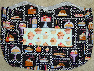
As you may recall, I made this lining for the Cupcake Tote, but ended up not using it.

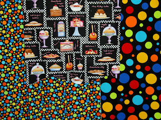
After finishing the Eggplant/Lemon tote and embellishing the Chocolate Flower Tote, I, once again, turned my attention to this troublesome lining. It wasn’t intentionally troublesome, but the colors turned out to be a problem.

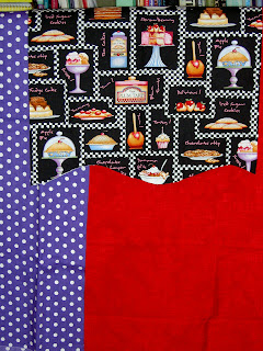
I looked through my fabric, not really sure what to pick. I pulled out these dots from the Timeless Treasures Basix collection. I love these dots, though I love the ones with the white backgrounds more. I thought I would use them, but when I looked at the three pieces together, I decided that making visually decisions visually was a good idea. The colors in the cake fabric didn’t go with the dots. No purple or pink in the dots and no turquoise or orange in the cake fabric. Too bad, because I have a lot of black dot fabrics that I haven’t used at all. The outside fabrics had to go with the lining, though.

After looking carefully at the focus fabric and looking through my black and white fabrics, I found this red batik and this violet dot.

This is the grouping that I picked. I wanted the fabrics to all go together without being too matchy-matchy. I also wanted to use some dots. The violet dot is very thin and I don’t like it forpiecing. I don’t have much of that red batik, but think it will be nice as an accent. I completely ignored the aqua pockets that I already sewed to the inside of the lining. Nobody will see them much except the owner.

Stay tuned.

Out of the Mouths of Babes

Here is the latest update to the Flowering Snowball (Cross Blocks).

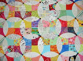
As I have mentioned, I am nearing the end of the project. I am not sure what the end actually is, but am thinking that it is 10 more of the middle blocks and then a round of border blocks. I haven’t designed the border blocks, but will design them to complete the colored areas with the rest being white. I was also thinking of a black border. I need to play around with what I am thinking because it is much easier to show a photo/image than explain.
Here is a detail.

The Child came in and joined me while I was looking at the blocks. He said that it looks too chaotic and I need to put some solids in it. HUH???

I do think he is right. I don’t know if I will use tone-on-tones or something like low contrast batiks, but I think I need to add some resting spots for the viewers eyes. I will try it out and see what I come up with.

Latest Fashion in Tote Bags

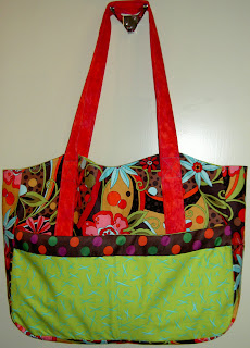
I worked on some totes this weekend. The Chocolate Flower tote was completed this summer (wrote about it on July 26), but something was missing. In general, I am also not liking the big blobs of fabric that the big outside pockets tend to become. I found a random piece of ribbon with the perfect colors. I used it to embellish the tote’s outside pocket last night. When I auditioned it, I thought the ribbon made the green in the flower print stand out.
In future totes I want to work on making the outside pocket less of a big blob.

My newest tote is the eggplant/lemon tote. I started it on my summer vacation, but didn’t work on it again until this weekend, .
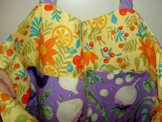
The lemon flower fabric is from a recent Moda collection (Fresh Squeezed by Sandy Gervais??). I love the colors in the vegee/eggplant fabric. It is a very fun fabric that I would, probably, never use in a quilt.

Here is the inside of the bag. I have started to put large pockets on the insides of all the bags in addition to the small pocket. They are very useful.

Quilt vs. Art

This is a giant piece of art made from found objects – large found objects – that is displayed at the American Gallery of Art. It is by Louise Nevelson and is described as an assemblage of found objects.

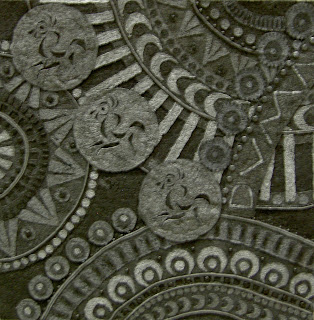
As you can see from the detail, this piece is about texture. I say that because the color is very flat and the artist does not use color to move your eye around the piece.

Above is a quilt we saw at APNQ, which reminded me of the art above. I don’t know if the quilt artist was informed or inspired by the piece above, but they are definitely related.

Metal Penguins and Exciting Eating Environments

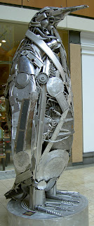
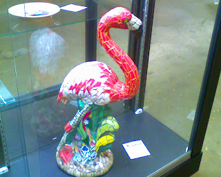
Pacific Place in Seattle is a mall downtown with shops, movie theatres and restaurants. They also have cool art – public and to buy.I like this penguin, because from far away it actually looks like a penguin. Up close it has great texture.


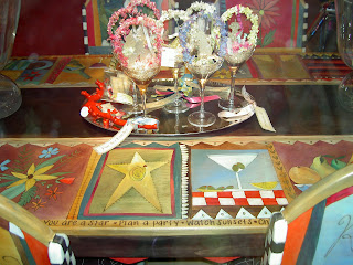
This is a wonderful set of table and chairs that are painted with lovely designs. They had other pieces such as a chest (like a cedar chest or toy chest).

Cupcake Tote


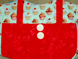
Here is the finished cupcake tote bag! The cupcake fabric is that which I bought from Clemetine’s Dry Goods a few months ago. I originally thought I would use a black cake fabric for the inside and I went so far as to construct it, but decided that it really didn’t go with the delicate aqua of the outside and changed the lining to this lovely turquoise cake with stands fabric. I bought that fabric at Capital Quilts AND at one of the shops in Connecticut while I was there.

Since I have not been able to figure out how to use the buttonholer on my machine, the buttons are decorative only. I put them there to break up that large expanse of pink. I have to go and get some more of these buttons as I love them. They have some style! They are vintage buttons from Britex and there are a couple of different styles available made out of the same material.

Before I put the large white buttons on, I tried these pewter teapot/coffee cup buttons. They were ok, but the bag required some bolder embellishments.
This is the original lining for the cupcake bag. I decided, eventually, that it just didn’t go with the light aqua and abandoned it for the turquoise gateau fabric lining. I’ll use this for another bag. Not sure which yet.

Next bag is the eggplant/lemon bag. 😉