ColorPlay: Wind Sculpture

Wind Sculpture, San Francisco

I saw this wind sculpture when I went to get my hair cut on Saturday. I have walked by it numerous times and finally stopped to take a photo.

ColorPlay Wind Sculpture-default

The default was great! NO neutrals this time. I found it to be a very appealing palette, if a little too monochromatic.

ColorPlay: Wind Sculpture n.1

I took the opportunity of a great default to try a monochromatic palette. I tried to go for sea tones and I think I got a blustery day sort of look.

ColorPlay: Wind Sculpture n.2

With the second palette, I tried to pull out the colors in the image. There are quite a few colors and I wanted a variety. The only one I don’t like is the Kona Parsley. It doesn’t look like parsley at all to me. It looks like one of those life-sucking beige relatives.

ColorPlay: Wind Sculpture n.3

In the third palette, I went back to blues, but expanded to darks. I like the colors together. In a quilt, however, I don’t think there would be enough contrast.

ColorPlay: Wind Sculpture n.4

I really got a lot of mileage out of the default blue-centric palette. I continued with the monochromatic theme in the fourth palette, but went with brighter and happier blues. There are some darks and it was hard to find places in the images where the tool registered the location as a different color/fabric.

ColorPlay Wind Sculpture-n.5

With n.5 I tried to find every spec of warm colors in the whole image. The pickle is the only cool color, but it has a tinge of warmth to it, I think.

ColorPlay: Wind Sculpture n.6

With the last palette, I decided to stick with blue, but go light, even venturing into grey. The Avocado was kind of a desperation choice, but the others stuck with my idea.

What will you make?

Creative Spark #23: Repetition

“There is only one way to achieve the fluency, freedom and grace of the expert, and that is by doing” (The Little Spark, pg.97). I believe this quote. I live this quote. I sew a lot. I make a respectable number of quilts and chop up and sew back together a lot of fabric.

I get the impression that people think you can make one quilt and be an expert. I have made a lot of quilts and I still don’t consider myself an expert. “We get better at anything we try to do by doing it over and over (and over and over)” (pg.97).

I do think, as we progress towards becoming an expert, we gain “fluency and fluidity with the materials and…movements.” We “understand…the rhythm and harmony of the” materials, the tools and our “body.” We can feel our way through the” work ” instead of thinking…through” [it]. We become less attached to our work as we get better and we get better at telling the materials exactly what we want them to do using great economy of movement. As we get better, we are fully in control of our work and yet we choose to surrender that control to the materials. (pg.97)

“You don’t learn by thinking about doing. You might enjoy thinking and planning, but the learning comes from doing” (pg.97). Each time we make a quilt or, even, a block “a new awareness…is born. The reality is that you have to show up and do the work.

Carrie recommends that when you start to, she calls it, “throw a hundred bowls” (pg.97) that you not do it alone. In quiltmaking, guilds are great for that, but so are friends, classes and, in a pinch, the Internet. YouTube is a wonderful thing. The point is that if you get stuck and you don’t have a friend or support system, you will have an easier time stopping that if you have someone to lean on.

The text is followed by a quiz (pg.98-99), which helps determine your learning style.

Now, go make your hundred quilts or hundred blocks and improve your skills. Become an expert.

You can see the last post on this topic from last week.

Nota bene: we are working through Carrie Bloomston’s book, The Little Spark. Buy it. Support the artist. Play along. There is much more to each spark than what I am writing. The original chapters will help you. Go buy Carrie Bloomston’s book, so you get the full benefit of her fabulousness! You can see my book review, which is fueling this flight of fancy.

ColorPlay: Israeli Art

Flying Sun by Joel Amit

I was walking through the streets of downtown San Francisco to the train Saturday night after a lovely dinner with friends. I saw this great piece of art by Joel Amit of Jerusalem in one of the gallery windows. The piece is called Flying Sun. I really like it and thought it would be great for ColorPlay.

ColorPlay: Apr27-default

Starting off with the default always makes me wonder. This time I checked out some of the pieces on the Play-Crafts Instagram feed and I don’t see that her quilt pieces focus particularly on neutrals. With all the color in this piece, the tool still defaults to neutrals. There are so many colors that can come in the Palette Builder tool! I don’t even have to move the circles very much- a couple of millimeters at the most to make a new palette with completely new colors. Again, this makes me wonder why so many neutrals in the default palette. Do I sound obsessed? Perhaps I am?

The greys are nice, but it is still mostly neutral.

ColorPlay:Apr,27 n.1

I finally started moving the circles around and thought, when my first palette was finished “okay, I am done”. My first palette is extremely bright and cheerful and reflects some of the colors Mr. Amit has used. I like the Kona Lipstick and the Kona Cardinal, overall, but there is a bit of a circus feel with this palette, so I tried again into order to get something a little more subtle or, perhaps sophisticated.

ColorPlay: Apr. 27 n.2

My second palette uses more subtle colors. I don’t think the Kona Grellow works. It looks a little too mustardy to me. It isn’t terrible, but it doesn’t fit with the rest of the palette. I like the green – Kona Leaf, but not with the  Tomato and Watermelon.

ColorPlay: April 27 n.3

Palette n.3 was another adventure. I added some turquoise, which is great and added Orangeade – there aren’t enough circles to have a ROYGBIV rainbow palette, but we do what we can. I wanted to keep the Watermelon, but moved the wrong circle and ended up with Chinese Red. Somehow I didn’t get rid of the Leaf or Grellow.

ColorPlay:April 27 n.4

Palette n.4 is much better. I kept the colors I liked – Cyan and Orangeade – and tweaked the rest. Except for the yellow, I just made little tweaks. The Geranium is a nice addition. The Honeysuckle and Cyan go really well together. The Clover isn’t terrible, but I don’t like it next to the Canary.

ColorPlay: April 27 n.5

Since I was getting close to a palette I really liked, I only changed the green. Again the Grasshopper is better, but still doesn’t work very well with the yellow. Also, with the Grasshopper, somehow the Orangeade doesn’t look as bright, but it does look ok next to the Honeysuckle.

This is a great photo for this exercise and I could go on forever, but I am not going to since you can go to Play-Crafts.com and make your own palettes.

ColorPlay: April 27 n.6

TA-DA! I took out the green. It wasn’t working, so I added some Shitake. It is a nice light-ish grey and would make a good background.

What will you make?


Creative Spark #22: Find Your Voice

This has been a difficult week, so I decided to sit down and work on a creative spark post. These posts take a while, but I usually end up happy after I am done. Or, at least, distracted.

Carrie Bloomston shares an Alan Alda quote with us that exactly explains the subject of this spark. She quotes “You have to leave the city of your comfort and go into the wilderness of your intuition. what you’ll discover will be wonderful. What you’ll discover is yourself” (pg.93).

We often put on a mask to go to work, do not wear red tights with our all black outfit or simply don’t talk about our true feelings about creativity. Engaging in creativity is different. “No matter what you do in your creative life, you will bring all of you to it” (pg.93). I also would add that artists do their best work when they do what they want to do, not what they think someone else wants them to do and certainly not what the artists think they should do.

This spark is about finding your creative voice. Bloomston explains that “your voice is a combination of style, experience, work, and subject matter” (pg.93).  She shows readers three ways to find your creative subject, “Internal, External and Catharsis” (pg.94).

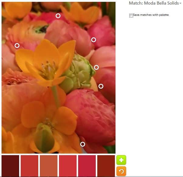
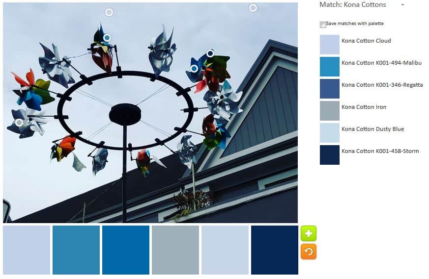
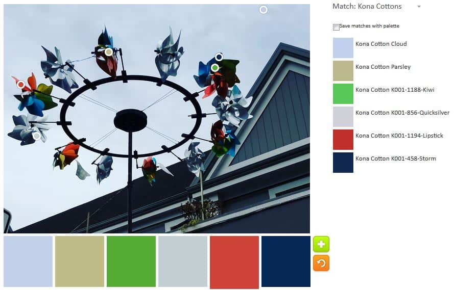
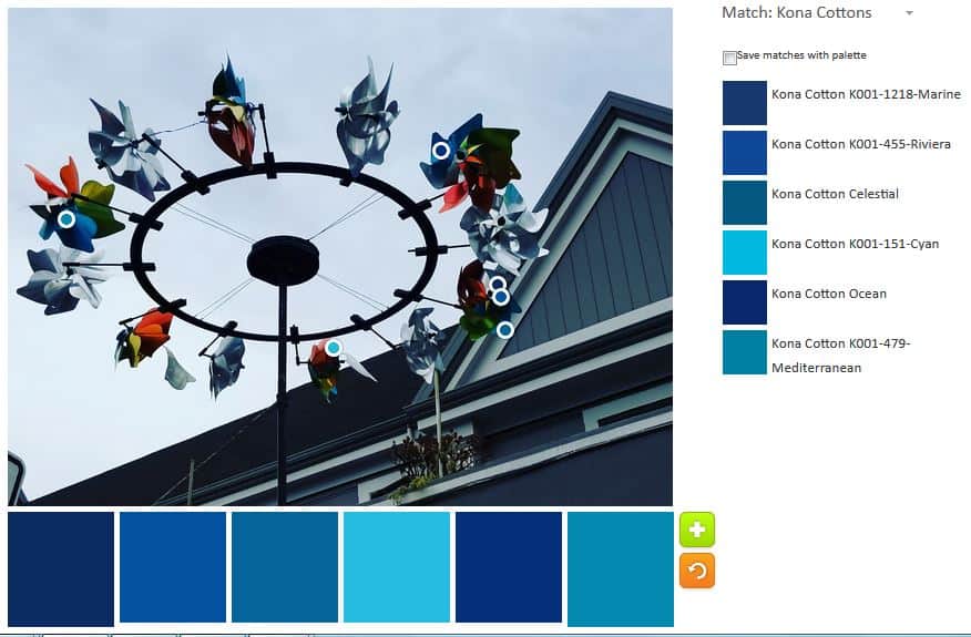
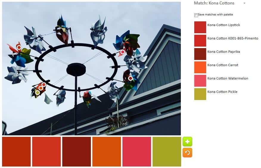
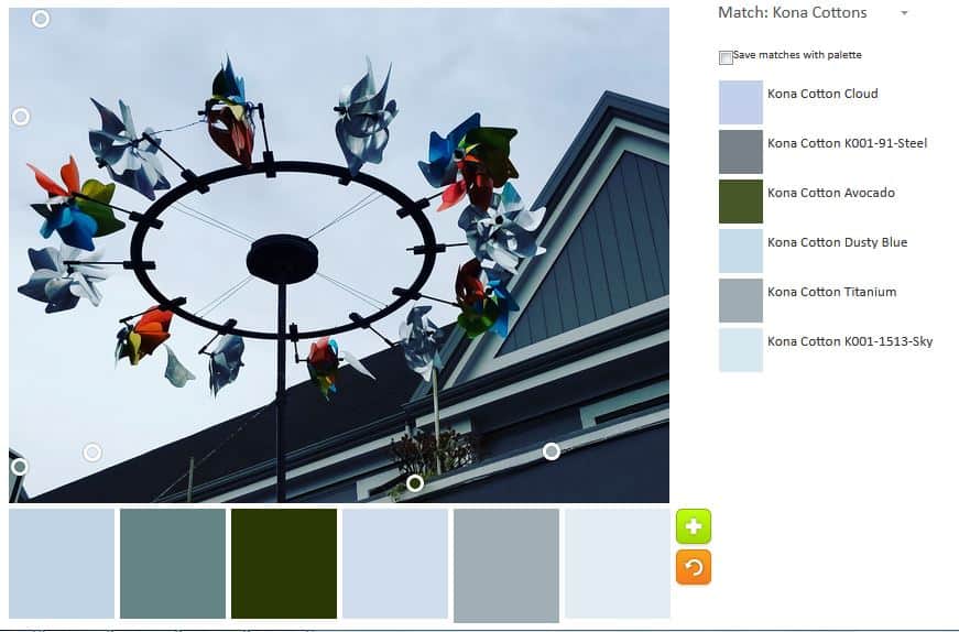
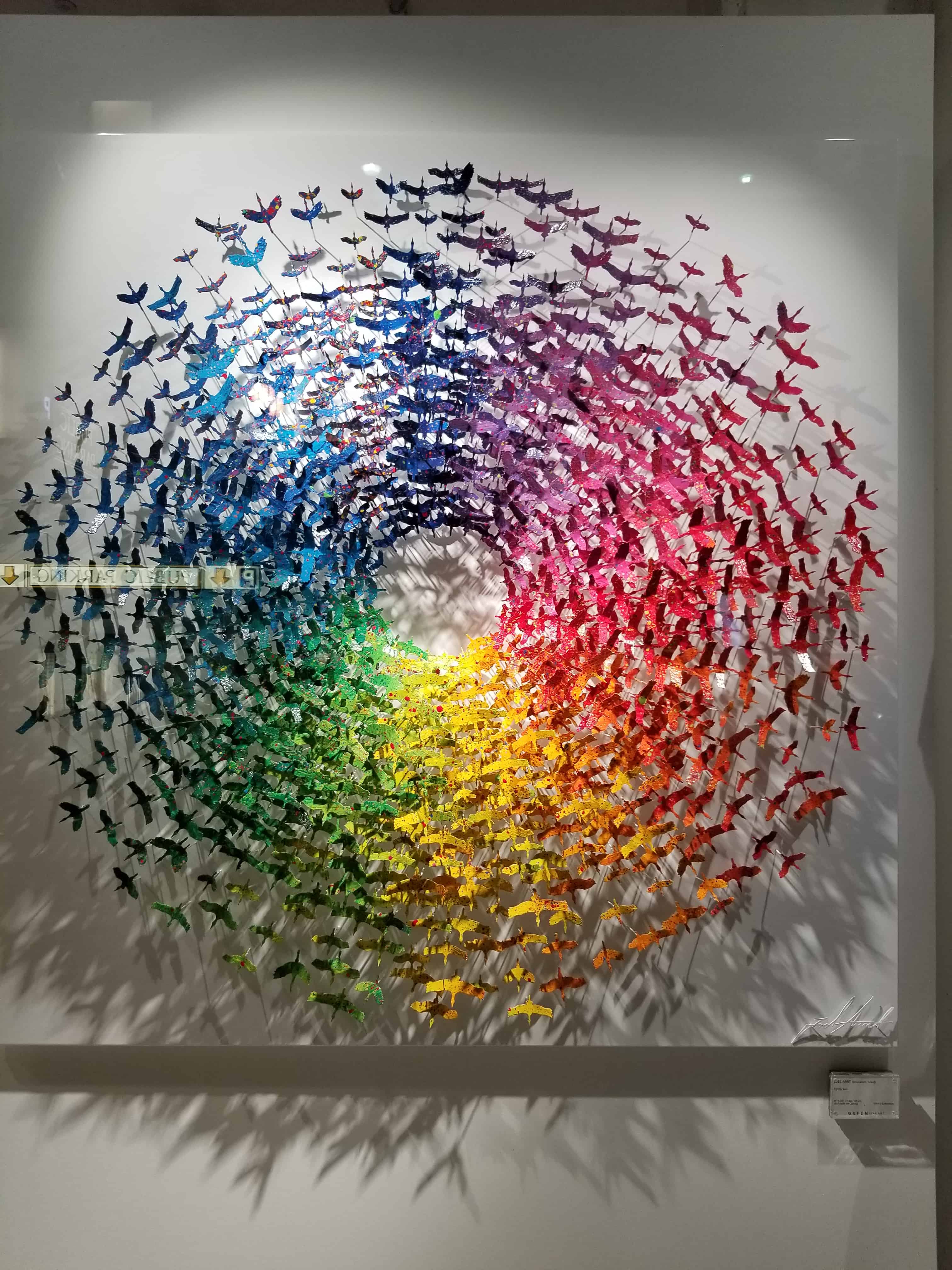
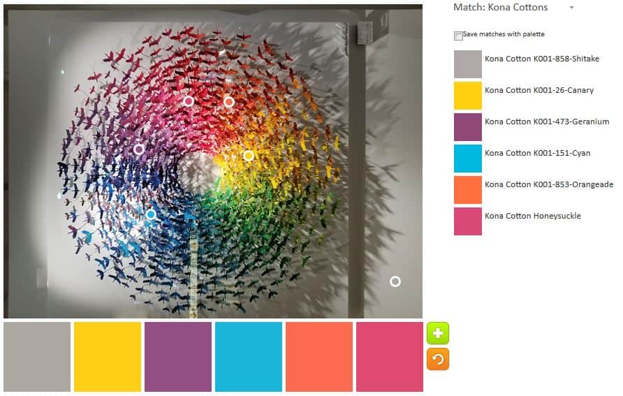
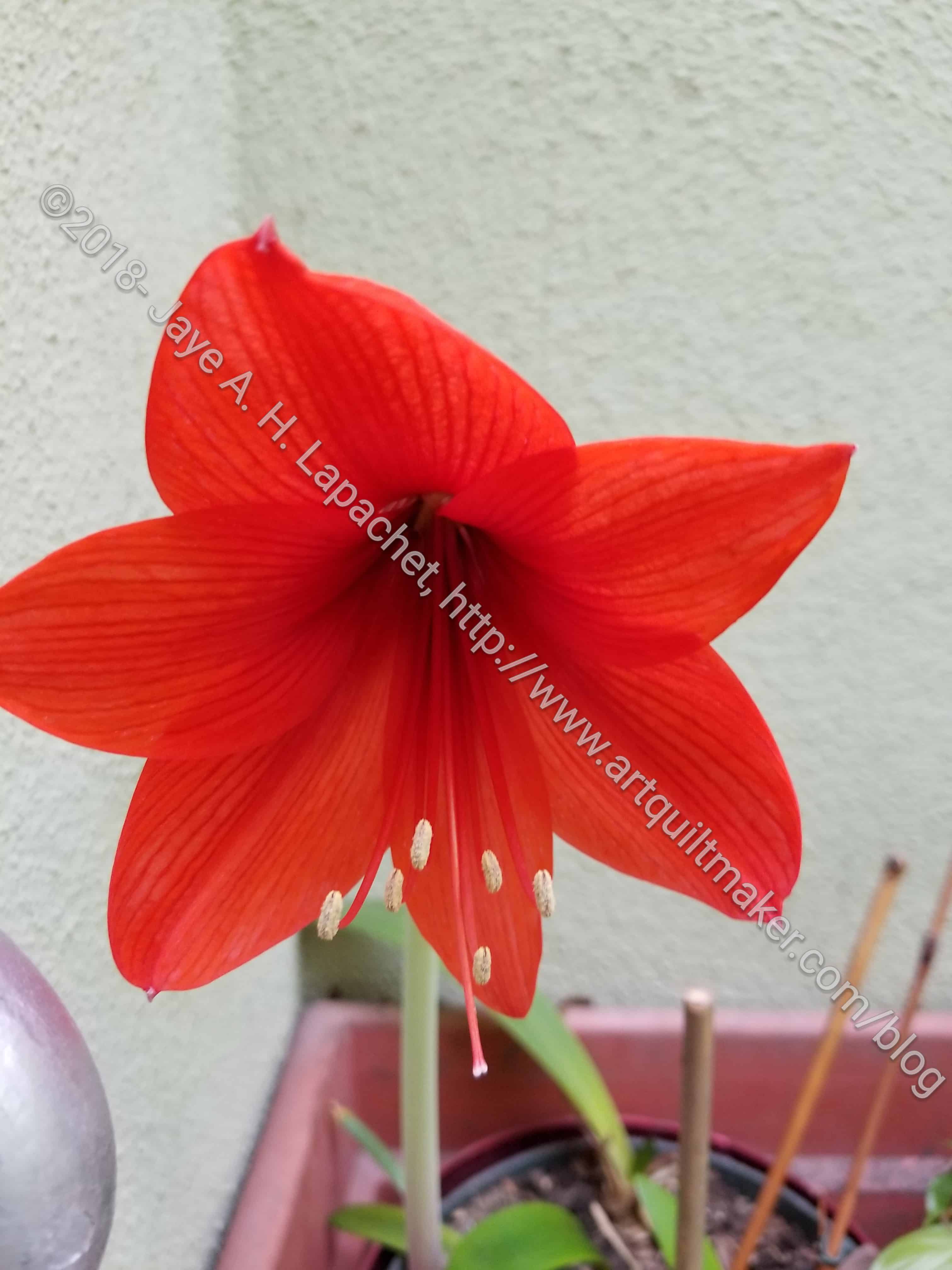
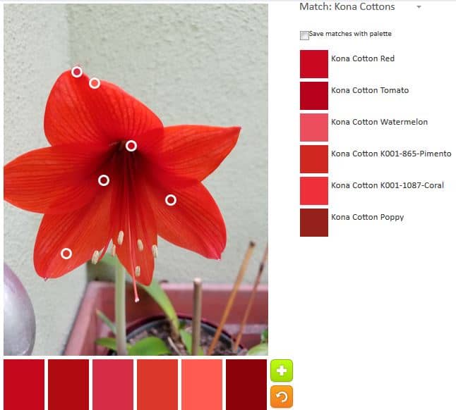
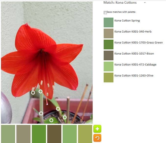
For internal, we have to dig through our unconscious self for content to figure out what we want to say. For external, you have to do research and then there is catharsis, which is healing through art. I find that I use two of the three less than External. I look at things (have you seen this blog?) and get inspiration from them. Sometimes it is colors, sometimes shapes, sometimes what others are doing, sometimes from books. I know I bring my own twist to these sources. I know that sometimes I veer so far away from the original source that the art has little to no relation to the original source.

In terms of internal and catharsis, inspiration is more complicated. I write a lot about my feelings and I think that form of creativity takes care of internal imagery for me. With my quiltmaking, I am more interested in color, shape and line. I don’t always have those images in my head. With catharsis, again, I write, though I have made some art to try and get painful experiences out and work through them. Quiltmaking doesn’t always provide an adequate venue for working through problems. Again, I write.

The worksheet is very good in this chapter and I am actually feeling good about working on it.

What do you think about finding your voice?

You can see the last post on this topic from last week.

Nota bene: we are working through Carrie Bloomston’s book, The Little Spark. Buy it. Support the artist. Play along. There is much more to each spark than what I am writing. The original chapters will help you. Go buy Carrie Bloomston’s book, so you get the full benefit of her fabulousness! You can see my book review, which is what started this flight of fancy.

ColorPlay: Ruth’s Flower

Ruth's Flower
Ruth’s Flower

DH and I went over to my MIL’s house last night to get the mail and take out the garbage. On my way up the stairs, I saw that one of her flowers had bloomed. Better late than never, I suppose. It was still perfect.

I thought I would use it as my ColorPlay image of the week. Even though I already did a sort of tribute to her, this one seems appropriate as well.

ColorPlay April 13: default

The default palette was actually pretty good this time. I guess the tool couldn’t ignore all of that red-orange.

ColorPlay April 13 n.1

My first original palette was all about the various reds, pinks and red-oranges. I couldn’t resist trying to find as many as possible in that photo.

ColorPlay April 13 n.2

Can I vary the colors? Yes! Can I create a balanced palette that would make a good set of colors for a quilt? Apparently, only if that quilt palette is monochromatic. This time I went with green. I like green in plants, but not so much in fabric. This palette is not a favorite.

ColorPlay April 13 n.3

I decided to create a balanced palette move one circle to each main section of the image. I did come up with a lot of different colors, but am not sure if the palette would make a good group of colors for a quilt. I think not.

ColorPlay April 13 n.4

I made a last effort and actually looked for opportunities to add in some neutrals. This one has both Kona Cinnamon and Kona Crimson. They look the same to me and the latter looks nothing like Crimson.

What will you make?

CQFA Unconventional Materials Exercise

Rhonda led us in an exercise using unconventional materials, e.g. not fabric. For me, these materials were unconventional in terms of quiltmaking, but familiar in terms of creativity. I love working with paper and don’t get to do it enough.

Rhonda brought quite a bit of stuff for us to work with, but not enough that we spent the whole time rummaging for materials. I saw a shiny binder clip as she was introducing us to the materials and an idea started to form in my head.

Everyone’s pieces came out so differently. It was exciting to see the creativity at work. I didn’t take photos of all of the pieces. I was too engrossed in my own work, but each of them were different and exciting in their own way.

CQFA Unconventional Materials Exercise

I am pleased with the way my piece came out. I am also pleased that I was able to finish. Ever since I saw Nancy’s map piece for the last show and talked with Maureen about her work with maps in her collage group, I have been wanting to work with maps. I am going to check to see if there is a category at the fair that will be suitable for this piece.

ColorPlay: Window Dressing

ColorPlay: Window Dressing - original
ColorPlay: Window Dressing – original

After a brief hiatus, ColorPlay is back. I was inspired by a window display I saw.

At first, I thought the dots were part of the items for sale, but then I realized that they were temporary dots and added a lot of fun color to an, otherwise, uninspiring display. The table has a nice shape and the black isn’t terrible, but the pops of color really made me look again at the display.

ColorPlay: Window Dressing - default
ColorPlay: Window Dressing – default

The default palette was pretty uninspiring. Again, the tool pulled out all of the neutrals and produced a shockingly depressing palette from an image that comes across as, at least, relatively, cheerful. I can only guess that the tool analyzes the relative sizes of the shapes in the image and pulls color from those. In that case, the Gotham Grey and the Gold would be understandable.

ColorPlay: Window Dressing - n.1
ColorPlay: Window Dressing – n.1

Enough of that nonsense, however! I saw lime and pink and other colors and I delved in to see if I could make a palette that I would like.

The first palette I created is much better – much more cheerful, I should say. I deliberately stayed away from the black, brown and other neutrals. I especially love the Bright Pink, the Pickle and the Citrus. The combination work well together. I think the Kona Haze gives the other bright colors space to shine.

ColorPlay: Window Dressing n.2

The second palette is my favorite, however. I added in more cool colors and it looks like a palette that I would use.

The turquoise, of course, is a favorite, but the two purples, Kona Lupine and Kona Violet, really add to the turquoise. This does not come across as sweet and kidlike as palette n.1.

ColorPlay: Window Dressing n.3

The final palette was an attempt to blend my color preferences with the default palette. I am not as enamoured with it as I am with Palette n.2, though I do see the benefits of the group of colors. That Kona Magenta (which looks more like dark violet to me) is a star. I am on the fence about the Clover (green). I purposefully chose the Wasabi, because there is so much of it in the tableau. I am just not sure this palette works together as well as the others.

Let me know what you make!


ColorPlay: Year of Colour pt.2

I am not being a snob by spelling color as “colour”. That is how it is spelled on the app/website. You can try it out Year of Colour and find out what colors you post most.

I have been actively seeking out brightly colored images so my palettes would be virtually neutral free. The one from last week was too much fun to limit to one week. Also, I was busy and had to get on.

Year of Colour Rainbow Report

Last week I started with one of my iterations of my own Year of Colour. I finished with a mostly blue palette last time.

ColorPlay Jan 26 n.5

The blue led me to try an all pink palette. I threw in some very light purplish colors as well – Haze and Pearl Pink – before I got to all pink, because I thought they were pink circles. They, as I said, turned out to be very light purplish colors.

ColorPlay Jan 26 n.6

I did make it to an all pink palette. Very cheerful!

ColorPlay Jan 26 n.7

The pinks made me think of red. The palette above has some more pinky-reds/dusty rose colors – Coral and Melon – thrown in with the reds.

ColorPlay Jan 26 n.8

I tried an all green palette and couldn’t find/use enough greens. I barely use green in my quilts anymore. I had to add in the yellow so I didn’t have duplicates.

ColorPlay Jan 26 n.9

The pink and light purple palette from above made me think that there might still be possibilities, so I tried to go very light. Think this would make a lovely baby quilts.

ColorPlay Jan 26 n 10

As I said, I could have gone on forever, but I made one last orange palette for your quiltmaking pleasure. the oranges aren’t very bright, so the whole palette looks very Autumnal rather than Creamsicle

You might see this image again. I don’t think I even scratched the surface of this image. I think I can make many more palettes.


MQG Creative Webinar

Periodically, I am actually able to take advantage of some of the benefits of my MQG membership. Last week, I watched a webinar with Malka Dubrawsky on using prints called Creative Webinar: Printed and Patched: Designing with Patterned Fabric with Malka Dubrawsky.

My overall first impression was that there is an assumption that modern quiltmakers don’t use prints. I see a lot of MQG people buy lots of FQ collections. Wasn’t there some crazy hullabaloo over Heather Ross and some castle/princess collection a few years? Blueberry Park is pretty popular as well.

I tried to take this weird impression and set it off to the side so I could gain some knowledge from the webinar.

Malka said that prints have graphic information. There seemed to be another assumption that we are used to using small scale prints because they read as colors. She talked about using larger scale prints as graphic messaging. Dubrawsky said that using a variety, both large and small scale prints, creates interest.

She divided the presentation up into points:

  • spaces
  • movement
  • color/color contrast
  • common print
  • random

I think that I may have missed one or two points, but I got some good information out of these, so the webinar was worth my time.

When Malka talked about spaces she was talking about dividing up the quilt’s surface into different spaces. She, then, talked about using prints in those spaces. You can also organize blocks as spaces or into spaces to use prints.

Movement went right past me.

She used Color / Color Contrast as a different type of organizing tool, which I thought was interesting. One example was dividing up a quilt into warm/cool.  Again the idea was about organizing fabrics on the surface of the quilt so you can use printed fabrics. I don’t find this to be necessary in my work, but I thought the concept was interesting and it might be worth trying.

She encouraged makers to create rules for ourselves to use prints so they make sense across the surface. I do this with my quilts in general.

I had no idea what Dubawsky meant by Common Print. She was referring to using different colorways of the same prints all together. I have always loved this concept. I often like having all the prints in all the colors. Remember my Half Moon Modern drama? Malka says that it allows for easier color and shape focus.

She said that using prints can produce ‘hidden treasures’ that don’t show up when you use solids. Prints create another point of interest, more to look at.

Random: hard to make work, but can work. This was difficult for the presenter to explain and I can understand why. She threw out:

“Simple shapes, colors go together, big spaces. Active background electrify prints rather than toning them down. Focus is on color rather than design.”

Overall message is that makers need to organize your fabrics and design so that they work on the surface. She said that design is really important and I was thrilled.

She encourages people to make their own FQ packs.

Yay! She uses batiks all the time. She calls them modern batiks – modern, bold, graphic designs. Malka also said that she doesn’t really like the older style, watercolor-y batiks. I got the impression that it was the motifs on the surface of the fabric rather than the batik process she didn’t like.

To start: Pick (buy or create) a fabric collection you really love – she buys entire FQ bundle- and then play around with different ways of organizing fabrics. Small/large prints or warm/cool colors. Use a simple geometric design. Challenge yourself. I also got the impression that she was saying to be brave.

Her new designs will be available on Feb 1 on her website as PDFs. Printed patterns will be available Feb 20. She is also doing kits.

A recording of this webinar is on the MQG site for your viewing pleasure, if you are a member.


ColorPlay: Year of Colour

Last time I did a ColorPlay it was last year. HA! I was trying, again, to make a colorful palette and was moderately successful. This time I think I have done it!

Year of Colour Rainbow Report

I used one of the iterations of my Year of Colour report. I have no idea how so much beige got into the report, though I presume it is from my landscape and neighborhood photos. My neighborhood definitely needs more pink and turquoise houses.

ColorPlay Jan 26 default

Even the default is fabulous! I do like the Grellow paired with the Watermelon.

ColorPlay.Jan26 n.1
ColorPlay.Jan26 n.1

My first try was very fun and the result pleased me. I like the Coral, Melon and Bright pink combination. I think those colors would look great with the Grellow from above. I thought the Bright Pink would be more violet, a color I am enamoured with lately. Not so much, but I still like it.

I started from one edge to see what I could make. This image has the potential for a lot of palettes. Don’t worry, I won’t make you suffer through hundreds of iterations. 😉

ColorPlay Jan26 n.2
ColorPlay Jan26 n.2

My second try is even more fun. I would think it would be circusy, but it isn’t. I have to admit hunting around for the Papaya. I was actually looking for Grellow, as from above, but found the Papaya and really liked it with the various pinks.

ColorPlay Jan26 n.3
ColorPlay Jan26 n.3

Not sure what I was going for with n.3, but it is pleasing. It inspired me to try for an all blue palette.

ColorPlay Jan 26 n.4

I thought the all blue palette was too boring so I kept the Medium Pink. I like the combination, especially the Lagoon and the Medium Pink.

There are tons of opportunities for more from this image. I’ll post more next week.


Creative Spark #21: Fear

This is another spark I don’t want to confront or acknowledge. Bloomston, however tackles that exact issue in the first paragraph of the spark by saying “Creativity is my own version of anti-anxiety meds**. It’s a self-made panacea and it is usually effective….You can’t stay stuck in your fear if you are already wandering to your next creative project. Creativity is hope. (pg.89).”

After reading the above, I have to confront what I know about my own creativity related fear:

  • I am not afraid of fabric, piecing, new techniques. Frustrated sometimes: yes; afraid: no.
  • I am not afraid of what my next project will be (have you seen my list?)
  • I might be afraid of finishing all my projects and not knowing what to do next.
  • I am afraid of not having time to finish all of my projects.
  • I am not afraid of fabric combinations or combining fabrics.
  • I am not afraid of running out of fabric (can you say design challenge?).
  • I am afraid of not having enough: enough fabric (stop laughing!), enough thread, the right ruler, enough pins, etc.

Yes, I have fears, but I combat them using many methods. “Being creative is the answer right now (pg.90).” I have a goal to sew or draw or do something every day. This is not a 2018 New Year’s Resolution. I have had that goal for a long time and I just keep chipping away. Creating patterns using the Zentangle method is a new way to try and achieve that goal. “Creativity takes courage. It takes courage to be who you are. It takes courage to step into the unknown, to dig around in your soul and see what you find, to follow your passion, to start something new (pg.90).”

Bloomston provides some ways to be brave. I am not sure bravery combats creative fear, but it is worth considering. She suggests cultivating “beginner’s mind or shoshin (pg.90).” I like this idea. When you are a beginner, you don’t know that you can’t do something. I resized some blocks in my first quilt, not knowing that beginners didn’t really do that. I also found a block in an issue of Quilter’s Newsletter than I wanted to include. There were no templates or anything, so I had to redraft the block and make the templates. Nobody told me I couldn’t, so I did it. I finished my quilt and while it is isn’t perfect, I did it and wasn’t afraid. I wholeheartedly agree with beginner’s mind. I have been thinking about that lately and wanting to embrace it, thus the Zentangle class. I don’t know if I can capture that mindset with quiltmaking. It is hard to forget what I already know.

I do know that each quilt presents a new challenge. Putting blocks or units together is always a challenge.

“Fake it ’til You Make it (pg.90)” is a phrase with which I agree. I often do not feel confident in certain situations. I act confident and that projects confidence to others. Bloomston has some examples from a Ted Talk about how posture changes the body, which are interesting and worth thinking about. I like the idea of power posing she discusses.

You can see the last post on this topic from last week.

Nota bene: we are working through Carrie Bloomston’s book, The Little Spark. Buy it. Support the artist. Play along. There is much more to each spark than what I am writing. The original chapters will help you. Go buy Carrie Bloomston’s book, so you get the full benefit of her fabulousness! You can see my book review, which is what started this flight of fancy.


**This is not making an judgments about the need for any kind of mental health medication. If you are struggling, please contact your doctor or ask a friend to contact your doctor.

Gift Post #5: Zentangle

I took a class at A Work of Heart Studio in San Jose last week. My mom has been talking about learning the Zentangle technique, so I took her as a Christmas gift.

First two Zentangle tiles

The class was 2 hours and we drew two tiles (3.5″ x 3.5″ squares of rag paper). In the course of the class we learned several patterns. The technique is a lot simpler than the finished product looks and I don’t think you need special powers to make a tile like I have drawn above. I followed the directions and piece by piece the finished tile evolved.

I went to Dick Blick with my mom and Lil Sissy (they both had gift cards)  and bought some Illustration Board ATCs. I have been drawing some more Zentangle patterns on those. I drew the first sets of patterns over and then started trying a new one.

This method reminds me of the type of drawing and materials I  used when I did the Creative Prompt Project Responses.

Tim ROCKS (and Quilts)

Terrain Donation Quilt

Tim is quickly becoming a quiltmaking rockstar. He got his new longarm and is back in the saddle. He seems to have found his place in quiltmaking. I think he is a quilting savant! If he isn’t at this moment, he is quickly working his way to that level.

Terrain Donation Quilt detail


He brought the Terrain donation quilt to Sew Day on Saturday and it really looks great. He quilted the sashing differently than the blocks. The sashing has the feathery swirl-like things and the blocks have a sort of cathedral window design. I commented on that style the last time we talked about quilting and the way Colleen quilts my quilts.

He decided to try it out. I am so impressed with how well he did the first time he tried it. He said that it took much longer than an all over pattern, but was pleased with the results.

Terrain Donation Quilt back

He trimmed and applied the binding to the quilt at Sew Day, using the leftover backing to make the binding. It is really great to collaborate with him! I just have to piece donation quilts faster. 😉

ColorPlay: Tea Canisters

ColorPlay: Tea Canister -original

I went shopping with a friend the other day. Mostly I did not buy, but I did take a load of pictures.

This photo was taken in a small grocery store and I loved the different colors of the team canisters. Aren’t they cheerful?

ColorPlay: Tea Canister -default

As we would all predict, the default palette came out quite neutral based. The program placed the dots almost as far away from the colored canisters as was computerly possible.

I was pleased to see that Kona Mocha again, which is a lovely color…for brown. The Kona Sand looks more like oyster to me.

ColorPlay: Tea Canister -n.1

For my first image – the one I controlled – I went straight for the colors. this is definitely a circus type palette, which, I think, is kept from being too kid-like with that green. The green looks a little like the green in Jadeite housewares and dishes. It is definitely not sweet. The Grellow helps as well. Looking at the colors, I would say that they are all a little off. The Peridot and the Grellow stand out the most.

ColorPlay: Tea Canister -n.2

On my second palette, I still wanted color, but not the same colors. The Grellow turned into Butterscotch, which is not an appealing color. The green, now called Leprechaun, still looks good, but the blue, now Kona Coal, does not look cheerful at all. Still, somewhat better than neutrals.

ColorPlay: Tea Canister -n.3

Unintentionally, I made a warm palette. Almost all of the colors were Fallish or Thankgiving-ish. The names of the colors are comforting names.

I especially like the name Roasted Pecan, though the color looks more like Baby Poop Brown. I don’t suppose the name Baby Poop Brown would be a good marketing choice. How about those red-oranges? Aren’t they great?

ColorPlay: Tea Canister -n.4

In an effort to embrace neutrals, I sought out neutrals for palette n.4. This is actually a nice palette, if you like neutrals. Kona Cinnamon is a great color, but I know that Chestnuts are definitely NOT that color.

I couldn’t resist adding some color, thus the purple, though it is called Crimson. I always thought of Crimson as more of a red, but who am I to argue with Robert Kaufman?

ColorPlay: Tea Canister n.5

Finally, I wanted to get back to the bright colors. These look very similar to the colors in Palette n.1, but are not the same. I particularly like Noble Purple. Very nice color. I really Kona would be dyed on better greige goods.

Have fun with these palettes!


ColorPlay: Pumpkin Pie

ColorPlay: Pumpkin Pie

In honor of Thanksgiving, I chose a picture of my pumpkin pie filling in process. I make a maple pumpkin pie. I found the recipe in a Bon Appetit magazine when I first contributed to Thanksgiving about a zillion years ago. Nobody has complained so I keep making it that way.

We remodeled our kitchen in about 2007 and it has red accents. We are very strict about what color appliances and accessories come into the kitchen. As a result, I received this food processor as a gift one year. I use it for all holiday food prep and it works really well.

ColorPlay: Pumpkin, default

I found out very quickly that the tight composition of the shot made for a very limited palette. The default palette, as we have found over the year, has a lot of neutrals. However, I found this to be a very warm palette.

ColorPlay: Pumpkin, n.1

I wanted to try and get more reds, more different reds, so I tried again.

ColorPlay: Pumpkin, n.2

n.2 has more reds, so I succeeded in that way. I am not that fond of Kona Caramel on its own, but with the reds, it does add something – perhaps a place for the eyes to rest?

ColorPlay: Pumpkin, n.3

I was able to get even more red tones in.3.  I also changed the Caramel to Kona Latte for a slightly different look. I might like Latte less than Caramel, but I haven’t decided. As with Caramel, it does add something to the heavy red palette.

ColorPlay: Pumpkin, n.4

I kept a red, but tried out a dark neutral palette. The buttons of the food processor are grey, so I was able to add in Kona Mocha, which I think might be off in terms of names, but it is a nice addition to the palette. Kona Ruby comes from my spoon rest (made by the YM) and I kept it in to keep the palette from becoming too neutral.

ColorPlay: Pumpkin, n.5

I tried an even more neutral palette for n.5, building on n.4. I, again, kept some red, but changed the specific red from Ruby to Kona Cotton Wine. I wouldn’t make a quilt from this palette, but can see it being used for a very chic house sale.

ColorPlay: Pumpkin, n.6

Finally, for the last palette, I went for broke with the reds. I was pleased to see a Kona Lipstick show up! I love the name of that fabric. In this palette, the grey (Kona Mushroom) is the only neutral, though the Kona Mahogany could go either way in terms of it being one of the reds or a neutral

I know the differences are subtle between the palettes above, but it is interesting to see the changes one can make by moving the circles around a picture. As I have said before this is a good exercise.

What palettes have you made?