Late Pre-Christmas ColorPlay

Nobody died, but I did have a slightly stressful week, which you can see on Instagram and Twitter, if you are interested. I post more about my life there. No quilt related emergencies. thus, the late posting of ColorPlay and little other posting this week. I also haven’t sewed much.

ColorPlay Christmas 2016

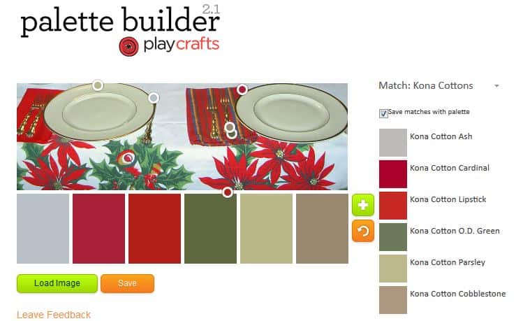
This is an old photo from a prior Thanksgiving dinner, but I thought it would make a nice themed ColorPlay this week.

ColorPlay Christmas n.1

The first color palette is the default. It is what the tool gave me out of the gate; I didn’t make any changes. I really like it, mostly because I got two in the red area right off. I also like the neutrals.

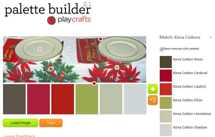
ColorPlay Christmas n.2

I fooled around with the dots a bit on the second option, keeping the reds, but changing up the neutrals. I also added some additional greens, which, though present in the first palette, were not representative of the theme of the tablecloth.

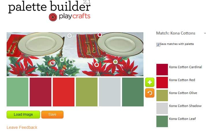
ColorPlay Christmas n.3

Finally, this is my masterpiece. I really like this color palette. I like the various greens – they are brighter – in combination with the two reds and only one neutral and think it would make a great quilt.

ColorPlay December 16

ColorPlay December 16

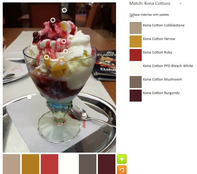
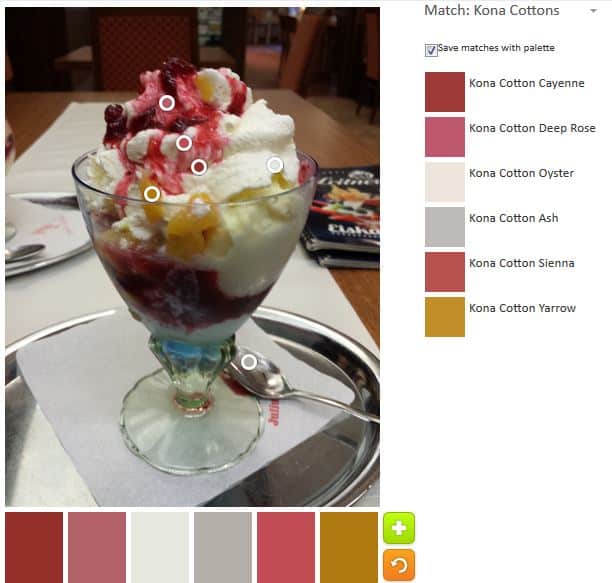
More torture for you for the sake of color. This is an example of a standard sundae you can order at almost any Austrian cafe. I indulged several times with different sundaes while I was in Austria. I had this one in Steiermark near GroB St. Florian. I didn’t think much about what I was eating while I was there, though I didn’t stuff myself either.

This one is called Pfirsich Melba, I think, meaning Peach Melba. I’d give a lot for another one in Austria just now.

ColorPlay Dec 16 n.2

The first one, the standard made by the tool, has a load of neutrals as the others in previous editions had. I kind of like the coffee colors and the combination, but would probably never make a quilt with these colors. I get depressed using dark purple fabric in the winter. No pink; I’d get depressed and never finish it or toss it or give it to the Charity Girls. If I ever go live in Hawaii I’ll think about trying a neutral quilt.

ColorPlay Dec 16 n.1

I made some changes to the location of the circles to get some color.

I got some red and a kind of gold Kona calls Yarrow. I wanted to keep some of the neutrals to see how it would look.

More color. I needed more color. I didn’t have much with which to work.

ColorPlay Dec 16 n3
ColorPlay Dec 16 n3

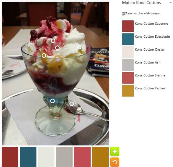
The third time I put all the circles on the colored areas. Lots of red, mauve dusty rose, which are really called Cayenne, Sienna and Deep Rose in the Kona world.  Yarrow is back as well.

One thing that this exercise does is it makes me look – really LOOK – at the photos. After trying to get more pink or color, I finally saw the blue towards the base of the dish. The blue looks lighter to me than the Palette Builder determined.

ColorPlay Dec 16 n.5

Kona Everglade was added to the mix. As usual, the work paid off and this is the best of the lot.

Have you made something with one of the palettes. Let me see it.

Creative Spark 6: Perfectionism & Messes

“Perfectionism is the enemy of the creative act.” pg. 29

The above quote cannot be learned. It has to be infused into your bones. The single thing that prevents it from being infused, possibly forever, is someone (mother, father, grandmother, well meaning person) crying “how did you get so dirty?” These simple, seemingly innocuous words can doom someone to a lifetime of cleanliness and perfectionism. I know this because I have only made some strides into messiness. When I am in the midst of projects, my workroom is terribly messy. The boys are scared to walk across the room lest they step on something important. The YM gives me dirty looks and stern admonishments as he walks through the bathroom he uses.

The strides I have not made are into dyeing and painting. I do both very occasionally, but they are just too messy. My godmother had a lot of good qualities, but encouraging and supporting messiness was not one of them.

However, it is important to encourage creativity and one way is to validate process and exploration. “Life is filled with opportunities and if you are worried about getting dirty or making a mess…then you will be limited in your possibilities” (pg.29).

Life isn’t a show. people are messy. Perfectionism “constricts and confines you” (pg. 29). Your life and work “doesn’t have to be tidy. It doesn’t have to be tidy. It doesn’t have to look perfect. But it does have to be true to you” (pg.30). I have started to get rid of fabric that I bought because people said I needed to add ugly fabric to quilts to make them sing. This is not my authentic style: out they go. I look at fabric in a quilt store in the context of the fabric I have at home not in the context of the quilt store, so I can bring home fabric that works with the fabric I have. Most fabric looks fantastic in a quilt store; not all fabric looks good in my workroom. I want the fabric I buy to be authentic to what I am making, so I can include it in quilts that will end up being my style.

The other thing is that allowing the messy part out allows you to grow as a person. “Allowing the messy part of the self-the unresolved part- to have a voice is a way of healing and a way of understanding yourself and the world” (pg.30). Not all of your work will be perfect. There will be tears and raw edges and corners that don’t match. You won’t ever get to perfect without these things.

In this Spark, I am reminded of the 10,000 hours. Someone said you had to do 10,000 hours worth of work in your chosen field in order to master it. I don’t know if that is true, but if things aren’t going well for me in my work, I think about that and tell myself I have to put in the hours.

I was reminded on Saturday, at the CQFA meeting, how much I enjoy hearing about people’s process and how they got to the piece they are showing. It shows work and a process and trying things out that might have sort of worked or didn’t work. It shows tweaking and thinking.

Anne Lamott wrote (and Bloomston shared) “Perfectionism is the voice of the oppressor, the enemy of hte people. It will keep you cramped and insane your whole life…Perfectionism is a mean, frozen form of idealism, while messes are the artist’s true friend” (pg.31).

Nota bene: we are still working through Carrie Bloomston’s book, The Little Spark. Buy it. There is a lot more to it than what I am writing and it will help you.


ColorPlay Dec 2

Dishes
Dishes

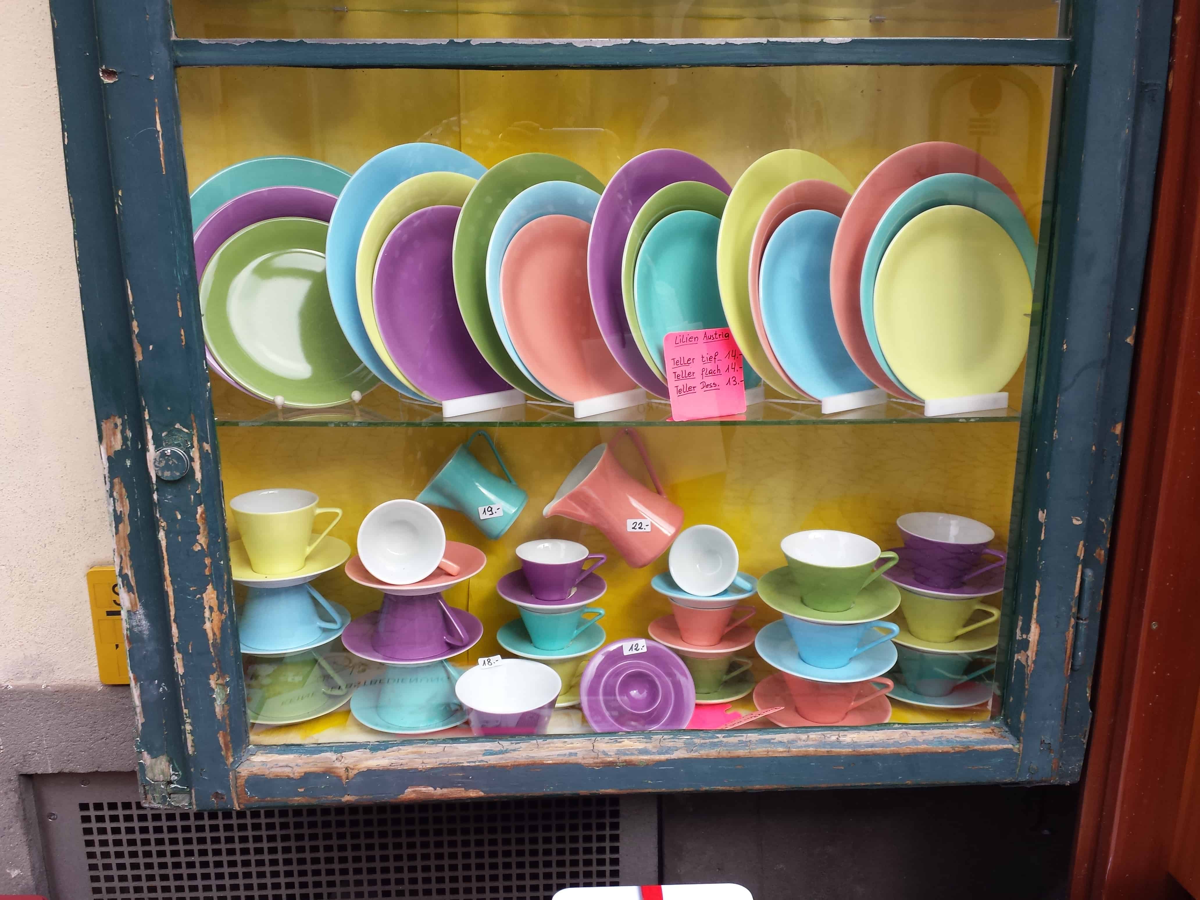
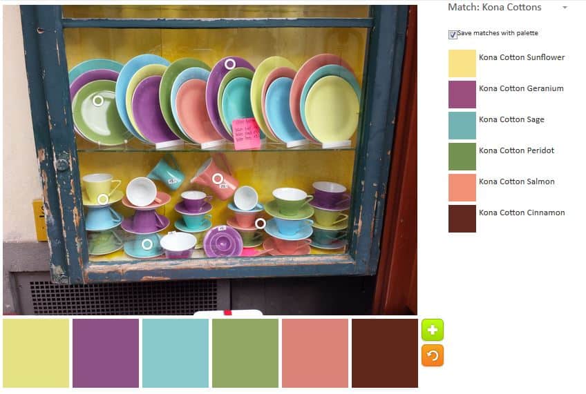
These dishes caught my attention when I was in Franziskanerplatz in Graz. Later I saw a set of four cups in an antique shop and I thought of buying them as a thank you gift for one of my friends. Unfortunately, the cups were 25 Euros each, which was out of my budget right at that moment. If I had a vacation house, I would buy a set for it. However, a person can only use so many dishes and I have enough at the moment. They are so bright and cheerful, though not clunky and chunky like some other colorful styles. I especially like the purple.

The dishes are by Lilien AT and the style is from 2010, called Daisy. I don’t know if they are still available, though I doubt it as they are not listed on the Lilien website.

This was an appropriate photo for this week since I, and my house, are still recovering from Thanksgiving. The colors are cheerful and springlike.

ColorPlay Dec 2, Palette n.1

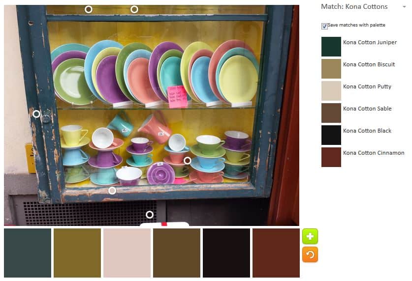
I had fun with the palettes. I was shocked at the default palette that the tool came up with. Can you believe all the browns and neutrals. It is as though the tool is design to select from the edges of the image. I was really shocked at this palette considering the bright colors of the dishes.

ColorPlay Dec 2, Palette n.2

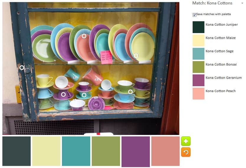
Of course, I got busy and moved the bubbles around. I wanted to try and get all those gorgeous springy colors. One thing I noticed was that within the colorful areas, it was possible to get different versions of the colors we see. For example, at one point Kona Maize was part of the palette instead of Kona Sunflower. There are shadows that are difficult to see in the photo and that affects the palette.

ColorPlay Dec 2, Palette n.3

I tried again, still going for the bright colors and made a slightly different palette. Kona Maize is back instead of Sunflower and Kona Peach is in place of Kona Salmon. I forgot to move one bubble off the window frame, so Kona Juniper is also included.

It just occurred to me (DUH!) that there are tone-on-tones that I could match to this palette instead of going to buy the solids. Not sure why that leap of inspiration didn’t occur to me before.

ColorPlay November 25

Postamt Boden
Postamt Boden

I owe you a chapter from The Little Spark book, but that chapter will not be this week. Thanksgiving kicked my butt and after I post this, I am going to lay on the floor of my workroom and pretend I am sewing.

Once again we are looking at color palettes. This is an endlessly fascinating topic for me.

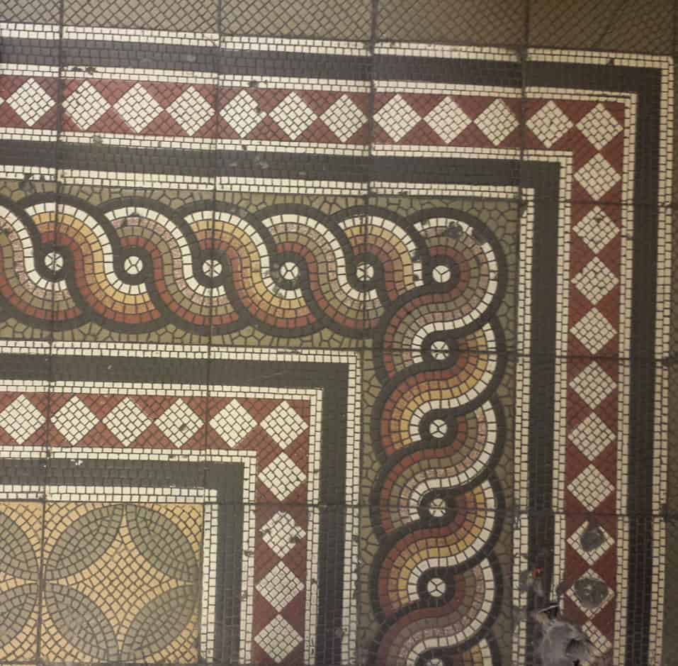
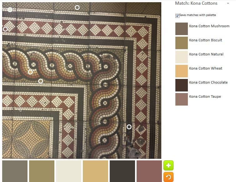
I saw this floor in the Postamt at Neutorgasse 46 in Graz when I went to mail some postcards home. I love mosaics and tile as you well know and despite the grime and poor repair of this floor, I thought it was a beautiful design.

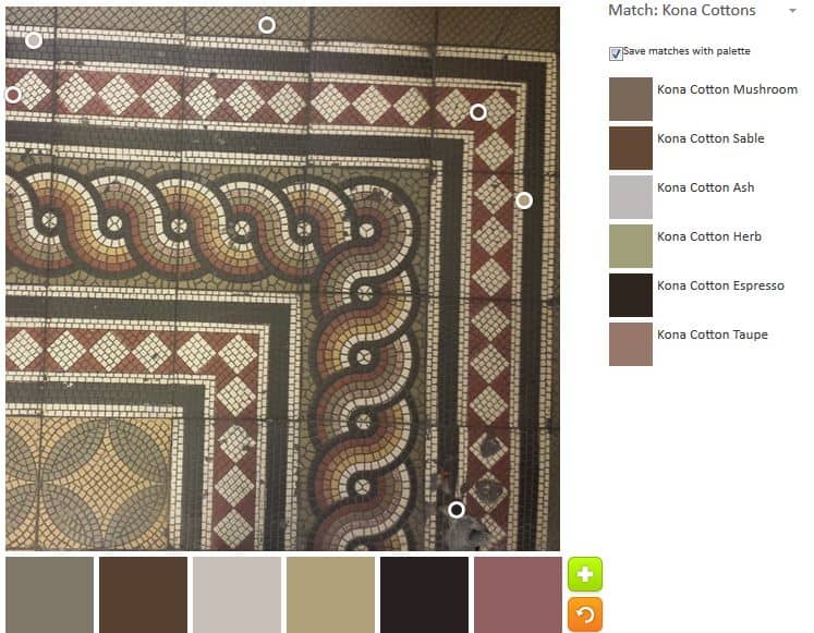
ColorPlay November 25 n.1

I tried to get a pleasing array of the neutrals. Again, lots of neutrals and ‘repro’ colors. Another challenge. Lots of chocolate and mocha type colors. The Kona Taupe definitely has a pink cast and the Ash looks silvery. The two of them keep this palette from being too depressing.

ColorPlay November 25 n.2

I worked hard to keep that taupe in the palette on my second attempt. This second palette is somewhat brighter, especially with the Wheat.

If you make anything from one of the palettes above, let me know.


ColorPlay November 18

Glockenspiel on Glockenspielplatz

I am working, today, with another photo from my trip to Austria.

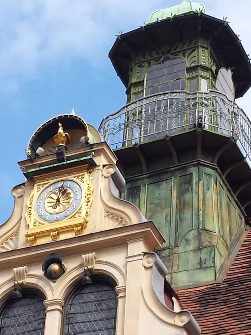
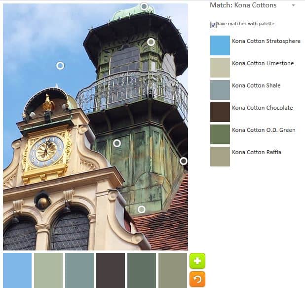
I used to live at Glockenspielplatz 6/3/13 and this is the Glockenspiel (chimes, carillon) across from the main house door. I don’t remember that giant tower and will have to look up some photos from my last trip to Graz to see if I simply don’t remember.

Again, I am playing with neutrals, apparently. The colors of the buildings are remarkably consistent in Graz. The yellowing stone of the buildings, the red tile (slate???) roofs and the green copper of some towers or other architectural details. No fuchsia or turquoise here.

ColorPlay November 18 n.2

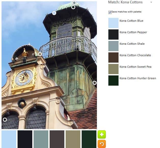
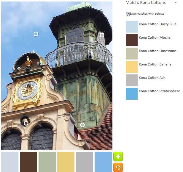
The Palette Builder tool created a much more neutral heavy palette, which makes me wonder how the circles are placed on the image by the programming. The circles seem to gravitate to the darker sections of the photo. You can see that none of the gold or sand colors have a circle on them.

Still the tool selected a bit of blue, which adds to the palette, though I was sorely tempted to move the blue circle to a darker section of the sky.

ColorPlay November 18

I thought my first attempt would also be somewhat depressing (I am gaining more of an appreciation for neutrals, however), but the yellow and the blues add some cheeriness.

I wanted to get a good color for the green copper, but wasn’t really successful. This made me think about whether I was expecting a matching color from my mind or if I was truly seeing that green color. Yes, I do know there are a variety of greens in that architectural detail.

ColorPlay November 18 n.3

Since I seemed to be stuck on greens, I decided to try and create an almost completely green palette using that copper covered tower.

I am not sure if Limestone, Shale and OD Green are actually greens. If I assume they are, I have to say they lean heavily towards the grey end of the green spectrum. Yes, I did move that blue circle to a spot that would register Stratosphere.

Let me know if you make something from either of these color palettes.

ColorPlay Friday

Dornbirn Window Boxes

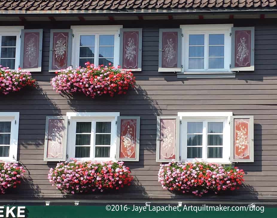
On my first day in Dornbirn, I went with my Austrian mom to the natural grocery store (Bioladen). Across the street was the house above. I love the painted shutters and the window boxes. September is such a lovely month in Vorarlberg.

I decided to use the photo to see what kind of palette I could make. I have recently been fascinated with the combinations of neutrals. I see a lot of houses in the neighborhood painted in a pleasing combination of neutrals. I am reluctant to commit to such a color combination, however. There is a difference between admiring as I amble by and being forced to look at it each time I drive up and walk in.

ColorPlay Nov 11 n.1

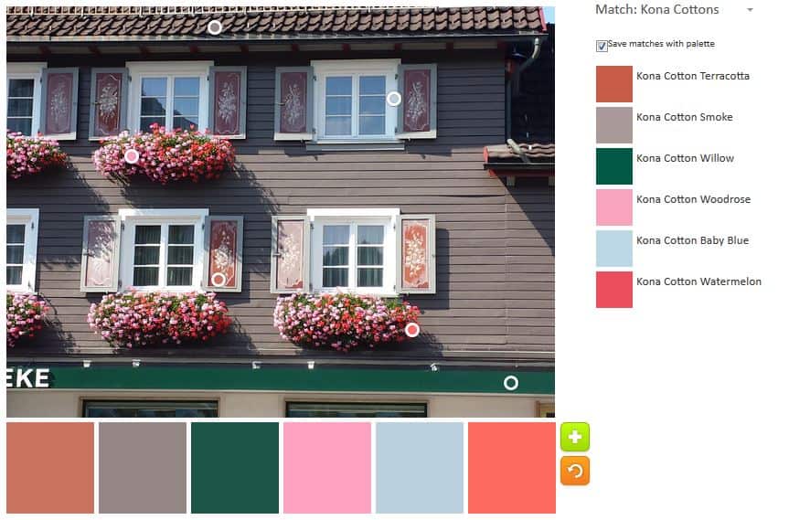
This photo has some interesting neutrals. I focused on the neutrals in the first palette. As individual colors combined with super brights, as per my usual, I can imagine using them. I am not sure about the palette above. I was trying to get a white, but the Palette Builder recognized the color as baby blue. It is interesting to think about using a very, very pale blue instead of white. This is when I need a team of assistants to sew on command. 😉

ColorPlay Nov 11 n.2

Kind of depressing, especially after Tuesday, so I tried to create a brighter version. Not much to work with, but I do like the result. The watermelon is an interesting color.

What have you made?

ColorPlay: Soup Tureen

My recent trip to Austria was a complete feast for the eyes. Everywhere I looked I wanted to capture the images – the layering, the lines and especially the color.

Silberkammer: pantry

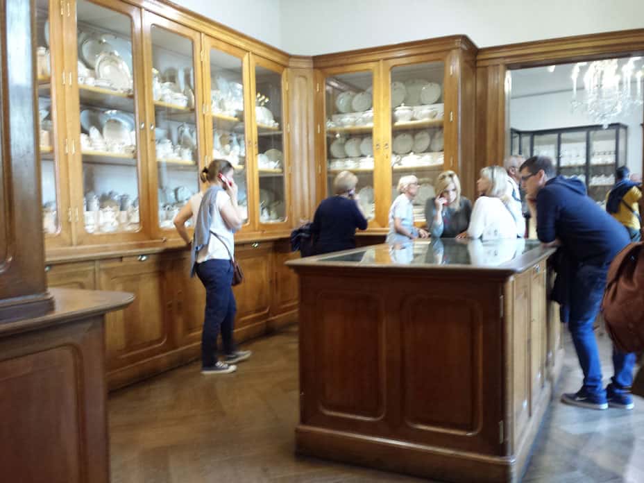
It is hard to choose a favorite museum, but right now I am in love with the Silberkammer in Vienna. It is the museum of the Kitchens and Dining of the Hapsburgs. There are dishes, serveware and set tables everywhere. Above shows one of the rooms of the pantries that remain. There were several, but some are now used for other purposes. Ever since I saw the butler’s pantry at my friend Kathy’s childhood home in Upstate New York, I have wanted a pantry. Of course, the one shown above would take up half of the main floor of my house (kitchen, dining room and part of the living). To have somewhere to keep china, crystal and silver would be fantastic.

Silberkammer: Soup tureen

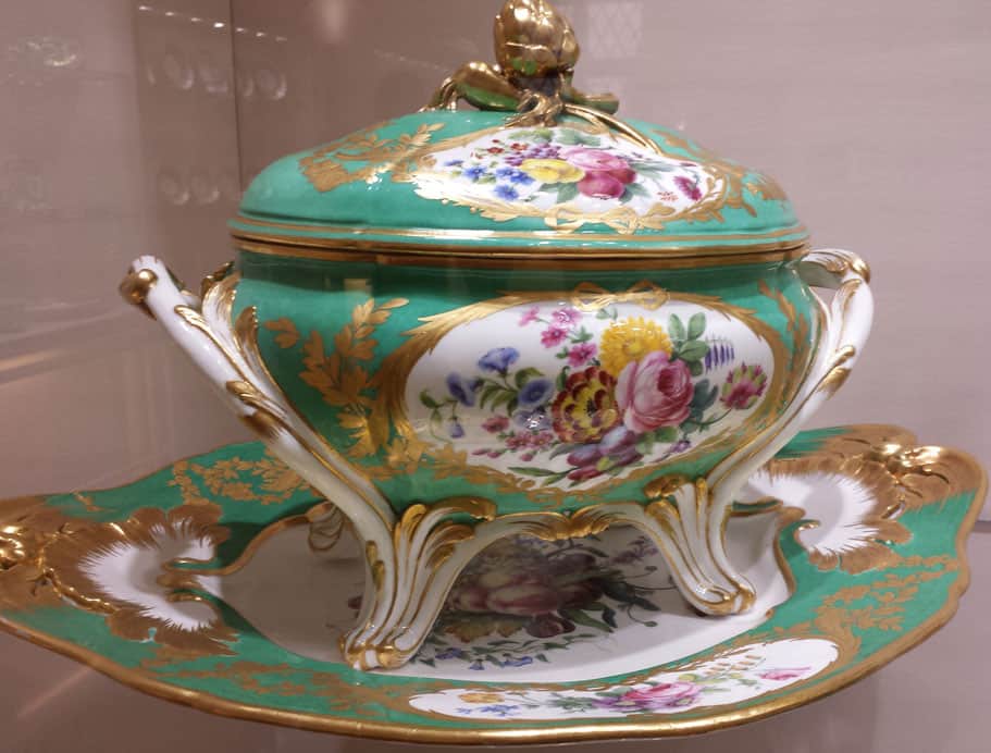
One of the sets of china includes a soup tureen decorated with a lovely jade color. I am using it as our color play today.

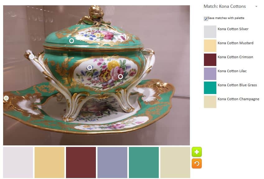
The color scheme the Palette Builder tool originated was all neutrals. That lovely green color was not included. I didn’t even save that palette. I moved all the circles around to come up with something better

Soup Tureen Palette
Soup Tureen Palette

It is interesting that the green is considered Kona Bluegrass. I’ll have to go and look up what color Kona Jade is, if there is such a color.

Again the tool had problems with the pinks/fuschias. I moved the little bubble around quite a bit and the Kona Crimson was the only red I could get. I think the angle of the photo had something to do with the results as well.

I would definitely change out some of the colors if I made a quilt with this color palette.

Let me know your thoughts or if you make something from this color palette.

ColorPlay Mountains

Once again, I used the palette builder to…well… build some palettes for you.

Mountain photo
Mountain photo

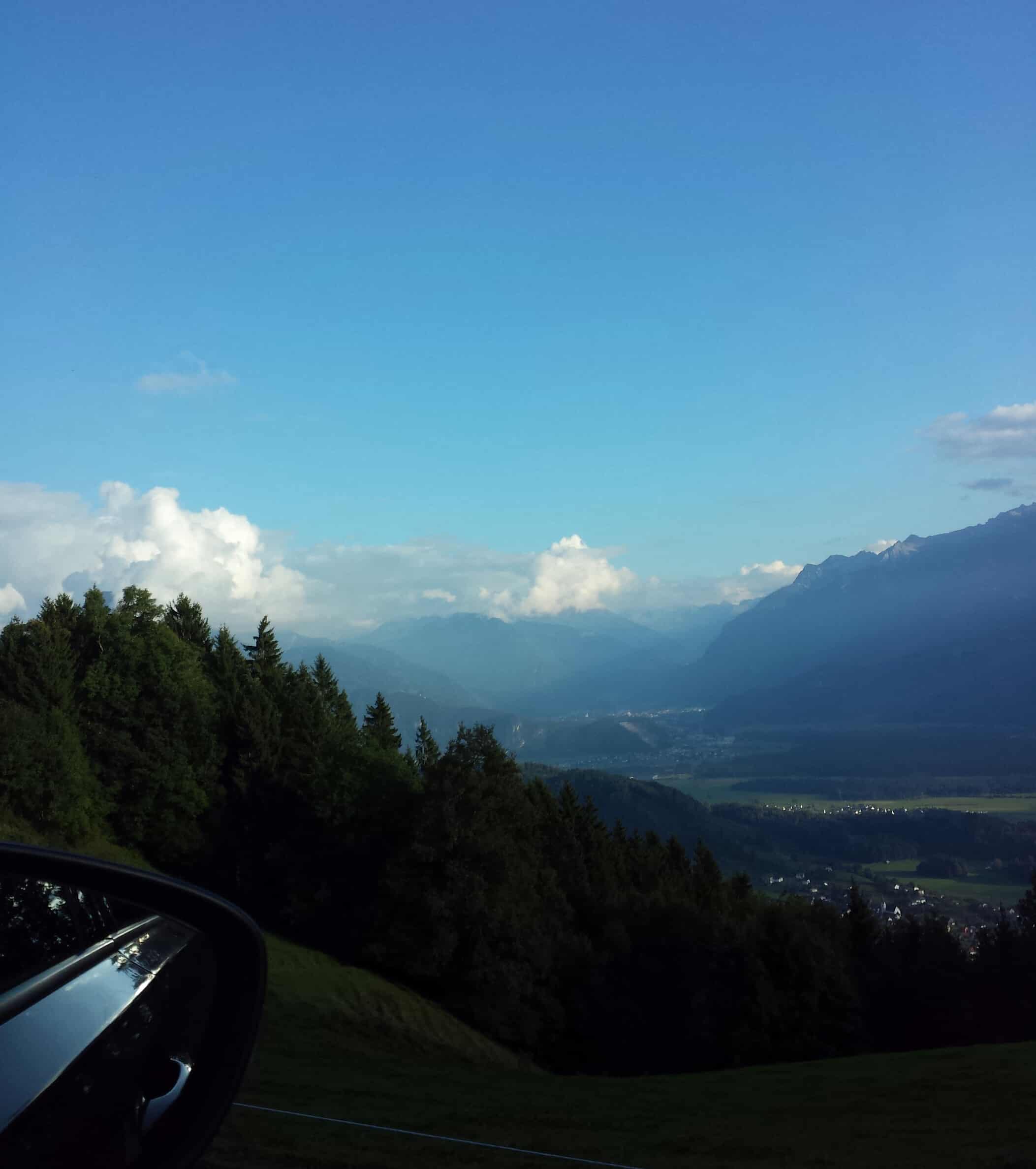
The photo is a photo I took from the car window as my friends drove me around GroBes Walser Tal in Vorarlberg, Austria. I chose this picture deliberately because there were a lot of blues and I wanted to see if the Palette Builder could deal with them.

Mountains & Sky
Mountains & Sky

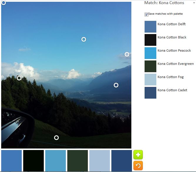
I am pretty pleased with the palette the tool built. I didn’t even move the circles around.

Mountains & Sky 2
Mountains & Sky 2

mtn-palette2I like some of the colors in the second palette, but I am not as excited about it overall. Peacock and Glacier are two of my favorite Kona solid colors. The others are ok.

This is a fun tool, as I have said, and I could make 50 more palettes with this one photo. Go and make a quilt with this palette.

ColorPlay Chocolate

Milka HaselnuB
Milka HaselnuB

Yes, I am going to torture you today. I am not really very sorry. It is helping me to remember my trip.

Milka is a brand of chocolate sold in Austria. Occasionally, I can buy it at World Market, but not regularly. It might be sold elsewhere, but it is not widely available here in the US. When I visit friends in Austria, I indulge.

Yes, chocolate snobs are sticking their noses up, because this bar is made from milk chocolate. I am also a dark chocolate fan, but this milk chocolate is no Hershey’s. It is so creamy and rich that it calms fretful children and makes grown men weep when they eat it.

Now that you are frantically rummaging through your desk drawers looking for chocolate crumbs, let’s get to the ColorPlay. 😉

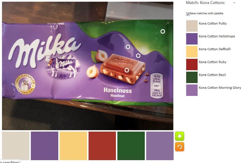
I took the wrapper and ran it through the Palette Builder tool. If you still haven’t tried it, get some colorful photos and have some fun.

Milka ColorPlay
Milka ColorPlay

I didn’t crop this photo, but when I ran it through the tool, I moved the circles off the background and focused on the wrapper. Yes, I can control the colors to a certain degree, as you know, by moving the little circles around. The palette above is a little heavy with those particular shades of red and green. Thus, I decided to make a new palette and try to make it lighter.

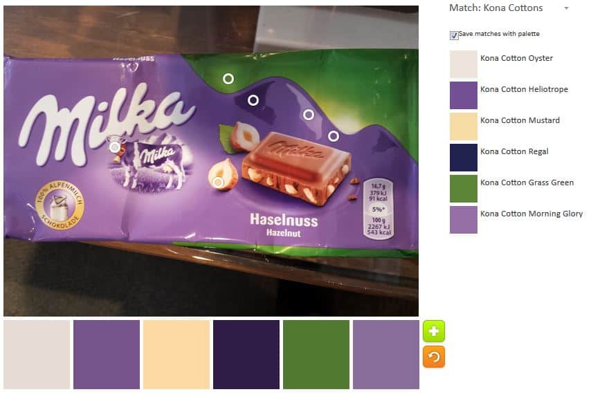
Milka HaselnuB 2
Milka HaselnuB 2

Perhaps the Daffodil and Ruby, in the middle photo above, add to the palette in ways that I cannot imagine without sewing. My favorite, however, is the second palette. Yes, there is a lot of purply tones, but it feels lighter and fresher to me. What do you think?

The whole idea is to give you ideas for palettes for your quilts, so let me know if you create a project with either of these palettes.

Creativity: Value and Worth

“We know that athletes, musicians, and actors all have to practice, rehearse, repeat things until it gets into the body, the ‘muscle memory’, but for some reason, writers and visual artists think they have to be inspired before they make something not suspecting the PHYSICAL ACT of writing or drawing is what brings that inspiration about. Worrying about its worth and value before it exists can keep us immobilized forever. Any story we write or picture we made cannot demonstrate its worth until we write it or draw it. The answer can’t come to us any other way” (Syllabus: Notes from an Accidental Professor, Lynda Barry, pg.163)


Truth? What do you think?

Creative Spark 5: Time

“Forever is composed of nows. Emily Dickinson” (pg.25)

Have you ever driven to work, to the grocery store or to your hair appointment and all the lights were green, there were no idiot drivers and you found a parking spot right in front of your destination? “If I am struggling with anything, I generally feel like I need to find a better way” (pg.25). The first page of this section confirms what I have thought – I know when I am on the right track because everything comes together easily.

When I saw the above quote on the page in the Bloomston book, I couldn’t stop thinking about what it meant. I don’t think it means don’t plan for the future. I do think it means don’t live in the future.

In finding time, it is important to do a little self reflection. Bloomston has some questions to answer, among them “What is your best time of day?” This is impoetant to know and often hard to be real about because of societal pressures and age. College students and young adults are often pressured by their peers to stay up late. Teenagers would rather be in bed at 8am than in the classroom.

I am a morning person. If I can focus, I can get a lot done in the morning. I am at my best then. Depending on the day, I either start out at the gym or with some work and then a walk. I try to get my work and errands done early, especially the “fixed” errands like grocery shopping. As the day moves on my mind starts to drift so I will do errands at about 3 or 4 pm, attend meetings or other random to dos. It kills me not to be able to work on my quiltmaking every morning. I know I would be able to churn out some fantastic work.

I am not in the habit of working on my quiltmaking during the week because I get so engrossed that I forget to work (paying work). Probably, I just make the decision to take the day off and damn the consequences. My boss is pretty lenient, but it makes my paychecks pretty thin. On the weekends I devote as much time as possible to quiltmaking. I have found, however, that late in the day during the week, before my people get home, is a good time to do prep work -not intensive thinking work – but prep work. Recently, I dragged out a bunch of pillowcase fabric and used about an hour to find cuff fabric, cut the body fabric and generally get the body ready to sew. This has helped me to relax after work and get a lot more accomplished on the weekends.

Bloomston writes “…so I had to tune in and not miss the opportunity” (pg.26). I think that the experience of working for 30 minutes-1 hour in the evenings during the week was an example of taking advantage of an opportunity. I took advantage of something that presented itself and it turned into something positive. I also created a process that ended with a big bang of work on the weekends.

“To squeeze the most out of his creative life, he found a way to squeeze it into his life. No doubt, this takes dedication, persistence, and sacrifice. We have to tune into our own lives to locate those precious hours” (pg.27). In order to get better, you have to work – and that applies to everything, including your quiltmaking and artwork. It’s not all about the inspiration, you have to work to get the process and the habit into muscle memory. Working also creates more work. Have you seen my Petrillo Bags? I did not, as you know, create the pattern. I made the first bag as written and I liked it. However, I looked at the bag and thought ‘I wonder what would happen if…’ which is always the best feeling, because it means that I am inspired to make a pattern different or better. Since the first one, I have made two more, each with some changes, hacks or tweaks. As you read recently, I finished the third one. Despite the fact that I have made many, many bag patterns I want to make a fourth Petrillo bag just to make that particular pattern a little more useful for me.  You have to take the time to make progress.

Because there is a finite amount of time in the day and I like my beauty sleep I try to add time to be creative into little pockets of the day. As I wrote the first draft of this blog post, I wrote it my journal with a lime green Sarasa pen. Writing is one aspect of my creatiivty but I try to make it a visual exercise by using a different colored pen every day so my journal is pretty while still being useful.

You need time.

You can find the time if you only look at what is important. Only read your social media while you are standing in line. Make menus and go grocery shopping once a week. You have to become the mistress (or master) of your time. There is only so much. Don’t waste it.

ColorPlay Fun and Inspiration

Alden Lane Window Frames

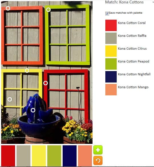
I found another good photo for this project in the Alden Lane photos. To my eye, there are limited colors. To the tool’s way of thinking there were many.

Colorplay-windows
Colorplay-windows

The Palette Builder chose the colors above. There are more warm colors than the tool usually chooses, but I think ‘choose’ is the wrong term. I like the two greens – Kona Peapod and Kona Cactus. If nothing else, I am getting a nice introduction to the Kona solids.

Colorplay-windows 2
Colorplay-windows 2

Of course, I decided to have my fun and play around with what other palettes I could find using this picture. I definitely had to get that dark blue from the fountain into the palette.

Colorplay-windows 3
Colorplay-windows 3

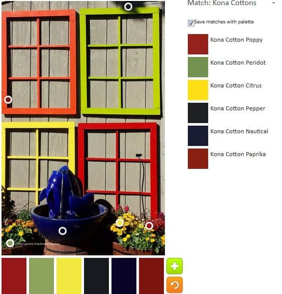
Finally, I moved the circles down to the flowers towards the bottom to see what changes I could make. I was surprised at how much darker the palette became.

Creative Spark: Chapter 4

The fourth chapter in The Creative Spark is called The Crazies. Many writers of creative inspiration write about the negative voices in our heads: the judges, the critics, naysayers, all the people who ever told you you couldn’t. Bloomston calls them The Crazies.

I am not surprised that Bloomston brings them up. They are as much a part of the creative process as paper and fabric. They are in our heads and we all hear them whether we acknowledge them or not. “The Crazies are programmed to trip you up” (pg.21).

I hear them. They often tell me I am not good enough, need to do better, need to do more, need to spend more time, etc. It isn’t always possible, but when they tell me I need to do better, I try to listen by work on improving my skills. I also try not to get depressed. Examples of things I do are:

  • Ripping out pillowcase cuffs when I sewed them on upside down
  • Matching seams better
  • Evening out topstitching
  • etc

Using what they say often involves a lot of ripping. From my vantage point, my work is better when I try harder to do better.

Still, I don’t always like hearing what the critics have to say. They are never nice about my work and it isn’t always possible to be Zen about their words.

I have never wanted to be a full-time artist; I have always wanted to make what I want to make when I want to make it. This attitude gets me off the hook for most of the comments about being irresponsible and dooming myself to a life of “poverty,  lack and struggle ” (pg.21). Still this work, especially since fabric and thread are so firmly  rooted in the female realm, is not valued and that is painful to me. Even not being a full-time artist, I feel I have to explain or justify the time I spend on my work and what I make.

Bloomston has great strategies for banishing the Crazies. Chief among them is writing them down and enclosing the voices somewhere.

Being organized is another one. “Life generally tampers with creativity because being a grownup requires a great deal of organization and management” (pg.22). Being a grownup doesn’t mean you have to give up your creativity or the art you make. It simply means you have choices with regard to your art. Don’t  let The Crazies become the buzzkill, the axman or the murderer of your dreams of art (pg.22), use their criticism to spur you on.

Bloomston also has great techniques for dealing with, if you can’t banish The Crazies: Play, Notice, box Them Up, Show Them the Door (pg.23).

And when you are being overwhelmed with the magnitude of the criticism, turn to your friends, your critique group, your sewing circle, for support.

If you work regularly you will succeed.

Book Review: Syllabus

It isn’t my intention to have very frequent book reviews in this Friday space. I think, however, that this book review feeds directly into my search for continuing creative inspiration. There are a lot of words in this review, but you will get more out of the book review, if you go buy the book (or find it at your local library). Definitely read and comment on my review, but go and get more out of it by looking at the illustrations and other materials in the book, too.

Syllabus: Notes from an Accidental ProfessorSyllabus: Notes from an Accidental Professor by Lynda Barry
My rating: 4 of 5 stars

I heard about this book when I listened to the Creative Mom podcast. This is not normally my kind of book, but I really enjoyed it. I was also very taken with the profound insights into the creative process and the thoughtfulness in nurturing creativity. The book is the product of a curriculum from one of Lynda Barry‘s classes and the content still has those qualities. I liked Barry’s idea of a curriculum: clear standards for the class that had more to do with production than perfect drawing. My favorite thing about this book is that it conveys the message that I was trying to convey with the Creative Prompt Project:

Just draw (or paint or sculpt or dance) and don’t worry if it looks imperfect or childish. Experience the act of making something with your hands/body.

The book looks like a composition notebook, one of those black and white marbled notebooks seen in massive stacks at stores during the back-to-school season. Barry uses very humble materials. They are not low quality, but humble — crayons (pg.87), Flair felt pen, etc. The title page and verso are not very obvious at all, which caught me, as a librarian, off guard. There is no table of contents and no index. The text just starts with the question “Is Creative Concentration Contagious?” There is a method to the seeming madness, however, and the book includes the story about the class Lynda Barry taught.

As I wrote the review, I wanted to go back and read all the pages over again. There is so much to see on the pages, I think it is possible to get something new no matter how many times you look at the pages. One part I cannot get out of my head is something I knew, but could never put into words. I was very glad when Lynda Barry wrote it down for me. “We know that athletes, musicians, and actors all have to practice, rehearse, repeat things until it gets into the body, the ‘muscle memory’, but for some reason, writers and visual artists think they have to be inspired before they make something not suspecting the PHYSICAL ACT of writing or drawing is what brings that inspiration about. Worrying about its worth and value before it exists can keep us immobilized forever. Any story we write or picture we made cannot demonstrate its worth until we write it or draw it. The answer can’t come to us any other way” (pg.163). I love the quote and think I will write it down and put it up where I can see it. It is so important to remember that inspiration is a must, but it is not everything. Practice. Practice. Practice.

There are a lot of slightly scary (I am not a horror person) and disturbing images in this book. A lot of the images are dark. This book is probably not appropriate for 5 year olds, but is perfectly fine for the tween to adult set. Also, it is a good reminder that not all drawings (or quilts or other artworks) are pretty in a conventional sense. This does not diminish other aspects of the piece (pg.29). The encouragement to just be creative regularly is the point.

The book discusses drawing a lot – not theoretical aspects, but the sheer magnitude of work the students are expected to create. Yes, you get better the more you practice, but you also have to have an “experience by hand” (pg.31), which has value. Barry writes “…what if the way kids draw — that kind of line that we call ‘childish’ — what if that is what a lines looks like when someone is having an experience by hand?” (pg.31). When I work, there is definitely something I gain by having fabric in my hands. It may be because my paid work is just stuff appearing on a screen while my quiltmaking is more of a whole body experience.

There is so much that translates directly to quiltmaking. I almost couldn’t take it all in. “I told them to color had in order to do it right. And go straight to use force — thinking I was showing them a short-cut — this took away the way of coloring they would have found on their own. By telling them just how to do it, I took the playing-around away, the gradual figuring out that bring something alive to the activity, makes it worthwhile, and is transferrable [sic] to other activities.” (pg.89) I love this passage. It makes me wonder if there is joy in using quilt patterns? Sure you have a quilt when you finish, but did the making of a design that someone else has already made bring joy to the quiltmaker? Perhaps this is the product vs. process question.

There are random and very interesting facts scattered throughout the book. “Every baby old enough to hold a crayon can already use and understand these 3 languages. Sometimes all at once.” (pg.14). She is talking about the relationship between pictures, music and dancing. This struck me as really amazing. She also talks about the relationship between hands, images and insights referring to using what is at hand to make art. One example is a child in bed interacting with his/her blanket as if it were alive. Another example is a of a homeless man acting out Romeo and Juliet with a cigarette butt and bottle cap as the main characters. (pg.15). This section is too insightful to include quotes. I would have had to type the entire section, which is why you should read this book. 😉

One good reminder (pg.19) is that even though we don’t like a piece of our artwork, it survives. This reminds me of finishing a quilt and being very glad to be done with it. Still, six months later, the quilt is one of my best. It is a good thing to remember that our work survives even if we don’t like it. Barry also states “Liking and not liking can make us blind to what’s there.” (pg.23). I make no secret of not liking brown and having a hard time appreciating Civil War reproduction fabrics. Some years ago, I forced myself to look more carefully at some of these types of quilts in order to appreciate something else about the quilt, such as the piecing and the design. While I have a hard time imagining such quilts in brights and dots, I can appreciate intricate and exact piecing.

The book is filled with tips, many of which dovetail with what I am trying to do with my blog. One states “I know if I can just keep them drawing without thinking about it too much, something quite original will appear…” (pg.21). I think it is very important to keep working, even if you make a lot of terrible work, because at some point, something great will happen that wouldn’t have happened if you hadn’t done so much mediocre or okay work. One tip is to use smaller spaces. Lynda has her students fold 8.5″x11″ sheets of paper into 16 squares and use those for their drawings. Friend Julie is making small square quilts as a weekly exercise. Is this something that would jolt my creativity? Your creativity?

Words in the book described as tips become profound when I think about them. One such group of words is something that I tried to espouse in the Creative Prompt Project. “Daily practice with images both written and drawn is rare once we have lost our baby teeth and begin to think of ourselves as good at some things and bad at other things. It’s not that this isn’t TRUE but the side effects are profound once we abandon a certain activity like drawing because we are bad at it. A certain state of mind (what McGilchrist might call ‘attention’) is also lost. A certain capacity of the mind is shuttered and for most people, it stays that way for life” (pg.115). This quote, idea hits close to home. I know I do it. It is easier to do things I am good at and avoid things I think I am bad at. I don’t do needle-turn applique’ because it is hard and I have to work at it. I want the time I spend to mean something more than ravelly edges on a piece of applique’. Still, what am I losing with this attitude?

One aspect of the ideas in the text that really struck me was about images. Lynda Barry writes “I was trying to understand how images travel between people, how they move through time, and if there was a way to use writing and picture making to figure out more about how images work. (pg.49) This idea has been rumbling around in my head, including the relationship to quiltmaking. We know that newspapers used to print patterns. We know that ladies would trade patterns. Now we have digital cameras and record quilt images that way. Still, we see images and they rumble around in our heads, morph and change before they become a quilt. Even when they become a quilt, changes are still possible.

The other thing about this book is the author encourages us to notice things. The composition book acts as a life note book. She encourages a small box to record things students did, saw, heard and then there is a space for a daily drawing. “what goes into your diary are things that you noticed when you became present — that is to say when the hamster wheel of thoughts and plans and worries stopped long enough for you to notice where you were and what was going on around you — little things…” (pg.61). This happens to me when I walk and am not listening to a book. This book makes me think I should just allow my mind to wander more often. What am I losing by not giving my mind that space?

Partway through the text, Barry writes “sometimes right before class I’ll see students rushing to finish the homework I gave them and I always feel sad. They’ll get nothing from the work without the state of mind that comes with it. It’s a thing Dan Chaon calls ‘Dreaming Awake’ – we can use writing and drawing to get to that state, but not by rushing” (pg.128). I think I get to this state when I am piecing a lot of the same types of pieces. It allows me to accomplish something in the quiltmaking world while my mind wanders off to other places to solve other problems. I don’t think we have enough of this type of time. While I like to have a basic plan in place when I start a quilt, often I just want to try something and that ends up as a quilt, like the Swoon did. I think there was an element of this type of working in the IRR as well. Lynda talks about this when she says “It’s a kind of picturing that is formed by our own activity, one line suggesting the next. We have a general direction but can’t see where we are until we let ourselves take a step, and then another, and then we move on to the third”(pg.136). There is an element of uncertainty when working this way, but also an element of excitement, because the maker does not know exactly where s/he is going.

Fixed places are a concept I cannot completely wrap my head around, but if what I think the author is talking about is true. I can identify at least one group of fixed places relevant to my life. Lynda B writes “Poets claim that we recapture for a moment the self that we were long ago when we enter some house or garden in which we used to live in our youth. But these are most hazardous pilgrimages, which end as often in disappointment as in success. It is in ourselves that we should rather seek to find those fixed places, contemporaneous with different years” (pg.181). I wonder how fixed places affect our lives. The point about failure and success is well taken. You can’t go back and we do look back on the past with rose colored glasses and forget the difficult parts.

Finally, Ms. Barry talks about journals. Journals, as you know, are near and dear to my heart. I have kept one for years and she gives voice to my thoughts on journals and writing in a journal when she says ‘the nature of notetaking by hand. Thinking of one’s compbook as a place. The practice of developing a place not a thing” (pg.194). For me, a journal is a place to think. It can be a mess. If I force yourself to make it beautiful I know it is less useful. I need a place to dump and my daily journal is that place.

Towards the end of this 200 page book, Barry tells a story “He said that during those years, as a child, he used to imagine that he was the son of the emperor of China, and the old, wise advisors of his father set a spell on him: he would have to experience all these terrible events so when he grew up and became the emperor himself, he would not make war. Since, I stopped thinking that art is decoration in life; for me, it is proof that art is essential to our surviving.” (pg.173). Using creativity to survive a terrible situation is so clever that I cannot think how this author thought of it except that he practiced and it was second nature.

I guess the thing about this book that I liked best was that it made me think in a different way. Barry’s book gives me a lot to think about. It made me wonder if I can to do more to develop my creativity? Practice more? Draw more? Dance more? More walking without headphones and an audiobook? Allow my mind to wander? There is a lot in what I have written in this review, but there is so much more. Go buy this book (shameless plug!!) and read it. Then read it again and again.

View all my reviews