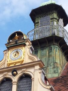
I am working, today, with another photo from my trip to Austria.
I used to live at Glockenspielplatz 6/3/13 and this is the Glockenspiel (chimes, carillon) across from the main house door. I don’t remember that giant tower and will have to look up some photos from my last trip to Graz to see if I simply don’t remember.
Again, I am playing with neutrals, apparently. The colors of the buildings are remarkably consistent in Graz. The yellowing stone of the buildings, the red tile (slate???) roofs and the green copper of some towers or other architectural details. No fuchsia or turquoise here.

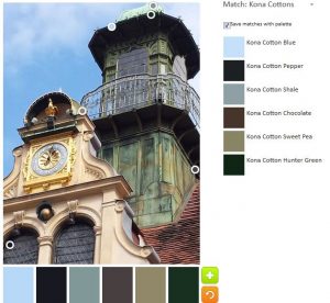
The Palette Builder tool created a much more neutral heavy palette, which makes me wonder how the circles are placed on the image by the programming. The circles seem to gravitate to the darker sections of the photo. You can see that none of the gold or sand colors have a circle on them.
Still the tool selected a bit of blue, which adds to the palette, though I was sorely tempted to move the blue circle to a darker section of the sky.

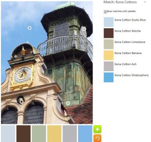
I thought my first attempt would also be somewhat depressing (I am gaining more of an appreciation for neutrals, however), but the yellow and the blues add some cheeriness.
I wanted to get a good color for the green copper, but wasn’t really successful. This made me think about whether I was expecting a matching color from my mind or if I was truly seeing that green color. Yes, I do know there are a variety of greens in that architectural detail.

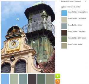
Since I seemed to be stuck on greens, I decided to try and create an almost completely green palette using that copper covered tower.
I am not sure if Limestone, Shale and OD Green are actually greens. If I assume they are, I have to say they lean heavily towards the grey end of the green spectrum. Yes, I did move that blue circle to a spot that would register Stratosphere.
Let me know if you make something from either of these color palettes.