For the audio portion, check out Sandy’s page or iTunes
Rhythm is a Principle of Design
Rhythm is a design principle based on repetition (Pentak & Lauer, pg. 100)
Definitions:
- “Intervals at which related element occur throughout a piece of art” (Liz Berg handout entitled Principles of Design from “Design the Abstract Quilt” class)
- Visual rhythm is created when elements repeat in a sequence in a design. The repeated elements are often shape or color motifs…rather than simply repeating the elements to create a pattern. They act as a series of beats that ‘speak’ to one another.” (Aimone, Design! A lively guide to design basics for artists & craftspeople, pg. 112-113)
- “..rhythm involves a clear repetition of elements that are the same or only slightly modified.” (Pentak & Lauer, pg. 100)
-
- Vertical slats on the back of a chair
- Rhythm is “the repetition of a regular pattern, or a harmonious sequence or correlation of colors or elements.” (Art+Quilt by Lyric Kinard, pg. 80)
- “Visual rhythm involves the movement of our eye from one element to the next in a regular pattern.” (Art+Quilt, pg. 80)
- “In visual art, refers to the movement of the viewer’s eye across recurrent motifs.” (The Quilter’s Book of Design, 2d ed, pg. 155)
“…repetition of an element creates visual rhythm.” (The Quilter’s Book of Design, 2d ed, pg.15)
The following relate back to unity, so be sure to review those notes and the podcast before you move to Rhythm
Types of Rhythm
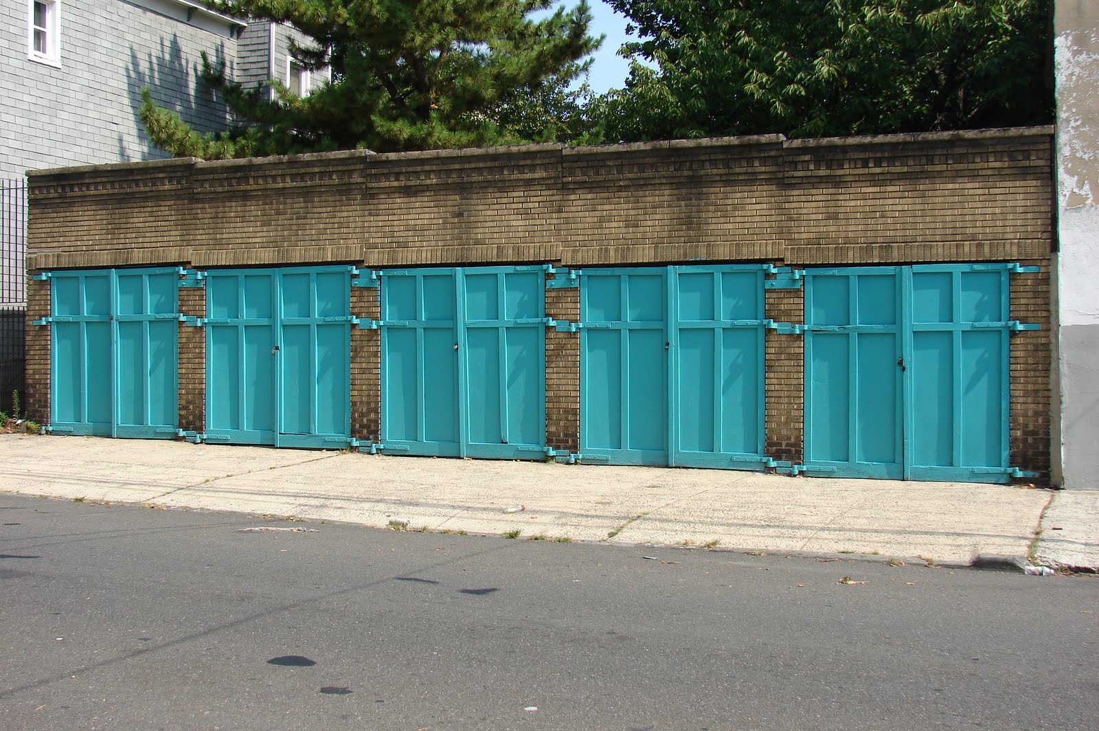
Alternating Rhythm (The Quilter’s Book of Design, 2d ed, pg. 16)
- “…the variation of a repeated pattern between two or more elements.” (Art+Quilt, pg. 80)
- Example: the pattern of night and day (Art+Quilt, pg. 80)
- Example: “…a chorus repeated between different verses of a song.” (Art+Quilt, pg. 80)
- “…uses patterns that move back and forth.” (The Quilter’s Book of Design, 2d ed, pg. 16)
- Light and dark
- thick and thin
- hot and cold
- tall and short
- “A familiar example of this idea can be seen in a building with columns, such as a Greek Temple. The repeating pattern of light columns against darker negative spaces is clearly an alternating rhythm.” (Pentak & Lauer, pg. 104)
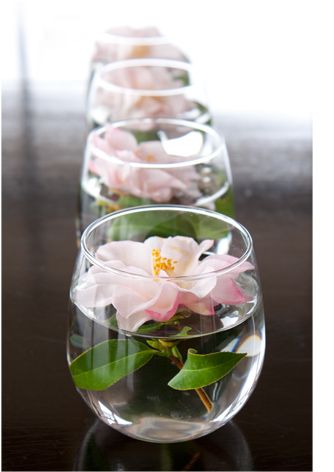
Progressive Rhythm (The Quilter’s Book of Design, 2d ed, pg.16)
- “…uses the repetition of an element to deliberately move the viewer’s eye in a specific direction. It is a pattern in which the viewer can see a sequence that is predictable. (The Quilter’s Book of Design, 2d ed, pg. 16)
- “In visual art, a progressive rhythm might consist of any repeated element growing or shrinking in size, shape, or number.” (Art+Quilt, pg. 80)
- Example: “The expanding rays of a Mariner’s compass block as it reaches outward.” (Art+Quilt, pg. 80)
- “A progressive rhythm is often found in nature when the size or shape of something gradually increases or descreases.” (Art+Quilt, pg. 80)
- concentric layers of tree rings (Art+Quilt, pg. 80)
- a musical theme that “grows in complexity, volume, and instrumentation with repetition.” (Art+Quilt, pg. 80)
- “gradually diminishing pattern of ocean waves as your eye moves toward the horizon” (Art+Quilt, pg. 80)
- Commonplace in nature, but not always readily apparent (Pentak & Lauer, pg. 107)
- Cut in half, the inside of an artichoke shows a growth pattern. (Pentak & Lauer, pg. 107)
- chambered nautilus cut in cross section. (Pentak & Lauer, pg. 107)
Staccato Rhythm
- “abrupt changes with dynamic contrast. The reccurrence of these dark squares establishes a visual rhythm. The irregular spacing of the small squares causes the pattern (and rhythm) to be lively rather than monotonous.” (Pentak & Lauer, pg. 100)
- Piet Mondrian painting called Broadway Boogie-Woogie expresses the “on/off patterns of Broadway’s neon landscape but also the rhythmic sounds of 1940s instrumental blues music.” (Pentak & Lauer, pg. 102)
- Staccato rhythm can, sometimes, be exciting if unsettling. (Pentak & Lauer, pg. 100)
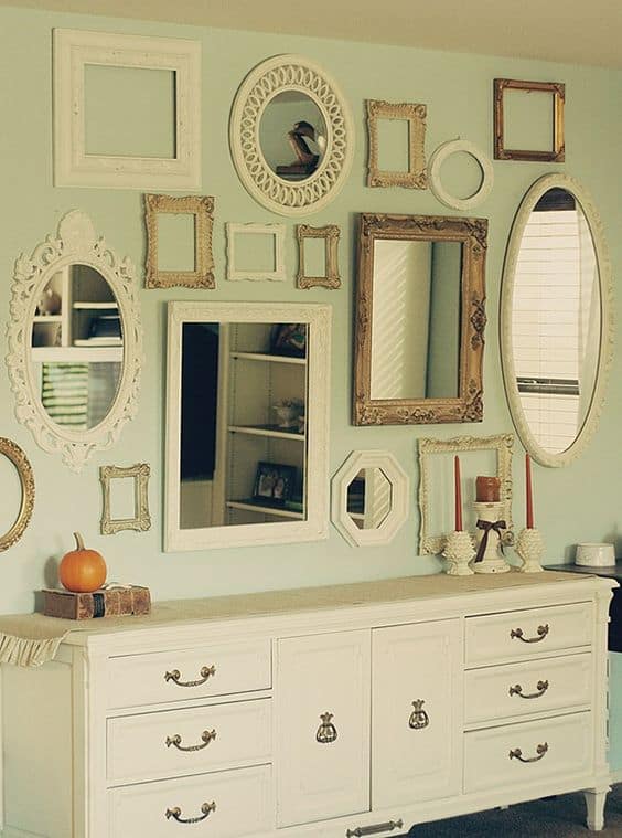
Static Rhythm
- “…has no variety and can be monotonous if carried throughout a composition… If there is no variety in the fabrics chosen, the quilt will have static rhythm, …no movement.” (The Quilter’s Book of Design, 2d ed, pg. 15)
- “Static rhythm is only apparent; for in every seeming case, the rhythm really pervades the succession of acts of attention to the elements rather than the elements themselves; a colonnade, for example, is rhythmical only when the attention moves from one column to another.” (http://www.authorama.com/principles-of-aesthetics-6.html) – I think this is why we like those red and white Sawtooth Star quilts.
Syncopated Rhythm
- “…gives surprising emphasis to a beat that is normally weak and adds unexpected interest.” (Art+Quilt, pg. 80)
- “A syncopation or syncopated rhythm is any rhythm that puts an emphasis on a beat, or a subdivision of a beat, that is not usually emphasized…Syncopation is one way to liven things up. The music can suddenly emphasize the weaker beats of the measure, or it can even emphasize notes that are not on the beat at all.” (Connexions http://cnx.org/content/m11644/latest/)
Visual Rhythm
- “Repetition is another way to create unity in a quilt design. The repetition of an element in a composition can tie the whole together, creating a relationship among the elements.” (The Quilter’s Book of Design, 2d ed, pg.15)
- “…repetition of an element creates visual rhythm.” (The Quilter’s Book of Design, 2d ed, pg.15) Static rhythm, alternating rhythm and progressive rhythm have an effect on unity through repetition.
- “Visual rhythm can be smooth and even, or it can be abrupt and uneven, depending on the goal the quilt designer wants to achieve.” (The Quilter’s Book of Design, 2d ed, pg. 16)
Examples of Rhythm
- heartbeat – “repeats in a regular, orderly manner and establishes a rhythm that underlies your very existence” (Aimone, Design! A lively guide to design basics for artists & craftspeople, pg.112)
- “breathing consists of a regular sequence of inhaling and exhaling” (Aimone, Design! A lively guide to design basics for artists & craftspeople, pg.112)
- “When you walk, you establish parallel rhythms with the two sides of your body.” (Aimone, Design! A lively guide to design basics for artists & craftspeople, pg.112)
Notes:
- “Careful placement of accents pulls the viewer’s eye across the picture. The eye travels quickly when elements are closely spaced, more slowly across wider intervals. Use accents to control the rhythm and keep the viewer’s eye moving within the picture.” (Liz Berg handout entitled Principles of Design from “Design the Abstract Quilt” class). This is one area where a border is useful. Instead of just slapping on a border (and you all know by now that this is one of my biggest pet peeves), look at whether your design is falling off the quilt and needs to be contained or whether you need to continue the design into the border to finish it.
- “…rhythm relies on repetition. Repeating design elements over and over again will create a sense of rhythm with the design field.” (A Fiber Artist’s Guide to Color & Design, pg. 127)
- “Rhythm helps to entice the viewer to stay longer and can make an artwork easier to live with. (A Fiber Artist’s Guide to Color & Design, pg. 127)
- “..if the rhythm of a work becomes too static or monotonous then the work becomes easy to ignore.” (A Fiber Artist’s Guide to Color & Design, pg. 127)
- Visual rhythm is closely connected to rhythms in music and the rhythms of art pieces are sometimes inspired by music. (Pentak & Lauer, pg. 108)
Rhythm Resources:
- A Fiber Artist’s Guide to Color & Design book* by Heather Thomas
- Art+Quilt* by Lyric Kinard
- Design! A lively guide to design basics for artists & craftspeople by Steven Aimone book*
- International School | Breda Principles of Design page
- Liz Berg handout entitled Principles of Design from “Design the Abstract Quilt” class
- Rhythm – Basic Principles of Design post/article
- The Quilter’s Book of Design, 2d book*
**Obviously, you should shop at local quilt shops. However, I use affiliate links and may be paid for your purchase of an item when you click on an item’s link in my post. There is no additional cost to you for clicking or purchasing items I recommend. I appreciate your clicks and purchases as it helps support this blog.


")