This article is a set of notes from the color module of my design for quiltmakers class.
Your first design choice is to choose your own colors. If you buy a pattern and use the fabrics you enjoy (not the fabrics in the pattern) you have made the first step in designing your own quilts.
Words you Might Encounter
- hue
- value
- intensity
- chroma
- tint
- shade
- saturation
Color Systems
- Munsell color system: An artist and an educator, Munsell developed his color theory to bring clarity to color communication by establishing an orderly system for accurately identifying every color that exists. Munsell based his system on what he defined as “perceived equidistance” — the human visual system’s perception of color. (Munsell color, http://munsell.com/about-munsell-color/)
- “Professor Albert H. Munsell, an artist and art teacher, developed the basic principles of his color order system mainly for the purpose of bringing order to the study of color. Munsell wanted the study of color to be similar to the study of music, which had order so that one could “hear” how a composition would sound by reading the notes. Likewise, Munsell wanted one to “see” color based on its three-dimensional attributes of hue, value and chroma.” (Development of the Munsell Color order System http://munsell.com/about-munsell-color/development-of-the-munsell-color-order-system/)
- Munsell color order system is based on a three-dimensional model depicted in the Munsell color tree. Each color has three qualities or attributes:
-
- Hue – color such as red, orange, yellow, etc.
- Value – the lightness or darkness of a color
- Chroma – the saturation or brilliance of a color
- Hue, value and chroma are also referred to as (HVC)
- Munsell Color Theory is based on a three-dimensional model in which each color is comprised of three attributes of hue (color itself), value (lightness/darkness) and chroma (color saturation or brilliance)
- The Munsell Color system is set up as a numerical scale with visually uniform steps for each of the three color attributes—in Munsell color notation, each color has a logical and visual relationship to all other colors. (How color notation works http://munsell.com/about-munsell-color/how-color-notation-works/)
-
- “The Munsell color-order system has gained international acceptance. It is described in unabridged dictionaries and encyclopedias as well as in specialized publications on art, design, color photography, television, printing, paint, textiles and plastics. It is recognized as a standard system of color specification in standard Z138.2 of the American National Standards Institute, Japanese Industrial Standard for Color JIS Z 8721, the German Standard Color System, DIN 6164 and several British national standards.” (Development of Munsell Color Order System http://munsell.com/about-munsell-color/development-of-the-munsell-color-order-system/)
- Ives
- Pantone
- RGB
Colors
- Red
- Orange
- Yellow
- Windsor Newton History of Ochre
- Green
- Thr3fold Journal issue #5 article “Being Green”, pg.48.
- Blue
- Indigo
- Violet
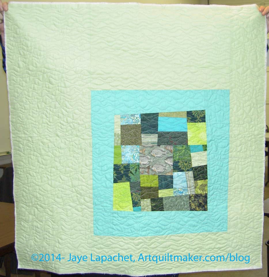
See the monochromatic quilts I have made using scraps.
Notes:
- “Up until the mid-19th century, bright colors were the preserve of the wealthy, the only people who could afford them. Yet the dyes used in even the most expensive items were so unstable that they often faded or discolored. The development of chemical dyes, like Perkin’s, enabled more shades to be created in brighter, longer lasting hues. People responded by choosing the vivid colors that had until then been denied them when clothing themselves and furnishing their homes, prompting the upper classes to choose subtler shades as a form of snobbish protest. ” (New York Times, 50 Shades of Color: How the Evolution of Palettes Changed the World, By ALICE RAWSTHORN, Published: September 23, 2012 http://nyti.ms/RZj53N)
- In the TQS episode 313 with Jinny Beyer, she talks about her color system, which is way of picking colors different than the systems we have talked about above. Her idea is to shade from one set of colors to another in order to keep the transitions smooth. She uses her Portable Palette tool, which uses Beyer’s fabrics. This is a good system, but you might be unduly influenced by Beyer’s color palette, which has, in my opinion, an East Coast look to it. Try to create your own portable palette with colors you have in your stash.
- “By the 1910s, the scientific approach to management advocated by theoreticians like Frederick Winslow Taylor was becoming increasingly popular, and color was identified as a problematic area, because of its unpredictability. If a manufacturer of furniture or dresses ordered fabric and trimmings, which were both described as “scarlet,” they often turned out to be different hues. The problem worsened with the development of new types of paints and dyes after World War I, and the U.S. government encouraged various industries to standardize colors in an attempt to reduce wastage.” (New York Times, 50 Shades of Color: How the Evolution of Palettes Changed the World, By ALICE RAWSTHORN, Published: September 23, 2012 http://nyti.ms/RZj53N)
- Most of us love precuts, because, well, they are PRE cut, e.g. you don’t have to cut them. Keep in mind when you actually want to use them in a quilt, as opposed to using them for decoration, that pre-cuts (Jelly Rolls, Layer cakes, honey buns, etc., as well as Fat Quarter packs) are marketing tools. Pre-cuts are marketing tools. They are small, fun, look great on your shelves and are easy to purchase. They are all-in-one and don’t need much thinking when buying them.
- When you are using these for a quilt you need to look at the colors/fabrics included in the selection. IF you need the contrast as part of the design of your quilt, make sure you have enough contrast. Many of the pre-cuts are heavy on medium colors, which we all love to buy, but can create a mushy looking quilt when you don’t want it to be mushy. Joanna Figueroa of Fig Tree Quilts has (or had) a publication called Fresh Vintage and in many of her issues, she says to take 20% of the pre selected pre-cuts out and replaces them with something else. Not only with this give you more control over your light and dark, but it will also make your quilt your own. You can see a good variety of sizes of prints in the 2025 video introducing the new Tula Pink True Colors.
- A profile of Alicia Merret in Quilting Arts includes “Her appreciation for color theory greatly informs her work. ‘I have found that it is incredibly important to understand how colors interact with each, and how one color can look quite different depending on the colors that are next to it.’ ” (Quilting Arts Magazine, April/May 2012, Artist Profile: Alicia Merrett, pg. 33)
- One way to figure out your own palette is to look at the world around you. Remember the glossy expensive fashion magazines we discussed before? Ms. Brackett, in Scrap Basket Sensations, writes “Be alert for color combinations that catch your eye in clothing, magazines, nature, and the quilts of others (pg.10).” This is a great way to learn about color. I keep an idea book where bits and pieces are pasted. Some are shapes I want to remember and others are color combinations that would make great quilts. Once you identify color groups you like, check the color wheel and try to identify the type of color scheme it is (primary, secondary, split complimentary, monochromatic, etc). This exercise will help you to become familiar with the different ways to use the color wheel to make successful quilts.
Homework:
Exercise #1: Create a palette
1. Choose a favorite photo.
2. Look carefully at the photo to try to identify the unique colors. You don’t need to isolate periwinkle, violet and lavender. Unless you are making a purple family quilt, just pick one from the purple family. Be sure to look at the very thin lines, if any, and include those colors.
3. Select fabrics (or paper or another craft supply) that match the colors you have selected.
4. Create a palette of 5-9 fabrics and take a photo. Share the photo.
5. Optional: make a quilt from your palette and give the group your thoughts.
–> I was inspired to create the above exercise by the Palette Chasing feature in Modern Quilts Illustrated.
Exercise #2
Please note that this not a weekend project and it will be easier the more fabrics you have to work with.
1. Cut a 2.5″ square from every fabric you have.
2. When you have a good number of squares sort them into color families, e.g. heap all blues together, all reds together.
3. Once you have the colors in color families, place them on the design wall in color order from dark (upper left hand corner) to light (lower right hand corner.
4. Work on rearranging the squares until there is a smooth transition between the color families.
Questions to answer:
- What do you notice about prints and colors?
- How does the ratio of one color to another in a print affect how the color ‘reads’?
- What colors are most prevalent in your stash? What do you think about that? What did you expect the answer to be?
Resources:
Color in Quilts by Janet Twinn
The Color Revolution, by Regina lee Blaszcyk http://amzn.to/S8oIqP
Janet Lynn Ford’s Color Worqx includes some photos of the Johannes Itten Color Star as well as a color theory overview.
Elizabeth Hartman’s The Practical Guide to Patchwork, pg.21-24, includes some color wheel concepts with lovely photos of fabric.
Exploring Visual Design: The Elements and Principles, Joseph Gatto, Albert Porter, Jack Selleck. Davis Publications. 2000.
Joen Wolfrom’s ColorPlay
Joen Wolfrom’s 3-in-1 Color tool
Joen Wolfrom’s book “The Visual Dance: Creating Spectacular Quilts” (C&T, 1995)
Mary’s Art Musings blog posts on the Munsell Color System: http://marysartmusings.blogspot.com/search/label/The%20Munsell%20System%20of%20color%20theory
Munsell System Bibliography http://en.wikipedia.org/wiki/Munsell_color_system#Bibliography
Psychology of Color: http://diferent-photos.blogspot.com/2013/06/what-your-favorite-colors-say-about-you.html
Quilting Arts Magazine, April/May 2012, Artist Profile: Alicia Merrett, pg.32-36
Quilting for the Rest of Us, episode 11 and episode 12 – Sandy has listed a number of resources on both of these episodes.
Quiltmaker’s Color Workshop: the FunQuilts guide to understanding color and choosing fabrics by Weeks Ringle and Bill Kerr, 2006 (Quarry Books)
Studio Color Wheel by Joen Wolfrom (C&T Publishing)
Thr3fold Journal: www.thr3foldjournal.com
The Quilt Show: Jinny Beyer 2008 Quilt Legend episode #313: http://www.thequiltshow.com/os/shows.php/episode/313 (may require a subscription)
Tiger Color: http://www.tigercolor.com/color-lab/color-theory/color-harmonies.htm
Transparency Quilts by Weeks Ringle & Bill Kerr, 2011 (C&T Publishing)
Using a Color Wheel to Select Quilting Fabrics website: http://www.homeandcareers.com/using-colorwheel%20for-quilting.htm


")


