Creative Spark #18: The Pleasure Principle

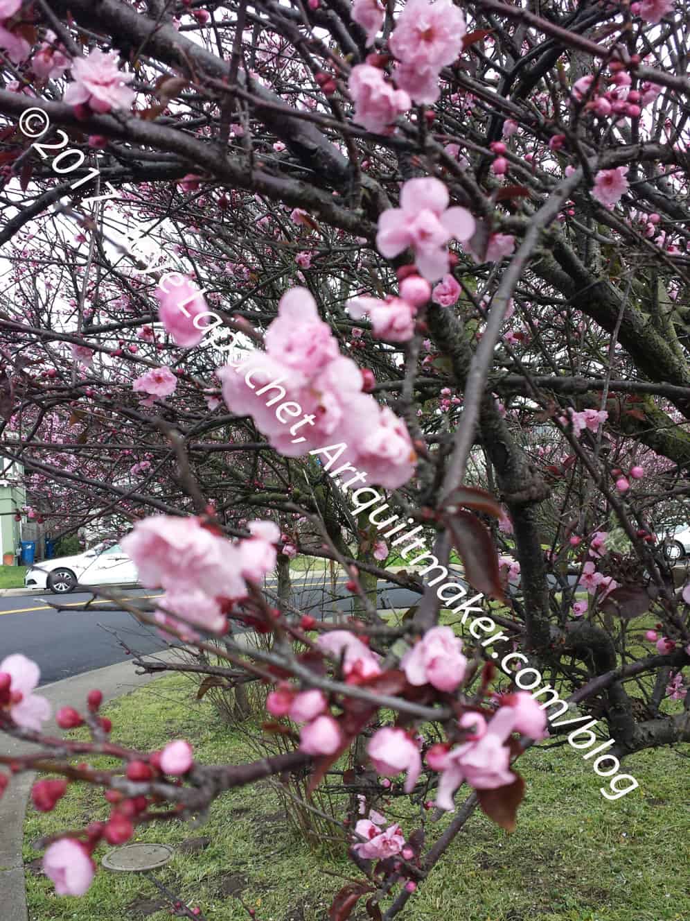
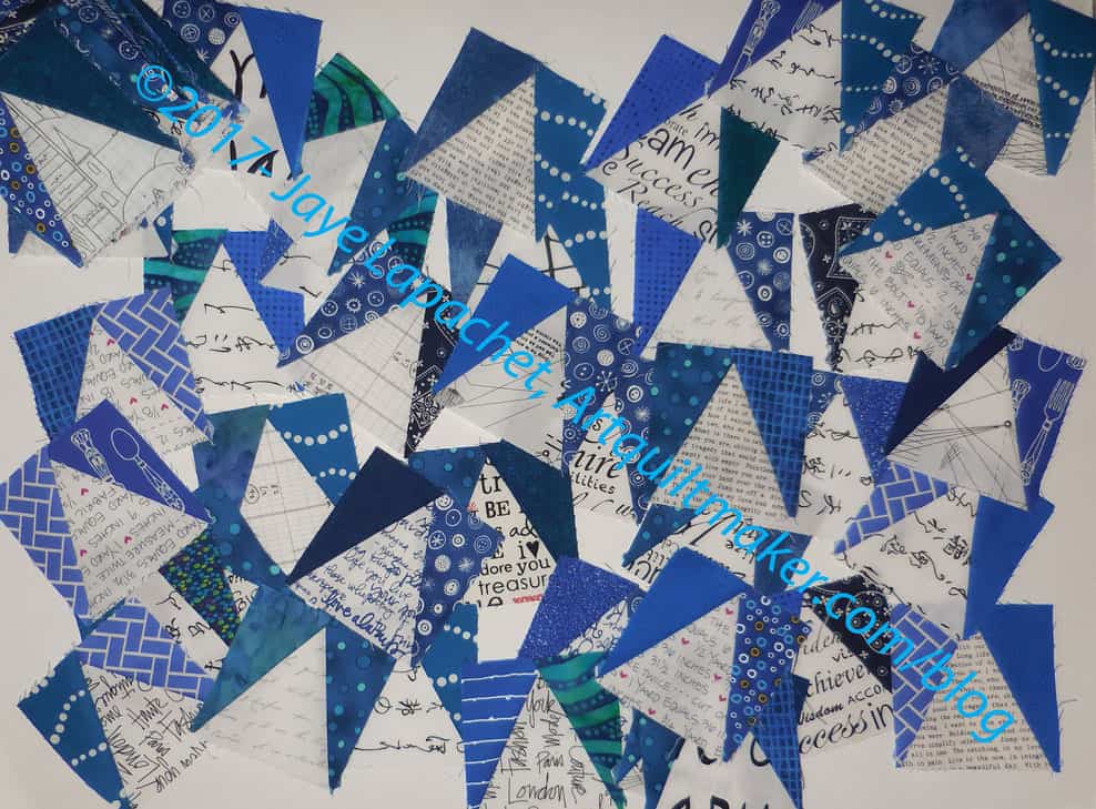
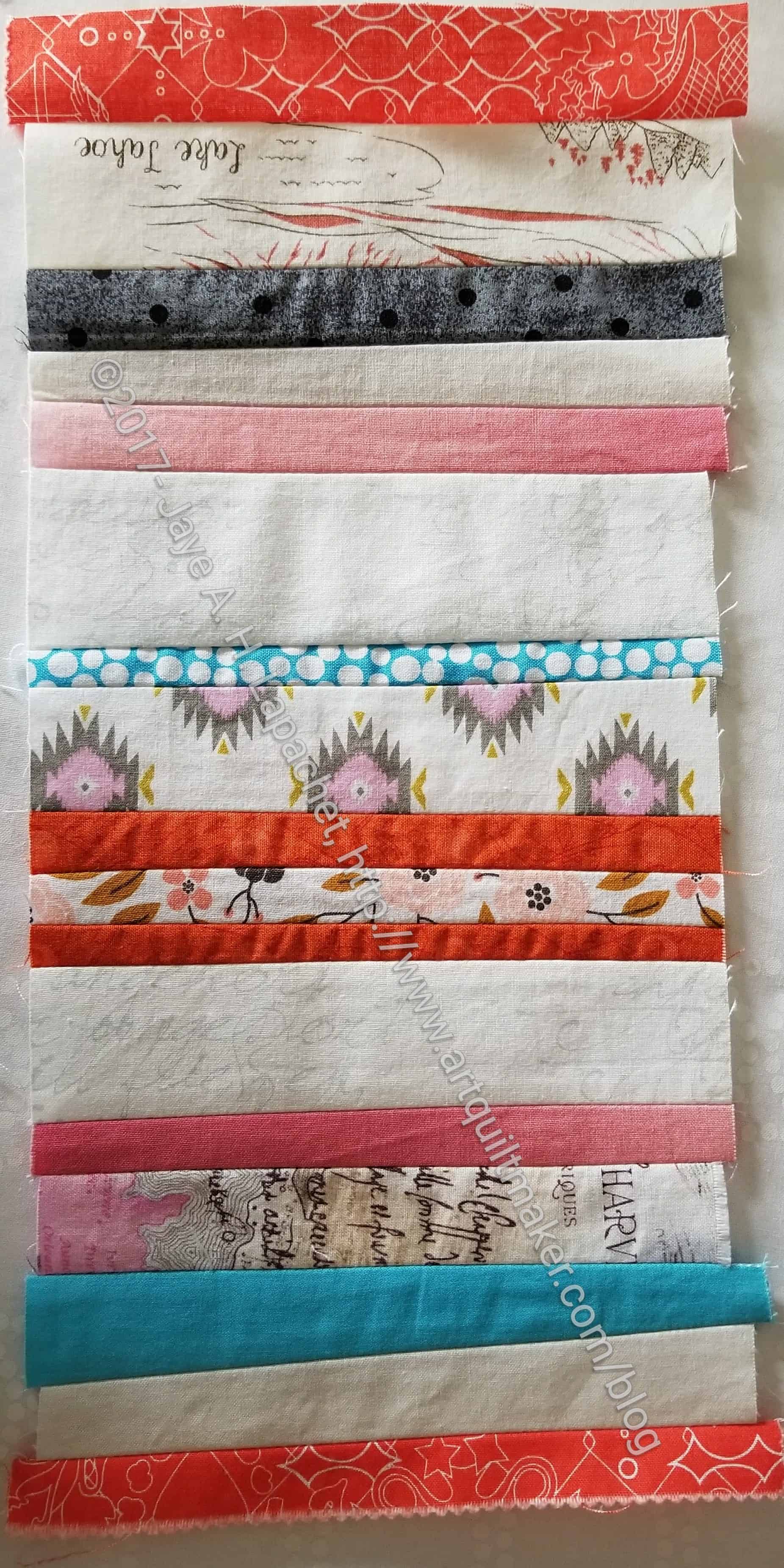
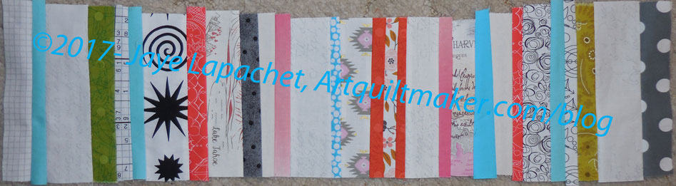
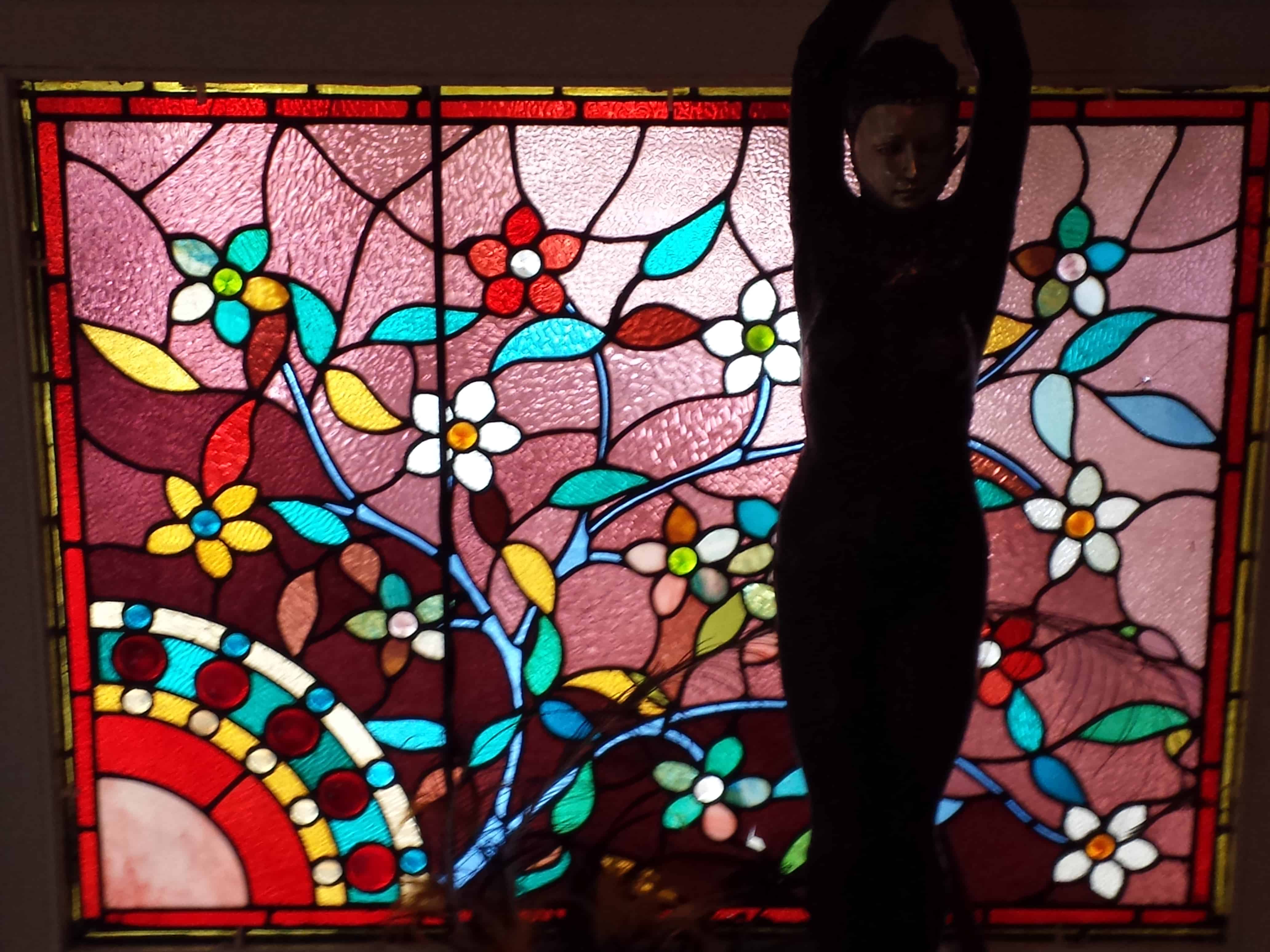
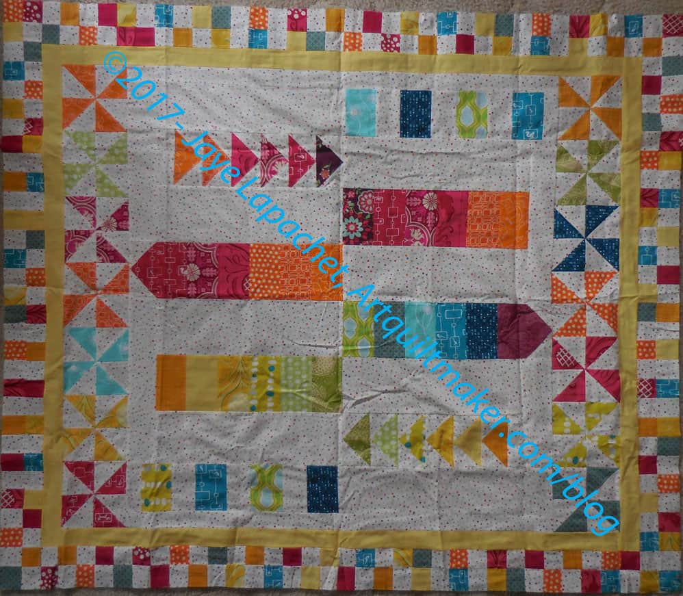
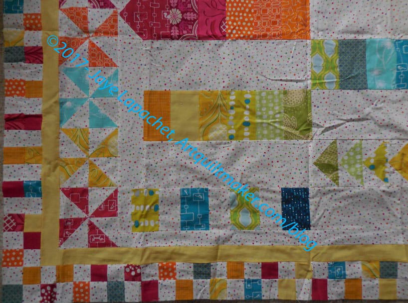
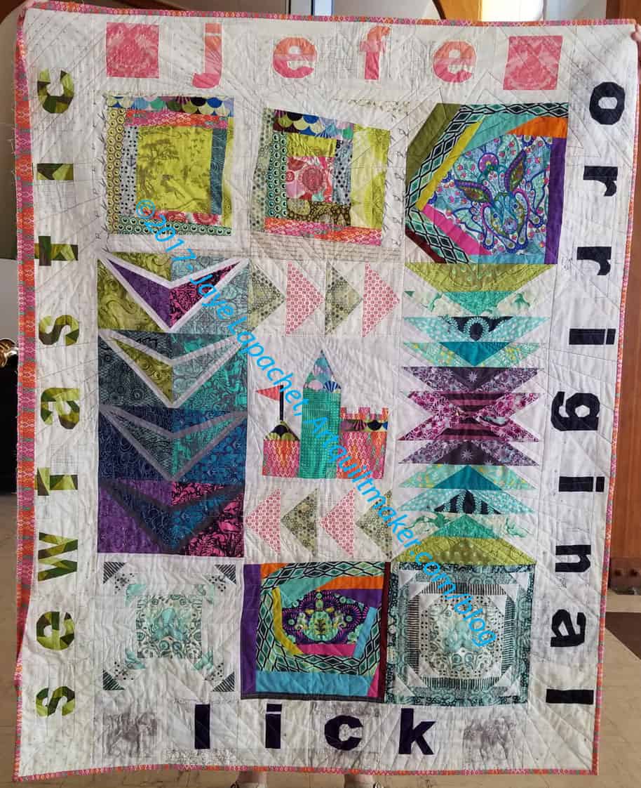
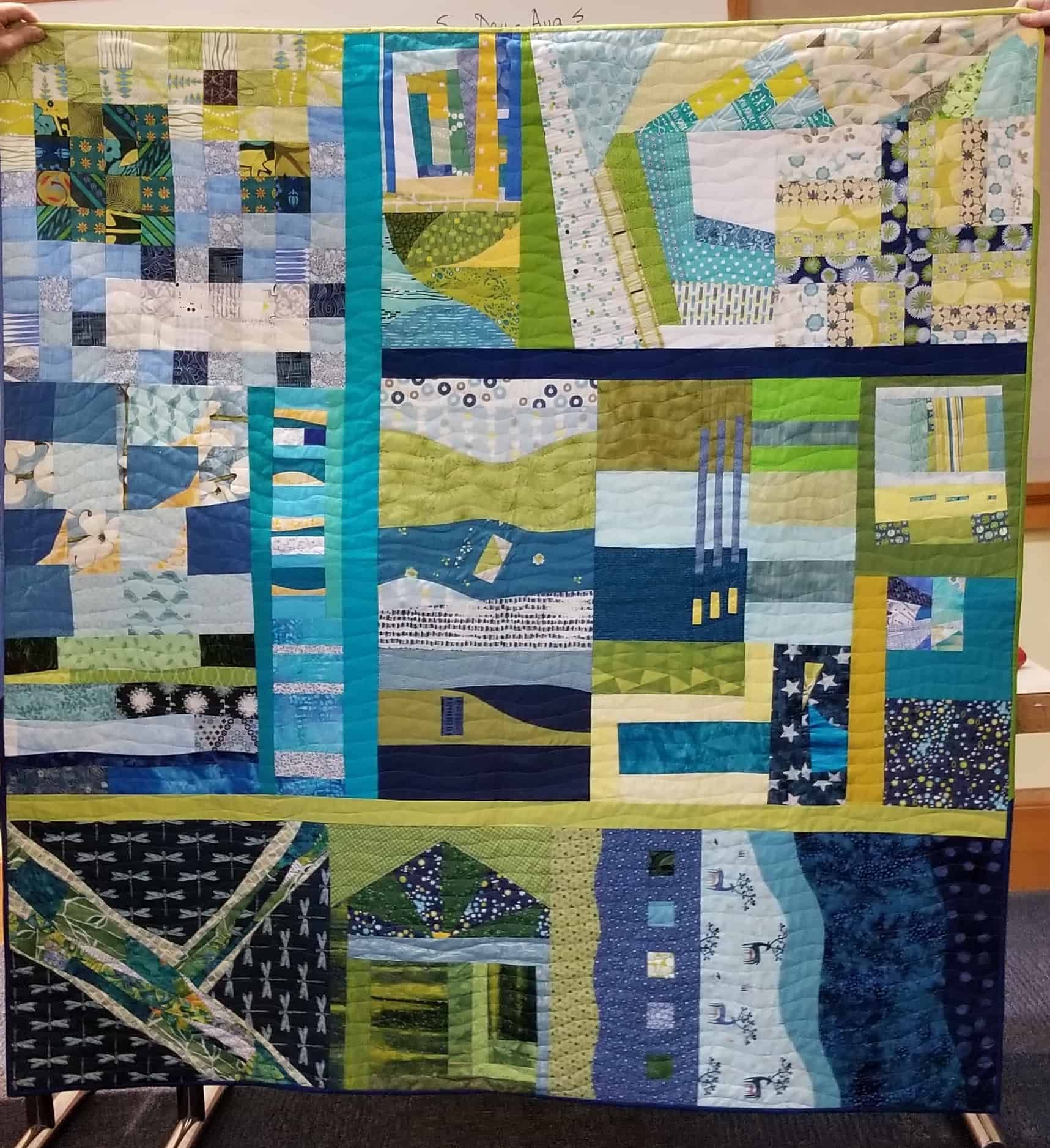
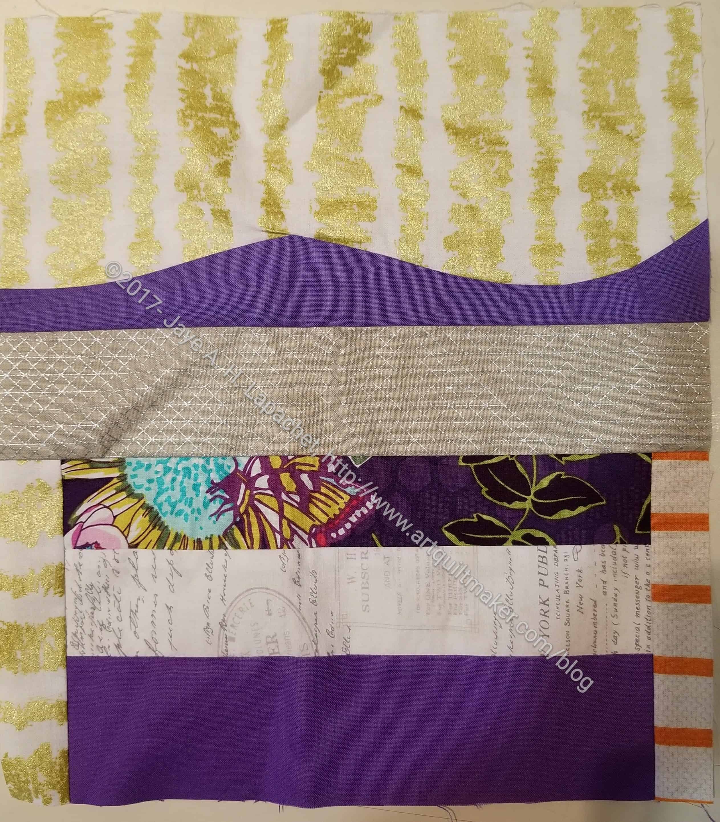
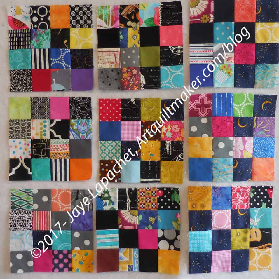
I went to work on Tuesday still on a high from the sewing I completed over the weekend. I felt so good and wanted another day to prolong the feeling. I guess that is why it is so hard for those in recovery.

This spark is about seeking pleasure. “Your life is full and, no doubt, you have your hands full – with work, family, and other responsibilities. You probably don’t take many moments to check in with your desires because you are so busy working about everyone else’s” (pg.77). “Children seek pleasure at every turn. they don’t need reminders about how to have play, how to have fun, or how to make room for themselves. They know what feels good” (pg.77).

Bloomston asks what about ourselves?

Well? What about it?

I know that sewing makes me feel good. I must get a rush of endorphins when I accomplish certain tasks that my body craves, because I take every opportunity to sew.

Some of the challenge is about allotting limited resources (pg. 78). “Responsibilities, financial pressures, plans” (pg.78) and I would add guilt for doing something fun, “…are the reasons we forget to play and have fun” (pg.78). It is important to pursue creative activities that make you feel good otherwise you will forget how to be creative. Being creative requires practice. I find that I don’t flail around as much, because I am in the habit of being creative and I am in practice. I still struggle with the guilt of taking time to make quilts. I don’t know if I will ever get over the feeling that I am not doing something real. I may not get over it, but I don’t have to listen to the voice.

Ms. Carrie has a worksheet, which I think looks deceptively easy. the really good advice is “Unless you begin to uncover yourself from the bottom of the heaping, mountainous pile of your obligations and busyness, you might not get a crack of time to cultivate your creative self. That is why you need to get in touch again with what feels good, just for you. If you can begin to discover and uncover your desire, you can pursue the Spark” (pg.78).

Nota bene: we are working through Carrie Bloomston’s book, The Little Spark. Buy it. Support the artist. Play along. There is much more to each spark than what I am writing. The original chapters will help you. Go buy Carrie Bloomston’s book, so you get the full benefit of her fabulousness! You can see my book review, which is what started this flight of fancy.

You can find the last spark on the blog a few weeks ago.

ColorPlay: Cherry Tree

I had a hard time finding a picture this week. I am not sure why.

ColorPlay: Cherry Tree

Still, I love cherry trees, so I went with one this time. This was taken a few years ago, but I still like the detail. I am curious as the palettes.

ColorPlay: CherryTree default palette

I don’t dislike the default palette this time. I am interested in that there are so many purples.

ColorPlay: CherryTree n.2

I moved the circles around to see about getting a more pink palette.

ColorPlay: CherryTree n.3

I decided, shockingly, to try and make a palette with neutrals. HA! Lots of grey. It would make a good guy quilt.

ColorPlay: CherryTree n.4

Next I focused on the green to see what I could make.

This was actually a good exercise and I am pleased.

Creative Spark #17: Inspiration

Dolores Street Decoration

The first headline of this spark is “Follow Fireflies. it made me think of my ‘What If’ game. The first line also sent my mind spinning. It reads “Inspiration is everywhere you look” (pg.73). I had just been walking down a street I frequent when I saw the decoration/gargoyle on a house. I thought it looked like a semi-wild cat. I like the detail (new houses have no character) and was amazed that I can still find things to see and be inspired by on a street I have walked down many times. I think having a  camera in my pocket gives me incentive to look more carefully at the world around me.  Bloomston also says “it can be commonplace or holy. It can catch you unaware and take away your breath. It can leave you speechless” (pg.73). I think I tend towards the commonplace – looking at the world around me, taking inspiration from the line of some bricks or some green growing in the crack of a sidewalk. At certain times of the year – not summer where I live – the sky and clouds can be quite dramatic. When I travel, I often find views and cityscapes that take my breath away. Architecture often amazes me because of the sheer scale of buildings built without computers. Noticing shape and line that inspires us is what Bloomston calls “the fireflies” (pg.73). She says “when we step into a life of chasing the fireflies of inspiration, we are more able to get into a creative space” (pg.73).

I find that I worry less when I am looking at the world around and making an effort to see the details – the beauty of the world around me. Carrie says that by getting into a more creative space “we create a fluency between our so-called normal life and our creative life” (pg.73). I find that there is less of a difference between the lives or parts of our lives. That lessening of space makes it easier to move between the two. The author further says “inspiration is often just a pebble thrown onto the path. It is up to you to stop, stoop down, and investigate it” (pg.73).

Ms. Bloomston has four suggestions: “slowdown, daydream, unplug, have a net” (pg.74). Unplug speaks to me today. I have been listening to many, many audiobooks. Lately, I have to think a lot and I can’t keep track of the story, so I haven’t been listening to as many audiobooks. I realized that, while I was very much enjoying listening to stories on audio, I was escaping and keeping my mind entertained so it wouldn’t dwell on the political situation or other bad things with which I was struggling. Now that I have less time to listen, I am allowing my mind to wander a bit. It does go to the dark places, but not as often. By not engaging it with audio 24/7, I am giving it space to think creatively as well. I am getting back into the groove of daydreaming. I think I am also learning to let my mind wander and touch on various topics, let it make connections between things.

As usual, Carrie Bloomston has some worksheets (pg.75). Go get your copy and fill them out. Think about what you are writing as you fill in the worksheet and let it inspire your creativity.


Nota bene: we are working through Carrie Bloomston’s book, The Little Spark. Buy it. Support the artist. Play along. There is much more to each spark than what I am writing. The original chapters will help you. Go buy Carrie Bloomston’s book, so you get the full benefit of her fabulousness! You can see my book review, which is what started this flight of fancy.

You can find the last spark on the blog a few weeks ago.

DONE: En Provence Clue 4

En Provence, Clue 4 - Peaky & Spike
En Provence, Clue 4 – Peaky & Spike

Yep, I finally finished all of those Peaky and Spikes I talked about in July.

I thought I would never finish and while I was taking a piecing break last weekend I put all the rest of the undone pieces together and sewed.

I never thought I would finish this clue. I have to admit that I am getting sick of all of this prep and would like to sew some blocks together. I am fighting with myself about whether to sew a block or two together or to just follow the clues.

I just looked in the folder and I have two more clues, then I will be, presumably, finished.

The next thing I need to do is make a bunch of half square triangles. Now to figure out the colors.

Amy’s Color My Quilt Finished

Amy's Inspiration
Amy’s Inspiration

After hearing Karen talk about her quilt, I decided that I would do more of a strip piece for Amy, so she would have some pieces she could use to connect other pieces. I tried to keep the pieces long and thin-ish.

Amy's Color My Quilt piece in process
Amy’s Color My Quilt piece in process

Partway through the process, as I mentioned, I took out the piece and took a look at it.

I was trying very hard to adhere to the spirit of the words, but color balance kept creeping in to my work. In the case of color balance, left, of the in process piece, I thought it needed more blue towards the top.

After working through all of my thoughts and feelings, I am pleased with the way this came out. I worked on it over the course of several weeks in between other things until I ran out of time. I also focused on the placement of the color rather than the width of the strips, etc. I did try to keep the strips from getting to wide, though I really wanted it to be long, so some are quite wide.

Amy's Color My Quilt piece
Amy’s Color My Quilt piece

I wanted to make it about a foot longer, but ran out of time. I am pleased and hope Amy will be, too.

Colorplay: Glass n.2

AirBnB leaded Glass Window

I decided to use this photo again and try to make palettes with Kona colors and see the differences. Obviously, I am going to try to put the dots in the same place.

You can see my first effort, from last week. I used Bella Solids on last week’s post. It was an accident. I meant to use Kona, but Bella was turned on so I went with it.

Leaded Glass-default-Kona

The default palette is very similar to last week’s default. I guess if there are no neutral colored areas in the uploaded image, it goes with similar colors or as close to neutral as possible.

I do like that very dark, Kona Espresso as an addition to the pinks. I think I would swap out the Crimson, though it looks more purple than crimson to me, to allow the Espresso to shine more.

Leaded Glass - palette n.1-Kona
Leaded Glass – palette n.1-Kona

The obvious differences in my first palette are the first red is darker and pink is more blush than grape. The first three colors (from left) are the stars as they were in the first Bella palette.

Kona Pool is such a great color and the yellow, Kona Wasabi, though looking much brighter on the bottom is a nice addition. I am not fond of the sand, but I am sure it would be a good unobtrusive hue to help the others shine.

Leaded Glass n.2-Kona

I gave up doing a scientific experiment and just had some fun. The next palette had a circus feel.

The colors are not pure primaries, so I don’t think it looks kid-like. I think it looks very cheerful. The Baby Pink as well as the Tomato keep the whole palette from being too much like a young child’s playroom.

Leaded Glass n.3-Kona

I tried for another cheerful palette and got one similar to the circus palette above, but with greyer hues. Not completely, because Pool and the Citrus are VERY cheerful. I am not sure I have seen citrus show up in a palette before (it must have and I didn’t notice). The Ultramarine and Grass Green make this palette into one that the parents of the children above could use.

Leaded Glass n.4-Kona

The blues stood out to me. Since I can resist them I made a palette with blues and greens – towards the darker, tending towards neutral.

The plum was an unexpected addition. I can’t pretend it just happened, because I put the circles in place. I was surprised at how well it went with the greens, especially the Celadon.

Leaded Glass n.6-Kona

I guess the neutrals have gotten to me, because I couldn’t finish the exercise without a neutral palette.

One thing I noticed is that I have to really notice all the colors when I made so many palettes. I didn’t notice the dark brown, actually Cocoa, when I started on this exercise last week. The Kona Pepper looks more dark blue to me than black, but it adds a tinge of optimism to the palette.

Leaded Glass n.5-Kona

The Pepper with its blue tinges sent me off to make one more blue palette.

The Ivy, which isn’t a favorite allows the Oasis and the Holly colors to shine. This might be might favorite palette, but I am also partial to n.2 above.

It is really a lot more fun to use a photo with many colors. I’ll have to find some others to use and do it again.


BAMQG Round Robin Returns…Again

Rhonda brought my BAMQG Round Robin back to me when we met at the CQFA meeting. I had to hunt around the blog for which challenge it came as I couldn’t remember. I also wanted to see the changes. I remembered that Kathleen worked on it and Kelly had it, but I couldn’t remember anything else about it. 🙁  Kelly had it for a long time and since she is much more into quilting than piecing, I wasn’t surprised to see no changes.

BAMaQG Round Robin
BAMaQG Round Robin

I remember Kathleen and I talking about ways to make the piece more horizontal as it started out very vertical. As it is now, it is very traditional in layout. It is turning into a  medallion quilt, which I don’t find that interesting.

Round Robin detail
Round Robin detail

The piecing is really good. I have asked for some other volunteers to work on the piece. We’ll see if anyone volunteers. If not, I will finish it and give it to a kid I know, I think. I don’t think I am really interested in working on it anymore.


Related Round Robin Posts

Colorplay: Glass

AirBnB leaded Glass Window

Today, I decided to try a photo that was super colorful. This is a leaded glass window I saw in a house on Guerrero Street. It is an AirBnB and my friend stayed there. I saw it when I dropped her off. the female shape in front of it is a statue. I am going to focus on the glass.

Apparently, I chose Bella Solids this time.

Leaded Glass- default palette
Leaded Glass palette n.1

The first palette, always the default, is very grape heavy. It isn’t unpleasant at all. I am struck at the similarities in the colors chosen by the program. Although, the hues provided tend to be somewhat dusky, the Bella Off-White seems have a pink tone when put next to the grapes and pink fabrics.

My first palette looks very circus-y. The Bella Sunflower next to the Little Boy Blue looks very cheerful. I got the red – actually Mango – by moving the dot very slightly up on the same piece of glass.

Leaded Glass - palette n.2
Leaded Glass – palette n.2

The Bella Sprout really makes the second of my palettes. I wanted something different than the yellow, but was concerned about that Longhorn (gold-yellow). with the other colors, I think it works. This palette is probably my favorite.

Leaded Glass - palette n.3
Leaded Glass – palette n.3

My immediate reaction to the third of my palettes was that I didn’t like it. However, I looked again and while I have concerns about the Bella Avocado, I think, overall, it works.

The colors come from one flower and I know the light affected the colors appeared.

I might do this exercise again with Konas just to see the difference.


Final Tula Quilt

I wrote about the Tula quilt we were making for our friend Kelly who was moving to Scotland. We got together a few weeks ago to present the quilt. We had breakfast, chatted and made Kelly cry.

Kelly's Good-bye quilt 2017
Kelly’s Good-bye quilt 2017

Rhonda hosted the party and did the most work on finishing the quilt. Amanda and Gerre did the amazing job with the letters on the borders. Some of those pieces are tiny!

The rest of us made 2 blocks or the equivalent and did some of the quilting. The whole process was pretty fun and went smoothly.

Kelly's Good-bye quilt 2017 with peeps
Kelly’s Good-bye quilt 2017 with peeps

Amy’s Color My Quilt

Yes, this appears to the be the week of Color My Quilt.

Amy's Color My Quilt piece in process
Amy’s Color My Quilt piece in process

I decided that I would start work on Amy’s Color My Quilt piece right away. I used it as leaders and enders while I sewed fabric pieces that didn’t require a 1/4″ foot. It was a good plan as I have made enough progress to hand it in today even if I do nothing else.

Don’t get the idea that I was doing a shoddy job. I was eyeballing a seam allowance rather than using the 1/4″ foot guide so I could make progress, but not being shoddy. If anything most of the seam allowances are larger than 1/4″.

Of course, I want to do more. I think it needs more blue. If I don’t do anymore, I’ll be happy and not embarrassed to give what I have to Amy.

Color My Quilt WOW

The BAMQG meeting was….sometime in the recent past. I have a lot going on and can’t quite remember.

Karen M. Color My Quilt

Anyway, one fabulous thing that happened was that Karen M brought her finished ‘Color My Quilt’ piece. I thought it looked fabulous. She talked quite a bit about how she put it together and where she added strips and bits and pieces.

Keeping the colors in the same family with a bit of spark really made this quilt come together.

Karen was asked to do a workshop on teaching people to put their own pieces together. She may do a hands on tutorial at the next meeting.

MS Color My Quilt

Michelle's Color My Quilt
Michelle’s Color My Quilt

The Color My Quilt project reared it’s lovely head again and I got busy making something for Michelle. My goal was to use my scraps, though I was determined not to skimp and paw through the fabric closet if there were no appropriate scraps.

One of Michelle’s words was shiny and I found some fabric that had a lot of shine, so I grabbed that. I also found some perfect purples. I was embroiled very hard in another project and this little piece allowed me to play a bit.

Creative Spark #16: Have a Secret

Bloomston got an assignment from an art professor to go and make a secret piece. The class was to do it and not tell anyone. They weren’t to turn it in or ever talk about it. Having and keeping the secret was the assignment. Having a secret doesn’t mean going and destroying some public property and then never telling anyone because of the guilt. Guilt is not involved. Having a secret in this context means finding that the “reward is inside us” (pg.70). If you are doing your art to get attention or to post on Facebook, then this spark is for you. Don’t make things because you think they will sell; make things that come from your heart.

I decided at some point that I would create this blog for myself 1) as a chronicle of my quiltmaking work and 2) as tool for practicing my writing. It isn’t a secret since, presumably, you are reading it. While I adore comments and interactions with my readers, if I only wrote the blog for you, I would have stopped a long time ago. I don’t get enough comments to get motivated to keep writing. I do refer back to old posts often enough to make it worth it for me. My blog isn’t a secret, but I have gained the benefit of the secret status because I really do write it for me.

There is something about having a secret project to work on. “Your own creative voice can get a bit clouded by all the other voices you hear from peers and teachers. It can become confusing and difficult to listen to your own voice.” (pg.70). No Instagram comments saying followers “LOVE IT”. Nobody has to get it. Just you.

Journals are often very private. My husband knows I keep one, but he has never read it. He can read them all when I am dead.

Nota bene: we are working through Carrie Bloomston’s book, The Little Spark. Buy it. Support the artist. There is a lot more to each spark than what I am writing and the original chapters will help you. Go buy Carrie Bloomston’s book, so you get the full benefit of her fabulousness! You can see my book review, which is what started this flight of fancy.

You can find the last spark on the blog a few weeks ago.

Star Donation Quilt #2 – in Process

I liked the previous Star Donation top so much that I decided to make another one. As I have mentioned, I have a lot of leaders and enders opportunities, so I am not making as much progress on donation tops and blocks right at the moment. Still, slow progress is better than no progress.

Sawtooth Stars to be - Donation Blocks
Sawtooth Stars to be – Donation Blocks

At the moment, I have the blocks done. I will make Flying Geese to add to make them into Sawtooth Stars.

Not all of the blocks have black background patches, but I did try to keep the background patches dark so as to continue to explore that look.

I also decided to make this one larger – 9 blocks instead of 4. Still, looking at it makes me think I could make two donation tops with these blocks for the NICU, if I wanted to make them smaller. I will see what I think when I finish making the blocks into stars.