Make Visual Decisions Visually: Serendipity Puzzle

That is a quote (without the Serendipity Puzzle part) from Lorraine Torrence. It is a great ‘rule’ to remember, at least for me. I find that the picture in my mind’s eye often looks better in my mind’s eye.

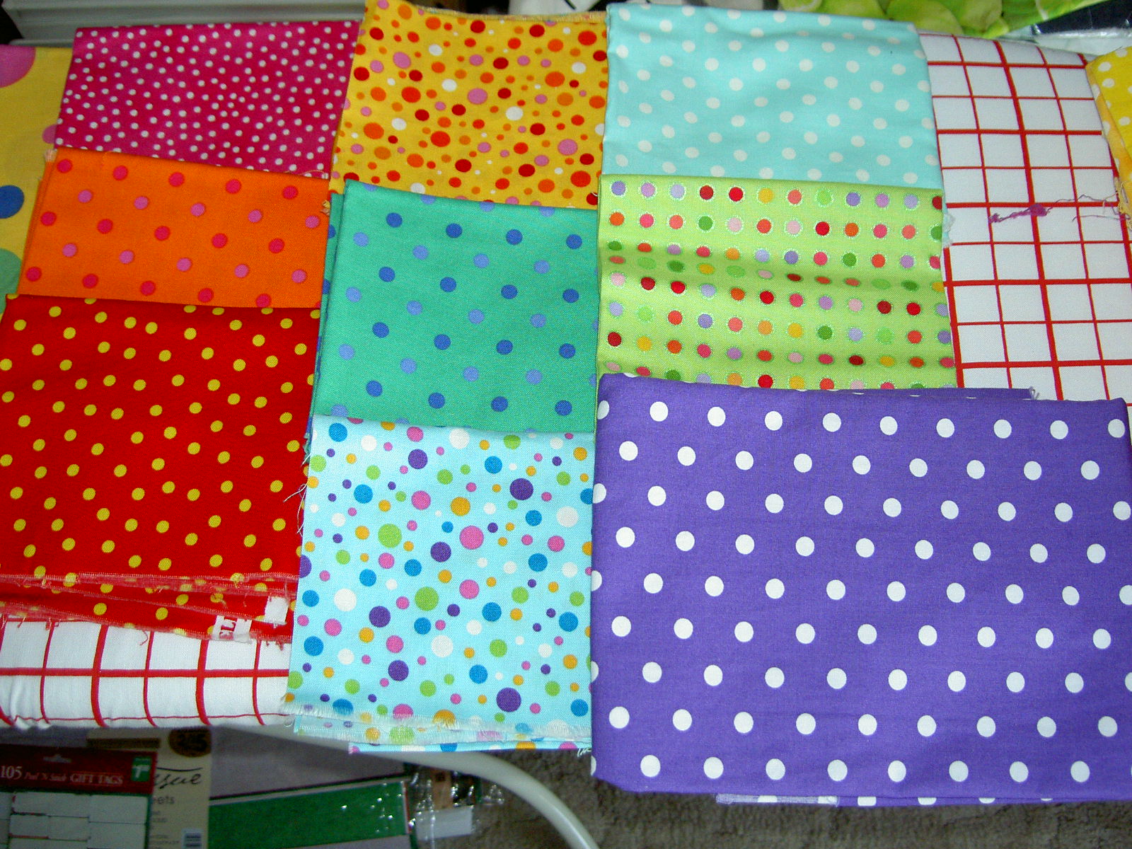
To that end, I cut some sashing pieces to try and figure out if I was on the right track.


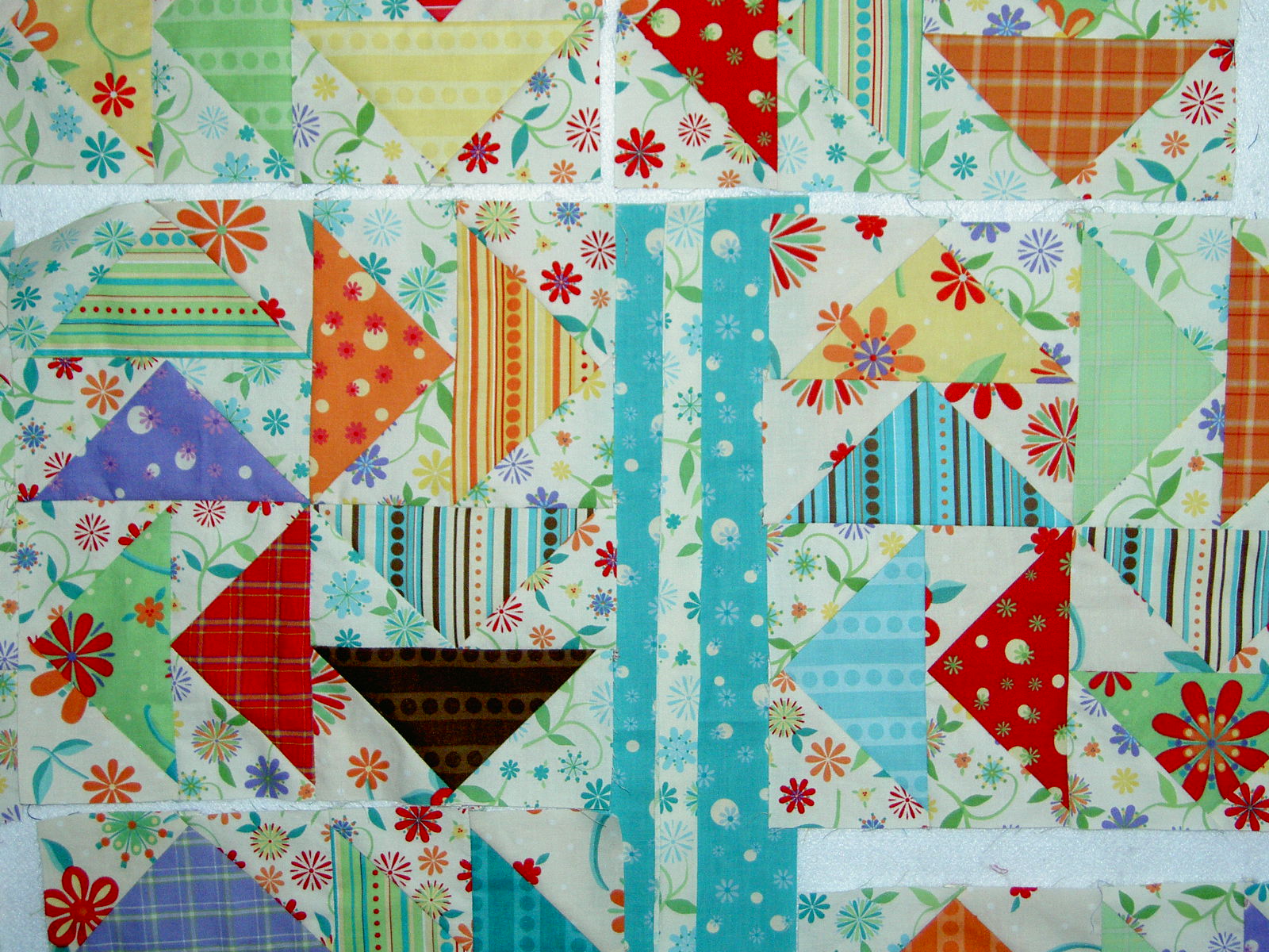
This example was my original idea for the sashing. I am not fond of it, but it is also not terrible. It looks busy and is not restful. Not sure if this quilt can be considered restful in general, but I certainly don’t want to add to the excitement. I may have to sew some pieces together to make sure this is not the right sashing design before I decide.


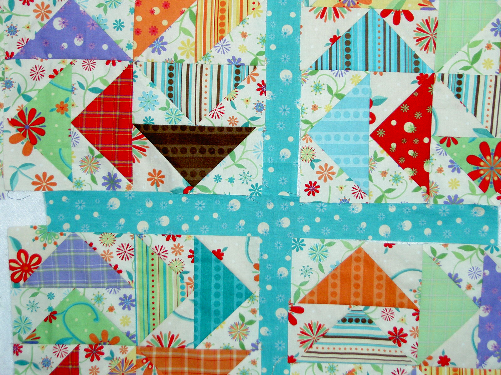
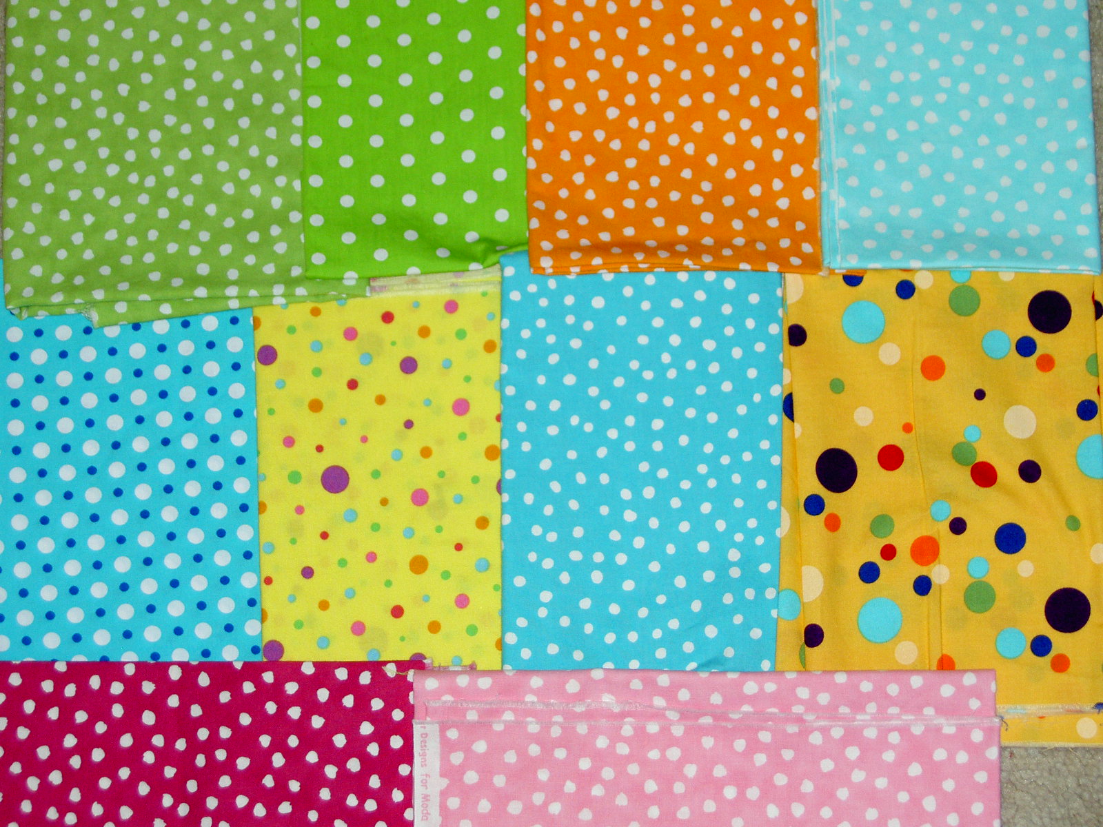
To me, this screams “look at the cross.” I think the contrast between the light background and dark sashing does not add to the overall design.


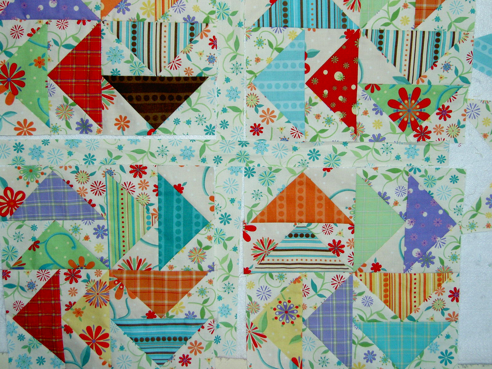
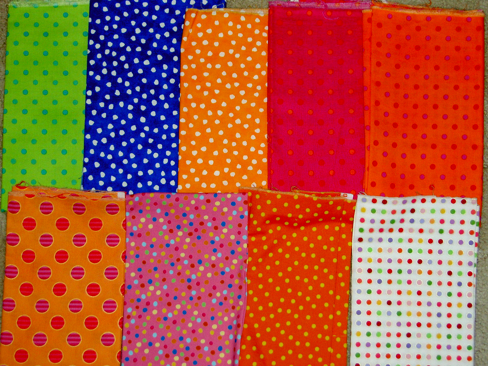
Think, so far, this is the best, which surprised me. It gives some space to each block so you can see the design and alleviates some of the busy-ness. I would put pieces of the three different lights instead of just the blue on white.

Pineapple Homework cont’d

I worked, yesterday, on selecting fabrics for the Pineapple class, which takes place next Friday. These are the fabrics that I have selected so far. As I looked through my dot fabrics, I felt like some were missing, but couldn’t find any others, so I guess I just have the impression in my mind that there are never enough dots! I am pretty happy with the selection, but am still contemplating whether or not the dot sizes are too similar and whether the colors are too similar in value.

In this selection, I didn’t include any of the Fusions fabrics by Robert Kaufman, but am considering adding some to add a little motif size interest. Some of the colorways are very light, however, so if I do add them I need to take care. I don’t want the background to bleed into the foreground creating visual confusion. I can certainly bring them with me, so if I need them I will have them, but if not, no harm done. Opinions are welcome.


Ignore the checkerboard, as that is my ironing board cover!


The two pictures above are the same group, so you will see some overlap (e.g. the red).


Value too similar? I might have get rid of the red one in from the right as it seems to read as a solid.