Some things take time. I know that in our house, if something comes in it is difficult to dislodge it. This has a number of effects. Nothing temporary may come in. Temporary has no meaning in our house, so only things that we want to keep forever may come in.
As I work towards my ideal workroom, I have to work with this stricture. Thus when I walked by a new shop downtown and saw the sweets shop with the look and feel I wanted, I had to take a photo. Knowing the look and feel I want helps to weed out anything that doesn’t fit.
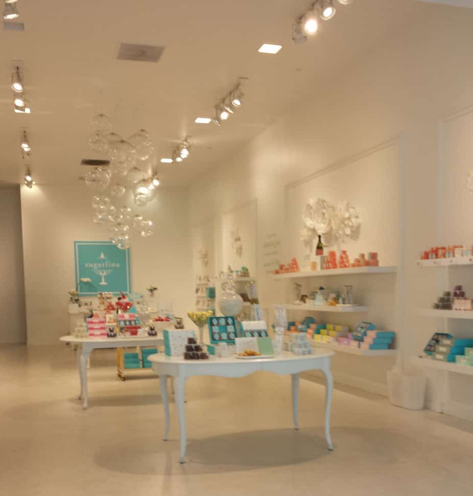
I decided to use this photo as our ColorPlay this week. What is the dominant color you see? And the secondary?
For me, I see a white domination with a turquoise, or, perhaps pink (salmon) secondary color.
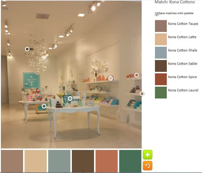
I do NOT see a preponderance of neutrals! The above is the default palette. Are you kidding me? No white. No turquoise. This is a big failure to me. If we were matching up palettes with original pictures, nobody would pick this palette to go with my picture. Can you tell I am miffed?
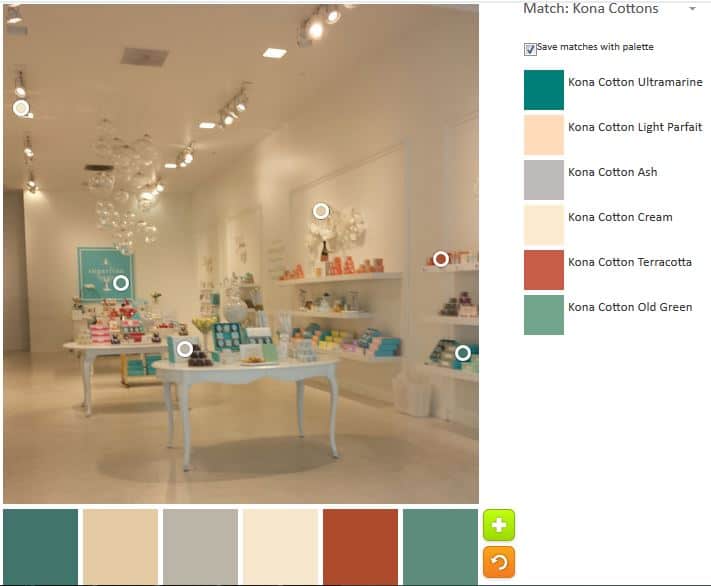
My first attempt to stack the deck is not much better. The colors are slightly nicer, but still no white, pink or turquoise. I know this is because of the shadows, but I am still annoyed.
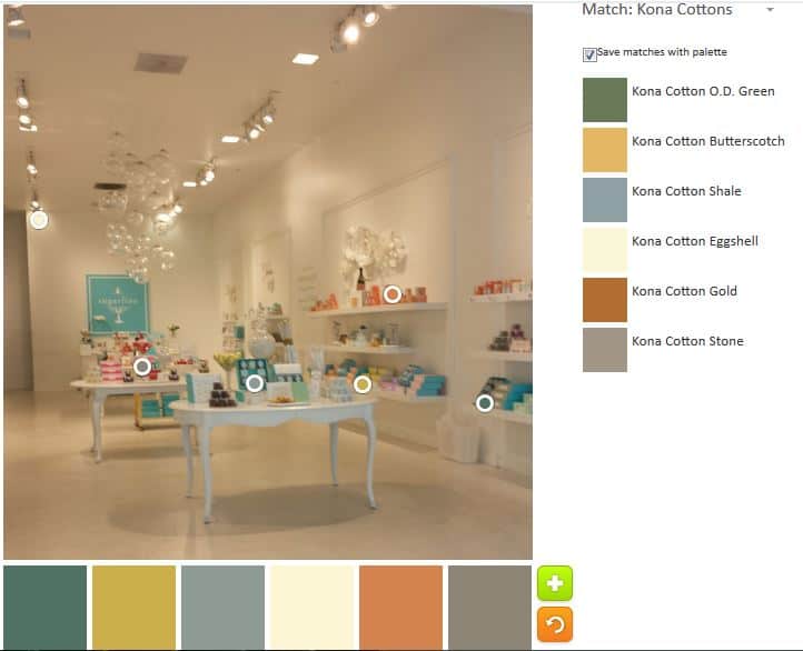
My second attempt is, at least, slightly more palatable (HA!). The colors are a bit lighter and a bit fresher. Still no white or turquoise.

Despite the fact that the Kona Emerald doesn’t look anything like any emeralds I have seen, this palette is slightly better. At least there is a pinky-red included.
I absolutely will not use any of these palettes for my workroom. If you haven’t tried the Palette Builder by Play-Crafts, go and try it — after you leave a comment ;-).