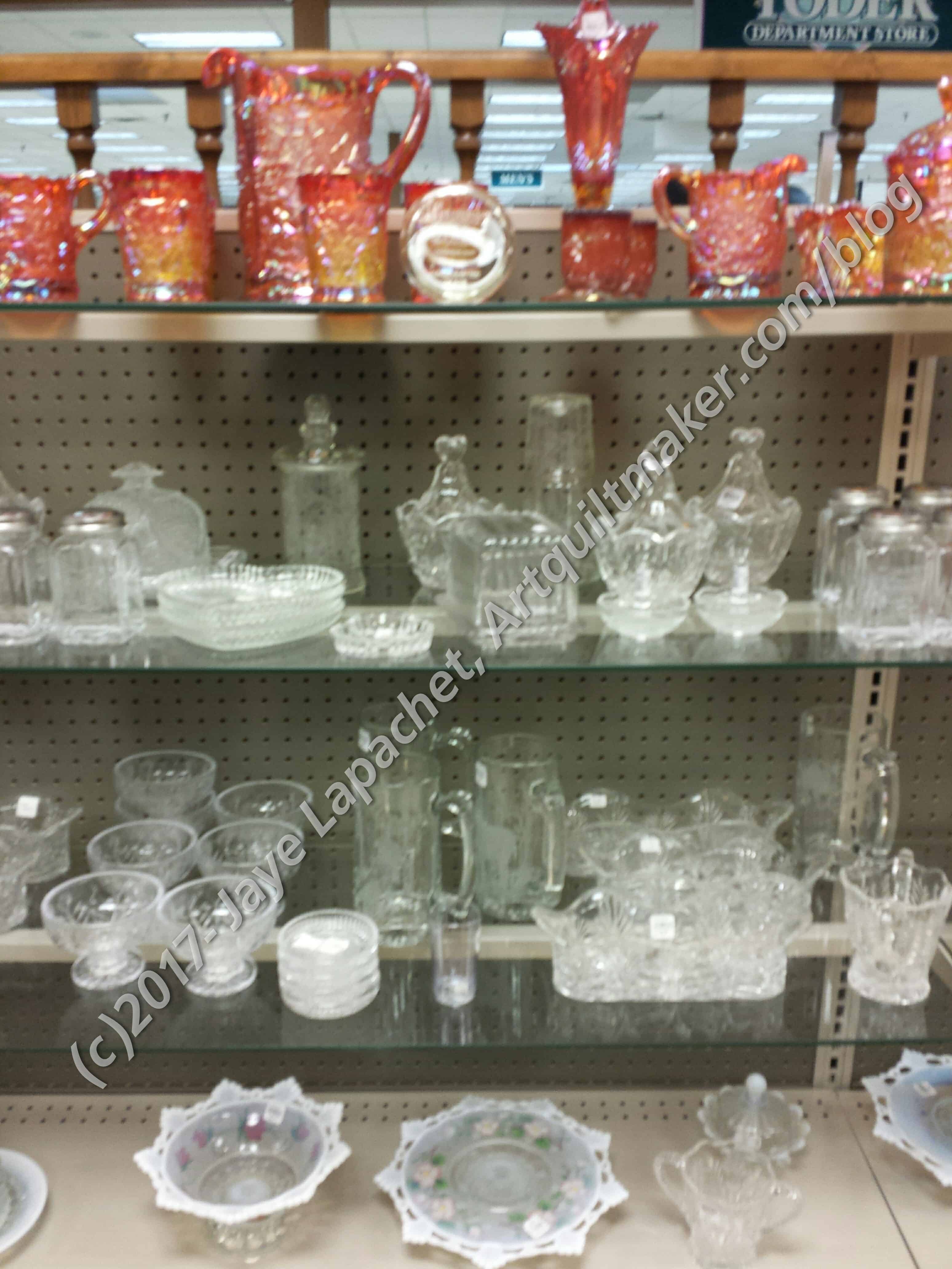
I still have some of the pressed glass photos from my trip to Indiana and wanted to try a few more palettes. I thought this color scheme would be an interesting challenge.
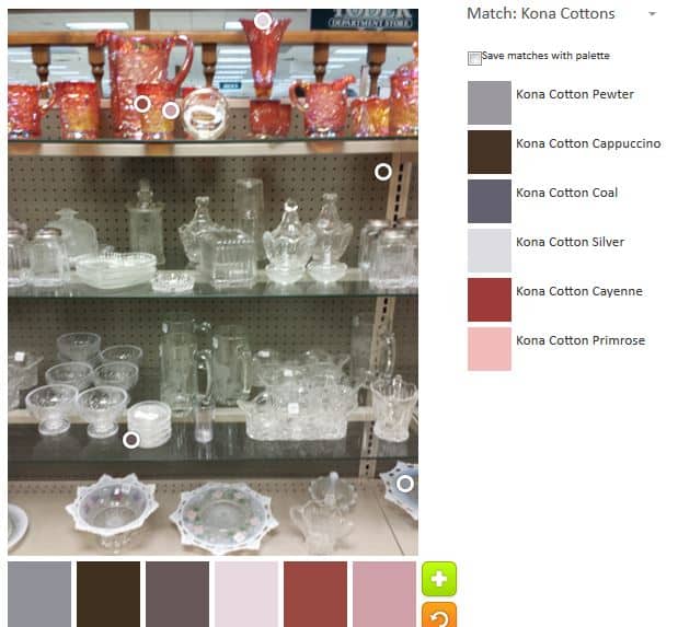
The default was, of course, in Jaye-world, not to my tastes. It isn’t horrendous. The Silver and Pewter, as well as the Primrose are all nice. The Cayenne adds some zing.
I did think it was interesting that most of the circles were clustered in the top of the photo. Not all, but most.
It is a little dusty for my tastes – the colors are not clear. It is good that I could try again.
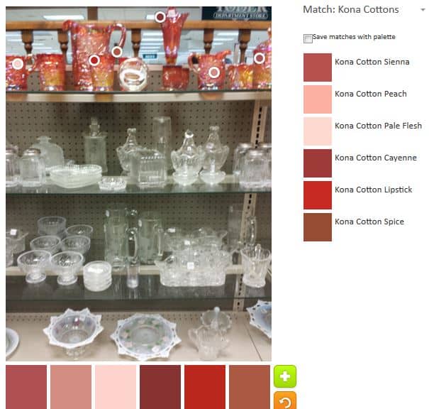
The second palette, the first where I moved the circles, was much more focused on the reds. I intentionally kept the circles to the top row of vessels and tried to get as many reds as possible.
As you can see there is a Peach, Pale Flesh and Spice, which are tones and shades of red, but not strictly red.
There might not be enough contrast in this palette for a quilt where one really wanted to show off the piecing, but for a subtly shaded quilt, it would be great.
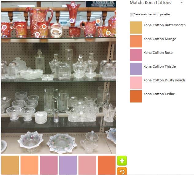
In the third palette, my second, I tried to go for bright and cheerful.
Success! The combination seems cheerful to me and all of the colors go together.
This palette also has Peach in it and I noticed that the peach looks very different next to the Butterscotch than it does above next to the Sienna. I have always wanted to play around with putting one color next to a bunch of different ones to see the effect of the different colors on the one. Someday, perhaps.
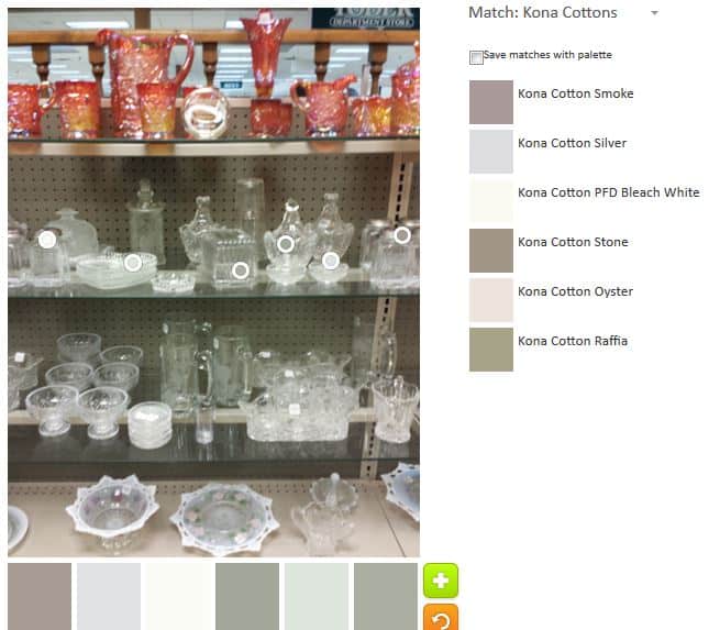
My third, the fourth total palette, uses the middle of the image. This is a challenge on a couple of levels based on the question “what color is clear?”. Well, our eyes say something different than the Palette Builder tool. The Palette Builder tool has to assign a Kona fabric color. I knew that this palette would be wintery.
It is. The greys and blues are colors I would use for a snowy landscape quilt. Some of the darker greys are a little depressing for me, but I do like the Silver and the Oyster is okay, too.
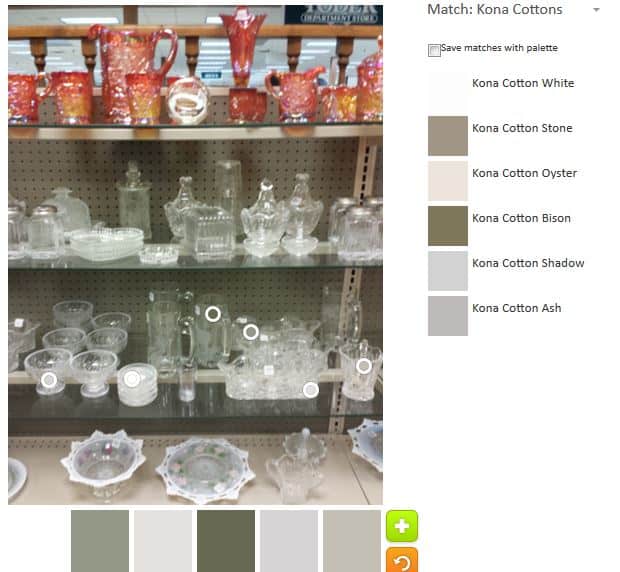
I wanted to see if I could make a very different palette in the same area of the photo. I ended up moving the circles down to the next row on the photo.
My idea didn’t work very well. The two palettes are very similar with the addition of Bison (hilarious name if you have ever seen a Bison).
Stone shows up, which is repeat, as does Ash, which is not. Ash is another one of the Konas that I really like.
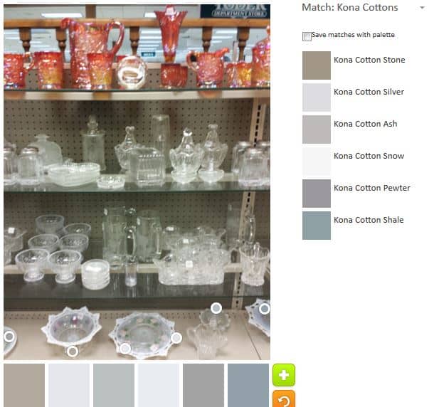
I was running out of photo, but I decided to try with the white and clear pressed glass one more time and see what I could come up with.
Another wintery landscape palette with some more blue tints added. Some of my favorite Konas are included: Ash, Snow and Silver. The Shale was an unexpected addition. I think the Shale gives the whole palette an icy feel.
I think I went in with a different mindset this time and was much more openminded about the palettes. The Palette Builder is a great and fun tool. Try it out! Let me know if you make anything with any of these palettes.