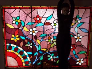
Today, I decided to try a photo that was super colorful. This is a leaded glass window I saw in a house on Guerrero Street. It is an AirBnB and my friend stayed there. I saw it when I dropped her off. the female shape in front of it is a statue. I am going to focus on the glass.
Apparently, I chose Bella Solids this time.
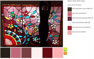
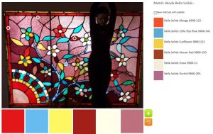
The first palette, always the default, is very grape heavy. It isn’t unpleasant at all. I am struck at the similarities in the colors chosen by the program. Although, the hues provided tend to be somewhat dusky, the Bella Off-White seems have a pink tone when put next to the grapes and pink fabrics.
My first palette looks very circus-y. The Bella Sunflower next to the Little Boy Blue looks very cheerful. I got the red – actually Mango – by moving the dot very slightly up on the same piece of glass.
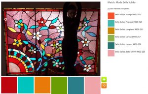
The Bella Sprout really makes the second of my palettes. I wanted something different than the yellow, but was concerned about that Longhorn (gold-yellow). with the other colors, I think it works. This palette is probably my favorite.
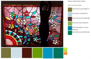
My immediate reaction to the third of my palettes was that I didn’t like it. However, I looked again and while I have concerns about the Bella Avocado, I think, overall, it works.
The colors come from one flower and I know the light affected the colors appeared.
I might do this exercise again with Konas just to see the difference.