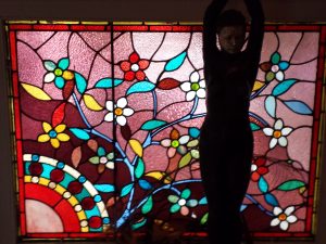
I decided to use this photo again and try to make palettes with Kona colors and see the differences. Obviously, I am going to try to put the dots in the same place.
You can see my first effort, from last week. I used Bella Solids on last week’s post. It was an accident. I meant to use Kona, but Bella was turned on so I went with it.
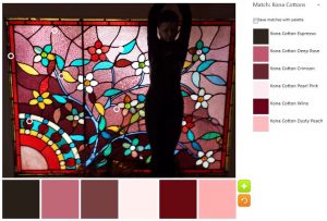
The default palette is very similar to last week’s default. I guess if there are no neutral colored areas in the uploaded image, it goes with similar colors or as close to neutral as possible.
I do like that very dark, Kona Espresso as an addition to the pinks. I think I would swap out the Crimson, though it looks more purple than crimson to me, to allow the Espresso to shine more.
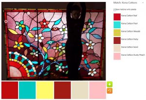
The obvious differences in my first palette are the first red is darker and pink is more blush than grape. The first three colors (from left) are the stars as they were in the first Bella palette.
Kona Pool is such a great color and the yellow, Kona Wasabi, though looking much brighter on the bottom is a nice addition. I am not fond of the sand, but I am sure it would be a good unobtrusive hue to help the others shine.
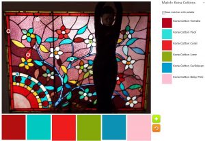
I gave up doing a scientific experiment and just had some fun. The next palette had a circus feel.
The colors are not pure primaries, so I don’t think it looks kid-like. I think it looks very cheerful. The Baby Pink as well as the Tomato keep the whole palette from being too much like a young child’s playroom.
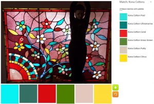
I tried for another cheerful palette and got one similar to the circus palette above, but with greyer hues. Not completely, because Pool and the Citrus are VERY cheerful. I am not sure I have seen citrus show up in a palette before (it must have and I didn’t notice). The Ultramarine and Grass Green make this palette into one that the parents of the children above could use.
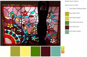
The blues stood out to me. Since I can resist them I made a palette with blues and greens – towards the darker, tending towards neutral.
The plum was an unexpected addition. I can’t pretend it just happened, because I put the circles in place. I was surprised at how well it went with the greens, especially the Celadon.
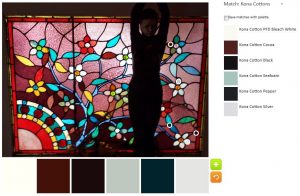
I guess the neutrals have gotten to me, because I couldn’t finish the exercise without a neutral palette.
One thing I noticed is that I have to really notice all the colors when I made so many palettes. I didn’t notice the dark brown, actually Cocoa, when I started on this exercise last week. The Kona Pepper looks more dark blue to me than black, but it adds a tinge of optimism to the palette.
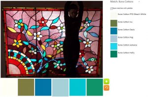
The Pepper with its blue tinges sent me off to make one more blue palette.
The Ivy, which isn’t a favorite allows the Oasis and the Holly colors to shine. This might be might favorite palette, but I am also partial to n.2 above.
It is really a lot more fun to use a photo with many colors. I’ll have to find some others to use and do it again.