
After a brief hiatus, ColorPlay is back. I was inspired by a window display I saw.
At first, I thought the dots were part of the items for sale, but then I realized that they were temporary dots and added a lot of fun color to an, otherwise, uninspiring display. The table has a nice shape and the black isn’t terrible, but the pops of color really made me look again at the display.
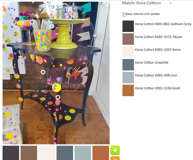
The default palette was pretty uninspiring. Again, the tool pulled out all of the neutrals and produced a shockingly depressing palette from an image that comes across as, at least, relatively, cheerful. I can only guess that the tool analyzes the relative sizes of the shapes in the image and pulls color from those. In that case, the Gotham Grey and the Gold would be understandable.

Enough of that nonsense, however! I saw lime and pink and other colors and I delved in to see if I could make a palette that I would like.
The first palette I created is much better – much more cheerful, I should say. I deliberately stayed away from the black, brown and other neutrals. I especially love the Bright Pink, the Pickle and the Citrus. The combination work well together. I think the Kona Haze gives the other bright colors space to shine.

The second palette is my favorite, however. I added in more cool colors and it looks like a palette that I would use.
The turquoise, of course, is a favorite, but the two purples, Kona Lupine and Kona Violet, really add to the turquoise. This does not come across as sweet and kidlike as palette n.1.
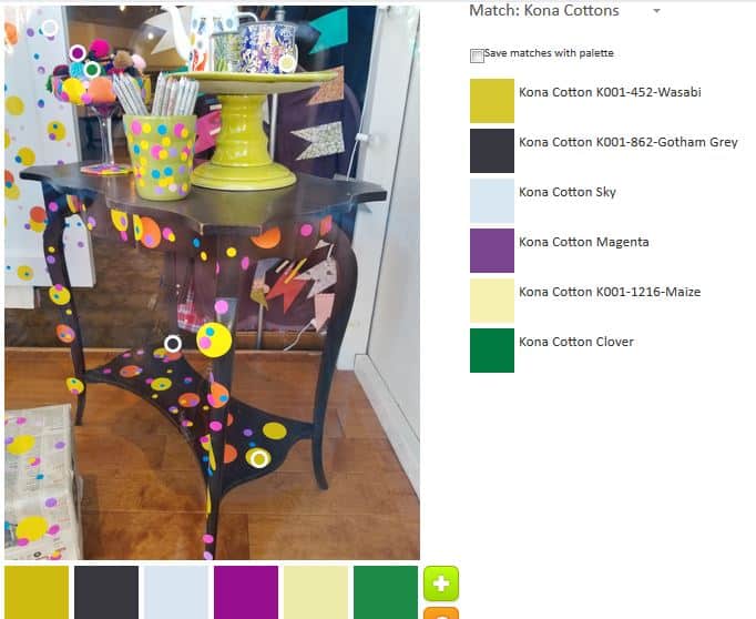
The final palette was an attempt to blend my color preferences with the default palette. I am not as enamoured with it as I am with Palette n.2, though I do see the benefits of the group of colors. That Kona Magenta (which looks more like dark violet to me) is a star. I am on the fence about the Clover (green). I purposefully chose the Wasabi, because there is so much of it in the tableau. I am just not sure this palette works together as well as the others.
Let me know what you make!