Make your own Jackson Polluck painting
My attempt at Jackson Polluck’s style:
Commentary about works in progress, design & creativity
 I spent the day in a class at Quilting Adventures in Richmond, VA with quilt artist, Pamela Allen. Pamela is from Canada and you can see much of her work at her website.
If you haven’t been to Quilting Adventures, drop what you are doing and go. The shop is great: bright colors, fabulous samples of dolls, quilts and what paints and dyes look like on fabric as well as examples of what you can do with them. Joyce and her team have done an outstanding job with the shop. They are not all things to all quiltmakers, but I think everyone could find something there!
In the class, the topic was Mavericky portraits. Mine is not a self portrait, and is clearly not complete. I took the above photo before I started to quilt it. I “appli-quilted”, which is to say I appliqued the pieces down as I quilted them.
It was a rocky road to quilting as I wanted to use the Glitter thread, but had used very fat batting. I took my initial attempts at stitching out after several frustrating thread breaks. Joyce, the owner of QA, calmly and ably assisted me and replaced the batting with thinner batting and the quilting went much more smoothly. I was able to finish all I wanted to on one machine.
People may be afraid of Glitter, but it is wonderful thread. It gives the sparkle of metallic threads without the headaches. I have tried it, now, on three different machines with minimal issues. It does not like the fat batts, though.
I still want to do some work embellishing, the silk flowers especially need centers of some kind. I also need some kind of hair, but perhaps I will leave her hairless. She is very much still in progress and her personality is not developed, so we will see what comes next.
Also, during TFQ’s visit, I worked on the Moda squares I got from Hancock’s. I decided on the final arrangement and started sewing them together. More than 20 days later, they are still in the same state. I will get back to it in another month or so.
I decided to get more of the squares, after St.JCN suggested it, and make the piece a little bigger. I was thinking about how I would arrange the new batch of squares. My idea now is to arrange them the same way, but turn the whole arrangement upside down and then sew it to the original group. Since I have not made this decision visually yet, we will have to see once the squares arrive.
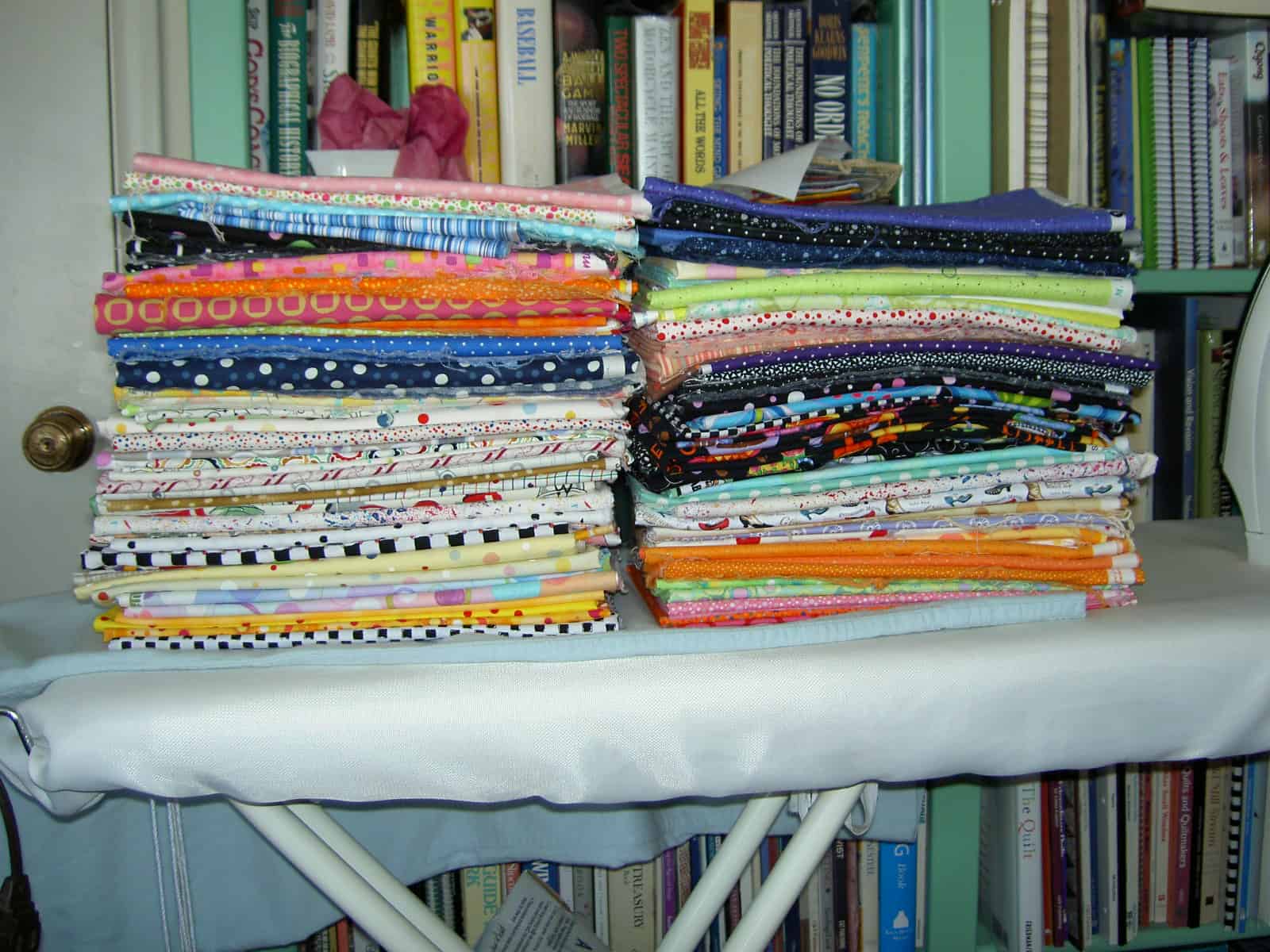
One of the benefits for me of my friendship with St.JCN is that she doesn’t mind ironing and pressing. Above is the great unwashed clean and pressed and ready for use! I had nothing to do with these neat piles of fabric. St.JCN pressed and folded it all.
She was quite disgusted that I had not washed all the fabric and packed it up and took it home with her to wash and press there. The fabric will also stay and play with its friends until the chaos here at home dies down.
Some time has gone by since I last wrote and I hope my faithful readers have not given up on this blog. Since I last wrote, I haven’t been doing much of anything creative. However, the top for the Nosegay is finished! St. JCN’s visit was the first weekend in May and extremely productive in a lot of ways. Although we did not get to do everything we wanted (we never do!), we did get to do a number of fun things on the list, one of which was finishing the Nosegay.
The Nosegay was started in a class with Doreen Speckman at Black Cat Quilts. It was the last class she taught at Black Cat before she died. This class was held in about 1997 or 1998. I worked on it on and off, but fairly steadily until I came to the border. The quilt is huge and, thus, unwieldy to work on alone. St. JCN has helped me on and off but other quilts took precendence since the 90s and the Nosegay was relegated to the closet. At some point a few years ago, in an attempt to move the project along, we made border blocks. St. JCN is very good at helping me work through problems. She is also generous with her time and excellent at keeping me on track. We (I?) decided that the time had come to deal with Nosegay. First we looked over all the notes I had from the past efforts (I keep a file on each quilt and stuff everything related to it in the file). One note had been on my bulletin board so long that the ink had faded to a point where we could no longer read it! We also measured the border blocks and the quilt itself. We discussed how to get the border blocks to fit and tried a couple of different options.

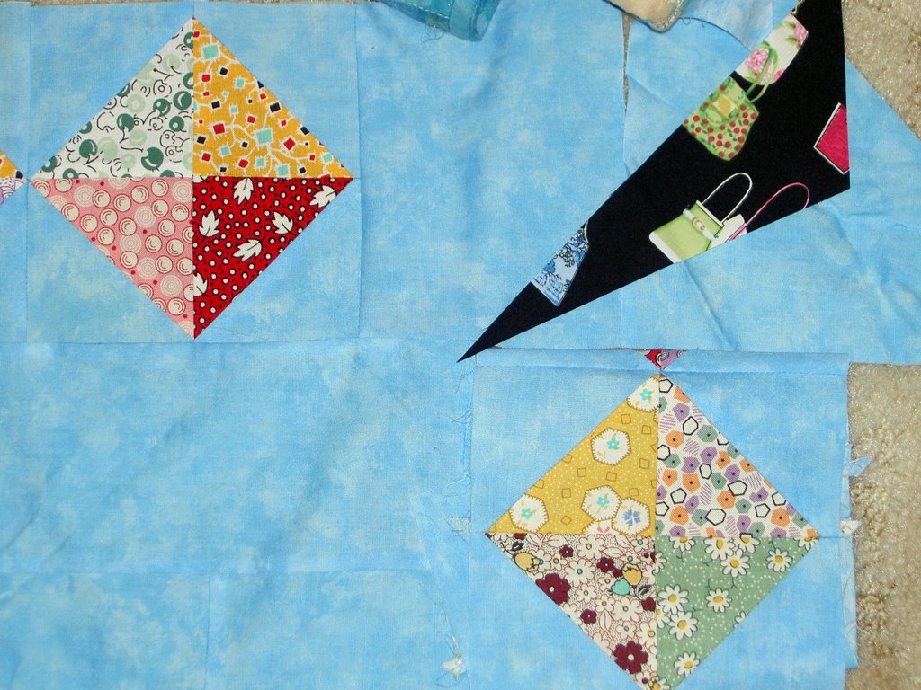

I did like the black, in theory, as it echoed the cone in each of the Nosegay blocks, but it really looked like a big blob of black in each corner. The other colors are very pastel-y, thus we thought it was important to watch how the black fit in. I also liked the idea of a different shape in each corner to take the viewers mind off of the fact that the border blocks didn’t fit perfectly.
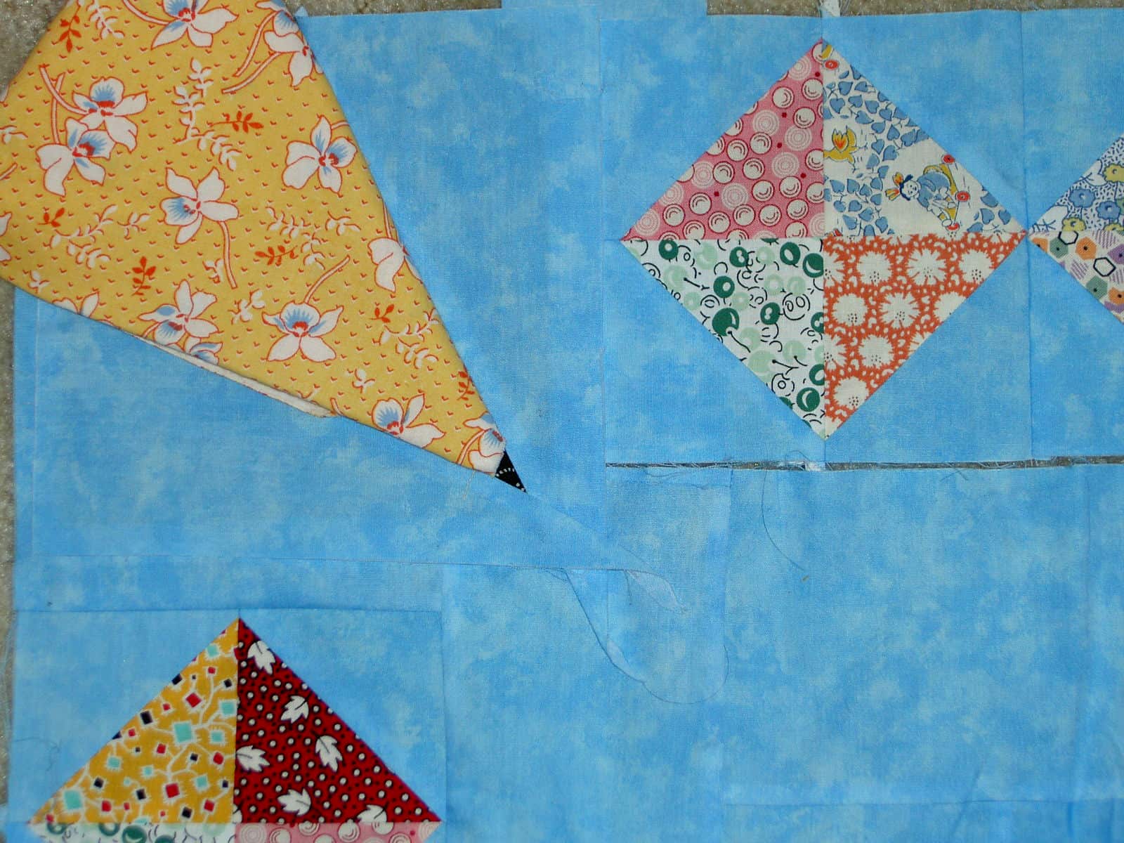
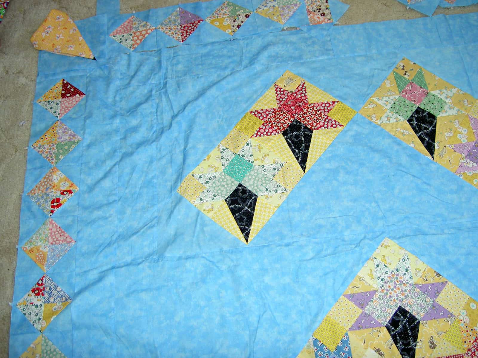
The yellow looked nice in the corner and was pastel so it worked with the other colors. It also fit with my concept of the different shape to draw attention away from the spacing issue, but again we had the big blob problem. A big blob of fabric in the corner drew too much attention to the area we wanted to mask.

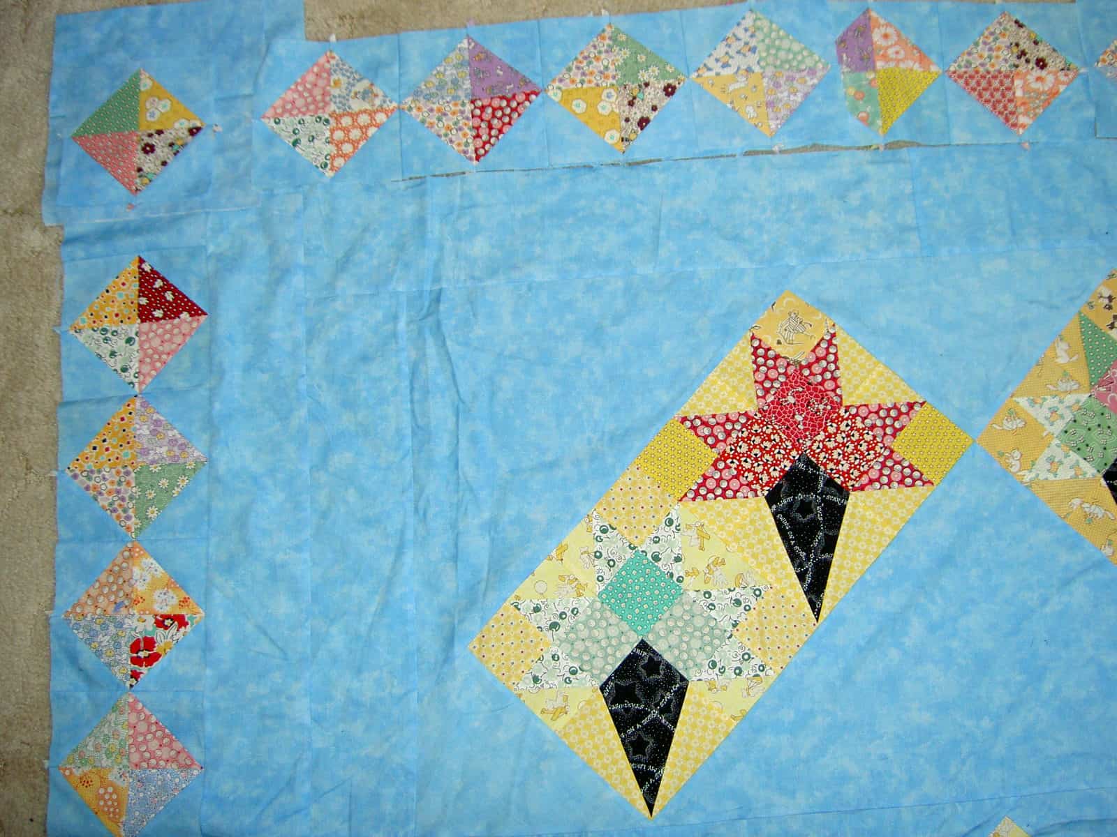
Finally, we selected the above arrangement of border blocks as the best option. Even though the spacing isn’t even when you get to the corners, the blocks being similar draws less attention to the problem area.
Lorraine Torrence is one of my favorite teachers. She is organized, not sentimental, friendly in a professional way and provides useful information. One of her precepts, which has proven very useful to me, is “make visual decisions visually.” This means that a quiltmaker needs to make design decisions by looking at how the design will look IRL before starting to sew and cut. I did this with the black and yellow options above. In the case of the black, I actually sewed a few blocks and we tried them out. In the case of the yellow, St. JCN and I folded the fabric in some semblance of how the block would look. This is a much better method than just thinking it would look good. If I hadn’t looked at the design visually, I would have probably gone with the black and ended up with blocks that drew attentio to an area, I really didn’t want anyone to notice.
There are some ugly and inaccurate words and generally accepted principles in quiltmaking. Here is my opinion about them
* Stash implies we are doing something sordid or illegal. I prefer palette or materials.
* The term ‘Quilting‘ does not acknowledge all the aspects that comprises making a quilt. Whenever I hear the word quilting, I think of the process of putting three layers together. I understand that the same terms are often used for different, but related concepts. Still, I don’t often do my own quilting; I prefer to be called a quiltmaker rather than a quilter.
* A lot of quiltmakers are nice people. I don’t assume that all are. I have been at shows where the police have been called and people are shocked when a quiltmaker is taken away for shoplifting. Quiltmakers are people like every other group.
*While I may have something in common with others who make quilts, I don’t automatically assume that every quiltmaker is my friend. Friendships are developed and nurtured.
* Design is given short shrift in quiltmaking. A good design is everything. If you have a beautifully executed quilt with poor design, it doesn’t matter how great the design is.
* Hand-dyed fabric is not always the be-all end all. People can make gorgeous quilts without hand-dyes. In your artist statement, please do not include how much hand-dyed fabric you used. We all know what hand-dyed fabrics look like and can tell. Do a great design and tell us your inspiration. We will admire your hand-dyed fabric along with the design.
Kathan Brown is a printmaker and author of a book called Magical Secrets about Thinking Creatively. She is also the founder of Crown Point Press. At the de Young, they had an exhibit of Crown Point Press prints. On the legends I noticed some of the magical secrets, which made some sense or were interesting to think about so I started to write them down. I stopped when I found a brochure. The Magical Secrets are listed at www.magical-secrets.com.
Seeing these ‘secrets’ made me think that creativity is a lifetime experience and that you have to work at your creative work.
I like the idea of Magical Secrets of Creativity. It makes me wonder if people have their own ideas about creativity and where people’s ideas intersect. I want to think about Brown’s ideas and see if they work for me.
I spent several hours at the New de Young on Friday. St.JCN spurred me to finally make the trek down there as she is visiting and that is one of the activities that she wanted to do. We are notoriously bad at doing anything remotely touristy when we visit each other, so this was a nice change.
In all, I enjoyed myself. For once, I brought my journal with me and wrote down the pieces of art that I liked. It was a good exercise in looking at things. I, long ago, gave myself permission not to look at all the art. But I looked at a lot of art at the de Young — more than I had really planned to.
The new building took some gettng acquainted with. The entrance was hard to find. Once in, it was a little unclear where to go for tickets. I loved the hominess of the old building, but the new building is definitely built for art and the art is shown at its best.
There is a textile room. They were showing gowns (Fortuny, Dior, Chanel, Balenciaga, etc.). Seeing some of htem was like seeing old friends as I had seen a few them before in a fashion exhibit. I remember making a sketch of a red dress with a big bow and gorgeous back treatment the last time I saw designer dresses.
Here are the pieces that I liked:
Wayne Thiebaud:
Three Machines
I like this one because of hte thickness of the paint and the simple imagery.
Diagonal Freeway
This one is quiltlike.
Park Place
the colors are very attractive.
Richard Diebenkorn:
Ocean Park 116
Quiltlike and pleasing colors.
Green
Red-Yellow-Blue
Bernd & Hilla Becher:
Passau, Germany (Grain Elevator) -photography
This is amazing, because of the shape of the building and the stillness of the pond in front of the building.
Franz Senkinc (Austrian):
Iron, 1931 -photography
I really liked the simplicity of the image and the direction from which it was photographed.
Susanne & the Elders (artist unknown and not available on the web)
Provoking. I am sure certain sectors of society would deem this image pornographic.
I was definitely drawn to geometric shapes. I was not taken with many of the modern art pieces as they looked like a mess to me. I suppose I am not an art sophisticate. As I said, I enjoyed myself and am thinking of getting a membership so I can stop in and bring W.
Stephanie Metz makes really interesting felted wool statues. She is having an opening this weekend.
My favorite piece of hers is Meditation. I think it is unbelievably beautiful. Unfortunately she sold it before I could buy it. Oh well; it wasn’t meant to be.
Here is a notice about the opening from Stephanie herself.
__________________________________________________
This coming weekend I will be participating in Silicon Valley Open Studios, a Bay-Area wide program in which artists invite the public in to see their creative process, their works-in-progress, and recent artwork.
Once again this year I will be showing my work at the Pacific Art League in Palo Alto along with nine other artists—a group location right in downtown Palo Alto, with ample parking across the street. I will be on site and available to chat and demonstrate wool felting from 11am till 5pm on Saturday and Sunday, May 6th and 7th.
Along with a selection of paintings, prints, and drawings that will be available for sale, I am also pleased to offer a first look at a still-in-progress new body of work: a series of felted wool teddy bear skulls based on a variety of ‘breeds’ of teddy bears.
For a preview of my work and links to the other artists at this location, please visit my web site: www.StephanieMetz.com.
For more information and a directory of artists and locations participating in Open Studios, please see http://svos.org/
The Pacific Art League is located at 668 Ramona Street, Palo Alto, 94301; their phone number is 650-321-3891, and their website is www.pacificartleague.org.
I first saw Kay Khan’s work about a year ago. I can’t remember what led me to it, but I was enamored with the shapes and fascinated with the fact that she used fabric to create three dimensional objects. Vessels and bowls seem very feminine to me.
You can see more of Kay Khan’s work at the following URLs:
http://hibberdmcgrath.com/khan.html
http://www.thirteenmoonsgallery.com/sagemoon/artistPages/KK.html
I have been thinking of fabric bowls lately, but also of vases and other types of vessels. Recently I was informed that the Marin Needle Arts Guild will be having a Craft Fair in the autumn to raise money for the guild (they will not be hosting a show this year and need to raise money to keep their programs going. You can find out more by contacting them directly at the URL above). Perhaps making a fabric bowl or vessel would be a good donation? We’ll see how the time until autumn shakes out.
In the meantime, I am admiring and being inspired by Ms. Khan’s work.
 What can I say? And I am not done with the washing yet.
The sun out and the sky is blue. It is still long-sleeve cool, but the sun being out makes all the difference in my mood. This is the second day! Is the rain gone? I don’t think so, but perhaps we will get a few days of spring before the descent into fogbound summer. Whatever the weather drama, I am determined to be grateful for the sun we get and appreciate it while it is here. If it rains tomorrow, so what? It is sunny now! YAY!
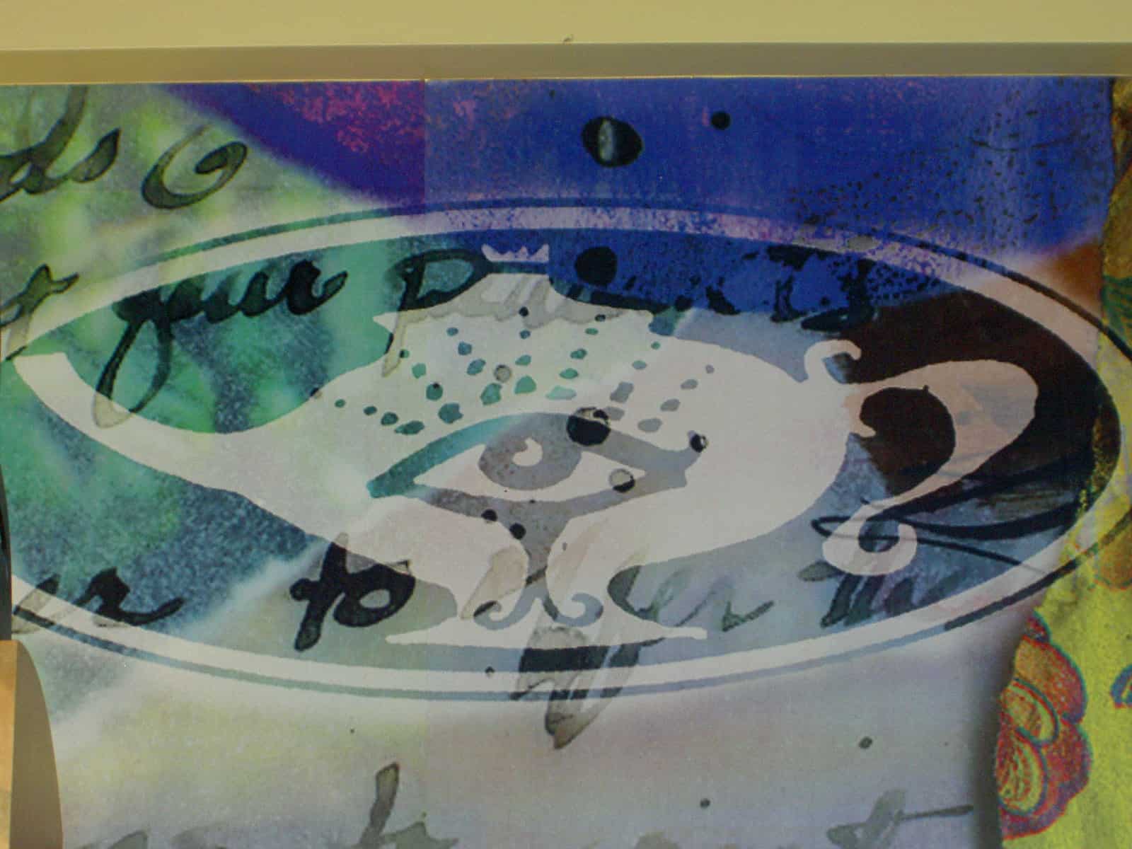
I look out for eyes wherever I go for Pamelala. This one was found in the Starbuck’s right in my neighborhood!. I don’t why I never saw it before. I go to that Starbuck’s at least twice a month. I saw it and then had it on my to do list for, what seemed like, months to go back and photograph the eye. I finally did yesterday. It is a nice eye and I like the way it is in the teapot.
 This is the arrangement that I laid out, serendipitiously, before the three additional blocks were added. I was thinking that I would need to do something more interesting than a 4×4 or 5×5 square arrangment. This layout just put itself up on the wall. I would fill in the blanks needed to make the thing square with blank blocks. I refuse to make a weird shaped quilt to give to someone. I don’t think I will need this arrangement now as SLB is taking some of the blank leftover blocks down to SoCal to have other people decorate at another shower. We’ll see how they end up before I decide.
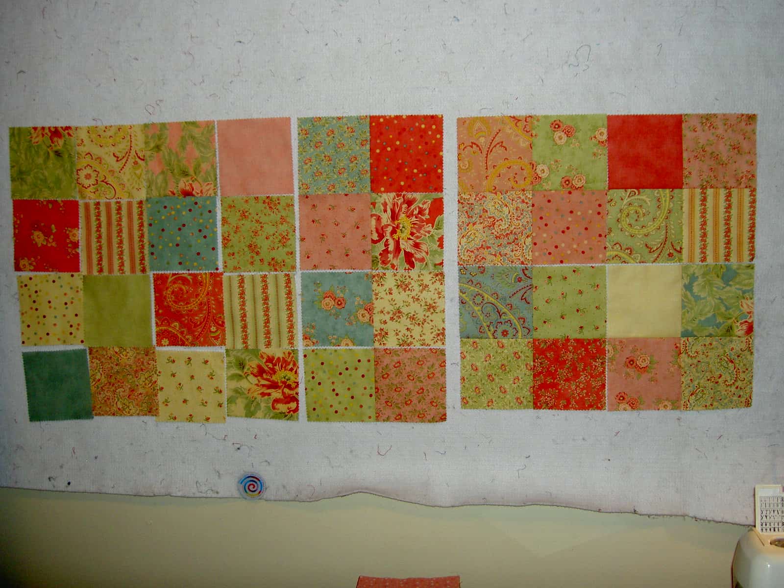
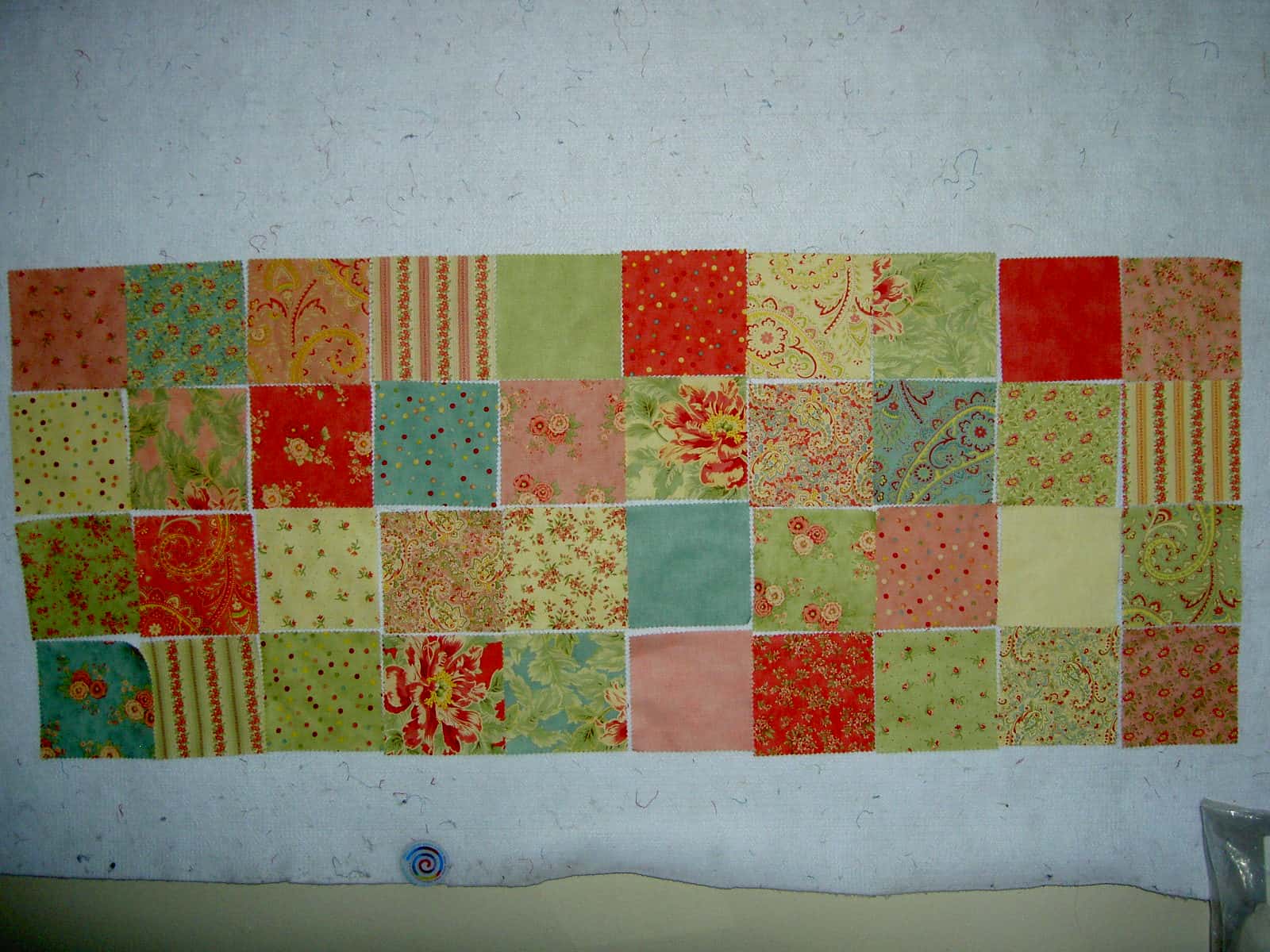 I got these squares from Hancock’s of Paducah. They are the fabrics which comprise Moda’s Poetry Collection by April Cornell. Again, I liked the fabrics, but they are the kind of fabrics that might just sit in my palette if I bought any yardage. Thus, the squares provided a good solution for me to work with the fabrics on a limited basis.
I have been having fun rearranging them. There is a wide variety, but the patterns on the fabric are the same. There are just different colorways. As a result it has been challenging. I don’t want all the same colors together, nor do I want all the same patterns next to each other. I would like the various patterns and colors spaced evenly and pleasingly over the piece. If I am not there yet, I am close.
Another challenge is that there are a couple of prints that stand out if they are near each other, like the dots (of which I did buy yardage). These patterns demand to be far from each other. If not, they scream “what moron put us so close together?” and they produce a lot of grumbling. There are also motifs which are different, but very similar in scale. This means that, from far away, I am looking at two fabrics in four colorways that look the same. I don’t think I can avoid having some of them together and my only option is to make sure that the colorways next to each other provide as much contrast as possible within the limits of the fabric group.
One reason, I like doing this sort of work is that it is easy. I don’t have to cut or press until I sew. I can arrange and rearrange forever with very little physical energy, yet there are some rules. Granted they are self-imposed, but all puzzles have rules. Also, it seems like it is good for my brain. I feel as though my brain is working when I am rearranging.
Once this one is sewed together, I will have three squares pieces. I haven’t the foggiest of what I will do with them. I still think table runners are in my future, but we will see. If nothing else, they will be good machine quilting practice.
BTW, Pamelala has a blog. It doesn’t look like she updates it very often, but the art she has up there is great! Her assemblage art is fantastic. She isn’t doing it anymore, so grab a piece while you can, especially since she is becoming famous for her quilts now.
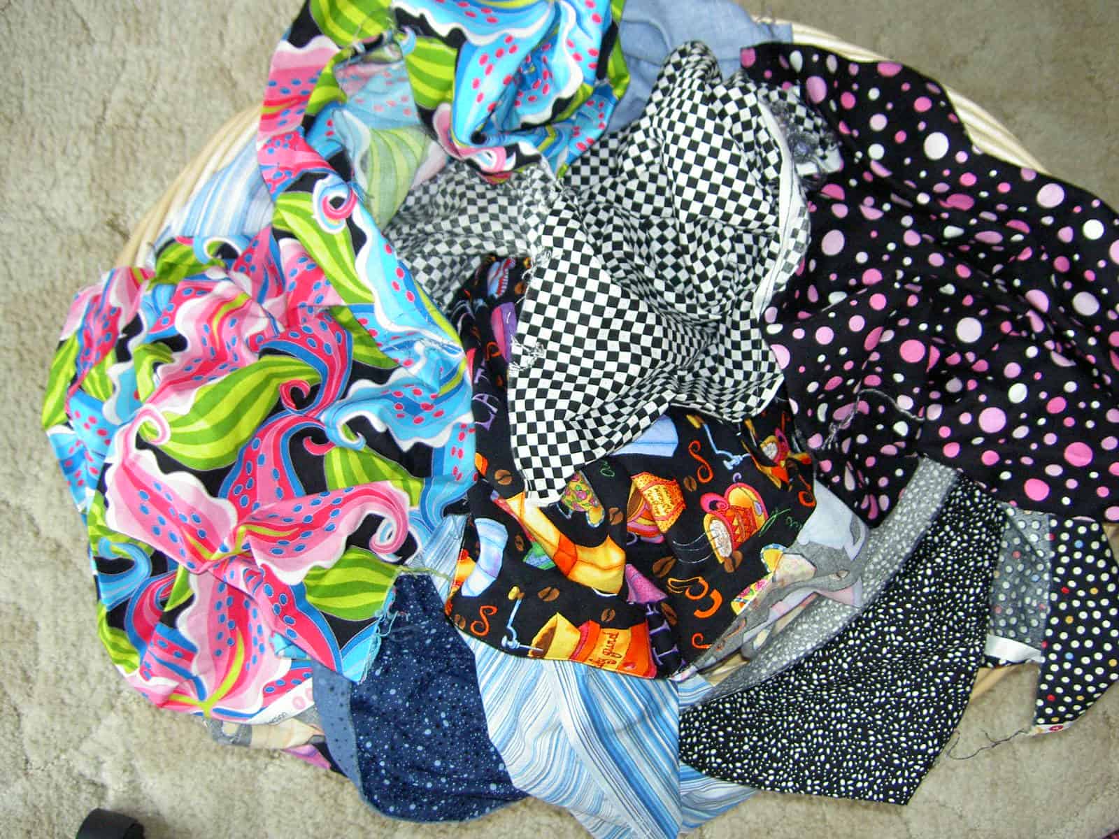
In the post about Sewing Accomplishments, I talked about some squares that I sewed together. They were, as I mentioned, a pack of squares from the Benartex squares club.
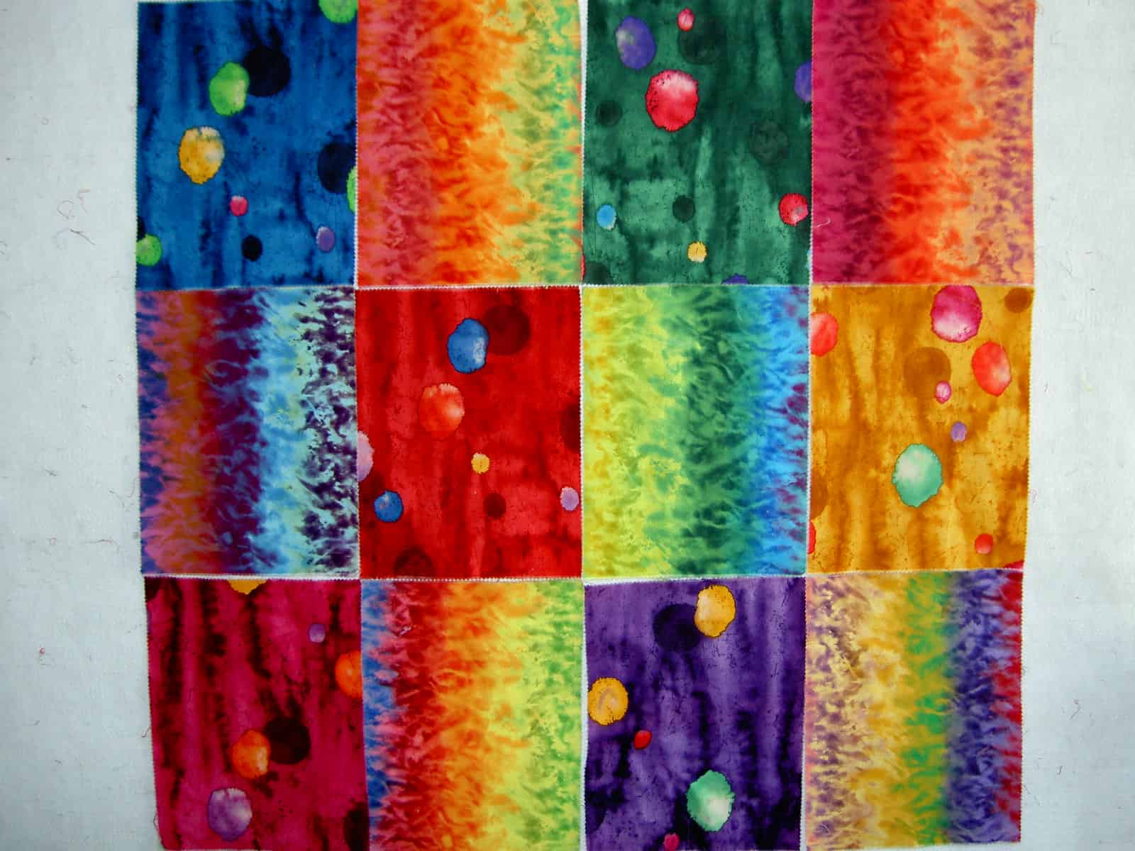 I got a different set of rectangles sometime previously, which I found Friday in the pile of the great unwashed (fabric). I washed them along with other fabrics and just sewed them together today. (Photo is prior to sewing them, but I used the same arrangement).
I probably wouldn’t use these types of fabrics, so this was a good solution. I thought that it might be a good beginning for a quilt for one of the older nieces or nephews, but it is an odd shape and those children are so large now that they are adults (or approaching adulthood) that I am not sure what would look good with it. I am not a tie-dye sort of person, so don’t think that I have much that would go with the fabrics. I do have many tone-on-tones, so I may be able to find something. I took down the piece after sewing the squares together and will let it percolate for awhile. In this case, sewing the squares together was a way of getting pieces that were really too small for anything else to cease being annoyingly in my way.
This squares thing is very interesting to me. It satisfies a need in me to see an entire line of fabric, yet doesn’t make a big investment in fabric that I probably wouldn’t use in large quantities. I do have an appreciation for most types and colors of fabrics (though baby poop brown still proves to be difficult), but I don’t usually want them all in large quantities…. or any quantities for that matter. This means that the fabric squares are a good choice.
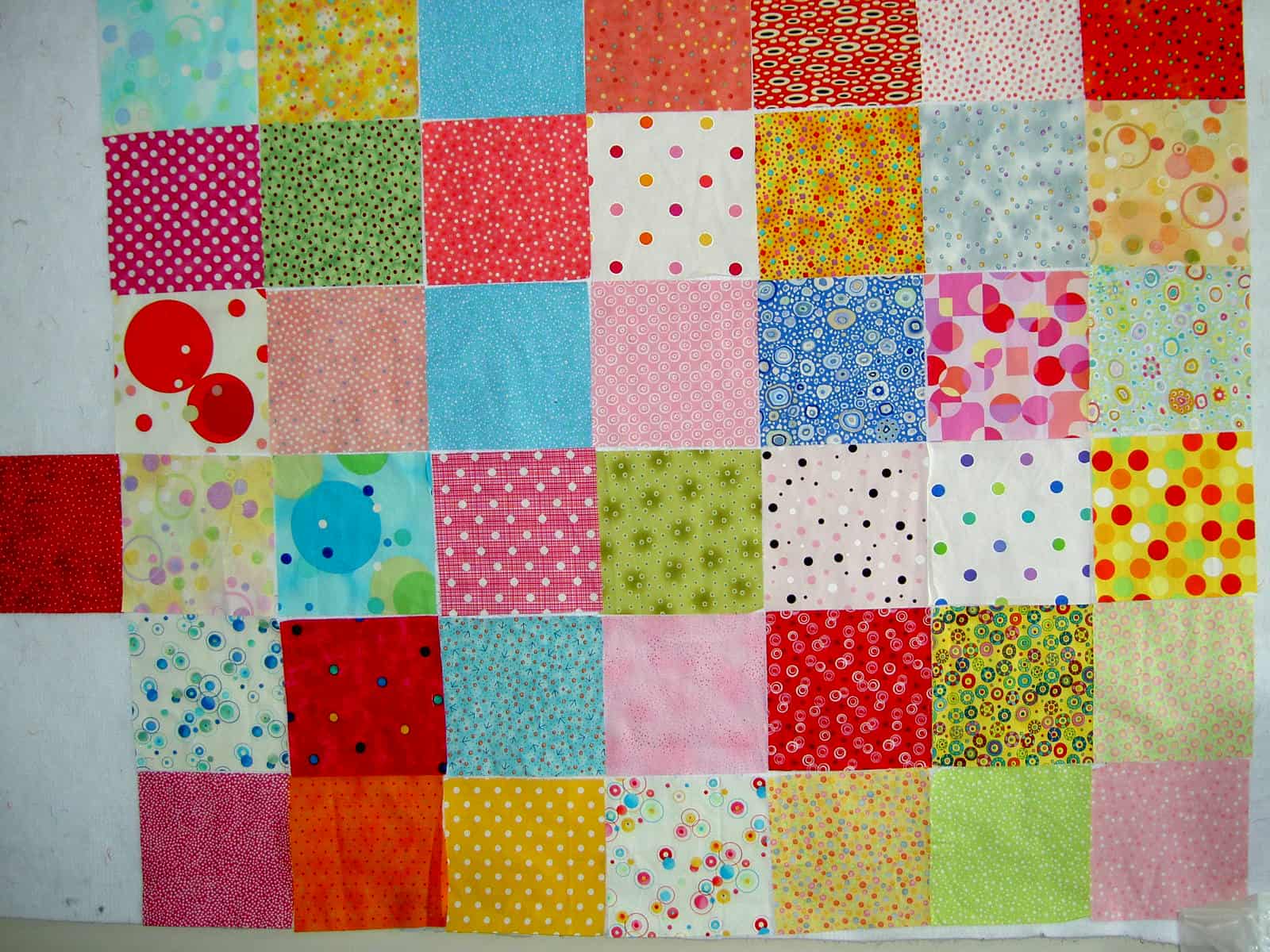 I cut some more squares for Thoughts on Dots. I also ejected some squares from the piece. I went back to that heavy/light method of choosing fabrics and ejected the two fabrics (the blue Terry Mangat fabric and the dark-ish green) that I had identified as iffy a few postings ago. They were both in the third row of that previous posting.
TFQ pointed out that some of the reds are not reading as dots. I have to think about if I care how the fabrics look from both far and near or if I want different looks depending on how far you are from the quilt, e.g. as you come closer you see different things. I said that a feeling of heavy and light was important, but in this case color is as well. I think that some of the reds don’t read as dots, because the dots are too light. I have to think about whether the reds become black holes of doom now that the very darks are gone. It is definitely an interesting exercise.
In arranging the squares this time, I tried putting a pink or yellow square in every other spot. In doing this type of arrangement, I realized that I need some violet. I had to remind myself that I have not even scratched the surface of the dots that I own and will get to the violets soon. I also need some more yellows. I am not sure I like this arrangement, but will work through its possibilities until I decide it works or doesn’t work.
One of the joys I am finding with these dots and with the size of the squares is the playfulness. I find that I am not agonizing about blocks going together because I am only working with squares.
The other thing that occurred to me is that I want this quilt to be larger than my design wall. I intend to wrap up in it when the weather is ugly and I need a boost. The question, then, becomes do I sew the squares that I have together, take them off the wall and do the next section? OR Do I take a photo of the squares and then take them off the wall recreating the piece from photos once I am ready to sew. The former would be fun and provide an element of surprise, but runs the risk of some major color disasters. The latter is very safe.
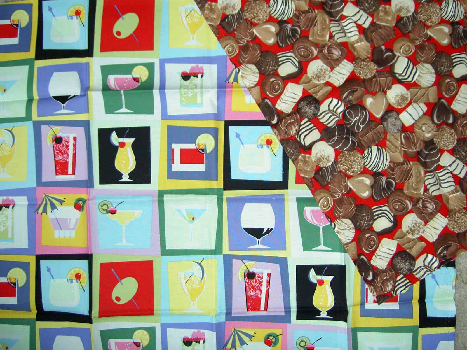 Finally, I was getting another load of the great unwashed ready to be redeemed and saw these two fabrics end up near each other. It occurred to me that these are the two things to which women resort to escape. Drugs, I suppose, are another, but alcohol and chocolate are much easier to procure and also legal. I think that these two fabrics have provided inspiration for another of the Women’s Work series (currently only a series of one!). I have lots of perfect fabrics and ideas, but not many completed quilts. I had better get busy.
