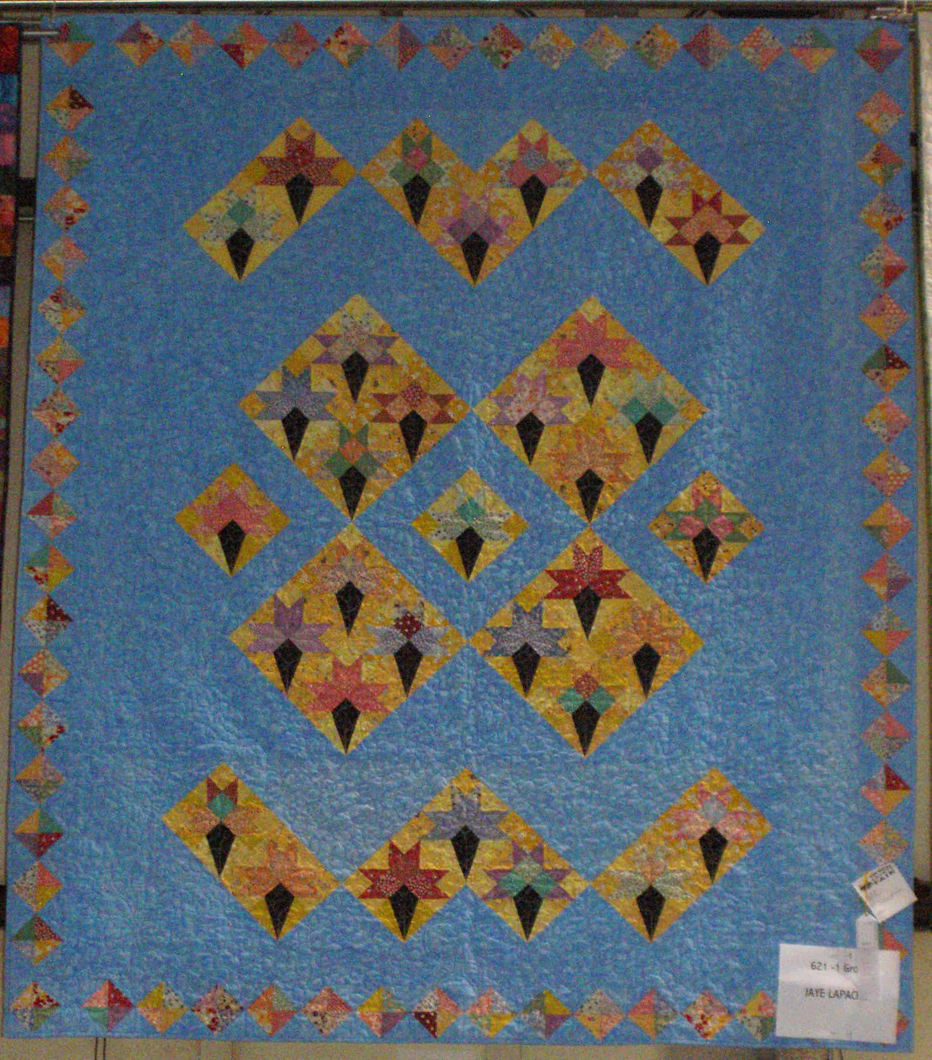
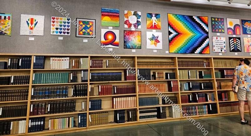
I went to the San Mateo County Fair on Thursday with SIL#4.
Winner 2026: Pandora Charisma
I was shocked and amazed that the Pandora Charisma won at the County Fair. Lee Ann shared the news with me at Sew Day, so it wasn’t a surprise. I was, however, so excited to see the evidence in person. I am in wonder at the size of those ribbons!
Old Town with Ribbon
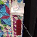
I was also pleased that one of my quilts, Old Town, won a second prize. While second place can seem like nothing special, this quilt was entered into a category where a lot of quilts are entered (quilted by someone else). After thinking about it, I was very pleased even with a second place in this category.
BAM members in general did really well! I was thrilled to see so many BAM cards on prize winning exhibits.
In anticipation of entering projects into the Fair, I decided to revisit some of the entries I have made into the Fair, and especially my winners. This also came about because I was working on the Fabric selection post and came across Fresh Fruit, which I had forgotten had won a prize. I was reminded, also, that I have received prizes at a variety of other shows as well.
I didn’t win any prizes for this meager entry, but I did enter.
It is fun and easy to enter, which is why I try to enter quilts and bags into the Fair. I also love thinking about all the people who have exhibited something working away in their workrooms and garages on projects.
While this post is quilt related, I am climbing up on to my soapbox, so you may want to come back tomorrow if you just want to talk about quilts and what I am making and doing.
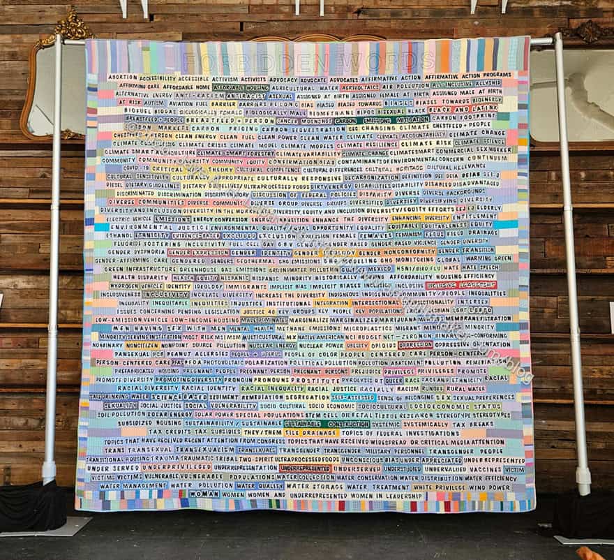
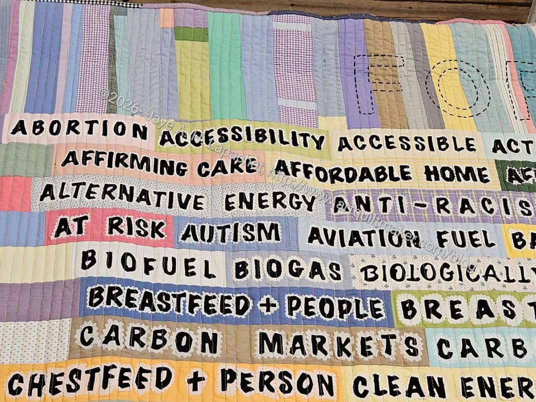
I want to thank PENAmerica for compiling this list and doing their best to let us all know.
Forbidden Words – top
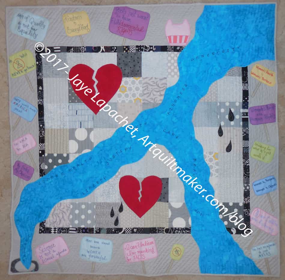
The first word on the quilt is “Abortion.” I do not want to get into an essay on whether abortion is right or wrong, because in this context it doesn’t matter. Men cannot have abortions so this doesn’t concern them. It concerns women.
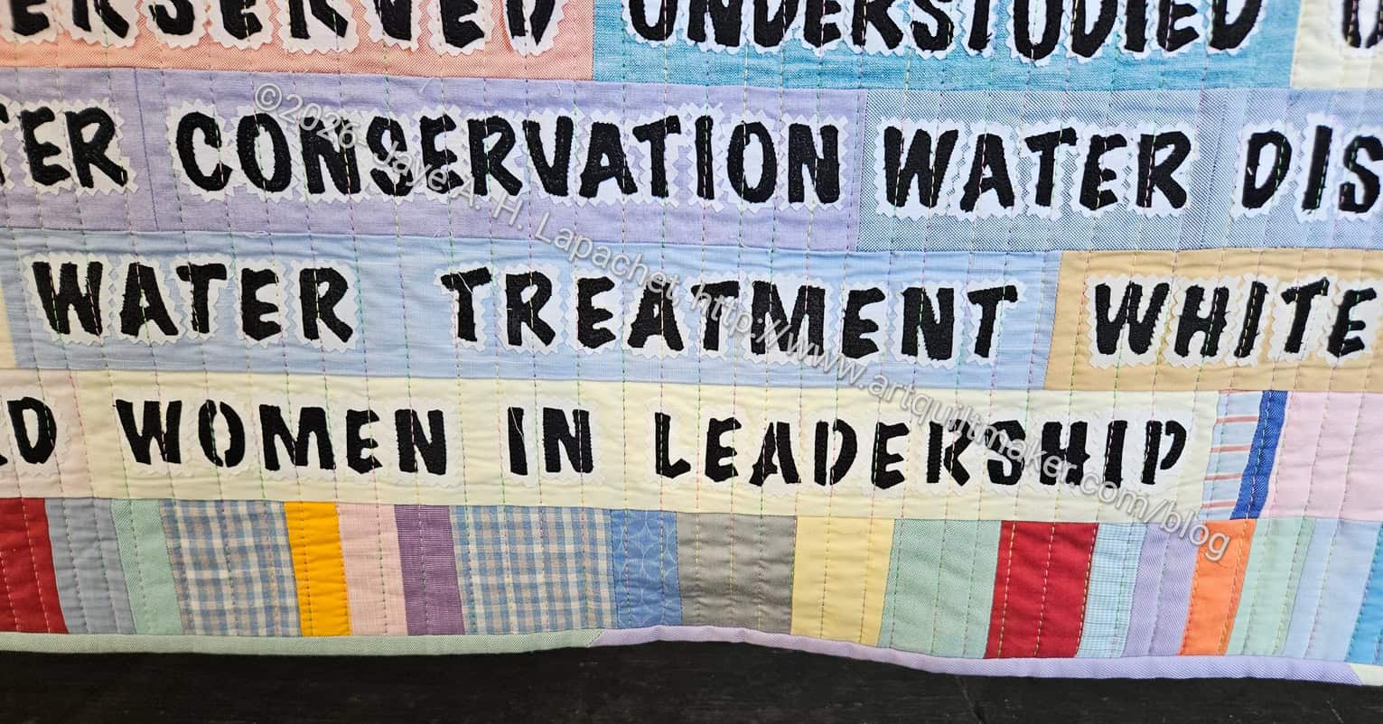
Forbidden Words – bottom
The last word (phrase) on the quilt is “Women in leadership”.
Women in leadership is a banned phrase on the U.S. Federal Government’s websites. Think about that.
There ARE women in leadership positions so WTH? Women have been ‘leading’ in jobs, organizations and projects for centuries. People can deny it all they want, but denial doesn’t change facts. If you eliminate everything outside the home, women have been in charge of their families for years. If you think that managing schedules, planning meals, vacations, house maintenance and keeping children alive is not project management, then I am not sure what project management is. I know women who have spreadsheets and color coded calendars to keep their homes running smoothly. This doesn’t even consider women in jobs that require extreme organization, knowledge and dedication not to mention previous educational efforts. Women are fully capable of leading, just as men are, so WTH?
This Federal Government list is a clear attack on women. It is also an attack on other groups, but it is first and foremost another attack on women. I am so angry! What have I done to deserve such treatment and why does one Administration get to decide?
In asking myself why I was reminded that women are extremely powerful. Women are resilient and create life. I know we can’t do it without men, but only one gender carries the precious cargo around until birth and then can feed the offspring.
Women also survive misogyny, the glass ceiling, and a myriad of other strategies used to keep us out of the limelight and off the main stages and we continue on. I know we will continue on, continue “acting as if”
Women are 50% or more of the population. Women contribute a lot to society, much of which we don’t get paid to do. We perform tasks despite no acknowledgement, pay or thanks.
There are no easy answers to this problem and I am absolutely not anti-men. I AM anti-men who create this list and think it is ok. We all must all treat people as we want to be treated regardless of gender, looks, job, origin, …all the things on the list in the quilt above. As Mark Lipinski said on April 8, 2026 “How you show up in the world MATTERS. Be present. Be kind. Be grateful. You are the gift to the world.”
Thanks to Lorraine Woodruff-Long and her team for their hard work and dedication in creating this quilt and planning for it to be seen.
*Photos are watermarked to prevent them being stolen off this website. Copyright is only claimed on the photo, not the image.
I decided that making a pencil roll would fit in with the upcoming Organizer swap and would be good to enter into the fair. I had nothing to enter and needed to make something. Time grew short and my free time became a precious commodity, so here we are.
I spent some of last weekend sewing the strips together after cutting them out at Sew Day. It didn’t all go as smoothly as I would have liked, but it has been about 6 years since I made one of these so some bumps in the path are to be expected. I am thinking black and white for the other pieces. Dots and stripes.
I hope to finish this sometime this week so I can hand it in at the meeting next weekend to be taken to the Fair.
Who Am I? is hanging at the Twin Pines Art Center in Belmont. I am very excited.
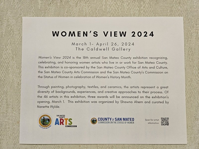
Women’s View is an annual San Mateo County exhibition recognizing, celebrating, and honoring women artists who live or work in San Mateo County. The exhibition is co-sponsored by the San Mateo County Arts Commission, the Commission on the Status of Women, and the Twin Pines Art Center in celebration of Women’s History Month.
Women’s View 2025 poster
This is the 19th year of the exhibition and features over 60 artists who have expressed themselves in photography, painting, textiles (me!), and ceramics.
I was impressed with the variety of media this year in contrast to last year. I may be mistaken, but I thought there was a wider variety of media this year. I saw quite a few mixed media pieces, which I thought were interesting.
Who Am I? in the Manor Gallery
Who Am I?
Who Am I? in the Manor Gallery
My piece, Who Am I?, was the only quilt. It had a great location in the largest gallery. I saw a lot of people stopping to look at it and talk about it. I tried to listen in to conversations (sshh!), but I either couldn’t understand what people were saying or kept getting distracted.
Although I have entered pieces I already had finished or in progress during the last two shows, I only entered pieces that I thought fit the theme. I looking at the various pieces, I wonder if my interpretation of the theme is too narrow? My interpretation for both exhibits was about how I am affected by the world or what my role is in the world. Many of the other artists chose flowers or other parts of nature. It made me think that, perhaps, my idea of the theme was too narrow. You can review the gallery guide and decide for yourself.
Elizabeth Gomez
Elizabeth Gomez detail
I did notice that there were some details that I would consider stereotypically female, as in the Amapolos de California piece above. Elizabeth Gomez has stitched a bit of the edge of the poppy with embroidery floss or thread. One of the winners did the same on a photograph of a hummingbird.
Women’s View Winners
I did not win a prize this time. Prizes were awarded by the president of the Commission on the Status of Women. One of the winning pieces was a mosaic table, which I thought did not fit the theme at all. But, if I am generous, it could be her view of the world. It was a beautiful piece. Still, I do like to win. 😉
Mom, DH and I went to the opening on Sunday and it was a very nice event. The show ends on March 30, so I hope, if you are local, you get to see it.
As a librarian, I am completely against censorship. Even as a special librarian and knowledge manager rather than a public librarian, I think people should make their own decisions about what they read. Of course, parents have a responsibility to guide their own children’s reading habits. My mom told me not to read Wifey** by Judy Blume when it came out. Since I loved Judy Blume’s novels, her frank way of talking about topics nobody discussed with me and I had a library card, I read it anyway. Later, my mom told me she was concerned I wouldn’t understand the sex parts. I didn’t, but I also just skipped over them. I do that now when the sex scenes are too graphic. Talking to me about the sex parts didn’t seem to be an option.
As an artist, I also am against censorship. Even though I make a lot of pillowcases and non-controversial items, I do consider myself to be an artist. I have made my fair share of art quilts. In that group is a subgroup of political quilts. When a quilt is pulled from a show, as my quilt Blood & Oil was, it is painful and confusing.
I also don’t really like people telling me, unsolicited, what to do.
I censor myself quite well. I do not watch horror films or anything remotely scary. When the YM is visiting and wants to watch a scary movie with DH, I go sew something with the door shut, or they watch it when I am gone. I don’t need any help with censorship, no matter how good your intentions.
There are three points here.
First, mind your own business. If you can’t mind your own business then compromise. Fighting doesn’t accomplish anything and calmly stating your point of view AND listening to your opponent’s point of view might create some change.
Second, if you don’t want your kid to read something, or look at some art, explain why. Don’t just say ‘it’s filth’. That may be true, but it is a non-answer. Let your emotions simmer down and explain your thoughts in a reasonable way. When the YM was in high school, the Archbishop of San Francisco wanted teachers to sign a morality code. This morality code was a huge problem for my son. We live in an area where all different kinds of lifestyles are tolerated. We talked about each of the points on the way to school each morning. Did I want to talk to my son about sex? No. Not a comfortable topic to talk about with a boy. As a parent, I felt it was my duty to tell him what I thought, explain to him what I thought the Archbishop was trying to achieve, and give him a chance to voice his views.
You’ll get better results from your kids, and compliance, if you explain your views clearly and are not hysterical while you are explaining. Is this easy? No. Communication is difficult. It takes practice and provokes a feeling of fear. Parenting isn’t easy, so don’t have a kid if you don’t want to do the hard things. Kids are not accessories.
Third, keep your thoughts and feelings to yourself when they might adversely impact others. I am not saying don’t discuss controversial issues, I am saying, if you don’t want to read a book, don’t read it, but let others decide for themselves. You are perfectly entitled to think the way you do. However, you are not entitled to tell others what to do. Let other people raise their children and manage their viewing or reading habits in a way that works for them.
This is not the first time AQS has acted in this manner. I remember them refusing to hang Amigos Muertos by Jonathan Shannon. Amigos Muertos was not good enough to be hung the year after Jonathan won Best of Show for another quilt at AQS the year before.
I thought then that it wasn’t possible that in the modern US, an organization would think that AIDs and death too awful of a subject for grownups to contemplate. An article in the Seattle Times at the time describes the various points of view.” In Jonathan’s case, Meredith Schroeder, AQS president, to one of Shannon’s backers dismissed charges of censorship [in a letter] and stressed that his was one of the 587 quilts that weren’t good enough for the 400 piece-quilt show. “Jonathan’s credibility is in question, he has misrepresented the truth to his friends to get them to act on his behalf to pressure AQS to reconsider his quilt and accept it into the show,” Schroeder wrote to the East Bay Heritage Quilters.” I remember the quilt hanging at the EBHQ show that year and signing the petition to get AQS to reconsider.
Hollis Chatelain’s quilt Burkinabe Mother was censored from the AQS magazine in 2005. It shows a woman feeding her child.
More recently, in 2016, Kathy Nida’s quilts were censored. The quilt that was excluded was “ ‘I Was Not Wearing a Life Jacket,’ a piece Nida made to help process a recurring nightmare in which she was losing things in a stream and nobody was coming to her aid.” Kathy wrote about it on her blog. One of part of her post says “So some person objected to my quilt and couldn’t just walk by, moving on to the next quilt (which is what I do when another Sunbonnet Sue shows its ugly head…I don’t call Fox News…I don’t pitch a fit and refuse to ever come back to another show.)…they had to demand it get pulled from the show.”
That is my point exactly. If you don’t like a piece of art, move along and look at something else.
Abby Glassenberg describes two AQS censorship incidents in her Craft Alliance article from 2016. This article also discusses how differently the Mancusos handled a complaint about content, including what they did when Fox News showed up to do a story about one of the quilts. I am sure she will write about this recent incident soon.
There is a lot of noise around this issue.
Kathy Nida is still blogging: YAY! and she writes about the most recent bout of censorship. See the quilts (I don’t have permission to post them) and hear her point of view on a recent post.
Bisa Butler and Faith Ringgold have certainly been drawn into controversy, but using quilts as a protest media has a long history. Temperance Union. Gee’s Bend. Quilts to raise money for both sides of the Civil War. Red Cross quilts. The NAMES project. How about my own political quilts, the most outrageous and vocal of them is Down the Drain? What would AQS say about my quilt? Io the Alien writes more about AQS censorship on her blog.
SAQA pulled the whole show, which I am sure was a difficult decision. In my opinion it was the right thing to do. People will not get to see any of the quilts in the show, which is really sad, but censorship is also not right. If you are able to see these quilts, tell any AQS people you see that you are glad you were able to see the show.
Keep in mind that AQS is a private organization. In its history section, you can see that the Schroeders underwrote the entire enterprise. The US Congress gave it National Quilt Museum designation in 2008, but that museum is private. It is not a 501c3, at least I was not able to find a record for it in Guidestar. If it is not a 501c3, that means it is for profit. They are making money off of the quilts and shows and books and patterns.
Art is meant to provoke thoughts and feelings. You may not have liked the Andres Serrano piece that swept up a bunch of artists including Robert Maplethorpe in a controversy about NEA funding. I do know that when you saw it, or heard about it, it provoked a response. The article describes the feelings of various Corcoran Gallery workers and their reactions. The pieces AQS censored didn’t look offensive to me. I was intrigued by the structure of the 3D piece by Yvonne Iten-Scott and wanted to see how it was made. I was also interested in how much piecing went into the second piece by Laura Shaw Feit. I love lots of piecing, so the second piece looked right up my alley.
These quilts vaguely gave me the impression that they might be about “women’s issues.” So? More than half the population of the world has to deal with “women’s issues,” including birth, breast feeding, menstruation, caregiving, hysterectomies, terminations, miscarriages and many other naturally occuring issues. As a woman, I think some of these normal bodily functions are gross and I don’t want to think about them much less discuss them. That doesn’t mean I don’t think of them or want to see artwork discussing or depicting them. Because topics like this are censored they have become important issues being discussed in public.
Because some people can’t mind their own business, nobody will get to see any of the quilts at a very large show where they might have changed someone’s life.
AQS Mission Statement
In light of this controversy, I find the AQS mission statement to be quite funny, in a “liar liar pants on fire” kind of way.
If you want to do something, here is a letter you can write to AQS sponsors. The letter encourages sponsors to think about the organizations to whom they give money. Pulling sponsorship has more of an impact than not renewing your AQS membership.
I am a grownup and can make my own decisions, especially about what I look at and read. I don’t need AQS to decide I am too delicate to handle looking a quilt. I don’t need others to protect me from art.
Digital ID: (intermediary roll film) fsa 8b14065 http://hdl.loc.gov/loc.pnp/fsa.8b14065 Reproduction Number: LC-USF34-008655-D (b&w film neg.) Repository: Library of Congress Prints and Photographs Division Washington, D.C. 20540 USA http://hdl.loc.gov/loc.pnp/pp.print
Get over the image of quiltmaking as a bunch of prim older ladies sitting around a quilt frame. An Observer article describes “And so we’re going to have to change that image of quilting we have in our heads, the one where matronly figures with prim buns bend over fabric scraps. “
Do what the article says. Get over it. I am not a prim older lady sitting at a quilt frame.
Quilts are art. Discuss.
UPDATE:
Hyperallergic published an article about this topic. I didn’t find it until after this post was published.
**N. B. : Obviously, you should shop at local quilt shops and small businesses. However, if you are too busy or can’t find what you need there, I use Amazon affiliate links and may be paid for your purchase of an item when you click on an item’s link in my post. There is no additional cost to you for clicking or purchasing items I recommend. I appreciate your clicks and purchases as it helps support this blog.
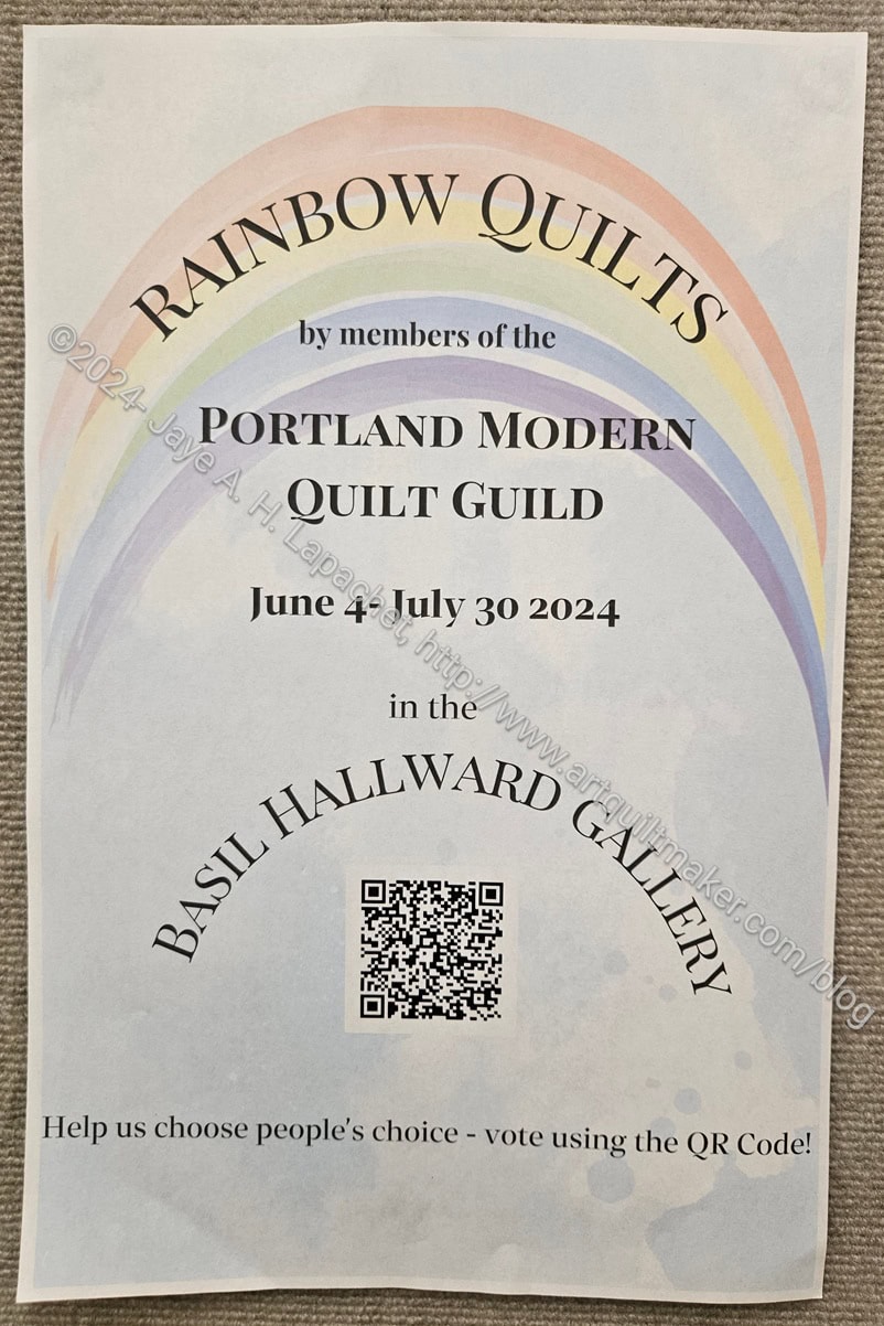
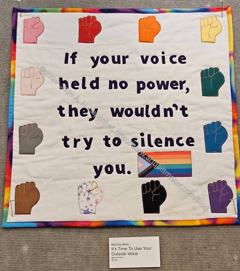
The Portland Modern Quilt Guild’s challenge was called Rainbow Quilts. The quilts were displayed in the Basil Hallward Gallery at Powell’s from June 4 to July 30, 2024. As you can imagine, all of the quilts incorporated a rainbow.
I really liked it that Powell’s displayed quilts and that the Portland Modern Quilt Guild organized a challenge.
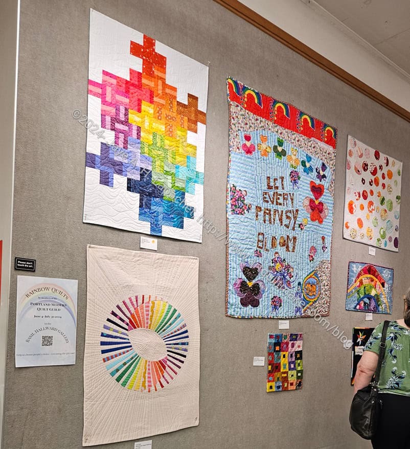
PMQG quilts at Powell’s
I am a big fan of rainbows. I love the imagery, but also the merging of colors into one another. Remember my Fabric of the Year quilts?
It was hard to pick my favorite. The plus quilt in the photo, right has a good design. I seem to be interested in curves and circles lately, so the one below it with the rainbow spikes was also a favorite.
PMQG quilts at Powell’s
You can see that there were quite a few quilts and they were all different sizes. I also saw a lot of different techniques: applique’, Bargello design, curves, mosaic piecing. It was a very interesting collection, which made it even harder to choose the top quilt.
Melinda Miller, It’s Time to Use Your Outside Voice
I eventually chose Melinda Miller’s “It’s Time to Use Your Outside Voice”, because I like the quote. I think that it is true for women as well. All of the attempts to curb the rights of women mean that we have some power someone fears.
Be sure to check out the exhibit space at Powell’s when you visit. You will surely see something interesting.
SueG’s entries were amazing! I didn’t know she entered so many projects into the Fair.
Breakage by SueG
This is Breakage by one of my friends (and student). It is her own design and I am so proud of her. She won a ribbon at the Fair as you can see.
She said that she was able to make this quilt, because of what I taught her in the quilt class. That made me feel SOO good.
I have been wanting to write about her quilt, Breakage, for awhile and seeing it at the Fair meant that I could take a photo and then would be able to write about it.
One of the things I teach is that knowing all the techniques allows you to have the skills to not only design your quilts, but actually put them together. Sue knew how to sew and how to make quilts when she joined my class, but she has much more confidence now and is really making some amazing works. Breakage is just one of them.
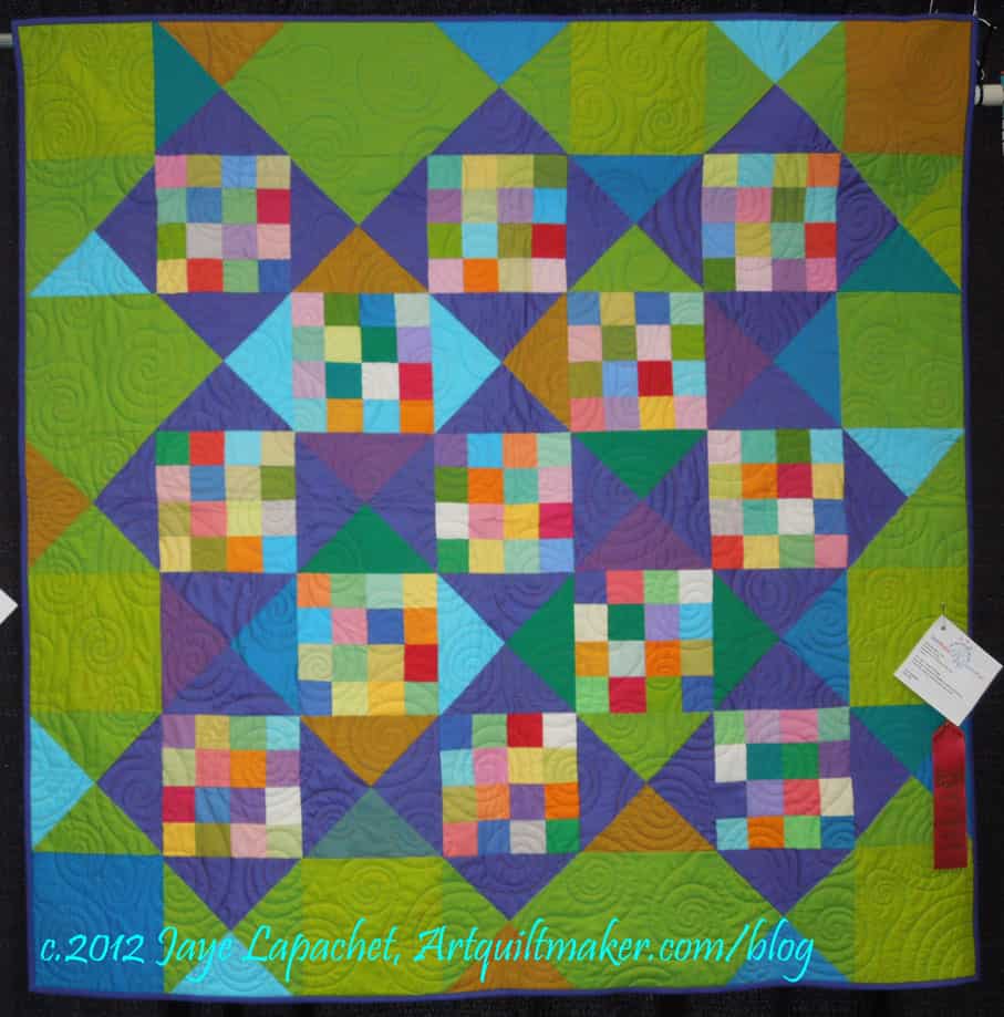
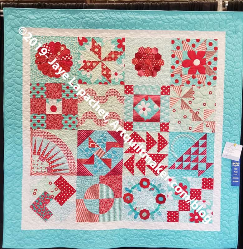
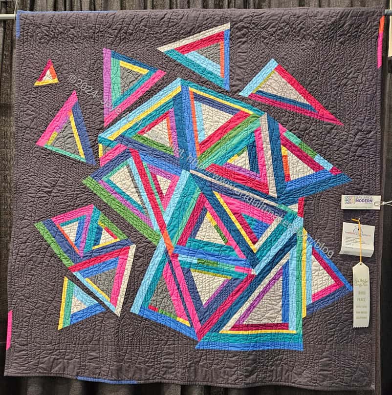
I attended the Fair last weekend with my wonderful SIL#3 and some great friends, including the fabulous Friend Julie. Her terrific husband Marc came along, too.
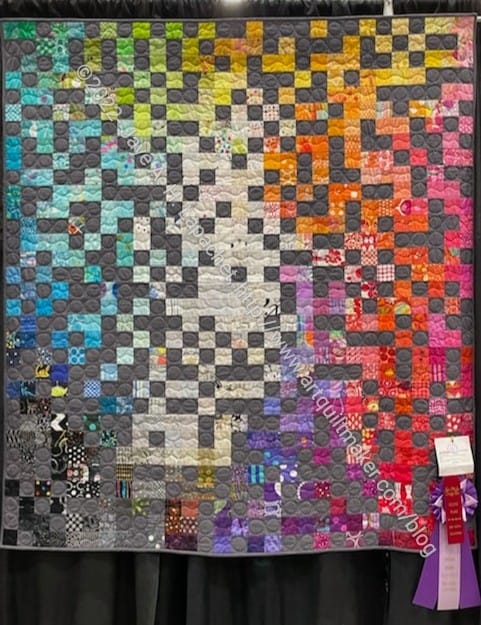
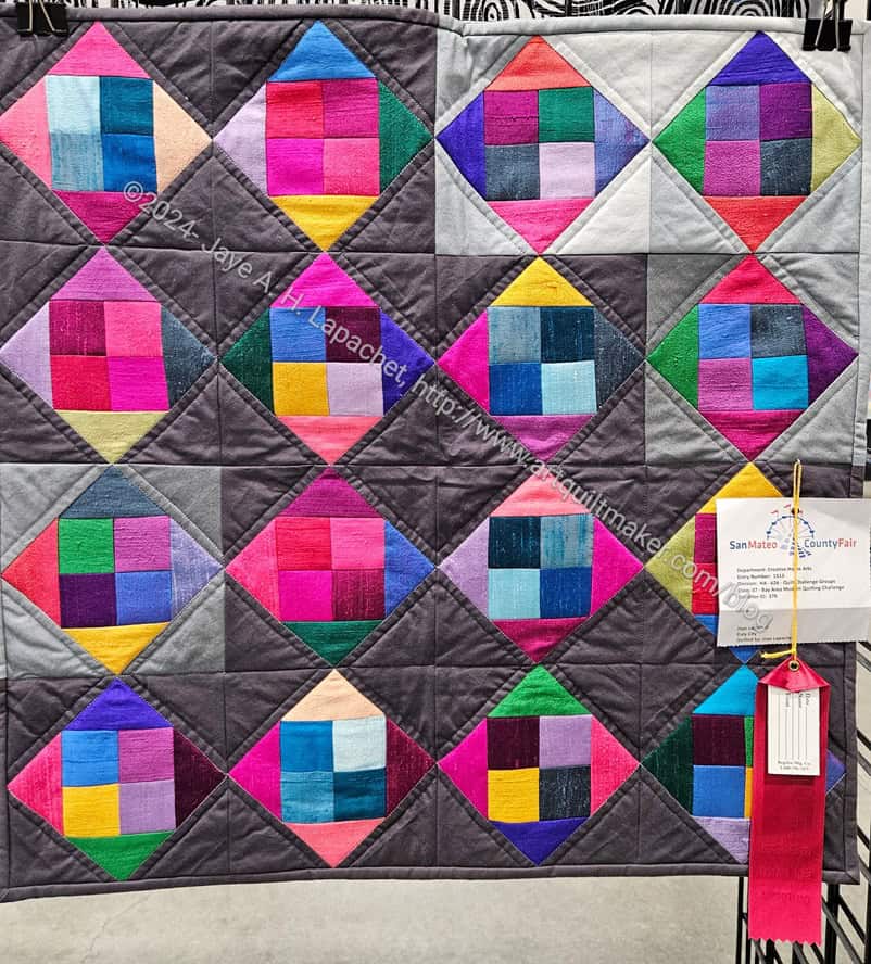
Colorblocks 3: Second Place San Mateo County Fair 2024
First, my quilt, Colorblocks #3, won second place. I always want first, but Julie won first and she deserved it. Her quilting was much better than mine.
I might need to make this quilt over again. I like it, but am not sure it hits the points I was hoping to hit. I need to look up my original notes on the iteration I wanted to make after I made Colorblocks 2. Good thing I have plenty of silk left.
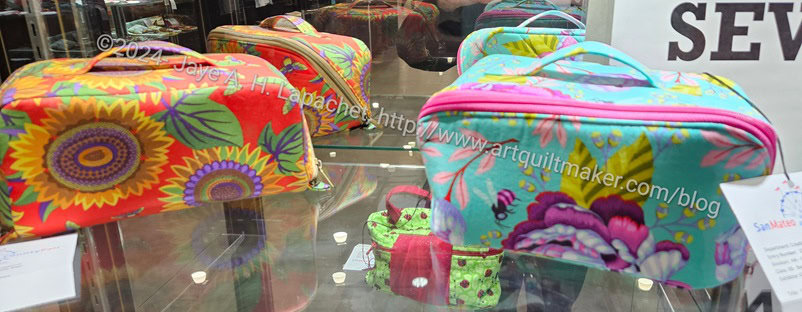
The Enigma pouches
Sadly, neither my nor Cindy’s Enigma pouches won anything. The big bags always win even though the one that won had NO zippers, NO hardware, nothing complicated.
Fortunately, Laura said she is breaking up that category so small bags are separated from large bags.
I only put in two entries, so I only got one prize this year. They are reintroducing the Sweepstakes winner next year, so I’ll have to start collecting various projects to enter.
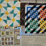
BAM Challenge quilts
BAM Challenge quilts
The challenge quilts were well hung (except for mine, which was at knee level) and there were many ribbons on them: 4 total. There is an award for the best quilt in the challenge category, but none of us won that one.
I’ll have some time this year to beef up my entries, so I will work on that. There is something really satisfying about entering the Fair. It’s a feeling I don’t get from entering regular quilt shows.
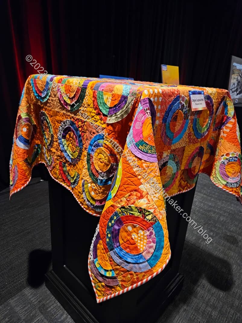
In addition to Women’s Work 1, Orange You Glad was also in an art exhibit.
Yes, an art exhibit not a quilt exhibit.
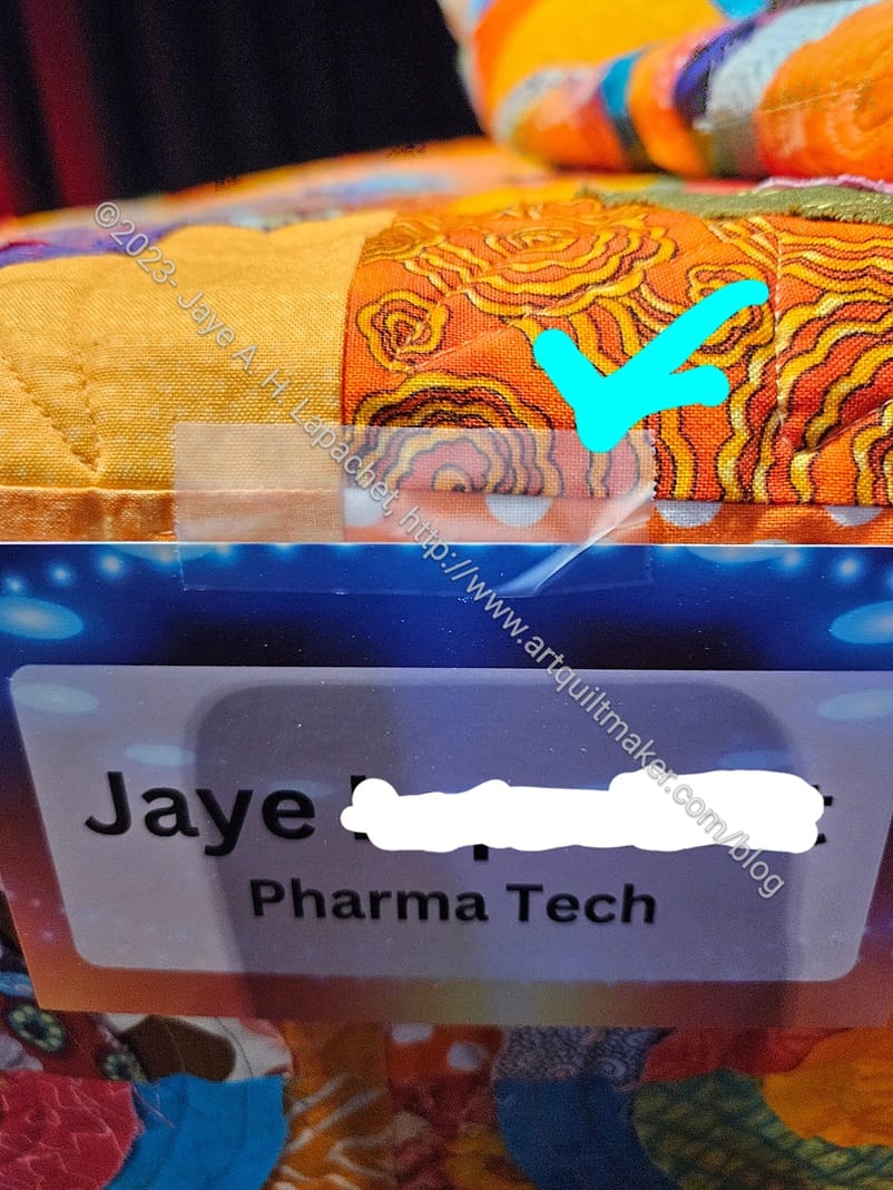
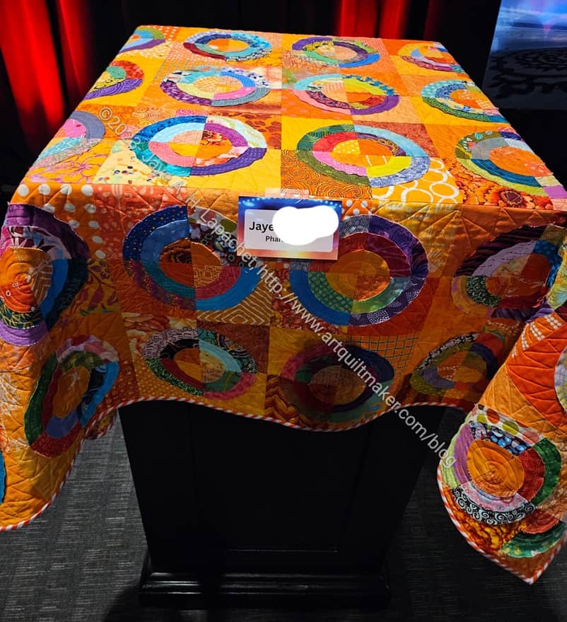
My work had a “[name of company]’s Got Talent”. It was mostly performances, but there was also an art show on the side and I entered Orange You Glad.
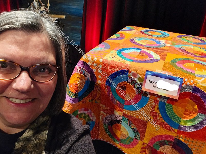
Orange You Glad & me
They didn’t know how to display quilts, so I had to give them a lesson and bring a curtain rod, but the art handlers flung the quilts over plinths and that’s how they were displayed. It worked out ok.
Orange You Glad with tape 🙁
I was kind of shocked when I saw that they had taped – yes Scotch taped! – the label to my quilt!!!
Clearly they were professional curators and it was only a few hours, so I didn’t worry about it too much, but it was still kind of shocking.
I had never seen a quilt on a plinth (pillar?) before, so that was an interesting experience. I thought it looked ok, though the border I sewed was completely lost.
Orange You Glad at work
I was glad to have the opportunity to have another quilt on display with paintings, wood carvings and other works.
I would not be writing this post or showing you the art, if it weren’t for my friend Cyndi. She told me about this exhibition, she dropped off my quilt and also did some work for the hanging mechanism. I am not sure what I would do without her.
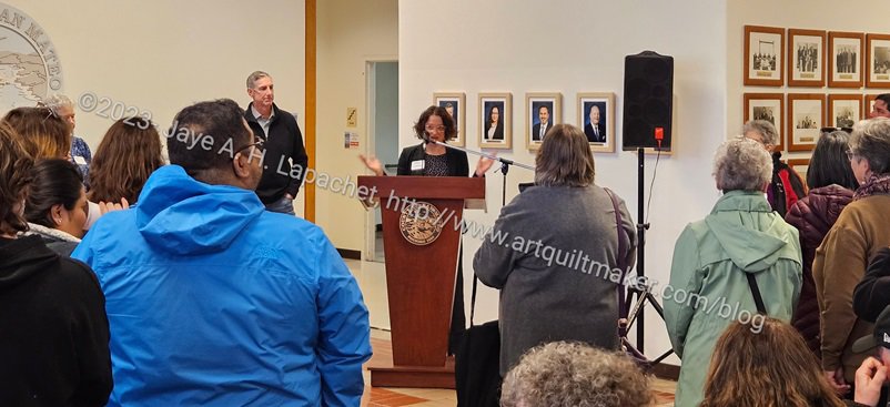
The Women’s View exhibit is installed in the County Center & Courthouse to celebrate Women’s History Month. This is the 18th year. I have never been before, but everything lined up really well. I took the day off work for an extra Sew Day and Cyndi and I left early to go to the artists reception.
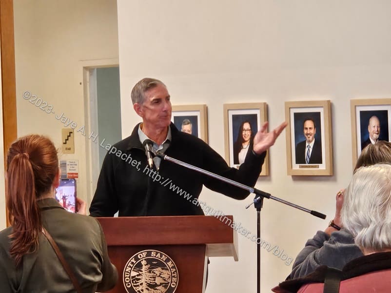
Mike Callagi, County Executive
We arrived and only had a short chance to look around before there were presentations.
Mike Callagy, the County Executive gave the opening remarks. He was very complimentary about the quality of the art that was entered. He was also down to earth and funny.
Aimee Shapiro, Arts Commission
Aimee Shapiro followed him. She is brand new. She has had her job on the Arts Commission for 3 weeks! She thanked a lot of people who helped and also announced the winners, of which I was one! Yes, I won one of the Honorable Mention awards.
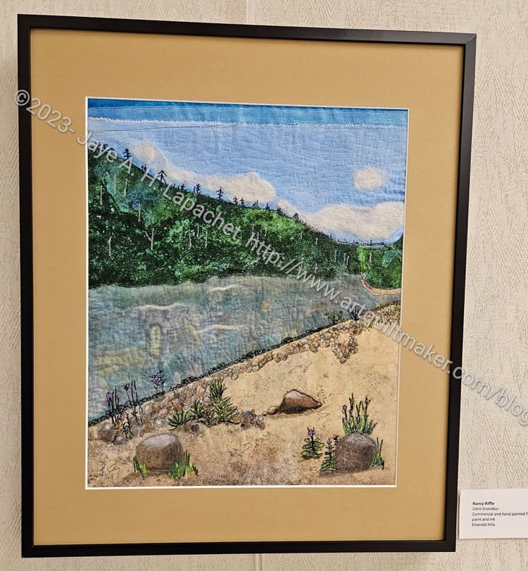
Nancy Riffle, Silent Grandeur
I think Women’s Work 1 fit into the theme, but I was super pleased that my QUILT (women’s work) got honorable mention up against paintings. I was further pleased that Nancy won honorable mention as well. Her piece was a scene from her trip to the Yukon and beautifully done. It was not only stitched, but she painted some of the motifs and embroidered bits as well. It is lovely.
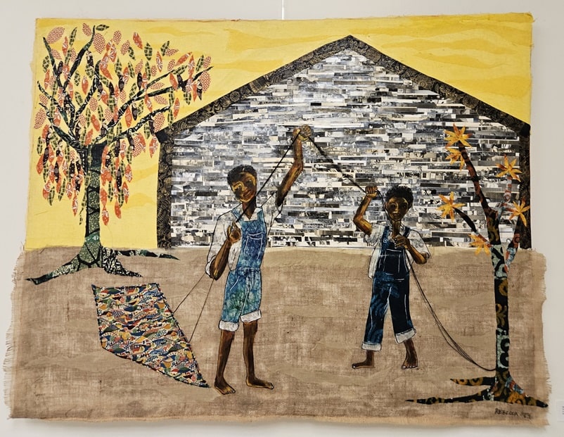
Rebecca Archer, Mother to Son: don’t let them steal your sunshine
Some of the other pieces were wonderful. I saw Rebecca Archer’s piece soon after I arrived and I really like it. It is multimedia as well. She used fabric and paper along with paint.
The inside of the house is mostly strips of paper while the leaves on the tree are fabric. I don’t know how she decided, but the overall design is very cohesive. The imagery doesn’t look like she just added motifs or used materials just to do it. Rebecca won first place. I took this photo before we heard the results.
Dana Dillworth, Emerging from Repose: Eve of Eves
Andrea Kosmo, the Old Stem
Savitha Viswanathan, From Lucie, NY
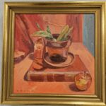
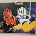
Linda Maki, Red and White Chairs
Echo Lake Wodarczyk, Madness
Some other interesting images are above. I like Dana’s piece because of the washi tape she used. The Old Stem is interesting because it is a still life all in one color – or mostly one color with its compliment. I am a sucker for cake and dessert imagery, so Savitha’s piece is very appealing, especially since she added flowers. Linda’s chair remind me of wanting an Adirondack chair when the YM was a baby so I could sit with him in the backyard. I admire Echo’s technique and the way she used watercolor. Also, she won Third place and I wanted to get all the winners, but missed second place and the other two honorable mentions.
It was exciting, but I was exhausted by the end of the day and almost didn’t cook dinner.
We were talking, at Sew Day, about all the work that military wives do when their husbands get new assignments and I might have inspiration for the next quilt in the Women’s Work series. I have never been in that life, so the idea might be too presumptuous for me to make. We’ll see.
The San Mateo County Women’s View exhibit has a Gallery Guide that includes all of the artist statements. I am so pleased that I am a part of this exhibit and am thinking I will enter Who Am I? in next year’s exhibit.
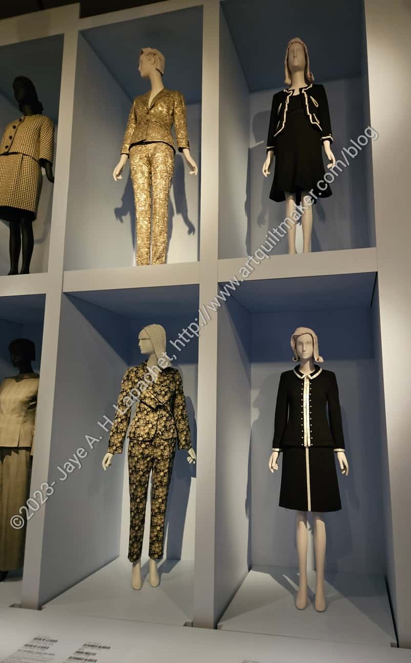
Knowing other librarians is a good thing! I have a new acquaintance who works at the Fine Arts Museums of San Francisco. These museums include the deYoung and the Legion of Honor. I recently saw that the deYoung was exhibiting Fashioning San Francisco: A Century of Style. It is about haute couture worn in San Francisco. I love seeing these types of dresses, so when we were emailing back and forth I mentioned a forthcoming (mythical) trip. My acquaintance offered FREE tickets. I was thrilled and took her up on it right away.
Of course, the day we chose turned out to be one of the worst weather days of the season. We went anyway. We drove carefully and at a moderate speed. We had no problems on the way there or back. I appreciated the all wheel drive of my Subaru and the fact that I didn’t have to drive on dirt roads.
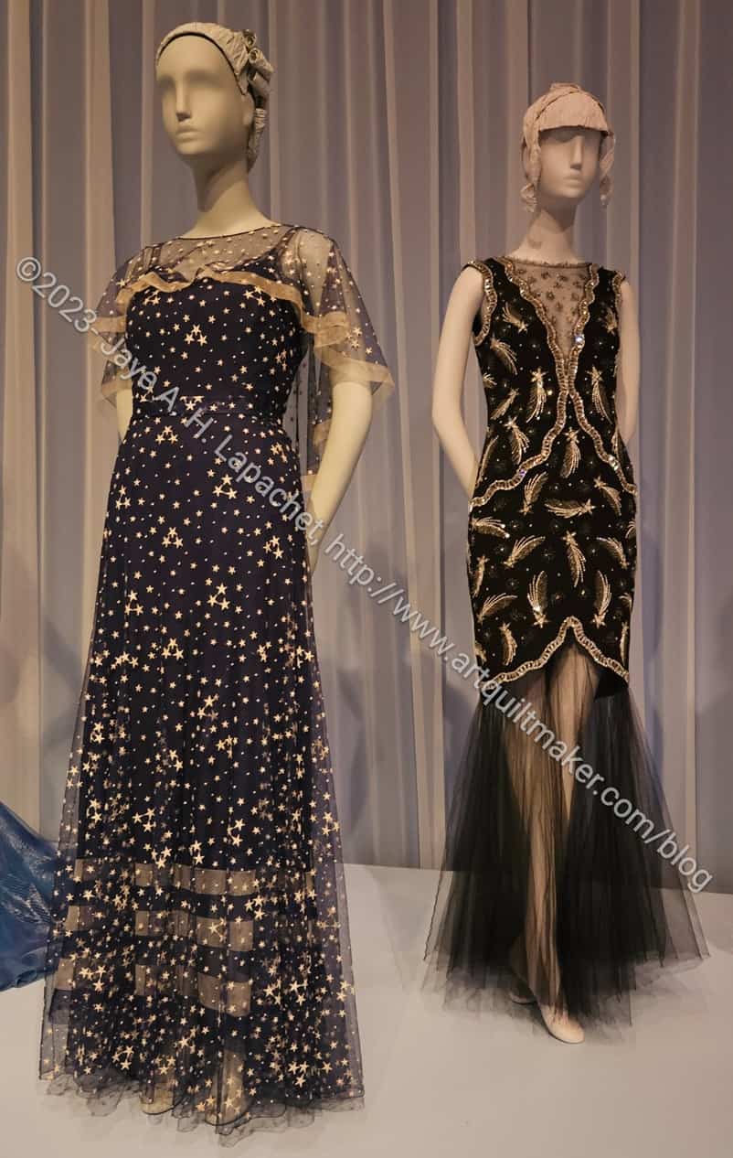
de Young: Moon and Stars dresses
The exhibit was nominally arranged by time period. That was clear at the beginning and at the end, but the time period of ball gowns are hard to pinpoint.
I really liked the use of sheer fabrics such as tulle in the various dresses. I think the technique provides structure and wearability to gowns, but also adds interest. Skating dresses use this technique a lot to show off skin without encouraging a wardrobe malfunction.
The neck insert in the dress above on the right gives the idea that cleavage is being shown off, without providing any access. Am I slightly prudish? Yes, a bit. I don’t like men leering at me and that affects the type of dresses I like and want to wear. I prefer an air of mystery when I dress up.
Christian Dior at FSF exhibit
I am definitely a Christian Dior girl. I really liked the simple lines of the designs they exhibited.
The dress in the center is wonderful! I am not a fan of the color, but really like the design. I’d love a cocktail length dress with the same design as the bodice.
I also like the dress on the left. I can do without the color, but the simple lines in turquoise would be fabulous.
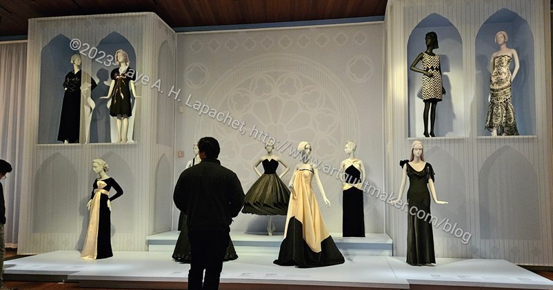
Little Black Dresses at FSF exhibit
I also like Little Black Dresses. There was a description of how they came about, which I thought was interesting. I liked most of the more form fitting examples of these LBDs. I could do without the center dress that is super drapey. I know these are all art, but I can’t help, but think about wearing them. All of these dresses were worn, but I can’t imagine wearing the cream and black one in the center above without a couple of pages to hold up my hem.
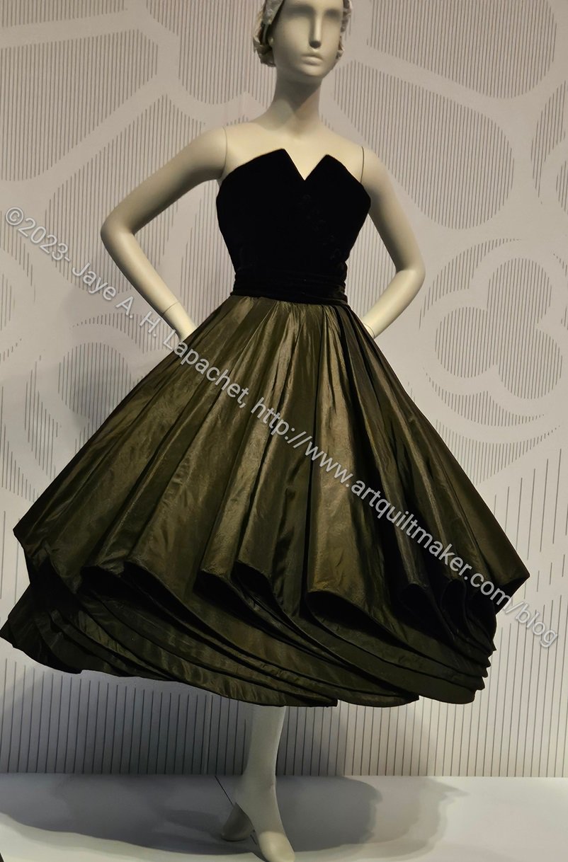
de Young: little black dress with cool hem
When I was running my most recent quilt class, I wanted to add more classes so my students would be well prepared for designing their own quilts. I kept trying to think of quilt blocks that required different techniques. One block they did not want to learn was Cathedral Windows. Next time I teach the class, I’ll teach that technique as a pincushion rather than a block. I think that will be more appealing and pincushions are also fun.
de Young: little black dress with cool hem – detail
One of the dresses made me think about whether or not I could add a technique that looked like the hem of the dress. First, I love the simplicity of this dress. While I don’t love strapless dresses, this one has structure, so I might even wear it.
I suspect, however, that the star is the skirt and that someone taller than me would really do this dress justice. What embellishment does the skirt remind you about?
Alexander McQueen mini dress
I wasn’t a fan of the more modern arty dress designs. One dress had no stitching. It was held together with staples and grommets. As mentioned, I can’t help thinking about wearability. That being said, I did like this Alexander McQueen mini dress.
It looks fairly wearable. It is short, but not TOO short. I like that it has a rounded neckline close to the neck, isn’t strapless and has sleeves.
I also like the texture of the lace contrasted with the red ‘coat’ over it. The shininess of both materials make it look perfect for a black tie event.
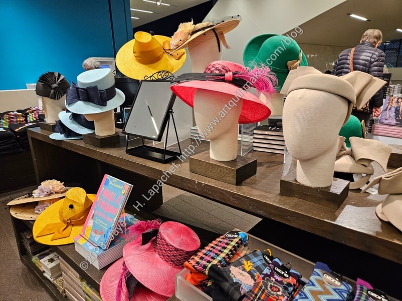
Hats in the deYoung gift shop
I had to look at the gift shop. I am always on the hunt for postcards. I found a few, but they never seem to have the ones I really want. I did see a display of 1940s style HATS in the gift shop. I was amused, but also tempted.
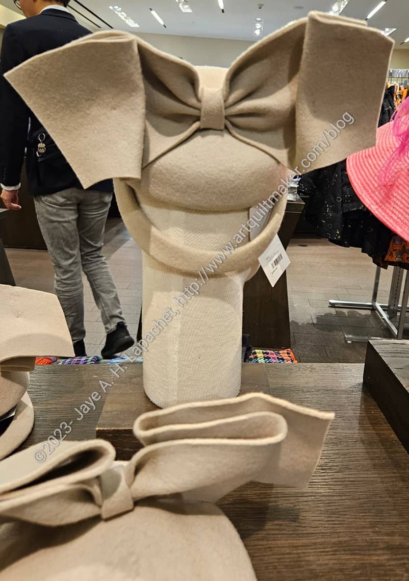
deYoung: beige hat detail
The beige hat, right side, in the photo above would be great in black. It has a fantastic bow on the back. I took a photo, because I wondered if I could use the shape as an embellishment for a bag or pouch.
Yes, I wanted the catalog, because it was big lush and fabulous. Also, I love these kinds of books that mesh fashion or pop culture with history. I knew I would only look at it a few times and wouldn’t really read it until I was old and grey. I’ll check it out of the library.
I mourned the loss of sewing time, but really got inspired by viewing the exhibit. I did enjoy spending time with DH as well.
On my way back from a recent trip, I saw some quilt art in the airport. Yes this was my first airline trip since 2019. I actually don’t remember my last airline trip.
I am always pleased when textiles get their day in the sun. While the Phoenix airport is not the Met, it is still a venue that has a lot of possibilities for people to view the artwork.
In this case, I saw a quilt and a chair with quilted and embellished elements in this exhibit.
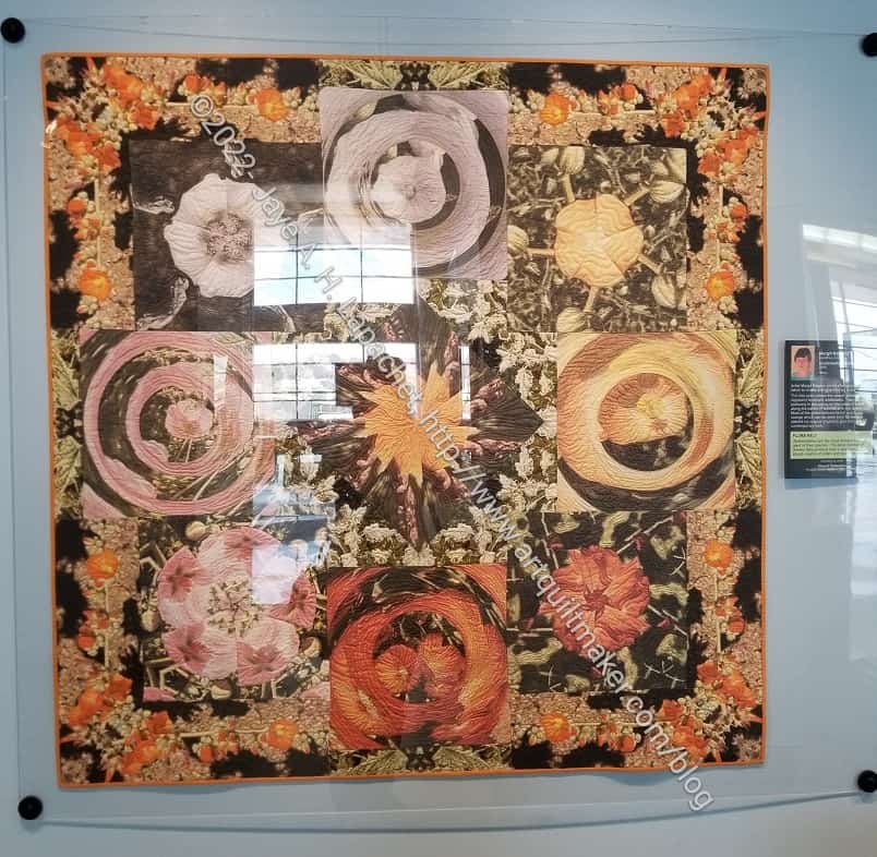
Airport Art: Globemallow Kaleidoscope
The quilt has photos printed on it. This is not a favorite technique of mine, but I applaud the work the artist, Margit Kagerer, did on this quilt.
N.B.: sorry about the reflection. The quilt was under glass and, although I tried a lot of different angles, I could get rid of the reflection. I was playing with some photo manipulation, but haven’t succeeded in getting rid of the reflection.
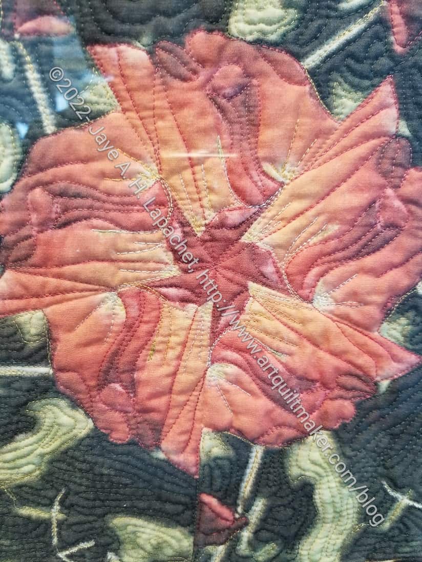
Airport Art: Globemallow Kaleidoscope detail
Getting some detail shots helped and also made it easier to see what was going on in the quilt.
This quilt has a lot of detailed machine quilting.
You can also see that the piecing looks like a kaleidoscope in the flower photo, left.
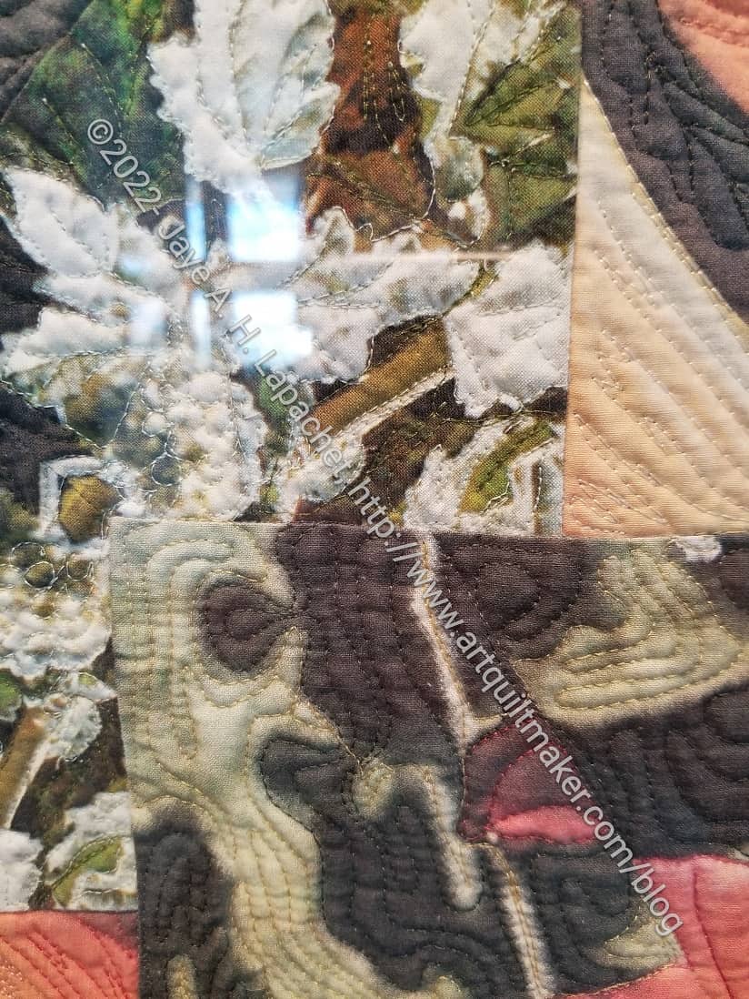
Airport Art: Globemallow Kaleidoscope detail 2
I am pretty sure this is piece is not longarm quilted.
Again, this photo has a reflection, but you can see more detailed quilting in the bottom of the photo.
I am interested in what Margit’s original photographs looked like. In order to answer that question, I would have put the original photographs on the back of the quilt. I had no way to see if she did that and I don’t see more information about the quilt on the web anywhere.
This work really reminds me of the fearlessness of Friend Julie‘s work.
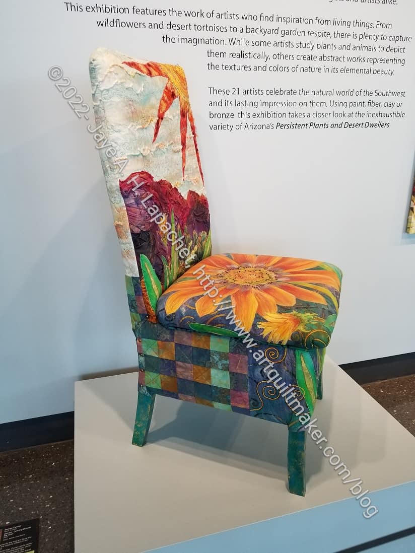
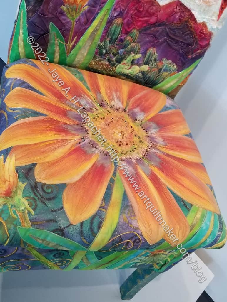
Get Set – Coloring Outside the Lines
I was more interested in the chair that also has some quilted elements. I have been interested in reupholstering chairs with quilts or quilted panels since I made the Tuffets and also since I saw Tula’s Elizabeth chair* as well as her Monkey Wrench chairs.
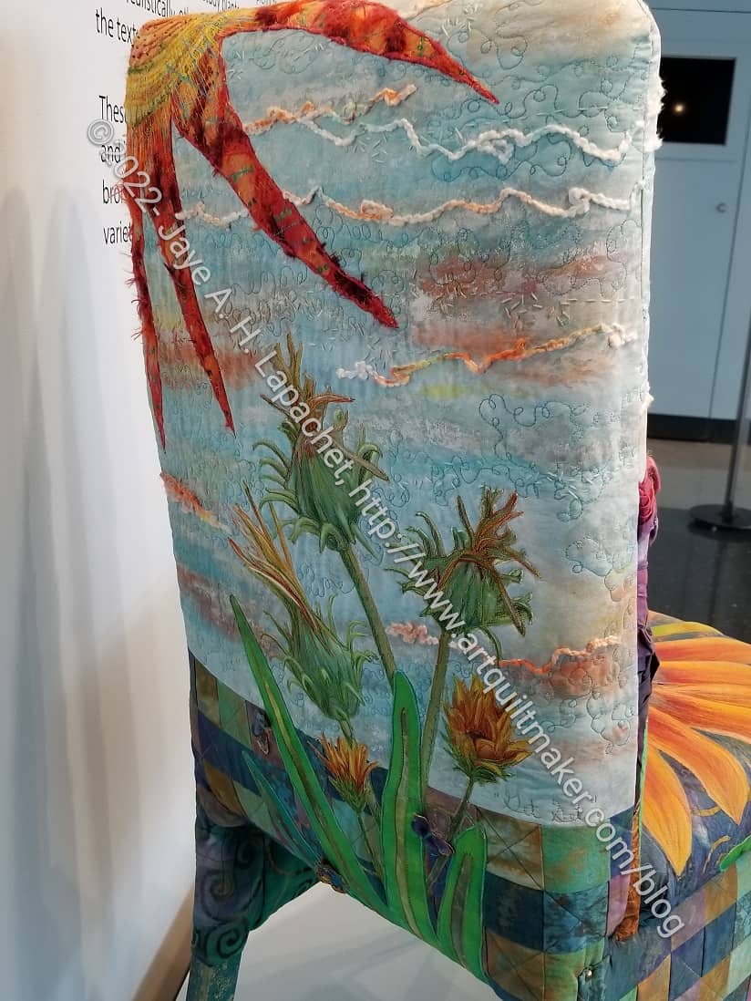
The chair was well protected, so I had some trouble getting detail shots.
Get Set – Coloring Outside the Lines detail
This chair is definitely art and not seating. The seat had beading in the flower, which I don’t think would be very comfortable.
I really like the idea of upholstering furniture in patchwork. I think it would give the furniture a unique appearance.
Get Set – Coloring Outside the Lines back detail
The artist used the entire chair for her artwork, including the back. The sun reminds me of the sun in Beach Town. I really like the thistle-like flowers. The background texture kept me looking at the piece for awhile.
I have mixed feelings about airport art, but I did enjoy seeing these pieces.
*N.B. 12 July 2022: I wasn’t able to find a photo of the Elizabeth chair, but you can see it some of her Tuesday videos. I will add the link if I am able to find one.
DH and I were both sick over the long holiday weekend. The illness lingered through the beginning of the Fair and through the day our extended family had decided to go together. I didn’t think we would be able to make it at all, but we decided to go last Saturday. I was not intending to see every single thing at the Fair and I made my desires clear: quilts and a frozen chocolate covered banana. I didn’t want to overdo it after resting and taking it easy for a few weeks.
I let DH pick what he wanted to see first, so we looked at the Commercial area first. It was sad. So many of the vendors and information booths we had seen before were not exhibiting. The vendors who made the effort were selling items of low quality or of no interest. I wish the Fair management would find a way to get artists to sell their wares.
After that, we went to see the quilts and other Home Arts. I saw Laura, the organizer of Home Arts, pretty soon after we arrived. She will be taking suggestions after she rests for a bit, but I talked with her about some things I thought were confusing. She also said that they had 75% of the entries they had pre-pandemic, which was a lot better than the other areas. I was pleased at the number of quilts even though it was obvious there were fewer.
BAM recycle/upcycle challenge
BAM made a GREAT showing. In addition to my wins, I saw that Sue G., Joelle, Bonnie, and Cyndi all received awards of one kind or another. The upcycle/recycle challenge was shown in a prominent place.
Cyndi’s Orphan block quilt
I saw one of the orphan block Sew Day quilts, Cyndi’s, which is a great effort. It is colorful and interesting to look at.
I was so impressed that she got her act together enough to get this into the Fair. I think it was made in April and since the deadline for entry and deliver are in different parts of May, it was a quick turnaround.
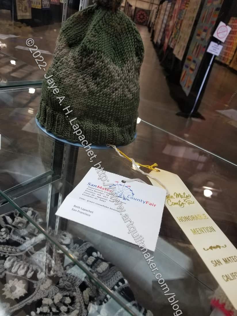
SIL#4 2022 Fair Entry
SIL#4 also won a prize for one of her knitted hats. I saw her hat before I saw either of my winners. It makes sense, though, as small knitted items are right at the front of the hall.
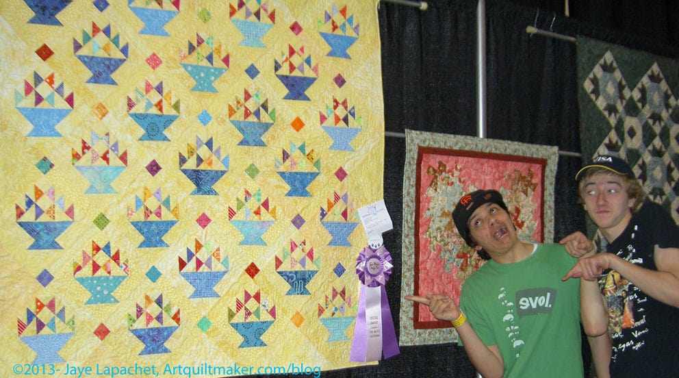
I was really pleased to see that my teaching paid off. Sue G., one student in a recent class (and member of the door prize team), put two quilts in the Fair and won prizes for both! I was thrilled beyond belief. She has been sewing a lot and practicing her skills, so the prizes were well deserved, but I was still thrilled. I’m not saying that I did everything, but I do take credit for instilling good habits and teaching good skills.
Sue G.’s Upcycled Shirt Quilt
Sue G.’s Color Connection Quilt
I was shocked at the prices. Everything had gone up. In some ways I felt like Fair management and the vendors were making me pay for the loss of two years worth of my attendance at the Fair:
Entry fee: $20.00 x 2 – $40.00
Parking: – $15.00
Ice Cream: – $16.50
Drink: – $10.00
______________________
$81.50
minus free ticket: $20.00
______________________
$61.50
We didn’t even have lunch. I wondered how families with children were able to afford the costs just to get in? I told DH he had a year to figure out what to enter into the Fair next year so he could get a free ticket as well. By the time we got home, he had decided on a cell phone photo.
I always look forward to the Fair and make a point of entering.
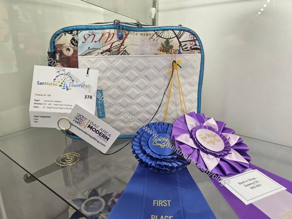
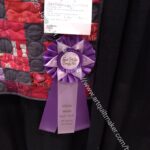
I wasn’t well enough to go to the Fair last weekend with the family, but they were kind enough to send me photos of my wins as they walked the exhibits. I was SHOCKED to get two wins in the made-by-one-quilted-by-another category. That category is almost impossible to win in since there are so many entries. I am thrilled!
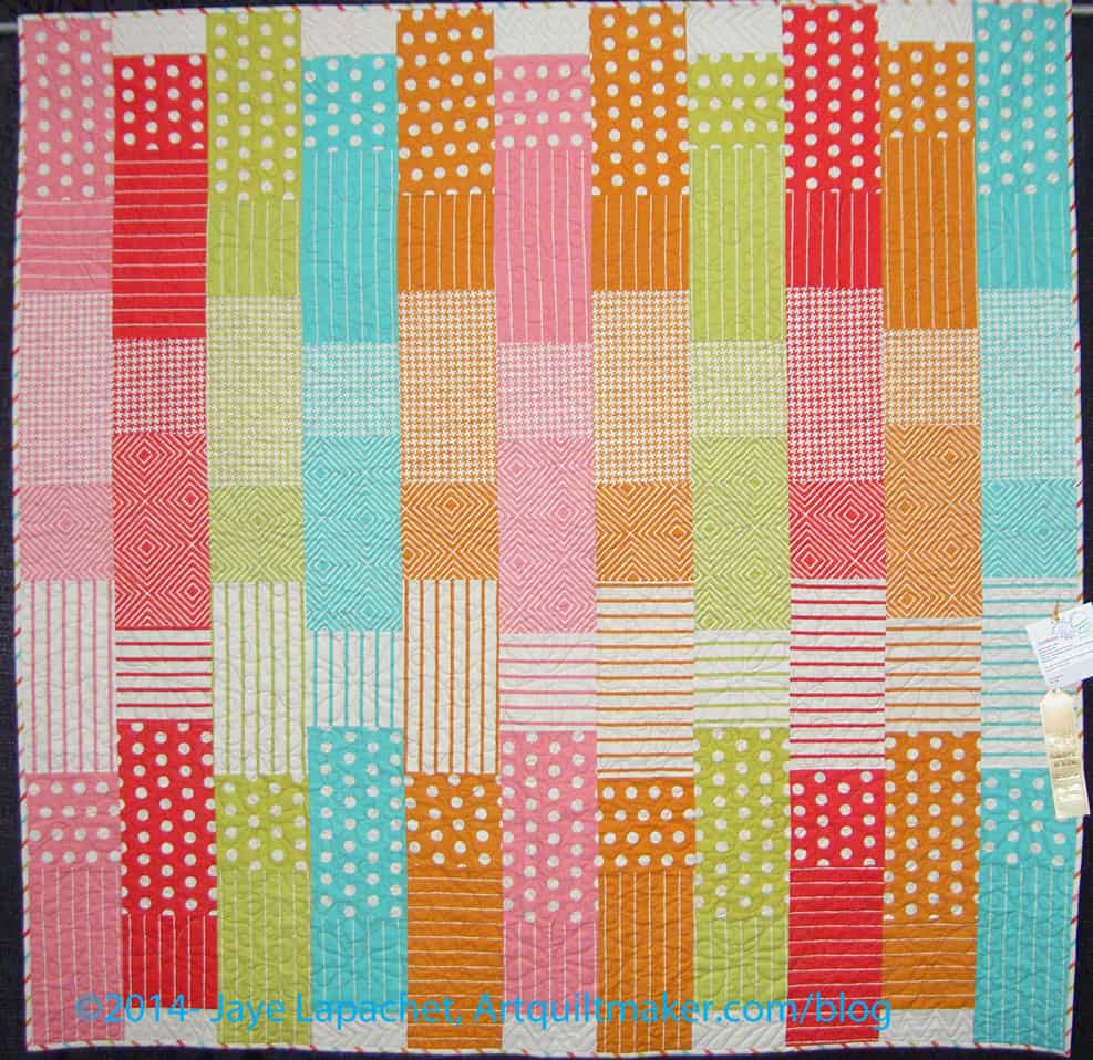
FOTY 2019 Win
Frolic! Fair Win
Fabric of the Year 2019 and Frolic! both won. Isn’t that purple ribbon pretty? I’ll have to see the details if I get to go to the Fair or when I get everything back.