Some time has gone by since I last wrote and I hope my faithful readers have not given up on this blog. Since I last wrote, I haven’t been doing much of anything creative. However, the top for the Nosegay is finished! St. JCN’s visit was the first weekend in May and extremely productive in a lot of ways. Although we did not get to do everything we wanted (we never do!), we did get to do a number of fun things on the list, one of which was finishing the Nosegay.
The Nosegay was started in a class with Doreen Speckman at Black Cat Quilts. It was the last class she taught at Black Cat before she died. This class was held in about 1997 or 1998. I worked on it on and off, but fairly steadily until I came to the border. The quilt is huge and, thus, unwieldy to work on alone. St. JCN has helped me on and off but other quilts took precendence since the 90s and the Nosegay was relegated to the closet. At some point a few years ago, in an attempt to move the project along, we made border blocks. St. JCN is very good at helping me work through problems. She is also generous with her time and excellent at keeping me on track. We (I?) decided that the time had come to deal with Nosegay. First we looked over all the notes I had from the past efforts (I keep a file on each quilt and stuff everything related to it in the file). One note had been on my bulletin board so long that the ink had faded to a point where we could no longer read it! We also measured the border blocks and the quilt itself. We discussed how to get the border blocks to fit and tried a couple of different options.

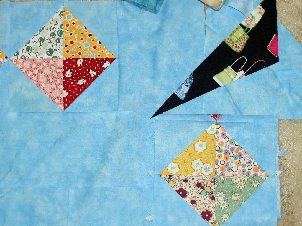

I did like the black, in theory, as it echoed the cone in each of the Nosegay blocks, but it really looked like a big blob of black in each corner. The other colors are very pastel-y, thus we thought it was important to watch how the black fit in. I also liked the idea of a different shape in each corner to take the viewers mind off of the fact that the border blocks didn’t fit perfectly.
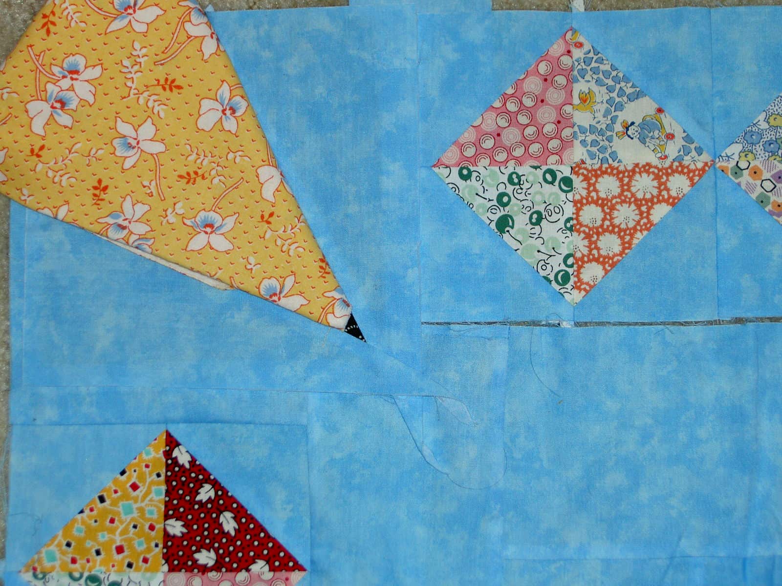
The yellow looked nice in the corner and was pastel so it worked with the other colors. It also fit with my concept of the different shape to draw attention away from the spacing issue, but again we had the big blob problem. A big blob of fabric in the corner drew too much attention to the area we wanted to mask.

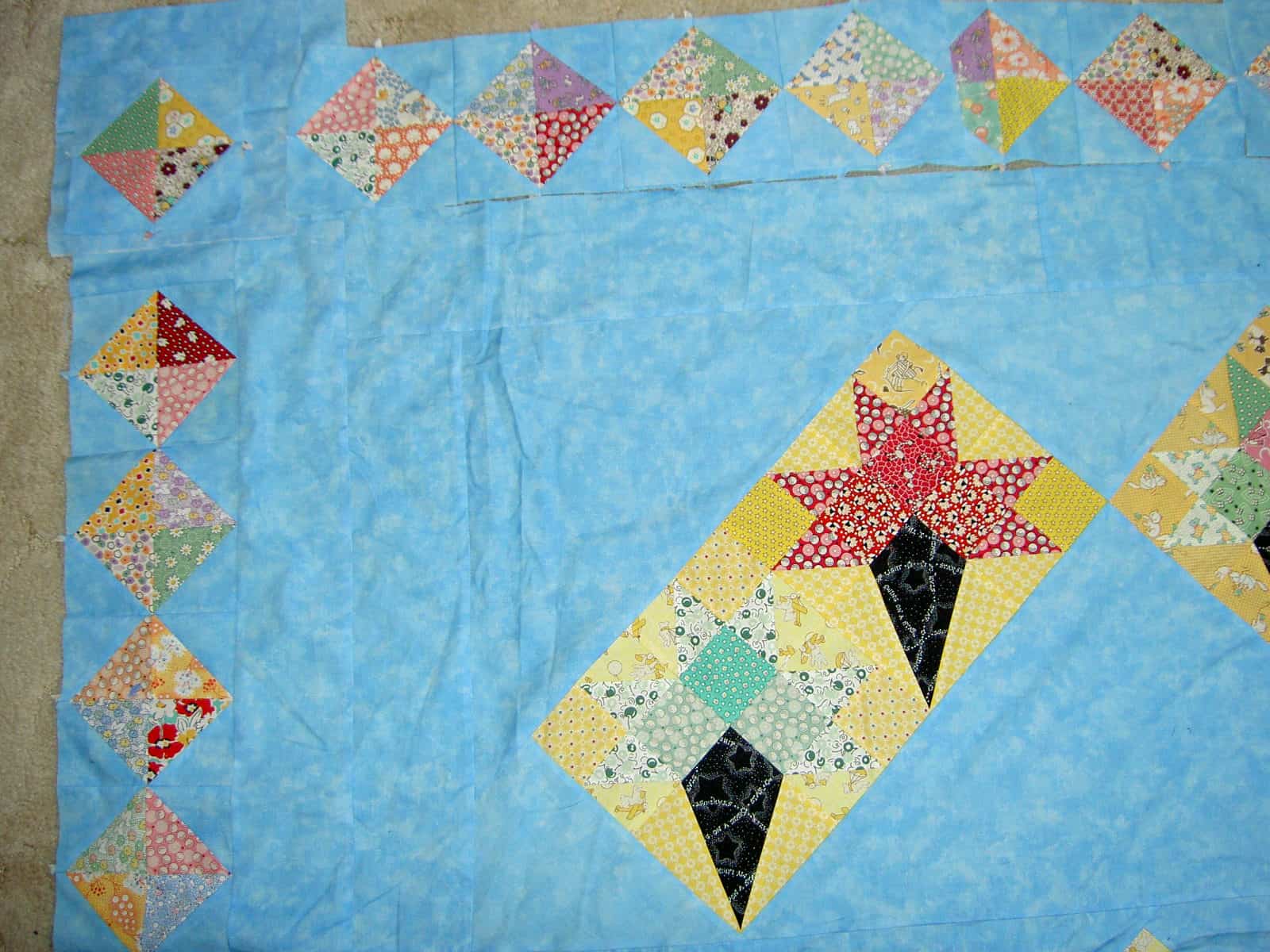
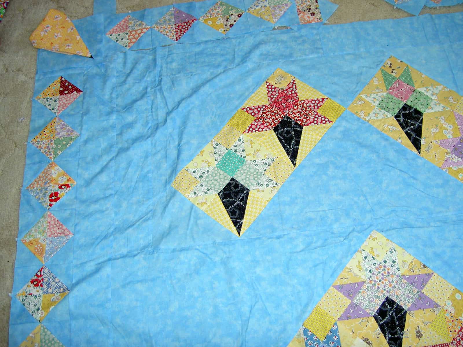
Finally, we selected the above arrangement of border blocks as the best option. Even though the spacing isn’t even when you get to the corners, the blocks being similar draws less attention to the problem area.
Lorraine Torrence is one of my favorite teachers. She is organized, not sentimental, friendly in a professional way and provides useful information. One of her precepts, which has proven very useful to me, is “make visual decisions visually.” This means that a quiltmaker needs to make design decisions by looking at how the design will look IRL before starting to sew and cut. I did this with the black and yellow options above. In the case of the black, I actually sewed a few blocks and we tried them out. In the case of the yellow, St. JCN and I folded the fabric in some semblance of how the block would look. This is a much better method than just thinking it would look good. If I hadn’t looked at the design visually, I would have probably gone with the black and ended up with blocks that drew attentio to an area, I really didn’t want anyone to notice.