I am finishing up a BIG report at work. I only have a few hours left on my contract, so I sent off the draft to my client and then closed it up and didn’t look at it anymore. I felt like I had reached a stopping point where I had done enough work and could be rewarded.
So, I sewed.
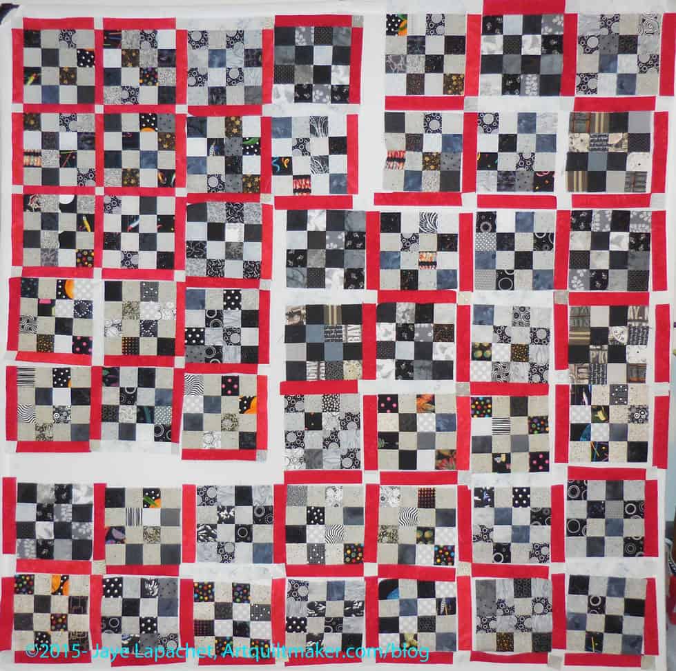
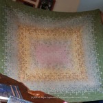
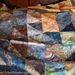
Black & Grey Donation Quilt pre-sashing
I got busy putting the sashing on the Black & Grey Teenaged Boy Donation Quilt. I starting marching across the design wall sewing one seam at a time. I used the Stepping Stones blocks as my leaders and enders, so made double progress.
The first part of the chunking was sewing the cornerstones to the sashing and sewing the sashing to the blocks. There are a lot of cornerstones and a lot of sashing in this quilt. I am still working on both.
I am making progress, however and that is a good thing.
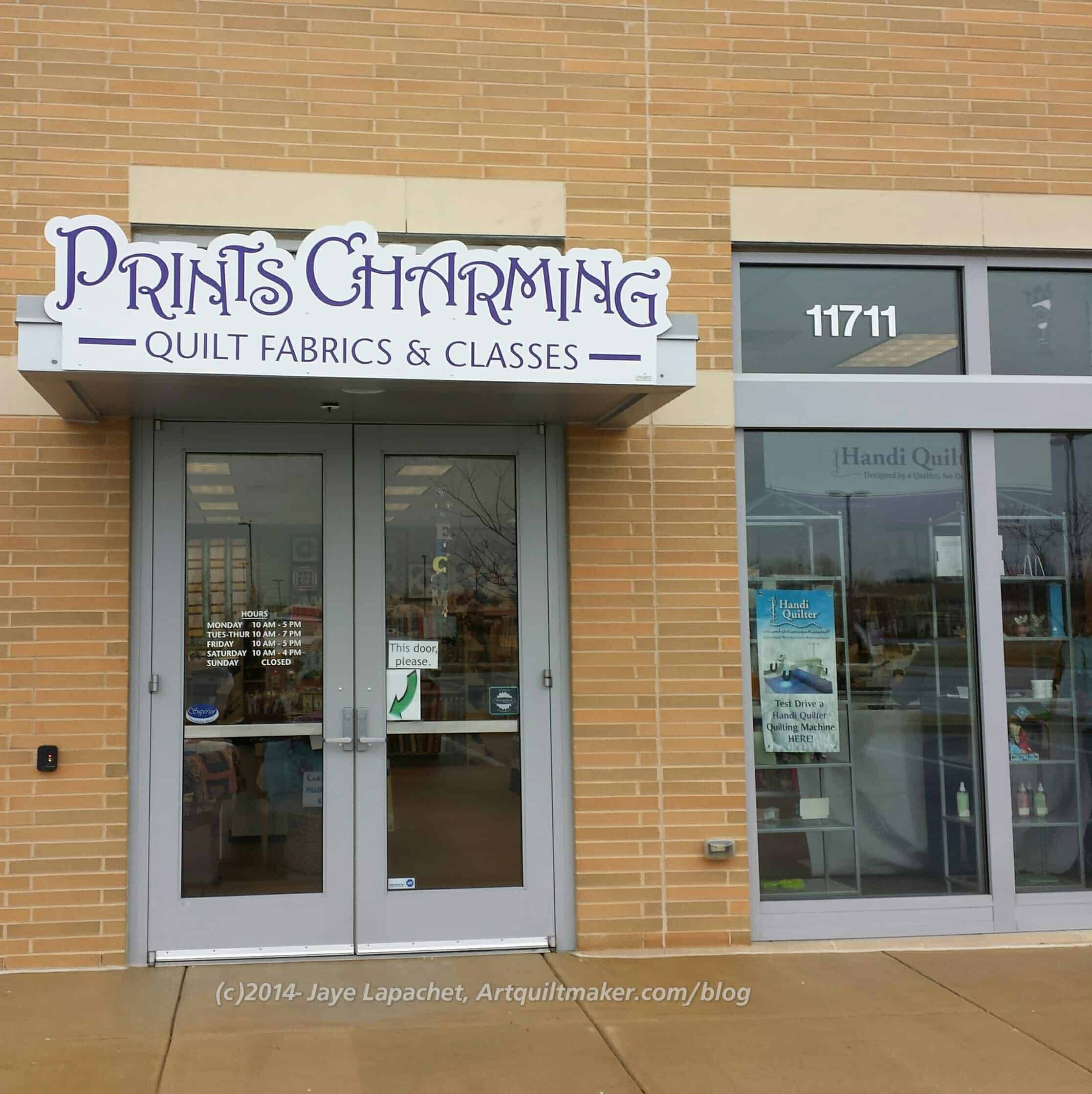
I really am a most demanding houseguest. All I want to do is sew or look at fabric and quilt shops when I travel. Fortunately, my SIL was willing and able to feed my frenzy. She came and picked me up on Saturday morning from the hotel in Baltimore and then we headed back to her house to sew. On the way we stopped at a new shop, Prints Charming.
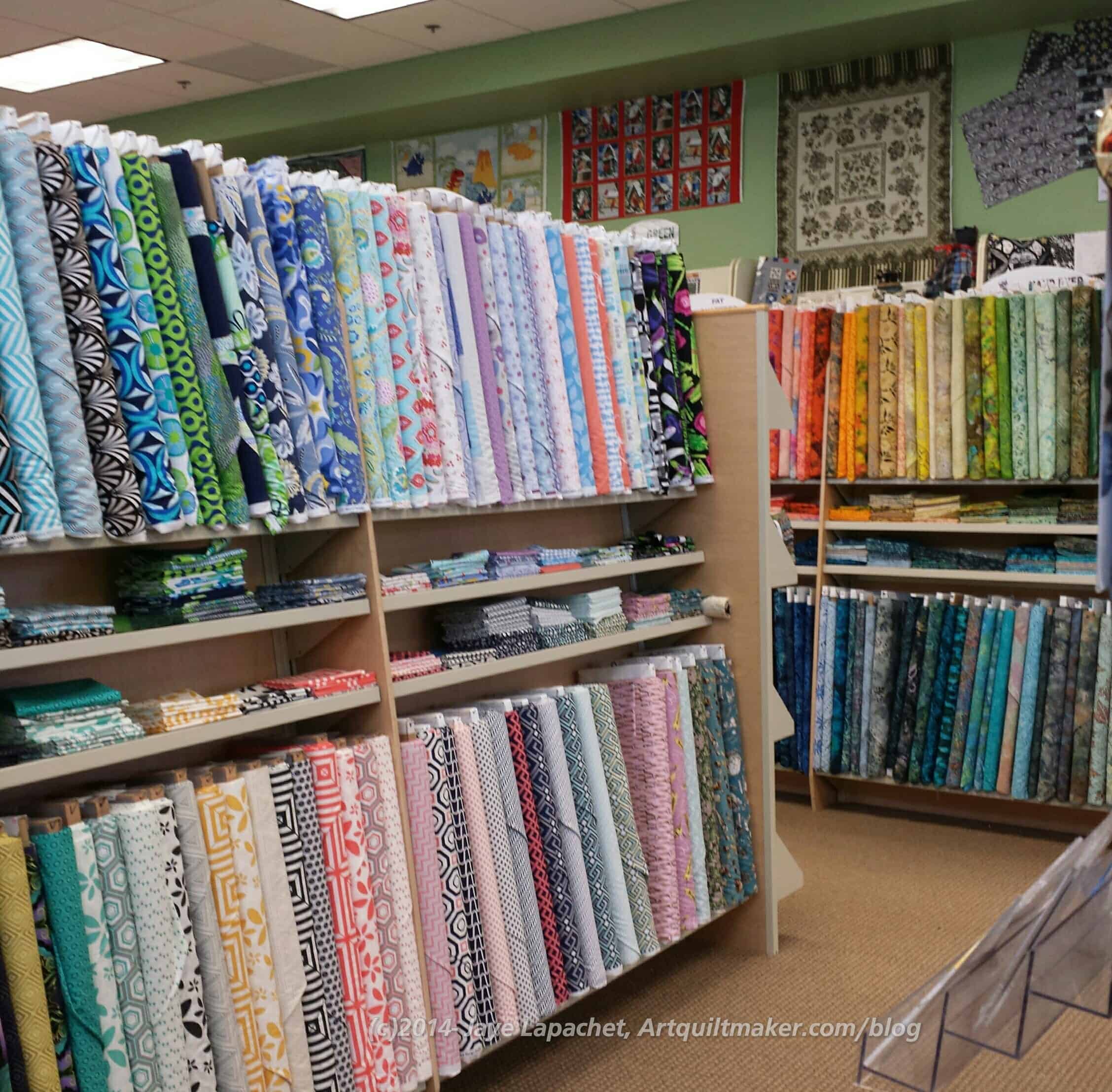
I liked this shop. In general, I thought the feel was good. They had a lot of nice fabrics in my style and colors. They had a good assortment of tools, notions, patterns and books and a longarm that people could rent. The shop is in a new mall, so the building is brand,spanking new and that adds to the feeling of fresh and clean.
Prints Charming front of shop
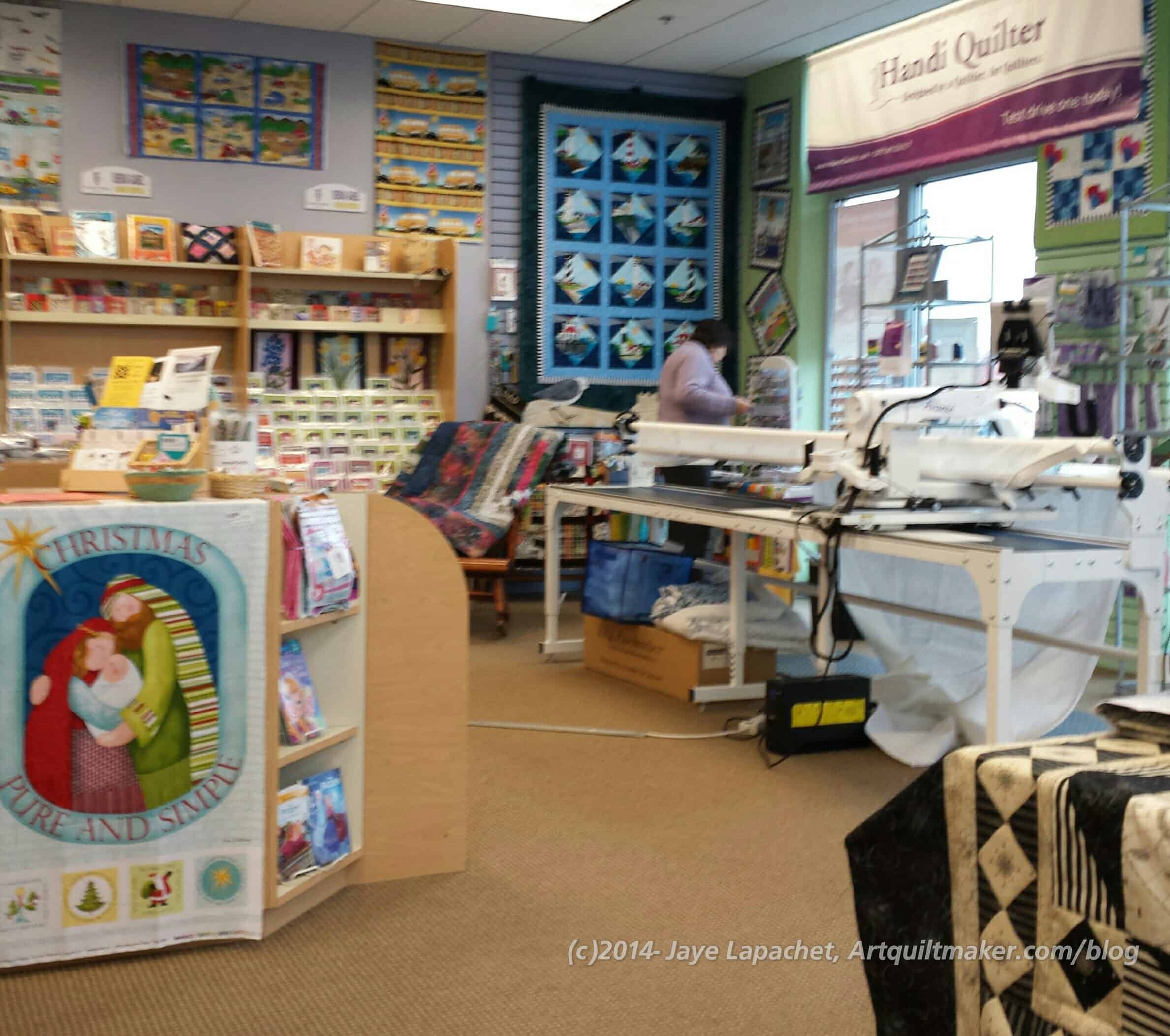
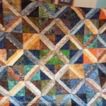
In the corner near the window is a lighthouse quilt that we also saw at Patches in Mt. Airy. There is a sea theme that pervades quilt shops in Maryland. They are on the Atlantic and seafaring, as well as various Navy related activities go on there, so it makes sense. Plus the whole crab thing.
Anyway, that lighthouse quilt is interesting (not interesting enough for me to make, but interesting) and I enjoyed seeing two different versions. I liked the one at PC fine, but I thought the background used in the Patches version added more interest. In the front of the shop photo, you can see the longarm (Handiquilter, perhaps?) and some of the patterns and books. If you are working at the longarm, you have your back to the front window of the shop, which is seen in the top photo.
The shop still had some of their Christmas stuff out. Mostly it was panels around the counter. Good idea to start early, if you are planning Christmas gifts IMO.
Prints Charming: front to back of shop
I stood near the longarm, kind of in front of the main door, to take this photo, which looks to the back of the shop. The table in the bottom left of the photo has kits and panel kits.
I am kind of interested in this resurgence of panel quilts. I got a panel when I bought some Kate Spain Christmas fabric, but I didn’t think that much of it. You might recall that I didn’t want to waste it, so I put it on the back of the Frosted Stars Leftovers Quilt. I have seen some really pretty panels lately. There was a peacock one that was very tempting. I don’t really begrudge people for wanting a quick quilt and using a panel. I think it is interesting and wonder if there is an AQSG article about it?
I didn’t get a good photo of their featured, new fabric, which you can see part of in the middle right (above). They had great fabrics in that section. I found a paintbox print that I plan to use for a set of gifts. (famous last words, right?).
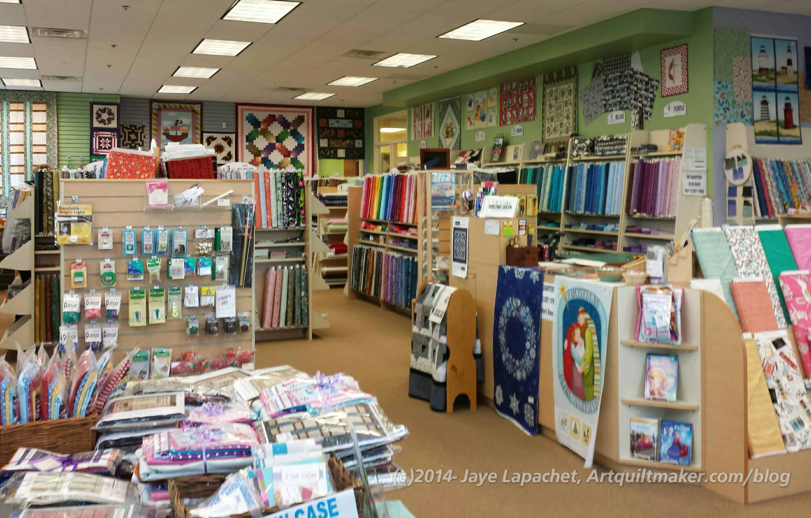
Prints Charming Back of Shop
I really liked the self made jelly rolls and pre-cuts that Capital Quilts had. The colors were just so fantastic. Prints Charming had a nice array of the kind shops buy from Moda as well. I am always so tempted by the small cute little bundles of pre-cuts, but I rarely use them so I let the shop keep their Jelly Rolls.
The area shown in the picture with the pre-cuts was in a bit of disarray. it wasn’t terrible, just not as tidy as the rest of the store, which was VERY tidy. One of the ladies said that they needed, desperately, to get rid of something and clean up that area. I can’t fault them. Every space (house, shop, cubicle) has a junk drawer. 😉
Prints Charming: Fabric
I guess what I want in a quilt shop is fabric. We have already established that I don’t need more fabric, but I do enjoy having a wide variety of colors and patterns from which to choose.
Prints Charming had a good amount of fabric. Not only did the have a good number of bolts, but they also had a wide variety: 2 brands of solids (not American Made Brands), batiks, novelty, tone-on-tones, flannels, modern, baby/kid fabrics, some 30s, I think and a section of nautical/ocean fabric.
I didn’t ask about whether they cut fat quarters. They had plenty out. I thought the range of colors they had tended towards brighter rather than muted, though I did see a small section of browns. I don’t know if there were other Civil War-colored prints there as I zoomed right by after looking at a coffee print.
One fabric we found was an architectural drawing of boat plans. SIL bought enough to make a shirt for her DH. We discussed cutting it out, but decided we had better finish the other shirts first.
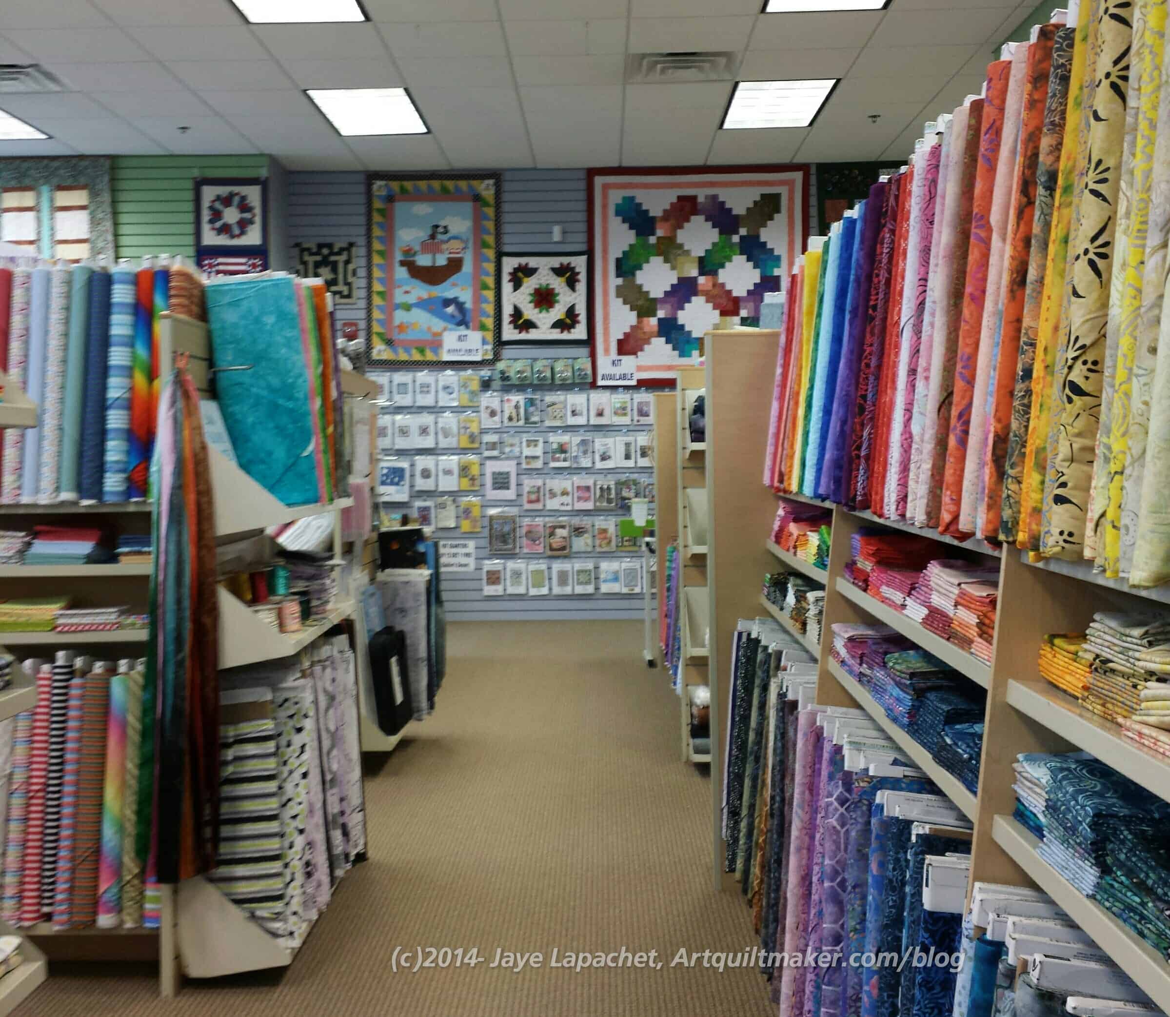
Prints Charming: looking towards the back
I also noticed that they had a lot of examples and class samples hanging in the shop. I thought the hanging quilts made the shop look warm and friendly.
You can see some of the class samples on the back wall. That is their pattern section as well.
Back by the patterns were two more exits and another cutting table. One exit (right) led to a nice clean restroom and connected the shop in some way (I didn’t explore) to the condos above. Can you imagine having a quilt shop right downstairs? I would love it and be totally doomed. DOOMED!
If you are heading to Maryland, I would recommend a visit to this shop. I found some nice stuff to buy and I am sure you would as well. (says your personal Temptress!)
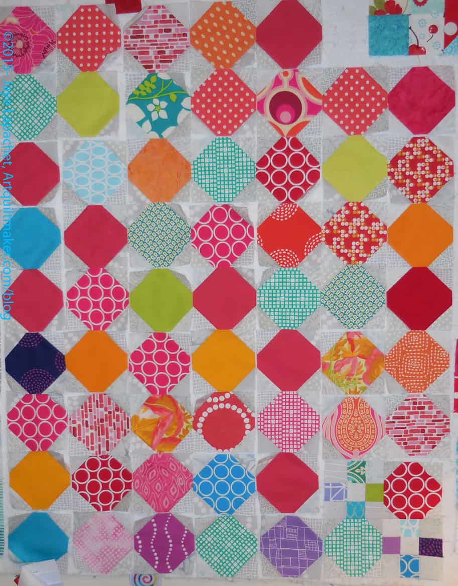
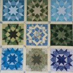
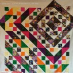
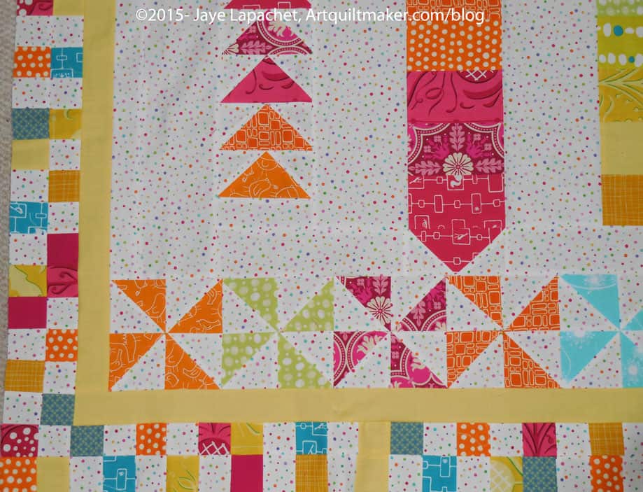
I am starting to think I should call this quilt the Snowball Nine Patch. Even though I think of the original shapes as octagons, I am turning them into snowballs. It is probably too late since, by now, I think of this quilt as the Octagon Nine Patch quilt, but it is a thought.
Also, what is it with Nine Patches all of a sudden? First it was the Rick Rack Nine Patch and now I have, as planned, added nine patches to this quilt.
Octagon Nine Patch Detail
I felt like I needed to add some nine patches to the octagon/snowball pieces to see some progress. I know I am making progress with the ever increasing number of octagon/snowball pieces, but I needed to see more. Making new scrappy blocks meant cutting a whole bunch of additional squares. Still, it was very gratifying when a couple of nine patches came to fruition.
I am trying to decide if I need more cool colors. I used a lot of the cool colors on the Russian Rubix. From the top photo, it looks like enough, but when I look closer I see the same fabrics over and over, then one of the circle blue octagons and one of the violet/light purple with the squares and rectangles line drawing. I don’t know how many octagons I will need as I don’t know how large of a quilt I am making. I am trying to restrain myself and wait to cut more until I can put this on the large design wall to see what I see. At this point the quilt (with 64 Snowballs only) will be 208″, which is a respectable size. Adding the Nine Patches will, I think, double the size.
I am getting to the point where this is starting to look like something. Perhaps this will become my number 1 project soon.
Here are the most recent patches. I can’t decide if I am going to keep cutting until I start laying out the piece on the design wall or if I should stop now.
The CQFA Retreat will be in May this year, but I certainly don’t want to wait that long. On the other hand, I haven’t chosen a shape for FOTY 2015. Lots to do.
Post the direct URL (link) where your drawing, doodle, artwork is posted (e.g. your blog, Flickr) in the comments area of this post. I would really like to keep all the artwork together and provide a way for others to see your work and/or your blog.
We are also talking about this on Twitter. Use the hashtag #CPP
The Creative Prompt Project, also, has a Flickr group, which you can join to post your responses. I created this spot so those of you without blogs and websites would have a place to post your responses.
Definition: “A tower is a tall structure, taller than it is wide, often by a significant margin. Towers are distinguished from masts by their lack of guy-wires and are therefore, along with tall buildings, self-supporting structures.
Towers are specifically distinguished from ‘buildings’ in that they are not built to be habitable but to serve other functions. The principal function is the use of their height to enable various functions to be achieved including: visibility of other features attached to the tower such clock towers; as part of a larger structure or device to increase the visibility of the surroundings as in a fortified building such as a castle; or as a structural feature as an integral part of a bridge.
Towers can be stand alone structures or be supported by adjacent buildings or can be a feature on top of a large structure or building.” (Wikipedia)
the Two Towers, Bologna
water tower
storage silo
Uhrturm, Graz, Austria
La Tour Eiffel
Tower Market
tower defense
Devil’s Tower National Monument
The Tower (IMDB 2012)
Tower of Power
Tower Hill Botanical Garden: Operated by Worcester County Horticultural Society, this garden features several distinctive theme areas.
The Tower District is Fresno’s dining, arts and entertainment district.
All small items, prior to those completed in December 2014, have been completed since November 4, 2013. This is a new list for 2015. You can find the list for 2014 and previous on the last post.
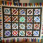
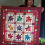
There is a lot of creativity happening in Maryland. No, I am not surprised.
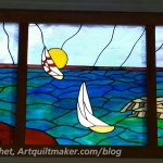
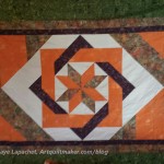
Rick’s Leaded Glass
Cathy’s Swoon
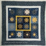
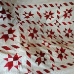
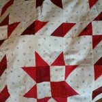
Cathy’s Embroidered Star Quilt
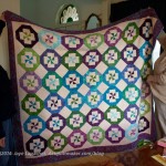
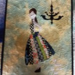
Torie’s Disappearing Pinwheels
Torie
Torie
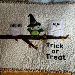
Tanesha
Tanesha
Tanesha
Tanesha
Tanesha
Tanesha
Tanesha
Tanesha
Tanesha
Tanesha
Torie – Fraternal Twins Quilt
Torie – Fraternal Twins Quilt
Torie
Navy Retirement Pillow
I have to say that I was really inspired by everything I saw. I love Tanesha’s mummy owls. I love the way Torie uses batiks. I really enjoy the way Rick has incorporated leaded glass panels into his house to make the house unique.
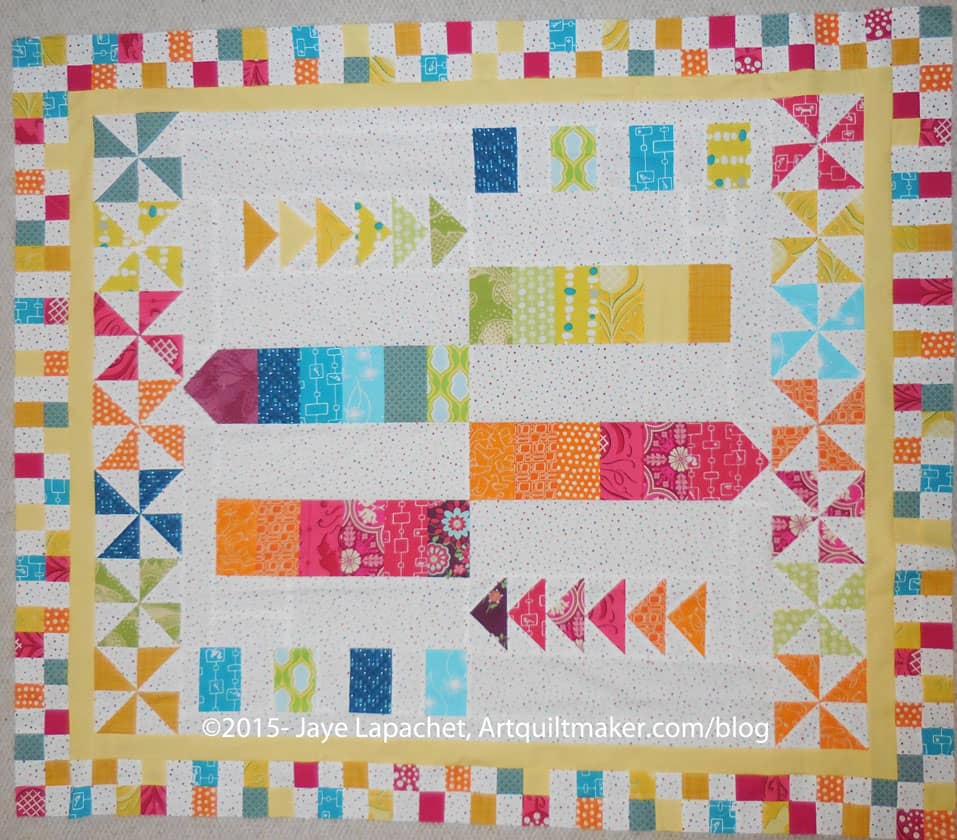
My round robin came back after a long vacation! It went through two moves of my various round robin-mates. Kathleen was able to work on it during the past few weeks and I just got it back yesterday!
It is so bright and cheerful! It is also completely unexpected. I guess the point of a round robin is to work with other people and see how they would work on your project.
I was expecting the rows I created to be continued out into the border, but instead Kathleen added these very cheerful pinwheels and the checkerboard border.
When I saw the pictures of the piece I thought it was very small, but the piece turns out to be quite large – well on its way to being a twin or larger quilt.
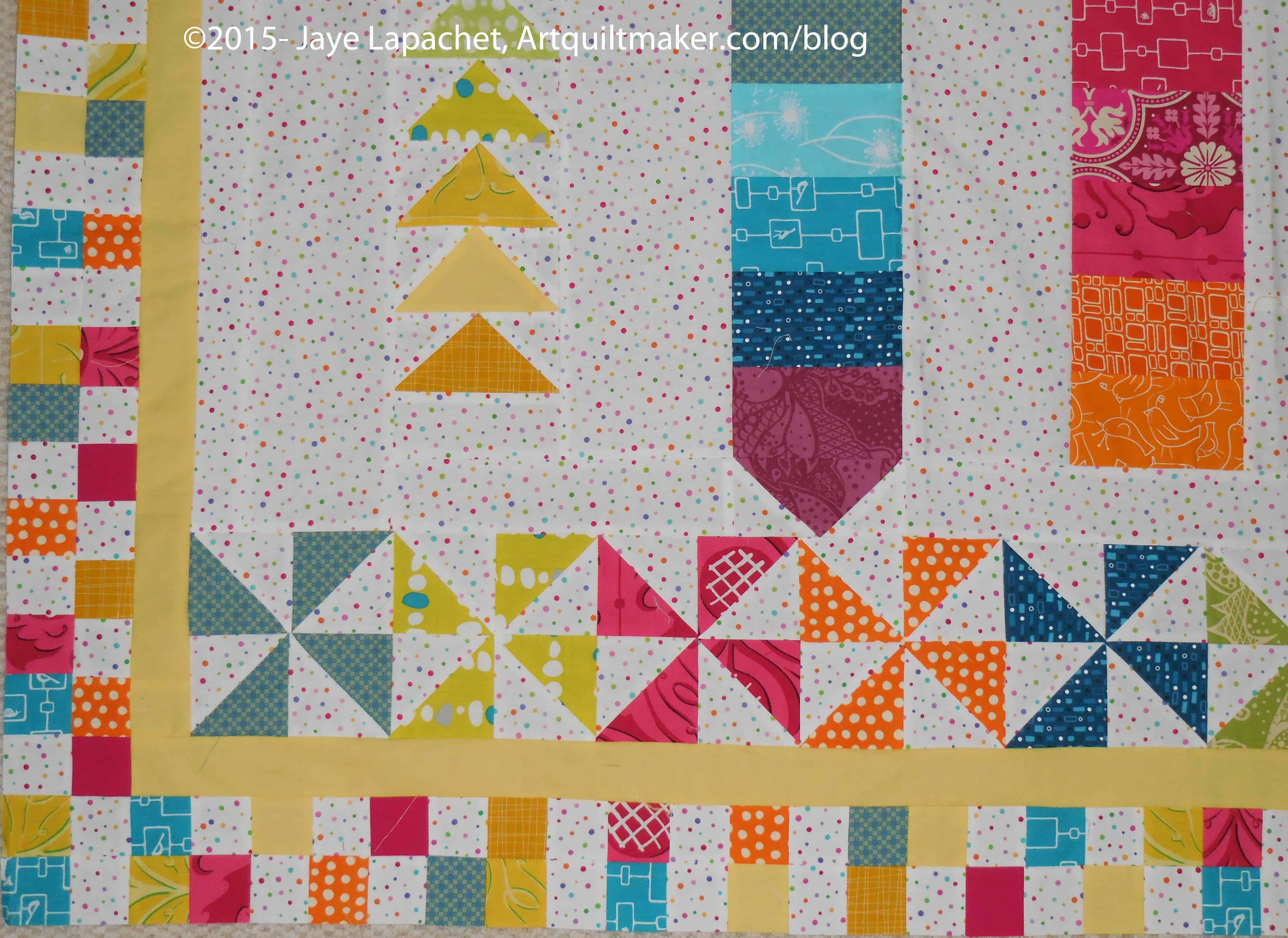
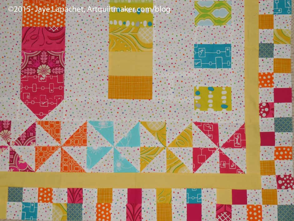
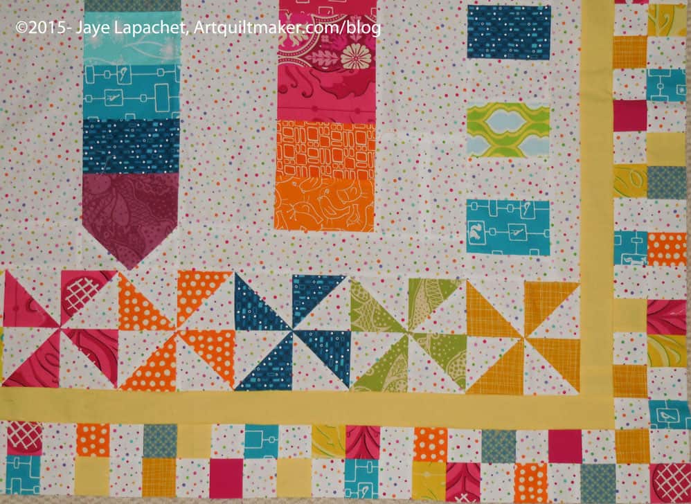
I think it needs more and Kelly has agreed to work on it. I think I have to look at the design thus far some more. I also need to see what else the design needs in case it comes back to me and I want to make it bigger. I think I would like others to work on it, in addition to Kelly, though, if I have the opportunity. We’ll see who I can round up.
BAMQG Round Robin detailBAMQG Round Robin detailBAMQG Round Robin detail
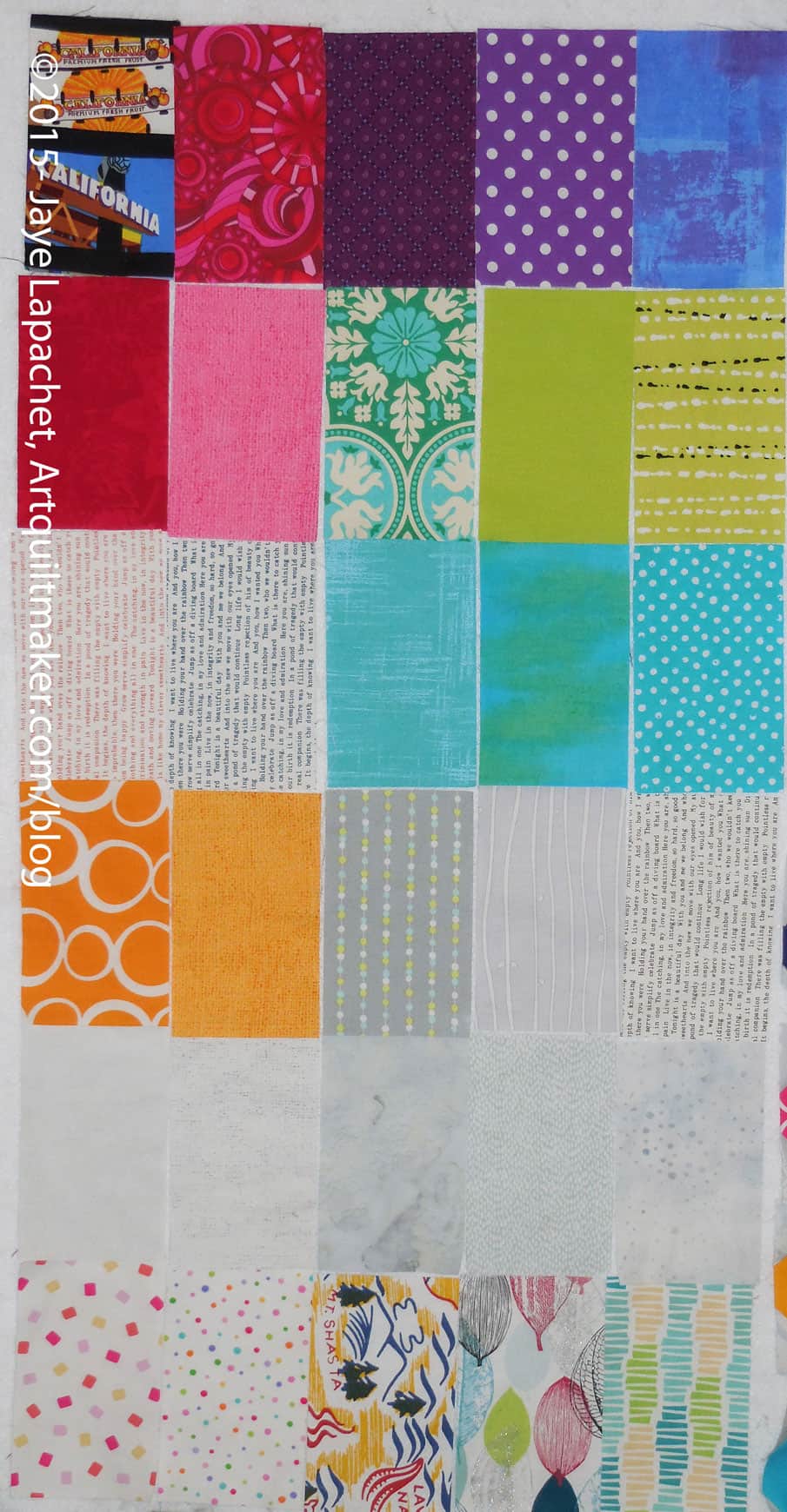
I think that my design wall looks exceptionally turquoise this week. There seems to be a sufficient amount of pink, too.
It looks really different from the last time I posted, partially because I have been sewing. Though different is probably the wrong word; it looks more – more of everything. More octagons, more Stepping Stones.
Same old four patches, though I have actually sewed a few.
More Fabric of the Year patches
A folded paper wreath that I made a long time ago. I really wish I remembered how to make it. Even extensive Googling didn’t help. If you know how to make one, let me know.
Somethings things conspire to seduce me into a project that was not in my plan. In this case, SIL #2 had me using her Accuquilt to cut the leftovers of the shirts into pieces she could use later. She asked me and I was happy to do the cutting, especially since she was sewing buttons on one of the shirts.
This task made me think about my ever increasing amount of scraps. Despite my active efforts to use them, they seem to multiply anyway.
Then Torie showed me Bonnie Hunter’s Rick Rack Nine Patch and told me how she was doing leaders and enders, making the 9 patches that would end up as a Rick Rack Nine Patch quilt. Hhmm.
I’d have to cut up a lot of scraps, but I am thinking about doing it anyway, partially due to my overfull scrap drawers. I have other leaders and enders projects (can you say Black & Grey Teenaged Boy Quilt? What about Octagon Nine Patch?), but somehow using the Accuquilt and really cutting up scraps appeals to me right now.
While at my SIL’s I looked through some quilt magazines I brought with me for her. We looked through the magazines and discussed the various projects. I had looked through the magazines before, but looking through them with my SIL made me see them differently.
I actually like looking through magazines with almost any other quiltmakers. I get a different perspective on the project as I talk with another person.
Pillows from Magazine
In the magazine, I caught a glimpse of some pillows. These were projects made from leftover HSTs. One had a very interesting pinwheel pillow.
The thing I like about that design is that it is simple, but interesting. The maker used at least four fabrics. It is hard to see the light blue in the corners so there could be more. The more fabrics keep the design simple, but make it interesting and not boring.
Brush Creek Foundation for the Arts offers artist residency programs on a 13000-acre Wyoming ranch.
eyebrow brush
Definition: “A brush is a tool with bristles, wire or other filaments, used for cleaning, groominghair, make up, painting, surface finishing and for many other purpose. It is one of the most basic and versatile tools known to mankind, and the average household may contain several dozen varieties. It generally consists of a handle or block to which filaments are affixed either parallel- or perpendicular-wise, depending on the way the brush is to be gripped during use. The material of both the block and bristles or filaments is chosen to withstand hazards of its application, such as corrosive chemicals, heat or abrasion.” (Wikipedia)
wire brush
brush with terror
toilet brush
brush your teeth
brush plant
Photoshop tool
watercolor brushes
brush it under the rug
blending brush
decorators’ brushes
brush with death
brush generators
shaving brushes
chip brush
Brush collection is provided to all City residential solid waste ratepayers.
brush pen
brush it aside
Selfie brush
Charles F. Brush High School
bottle brush plant
brush fonts
Brush News Tribune
Purdy Brush
paint brush cover
Post the direct URL (link) where your drawing, doodle, artwork is posted (e.g. your blog, Flickr) in the comments area of this post. I would really like to keep all the artwork together and provide a way for others to see your work and/or your blog.
We are also talking about this on Twitter. Use the hashtag #CPP
The Creative Prompt Project, also, has a Flickr group, which you can join to post your responses. I created this spot so those of you without blogs and websites would have a place to post your responses.
Brush varieties by function
For removal of material (cleaning & polishing)
The action of these brushes is mainly in the tip of each flexible bristle which dislodges particles of matter.
The action of these brushes is more akin to combing than brushing, that is they are used to straighten and untangle filaments. Certain varieties of hairbrush are however designed to brush the scalp itself free of material such as dead skin (dandruff) and to invigorate the skin of the scalp.
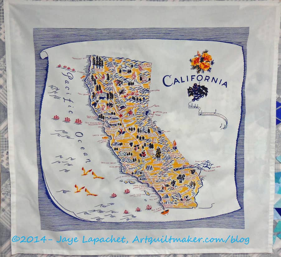
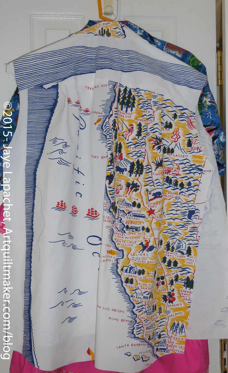
As I mentioned in the previous post, we made shirts for DH and BIL#3 (I have to give designations now since there are multiple BILs involved). As you have heard both are involved in the Native Sons of the Golden West. Over the course of a few months, I found two different types of California themed fabric and bought it. I knew I was heading to Maryland and SIL#2 is almost always game for the crazy ideas I have.
My idea was to make two shirts out of each fabric. We started with the tablecloths. They were available on eQuilter. Mrs. K saw them and emailed me about them. I bought the last three. As I said in the previous post from Sunday, we had to fussy cut in order to get the most out of the motifs on the fabric and to have enough fabric to make two shirts.
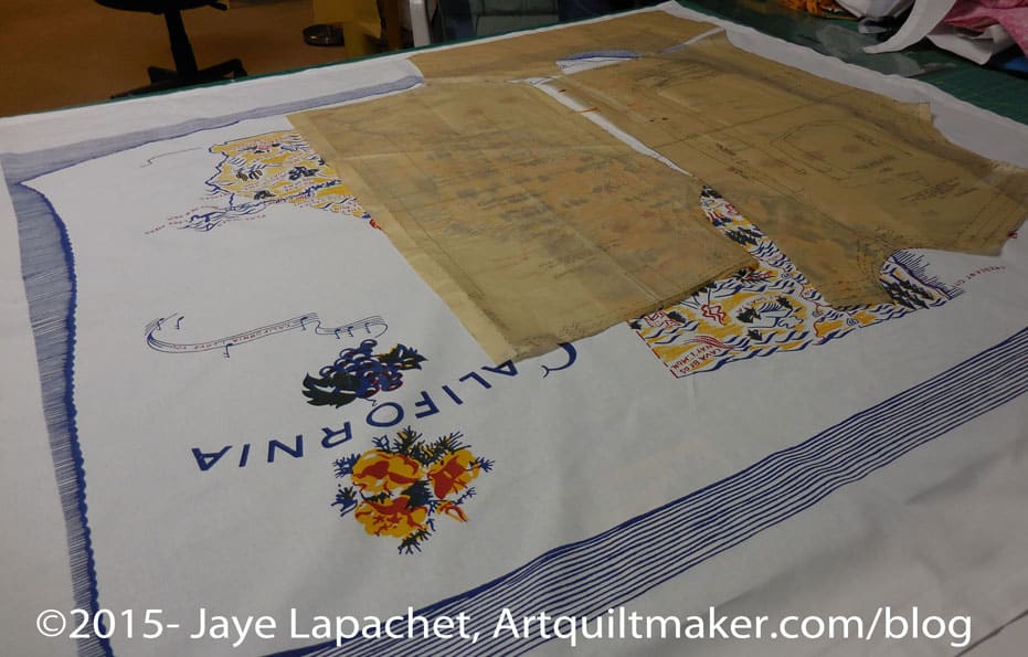
Pattern Layout
The first order of business was to lay out the pattern pieces on the tablecloths (yes, we washed them) and cut out the pieces. We tried to get the most pieces out of tablecloth #1 to ensure we had as much of the motifs on each shirt as we could and as we were nervous we wouldn’t have enough fabric.
While we were laying out the pattern pieces, a story appeared. Not a story with a murder and a romance, but a story about California. One of the shirts we decided tended towards water and boats and the other land. We couldn’t use all the motifs for each shirt. It was kind of a shame we couldn’t fit the California motif into both shirts. It just wouldn’t work. I kind of wish I had bought four tablecloths, but I know there were only three left.
Tablecloth in process
We decided not to do all of the shirts at the same time and we focused on the tablecloth shirts. We sewed and pressed and marked. By the time I went to my work conference, we had two shirts done in including the buttons.
We were pretty thrilled with the way the tablecloth shirts came out. Would we have wanted them to have more of the California map on them? Yes. Would we have preferred it if the lines around the border could have been made symmetrical? Yes. It wasn’t possible yet we are very happy with how they came out.
There were a lot of design challenges with these shirts, but I think that the design challenges made this project fun and the shirts unique.
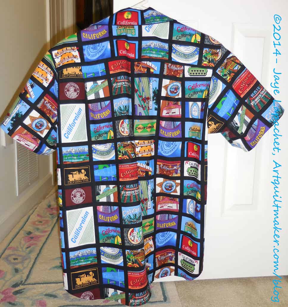
Black NSGW Shirt for Paul
SIL got me on the garment sewing bandwagon by making me sew the entire third shirt myself. She was there to guide and be my marking slave, but I did all the cutting and sewing.
We were able to finish that except for the buttons.
I came back on Saturday and we blew through the last shirt. I cut out the pattern (only one piece wrong this time) and then SIL took the lead and I took slave position again. We got it done, though we are both skeptical that it is a three hour shirt as the pattern advertises.
I have made a few garments before, but the patterns seem very complicated and I am not a confident garment maker. Working on Shirt #3 and alongside SIL on the others really helped boost my confidence. I won’t be making ballgowns anytime soon, but I might try an easy dress from a pattern I bought. Or remember that skirt?
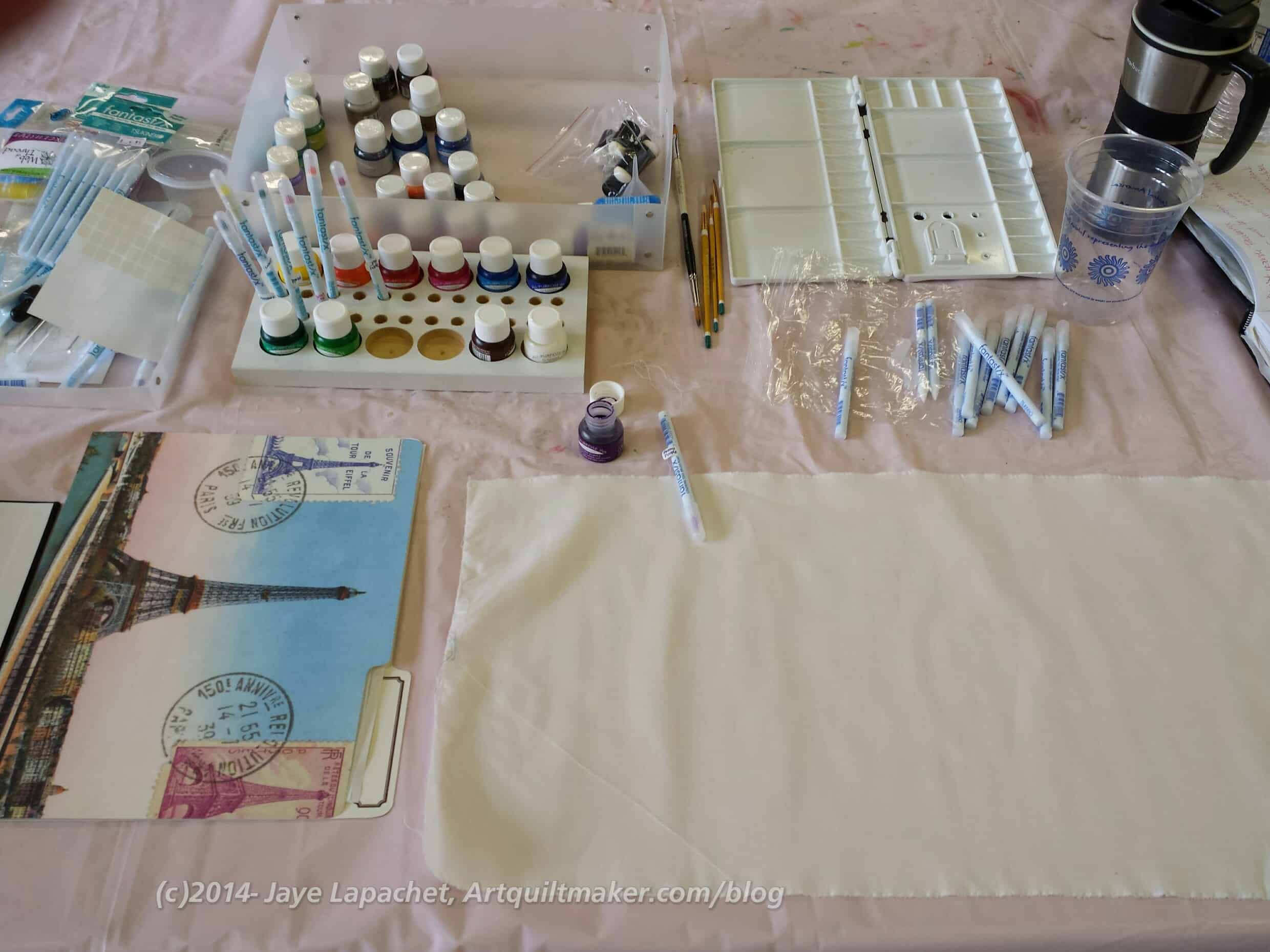
I have a lot of Tsukineko Inks. I love the idea of them. They don’t change the hand of the fabric. They purport to be permanent (have not Googled that nor do I have personal experience). They are not too messy and have fabulous colors.
Sadly, I have never had a lot of time to learn to use them or practice with them. Awhile ago, Nancy and I got together one time to try them out. I had fun and was inspired, but I haven’t really had a chance to work with them since. I love them so they have been on my mind.
It turns out that my class was with Judy Coates Perez. She is awesome and then I read my blog and found out that the first time I wrote about Tsukineko Inks had to do with Judy Coates Perez!
So, this was an EBHQ workshop and I signed up a few months ago knowing I would be on the East Coast around the same time. I signed up and made plans to be sure and be home by the time the class started.
Then I found out I was on the waiting list.
I was #8.
I had no chance of getting in. I was disappointed. Supremely disappointed.
What else could I do? I moved on. The inks stayed on the shelf.
Then I went on my trip. Practically as soon as I settled into the East Coast I got an email from the workshop coordinator saying I had gotten into the class and needed to confirm ASAP. I couldn’t believe that I, #8, had gotten into the class. That is practically a 50% dropout rate. I found out later that the dropout number was the most people who had ever dropped out of a workshop in recent memory and the most people on the waitlist who had ever gotten into a class.
I was really happy! I RSVPed ASAP and then panicked. Did I have the right colors? How could I know? I wasn’t at home to check. I panicked about it on and off until I got home. Finally, when I checked, I was completely astounded to find that I had all but one of the colors. I must have bought a ‘basics’ kit at some point. It didn’t even matter than I didn’t have that color once I was in the class.
Judy Coates Perez is an awesome teacher and I would take a class from her again in an instant. She is caring, giving and very easy going. She has a lot of extra colors (yes, I bought a few more) and supplies. Since I didn’t really have a chance to buy anything on the supply list, I scrounged a water cup from Peet’s when I got an extra cup of morning tea and bought the rest from her: brushes, etc. Fortunately, the supply list was short and sweet.
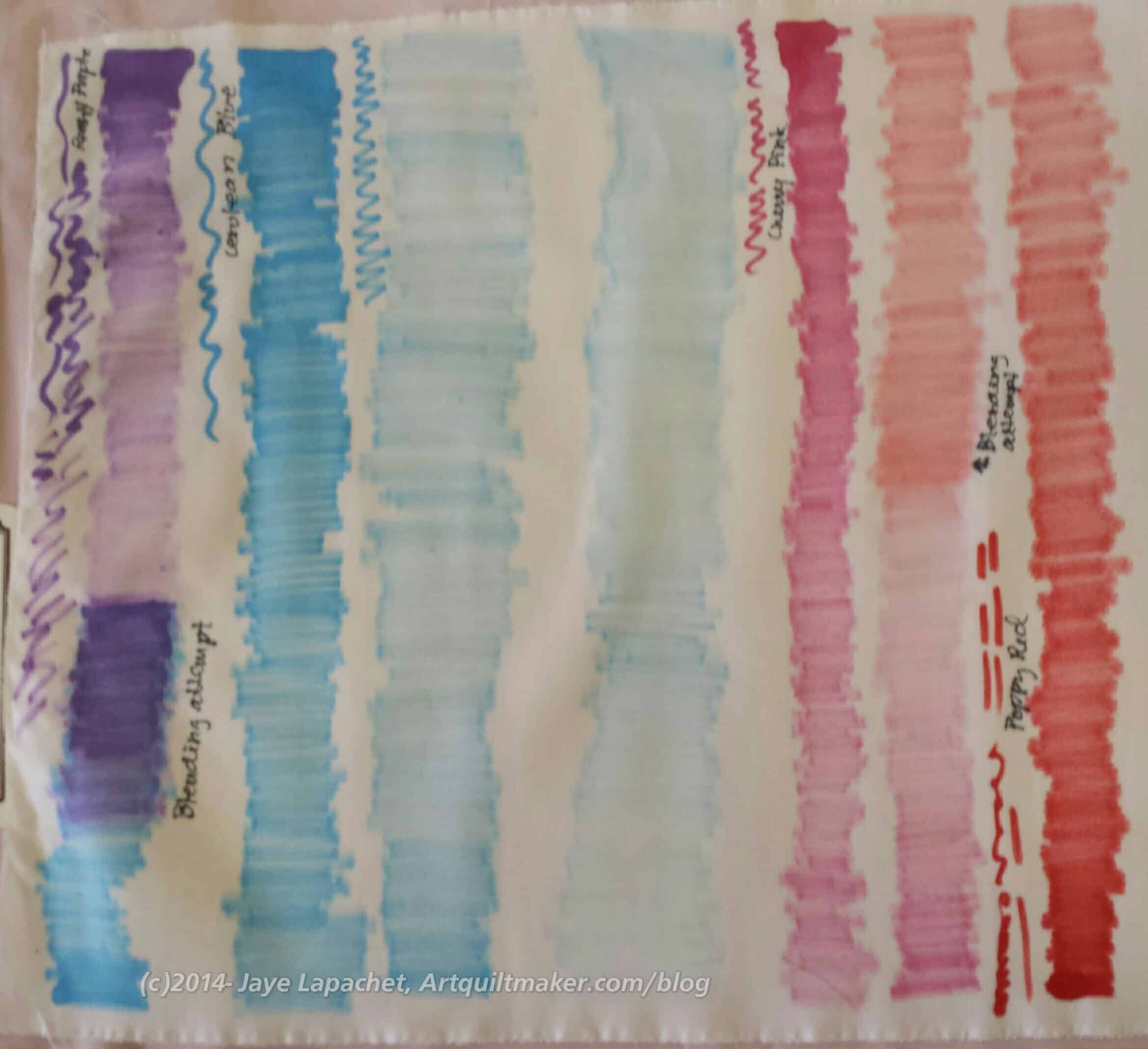
Blending
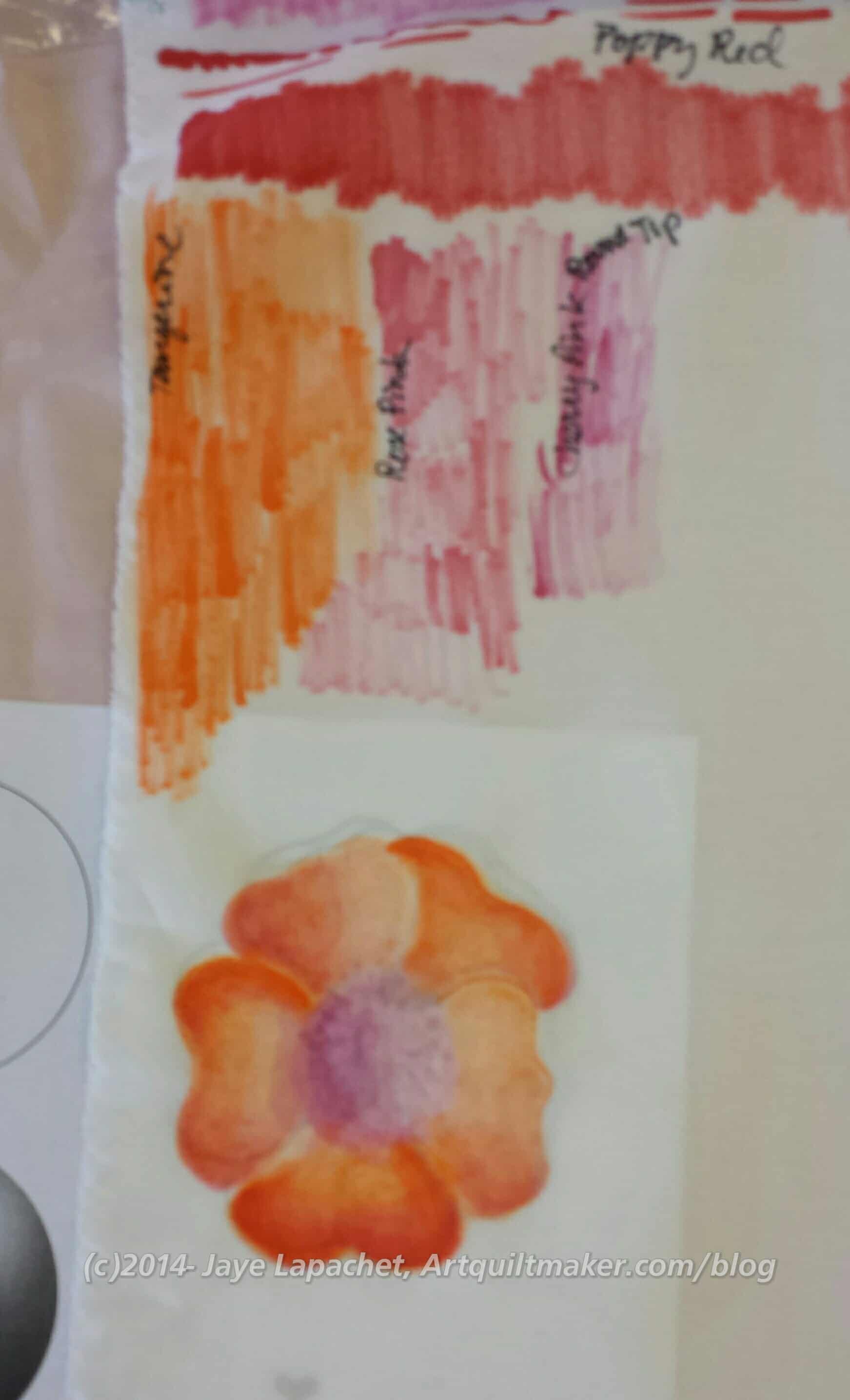
The first thing we did was work on getting used to the ink and blending. I wrote the colors down next to my practice pieces so I would know what I had done in the future.
It takes practice.
The technique requires a light touch. Having a light touch, I found is not my strength. I also found that, since I was determined to succeed, that I made an effort to calm down, slow down, be patient and realize that this technique was a commitment and not a sprint.
I really like the slow and careful way one has to apply the inks. It is soothing in a lot of ways.
Leaf and Flower
Once we started in on leaves and flowers, my rhythm was in full force and, though, my first leaf was a little heavy handed, but the practice helped and I got better. I needed to slow down and apply the ink more lightly. I tried to do that with the second leaf. It isn’t perfect, but it is much better.
The squiggly lines are me trying to get a smaller amount of ink of the applicator.
Tsukineko ink Flower, January 2015
I made a really nice flower. It isn’t as good as Judy’s, of course. For having only worked with Tsukineko inks for a few hours, I was pretty happy with my work. I can see shading and some shadows. I can also see how the blending changed the original tangerine I used for the first coat.
In the afternoon we switched to using paintbrushes. It is completely different and you make the inks more transparent and lighter in color using aloe vera gel (no additives).
I had to get used to a whole new technique, but I tried to take my patience with me into this new technique. The key with the paintbrushes is to have synthetic brushes (boar bristle for oils are too stiff and sable used for watercolors absorb too much liquid) and work in small spaces at a time.
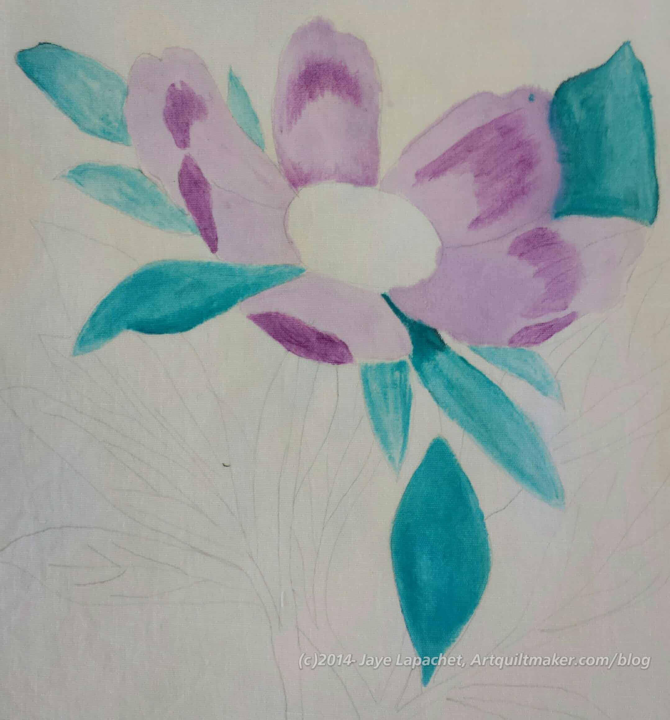
Tsukineko inks, Peony in progress
Judy had copies of botanical line drawings and I picked a peony. I didn’t want to get the snail! My neighbor did, however, and she did a really great job with it. Snails, though, YUCK!
While trying to make the ink looks smooth and even, I was also practicing managing the amount of ink I was using. I got better as I went along.
I could tell other people were getting frustrated with the technique and the inks as the noise level grew as people stood up and started to chat. I just sat and worked away at my little spaces on my Peony.
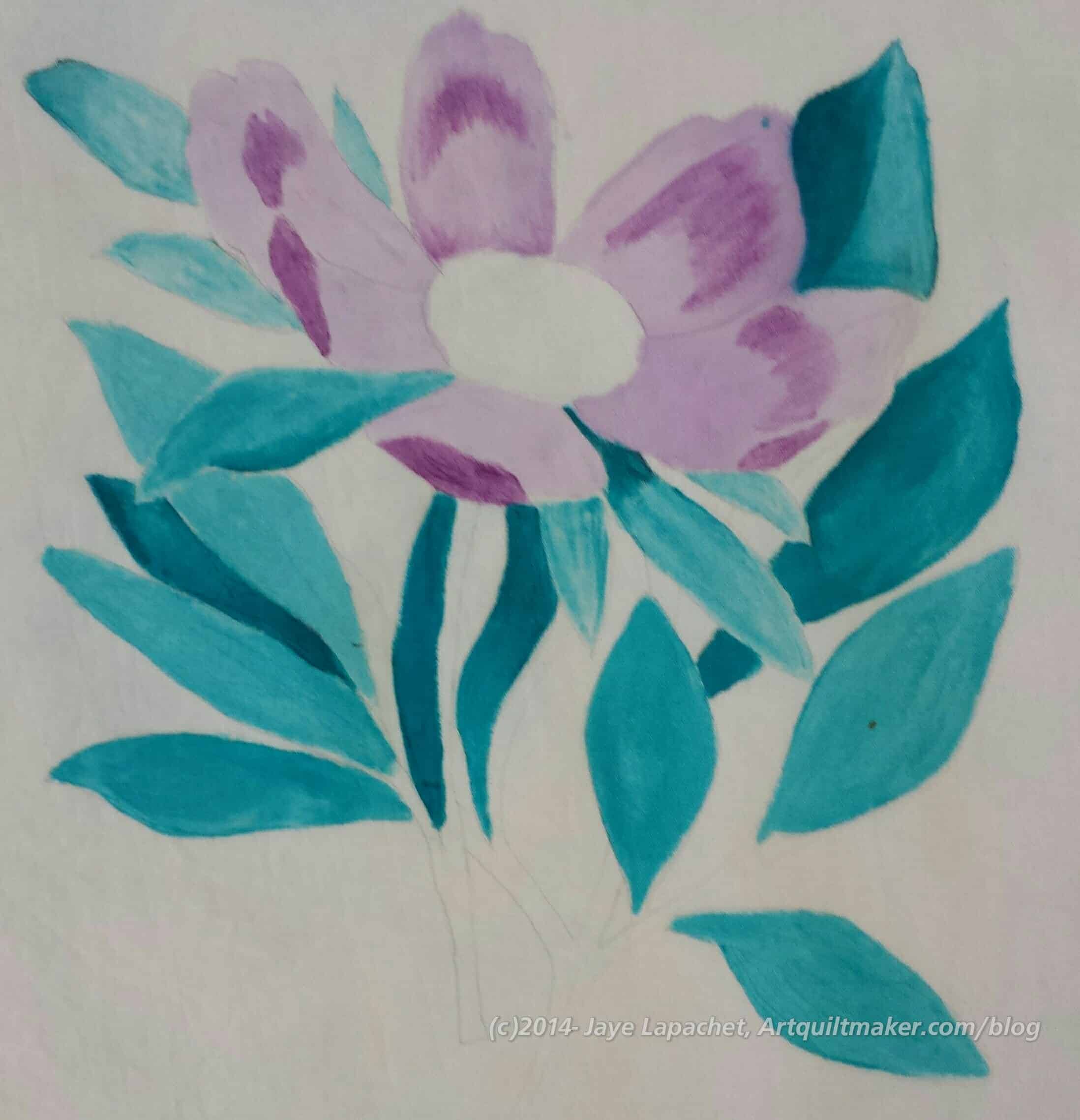
Tsukineko inks, Peony in progress 2
I used Orchid Odyssey for the petals, Thistle for the shadows on the petals and Tropical Lagoon for the leaves. I wanted to something a little different in terms of color and to try out some of my other inks.
Way too early they chivvied us along and got us to pay our bills and clean up our areas. I didn’t finish, but I am pleased with my progress.
The inks get heat set and are permanent when they dry. I learned in this particular exercise to heat set areas once I am happy with them.
I am trying to think of a way to use these inks in my work. I can’t think of anything at the moment, but will keep thinking as I want to use them.
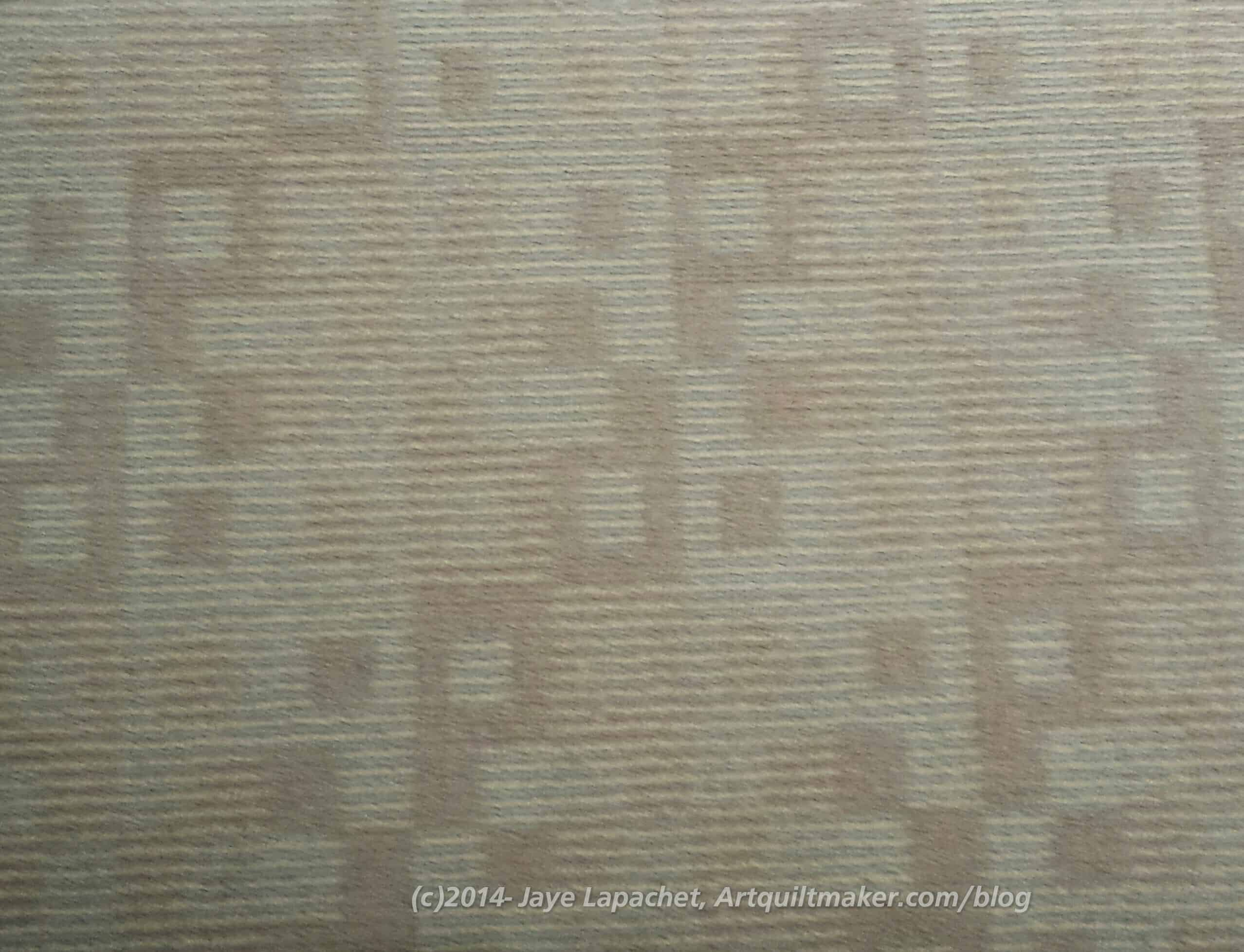
During my recent trip to the East Coast, I stayed in a hotel while attending a work meeting. I saw the carpet and thought it would make a great quilt, recolored, of course.
I like the simple design.
There is interest even though the design includes just squares, using different sized squares and subtle changes in “color.”**
I can see this design with a solid background and a variety of bright colored something fabrics for the squares. Prints or solids would both work. I was thinking about it, designing this in my head and then I saw….
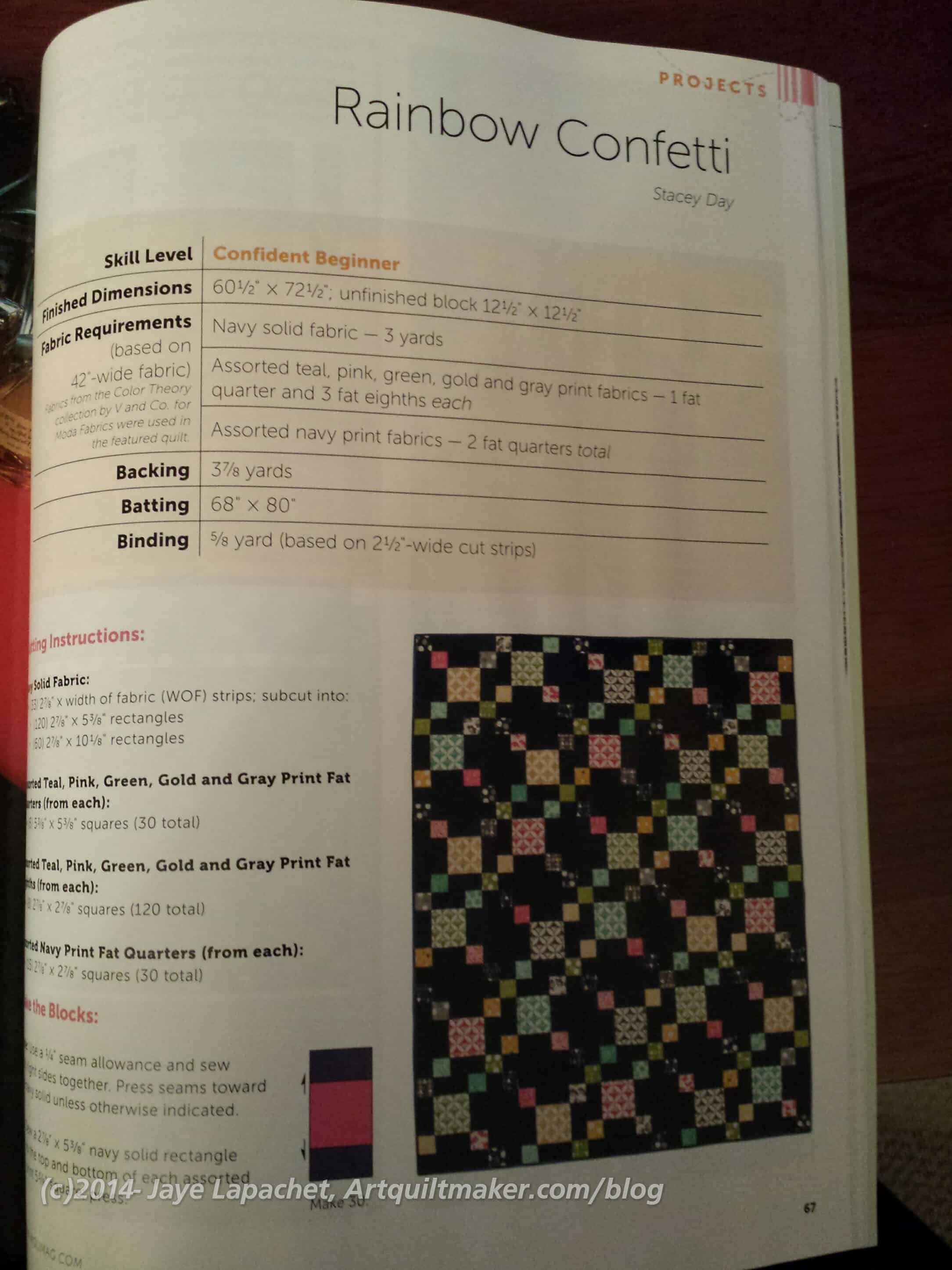
Modern Quilts, Winter 2015
almost the exact same design in Modern Quilts, the Winter 2015 issue. I couldn’t believe it.
Back to the drawing board.
**Nota bene: color in this instance is generous as I consider color to be something I can actually see. 😉