I thought about skipping this week, but realized if I put up a prompt this week and next week, we will have made it to 100. Have you done all 100? Also, I couldn’t get today’s word out of my mind. Not sure except perhaps I would like to act a little bit wicked today, since I have been so exceptionally good? Hhmm.
Post the direct URL (link) where your drawing, doodle, artwork is posted (e.g. your blog, Flickr) in the comments area of this post. I would really like to keep all the artwork together and provide a way for others to see your work and/or your blog.
The Creative Prompt Project, also, has a Flickr group, which you can join to post your responses. Are you already a member? I created this spot so those of you without blogs and websites would have a place to post your responses. Please join and look at all of the great artwork that people have posted. Post yours and get kudos!
“Wicked problem” is a phrase originally used in social planning to describe a problem that is difficult or impossible to solve because of incomplete, contradictory, and changing requirements that are often difficult to recognize. Moreover, because of complex interdependencies, the effort to solve one aspect of a wicked problem may reveal or create other problems. (Wikipedia)
Gregory Maguire
Definition from Merriam-Webster: 1: morally very bad :evil ; 2 a:fierce, vicious <a wicked dog> b: disposed to or marked by mischief :roguish <does wicked impersonations> ; 3 a: disgustingly unpleasant :vile <a wickedodor> b: causing or likely to cause harm, distress, or trouble <a wicked storm> ; 4: going beyond reasonable or predictable limits : of exceptional quality or degree <throws a wicked fastball> ; — wick·ed·lyadverb
Gifts and Wrapping Department
How many gift bags have you made? I saw a great video on making gift bags. Longtime readers know that I love fabric gift bags because:
they use great fabric
I am terrible wrapper
can be reused
little to no garbage/recycling on the holiday, birthday or anniversary
Deirdre has been sending me Colouricious videos and the most recent one is all about making making a gift bag. This is a really lovely pleated gift bag. You won’t be able to make a bunch of them before Christmas 2010, but this is a heads up for 2011. I think these bags would actually make nicer birthday or Mother’s Day bags. Please show me what you make!
I have had a whopping 4 sales in my Cafe Press shop. I am excited that people I don’t even know like my stuff enough to buy it. Look in the New Year for your thank you note cards!
Fabric
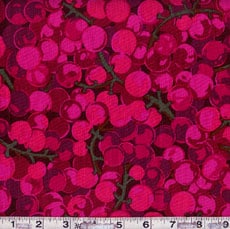
Westminster MN43 Plum
I think I said recently that I was going to try to keep my fabric purchases to a minimum through the end of the year so I could finish cutting all the diamonds for the FOTY 2010. I wanted to show someone some Martha Negley fabric I bought a few weeks ago, so I searched Google and found MY image there (I am ranking in Google. Cool, huh?). In the process, I saw other Martha Negley fabrics. I really like her designs, especially the one above. Perhaps I will just admire it.
I want to make a Quillow and need some nice fleece. The stuff at some local chains is just too pilly (is that a word?). I once bought a whole bunch of fleece for a bathrobe making jag from a place in Massachusetts that had the most wonderful feel. They had a fire and there was a big deal about how they kept paying their workers. I can’t remember the name of the place or if it is still in business. Where do you buy your fleece? Do you have a brand that doesn’t pill too much?
Replay Department
I know that I wrote about this tip before, but I really think it is a good tip. Also, questions about it have come up. I thought I would do a replay, not to bore you, but to encourage you to bite the bullet and set up a feed. ResearchBuzz is an electronic newsletter I read for work. One day, I was pleased to find an article that would allow me to keep a steady stream of quilts coming to my blog reader.
After creating the link above (by changing the tags-everything after the = sign with terms separated by commas- at the end to suit your needs), paste this URL into your Bloglines or Newsgator or Google or whatever reader. The feed will send you back search results showing the gorgeous quilts that have been added to Flickr. I put the above search into my Google Reader and was immediately provided with several fresh looking quilts for my viewing pleasure.
I also wanted to see what was new and exciting in the basket quilt arena so I changed up the URL above to:
I retrieved a number of basket quilts, but also some mishits. They were pretty mishits, so I didn’t mind much. You can also cut and paste the feeds I have created above into your reader.
This TedTalk is about offices, but I am curious to know how it applies to your quilt work? Jason Fried, the speaker, talks, at one point, about creativity and creative people.
Rice Freeman-Zachery is doing a workshop sort of thing in 2011 using her book Creative Time & Space. Take a look at the blog post on Goodreads. She has a worksheet you can download. You may have to sign up for Goodreads to read the post.
Chronicle Books
We didn’t win the big list of books I made. I did get some new visitors and I hope they come back. I never win the blog giveaways. I did win a book once from Quiltin’ Jenny and that was fun. Perhaps I got a taste of that joy and just want more. I have plenty and will be happy with what I have. -)
I shouldn’t buy stuff right before Christmas, but I did anyway. Nobody is going to buy this stuff for me anyway. I went to Joann to get a gift (well, look for one that I didn’t find) and decided to get serious about finishing the FOTY.
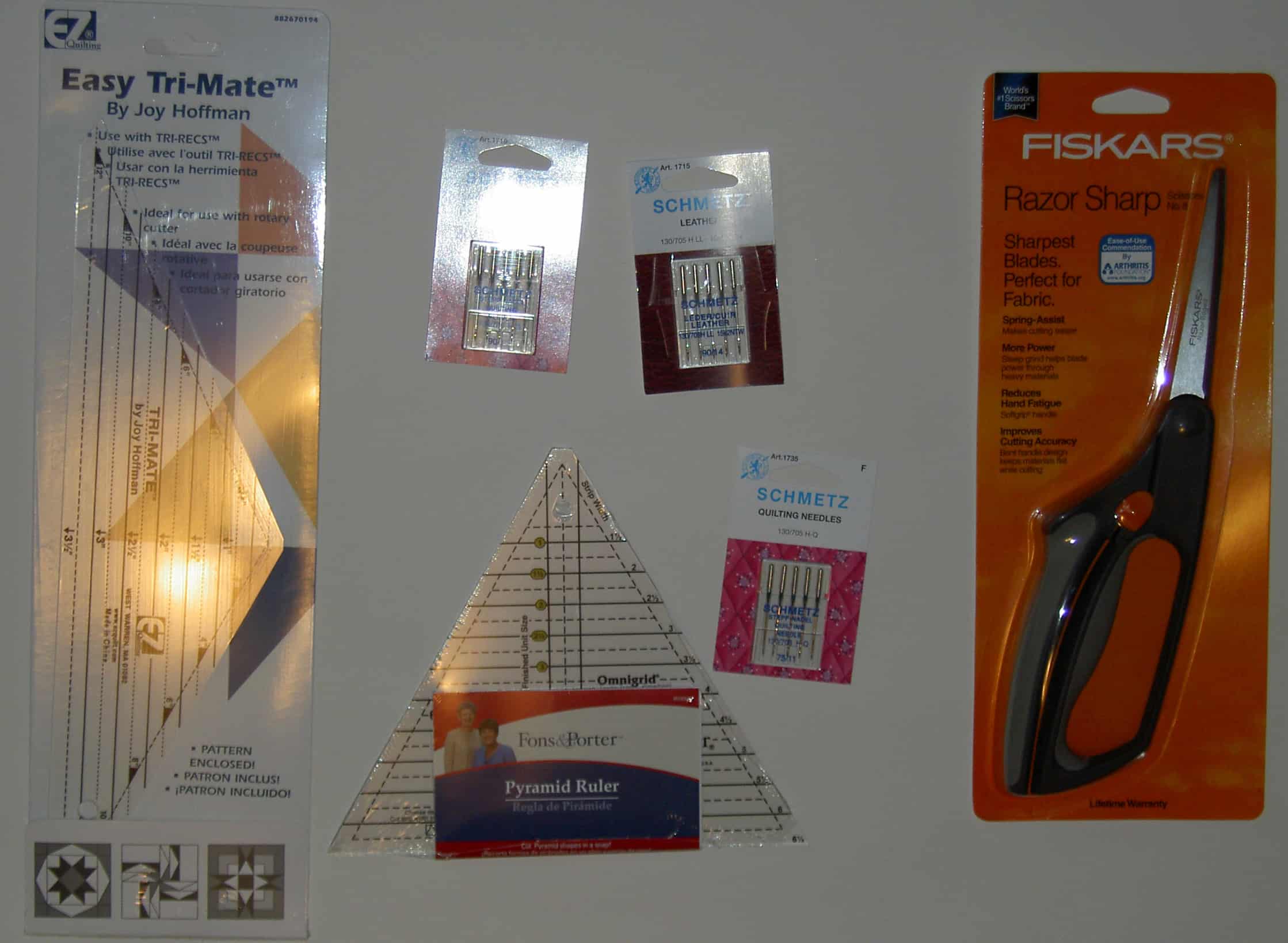
I am trying to finish the journal I have going. I only have a few pages left and they seem to be magically expanding the more I write. I have been writing a lot of lists. One of the lists I wrote was things I wanted to accomplish during my vacation. On that list was to decide on the border fabric for the Fabric of the Year quilt for 2010 and get busy cutting those pieces. I know I didn’t need a special ruler when I made the border for the Eye Spy, but I also remember that the triangle gymnastics I went through were a pain. I decided to buy the specialty rulers while at Joann. (Actually, I bough the side triangle ruler at the Granary when I was having my quilt appraised. More on that later.)
I also saw Fons & Porter using their Pyramid ruler. I haven’t tried it yet, but like it much better than the ruler set I looked so hard for in October. I like the lines. I am acknowledging that I might not like it after I try it.
I needed another pair of scissors as my Ginghers are too hard on my hands . I have been using them to cut out the Little Wallets. It is a good thing those wallets don’t take much to cut out, because my hands couldn’t handle much more. I have some bags in my future, thus the scissors.
I was also almost out of machine needles. I couldn’t remember what I normally use, so I just grabbed some. I also bought the leather needles, because I want try sewing the future journal signatures (like in the Red Journal) together and I know I will need a serious needle. It might not work, but I will try.
I have some cool handmade paper that has been hanging around and somehow my mind put all the pieces together and I will use some of that paper for my next journal.
I never used more than one coupon at Joann and they let me use on for every regularly priced item. I was shocked at how much I saved and felt a little guilty about it.
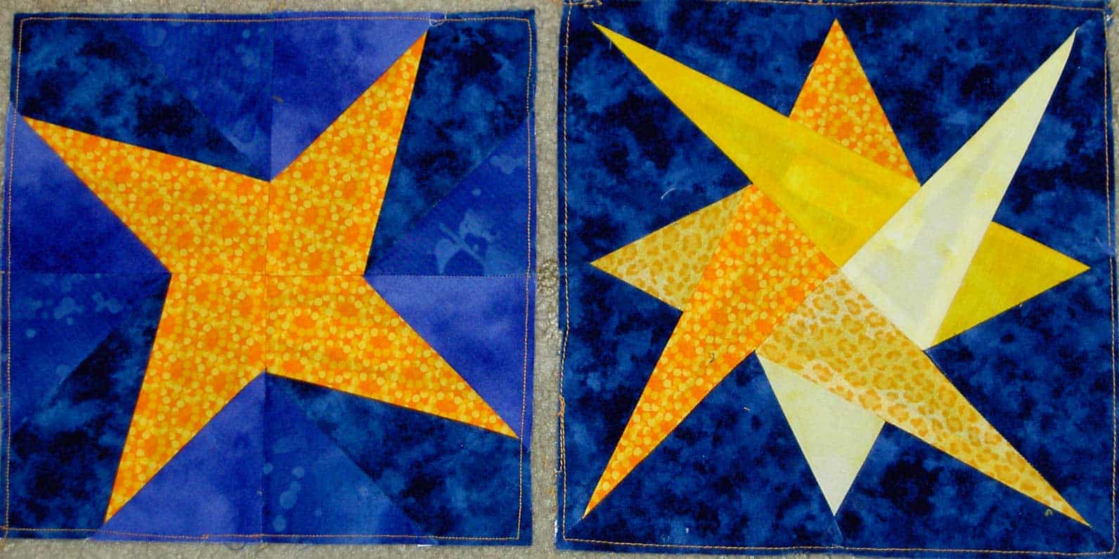
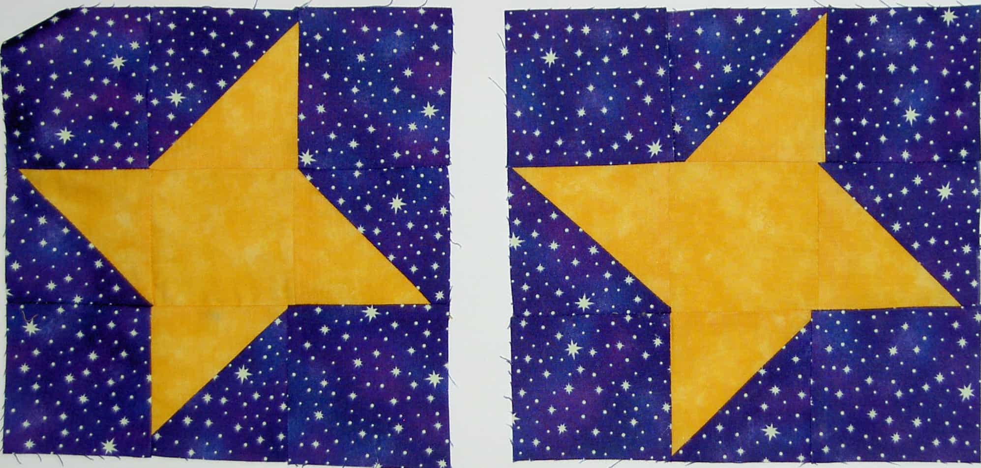
I received these blocks from SherriD yesterday. Aren’t they great? I love the combinations of goldy-yellows and blues she chose for the blocks. They glow.
Sherri told me that she tried a new technique to make the blocks, which is a great idea. It is nice to not have to commit to an entire quilt if you want to try something new.
If you would like to make blocks, too, here are the parameters:
All blocks are welcome!
Block background: dark blue
Block design: Yellow star (any pattern)
block size: 8? or less (we will work with any size)
remember to sign your block!
Deadline: TBA
Contact us through our blogs for mailing instructions. Thanks so much for your generosity!
Post the direct URL (link) where your drawing, doodle, artwork is posted (e.g. your blog, Flickr) in the comments area of this post. I would really like to keep all the artwork together and provide a way for others to see your work and/or your blog.
The Creative Prompt Project, also, has a Flickr group, which you can join to post your responses. Are you already a member? I created this spot so those of you without blogs and websites would have a place to post your responses. Please join and look at all of the great artwork that people have posted. Post yours and get kudos!
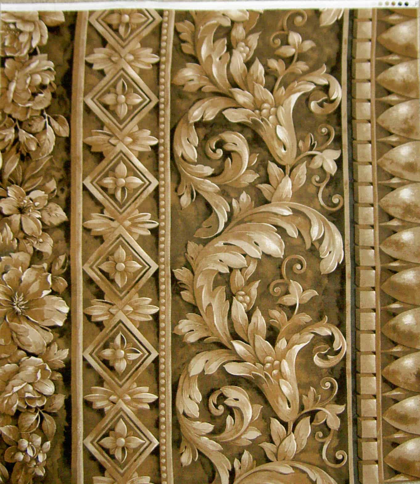
This fabric was included free when I ordered the Mexican food pillowcase fabric from Whichway Quilting. It is beige/taupe/tan (no info on the selvedge on my piece) so I wasn’t very excited about it. However, when I washed and pressed it, I noticed the incredible dimensionality. It made me think that this fabric would make a really cool journal cover or pencil roll. I only have a FQ, so the project would have to be small. Also, it isn’t as if I don’t already have a thousand projects on my to do list. We’ll see.
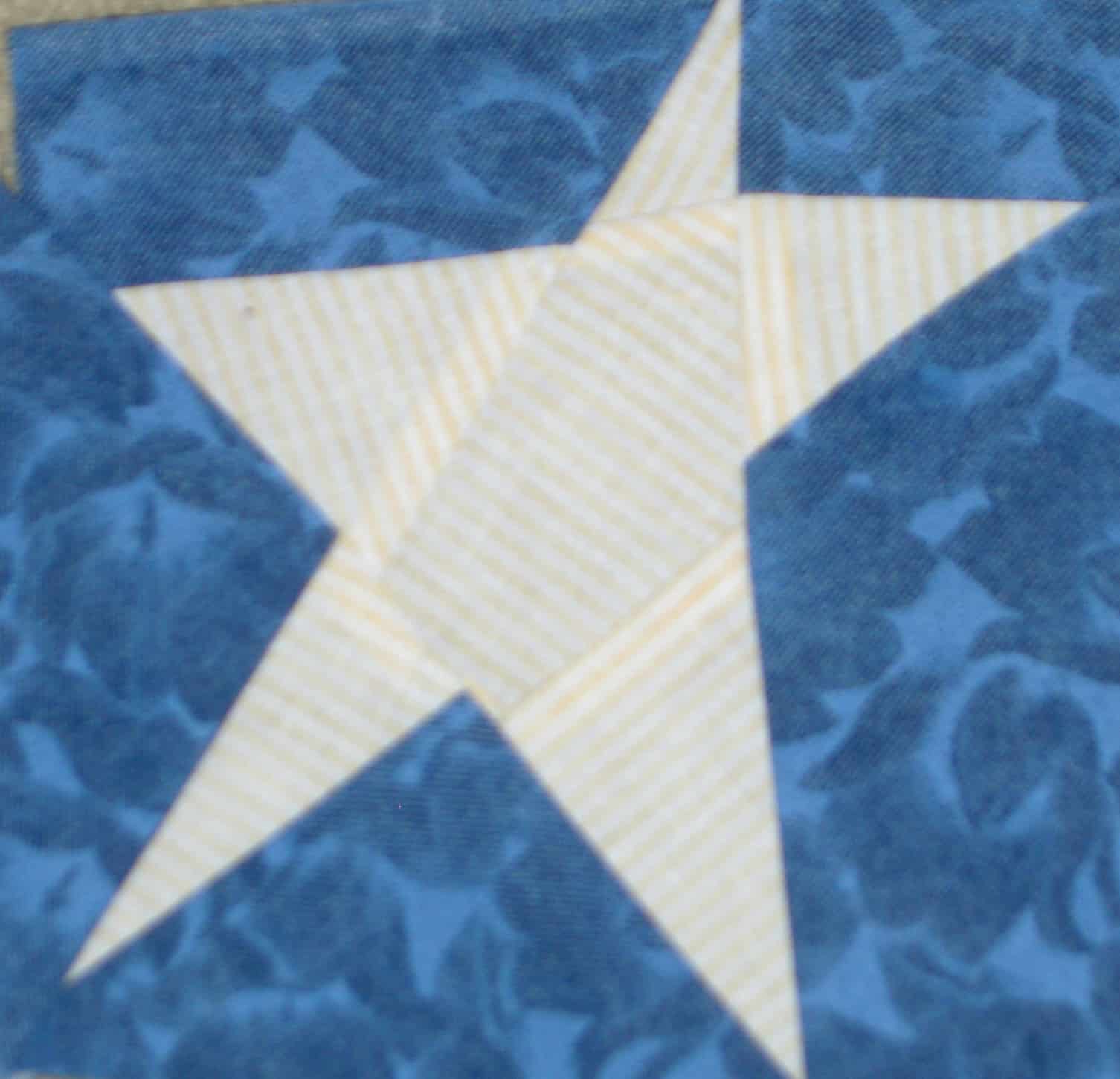
I mentioned that I went to a party on Sunday. Bron, a CQFAer was kind enough to give me two star blocks for the project. Bron is originally from New Zealand and is the leader of our little band. She keeps us on track at meetings. I was fortunate enough to see some of her work last Sunday. She does beautiful NZ imagery.
If you would like to make a block (or blocks), here are the parameters. All blocks are welcome!
Block background: dark blue
Block design: Yellow star (any pattern)
block size: 8? or less (we will work with any size)
remember to sign your block!
Contact us through our blogs for mailing instructions. Thanks so much for your generosity!
One of my medium nephews was over while his parents were gone and he decided he wanted to make a pillowcase.
The first step was to select fabrics. In the course of doing that, we pawed through my Christmas bag fabrics. I was reminded that I needed to get busy on some bags for 2010.
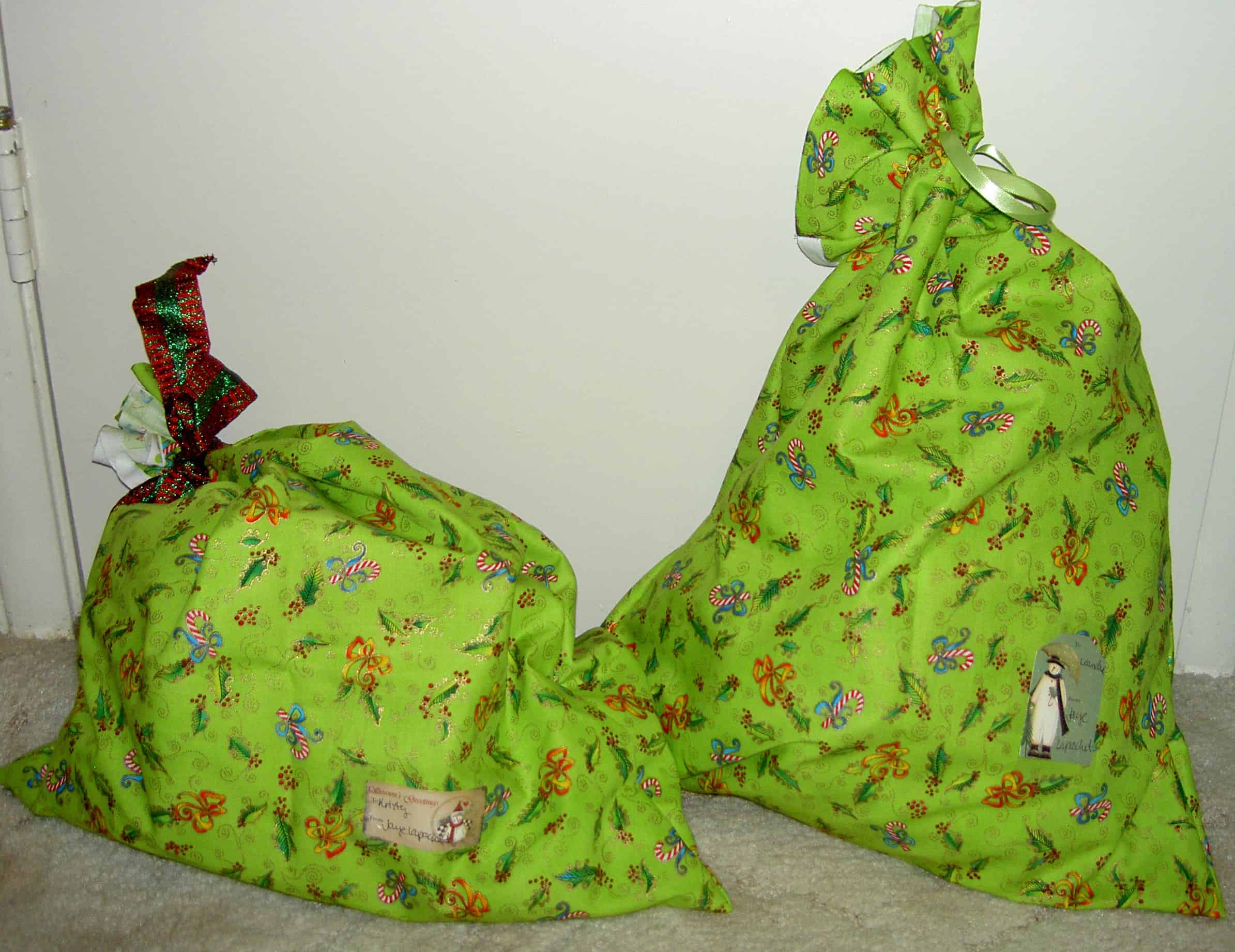
I have two gifts for two different people at work who have been especially helpful to me this year, so I decided to make bags for them. I don’t normally spread bags outside of the family, but the alternative would be to actually wrap the gifts with PAPER. Ugh! So, above are the bags. I used the French Seam method that I learned from the Twiddletails pillowcase pattern. I am not at all near making very many bags this year so far. That can always change, though, right?
This is the first of a few gifts that I made this season. I really missed making the quantity of gifts I made last year. It was fun, but I was way too busy this year. I’ll have to think about it and plan better for next year.
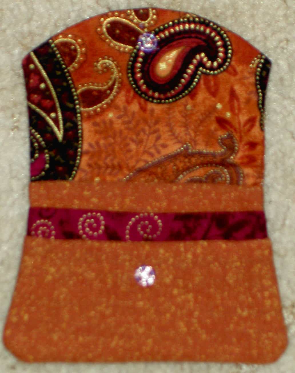
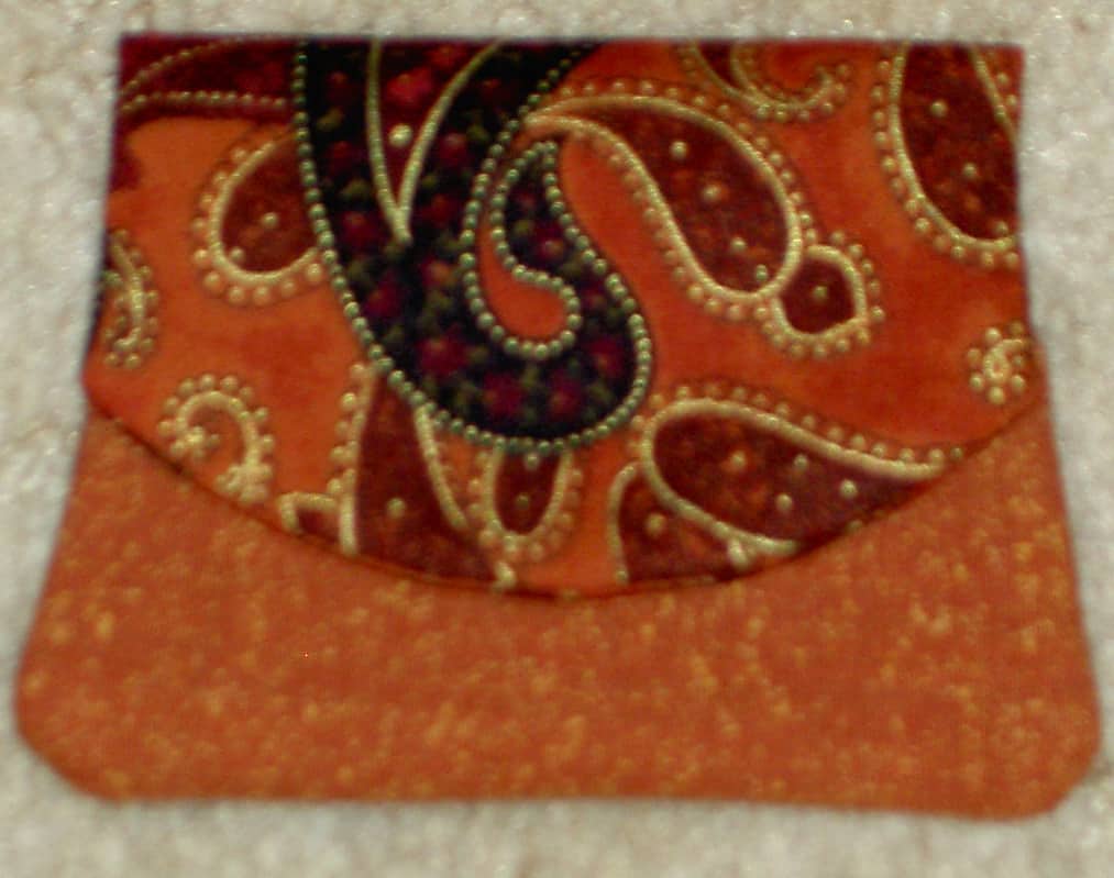
I made this Little Wallet as a hostess gift for a friend who hosted a CQFA meeting on Sunday. We went to her house and just did handwork and chatted. It was very pleasant and relaxing. She has some beautiful trees in her backyard that were sending showers of leaves down as I looked out the window. Gorgeous.
The afternoon made me think that I need to spend more time just sitting and stitching. Anyone need right of first refusal for artworks in exchange for a salary each year?
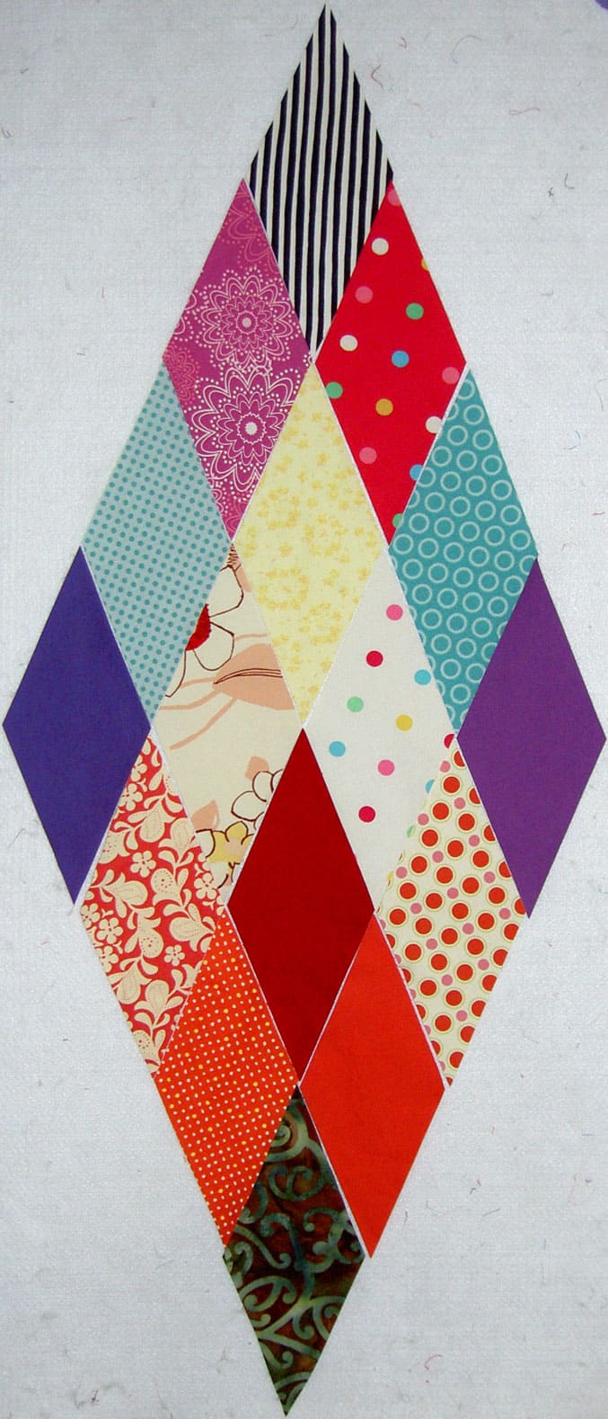
These diamonds could also be called Late Early December Diamonds. You pick and I’ll go along with it. I am nearing the end of my pressing and cutting. I don’t think I have anymore fabric enroute and I plan on keeping it that way. Famous last words, right?
That stripe at the top is my committment to making another Interlocking Triangles quilt. I have the Mixmasters Fizz and the P&B Fizz which are destined for that type of quilt as well. I worked on a design, but am thinking I may just use the same design I used for Spiky Stars. It is a good design and will look different with different fabrics. We’ll see.
Shall I make a New Year’s Resolution to that effect? I never make New Year’s Resolutions, so that would be new. We’ll see.
On September 10, 2010 a gas line exploded and leveled a neighborhood near where we live. It was big news at the time, but the world has moved on. In that neighborhood lived our cousin. His house was not destroyed, but was severely damaged. Also, the Young Man’s school friend lived there. His house was destroyed and he and his father ran for their lives.
Barsha's Star
My mom put out a call for blocks that we can make into quilts for these families and we received our first block today. One is promised and one is in the mail.
Barsha taught sewing in a local county for years before she retired. She is a gifted seamstress and I go to her when I need new pants. 😉 I first met her through a local guild. She is also a gifted quiltmaker, teacher and wearables artist. She has a wonderful, light studio and knows how to use a serger.
Thanks, Barsha!
Would you like to help? The parameters are:
Block backround: dark blue
Block design: Yellow star (any pattern)
block size: 8″ or less (we will work with any size)
remember to sign your block!
Contact us through our blogs for mailing instructions. Thanks so much for your generosity!
Skyee vodka (perhaps they don’t pronounce it the same way)
Sky.com
they sky opened
skydiving
light up the night sky
Post the direct URL (link) where your drawing, doodle, artwork is posted (e.g. your blog, Flickr) in the comments area of this post. I would really like to keep all the artwork together and provide a way for others to see your work and/or your blog.
The Creative Prompt Project, also, has a Flickr group, which you can join to post your responses. Are you already a member? I created this spot so those of you without blogs and websites would have a place to post your responses. Please join and look at all of the great artwork that people have posted. Post yours and get kudos!
As I mentioned, I opened a Cafe Press store around Thanksgiving (http://www.cafepress.com/Artquiltmaker). I was thrilled to check on the sales and had two sales after only two days. AWESOME! if you are reading this and you bought something, thanks! I know it doesn’t sound like a lot to you big time retail executives, but I am excited. Don’t worry! I am not going to harangue you with sales pitches all the time, but won’t you go take a look and buy?
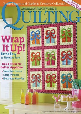
American Patchwork & Quilting Winter 2010
The Henry Glass Designer Holiday showcase of Project Goodness (or whatever it is called) just ended or is about to end. Linda Lum DeBono (Mark Lipinski’s friend) started out the first day with her blog post. She showed the picture above and I thought it was very like It’s a Merry & Bright Wrap, but much cuter. Is there another Christmas quilt in my future? I don’t know. I’ll buy the magazine, though. In general I found this blog hop confusing and gave up after a day or two. I did enjoy seeing the artists’ work.
Heather Muldur Peterson is also on the Project Hit Parade (or whatever it is called) and she has a great project in her blog post using her new fabric line called Artful Home. I like the way the stripes work in the piece. The colors are very vivid. She must have great light (or a special secret) for photographing. Her project is a dish passer, which I needed the other night. Perhaps I will make one. I assume I will have to make one for each of my baking dishes, so perhaps not.
I joined Creating the Hive when Lisa F of C&T Publishing invited me. I don’t do much there except repost my blog post and respond to comments. I was thrilled when my Red Journal post was featured last week! It makes me feel like all this writing is valuable! If you want an invitation, leave a comment and I will invite you. I think you can join without an invitation as well.
Last week I talked about the Bay Area Modern Quilt Guild meeting I attended. At that meeting, Adrianne brought a bag she had made. I really liked the bag and was thinking that I should buy the pattern. I thought I might have bought it already as the Grand Revival name rang a bell. I did a search in my blog to see if I had bought it and found that I had THOUGHT about buying that exact same bag pattern, but apparently didn’t. I wrote a blog post about it back in September. Perhaps that is a sign that I should actually buy the pattern, which I didn’t. Yes, I am still lamenting hte fact that I have so many bag patterns and haven’t made many fo them.
I did see a free bag pattern from Rebeka Lambert of Artsy Craft Babe, which might satisfy my urge for a new bag pattern. I really want to make some gifts for the holidays, but time is slipping and I am only wishing. We’ll see. Not having to wait for a pattern to arrive buys me time.
Somehow, in clicking around, I ended up at Kathy Loomis’ blog. She didn’t have a lot of pictures and sometimes I am too pressed for time to read a lot of words (I should remember that when I am going on and on, right?), but her post about taking a leap in art quilt imagery was interesting. I don’t know if I agree with her completely, but it was interesting to read some writing about going beyond the “bad, citing “clunky, obvious images” and “sappy, crappy ugly quilts or embroideries or puff-painted sweatshirts.” I think I got a glimpse of reaching beyond during the fabric exercise at the Bay Area Modern Quilt Guild meeting. I have been struggling with putting fabrics together and that exercise (which I am more and more in awe of as time goes by) really helped me. I don’t want to make representational quilts or quilts about AIDS or depression or the impending train wreck that is environmental disaster. I do want to reach beyond what I am doing now. I am not sure what that means quite yet, but since this quilt adventure is a process for me, I am sure I will reach and find it.
REACH BEYOND
I saw a feature story on the web about a grave in Massachusetts on Andi Stern’s blog with a really interesting carving of a cephalopod on it. Cthulhu was in the title of the story and I didn’t know what what it meant so I looked it up on Wikipedia and found some clarification on some other aspects of the story. Regardless, the image looks like a cheerful beast and I thought some child might like it on a quilt some day, so I saved the photo to my inspiration file.
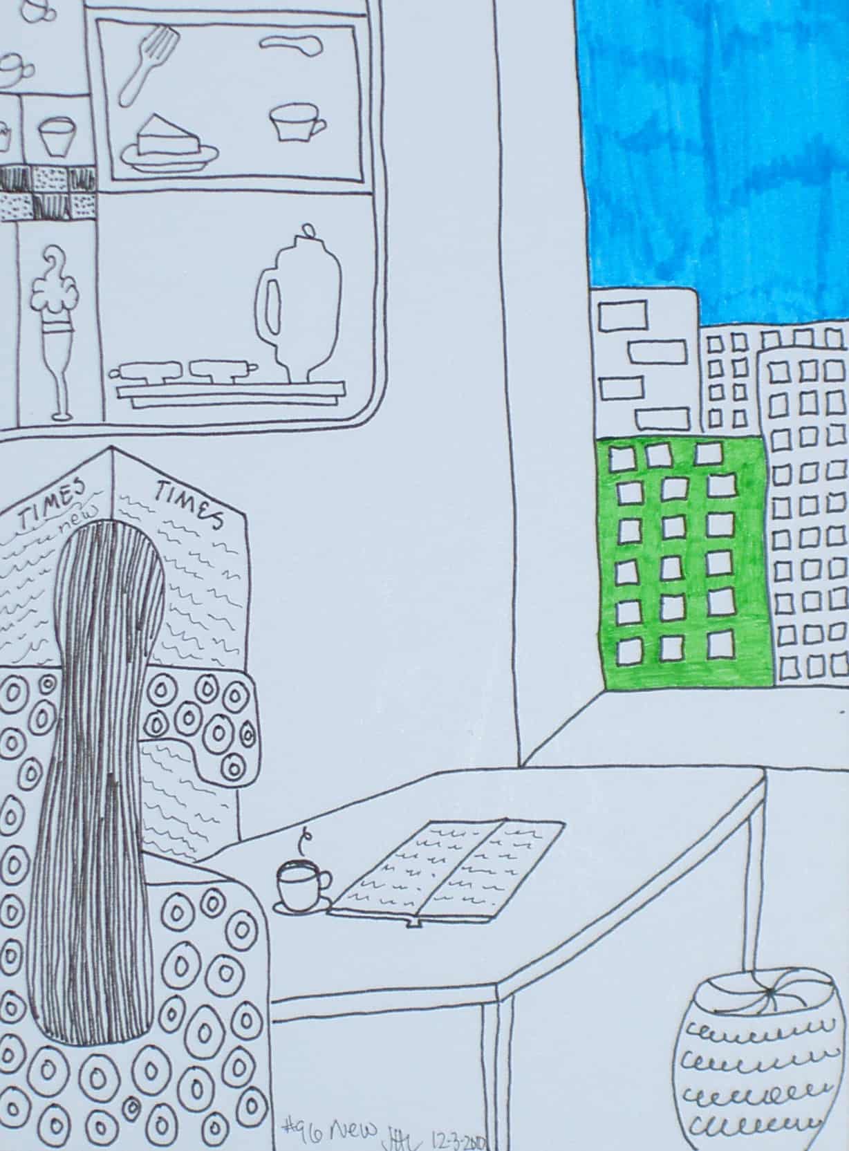
I spent several hours having a test at one of the labs at the hospital on Friday. It wasn’t invasive or painful, so I spent time reading, drawing, writing in my journal and staring at the wall.
I spent the time doing this Creative Prompt response. I am really happy to have gotten it done so quickly. Check out the original prompt.
In the 6th grade, I was in Mr. Sommer’s class. At some point he and my parents became friends and we used to go over to his house to swim. He also, at some point, married my 1st teacher, Ms. Selsky.
Anyway, Mr. Sommers was one of those innovative teachers. We did a project where we dissected the newspaper. We looked at shipping schedules, weather maps, etc. We learned a lot about the newspaper (FYI: that was WAAAAY before the Internet was a reality on my desk, so things have changed).
Some years ago, I found a tiny little “Converting Fractions to Decimals” chart in the newspaper. I was immediately transported back to the 6th grade.It is useful for quiltmaking periodically.
Decimal Equivalents Chart
Once more, I was transported back to Mr. Sommer’s class when I saw this chart. I don’t know if it is a good enough photo to print and paste up on the wall in my workroom, but it is useful anyway.