Field Day Zipper

Field Study Fabrics
Field Study Fabrics

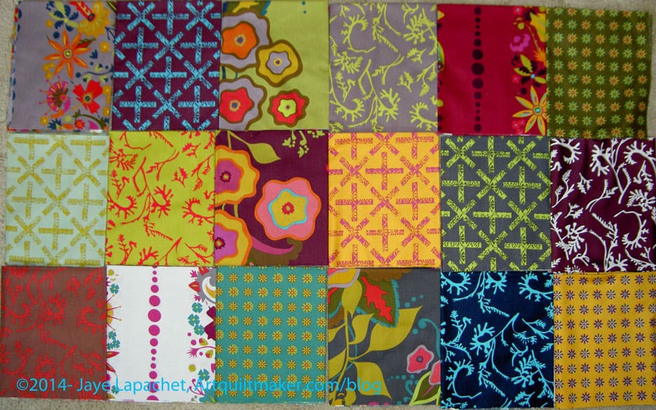
For some reason I became enamored with the Field Day print fabrics by Alison Glass. These are not my colors, they are somewhat muddy and have a flair, or feel,  of the turn of the 20th Century. This ‘feel’ makes it so odd that I actually want to work with them. There is something about them that appeals to me.

My favorite print is the dark blue  with the turquoise kelp-like print on top.

Shortly after receiving the fabrics, I came across a pattern I will use with these fabrics. It came from the Missouri Star Quilt Company and I found it in their Block! magazine (watch for a review soon). It isn’t a hard pattern, but there is something about it and the fabric that went together in my mind.

I washed the Field Day fabric last Friday, then started cutting 2.5″ strips on Saturday. I have about 10 strips cut. I need to cut them into 2.5″x5″ rectangles, but have only done that for one strip so far, because I still haven’t decided what to use as a background. Also, I still have about 10 FQs to cut strips from.

I thought about looking at the coordinating solids that various online shops suggest. I did that, but did not want to chose gold, chartreuse or deep garnety red-purple for the background. I want something lighter, brighter so the quilt doesn’t seem depressing.

I have the following background options:

IKEA large text print

I love this print, but think that the large letters will get lost.
Painter's Canvas in Vanilla
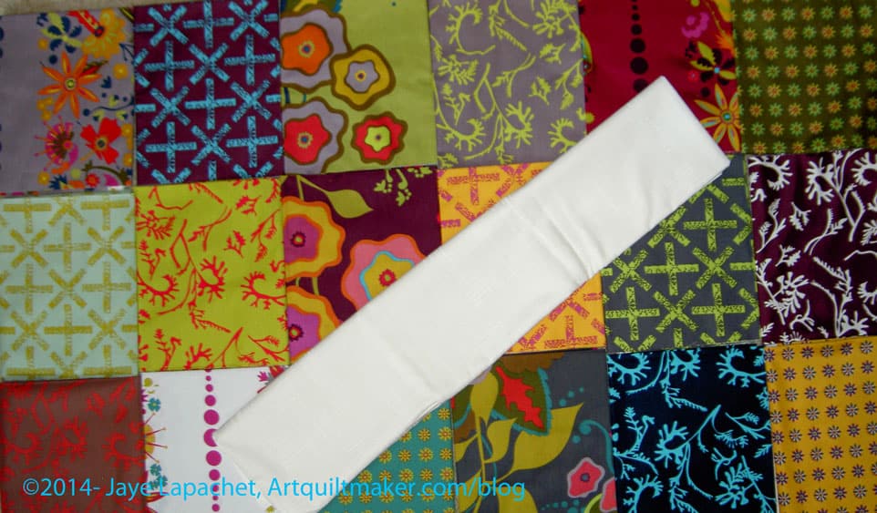
Painter’s Canvas in Vanilla

This is my favorite, because it brightens up the muddiness of some of the fabrics.

I also have a lot of grey.

Grey print from search

I would probably have to use a few different greys as I only have a yard of this one and I think I will need more. I don’t mind using different greys as it will add interest.

The funny thing is that after I started cutting the Field Day, I came across a friend who I think needs a quilt and this one might be perfect.
FOTY Red and Green

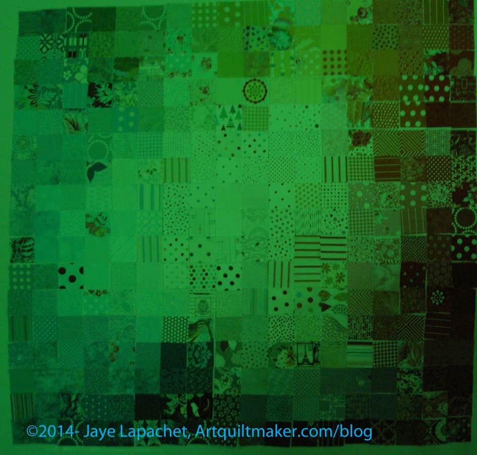
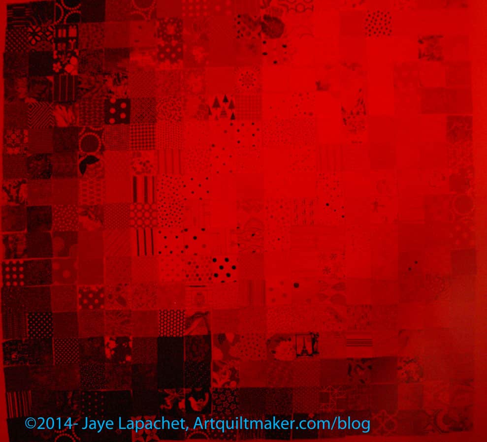
A week or so ago, I posted some black and white photos of the Fabric of the Year 2013 quilt. I also took photos through the red and green film of the Ultimate 3-in-1 tool. I am not sure they were very help, but they are interesting. I thought I would share those photos with you.

FOTY 2013 in Green
FOTY 2013 in Green

The green makes the entire quilt look a little sick and this might cure me from this color green for awhile.

It is helpful, though, as there are a couple of places that stick out that also stuck out in the black and white photos I posted previously. A few other things stick out that I need to look at in the real piece.

FOTY 2013 in Red
FOTY 2013 in Red

The red makes the colors extremely subtle.

One thing to remember is to look at the piece in real life. I mentioned it above, but it is an important point. These different views that I have shown are great tools to use to point out glaring problems. The key thing to remember is that they are tools. TOOLS. Your viewers won’t be looking at the quilt through a black and white, or green, or red filter when the quilt is on your wall. Be sure to use these tools to get an idea of what might not be working, then look at the real pieces in color before moving patches around.

FOTY 2013: a New View

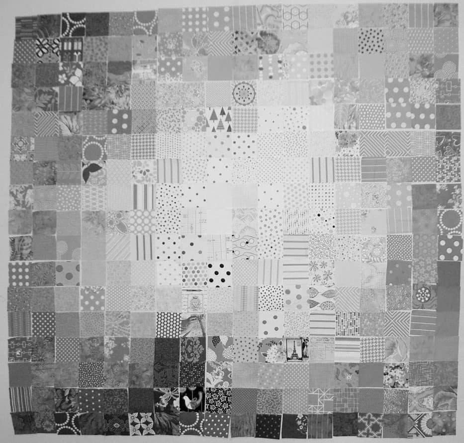
FOTY 2013 - Black & White
FOTY 2013 – Black & White

I am slowly, painfully, making my way through the FOTY 2013 piece. I am nearing the end of the arranging.

Nearing the end.

Not there yet.

I have been looking at the quilt project through the green and red films that come with the Ultimate 3-in-1 Color tool (if you don’t have this, click on the link and buy it RIGHT NOW**). It hasn’t been working out that well for me, so I decided to switch a photo to black and white to see areas that could use improvement. This was a great idea, because 1) it shows me that I am doing pretty well and 2) it shows me areas that I might be able to improve.

I am trying to stick to the idea that the darkest fabrics will go on the bottom because they have a heavier feeling.

I also want the like colors to be mostly together and there to be a smooth-ish gradation between colors.

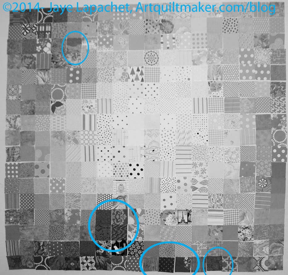
Annotated FOTY 2013
Annotated FOTY 2013

I thought I would share with you areas that jumped out at me and see what you think.

The areas I have indicated are too dark or too light for where they are currently placed OR do not make a smooth transition. I have not moved anything yet, because identifying a problem creates another problem: where to put the problem fabrics and what to put in their place.

This is where you have to look at the piece and at the colors to make sure that if you move it to the ‘obvious’ location, it doesn’t ruin the smooth transitions between colors.

Once I make the changes, I have to go start the process over.


**You should buy the Ultimate 3-in-1 color tool because it is a quick reference for color work. You can look at the relevant page see the complement, the analogous colors, triadic and split complementary. There is also a long list of colors that would work in a monochromatic quilt. It is a sampling of tints, shades and tones.

Previous Posts that Might be of Interest:


FOTY 2014 – Early July

FOTY 2014 - Early July
FOTY 2014 – Early July

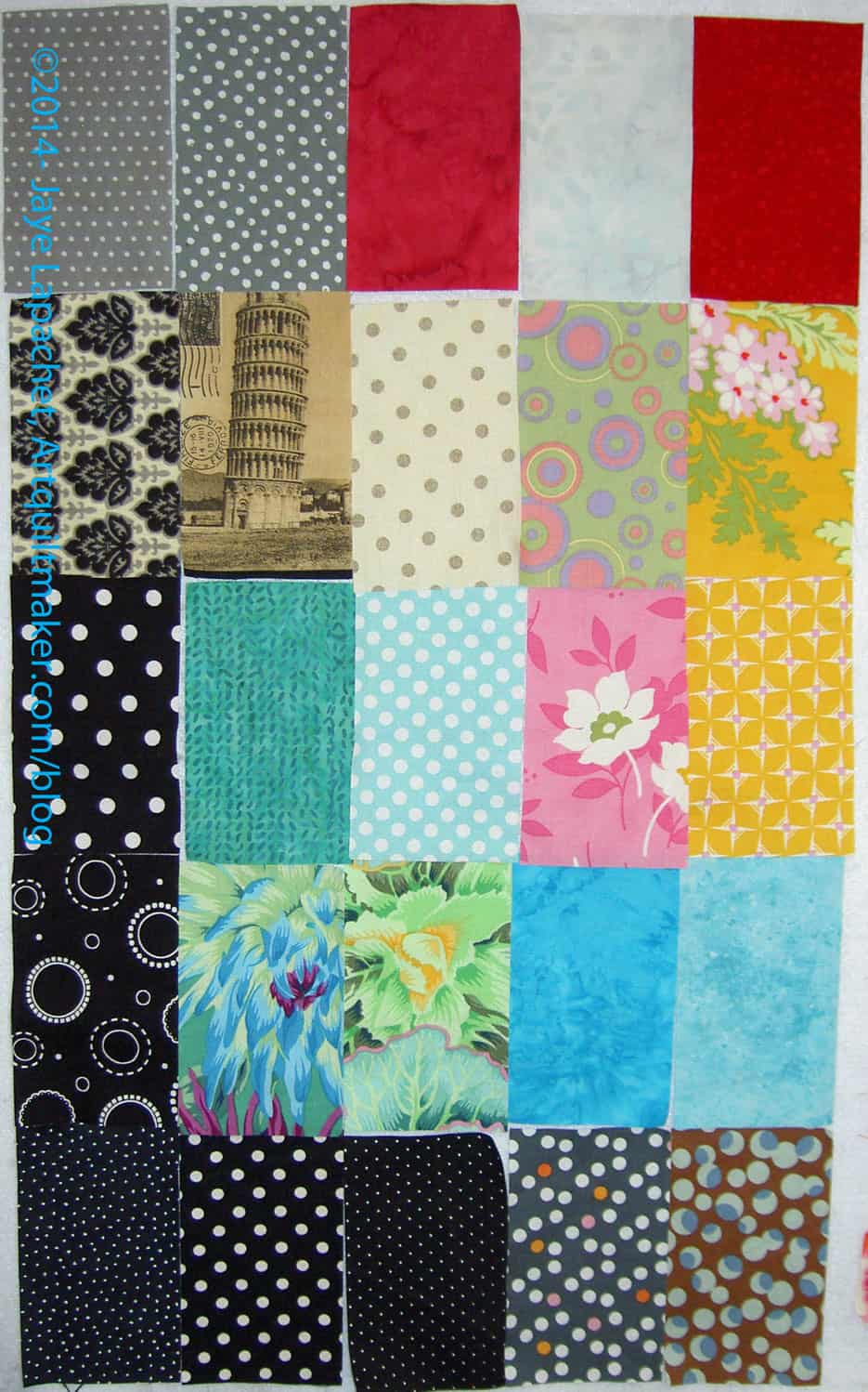
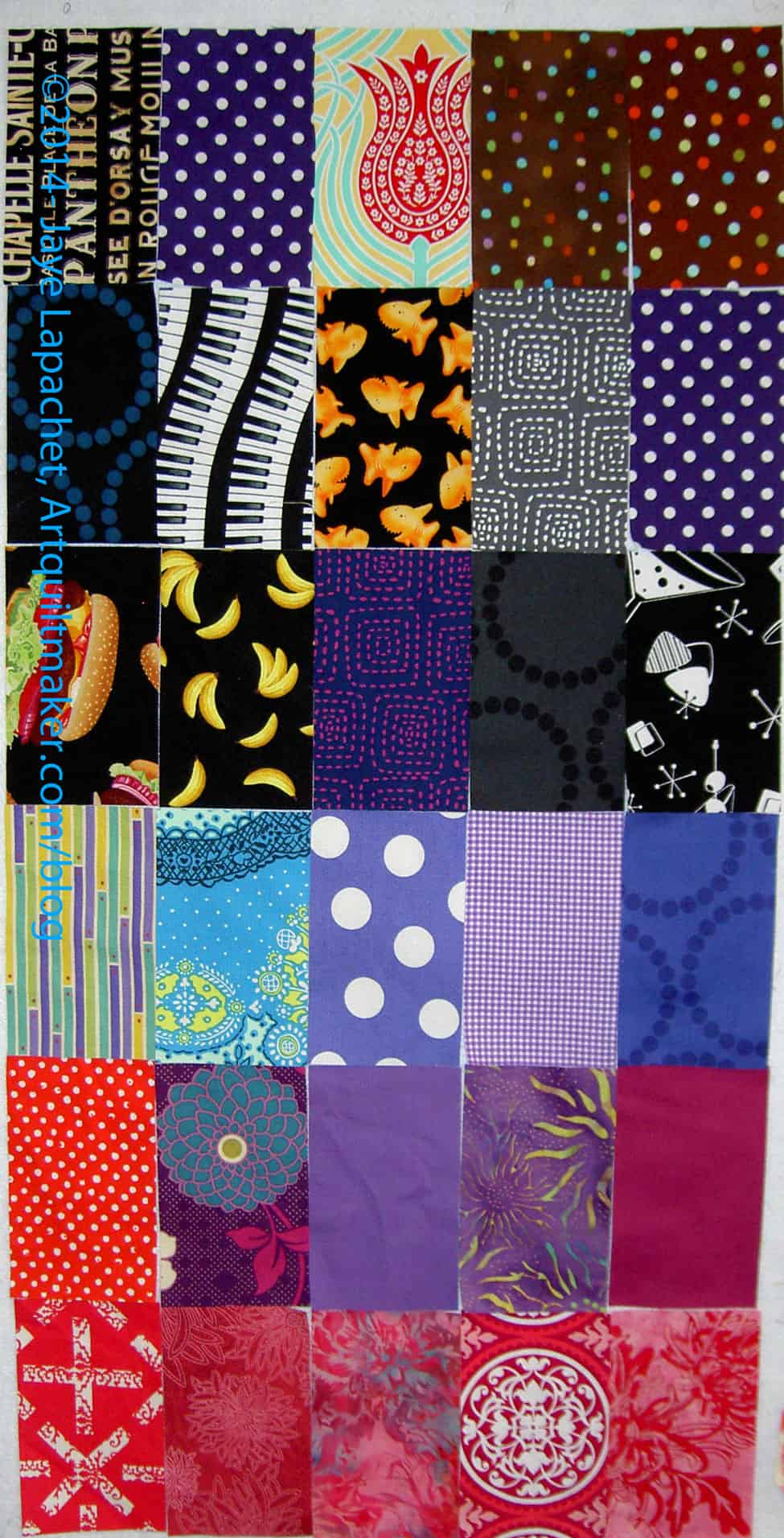
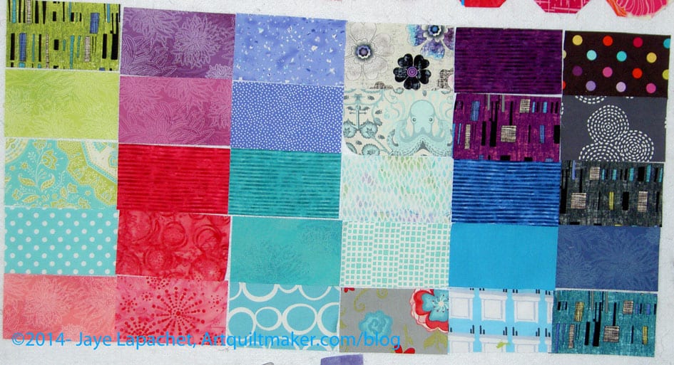
Here is another batch of rectangles for my FOTY 2014 piece.

Early July is a bit of a lie because all of these patches were cut in June. I picked the title based on the publish date and next year nobody will remember or care.

In between my travels, I did a load of blacks and greys. The colors you see are from projects I have been working on.

These are not in the same kind of color order that I normally use, but I was out of town for many days in June. You’ll see some of the fabrics I used in recent projects as well as a couple of loads of the Great Unwashed experiencing a bracing cleanliness for the first time. 😉

Half Moon Modern Possibilities

Sometime ago, I bought a bundle of Half Moon Modern fabrics. They are washed and pressed and awaiting inspiration. For all the reasons I have stated in the past, it is ridiculous to want to use them together, but I do anyway.

Lately, these fabrics have been on my mind. Though I want to do a difficult, time consuming project as my next start, I also want to get these fabrics out of the Fabric Closet and onto a bed or a wall.

https://www.threadbias.com/projects/summer-celebration

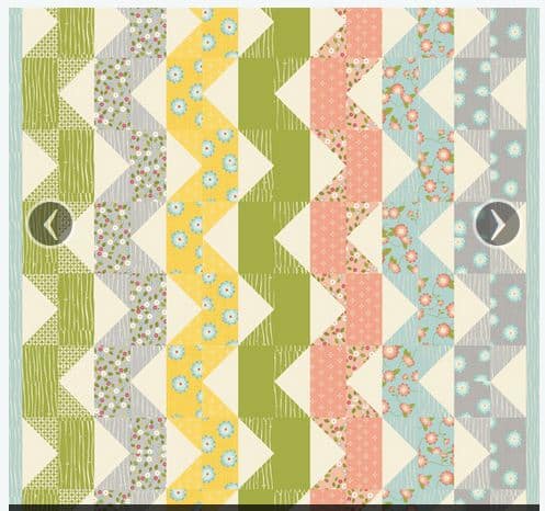
Some ideas have been coming my way including this Rusty Avenger pattern, called Summer Celebration.

I like the vertical look. I also like the ribbon effect.

I would use each of the colorways in one ribbon.

The question in my mind is: do I want to just use the fabric or do I want to use the fabric in a quilt that will matter? Is it possible that a quilt using the Half moon Modern fabrics will matter regardless of the design? Or will it be another flash in the pan?

Half Moon Mod Possibility 2

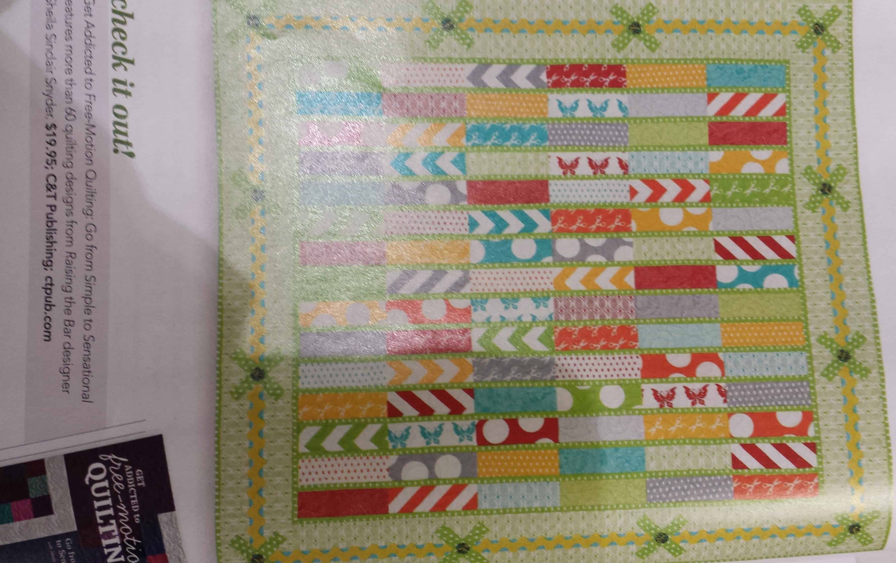
I also saw this pattern, Raising the Bar,  in Quilts and More, Spring 2014 magazine. I was reading in an orgy of quilt indulgence one evening while I waited for the Young Man. It is by Sheila Sinclair Snyder. I really like it for a couple of reasons:

  1. I think it shows off the fabric
  2. It isn’t difficult, but it also isn’t boring
  3. Except for the border I could easily resize it to accommodate more or less fabric
  4. I really like the border, which I think makes the quilt more interesting

The issue is that someone has already made this quilt. I don’t need to make a quilt that someone else has made. I showed the pattern to TFQ and she said that it would look great scrappy. The rectangles remind me of FOTY 2008.

This whole question makes me think about whether designing from fabric first or pattern first or block first is correct. I don’t think there is a correct answer. I seem to start from different places depending. Is there something more difficult about starting from a group of fabrics? What do you think?

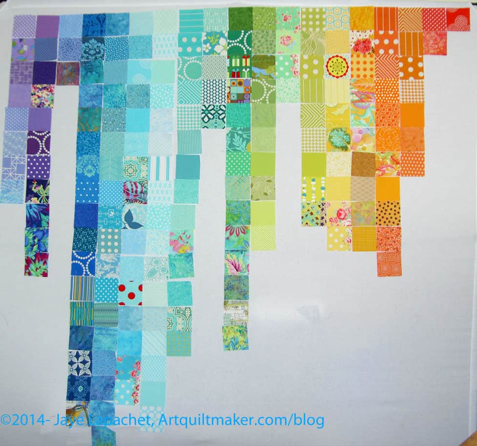
FOTY 2013 Even Better Progress

FOTY 2013: Mid-Late June 2014

I am not ready to piece yet, but I am so much farther along than I was when I last checked in.

I know a number of you liked the falling water/color gradation effect, but process wins and it wasn’t working for me.

This is so much better. I couldn’t have done it without the work I did on the first version. I did extensive sorting of the colors, as you may have noticed if you enlarged the photos and looked carefully. I expect that most of you didn’t have time and will just take my word for it.

The extensive sorting that I did really helped me leap frog over the preliminary shuffling that I have done in the past. I’ll have to keep that in mind for the future.

I still have a lot of work to do, but I am feeling better about the piece.

Previous Posts that Might be of Interest:

FOTY 2013 Better Progress

FOTY 2013 Mid-June Progress

I know many of you liked the progress I was making on FOTY 2013. I didn’t like it, so I talked to Maureen and her son and started over.

This project is killing me and I have to get it done. I have to get it done for my own piece of mind. I also want to get it done, but the other layout was not achieving the goal I wanted to achieve. I was having a hard time gradating the colors horizontally and thought that I would need too much background.

I also didn’t want to do the same thing as FOTY 2012 despite the success of that quilt. I don’t want to do the same thing over and over.

Maureen and Andy suggested starting in the middle. I went home and started, which is what you see in the picture, and I feel like the process is going a lot better.


FOTY 2014: Very Early June

FOTY 2014: Very Early June

I went on a fabric pressing binge and now have at least one post as a result.

I don’t know what is wrong with me, but I couldn’t seem to get my act together to sew last week. I have spent a couple days on the computer tweaking my blog and reading other blogs, but no sewing. Bleah. I think the machine problems are getting to me.

Pressing fabric seemed my best bet. Aren’t these fabrics pretty? They make me happy. And forced me to sew on Saturday and Sunday. That was a good thing.

And So It Begins…FOTY 2013

First Look at FOTY 2013

Some theatre we visit occasionally has a “First Look” feature. It is one of the half hour’s worth of ads that plays before the movie actually starts! This is your first look at Fabric of the Year 2013.

I want to stress FIRST look. I have a long way to go to get this quilt top pieced. There is a lot of rearranging that needs to happen.

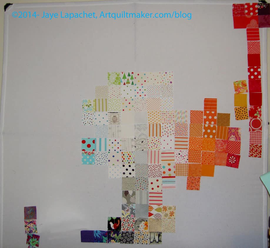
The first step to get to the first look was that I had to  get the squares out of the Fabric Closet. That was pretty easy, so I sorted them into rough color piles, e.g. ROYGBIV plus grey, black and white.

Pink Chalk Fabrics sends a post card with an order. It has some gorgeous piece on the front and sizes of quilts on the back. I saw the lifestyle shot on a post card I received from them. After getting FOTY 2012 back, I knew I needed to do something a little different. How could I compete with that quilt? At some point in the FOTY 2013 cutting process, I put the squares and the image on this postcard together in my head and decided to arrange the piece in a similar fashion.

Then I got out the post card that is inspiring this piece and started putting them up on the design wall. I just slapped them up, only further sorting roughly into light, medium and dark.

First observations:

  1. The picture above may not even begin to resemble the finished quilt.
  2. I couldn’t fit the pinks on the design wall
  3. Even though the Basic Textures by Patty Young (used on Fresh Fruit) are all the same value, they can’t all be next to each other.
  4. I might need to consolidate the greens a bit.

Vitals

  • Fabrics from 2013, both new and used
  • Patches are 3.5″ square

Fabric of the Year 2014 – Mid May

FOTY 2014 - Mid May
FOTY 2014 – Mid May

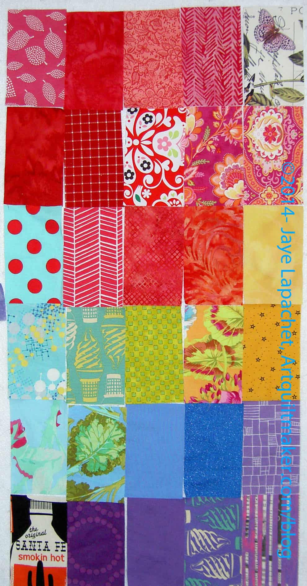
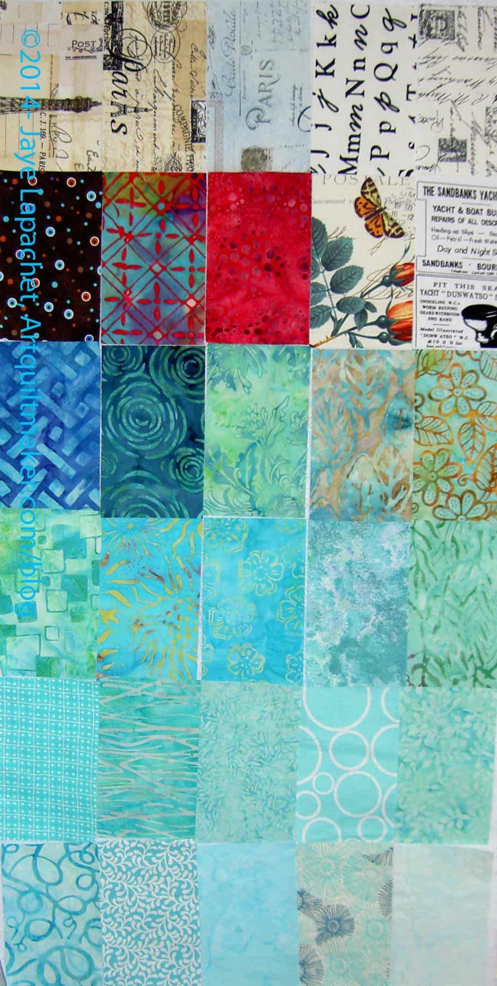
This group of fabric is a lot of what I got on my road trip. Not all, but a lot.

Someone suggested setting the rectangles like subway tiles, so I thought I would post them like that here so you could see what you think.

I really like the charcoal grey circle stitch fabric (last row, 2d from the top on the right). I am very tempted to buy a bunch of it and use if for a background for something. I don’t know what, though. I don’t know whether I am following a trend with all this grey or whether I am shying from other light colored backgrounds.

Do you like the crazy dip to the right? I can’t believe I didn’t see that until after I took the photo. Hopefully I won’t piece them like that.

FOTY 2014 – Early May

FOTY 2014 - early May
FOTY 2014 – early May

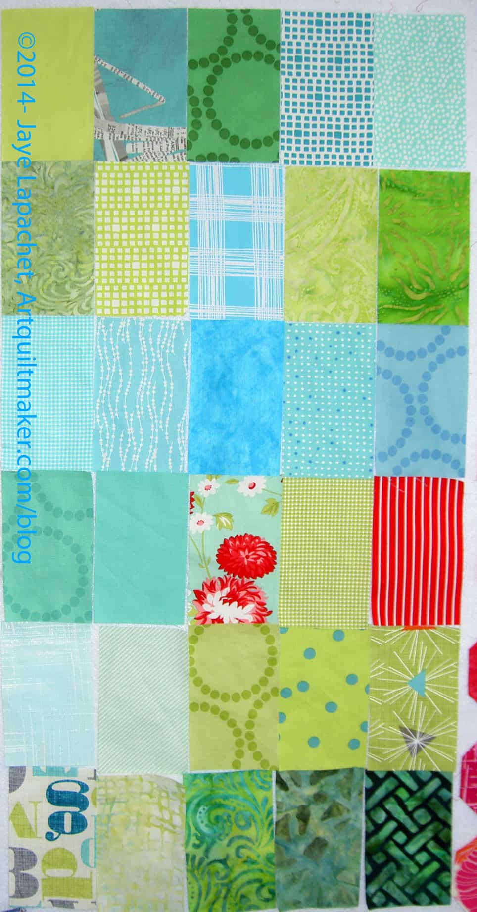
Lately I have been plowing through a lot of washed fabric. Most of it is blues and greens, which is good for my Blue[berry] Lemonade project and means that the FOTY 2014 will have a lot of blues and greens like the previous versions in the series.

I am a little more excited about cutting for FOTY 2014 now that FOTY 2012 is done. I am really pleased with how FOTY 2012 came out and now I am hoping future versions come out even better.

FOTY 2013? Yes, I will get to it soon.

FOTY 2014 – More Progress

FOTY 2014 - April 2014 #2
FOTY 2014 – April 2014 #2

I have a couple of projects in mind that require blues, so I have been washing and pressing blues, greens and light purples/violets lately. This is a nice little collection that I am really looking forward to using. I have already cut some pieces for projects that are still in the Hunting & Gathering stage.

I found a sense of peace and not frustration when I was cutting these pieces. It is satisfying to see a little pile of cut patches grow. That was a nice change.

Pretties

Recently I bought some stuff. Quiltmaking stuff, of course.

Pink Chalk Solids
Pink Chalk Solids

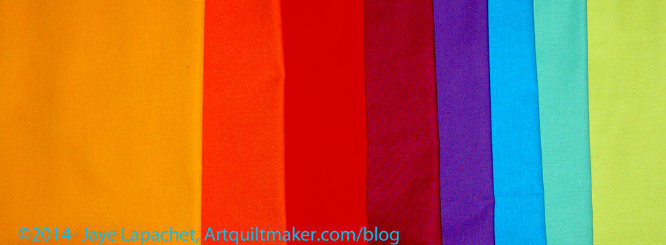
Pink Chalk had a special on these Indian Summer by Jenelle Clark solid grouping and they were kind enough to cut half yards for me. I will use the blues and greens for the Tale of Two Cities piece, but I do like looking at the gradation.

Reflecting Pool Perl Cotton by Anna Maria Horner

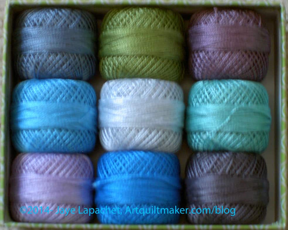
Yes, I am easily led by color. I have been looking at the Anna Maria Horner Perl Cottons in the Reflecting Pool colors for awhile and finally decided to bite the bullet. Fortunately for me they were on sale in her shop when I went to buy them. When received, I found that they are prettier than I imagined. Again I like the gradation. I am thinking about the Big Stitch for quilting as well as embellishing in the style of my Pamela Allen quilts. Perhaps the Serendipity Lady will get some embellishing?

Sashiko Thread
Sashiko Thread

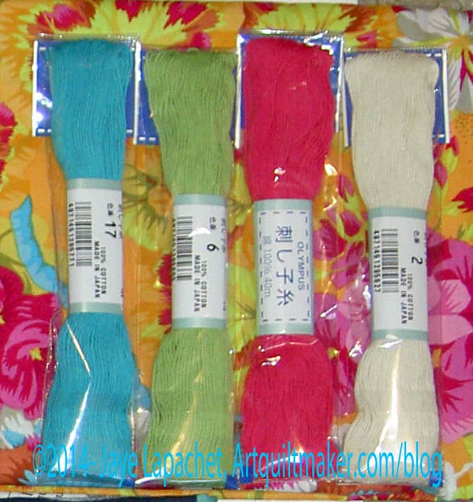
I had hand stitching on my mind at the EBHQ Show. When I saw this Sashiko thread, I had to buy some. Pink and Turquoise! What could be better?

The pink will work well for the Serendipity Lady as will the cream. I could use the turquoise for the flowers and the green for the leaves, unless I decide to make the leaves a different color. I do need to get back to that project.

I have the FOTY 2012 and the Fresh Fruit to bind as well as the EPP stars all as hand projects. Clearly, I am in need of some embroidery on which to work. Either I need to get going on the Serendipity Lady, so she is at a point where I can bead and embellish or I *shock*horror* need to get another Pamela Allen style quilt going. Perhaps I could embellish See? I’ll think about that as I do recoil a little bit when I think of starting a new project.

EBHQ Show Pretties
EBHQ Show Pretties

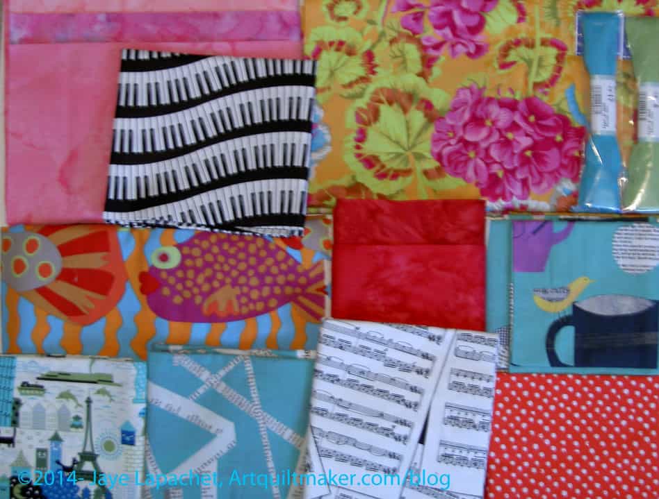
Finally, here is what I bought at the EBHQ show. Shockingly, I have some ideas for some of it. The fish fabric in the middle left is the most exciting. I have an idea that I will make a top of strips running vertically in warm colors, especially reds and pinks. Then I will cut out those fish and applique them along the bottom. I do feel excited about that piece. Some of the pinks and reds shown would go into it.

The Young Man told me he now wants a music quilt. I saw some fabrics in the Keepsake Quilting catalog and confirmed that he liked them, but saw these at the show and picked them up. I don’t have an idea for the layout or anything yet, but I will eventually. I am guessing that will be his graduation quilt. We’ll see.

The other fabrics were just fun. I hope to get them into something soon. The two turquoise pieces (cups and text) may end up in the Tale of Two Cites.

Mosaic Quilting for a Project

Brown Fabric
Brown Fabric

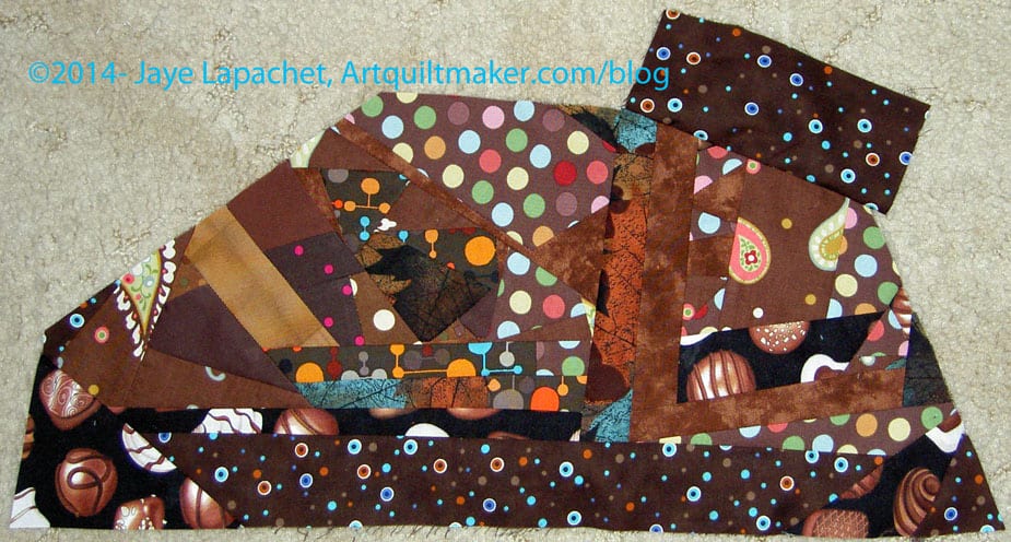
Some people call this crumb piecing. I have always called it mosaic quilting since I saw Shannon Williams on Simply Quilts about a thousand years ago. I like the term mosaic quilting. It sounds fancy and important. 😉 Crumb piecing sounds like something I have to wipe off my counter with a sponge (with apologies to Bonnie Hunter!)

I consider this to be making new fabric from scraps – some very tiny scraps in some cases. I am putting scraps together into a larger piece so that I can cut it up later using pattern pieces to make something new.

When I am working on a piece like this, I often use it as leaders and enders. I usually have several small pieces to which I add, then at some point I sew them together to make a larger piece. The piece above is getting to large to work on comfortably and I have not yet sewn it to the larger piece.

There are a lot of seams and these pieces get to be pretty heavy. I like them, though as I think they add interest and create a topic for conversation in a piece. Also, it is a technique you can use to draw people in closer to look at your quilt.

Once you have made your ‘fabric’, you can cut it up again into squares or other shapes and use them as patches for your quilt. You have to be aware of the seam allowances, because they can get quite thick. This technique is a good time to press your seams open.

I have several pieces of this new brown ‘fabric’ that I am making to use for a project that will be a gift for a friend. I will show you the project eventually, but for now you will have to be satisfied with the sneak peek above.