I take walks at lunch and there is a lot of construction going on around my office, which means I can’t walk the same way every day. I also don’t know the neighborhood very well and I walk on different streets every day, so I see different things every day.
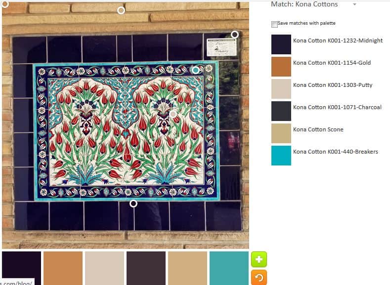
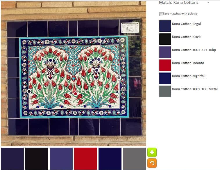
ColorPlay: Tile-default
I thought about cropping out that beige brick, but, frankly, I was too lazy. It is interesting how it came out in the default palette. The default goes for neutrals again. Two of the colors in the default palette are neutrals! That is crazy!
ColorPlay: Time -n.1
I went sort of random for the first palette. I am not sure that red works really well.
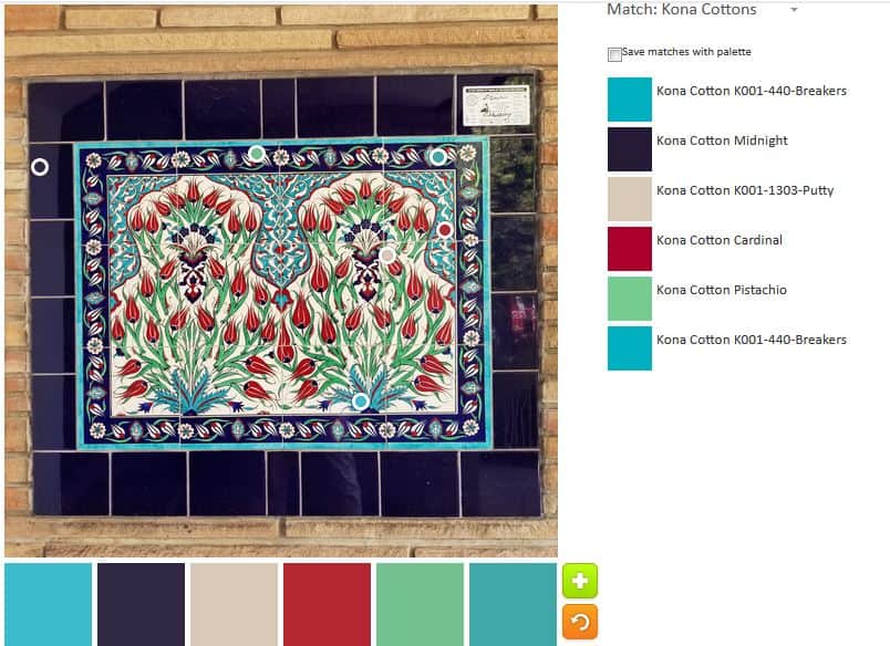
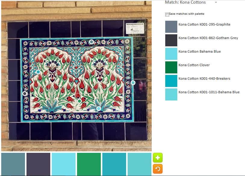
ColorPlay: Tile -n.2
This is my monochromatic palette. I like the variety of turquoises in this palette.
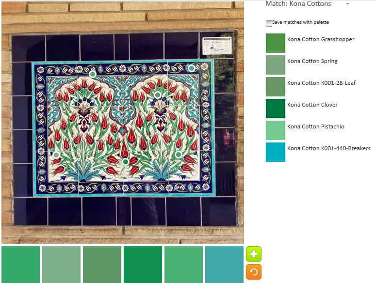
ColorPlay: Tile -n.3
I did another monochromatic palette – this time in green. I think combining palette two and three might be interesting.
ColorPlay: Tile-n.4
The fourth palette is completely random. I tried to make one that was completely different and used different colors than showed up in some of the other palettes.
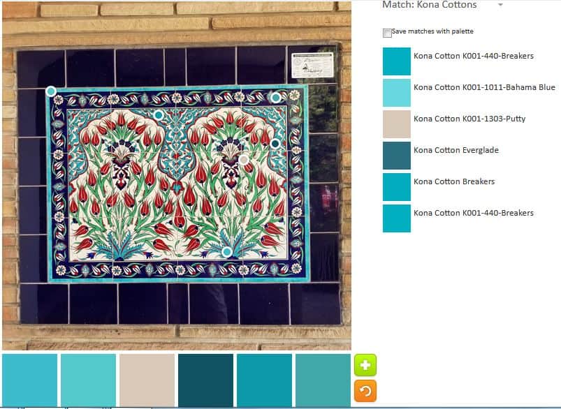
ColorPlay: Tile -n.5
I had to do one more mostly turquoise palette. i wanted to make it different than n.2, but there are some similarities.
“We are often able to rise to our highest self if it is for someone else” (pg.118). This quote had a profound effect on me this week I worked very hard for the past month on a work project. In the past week, I spent every spare work moment on this project. I gave it my all. The effect was that my personal life was a bit of a mess. Two appointments snuck up on me. I paid the YM’s tuition at the last minute. I didn’t plan for a dish we needed to make for a party tomorrow.
The point of this chapter is that we go all out when we have something due for someone else. We let ourselves go. I think this has resulted in the self-care movement, which is good IMO, but also promotes the feeling of guilt in many of us.
We are, inherently, creative people. Before you even think that you are not creative, I will remind you about all of the creative ways you coerce…uh…encourage your children and pets to go outside, eat their dinner and a million other things. While you may not have picked out fabric for a new quilt, you are being creative.
Combine these creative problem solving skills with your making- your quiltmaking, knitting, whatever art or craft – and give the product away. I find yarn I like, knit a scarf and give it to my mom for the gift baskets her church makes for a local domestic violence organization. I get to knit, someone gets a gift and I don’t have a thousand scarves laying around my house.
Carrie talks about getting to yes. She points out that ‘no’ is about the parent. Extrapolating out, since I no longer have young children at home, how can we use creative problem solving to get to yes in our making? How can YOU have time for a few seams or to see a few inches of binding?
I am not going to recommend that you sit down for 15 minutes a day and just do it. That doesn’t work for me. There are too many things that people want me to do for just 15 minutes a day and none of them are sitting with my DH watching TV. ?
Figure out what works for you. Also, recognize the creativity you already employ in your life and celebrate that.
You can see the last post on this topic from a few weeks ago.
Nota bene: we are working through Carrie Bloomston’s book, The Little Spark. Buy it. Support the artist. Play along. There is much more to each spark than what I am writing. The original chapters will help you. Go buy Carrie Bloomston’s book, so you get the full benefit of her fabulousness! You can see my book review, which is what started this flight of fancy.
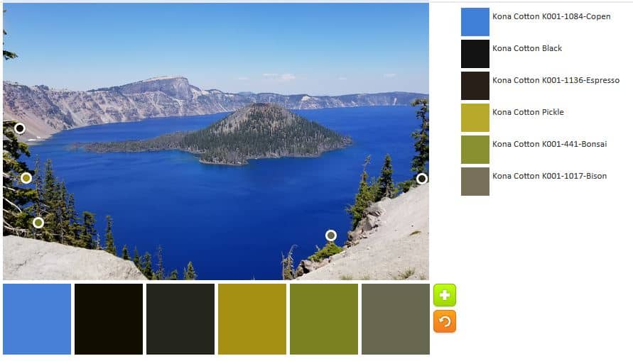
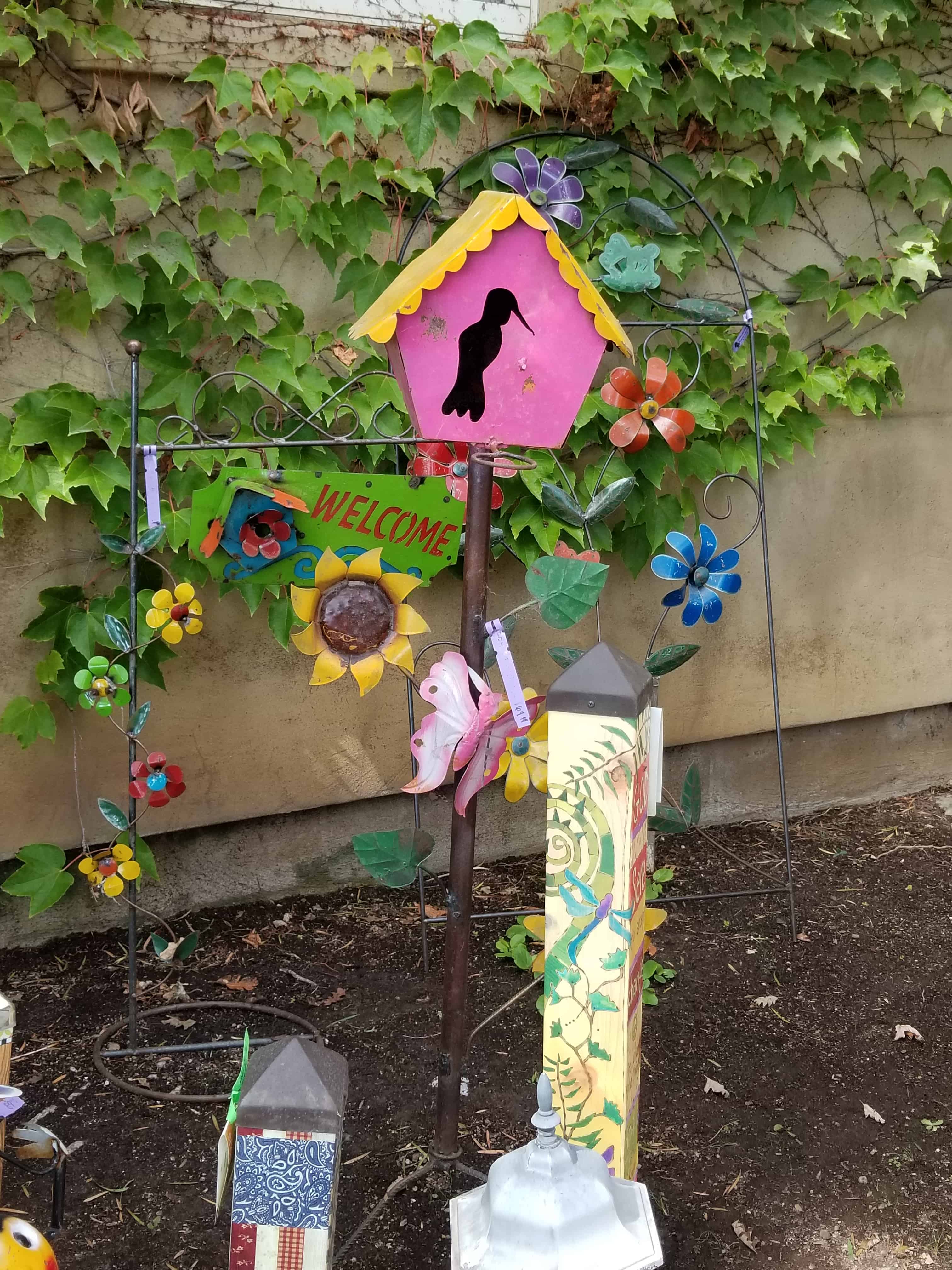
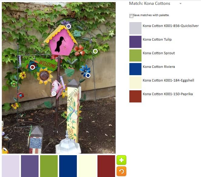
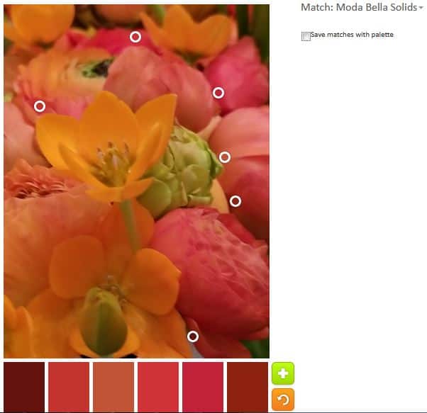
This is a photo from the Alden Lane Quilt show from last September. I picked it because it is so cheerful looking.
ColorPlay: Birdhouse-n.1
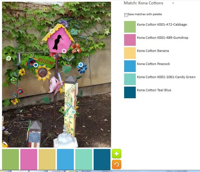
First, I had to pick out the candy colors. You know I love the brights.
ColorPlay: Birdhouse-n.2
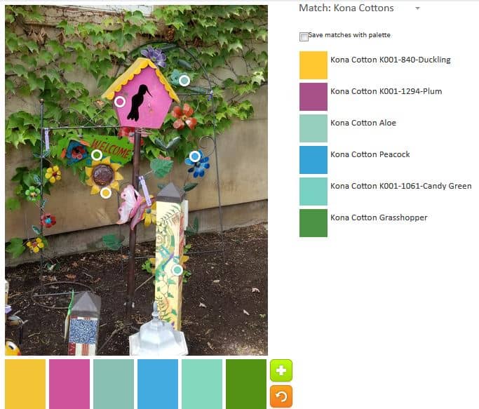
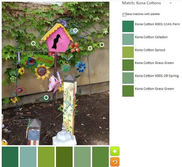
I did another palette of brights, because I thought I could. I think this palette is a little brighter. There are a lot of greens in this image, so it is a challenge.
ColorPlay: Birdhouse-n.3
This is sort of an ode to a more traditional palette. Perhaps 4th of July palette?
ColorPlay: Birdhouse-n.4
And I seem to have to do a monochromatic palette. This week’s is green.
I am revisiting old posts and came up with this Dose of Daily Art post. I thought it would be a good ColorPlay – kind of revisiting old friends.
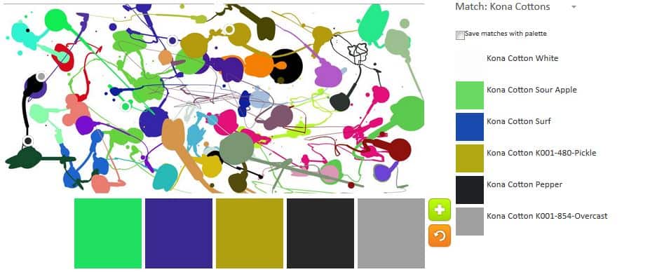
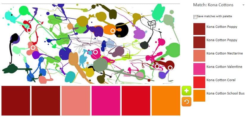
ColorPlay: Splatter Art-default
The default is, for once, not all neutrals.
ColorPlay: Splatter Art – 1
I like this one. It reminds me of the circus, but not a primary circus.
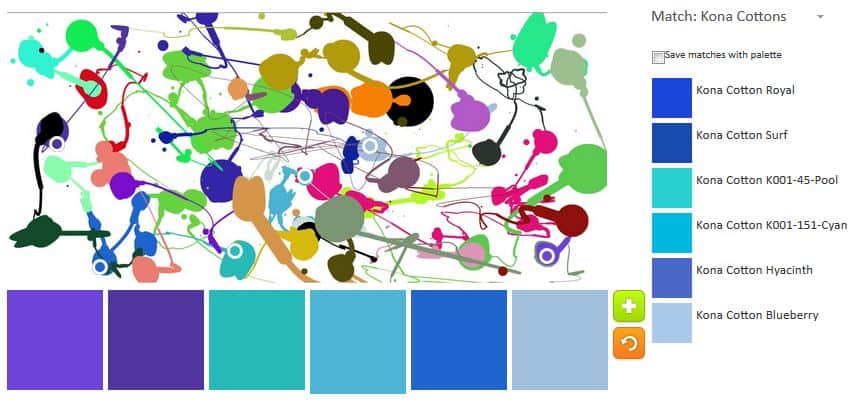
ColorPlay: Splatter Art n.2
I wasn’t quite done with that fuchsia. I like it with the various violets and blues. I can see actually using this palette for something very cheerful. I also noticed that one of the colors was white. I hadn’t seen it before.
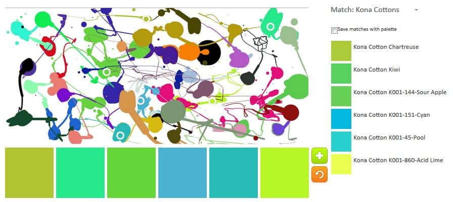
ColorPlay: Splatter Art n.3
I had to try a blue and green palette. The two greens on the end are bit much, but I am not much of a fan of green so that could be part of the problem.
ColorPlay: Splatter Art n.4
This is a warm palette I felt I needed to try.
I wanted to try a monochromatic palettes. First was blue.
ColorPlay: Splatter Art n.5
I felt like I needed to make a neutral palette, so I gave up. This was a great picture to use. Although there was no variations in the colors used in different parts of the painting, there were a lot of colors and that was fun.
There is a lot of building going on near my office. Barely moving my head, I can see at least 5 cranes when I get off the train without having to turn my head. The sound of jackhammers, hammering and other construction noises fill the air all day.
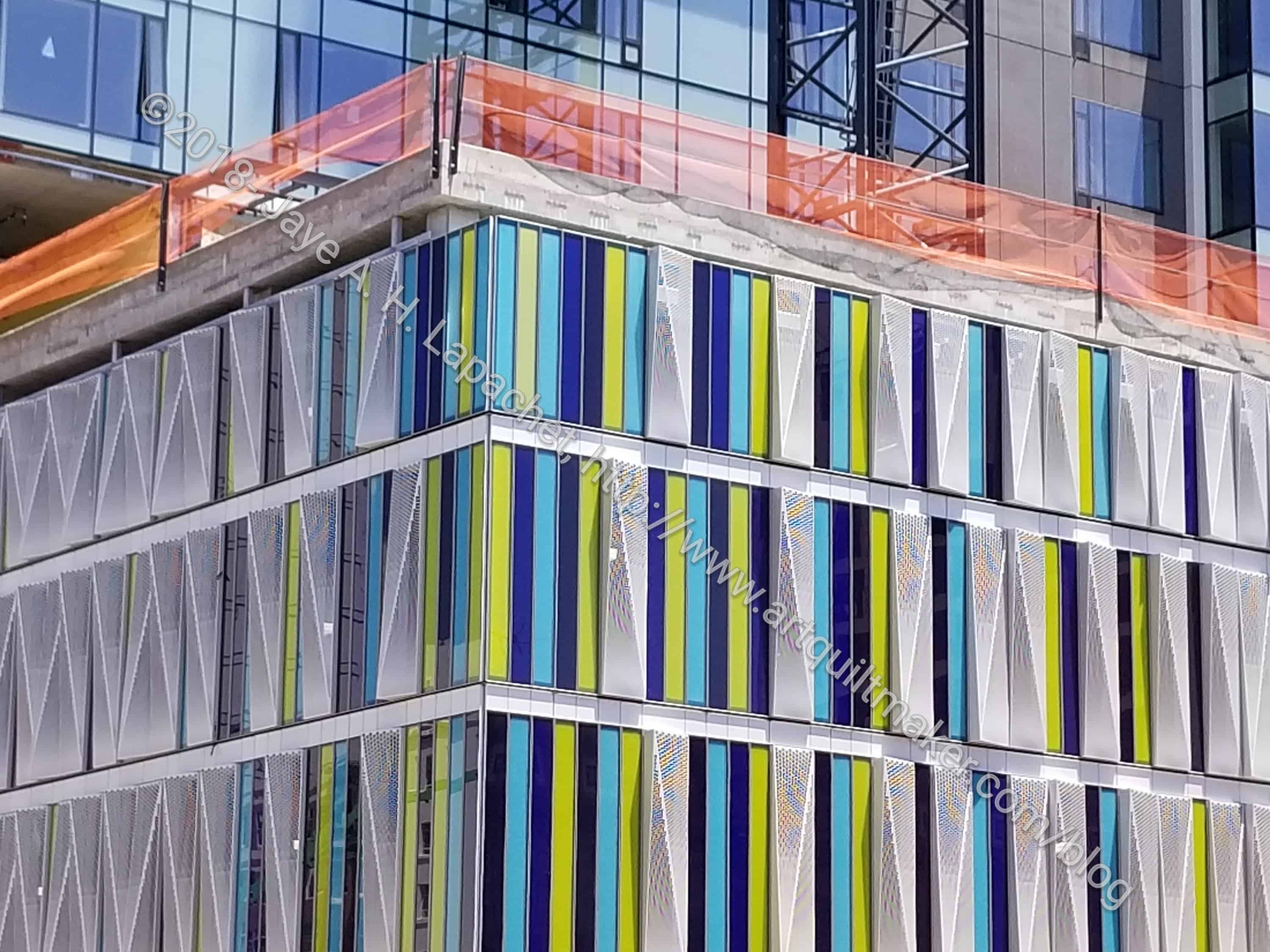
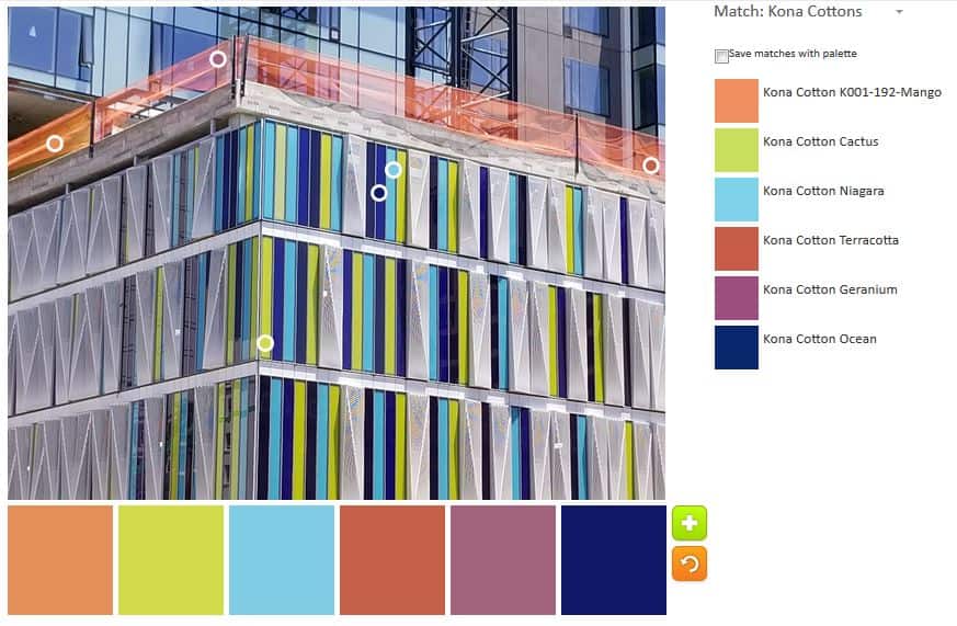
I walk around at lunch trying to get to know the neighborhood. It is hard, because it is changing rapidly. The other day I across this building. I love the windows and thought it would be great for this exercise. It is so whimsical.
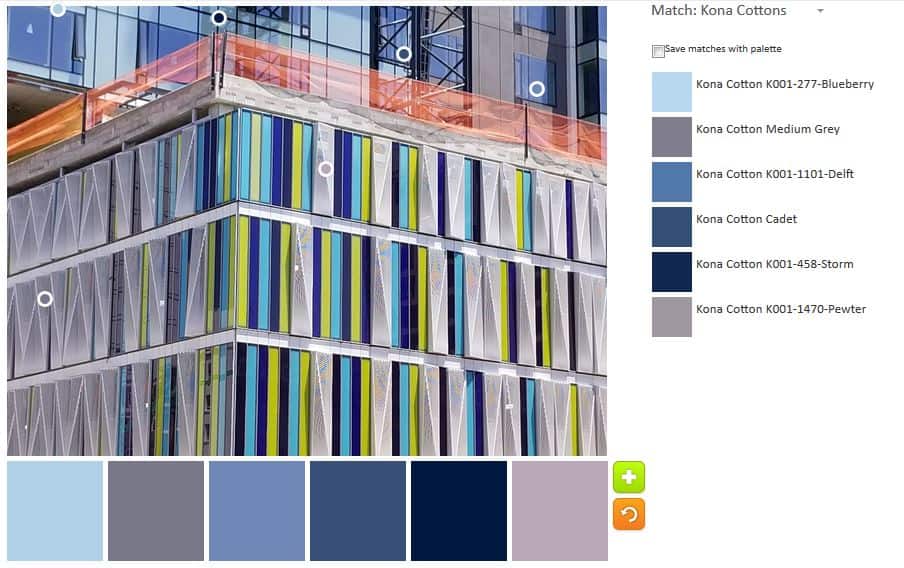
ColorPlay: Modern Building-default
I wanted to stop at this default palette. The blues are great, even without any turquoise and the Pewter makes a nice background. It is almost a perfect palette. Looking at it, however, I see that that green wasn’t touched or the orange.
ColorPlay: Modern Building 2
I had to do another monochromatic palette to see how many blues I could include. I moved the circles, but some of the colors chosen are the same as the previous palette.
I admit that it isn’t quite monchromatic, but it is analgous. That green with the brighter blues looks really good.
ColorPlay: Modern Building-2
I couldn’t avoid the orange. It is clearly some kind of construction fencing, which are, traditionally, that super bright orange. No matter where I moved the circles the brightest I could get was the Mango. I decided to embrace the vagaries of the computer and see what happened. This isn’t a palette I would have put together myself, but I think it works. It is definitely interesting.
ColorPlay: Modern Building-3
I liked the Mango and wanted to keep it in. I also liked the green and turquoise, so I kept those. The others aren’t as successful this time. All extra grey, even the Graphite, which my eyes tell me is actually blue.
Let me know what you think of these palettes and if you make anything.
“Artist Marcel Duchamp believed that his work wasn’t finished until it was seen by people–that the viewing completed the work” (pg.113).
This is an interesting quote and it makes me think. I always show my quilts, at least to the guild, before they go wherever their final destination ends up. As much as possible, I try to show them in shows. I like to win, but I am not daunted by not winning.
Once my quilt Spiky Stars won Judge’s Choice at the Marin Needle Arts Guild show (now defunct). I was VERY excited and stood unobtrusively near my quilt for quite awhile listening to people talk about it. Not all of the comments were nice, but the ones that were warmed my heart.
Ms. Bloomston advocates selling work via a ‘lemonade stand’ and by that she means a low entry overhead venue such as a local craft fair or farmers’ market. She also mentions online retail. I am not interested in making much of an effort to sell my work. I have had offers, but they have been laughably low and not worth me not having the quilt. I make quilts for the pleasure of making them.
Carrie also mentions sharing via social media. I think this is important, but I think live viewings are more important. I do both, as you know. Use social media for yourself. Don’t expect the world to flock to your site or account. If they do, it is an added bonus.
She give some tips for showing work as well, which is a nice bonus.
Go forth and share!
You can see the last post on this topic from a few weeks ago.
Nota bene: we are working through Carrie Bloomston’s book, The Little Spark. Buy it. Support the artist. Play along. There is much more to each spark than what I am writing. The original chapters will help you. Go buy Carrie Bloomston’s book, so you get the full benefit of her fabulousness! You can see my book review, which is what started this flight of fancy.
One of the things I like about this book is that the chapters are short. I am looking at my next book to review and one is great, but the chapters are super long. Perhaps I can do a page a week?
This is another physical chapter. In this one, Carrie Bloomston starts out by saying that she is not the kind of person to tell you to go sit in your studio at the same time every day and for the same length of time until inspiration strikes. She continues by saying that it is a theory that when inspiration strikes you will be readying for it and in your workspace ready to go. She recommends taking the day off and going fishing or hanging out in nature so you can actively fill your senses with inspiration (pg.109). I actually agree.
I don’t have enough time in my studio, but when I go out to get inspiration I come back itching for more, because I am filled with ideas. I know that going to a museum or even out to dinner with a friend will show me something new that will inspire me or give me a problem solving idea.
The reality is that you can’t force creativity and looking at the same walls isn’t going to help. I get a daily dose of inspiration when I go out walking. I try to take a different path and I have made the most interesting discoveries – a lake! a building completely covered in 4×4 inch tiles! trees touching each other! All of these things are within a 10 or 15 minute walk from my office. There is a brake shop building of which I am particularly fond. I have to take a picture, but it seems silly.
“Don’t get me wrong. I also believe in working. I believe in worth through the boredom, the obstacles, the writer’s block. But there is a time and a place for everything. Sometimes you just have to run away” (pg.110).
So, take yourself on a date and take a bunch of photos and make some sketches or doodles or whatever you do.
You can see the last post on this topic from a few weeks ago.
Nota bene: we are working through Carrie Bloomston’s book, The Little Spark. Buy it. Support the artist. Play along. There is much more to each spark than what I am writing. The original chapters will help you. Go buy Carrie Bloomston’s book, so you get the full benefit of her fabulousness! You can see my book review, which is what started this flight of fancy.
A Soul Box is a way to do “soul archaeology…while making a meaningful reminder of what is most important to you?” (pg.105).
In this chapter, Bloomston gives the reader a list of supplies to make an actual box. This is a very physical activity. Sometimes, making something that is not in our regular media leads to a new place in your chosen medium. I get so much inspiration from making books, folding paper and gluing paper to things.
You can see the last post on this topic from a few weeks ago.
Nota bene: we are working through Carrie Bloomston’s book, The Little Spark. Buy it. Support the artist. Play along. There is much more to each spark than what I am writing. The original chapters will help you. Go buy Carrie Bloomston’s book, so you get the full benefit of her fabulousness! You can see my book review, which is what started this flight of fancy.
“You have to let go of the feeling that you don’t deserve to be happy or that you could never have the freedom that you seek” (pg.102)
In my journal, at the back, I make a list of the small sewing achievements I make every day (in a good week). It might be something like “sewed 2 HRTs – 5/25/2018” or “finished a 2 inch strip of binding on Triple Star quilt – 5/18/2018.” I used to just put finished items on that list, but the entries were too few and too far between, so this is my comprise. These are seriously small victories, but I do it to make myself feel accomplished.
Celebrate the small victories. Pat YOURSELF on the back. Believe in yourself.
Carrie says that “believing in yourself is a practice. The more you practice, the better you get. And the more you practice, the more able you are to accept your limitations and shortcomings, because there is always another chance to try again, to do it differently and maybe better” (pg.102)
You can see the last post on this topic from a few weeks ago.
Nota bene: we are working through Carrie Bloomston’s book, The Little Spark. Buy it. Support the artist. Play along. There is much more to each spark than what I am writing. The original chapters will help you. Go buy Carrie Bloomston’s book, so you get the full benefit of her fabulousness! You can see my book review, which is what started this flight of fancy.
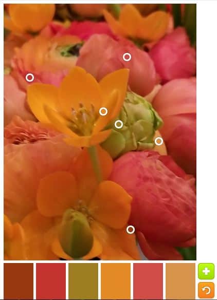
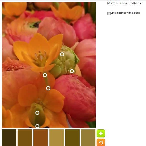
This week’s photo was a bad choice. It is a gorgeous group of flowers and I really like the image, but there isn’t enough diversity in the colors to make interesting palettes.
As a result, after the default palette, I stuck to monochromatic palettes.
Green: the green looks really brown – or yellowish brown- in the palette.
Orange: I thought the orange would be great, but, again, the colors look very brown. This groups would make a great Thanksgiving quilt.
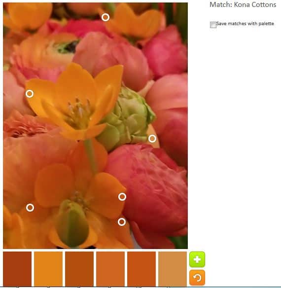
Pink: these colors aren’t bad. They do have a pink tinge to them, but I wouldn’t call them pink.
The tool was acting strange as well. The colors with names were not displaying on the side. It might be time to think up a new creativity/inspiration project.
Let me know if you use a palette to make something.
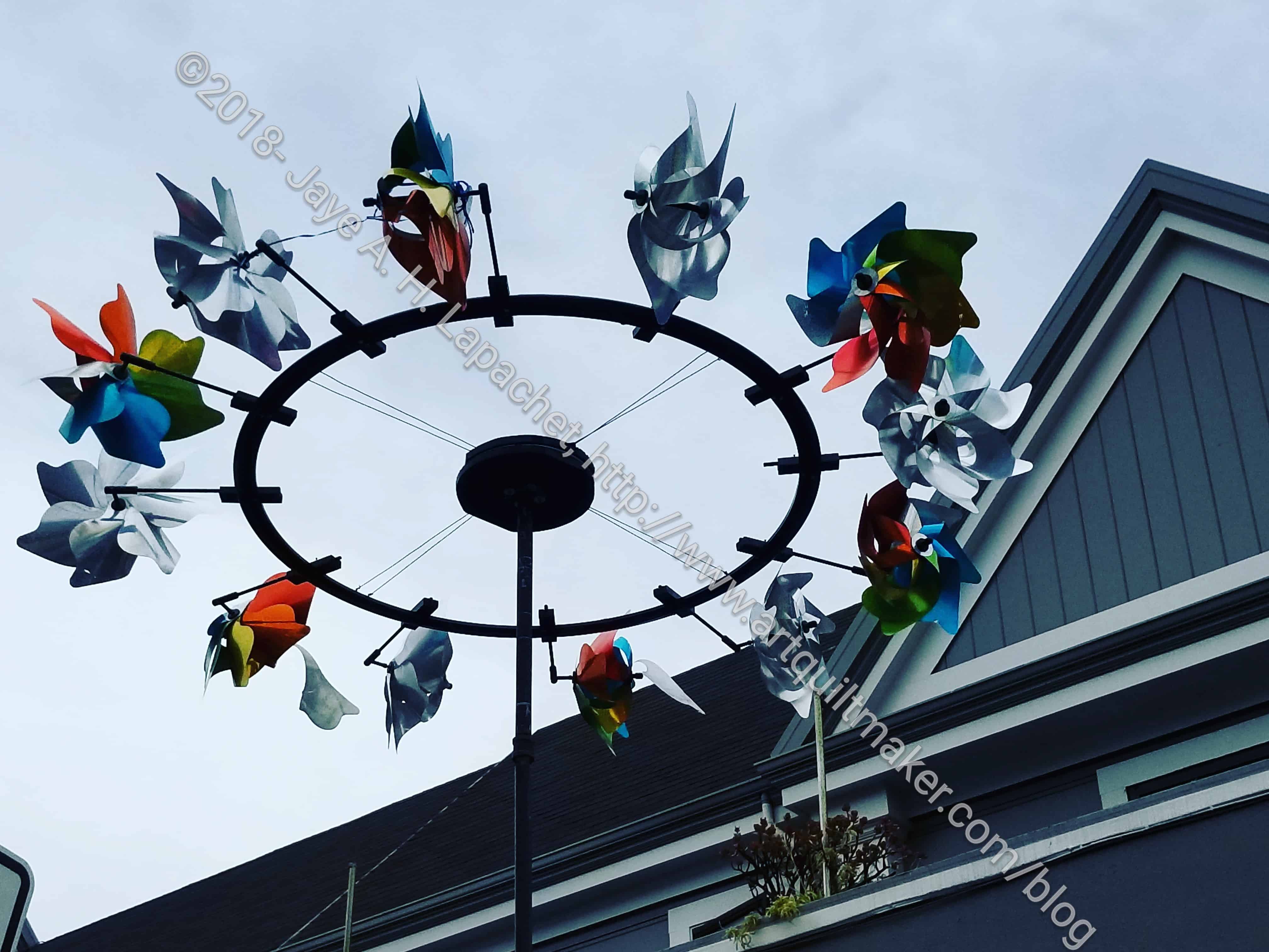
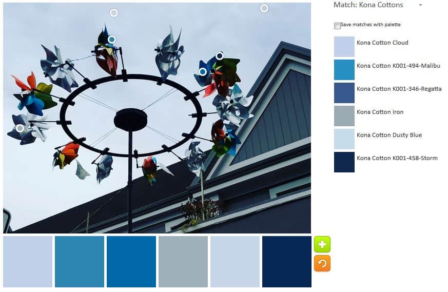
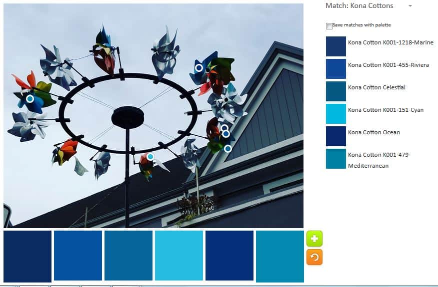
I saw this wind sculpture when I went to get my hair cut on Saturday. I have walked by it numerous times and finally stopped to take a photo.
ColorPlay Wind Sculpture-default
The default was great! NO neutrals this time. I found it to be a very appealing palette, if a little too monochromatic.
ColorPlay: Wind Sculpture n.1
I took the opportunity of a great default to try a monochromatic palette. I tried to go for sea tones and I think I got a blustery day sort of look.
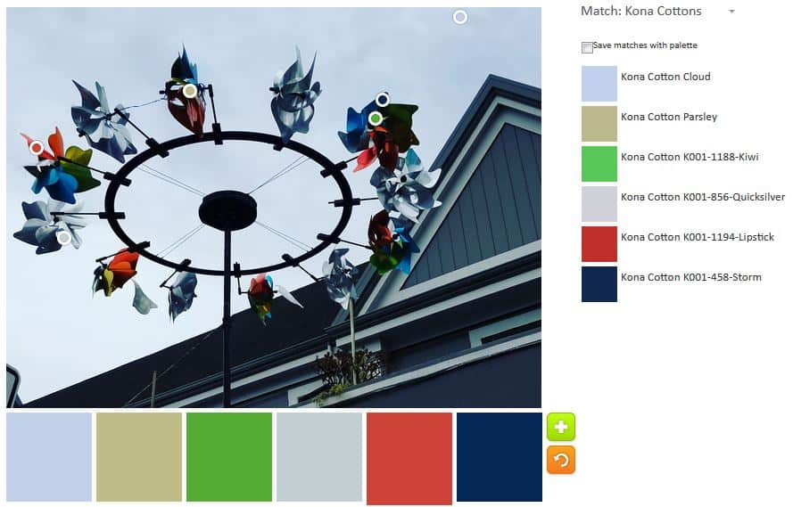
ColorPlay: Wind Sculpture n.2
With the second palette, I tried to pull out the colors in the image. There are quite a few colors and I wanted a variety. The only one I don’t like is the Kona Parsley. It doesn’t look like parsley at all to me. It looks like one of those life-sucking beige relatives.
ColorPlay: Wind Sculpture n.3
In the third palette, I went back to blues, but expanded to darks. I like the colors together. In a quilt, however, I don’t think there would be enough contrast.
ColorPlay: Wind Sculpture n.4
I really got a lot of mileage out of the default blue-centric palette. I continued with the monochromatic theme in the fourth palette, but went with brighter and happier blues. There are some darks and it was hard to find places in the images where the tool registered the location as a different color/fabric.
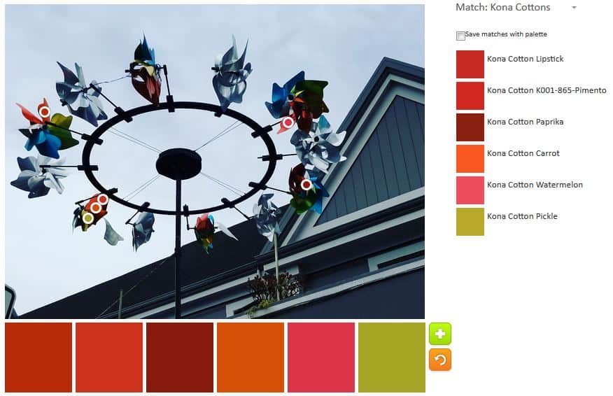
ColorPlay Wind Sculpture-n.5
With n.5 I tried to find every spec of warm colors in the whole image. The pickle is the only cool color, but it has a tinge of warmth to it, I think.
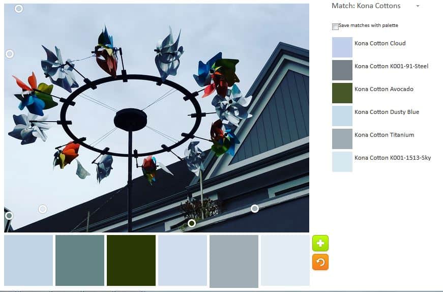
ColorPlay: Wind Sculpture n.6
With the last palette, I decided to stick with blue, but go light, even venturing into grey. The Avocado was kind of a desperation choice, but the others stuck with my idea.
“There is only one way to achieve the fluency, freedom and grace of the expert, and that is by doing” (The Little Spark, pg.97). I believe this quote. I live this quote. I sew a lot. I make a respectable number of quilts and chop up and sew back together a lot of fabric.
I get the impression that people think you can make one quilt and be an expert. I have made a lot of quilts and I still don’t consider myself an expert. “We get better at anything we try to do by doing it over and over (and over and over)” (pg.97).
I do think, as we progress towards becoming an expert, we gain “fluency and fluidity with the materials and…movements.” We “understand…the rhythm and harmony of the” materials, the tools and our “body.” We can feel our way through the” work ” instead of thinking…through” [it]. We become less attached to our work as we get better and we get better at telling the materials exactly what we want them to do using great economy of movement. As we get better, we are fully in control of our work and yet we choose to surrender that control to the materials. (pg.97)
“You don’t learn by thinking about doing. You might enjoy thinking and planning, but the learning comes from doing” (pg.97). Each time we make a quilt or, even, a block “a new awareness…is born. The reality is that you have to show up and do the work.
Carrie recommends that when you start to, she calls it, “throw a hundred bowls” (pg.97) that you not do it alone. In quiltmaking, guilds are great for that, but so are friends, classes and, in a pinch, the Internet. YouTube is a wonderful thing. The point is that if you get stuck and you don’t have a friend or support system, you will have an easier time stopping that if you have someone to lean on.
The text is followed by a quiz (pg.98-99), which helps determine your learning style.
Now, go make your hundred quilts or hundred blocks and improve your skills. Become an expert.
You can see the last post on this topic from last week.
Nota bene: we are working through Carrie Bloomston’s book, The Little Spark. Buy it. Support the artist. Play along. There is much more to each spark than what I am writing. The original chapters will help you. Go buy Carrie Bloomston’s book, so you get the full benefit of her fabulousness! You can see my book review, which is fueling this flight of fancy.
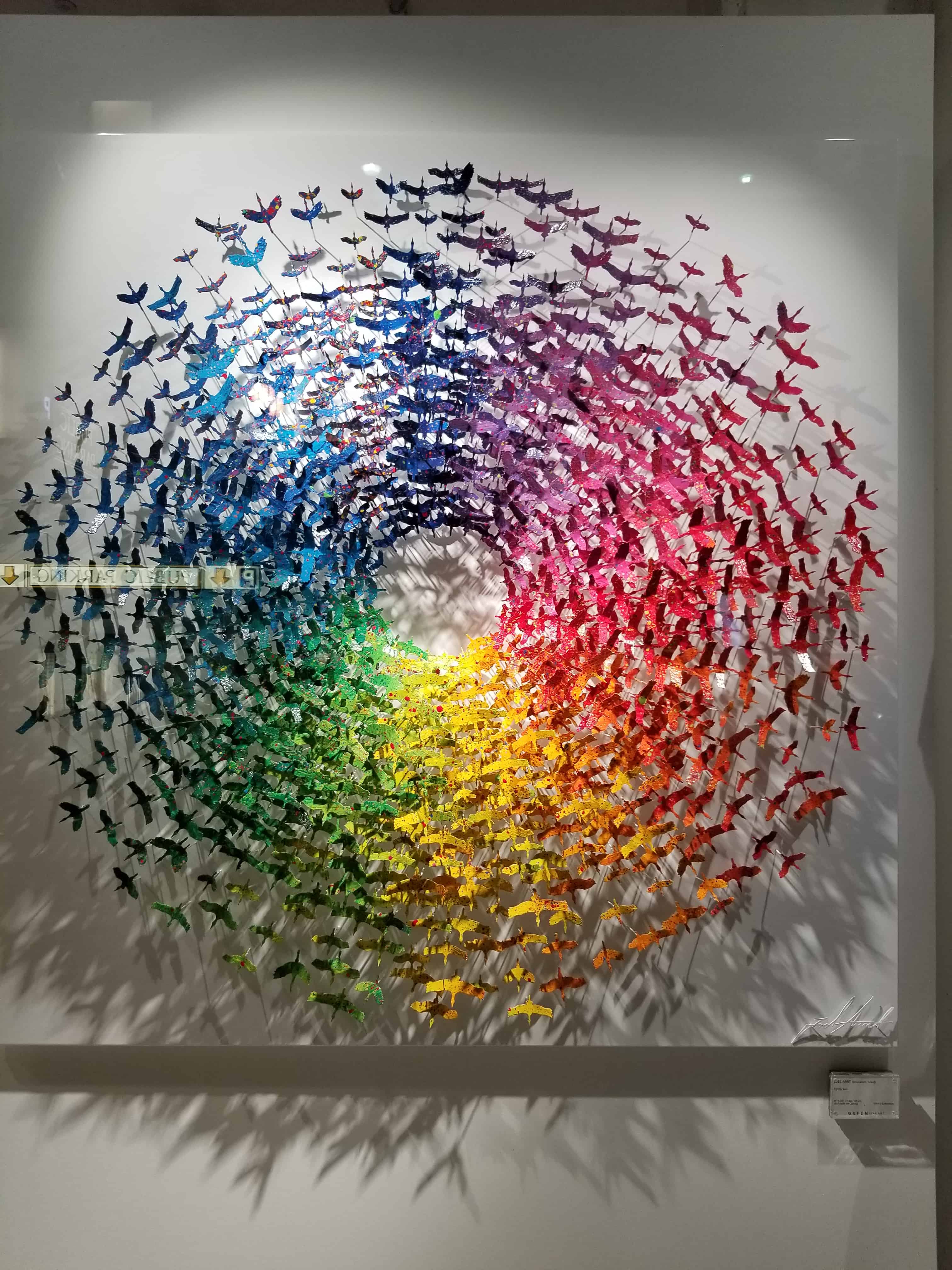
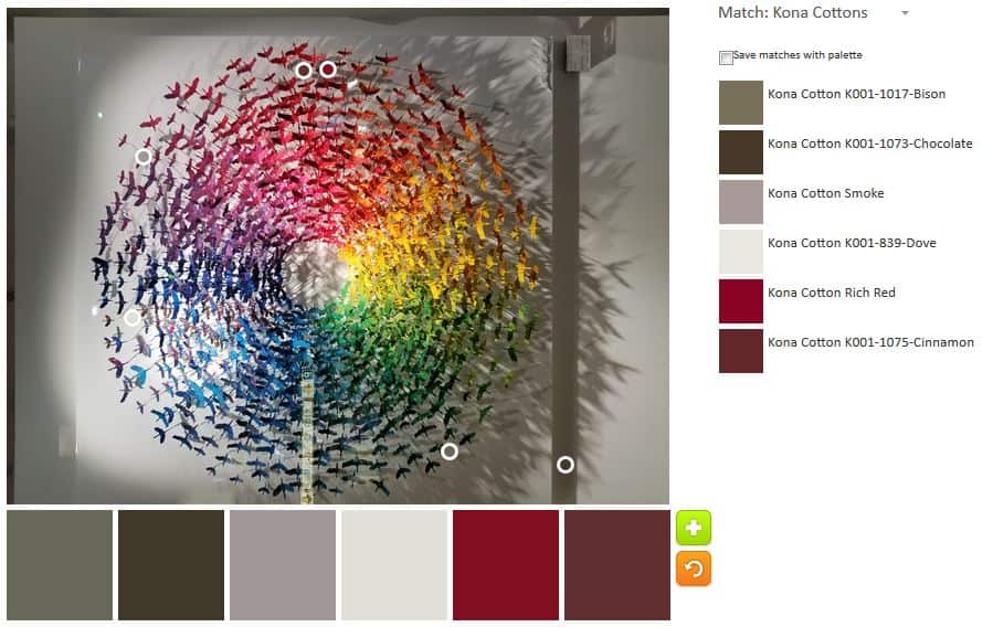
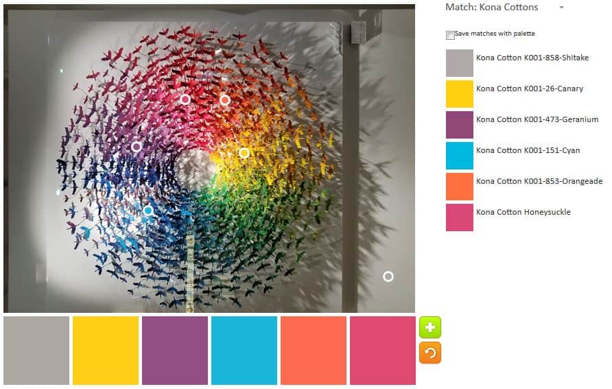
I was walking through the streets of downtown San Francisco to the train Saturday night after a lovely dinner with friends. I saw this great piece of art by Joel Amit of Jerusalem in one of the gallery windows. The piece is called Flying Sun. I really like it and thought it would be great for ColorPlay.
ColorPlay: Apr27-default
Starting off with the default always makes me wonder. This time I checked out some of the pieces on the Play-Crafts Instagram feed and I don’t see that her quilt pieces focus particularly on neutrals. With all the color in this piece, the tool still defaults to neutrals. There are so many colors that can come in the Palette Builder tool! I don’t even have to move the circles very much- a couple of millimeters at the most to make a new palette with completely new colors. Again, this makes me wonder why so many neutrals in the default palette. Do I sound obsessed? Perhaps I am?
The greys are nice, but it is still mostly neutral.
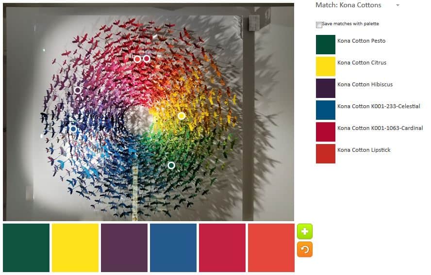
ColorPlay:Apr,27 n.1
I finally started moving the circles around and thought, when my first palette was finished “okay, I am done”. My first palette is extremely bright and cheerful and reflects some of the colors Mr. Amit has used. I like the Kona Lipstick and the Kona Cardinal, overall, but there is a bit of a circus feel with this palette, so I tried again into order to get something a little more subtle or, perhaps sophisticated.
ColorPlay: Apr. 27 n.2
My second palette uses more subtle colors. I don’t think the Kona Grellow works. It looks a little too mustardy to me. It isn’t terrible, but it doesn’t fit with the rest of the palette. I like the green – Kona Leaf, but not with the Tomato and Watermelon.
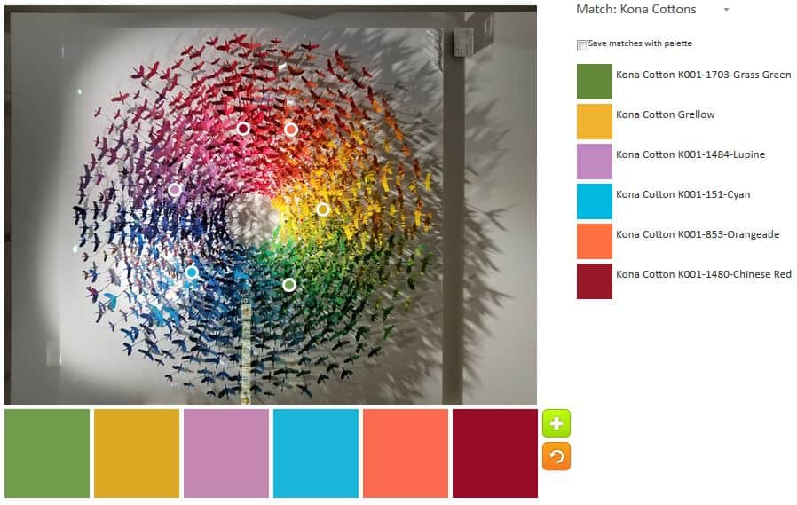
ColorPlay: April 27 n.3
Palette n.3 was another adventure. I added some turquoise, which is great and added Orangeade – there aren’t enough circles to have a ROYGBIV rainbow palette, but we do what we can. I wanted to keep the Watermelon, but moved the wrong circle and ended up with Chinese Red. Somehow I didn’t get rid of the Leaf or Grellow.
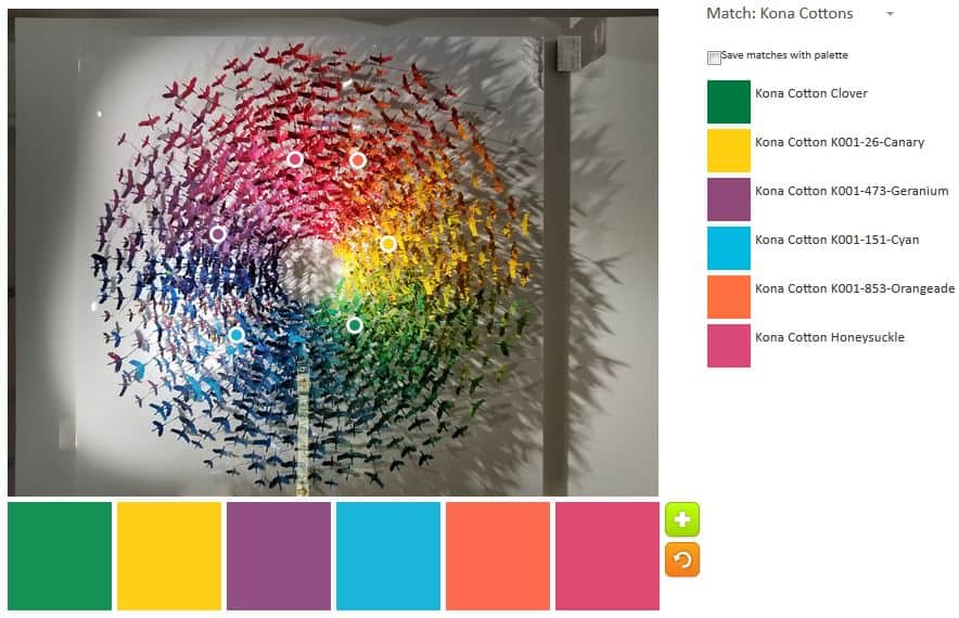
ColorPlay:April 27 n.4
Palette n.4 is much better. I kept the colors I liked – Cyan and Orangeade – and tweaked the rest. Except for the yellow, I just made little tweaks. The Geranium is a nice addition. The Honeysuckle and Cyan go really well together. The Clover isn’t terrible, but I don’t like it next to the Canary.
ColorPlay: April 27 n.5
Since I was getting close to a palette I really liked, I only changed the green. Again the Grasshopper is better, but still doesn’t work very well with the yellow. Also, with the Grasshopper, somehow the Orangeade doesn’t look as bright, but it does look ok next to the Honeysuckle.
This is a great photo for this exercise and I could go on forever, but I am not going to since you can go to Play-Crafts.com and make your own palettes.
ColorPlay: April 27 n.6
TA-DA! I took out the green. It wasn’t working, so I added some Shitake. It is a nice light-ish grey and would make a good background.
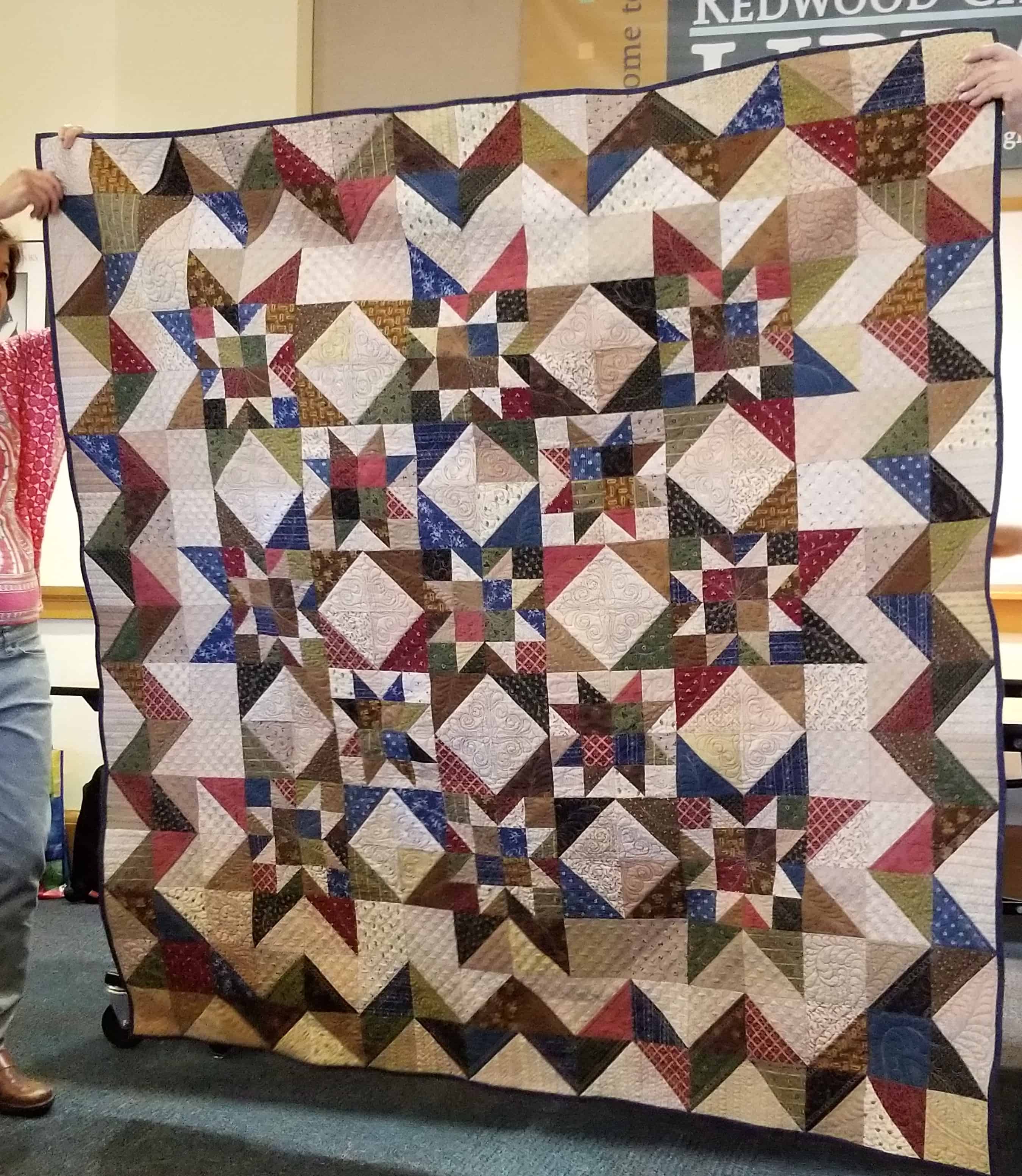
I get a lot out of the guild meetings and the April meeting was no exception. I already talked about Alison’s blocks and Tim’s quilting. Liz is a new-ish member and she brought her star quilt.
One of the things I liked about this quilt is that there are a lot of half square triangles that make secondary designs. The half square triangles also make up the border. This is a great self bordering border!
I also like that there are four patches. This tells me I could use leaders and enders if I want to make this quilt.
There really is a lot to like about this quilt including the stars within stars.