Mosaic Inspiration

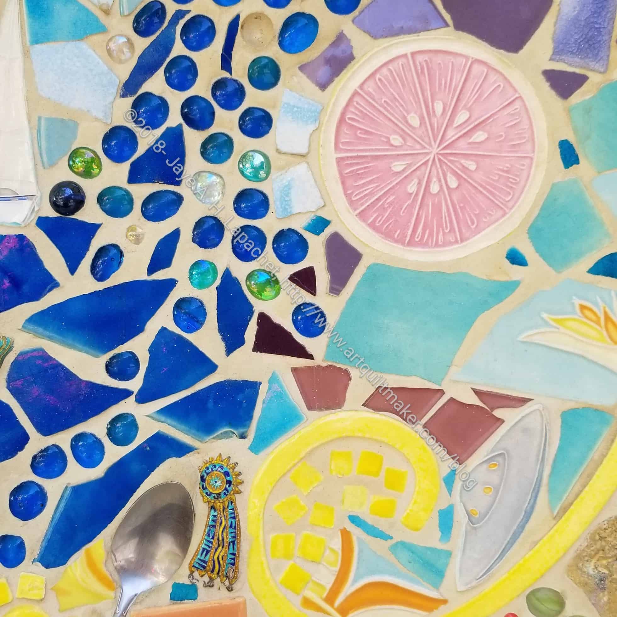
As mentioned recently, I went to Disneyland Resort with my SILs and nieces. I always get a lot of inspiration when I go there. I wonder if I would be happy wandering around by myself in an empty park just looking at the detail. I notice that I had taken pictures of motifs I had photographed before. I guess I need to get busy and make some quilts based on the inspiration.

Downtown Disney tile motif

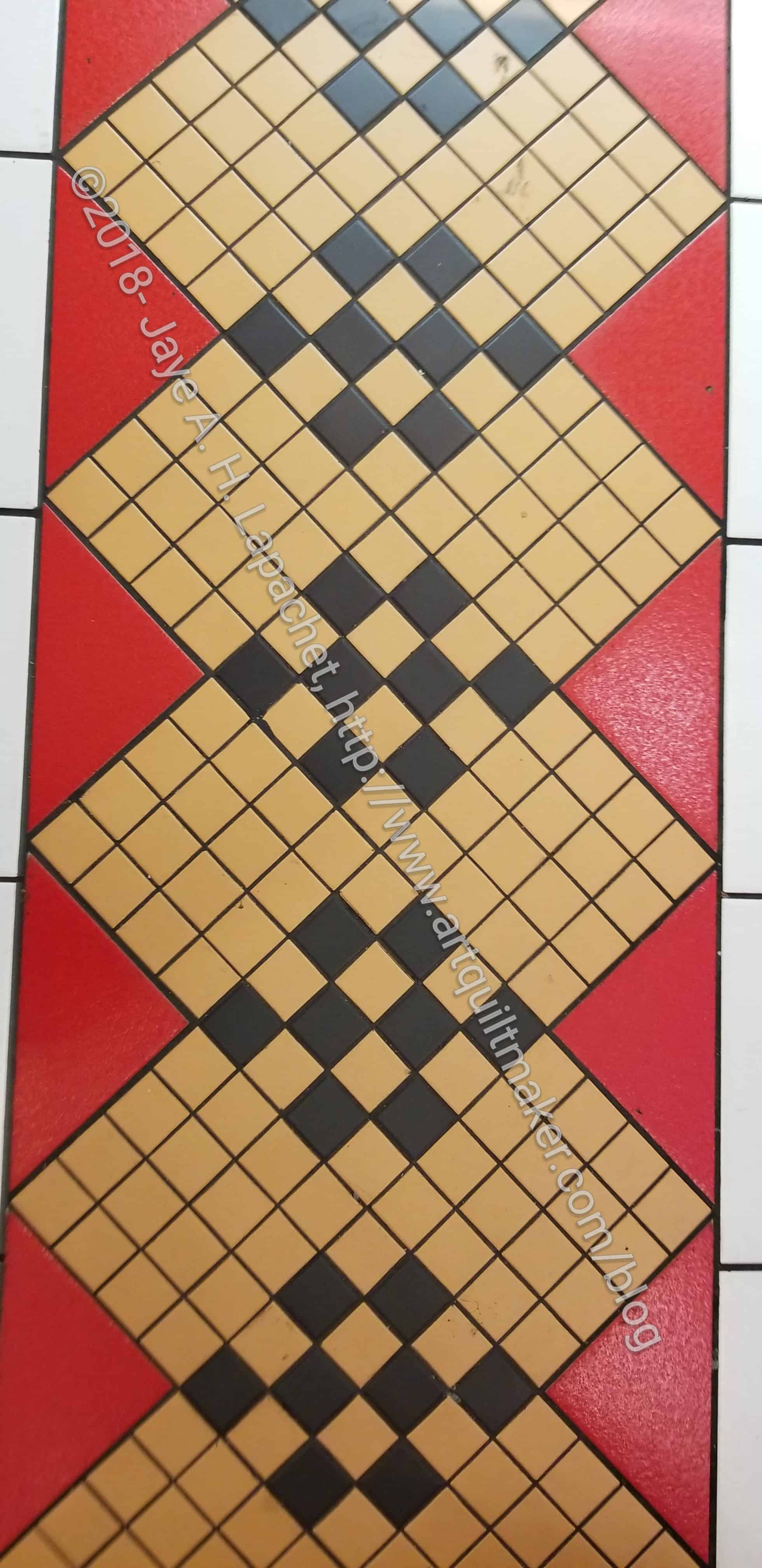
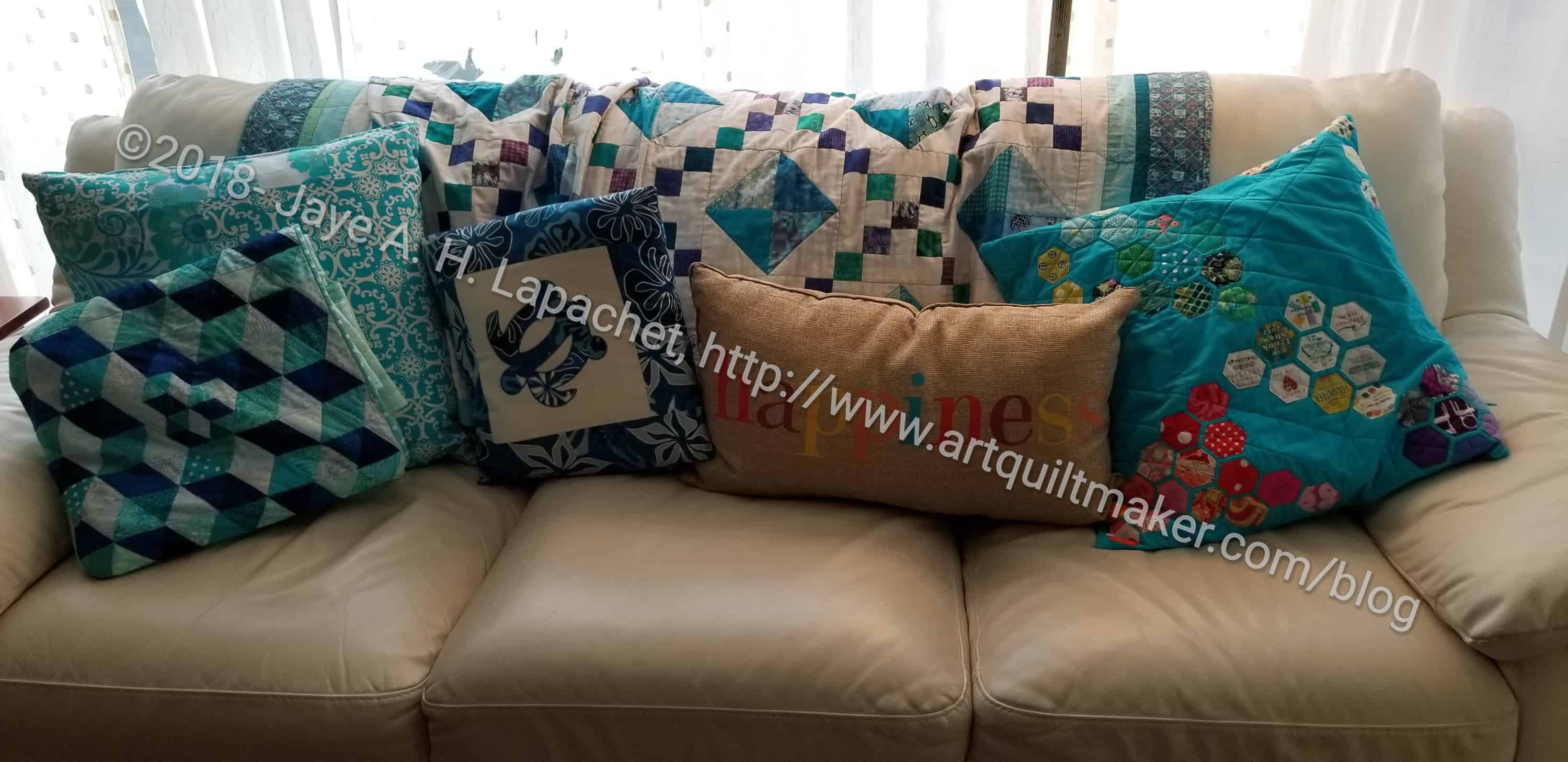
One tile motif would be great for setting the donation blocks the guild already makes. I wouldn’t even have to change the design from 9 patches or 4 patches to 16 patches, the work is already done. I am not sure what I think about the all-beige blocks. I don’t want to piece something that doesn’t need to be pieced. Subtle variations in color or a large plain block? I think large plain blocks would look good with a contrasting – or colorful – background fabric. The pieced design could be set in a column, like I did for the aqua and red Column Donation quilt. I am not sure about the half plain blocks on the top and bottom, but they do make the column look stable.

Tomorrowland pavers
Tomorrowland pavers

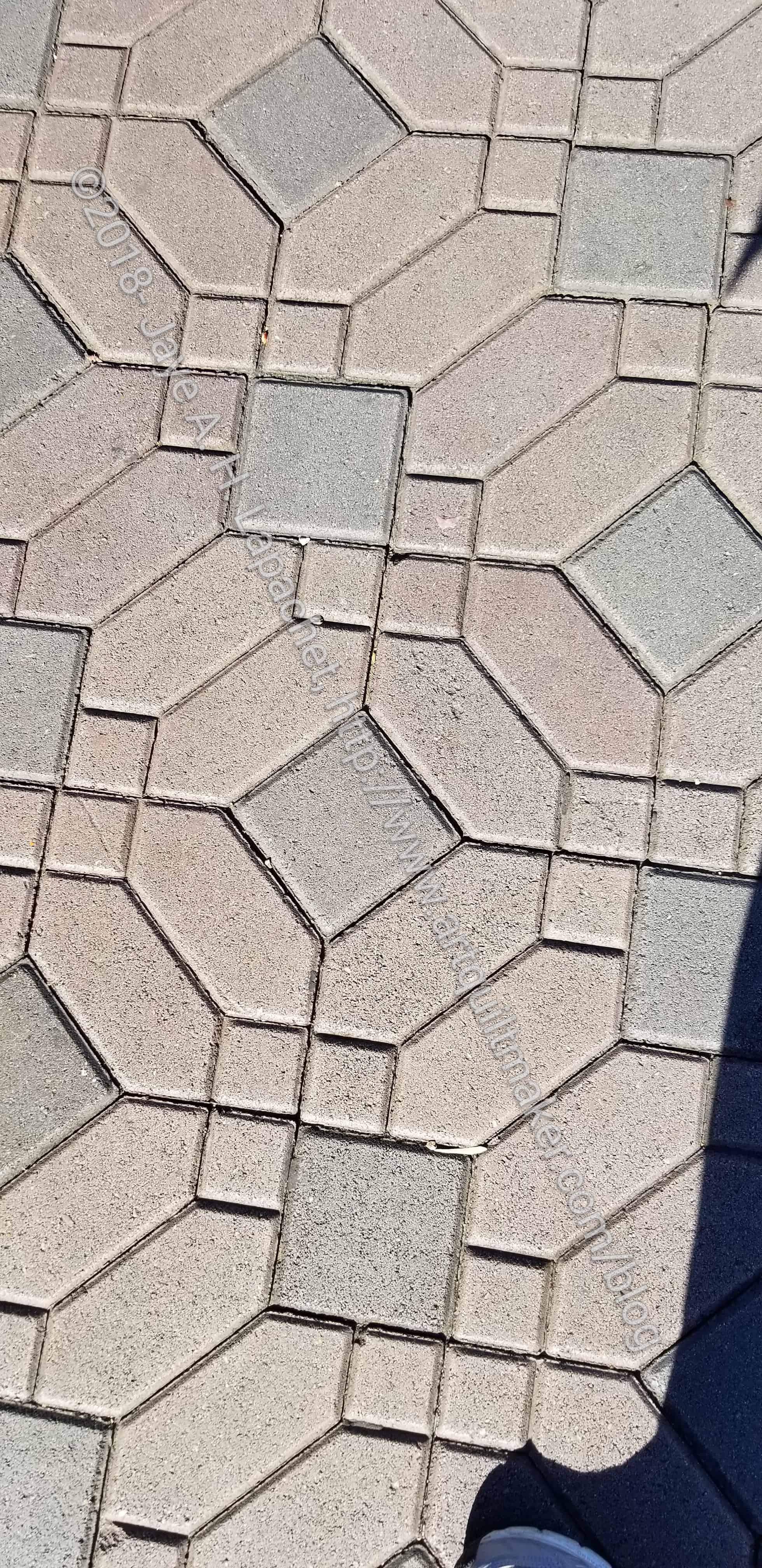
I still like the lozenge shape. Despite the Mostly Manor Lozenge quilt, that shape is not out of my system. I was on the run when I saw these pavers, so took a quick snap and ran on. I think the design would make a great English Paper Piecing pattern.

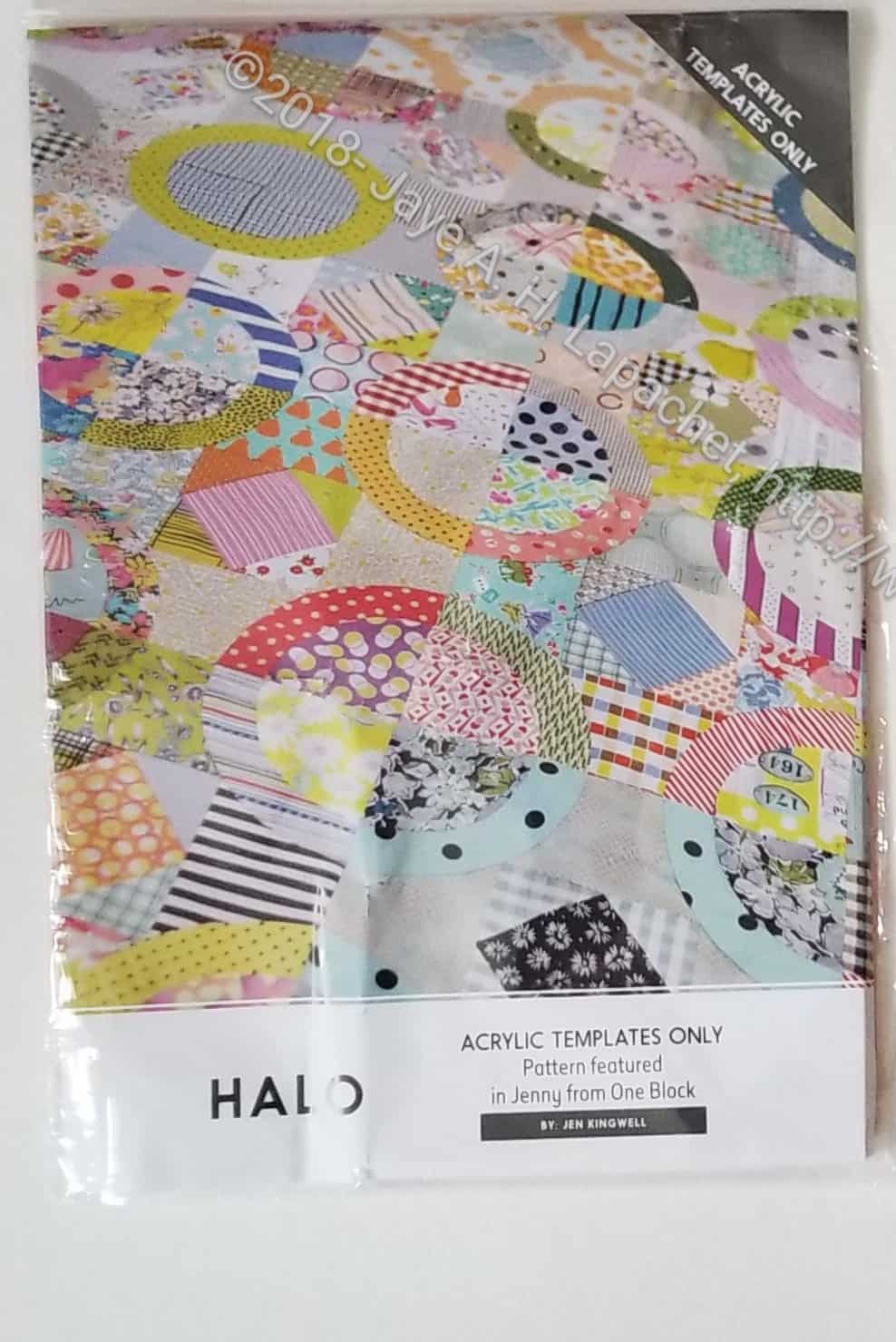
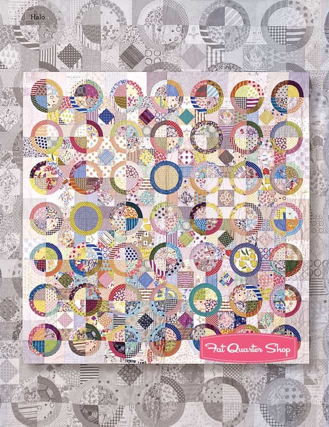
I tried to create a design in my journal, but wasn’t completely successful. I thought about sending the photo to Paper Pieces and asking them to send back the relevant shapes that fit together, but I haven’t. I have the half hexie project and the papers for La Passacagalia, so I don’t want to start something else. I thought about, with other EPP designs, just making one block and a pillow cover. This design doesn’t lend itself to that sort of solution.

Disneyland tile
Disneyland tile

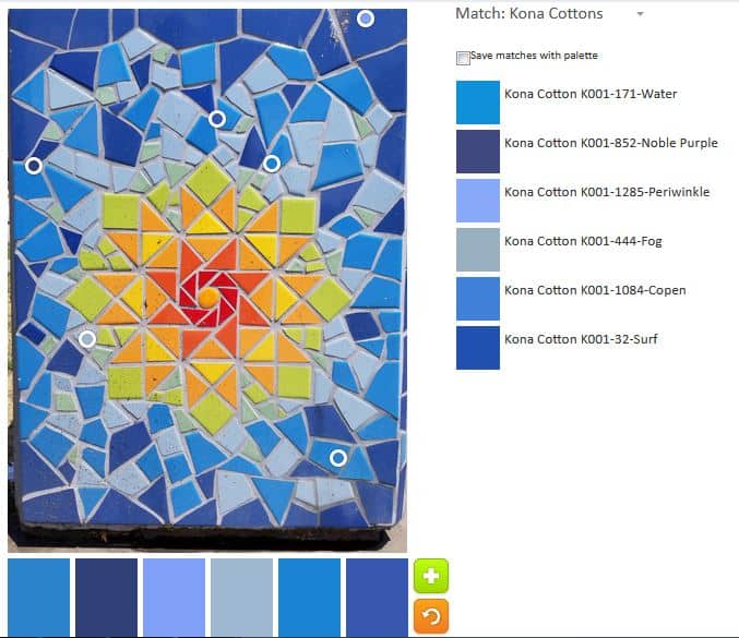
Despite the yucky green, the tile design has potential. I like the combination of larger and smaller squares. I also like the subtle sashing design. Using small enough squares would make this design a great stash busting pattern.

In looking at it carefully, for piecing clues, I am not sure if there is a specific block one could repeat. there are definitely 4 patches and a squashed 3×4 motif. This design would be relatively easy to work up in EQ8.

Do you look at floor and wall tile for quilt inspiration?


ColorPlay: Tile

I got back from a trip with my SILs and nieces to Disneyland and California Adventure on Sunday. As usual, I was overwhelmed by visual stimulation. I have previously written in couple of places about the colors and motifs I see at the parks.

California Adventure Mosaic/Tile

I do think I posted a photo of this mosaic/tile before, but I can’t find it, so we are doing it again with PlayCrafts, though we will just be using a small piece as I may need to use another piece in the future.

California Adventure "The Grapefruit Experience" (anno)
California Adventure “The Grapefruit Experience” (anno)

I will call the piece we are using the ‘Grapefruit Experience’.

ColorPlay default - Mosaics/Tile
ColorPlay default – Mosaics/Tile

The default, surprisingly, was not all neutrals and included some quite lovely blues.

ColorPlay n.1 - Mosaics/Tile
ColorPlay n.1 – Mosaics/Tile

The first palette was created with just a few tweaks to the default palette.  I like the Kona Marine and Caribbean combination. I am not very fond of the other colors, though Bright Idea is interesting.

ColorPlay n.2 - Mosaics/Tile
ColorPlay n.2 – Mosaics/Tile

In palette n.2, I tried to go for a light palette without being a  neutral palette. In the end I kept the Hyacinth and Coal. I like both of those hues, which look like tones of purple to me.

ColorPlay n.3 Mosaics/Tile
ColorPlay n.3 – Mosaics/Tile

The green I added to palette n.3 was inspired by the #GirlScoutHearts project on Instagram. I am not much of a green fan, but this palette might be a favorite. I like the Turquoise, the Royal and the Lavender, especially. I think the whole palette hangs together well.

ColorPlay n.4 - Mosaics/Tile
ColorPlay n.4 – Mosaics/Tile

With a little tweaking, I got a nice golden yellow. It goes well with the Kona Jamaica, which is one of my favorite tones.

This image had just the right amount of opportunity for playing with color.

ColorPlay n-5 - Mosaics/Tile
ColorPlay n-5 – Mosaics/Tile

I really, REALLY wish Kona had less ravely greige goods. some of their blues are fantastic, even adjusting for computer differences. N.5 is the monochromatic effort.

ColorPlay n.7 - Mosaics/Tile
ColorPlay n.7 – Mosaics/Tile

I realized I would be able to create a yellow palette as well.

ColorPlay n.6 - Mosaics/Tile
ColorPlay n.6 – Mosaics/Tile

I also tried on a neutral palette. I could resist.


What will you make?


Continuing to Sparkle

With Spark #30, we finished working our way through Carrie Bloomston’s book, The Little Spark. Buy it. Support the artist. Our journey here is done, but the posts will remain and you can work through the book and my comments at your own pace. There is much more to each spark than what I wrote. The original chapters will help you.

Included on the very last page of the book was a list of books and movies that Carrie suggests we read. I am listing some of them:

I haven’t read any of the books listed above. I have seen a couple of the books she lists, but would watch them again. Go buy Carrie Bloomston’s book, so you get the full benefit of her fabulousness!

Ring Toss Thoughts

Ring Toss (Halo Top by Jen Kingwell) Template Set

Now that I seem to be okay with starting new projects, quilts are being thrown in my path in such a way that I can’t seem to say no.

The official name of this quilt is Halo Top. I plan to call this quilt Ring Toss, once I get around to making it. I am not a fan of the word Halo in very many contexts and this is one I don’t like. Ring Toss sounds like a circus and fun.

The other thing is that the pattern is referred to as “Jenny from One Block.” I really don’t know what that means and haven’t had any luck with Google yet.

There is a lot of cutting to do, which, as I said, requires some Hunting & Gathering, so I might not get to it immediately.

I went out and searched the web for photos of the blocks to get some ideas. I came up with one from A Crafty Fox that was helpful. It is easy to see the block structure from this photo.

FQS Halo top example

Fat Quarter Shop had a photo, which was interesting as well. It showed a grey quilt in the same pattern under the brightly colored scrap quilt. It made me think that a monochromatic border might be interesting. I’d have to work hard at showing contrast.

Creative Spark #30: Trust Yourself

This is the last spark of the book and it is incredibly short. Carrie Blooms ton writes “Now that you have read this book, let me tell you one last thing to take with you on your adventure:

NOTHING YOU NEED

TO KNOW IS IN THIS

BOOK OR ANY OTHER.

Nothing you need is in a class or at the museum or at the art supply store. Everything you need is within you” (pg.124).

This is hard for me. I always think that if I get a better machine, or that new fabric, or a variety of zippers, my work will be better. I have to learn that my work is good enough with what I have and if I keep striving as discussed last week, then I will move towards perfection.

The author ends with “Trust yourself and you will awaken to the potential inside you. You already have everything you need (pg.124).

You can see the last post on this topic from last week.

Nota bene: we are working through Carrie Bloomston’s book, The Little Spark. Buy it. Support the artist. Play along. There is much more to each spark than what I am writing. The original chapters will help you. Go buy Carrie Bloomston’s book, so you get the full benefit of her fabulousness! You can see my book review, which is what started this flight of fancy.

Creative Spark #29: Leave it on the Field

“I am proud of what you did out there. You did your best. You left it all on the field” (pg.122).

What this quote says to me is something that I try to live by, but need reminding about periodically. I always says that I need to show up and do the work. That isn’t enough and this quote reminds me of it. Yes, I need to show up. Yes, I need to do the work. I can’t, however, do it in a desultory way. I need to give it my all. I need to look at my work throughout the process. I need to think about what I am doing. I need to try different things and do my best work. It might not actually end up being my best work, but I need to give quiltmaking my all and not hold back.

“I used to think I had to save it all up for this or that” (pg.122) speaks to me. I recently bought some Tula Pink dots and stripes and in September I started to use them. Using my good fabrics is FANTASTIC! I have done this a couple of times lately and I have to say that saving fabrics for the perfect project is horrible for me. I have fabrics I used to love and now I don’t even remember why I bought I them. It is sad. Using my good fabrics means that I can see them in my house and use the quilts and enjoy the fabrics.

In this context, Carrie Bloomston means herself. She compartmentalized herself and doled parts of herself out as she saw fit. She writes “some knew me as a mom, some as an artist, some as a spiritual seeker, some as a kniiter, glassblower, a painter, a designer…I finally let go of that a few years ago when I began the process of letting go of control” (pg.122).

I know the examples are different, but I believe that using my fabric now is the first step in stopping the compartmentalization we, as humans, are prone to engage in. Letting go of control or planning isn’t easy. We all have busy lives and like to squeeze a lot into our days. “Befriend incidents, accidents, and mishaps. They are your greatest teachers” (pg.123).

“No matter what form your creativity takes, you have to let go of expectation and perfection. For the record, there is no such thing as perfect. …if you ever finally made the perfect quilt or painting or cake, you’d never need to make another one, right?” (pg.123). This quote is profound to me. I know that there is no such thing as perfection. Every project I make sparks a ‘what if’ moment. What if I made the blocks bigger? What if I used pink instead of green? There is an endless number of what ifs that populate my mind as I work on quilts and other projects.

For me, trying my best (despite what Yoda says) and working towards my best work and towards perfection is what I have to do, what I have been doing and what I will continue to do.

Carrie says the same thing when she writes “There is only trying, doing your best, and leaving it all on the field. If you do your best, honor your journey, and love yourself along the way, then you will find the pot of gold at the end of your rainbow. The pot of gold is everywhere when you go with the flow, surrender to the process, stop controlling, and let yourself be filled with joy and love” (pg.123).

She ends the Spark with “I hope you have learned that no matter what, you are good enough exactly as you are right now, and your lief experience will fill your work with your spirit” (pg.123).

You can see the last post on this topic from several weeks ago.

Nota bene: we are working through Carrie Bloomston’s book, The Little Spark. Buy it. Support the artist. Play along. There is much more to each spark than what I am writing. The original chapters will help you. Go buy Carrie Bloomston’s book, so you get the full benefit of her fabulousness! You can see my book review, which is what started this flight of fancy.

ColorPlay: Windspinner

ColorPlay: Windspinner original

I took this photo in Tahoe. I really like those Windspinners.I can’t buy one, because DH gets sick.

There are a lot of colors, if a person is careful with the little Palette Builder circles. I had fun looking for them.

ColorPlay-Windspinners-default

Despite my efforts, the default palette is still a bunch of neutrals.  It is really dark, but somehow strangely appealing. The Kona Earth is a nice brown.

ACK! I can’t believe I said that about brown.

ColorPlay: Windspinner-n.1

I went for totally bright and cheerful in the first palette. The green in this palette is really a good addition. I like the Grasshopper with the Papaya even though I am not much of a green person.

ColorPlay: Windspinner-n.2

I went for a cool colors palette. Isn’t it fun? I kept the Grasshopper. It is a nice dark with the other colors.

ColorPlay: Windspinner-n.3

Palette number 3 is the monochromatic palette that weighs heavily towards turquoise. 😉 I did add in the darks to make it a little different. The Kona Carribean and Breakers are two great darks.

ColorPlay: Windspinner-n.4

I had to get out of my favorite cool colors, so I went with warms. This is a nice combinations of pinks and golds, I think.

ColorPlay: Windspinner-n.5

I couldn’t get away from the cools, even though I tried. I added some lavender and those greens – more mossy and sagey – add something, especially with the Breakers.

ColorPlay: Windspinner-n.6

I dragged myself away from the cools again and went back to warms, though I couldn’t stay completely away and that Jade Green combined with the Kona Cotton Red and the Pomegranate is awesome.

ColorPlay: Windspinner-n.7

I did a backwards version of n.6 in that I used mostly cools with a warm.

What will you make?


ColorPlay: Umbrellas

ColorPlay-umbrellas-Original

I’m always looking for photos with the most color possibilities. This week is no exception. I took this photo in Portland. The umbrellas were hanging down from the ceiling, covering the ceiling.

It doesn’t have as many colors as I would like, but until I start playing with the Palette Builder, I always think the photo I chose has more colors than it really does.

ColorPlay-Umbrellas-default

The Kona Earth looks like a cocoa color to me. Surprisingly the tool put some color into the default palette. I suppose it would have been really weird if it ignored the pink umbrella completely. It didn’t do much with the green umbrella.

ColorPlay-Umbrellas-n1

I took charge of the pink to see how much pink I could get out of the one photo. I was surprised that I got quite a lot. You can see all the dots are only on the pink umbrella.

ColorPlay-Umbrellas-n2

I went a little broader in my second palette. I like that Cotton Sage blue. Sage is green to me, but whatever that color is, it lends a brightness to an otherwise neutral palette.

ColorPlay-Umbrellas-n3

This 3rd palette is virtually the same as the one above except for a few tweaks. I wanted to just move the circles a little bit and see what came up. The green created Evergreen, which really looks black. I suppose I agree with the Desert Green name. Colors in the desert can be very pale, bleaches looking. The neutral palette is softer, I think.

ColorPlay-Umbrellas-n4

The fourth palette reminds me of dessert. The neutrals have a richness to them, especially the Kona Cinnamon.

In general, this photo is primarily generating neutral palettes with me teasing out the least bit of color to make them my own.


ColorPlay: deYoung Flowers

ColorPlay: DeYoung Flower - original
ColorPlay: DeYoung Flower – original

I took a few photos at a special exhibit held at the deYoung in late March.

I can’t remember the name of the exhibit. They do it every year and it is up for a very short time. Someone chooses artworks and matches them up with floral designers who create a floral arrangement that matches, reflects, goes with – or something – the artworks. I had a hard time seeing how the floral designs went with the artwork. You never know what the artist sees. I find that with my own work.

I have many pictures from the show, but the pink in this one intrigued me. I really created a lot of palettes and could have created more. There is a lot of scope for color in that arrangements. I had to stop because I knew you wouldn’t read about 50 palettes. I also didn’t want to write that much.

ColorPlay: DeYoung Flowers-default

The first palette, as usual is the default palette. This one is seriously neutral and somewhat depressing considering the vibrant colors in the bouquet. I noticed that the circles tend to be placed towards the edges.

ColorPlay: DeYoung Flowers n.1

I made sure my first palette included some brights, or at least cheerful solids. I kept in some of the neutral feel as I was trying to show progression. I don’t like that Kona Cotton Latte much. It sticks out like a sore thumb.

I have up on progression when making my first monochromatic palette, the pink. I was able to make two (yes, TWO) monochromatic palettes this time: a blue and a pink. I went for broke since that Kona Latte fabric really bugged me.

ColorPlay: DeYoung Flowers n.3

I went back to progression when I made palette n.3. I thought blue would look great with pink, so I kept some of the pinks and added some blues. I put more blues in as I didn’t want to make the palette exactly equal. I probably couldn’t have done another one that had more pinks than blues, too.

This one led to the monochromatic blue palette pictured above.

ColorPlay: DeYoung Flowers n.5

I tried to get away from my default blues and do something different. I think the anchor fabric in this palette is the Kona Cardinal. I didn’t completely succeed with this effort, because the Wasabi and Butterscotch are very similar. I am not sure the arrangement has need of that much of those tones.

ColorPlay: DeYoung Flowers n.6

I wanted to improve on the palette above, so I made minor adjustments. Chestnut Palm and Spice are not favorites. This is not my kind of palette.

ColorPlay: DeYoung Flowers n.7

I tried to improve the palette above again. I think I did a better job. The Grass Green and Deep Rose are much better.

ColorPlay: DeYoung Flowers n.8

I think n.8 is the best iteration of the last few. The palette reflects my personality. The pink brings out the best in the Sunflower. I think Taupe is a supporting actor and I wouldn’t put a lot of that in a quilt.

You may see other arrangements from this show in the future.

ColorPlay: Tool Tote

ColorPlay: Tool Tote

I really like the Philip Jacobs fabric in the Tool Tote and decided to do a ColorPlay using one of the photos from the post.

ColorPlay: Tool Tote -default

Again, the default is not all neutral. There are quite a number of violets.

ColorPlay: Tool Tote -n.1

This palette provides another group of violets with some neutrals included. It is kind of dark palette, but the Honeysuckle makes it slightly more cheerful.

ColorPlay: Tool Tote -n.2

I am not sure how different n.2 is from the two above. I like the Lupine in the palette above.

ColorPlay: Tool Tote -n.3

I couldn’t go without a neutral palette. I still got a lavender.

ColorPlay: Tool Tote -n.4

I really tried to make this one green. I think the greens look uglier in the palette than they do in the fabric. Granted there isn’t much green in the fabric.

ColorPlay: Tool Tote -n.5

Different grouping of colors, but the same colors as the first couple of palettes.

Surprisingly, this group of fabric offered up fewer opportunities for interesting palettes than I would have expected.


Grandma’s Tea Towels

Mary C's Embroidered Tea Towel Quilt
Mary C’s Embroidered Tea Towel Quilt

The other day, at Sew Day, I saw Mary’s GREAT quilt and it made me think of some of the tea towels and such that I have that are nicely embroidered.

Yes, we had the Boxy Bag class, but there was plenty of time to work on other projects. I started cutting out the All Rolled Up Tote, as mentioned.

Parakeet Embroidery
Parakeet Embroidery


Mary C, a great member of the group, brought a quilt she had made with embroidered tea towels. I have tea towels, pillowcases and a few other things from the matriarchal side of the family. I talked about the parakeet dresser scarf (or similar) in a previous post.

Mary said that she used a jelly roll of 1930s fabrics. I really like the fabrics she chose and think they are a little different than the Aunt Grace style of 1930s fabrics.

This is the first quilt that I have really liked that uses tea towels. She backed the embroideries with ShapeFlex after trimming them. We advised her to just quilt around the embroidery designs and not over them.

ColorPlay: Yergacheffe

ColorPlay: Yergacheffe original

I was really happy to find this photo. I was looking for it for some reason a little while ago. I saw this sign in a coffee shop years ago and the motif sticks in my mind as some interesting and different. The colors are interesting, too.

ColorPlay: Yergacheffe -default

The default colors this time tend towards purple, which I like. This palette would make a good outfit.

ColorPlay: Yergacheffe -n.1

In my first palette, I went for brights and the image did not disappoint. The palette itself doesn’t hang together very well, but the colors are bright and that is something.

ColorPlay: Yergacheffe - n.2
ColorPlay: Yergacheffe – n.2

I wanted to refine my first palette and try to get it to hang together better. This is, mostly, softer and tends towards warm colors, except for the Kona Royal, which doesn’t really fit.

ColorPlay: Yergacheffe - n.3
ColorPlay: Yergacheffe – n.3

I tweaked the colors from above a little and this palette is much more cohesive. That bright pink and the Kona Magenta (which looks more like purple/violet to me) really dominate, but not in an awful way.

ColorPlay: Yergacheffe - n.4
ColorPlay: Yergacheffe – n.4

I decided to focus even more on the pink and purple. Except for the Cheddar, which I must have forgotten about, the pink and purple are the stars. Many of the colors showed up in n.3 and show up in n.6.

ColorPlay: Yergacheffe - n.5
ColorPlay: Yergacheffe – n.5

The default palette wasn’t a neutral palette so, in the spirit of the Palette Builder, I created one.

ColorPlay: Yergacheffe -n.6

I had to try a monochromatic palette and this time I went for pink. I had a hard time finding different pinks as the Bright Pink dominated.

ColorPlay: Yergacheffe - n.7
ColorPlay: Yergacheffe – n.7

Yellow doesn’t show up much in the images I choose, so I wanted to take advantage of the yellow in this image and try to create another monochromatic palette using yellow.

ColorPlay: Yergacheffe -n.8

In another attempt to make a monochromatic palette, I chose the orange area. It is small, between the pink and the yellow, but I thought I might be able to get a range of peachy-oranges. I did sort-of.

ColorPlay: Tile

ColorPlay: Tile - original
ColorPlay: Tile – original

I saw this quilt-like pattern of tile on one of my daily walks.

ColorPlay: Tile -default

The default is less neutral than normal. It actually looks somewhat beachy.

ColorPlay: Tile -n.1

I went for my usual monochromatic palette and came up with a series of blues.

Sadly, the website was having a problem despite me switching browsers, so there are only two palettes today.

What will you make?

I use the Palette Builder Tool on the Play-Crafts site. Thanks to Anne Sullivan for making it available.

ColorPlay: Bar Color

Sobo Ramen Bar
Sobo Ramen Bar

I took a picture of this bar area before this restaurant stopped carrying gluten free noodles. I finally dug the photo out, because of the bright and cheerful nature and had some fun creating palettes.

ColorPlay: Bar default

The default palette was less neutral-y than usual, which was a pleasant surprise. The red tones are an interesting addition. I also noticed that the program didn’t stick exclusively to the edges.

The monochromatic palettes were interesting. Yes, I made more than one this time. As you can see there are both cools and warms. I know the green is not warm, but it has a kind of warm feel to it – a bit mossy, I guess. Perhaps there is a yellow undertone giving it a bit of a warm feel.

I like some of the blues in the blue palette quite a bit.

The two pink-red palates are similar, but a little different. As usual, I was really surprised at the colors that came out of the tool.

ColorPlay: Bar n.2
ColorPlay: Bar n.2

I really played around with the other palettes. I really like the blue and gold in palette n.2. The rest of the colors are kind of meh, though the greys alone or as a background would probably be great.

ColorPlay: Bar n.1
ColorPlay: Bar n.1

The one above looks like a Japanese stationery store or a bag of sweets or a girl’s party when she is just getting out of the pink stage.

ColorPlay: Bar n.8
ColorPlay: Bar n.8

I thought I had better create a palette of neutrals. I know there are some of you out there who love neutrals (well done they can be great). I think this one is much more interesting than some I have seen. I won’t make a quilt – or anything – from the colors, though.

What will you make?

I use the Palette Builder Tool on the Play-Crafts site. Thanks to Anne Sullivan for making it available.