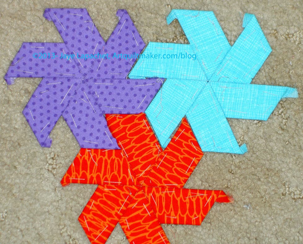
I guess I am on kind of a star kick. I am showing you MORE stars, after all.
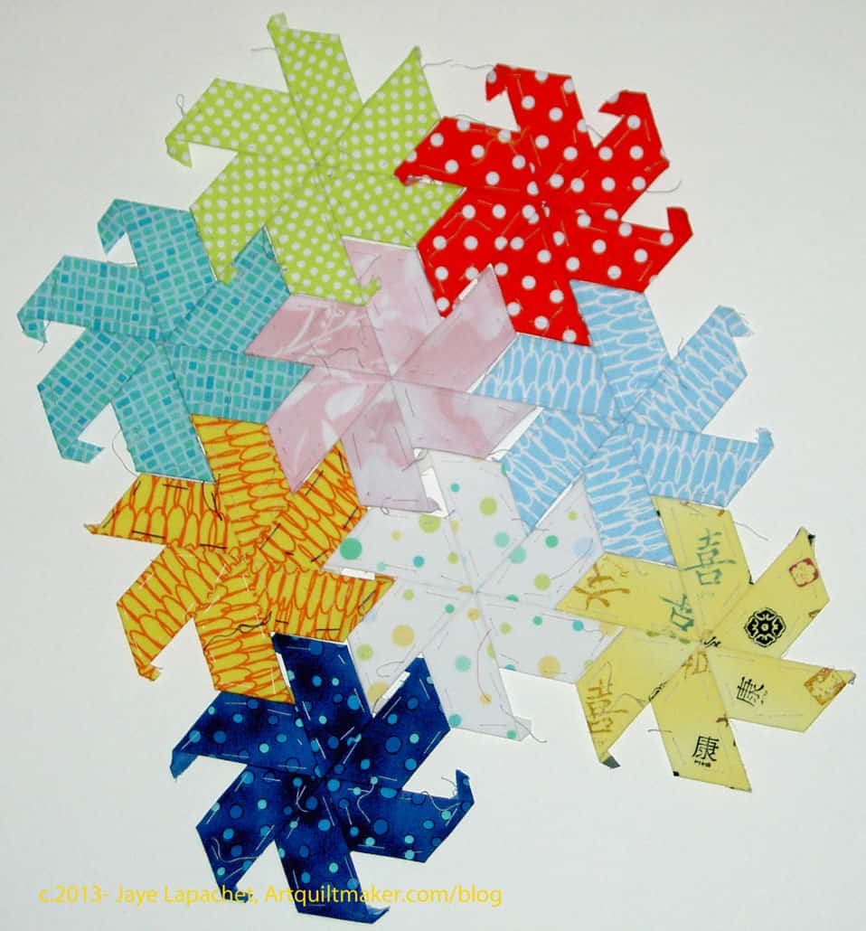
Aren’t the colors pretty? I think they go together well.
This is the miniscule amount of English Paper Piecing I was able to do while we were out with the Natives. I was only able to piece in the car and it was just a 4 hour drive each way.
I thought I would have scads of time sitting by the pool to work on this project, but nope. I was too busy smiling, shaking hands with DH’s constituents to bring this project out. I think I will have a goal of getting it done by the time he ends his term as Grand President in 2017. It will be my political project. Perhaps I’ll have enough for a table runner?
Last week, I wrote a big long post, which you might have read, about my quilting adventures while I was off with DH attending his Native Sons event.
Some of what I wrote the other day is repeated below, but I did change and add to it as well.
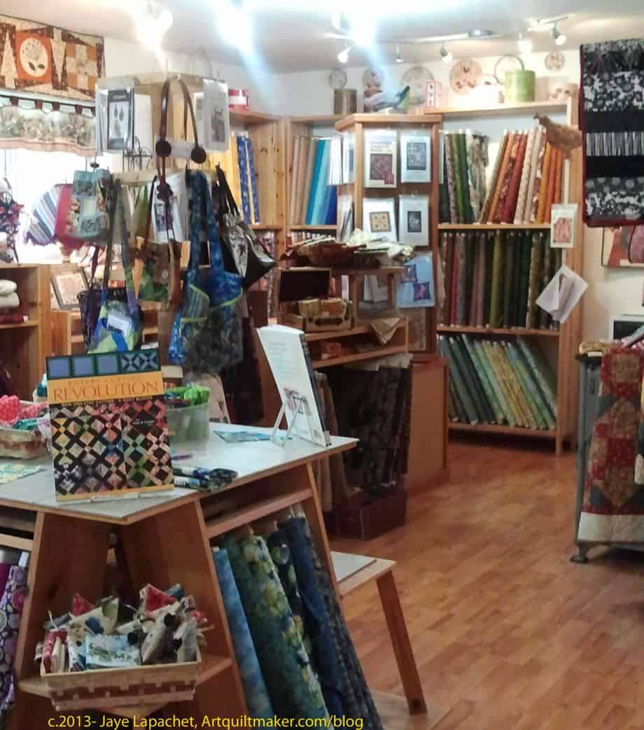
On our way home, we stopped in Vacaville for a late lunch. As we exited the freeway, Jeanie, MIL’s friend, pointed out a quilt shop. I didn’t even know she was well trained. 😉 I looked at it longingly as we ate lunch and finally said I would walk over and take a look while the rest of the party finished eating. They decided to come along, so we finished our lunch and drove over. It is called A Quilted Heart. It can be found at: 878 Alamo Drive ? Vacaville CA ? 95688. Store hours: Monday – Friday 10-6 ? Saturday 10-5 ? Sunday 11-4. Phone: 707.447.9000
A Quilted Heart
I liked the shop. They had the little 2″(?) Moda charm packs, the new Camille Roskelley line, a nice selection of batiks and, again, a boatload of thread. I bought one of the mini charm packs so I could look at Happy Go Lucky in person and see it in person and decide if there was yardage I wanted to buy. Last night, I thought that, perhaps, I should have bought a bunch of those mini charm packs and used them for a quilt. Then I mentally slapped myself and reminded myself that I have several projects in process and another several on the drawing board.
The shop sold machines as well and there seemed to be a guy in the back doing repairs. I don’t know what kind of machines, but I did see a large Brother (Innova? Innovis?), but it could have been a trade-in. I think they may have had Berninas. Again, I am not sure.
They had lots and lots of samples for such a small space. The samples were on the small side, but it was still fun to see so many. I am actually quite impressed with the variety of samples I have seen at shops I visited lately.
A Quilted Heart
The shop was quite full for the size. I don’t know square footage, but it was smaller than the other shops I visited this week.
Aside from the fabric, they had a good selection of books. there were a number of books I didn’t recognize, though the days when I knew all of the books that were out is long past!
I thought about taking TFQ to this shop, though I am not sure I am up for the drive again this weekend. I have a project for her when she comes over today. She doesn’t know. 😉
I was away for a week in Redding, California for a Native Sons ‘Grand Parlor’. You will remember that DH and I and SIL and I made pillows for this organization over the past few years.
Redding is about 4 hours north of us and to the east a bit. DH has been a Grand Trustee for the Native Sons of the Golden West for about 5 years and decided to run for an Executive Board position. He ran unopposed, which is not a given, but still campaigned like he had an opponent. that meant that I needed to be with him. Of course, if my mom had not been available and willing to help out with the Young Man, I would have needed to stay home. Fortunately, she is a saint and was happy to stay at our house, shuttle the Y.M. to school and cook for him. I sure she did not harangue as much as I do about homework. She also hired a bassoon teacher. The work on the campaign paid off. DH is now Grand 3rd Vice President. I cannot remember shaking so many hands, being kissed by so many people or talking to so many people in one week in my life. I am sure that RUSH surpassed this number (400 or so) or was close.
To deal with the grueling schedule and constant smiling, I snuck away to write blog posts, exercise and GO TO QUILT SHOPS. I found one before I left, but while I was there, the ladies were kind enough to tell me about two more. I only visited one, though.
Sew What Quilts
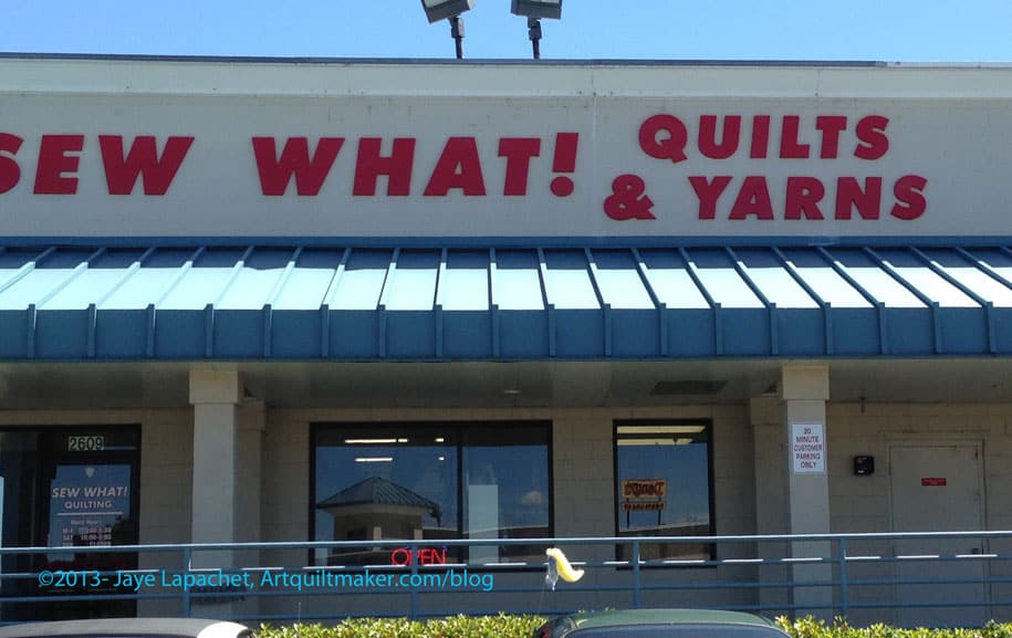
The first shop I visited was called Sew What Quilts. It looked exactly like the photo on Google Streetview and I saw it as we exited the freeway upon arrival. It was less than half a mile from our hotel. Perfect.
The outside looks fairly mall-ish and non-descript, but the inside is light and airy and they have a lot of interesting samples. There was some new fabric (Joel Dewberry Notting Hill), lots of batiks, several shelves of Philip Jacobs and Martha Negley, a couple of shelves of blacks and whites, Bali Pops, Kona Solids and lots more. there was room for a lot more fabric, but I didn’t ask them if they were low and nobody offered me that information.
Sew What Quilts WIP
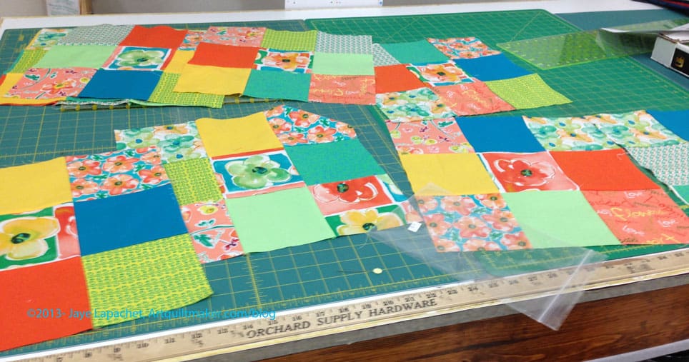
There was a class or a class sample or something in progress. This simple nine patch looks great with these fabrics. I especially like the fussy cut flower. I am pretty sure this isn’t a Disappearing Nine Patch, but it could well be if the maker put the fussy cut flower in one of the side squares. Just a thought
The shop had these fabrics on the shelf, which was nice. I didn’t buy any, but love the fresh, ‘summer drink’ feel of the colors.
Sew What Quilts
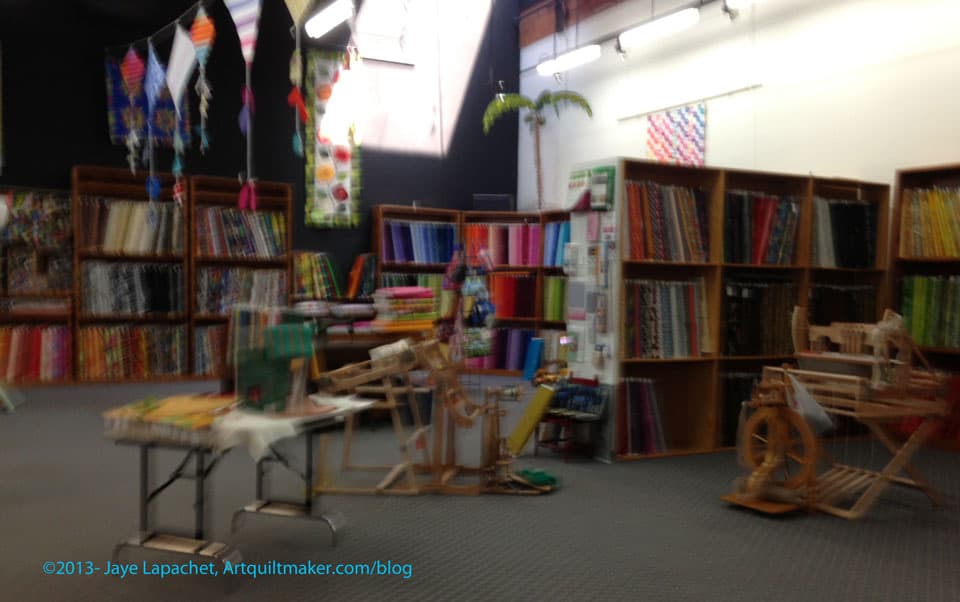
From this picture, you can see how large the store is. It has very high ceilings and plenty of floor space. They had really nice decorations and had fabric kites hanging from the ceilings, which looked very cheerful. I am not exactly sure if they have classes, though I assume they do. I haven’t looked at the website.
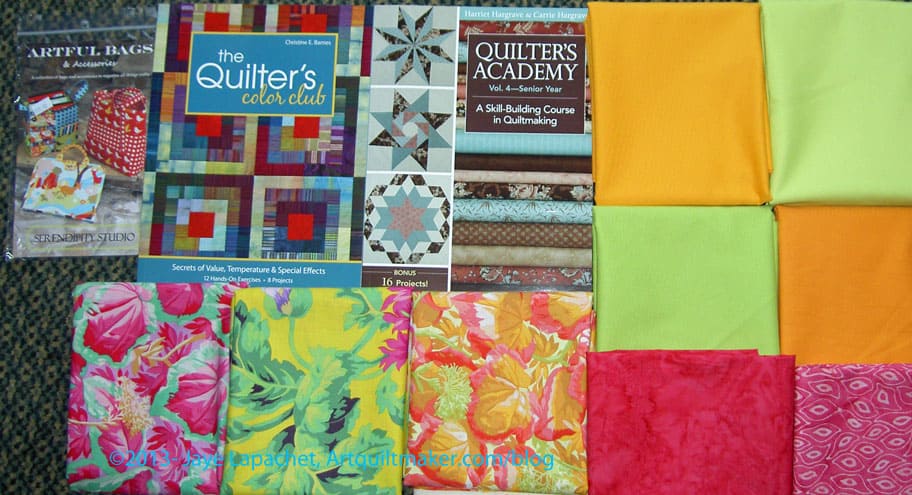
Sew What Quilts! had a sale going on for books. the sale was that you could buy one book and get a second book of equal or lesser value for free and I took advantage. I looked at all of them and bought the Harriet Hargrave Senior Year book and also the new Christine Barnes color book. I’ll use the former for tutorials and the later for podcast episodes with Sandy. Getting them both was less expensive than buying both on Amazon.
Sew What Quilts
In the photo to the left you can see the wall (far) that is perpendicular to the entrance. In the middle of the room, you can see the looms,spinning wheels and various equipment for the yarn people. Sew What Quilts and Yarn (real name). I think that it is a good idea to have yarn and quilt fabrics together. It seems to me that a lot quilt people are also knitters. I would like to knit more, but I don’t.
There were a lot of fluorescent lights in all the places I went around Redding: the hotel, the quilt shops, restaurants. Fluorescent lights are not kind to my face and hair. I looked in various mirrors and felt quite geezerly.
Sew What Quilts
At the end of the row, you can see the Kona solids and some semi solids/tone-on-tones as well.
Please click on the photo and make it larger, because the fat quarters are displayed very nicely. You can also see the buttons the shop has for sale.
The shop was getting ready for some kind of yarn trunk show and their preparations were fun to watch. I didn’t want to stay and see the trunk show so I tried to hurry and look at everything.
The shop also has a shop dog. She was nice, but barked a little when the shop women put a new shawl on display.
Sew What! ReddingSew Simple, Redding, Calif.
I also went to Sew Simple, a shop one block away from my hotel and on the way back to the hotel.
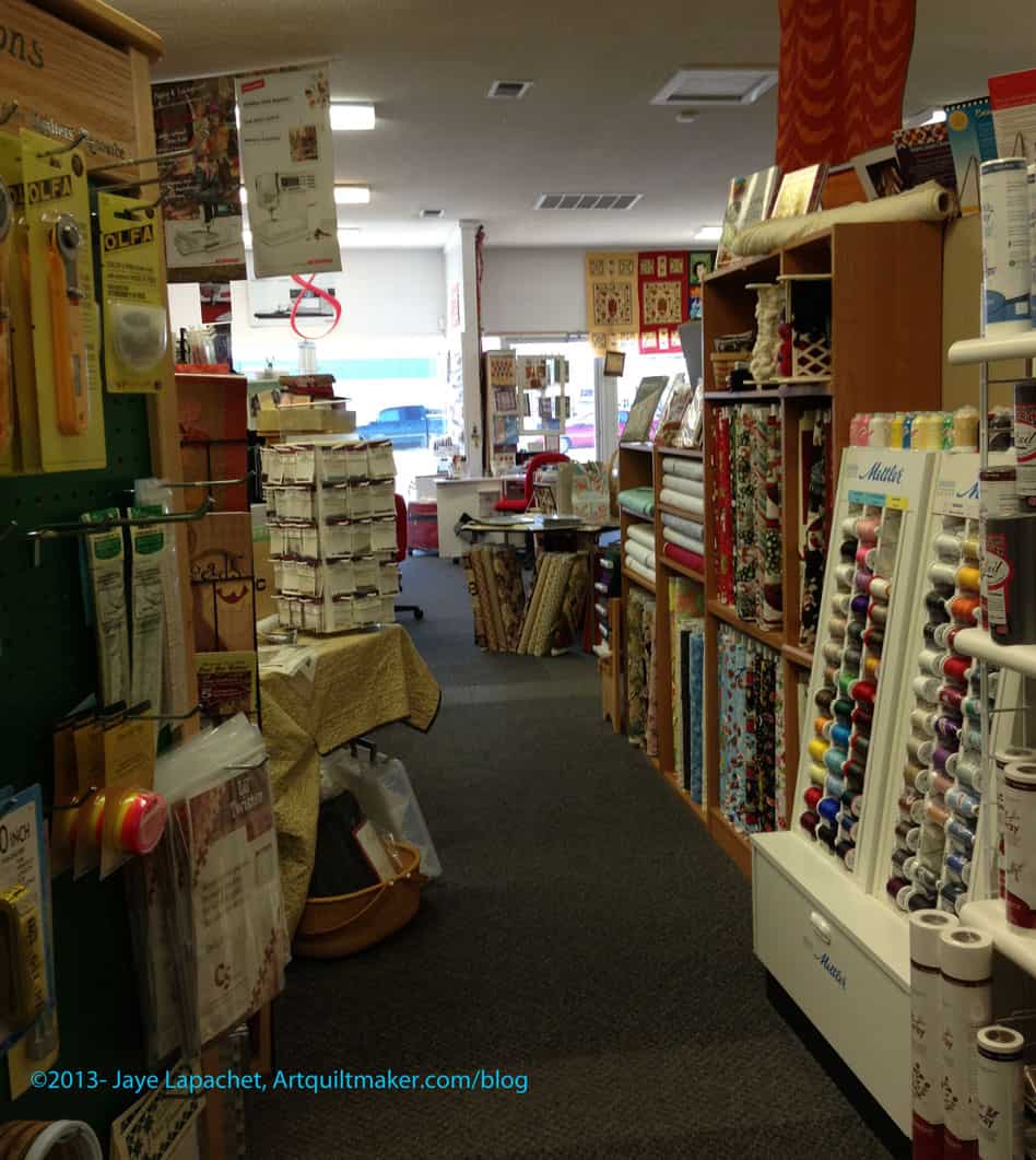
Again it was a shop in a strip mall. Again, it was HUGE. Rather than being a large open space like Sew What, this space was divided into smaller spaces with fabric, notions, Berninas (yes, they are a Bernina dealer), classroom, kitchen, classroom. I am not sure I have ever seen a larger classroom than the one at this store.
Sew Simple
I didn’t buy a lot at the shop. The fabric wasn’t all Civil War fabric, but their fabric didn’t have the bright vibe that I like.
This shop had an unbelievably large selection of thread. There was a lot of specialty thread. I assume that a lot of it was suitable for machine embroidery. The shop had the largest supply of Mettler I have seen in a while.
I was also impressed with their notions. They had several types of Sewline pencils, all sizes of rotary blades and lots of Paper Pieces paper piecing patterns. I am not sure I have ever seen these patterns in a store.
I have to say that shops in the Bay Area are smaller than these stores because of property costs.
Sew Simple
As I said, the space was divided into several areas. At some point the space was probably multiple storefronts.
While there weren’t really what I would consider bright fabrics, the shop did have fabrics tending towards bright – some dots, stripes. The colors just weren’t….bright enough for me. The reds weren’t pinky reds or even scarlet, they were tending towards blood red, but weren’t quite there.
Sew Simple did still have some of the Circa 1934 fabrics that I liked. They had a couple of blots of the number fabrics. Call them if you need some for a project. I know they had the cream numbers on a red background and I think they had red numbers on a cream background.
Sew Simple
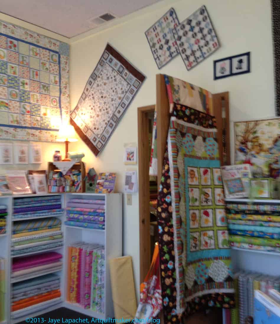
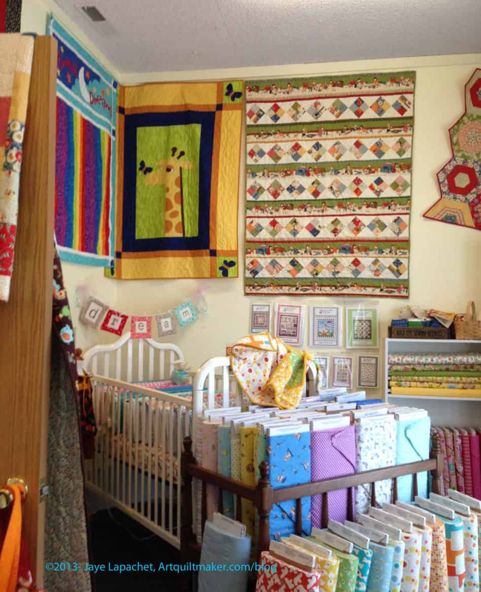
The brights I did see were in the baby room and were flannels. They had a quilt made from Fizz fabric by P&B Textiles. You can see the quilt in the upper left hand corner of the photo. I would have bought more of it, but they only had the quilt. They didn’t seem to have the fabric.
The crib was filled with bolts of fabric. It was a little hard to access, but filled completely and cute. In every room, there were tons of quilts on the walls. There was a cohesive look in the whole store – creamy, not quite country, not really bright. Hard to describe.
Amish BOM
I keep running into this Amish Block of the Month quilt. I saw it on the City Quilter site a few months ago and I saw it again this past week. I have always loved Amish style quilts and this one keeps following me around. My first quilt, The Sampler, was inspired by Amish quilts, but definitely not Amish style.
I have enough projects! I have enough fabric! My country house isn’t ready yet for quilts. But I really like it. I like the way the log cabins form the legs of Sawtooth Star. I like the shading. I like the pieced border.
Sew Simple Redding
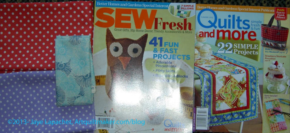
I am not sure why I bought the magazines, except that I was looking for projects that I will make for the NSGW wives/ladies that help me with the events I need to organize during DH’s next few years. I know I want to design a little purse or carrier that can hold their cards, pencil and note pad. A number of ladies play cards while waiting around for their husbands to finish meetings and they didn’t have anything cuter to carry the supplies in than a ziploc bag. Of course, they may want to keep them dray,thus the ziploc, so I will have to think about that. Laminated cotton?
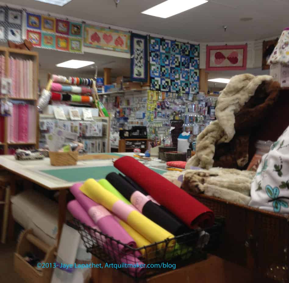
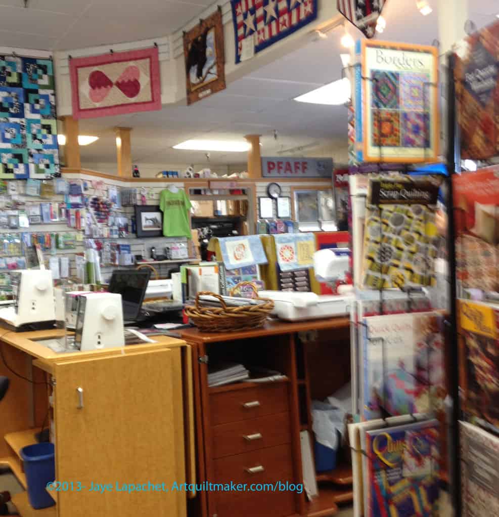
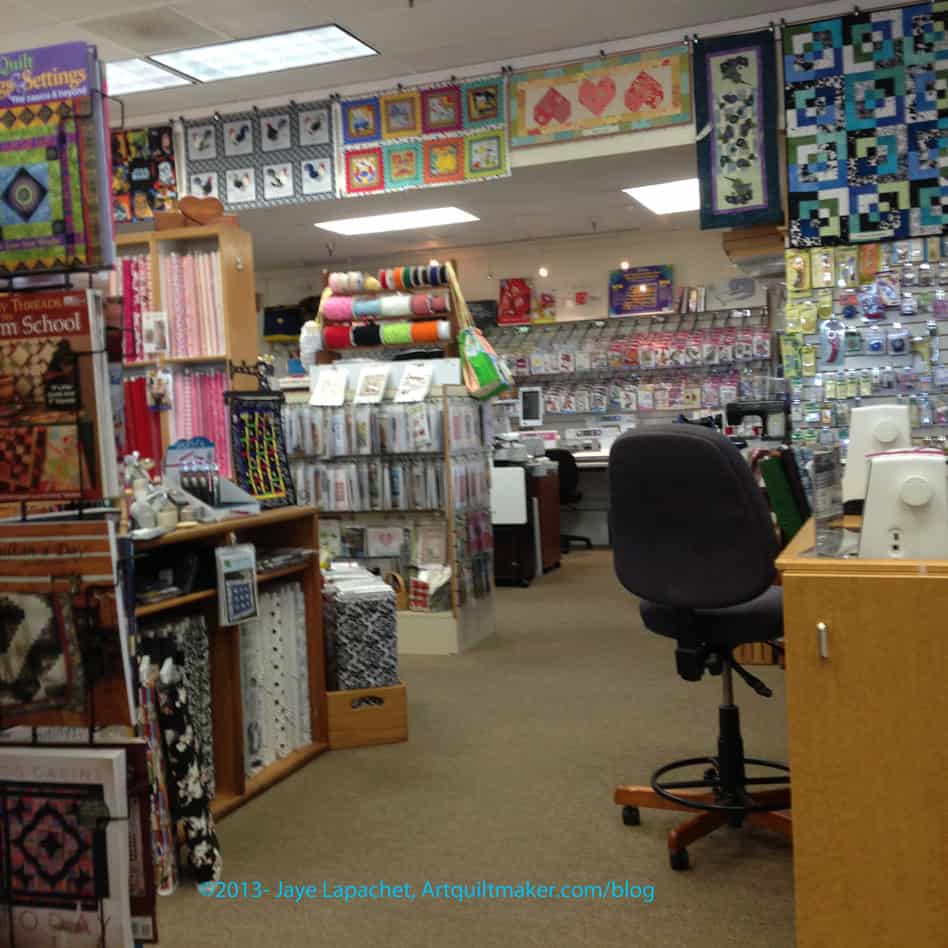
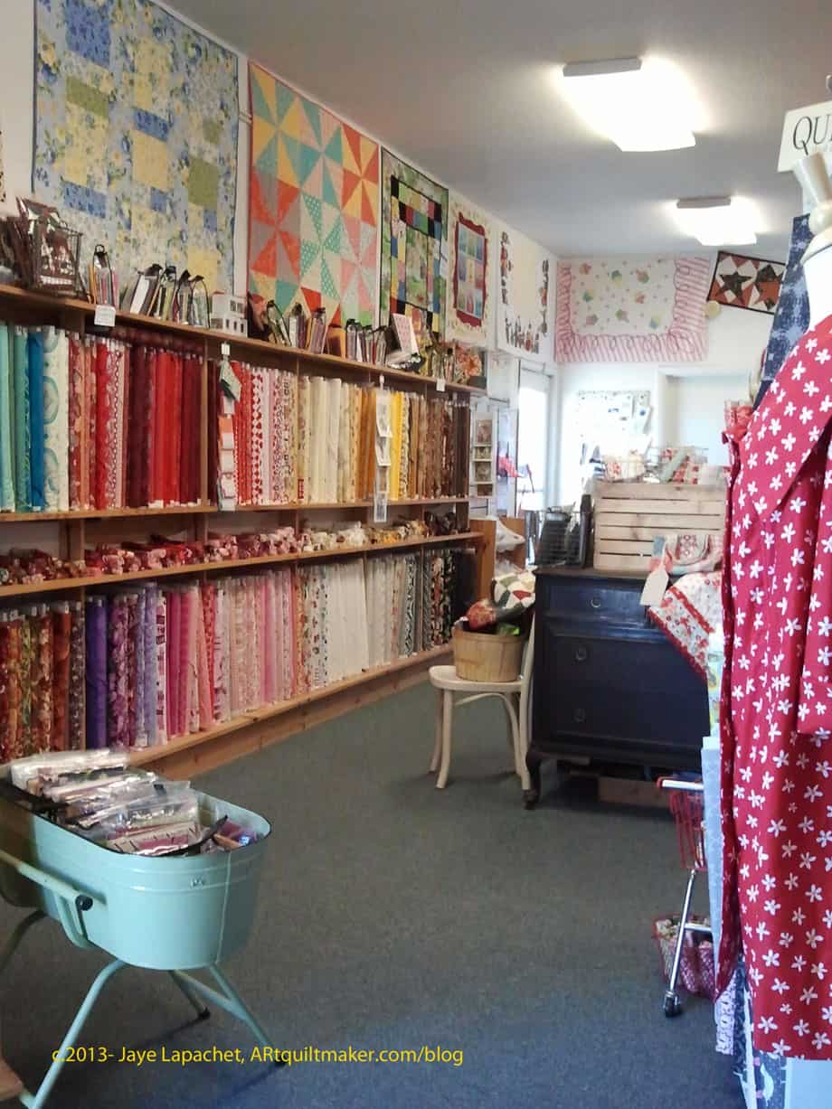
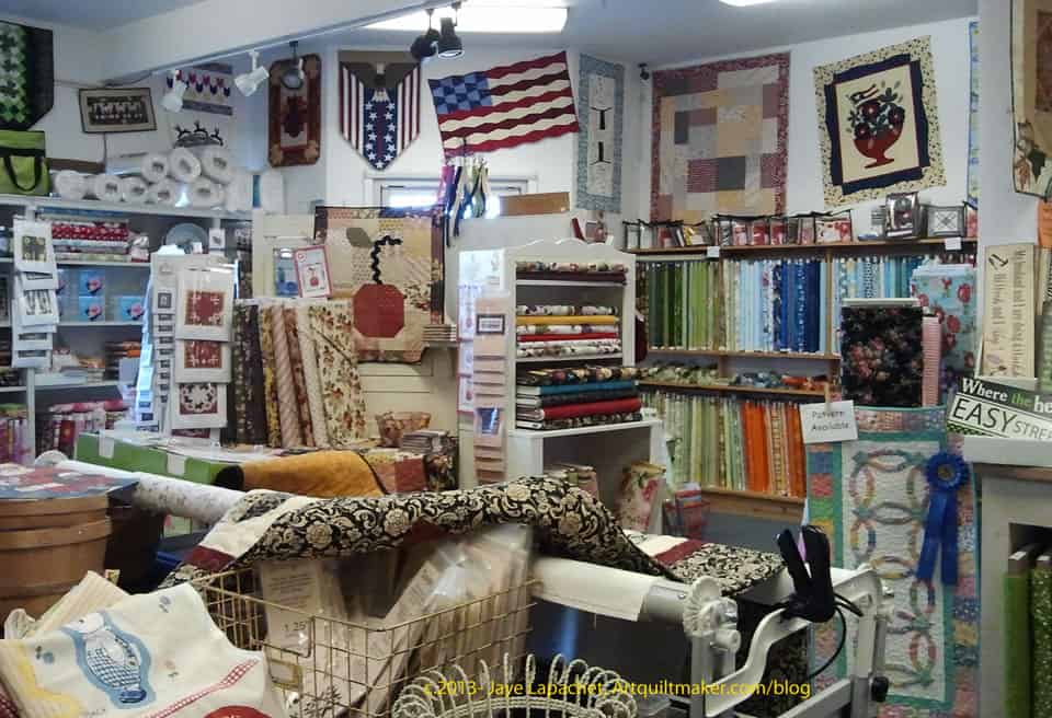
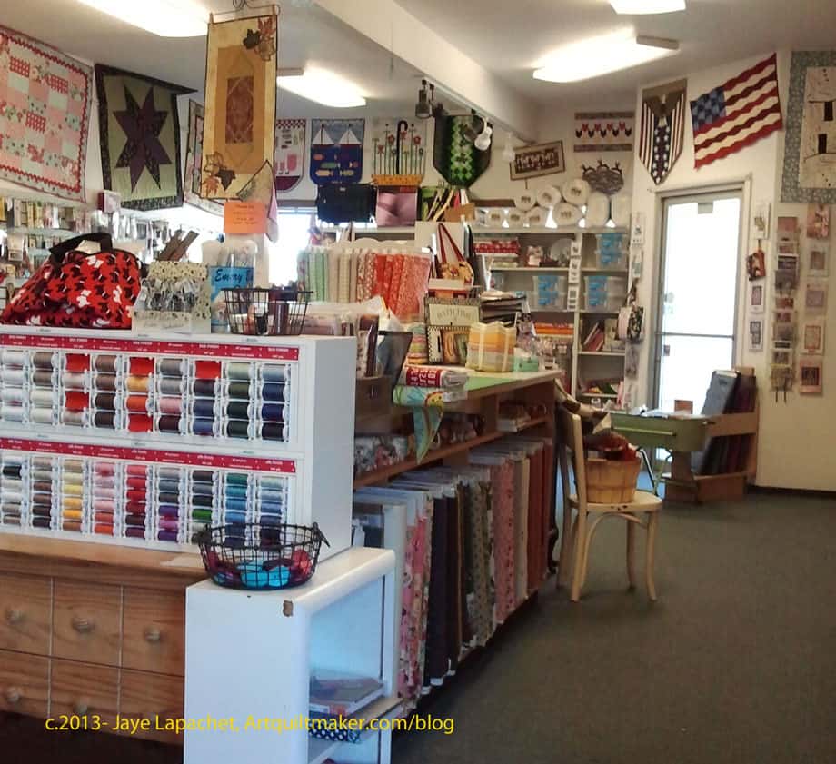
A Quilted Heart, Vacaville
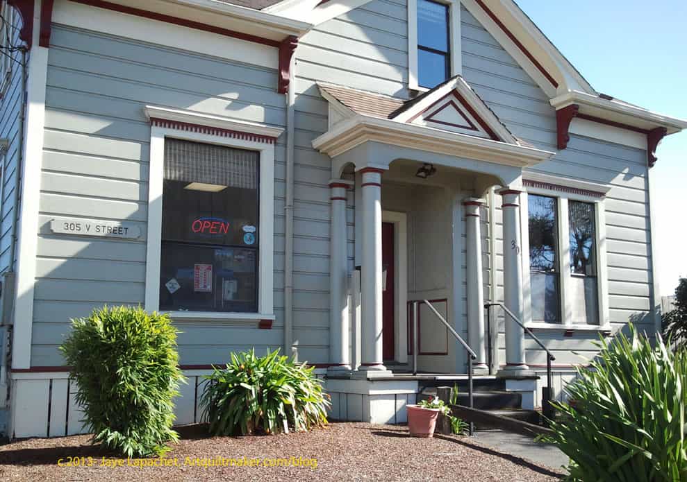
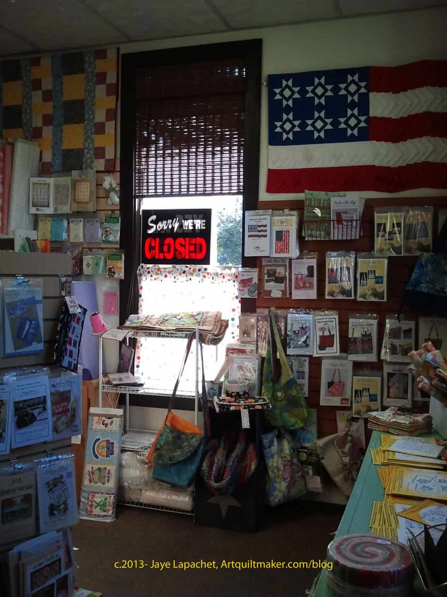
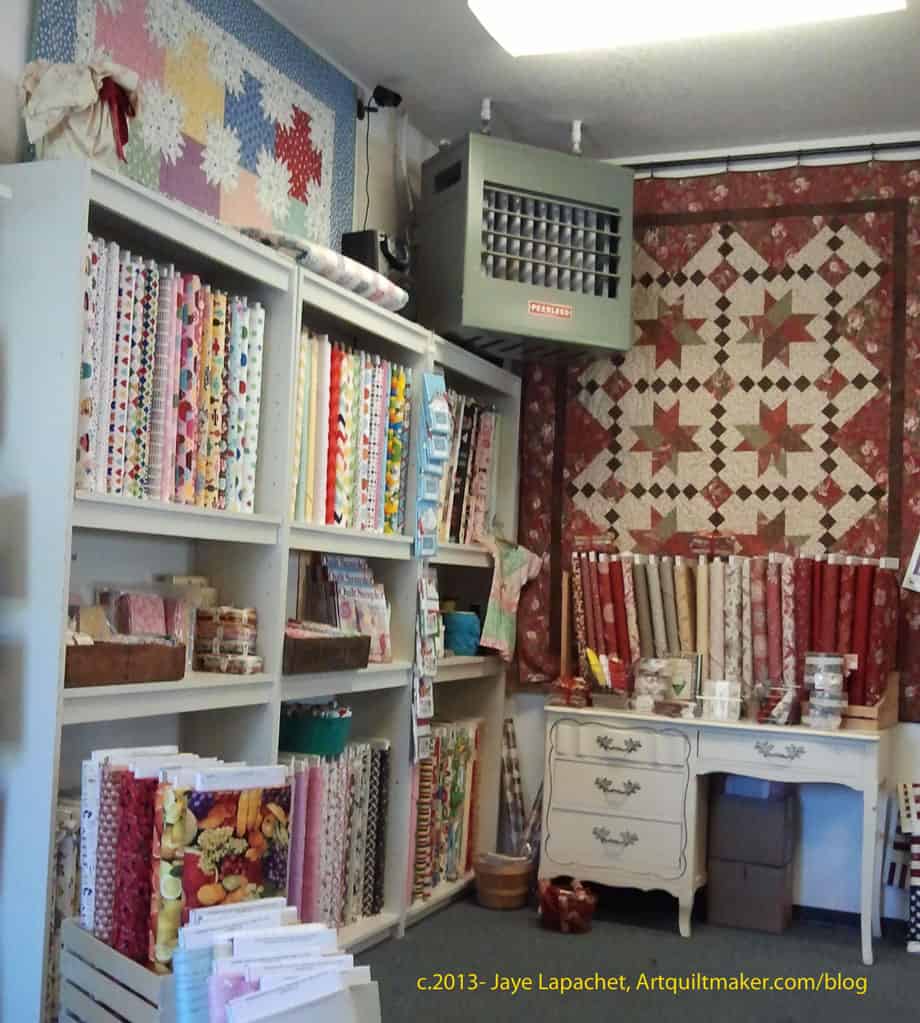
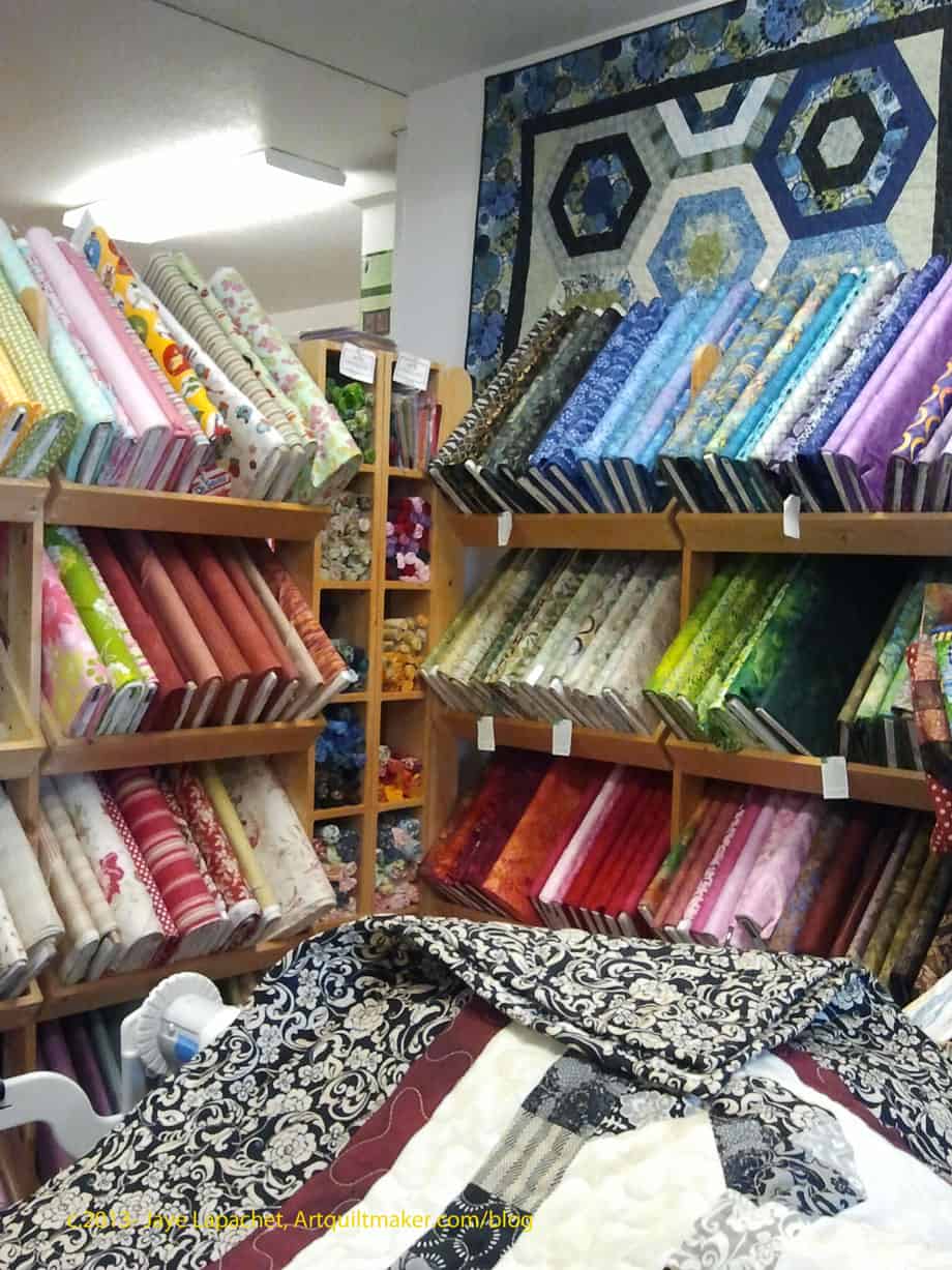
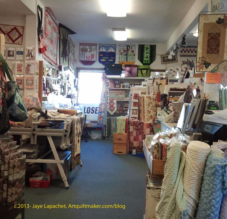
On our way home, we stopped in Vacaville for a late lunch. As we exited the freeway, Jeanie, MIL’s friend, pointed out a quilt shop. I didn’t even know she was well trained. 😉 I looked at it longingly as we ate lunch and finally said I would walk over and take a look while the rest of the party finished eating. They decided to come along, so we finished eating and drove over. It is called a Quilted Heart.
I liked it. They had the little 2″ Moda charm packs, the new Camille Roskelley line, a nice selection of batiks and, again, a boatload of thread. I bought one of the mini charm packs so I could look at Happy Go Lucky in person and see if there was yardage I wanted to buy. They sold machines as well and there seemed to be a guy in the back doing repairs. I promised I would only stay for 10 minutes, so I didn’t take many photos.
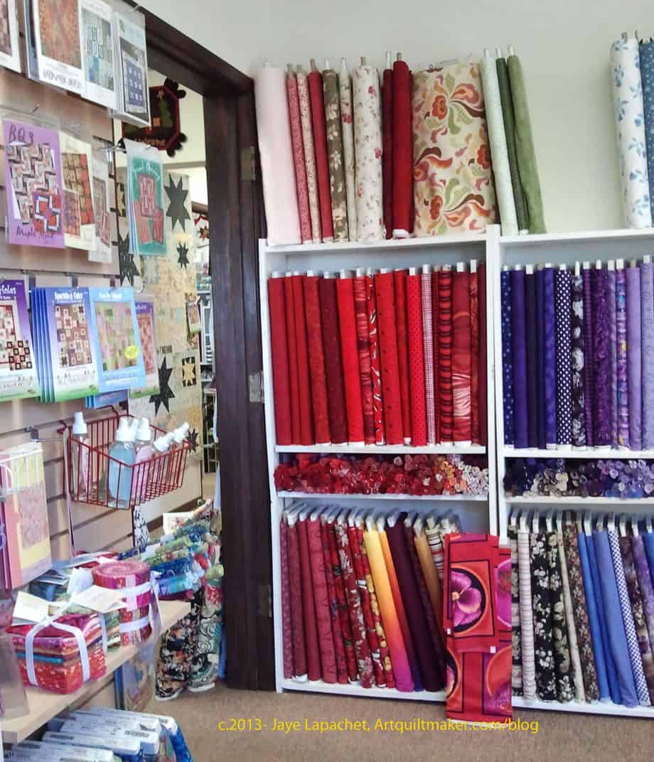
They had lots and lots of samples for such a small space. I am actually quite impressed with the variety of samples I have seen at shops lately.
I have no business buying fabric. I have a big pile to iron, another big pile to cut and another pile that has not made it to the washing machine yet. Yes, I participate in wine o’clock occasionally, though my #1 stress reliever has come to be buying fabric. Last week was stressful, so I bought fabric. I didn’t buy a lot on my recent trip down south, but I did buy some. It is so nice to buy fabric in person.
Roxanne’s, Carpinteria
We stopped at Birch Fabrics in Paso Robles (aka FabricWorm on the web) on the way down, and Roxanne’s and Quiltin’ Cousins on the way back up. I have talked about Birch before and will write another post about it later to update you on the changes there. I wanted to talk about Roxanne’s first.
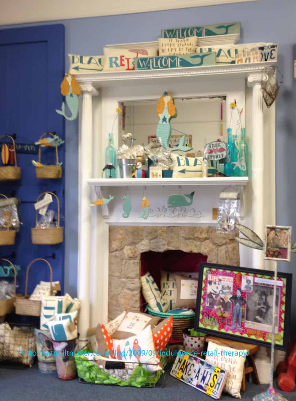
Roxanne’s fireplace
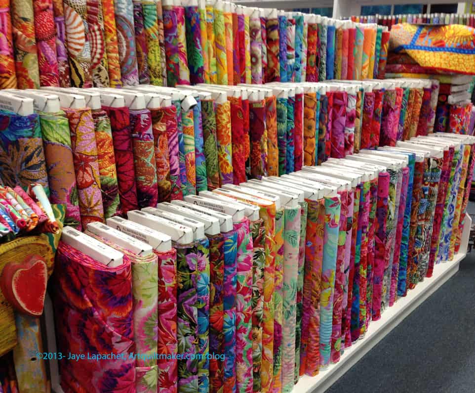
Roxanne’s, it turns out, used to the be the Treasure Hunt, which I visited and enjoyed in the past. Roxanne told my mom, who talks to everyone!, that she had a quilt /craft shop in that location for 25 years. After 25 years, she kept the building, but sold the business to someone who owned the Treasure Hunt. Last year the owner of the Treasure Hunt decided that owning a quilt shop was not her idea of a good time, so Roxanne gutted the building, which was completely empty, remodeled, upgraded and re-opened Roxanne’s. They have a large selection of crafting supplies such as yarn and paints, but their biggest offerings seemed to be in quiltmaking. It is a gorgeous building on the inside. I love the wall colors and the decorations.
I don’t know if Roxanne’s was a house at one point. The street seems to have mixed zoning and it kind of looks like a rancher. The inside has been completely redone, as I mentioned, so it is most definitely a shop now.
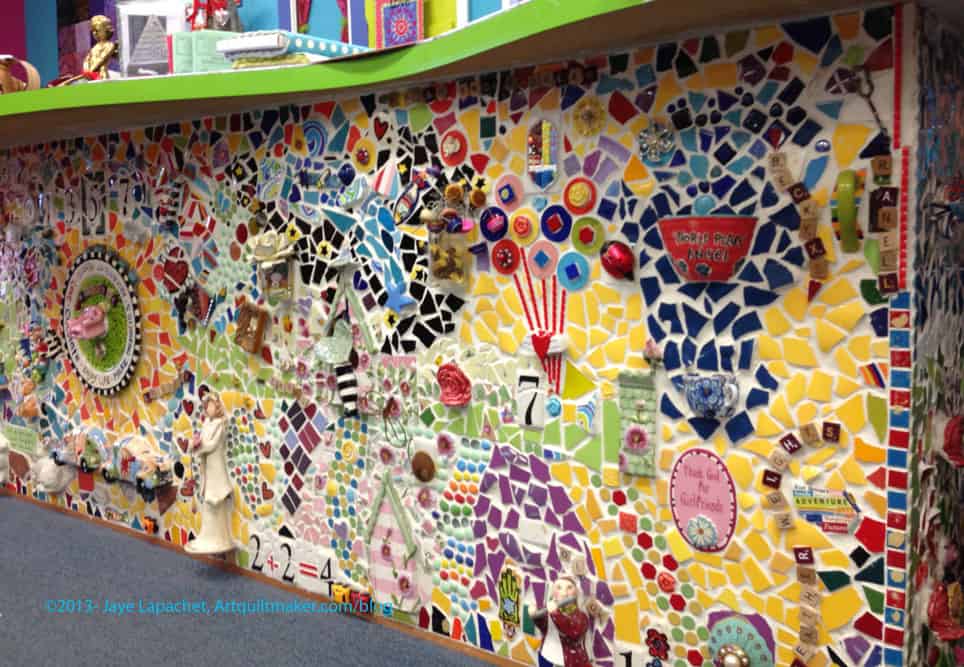
Roxanne’s cutting counter
One of the reasons to LOVE this shop is the tile mosaic counter front.
California Adventure in Anaheim has an outdoor mosaic like this. I think it was the first one of this creative type that I ever saw and I wanted to do a backsplash like when we remodeled our kitchen in 2007. I wasn’t really up for the amount of work or the cost or the time, though, and let it go. I do want to do a piece like this in a frame as a welcome sign and hang it next to my front door. Something large and impressive.
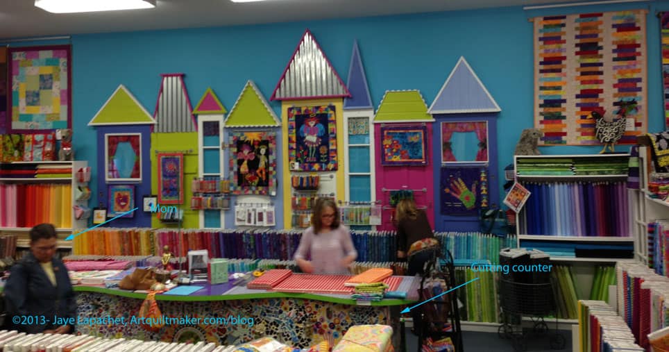
Roxanne’s, Main Floor
If you hadn’t noticed, I love color. Bright colors and lots of them. I don’t like gaudy, but I love putting interesting color combinations together.
First, of all, the blue of the wall color is fabulous. Second, that wall sculpture add so much interest to the room. It reminds me of It’s a Small World in Disneyland, but not in an annoying way. It makes me smile. The rectangular areas under the roofs of the wall sculpture have small areas for quilt samples.
Roxanne’s, Philip Jacobs fabrics
I almost had a seizure when I saw this group of shelving.
Do you know what it is?
Philip Jacobs fabrics.
A whole 3 long shelves of them!
There were some Martha Negleys thrown in as well. I have never seen anything like this before and could have bought all of them. I didn’t, though. I bought cuts from two different yardages that I hadn’t seen before and walked away before I truly lost my mind. I really need to win the lottery so I can A) not work and sew all the time; B) buy whatever fabric I want in whatever quantity I want whenever I want. It may not seem like I restrain myself when buying fabric, but I really do. I could have bought so much more than I did.
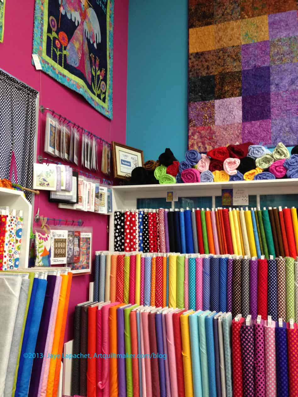
Roxanne’s, Pink dot area
Next to the blue wall on one side is a pink wall. I love the combination of the two next to each other.
This is a great store. Definitely stop if you are in Carpinteria. Well worth it!
Ocean Waves Quilt Shop was the last shop we visiting. It was much better in the sun, not so dim, though there were little nooks and crannies that were still a bit dim. The woman who worked there was very efficient and very helpful.
All Washed Up Sparkling Cider Pattern
They had a lot of quilts hanging up. One of the things I saw was a rendition of the All Washed Up Sparkling Cider pattern I used for Sparkle Pink. As I have said, the genius of that pattern is the interesting way it allows large prints to be showcased. This version, however, shows a different way the pattern can be used and has the feel of the fabric in the store.
There was a class going on in the back room. I am not sure what the class was about, but it might have been some type of beginning class. I was pleased to see that there were a relatively large number of people in the shop.
OWQS Fabric & Patterns
The tone of the shop was more Hoffman, smallish prints and florals, which is not to say they didn’t have great fabric. I found a dot I liked and a black on white that I might use for a project brewing in my head. The really nice dot I found was purple. The purple color reminds me of violet, but it is darker. I only got a half yard, but that should be enough for whatever it is I decide to make with it and I have selvedge.
Patterns, Samples & Pre-cuts
They had a lot of stuff there: fabric, patterns, pre-cuts, Aurifil, samples. There is a bag in the last picture (right photo, bottom center) with a curved flap. It is called the Flip Flap bag and they had just sold the last pattern, so I didn’t buy it, but I liked the shape
I also went to Scottie Dog Quilts again. This shop is a white stucco building (kind of an ugly building actually) on the corner of a street, but they don’t have a sign outside anymore, so we drove right past it and had to go around the block. It worked out, because we parked on the side street and were in the correct position to head east (I think) to Ocean Waves Quilt shop for the next stop.
Scottie Dog Right Middle
Scottie Dog has freshened up their look since I was there last. One big difference was that the weather was nicer. Last time, the whole area was fogged over and grey. This trip, the sky was a bright blue and it made everything nicer. Still, the freshening wasn’t all on the part of the weather. Scottie Dog has removed a high set of shelves and moved the cutting counter (I think) and that has made the whole space more open. I didn’t notice that they seemed to have less fabric. They crammed a lot into a relatively small shop.
Right towards Street
S.D. has also embraced modern fabrics in a big way. If you need some Ruby charm packs, they have a few left. They also had one of Moda’s Sophie as well as a bit of the yardage. I bought an old print of Heather Bailey’s called Pop…Flowers?? I don’t remember. Big stylized flowers. I am thinking I will make a bag. I hope to make a bag.
Little Bits Double Wedding Ring
I have to admit that I admire Double Wedding Ring Quilts, but will probably never make. I don’t like the look of some of the quilts made from the rotary cutting templates (curve is not smooth). I had decided to admire them from afar until I saw the Little Bits pattern for a DWR at Scottie Dog. (Nota bene: They don’t have it on their website and were out of stock, otherwise I would link to them). The pieces are small, but I could do some quick piecing and rotary cutting. They also had some bag patterns. I bought a bag pattern called The Potato Chip Bag because you can’t make just one, apparently.
Left Front
One good thing about stopping at quilt stores while traveling is that their restrooms are usually clean. I loved their restroom. It was scarlet, pipes and everything, with a border print of the Mary Englebreit scottie dog.
Left Front Corner
The shop also had different things to entice the shopper: a few shelves of batiks, pre-cut Tumblers in 2 sizes, lots of pre-cuts, especially charm packs. They also had a lot of patterns with samples hanging around the shop.
Front of Shop
They didn’t have any Aurifil, but they had a good selection of interesting notions and other types of thread. I bought some more True Grips and a swivel D Ring for a future bag.
Driving up the coast to the North Coast is a beautiful drive. It was particularly beautiful on Friday, because the Northern California area was washed by a rain storm on Thursday night. The light was gorgeous and the clouds were gorgeous and it made me glad to be driving up the Coast.
Fat Quail Quilt Shop
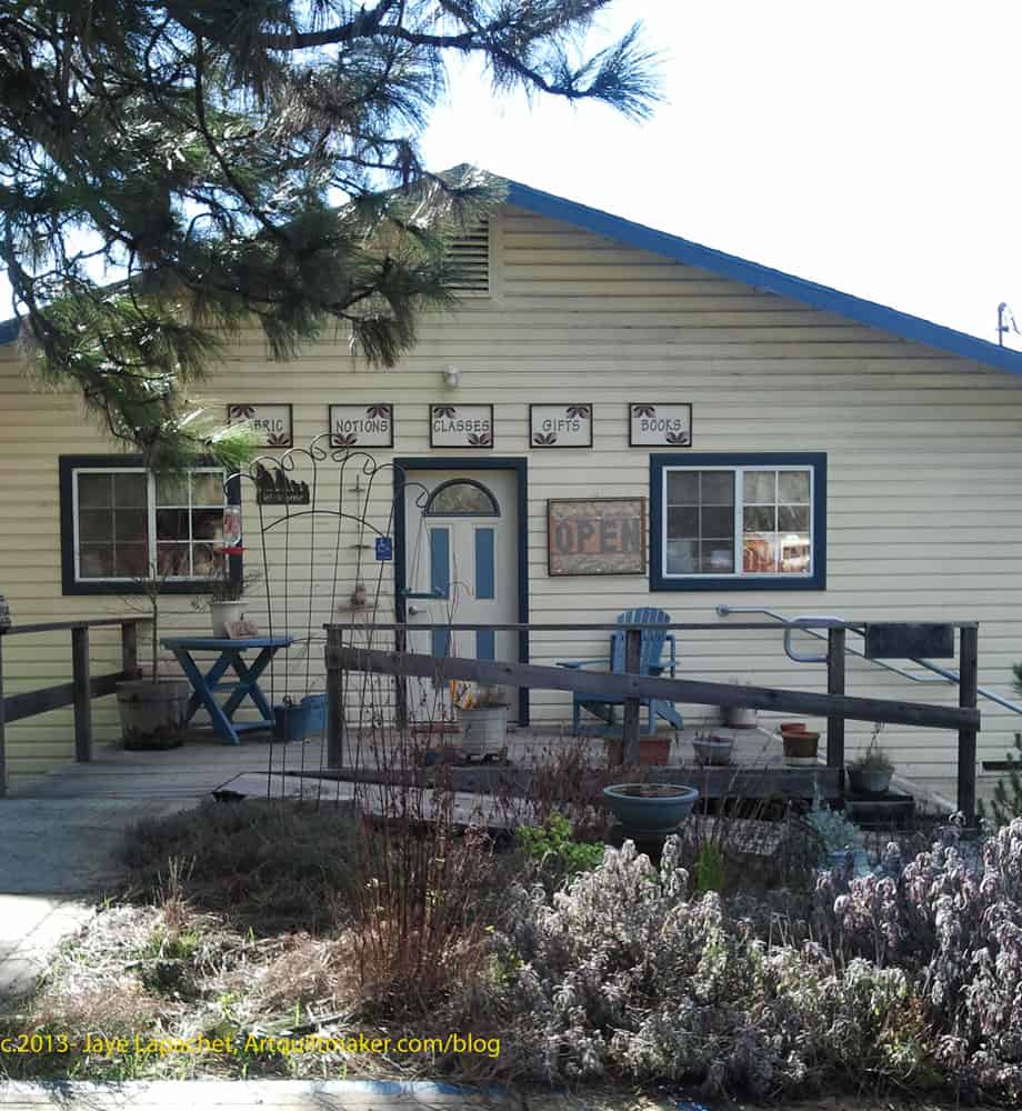
Last time we drove up that way, we saw a quilt shop in Laytonville called Fat Quail Quilts. The shop is on the side of 101N and we weren’t able to stop the first time, because we were already past by the time we knew what was happening. This time I planned ahead. Their website was very clear how to find it and we were able to stop.
It is a nice shop. They have a lot of fabric, patterns, notions. A good variety of
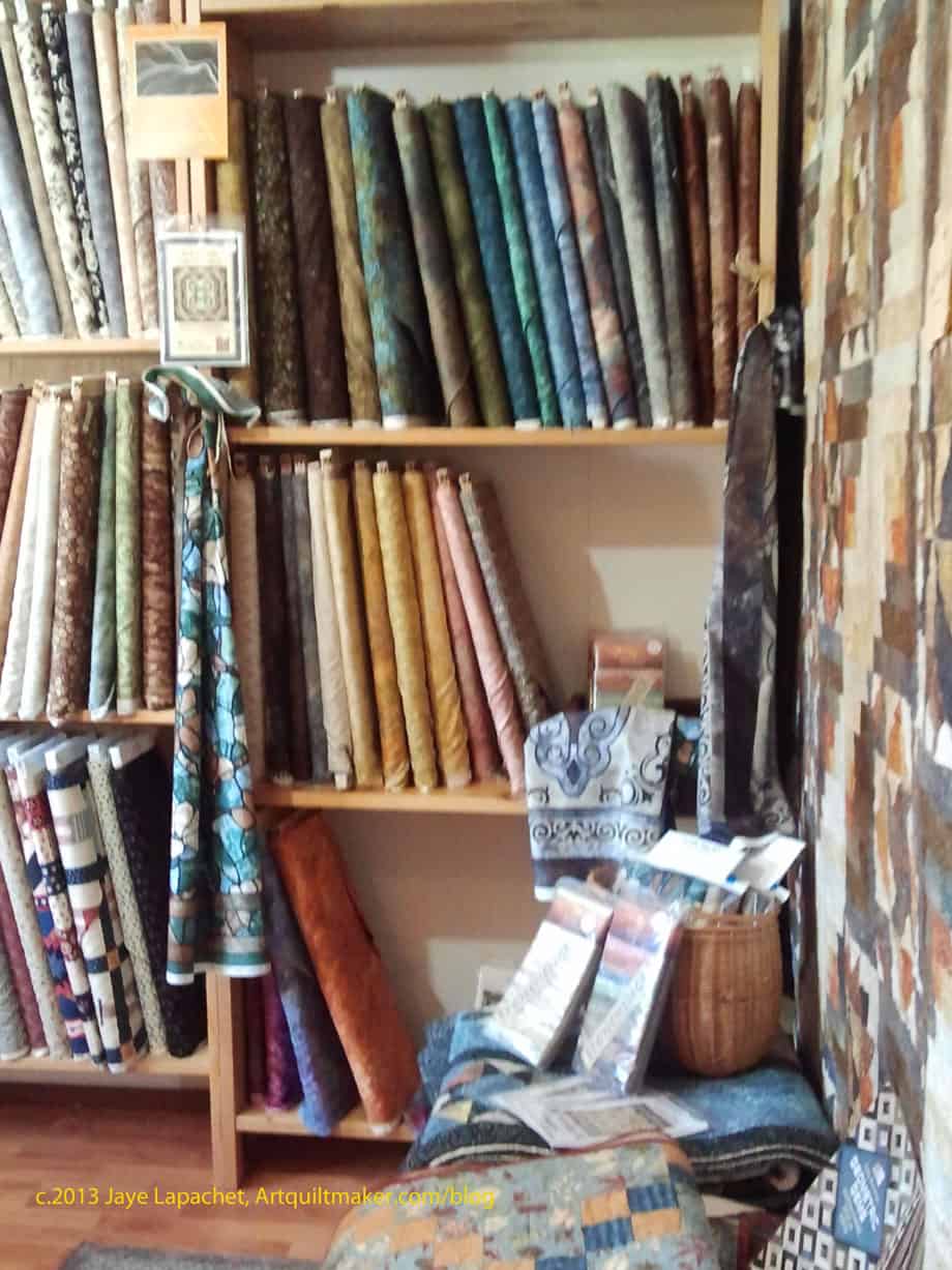
One of the things I like to notice when I am in an area is whether or not the color schemes are different from what I am used to seeing.
Fat Quail 30s Fabric
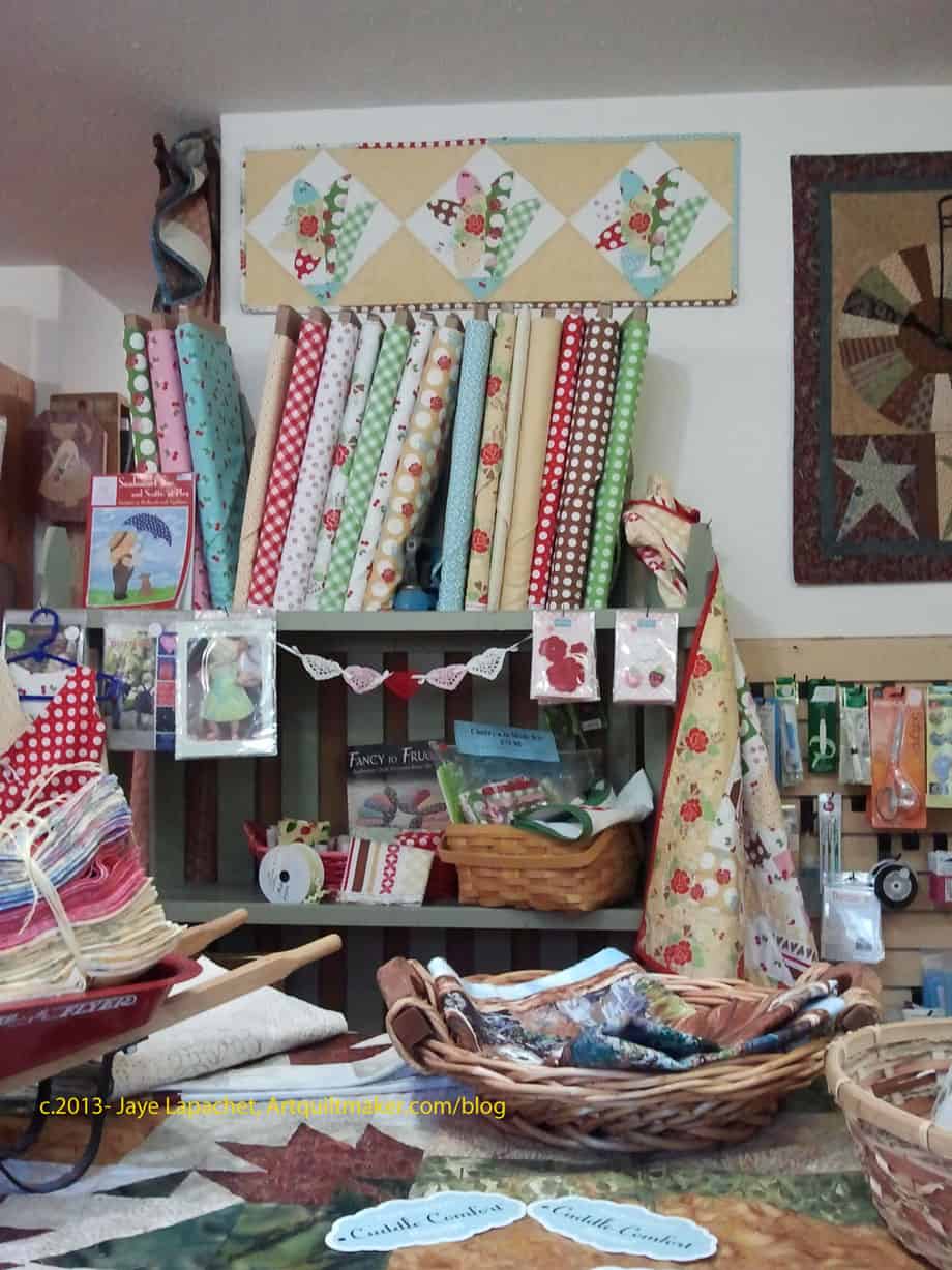
The overall color scheme reminded me of Fall colors. They had a lot of nice fabrics. I, of course, found a few things that I brought home with me. One was a needle threader. I broke mine last week working on the binding for the Stepping Stones.
The shop looked like a former house. It was broken up into 4 rooms plus a bathroom. The front room and the very back room were quite large, which makes me think there was some remodeling done. The layout worked well and the owner had used the various niches to create different displays.
The shop had a section of 1930s fabrics, that I thought was very appealing. There was a book called Frugal to Fancy about vintage patterns done in modern fabrics and the whole display made me want to buy all of the fabrics and the book.
Card Catalog Fat Quarters
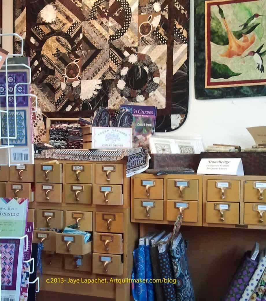
Being a librarian, I thought the shop’s storage of fat quarters was GREAT! I loved the use of the card catalog drawers for fat quarters. I thought it was an effective display technique even if it was hard to see the fat quarters. The drawers were labeled and that was great.
I also noticed that the Fat Quail lady had no problem cutting fat quarters. I wanted some reds, but was trying to be frugal, so she happily cut me some fat quarters of the reds. I wanted.
Stonehenge
Sandy from Quilting… for the Rest of Us talks about Stonehenge fabric all the time and I saw a display – a large display of it in this shop. I think this is the first time I have seen it, or, perhaps, it is the first time I have seen a display of it. It is very earthy looking and reminded me of picking out counters when we remodeled our kitchen. A little too beige for me, but interesting prints.
Front Room
The displays were little vignettes of fabrics, books and patterns. There were great samples of bags and other small accessories. I bought a pattern for a fish hot pad holder. I wanted to support the shop and also thought it would make a good gift for Christmas. I am going to make twelve, but will start with one and see how it goes before I commit. I was also thinking it might be a good way to practice machine quilting.
I spent the weekend up on the North Coast with my handsome DH. In the car, I like to work on something. The English Paper Piecing project I started in August is perfect and I was able to finish 4 stars. A few of the stars were done during TV watching sessions.
I forgot how much I liked this project.
I organized the half hexagons in the hotel room on Saturday, so they were ready to put together in the car. It worked out great.
The last weekend was spent at the CQFA Retreat. We go to a small town on the coast about half an hour away. It is perfect, because I don’t have to drive very far and it is beautiful.
Rhonda and Angela came to the CQFA Retreat for the first time. It was great, because they were able to get to know the other members better. As I mentioned CQFA and the BAMQG were on the same day so it was hard to stay and socialize. It was also great, because we got to spend much more time with Angela and Rhonda.
Rhonda brought her A-B-C Challenge and was able to work on it a little bit. It really looks great and the CQFAers loved her travel concept. I really admire people who bring multiple projects to the Retreat and then work on them. I brought two projects for the first and was able to work on both. One of my issues is I can’t organize myself well enough to make sure that I have all of the parts necessary for multiple projects.
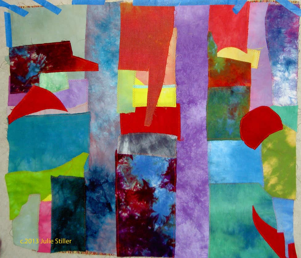
Julie, unlike me, has a wonderful spontaneity about her work. As a result, she worked on several different projects. The three parts of this piece are really a good aspect of this piece. Of course, she used her hand dyes.
Dolores’ FabMo Piece
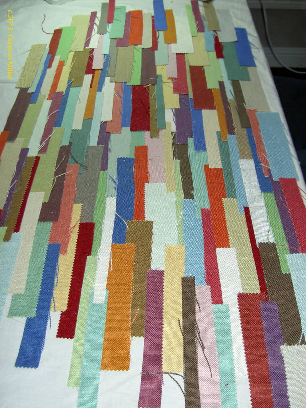
Dolores likes to plan her pieces and does gorgeous, thoughtful work. At this Retreat, however, Dolores was sitting next to Julie and, without Dolores realizing it, some of Julie’s spontaneity wore off (infected???) on Dolores. Dolores took a sample book of linen she got from FabMo and cut the pieces apart. She laid them out on a piece of muslin as a backing and glued them down temporarily.
Her intention was to sew them just enough to hold down the strips until she could embellish them.
The interesting thing about this piece is the texture of the fabric and the fraying of the edges. The colors are earthy with a bit of zing (see the purple?)
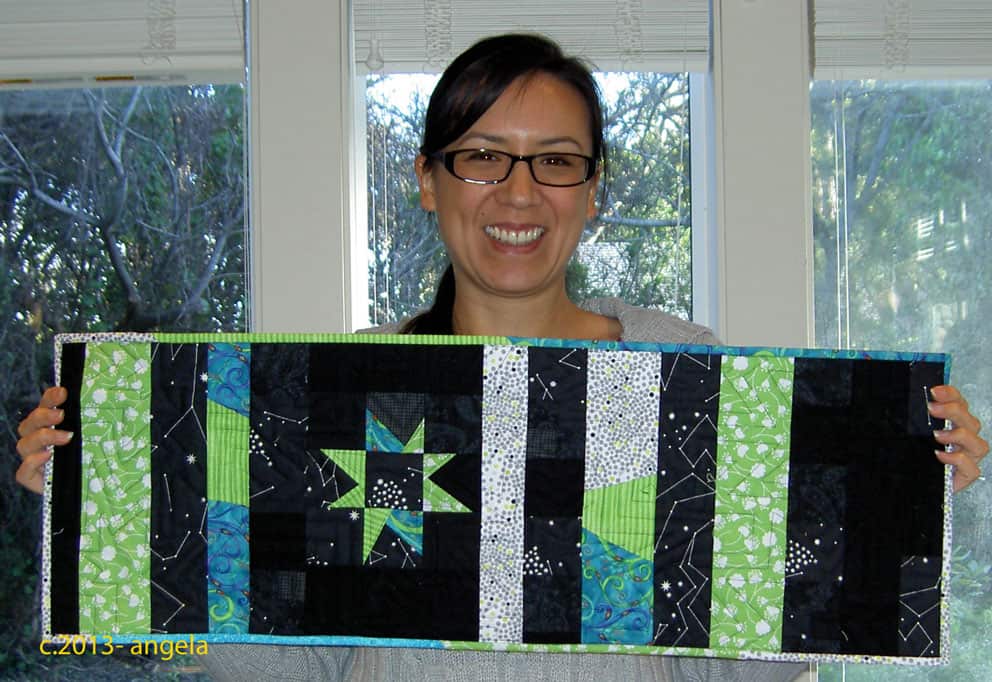
Angela’s Table Runner
Angela came with the SCVQA challenge project. They will be having a show in April and the theme is Oh My Stars!
Along with the show quilts, the organization will have a challenge exhibit and Angela brought her pieces along to work on. She brought fabric and thread and ended up with the piece on the left.
This is a miracle, because there were many, many rules to this challenge. I admire Angela for coming up with this gorgeous piece and still working within the rules of the challenge.
Angela’s Table Runner
She decided to use the Gwen Marston wonky stars technique. I love this piece. I love the colors (of course!!! Look at that turquoise). I love the embroidery of constellations she did as embellishments. I would love to see Angela make a similar piece but larger.
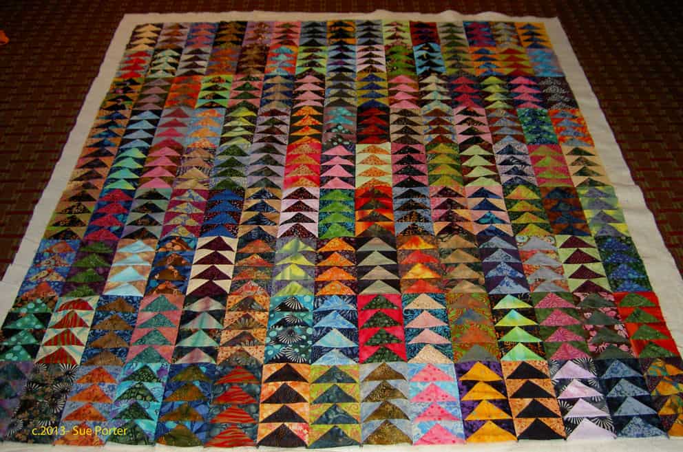
Sue’s Flying Geese
Sue worked, again, with batiks. Her piece from last year was just as gorgeous and when you look at them together, they look like a series.
I also like the juxtaposition of the classic Flying Geese with the contemporary look of the batiks. I know it is weird to say such a thing, but it looks so interesting to me and really stands out to me.
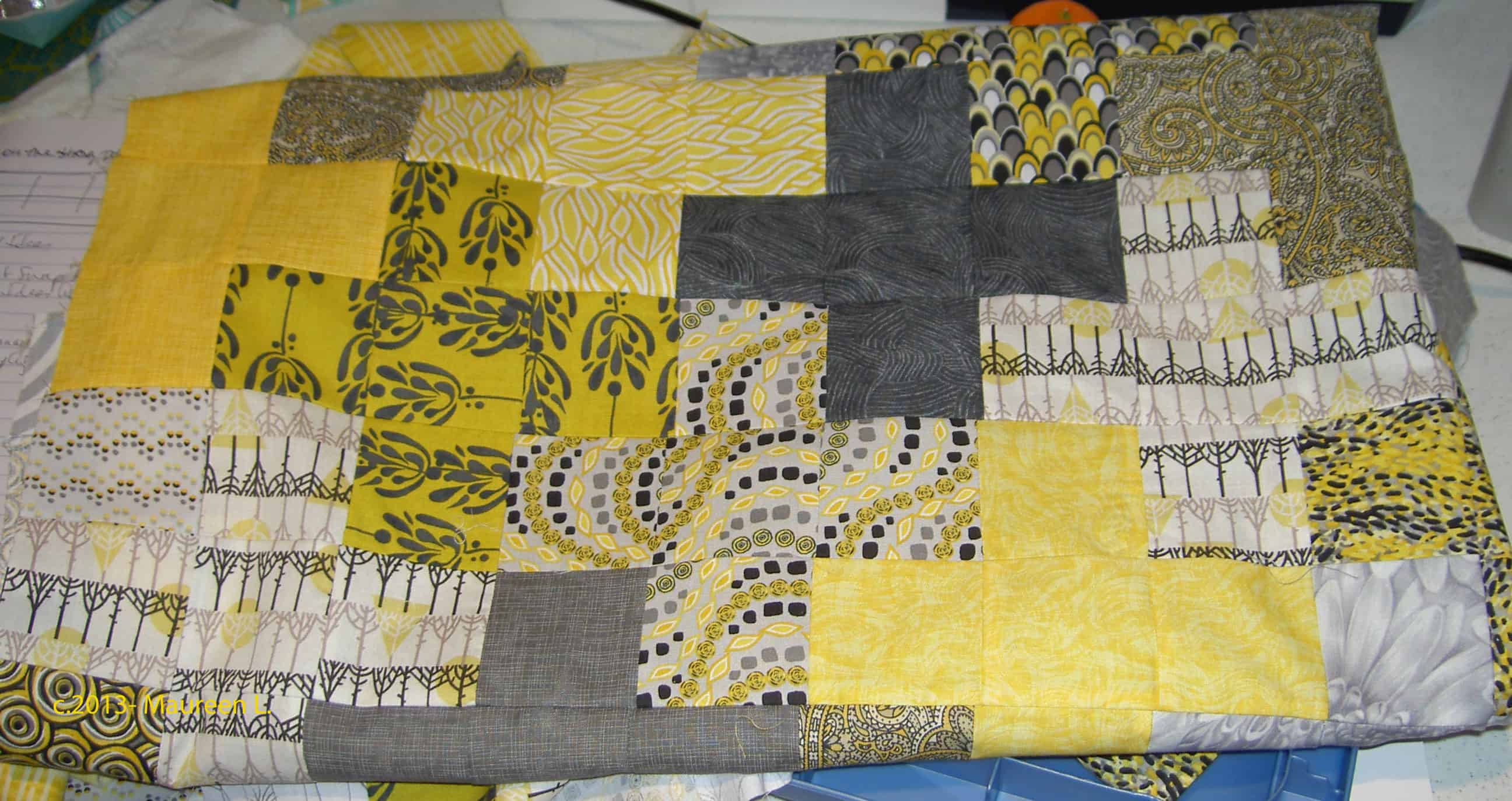
Maureen’s Plus Quilt
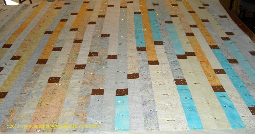
Maureen started out with this Plus type quilt.
I love the fabrics that she chose. Maureen had a Jelly Roll or strip set with these colors. Instead of using rectangles as some of the pieces Maureen used all squares. She told me that starting with this piece made for a very calming beginning to the quilt retreat.
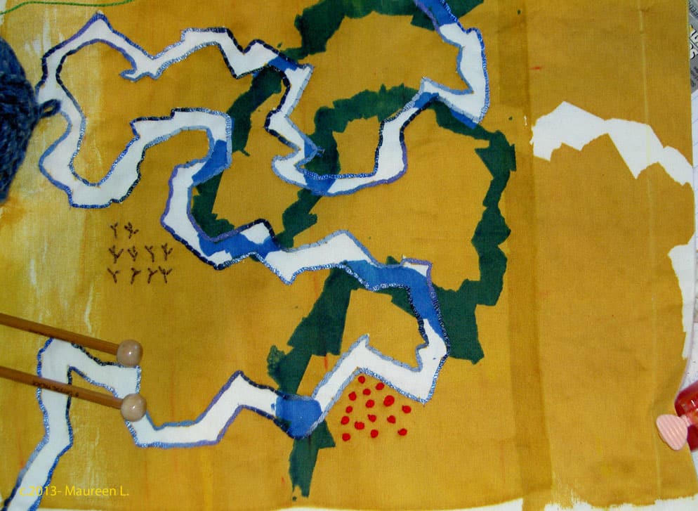
Maureen’s Fabric Map
Maureen started to have some trouble with her sewing machine so she switched to a hand project.
This piece looked like a map. Maureen did a lot of handwork on the piece and was thinking about others. She added French knots and a lot of couching around the edges of the white and blue areas..
DoloresCalm Basting
This is what Calm looks like during basting. Big Deal, right?
Rhonda’s Hand project
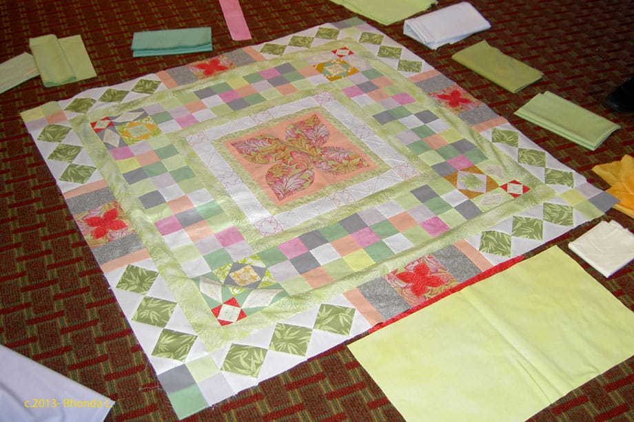
Rhonda took a class on different types of handwork. In the picture above we are helping Rhonda chose the colors for the next set of borders.
Robin’s Indigo Ocean Waves
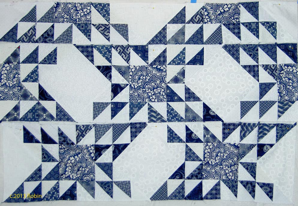
Robin had some indigo fabrics from her mother. They were from South Africa. She found some great, and perfect, contemporary companion prints to use with the indigos.
The large squares are the contemporary prints. I also like the way these blocks are a bit off. It gives the piece movement.
Sonja’s Bicycle
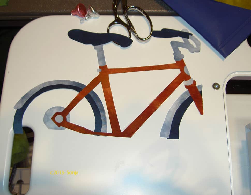
Sonja was working on several pieces as well. She was inspired by some of the activities she does with her family. In addition to the bicycle, she had a scooter as part of the series. It was such great work; I can’t wait to see it finished.
My day yesterday left me rather cranky and irritable and if that comes through on this post, I won’t publish and will see if I can uncrankify it. Work has a way of sucking all the good feelings I get from a few well deserved days off right out of my system.
Anyway.
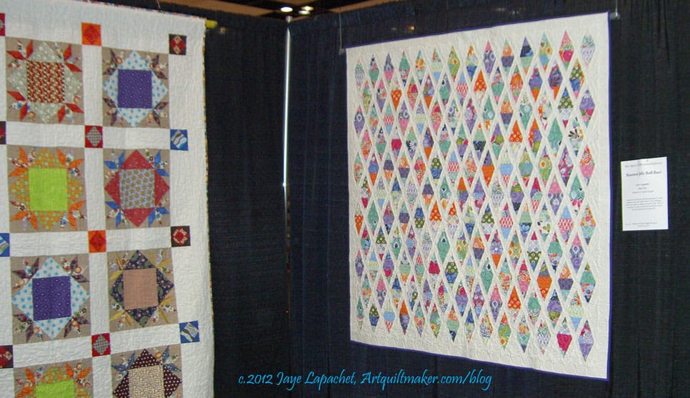
Renewed Jelly Roll Race on display
I took a day and a half off of work last week and went down to Santa Clara to the Pacific International Quilt Festival to visit the Renewed Jelly Roll Race, which was on display. TFQ and I usually go and she missed a year last year. We got ourselves organized again and were back in the saddle this year – sort of. Our trip was abbreviated a little because of family obligations for me. Despite having less time to view the quilts, I think we both agreed that we saw plenty.
I am concerned that once the 49ers stadium is built, the parking will no longer be free or there will be no available parking on game days. I look at these next few years as, possibly my last chance to go to the show. Yes, I am being melodramatic and borrowing trouble. I’ll get over myself.
The show was not as crowded as usual on Thursday and Friday, but I thought the preview was more crowded. I loved not having such large crowds on Thursday and Friday, because it was much easier to take photos. However I was concerned about what that meant for attendance numbers. Both days, I saw lots of white hair and not many strollers. I didn’t attend on Saturday or Sunday, so I’d like to know if you saw more younger quiltmakers on those days.
In terms of quilts, the show had the same look – lots of landscapes and portraits especially. I noticed lots of pattern quilts being shown, especially quilts made from patterns or classes by Judy Niemeyer. I still took a lot of photos.** I wonder about entering a quilt made from a pattern. What do you think about that? Should the quilt have been altered in some way or is it ok to enter a pattern quilt in a show that is an exact replica of the original?
The Best of Show winners were in the “more is better” philosophy. I apologize for being snarky, but I think design counts for something and since I heard a podcast on what judges look for, I have been disillusioned by Best of Show quilts. Still and all, there was lots at the show from which I was inspired. The stitching is still getting better and better and there was a lot of hand work to satisfy that craving.
The vendors were meh. I had put myself on a strict budget and it wasn’t difficult to keep to it. There were a few things I would have bought, but, in general, the offerings were old and expensive. I saw only a few vendors carrying Jelly Rolls, Layer Cakes and the like and the variety of choices was slim. One vendor told us it was very hard to receive the ‘baked goods’ that you actually order and that Moda does one run of them, sends what it can and does not reprint. I suppose I can understand not reprinting the “baked goods” as they have so many lines coming out each year. I, personally, cannot keep up with all the lines and have kind of given up on getting the newest latest and greatest.
I did see quite a few of the Tonga Treats and Bali Pops, which I thought was interesting and didn’t remember seeing last year. I really liked the colors from the Macaron line of fabrics by Hoffman, but didn’t buy any. I still might. Still, I wanted to see what was new and exciting in the quilt stuff department and just didn’t get that fix satisfied. I bought a little fabric, some dotty buttons, a couple of swivel clips and D ring sets and a Tonga Treats pack for a project I have in mind.
The SD card went bad on my camera while I was at the show. Fortunately, I only had about an aisle and a half left. Unfortunately, it was the aisle with New Quilts of Northern California on it. TFQ took photos of the last quilts, so you will have a complete set of the photos *we* liked. 😉
I bought a new SD card, but the camera can’t seem to read it. I like my camera and think it takes good photos. It will be hard to create interesting blog posts when I can’t take photos. I’ll have to deal with that problem sooner rather than later.
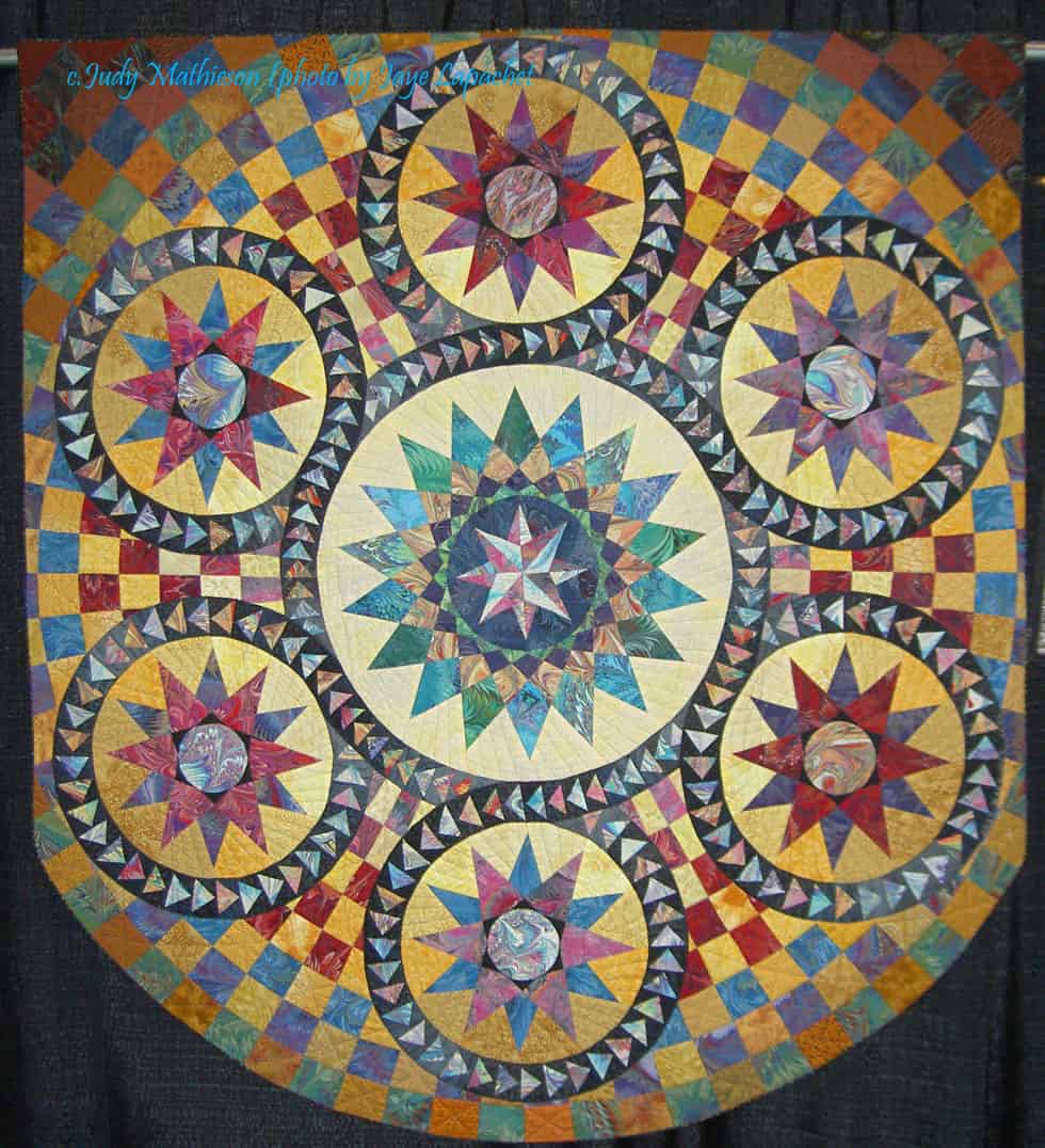
Marbled Star by Judy Mathieson
There were quilts in the various special exhibits that I liked. There was an exhibit of quilts inspired by the floors at Bristol Cathedral, including a smaller version of her quilt, Cosmati Stars, by Judy Mathieson. This is an offshoot or further examination of an exhibit we saw a few years ago, also at PIQF, of mosaic floor tile inspired quilts by Christine Porter.
Improvements the Mancusos need to make:
Replace black drapes behind quilts with white drapes. It will make the space seem lighter and larger as well make it easier to take pictures.
Include a special exhibit of Modern quilts (perhaps the Modern Quilt Guild should organize it?) to draw in more of the Modern quiltmakers.
Encourage vendors to bring new stuff.
Consider moving the show back to the City in order to provide more options for public transportation, which would, in turn, increase attendance.
Create a category for bags and other small accessories.
**I will be uploading all of the photos to my Flickr account, but it will take me some time. There is a link above, but you will need to return later to see them all.
Last year, I went to Philadelphia for a conference. I had been there before, but didn’t remember much about the smaller things I saw. I remember going out to Fairmont Park and my friend, Kathy, coming to tour around with me. I wrote about the quilt shops I visited on the most recent trip, but never wrote about the City.
Magic Gardens Entry View
Recently, I read a FB post and was reminded of the Magic Gardens. I had seen it my first time through, I think, but was enchanted and mesmerized by it when we walked by on this most recent trip.
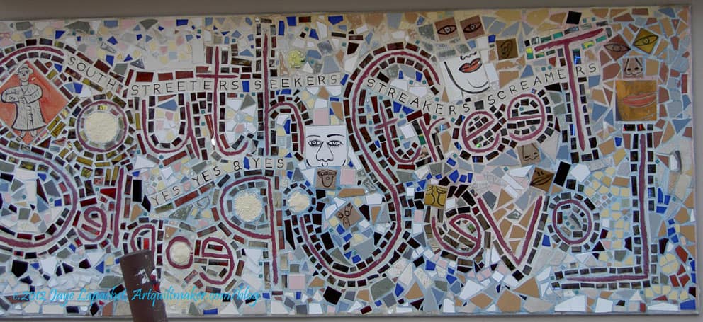
The Magic Gardens is on South Street, which is a funky street full of funky little mom and pop shops. There is an entry fee, but a person can see quite a lot from the street.
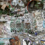
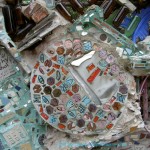
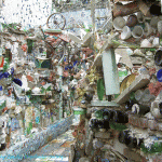
The place is amazing. The walls are filled with broken pieces of tile and glass. There are archways and walls made from concrete embedded with different types of crockery and tile all done in a mosaic style.
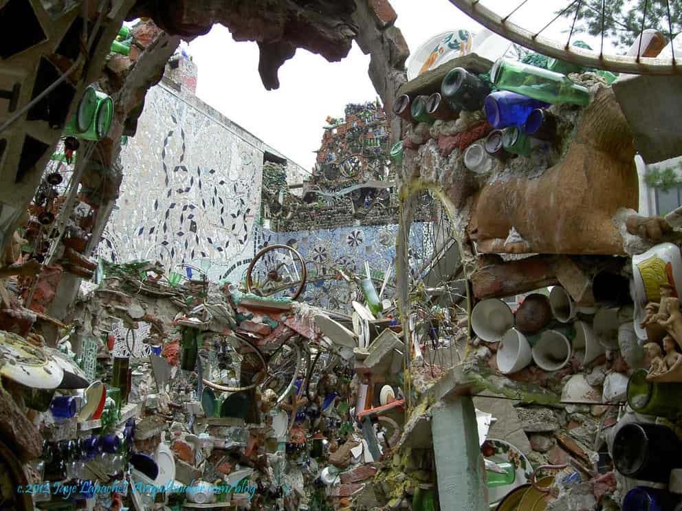
Messy Rooms
The place really looks like a mess from certain angles.
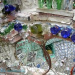
One thing I liked about it was the reuse of materials. I was particularly enamored with the bicycle wheels embedded in the tops of the walls. There is something about the shape that is appealing. I don’t remember seeing bicycle wheels embedded as if they were windows, but I think that would be an interesting look and I wonder if they will do that sometime in the future?
Magnificent details
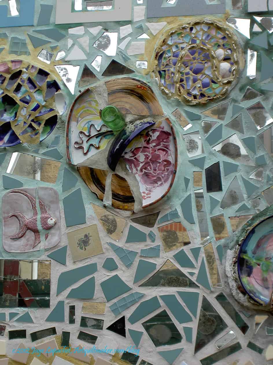
The details are magnificent as well.
I remember when we remodeled part of our house (an agonizing process, if there ever was one!) that we looked at all sort of interesting things, including tile. There are wonderful tiles out there that I loved, but didn’t match our color scheme or were too much or were too expensive.
In the Magic Garden I saw some very interesting tiles being used even if they were broken. They were used and fit in perfectly. They were used, but not used randomly. The details show care and thought in the designs.
I really want to do something like this for my porch. I want it to be interesting and I want people to stop an look closer before they ring the doorbell.
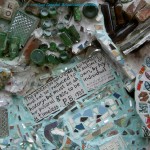
Messages
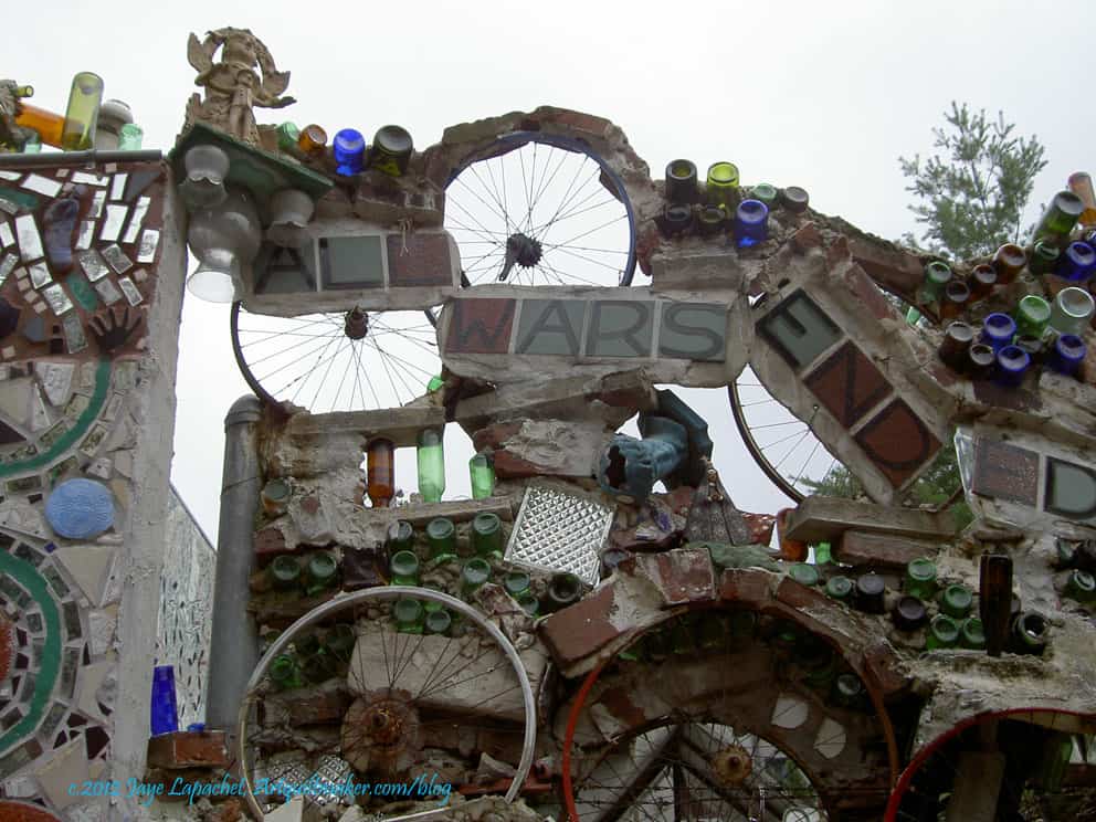
There are messages as well. This one is a common one, but no less poignant and the artist took care to embed it in the structure and make it timeless by not referring to specific wars. It makes me think of specific wars, which, I guess is common because of my time. In the future, perhaps people will think of other wars and wonder. I hope not, though.
The message also makes me wonder if the artist really believes their own message? Does s/he fight with other artists for space in the Magic Garden or for materials or for money. Do they fight because they are lovers or do they consider their message as applying to their lives as well?
Dishes
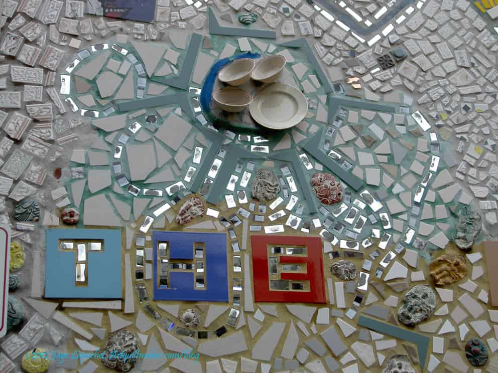
I saw themes as well. While the photo with the dishes was on a nearby building not in the Magic Garden, it illustrates what I mean. This mosaic piece had a number of items that reflected real life. Also, the shape of the dishes is carried out farther than just around the dishes themselves. Two themes.
There is a lot of texture in these pieces, which adds to the entirety.
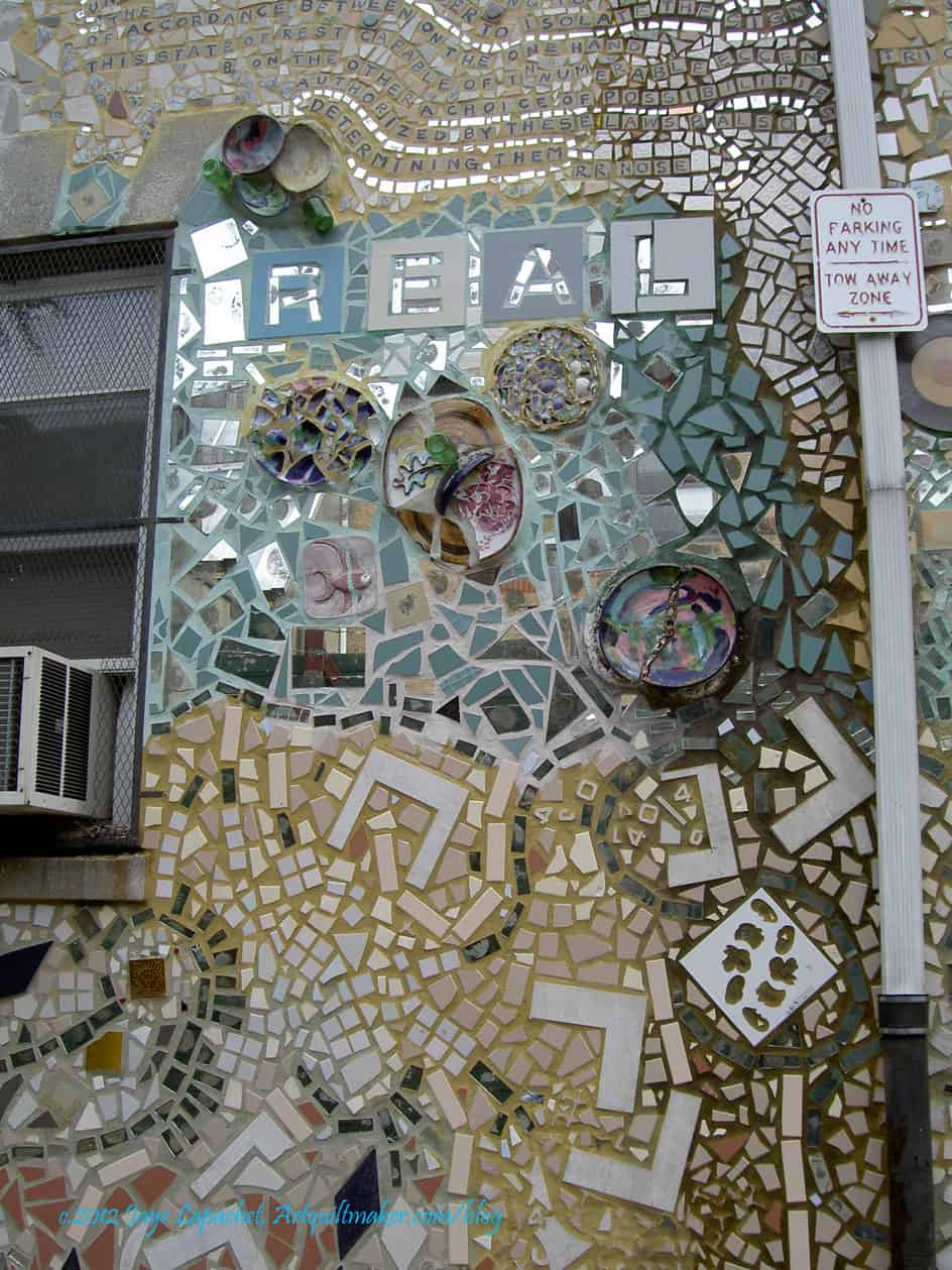
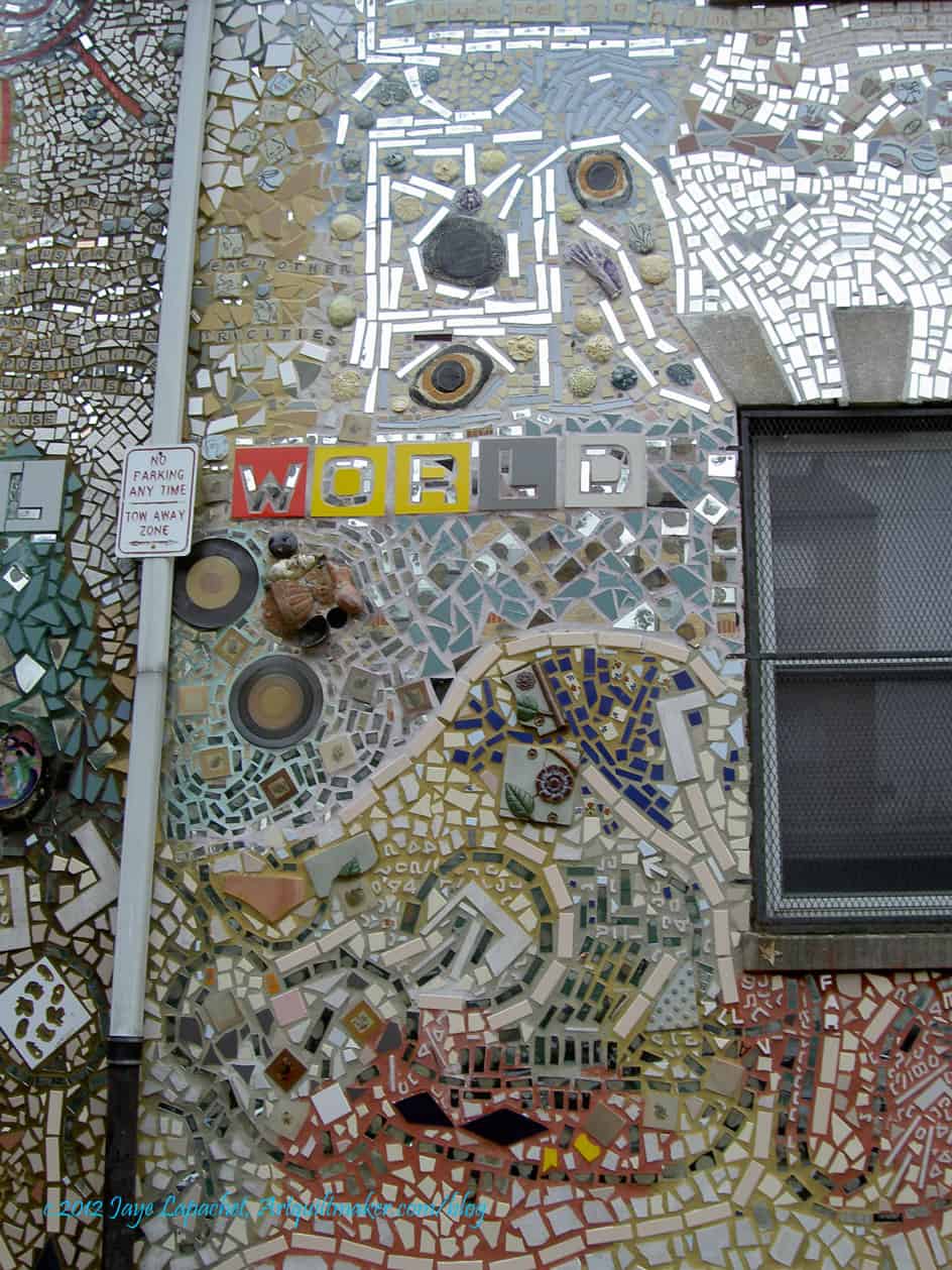
Mosaics in Real LifeMosaics in Real Life pt.2
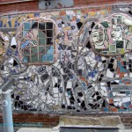
Around the Magic Gardens are mosaics that have been affixed to other walls. I don’t know if these are projects of the Magic Gardens programs or if people in the area have been inspired by the mosaics. I know that air conditioners and sign posts don’t make for excellent photos, but I like the way the mosaics have been worked around real life. We can’t do without the windows and signposts, so why not make them part of the landscape? Why not work around them and execute the vision rather than becoming frustrated that the wall isn’t perfectly blank? I am glad the artists worked through their challenges. We need more art in our every day lives.
I have so many more photos, but think I will save them for another day.
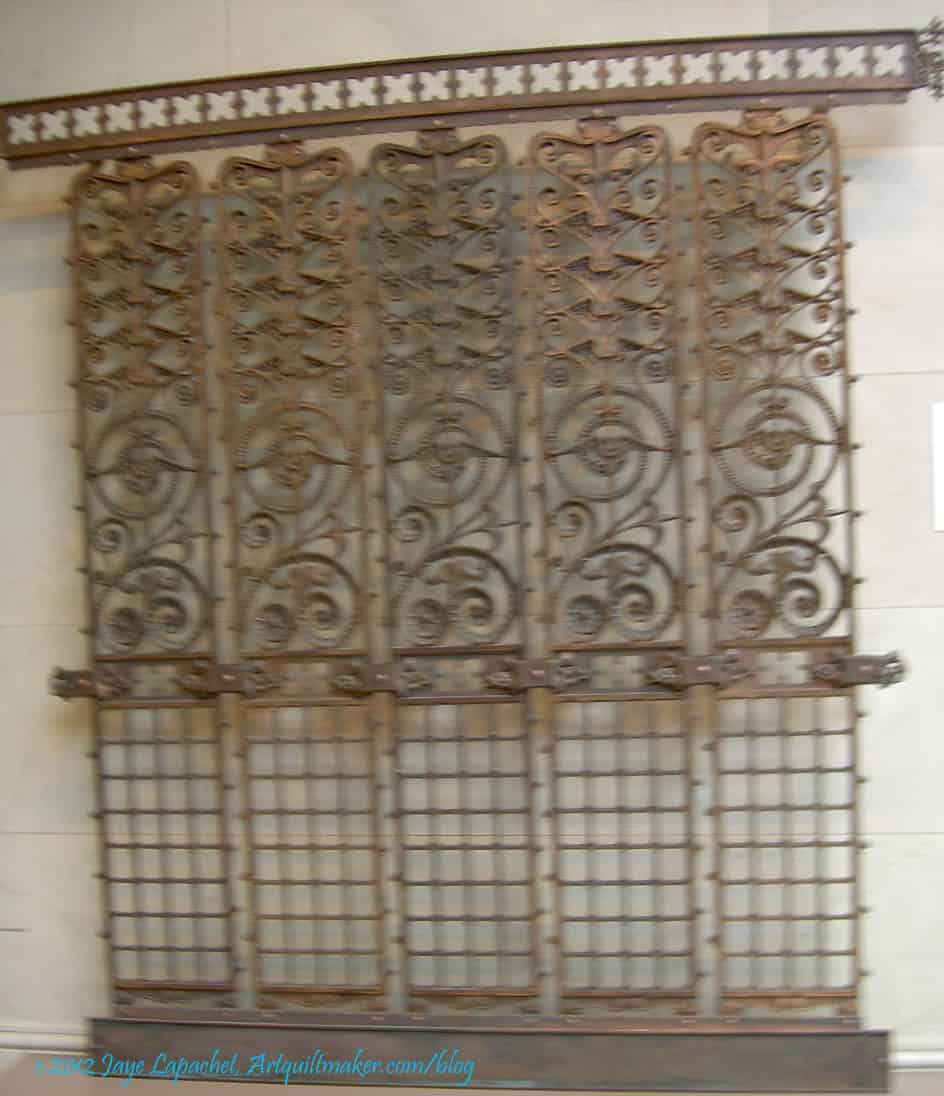
The last bit of my trip that I really wanted to talk about were the grates and grilles and other metal work. The Art Institute has collected pieces, parts and sections of buildings around Chicago that were being renovated or torn down. As you may have noticed from some of my inspiration photos, I have always enjoyed architectural details. Making a building beautiful (as opposed to striking or memorable) seems to be the greatest gift an architect can give a city.
I never really thought much about grates and grilles until I was standing in the second floor stairwell/lobby area of the AIC. For those of you who know the place, it is outside the Impressionist gallery. There, the curators have displayed a variety of pieces, many of which are metal. I know I have seen them as I have walked by buildings and there have even been a few times when I have ridden in one of those elevators where you have to close the door, but I didn’t really think about them as a source of inspiration until I saw them hanging on the wall. It is interesting how a museum will do that to me.
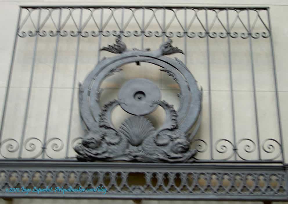
The Fisher Building Elevator Grille, above, is only the upper portion. I don’t think they had (or maybe I just didn’t photograph) the lower portion. I do think the round part looks like some kind of serpent. Not so great for quilty inspiration, but I could go with the general shape and proportion. What really grabbed me was the background. Those lines and curls would make great background on a quilt.
Manhattan Building Elevator Grille, 1889-91
This is a really elaborate elevator grille. Sometimes I wonder if the artisans or designers felt like they got one chance and went all out. Do you every do that?
I like the spirals in the middle, but in general I think this piece is top heavy. Stand on your head, look at the picture and tell me what you would think of it if the bottom were the top.
I think the spirals would be good quilting designs. I like the way there are different sizes of spirals and they go in different directions.
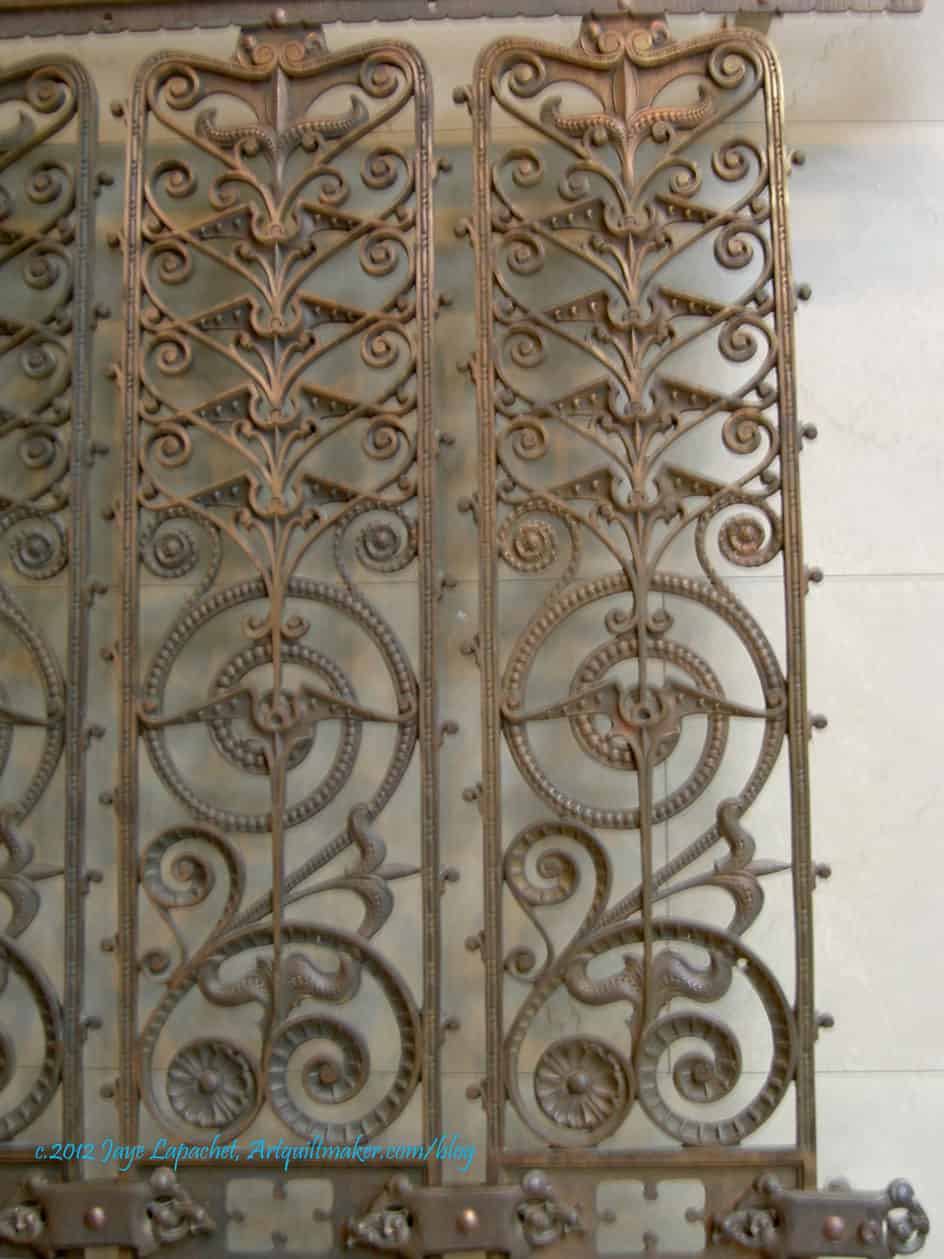
Manhattan Building Elevator Grille, 1889-91 detail
The close-up shows even more detail within the spirals and you can see the heavy part on top very well. I think it would be a good idea for me to take some kind of architectural history class so I would know what the official names of the various shapes are called. Dohickey isn’t very descriptive or precise.
The other thing about this detail is that it shows one thing I try to do in my quilts: the viewer gets a reward by getting close up. See the little dots and divets in the spirals? Do you see the wing shape in the largest spiral?
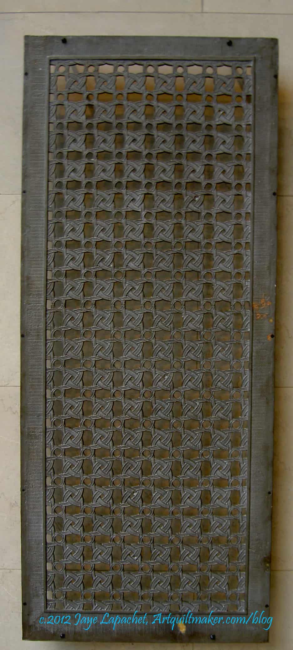
Window Keystone, 1872
I don’t know what a window keystone is, but the design would make an interesting piecing challenge. The way the piece is made makes the design seem like there is no ‘block’. I think this would probably be a similar piecing issue to the Spiky Stars piece I designed and created a number of years ago.
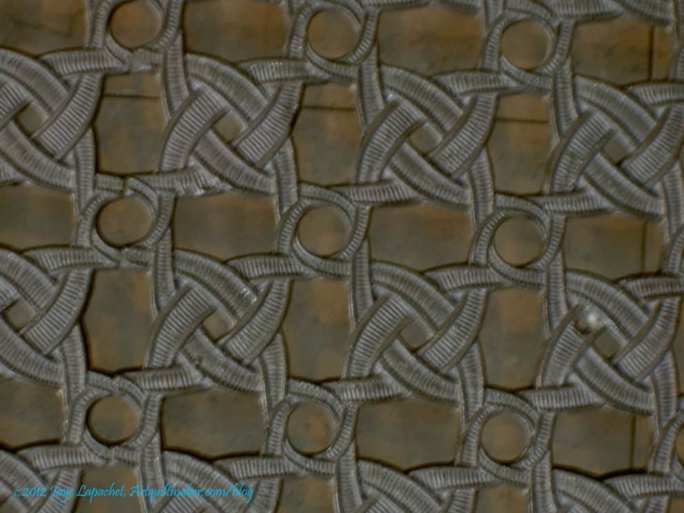
Window keystone, 1872, detail
I also like the slight curve of the motifs. I wonder if this is one of those motifs that could be sewed using straight lines, but would look curved? I don’t think so, but I also haven’t put much thought into it since I took the photos. Looking at the detail makes me see real curves in the piecing. I also like the interlocking knot look of some parts of the design. I think I would like a job where I designed useful items that would add to the beauty of everyday surroundings.
Schiller Building Block of Stringcourse
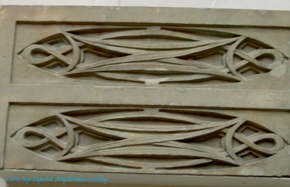
I am kind of partial to ovals, though I haven’t done anything with them in quiltmaking yet. These are really interesting pieces, partially because I have no idea what they were used for it and it fascinates me to think about these being added to a building because they were beautiful.
I really thought there were beautiful buildings in Chicago and it made me lament the dearth of classic (IMO) creativity in building today. Of course, things are a lot more expensive and these types of details may be prohibitively expensive, but I think their lack also makes us poorer.
These pieces would definitely make for interesting quilting designs and some complicated, but interesting piecing challenges.
As I said in my previous post about the Samplers, the textile exhibit was small. Despite being small the quilts on display were excellent. Perhaps not excellent in the that they were the best of the best, but excellent in that they were interesting. There were interesting choices of fabric, interesting corner treatments and interesting block variations. We all seem to go for perfect, especially when we run out of fabric and, yet, I find that antique quilts with an odd patch of fabric are more interesting. I often think “why would she choose that particular fabric?” and that thought leads me into a whole day dream about the woman that made the quilt.
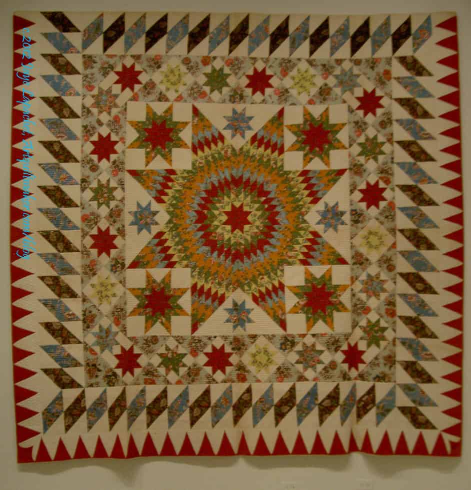
The Star of Bethlehem was a stellar example of a quilt. The museum called it a bedcover. I wonder why? I’ll have to ask a curator friend and see if she knows.
Star of Bethlehem, 1830 detail
The colors are a really good combination. The red, green and yellow are a combination I used to use a lot when I drew and colored with felt pens. The viewer is rewarded with the fabrics when viewing close-up. They are interesting and add a lot of movement to the quilt
The borders are another excellent part of this. In reality, the whole quilt is about the borders. It is kind of a border round robin idea.
Star of Bethlehem, 1830 detail
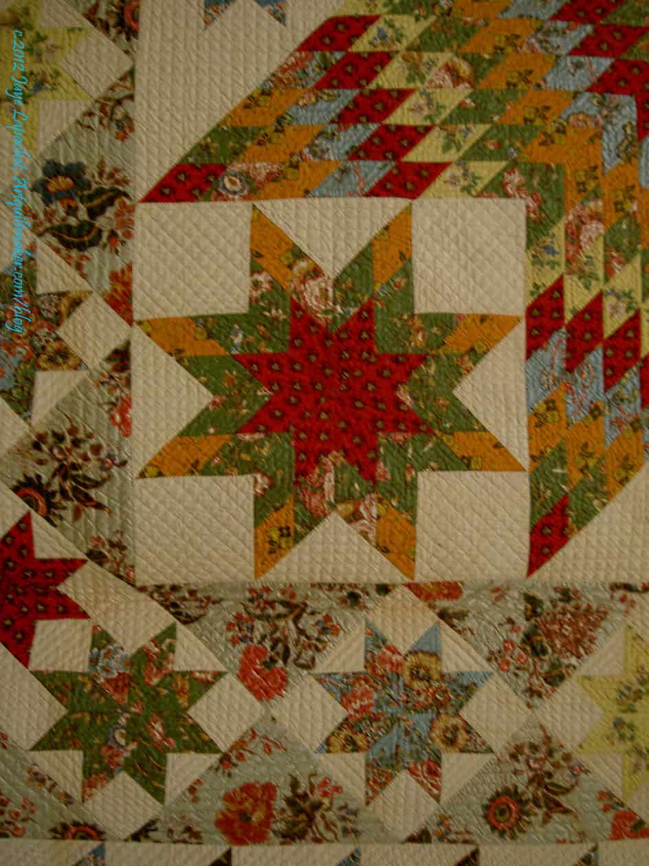
The detail of this quilt is great. The photo (left) is a detail of the center. I love it that this quiltmaker sewed so many inset seams, not only in the center, but in the whole quilt. I would love to know the maker (or makers).
The other thing is that the points are really well done. I know that points matching is not the be-all-end-all, but when the points matching is well done, it is a joy to behold.
Again, in this detail, you can see the nice combination of the red, yellow and green. I think the tones of the colors are interesting. Not greyed, not bright. Not sure what I am seeing, but it is interesting.
Star of Bethlehem, 1830 corner
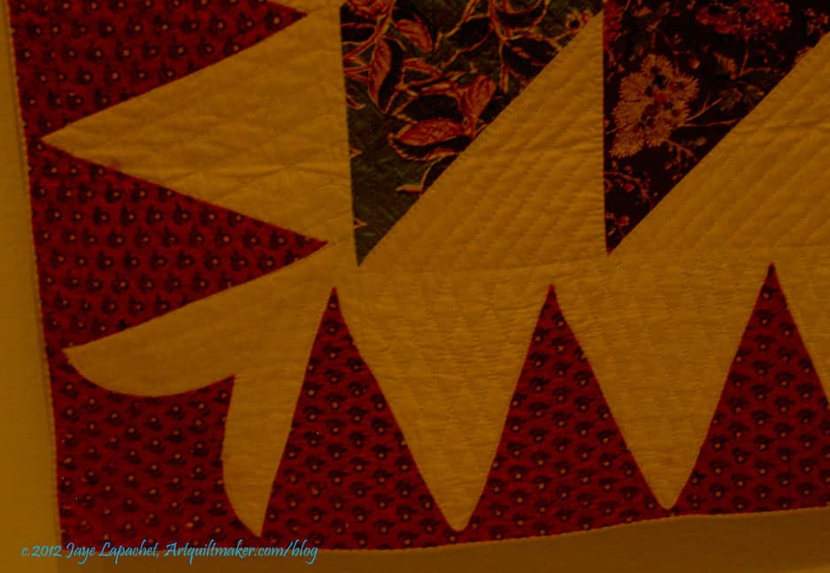
One thing I like to do is pay attention to the corners of borders. It is sometimes hard to know now to make a corner meet, especially if your piecing is a bit off. In this example the corner is a bit off where the two parts of the border meet, but the quiltmaker really did a nice job making that flower shape. I really like it. I also like that it is a bit off. It gives the quilt humanity, soul.
Keep in mind that I had to take photos of these quilts with no flash. Thus, the colors in the photo of the corner look more yellow than they were.
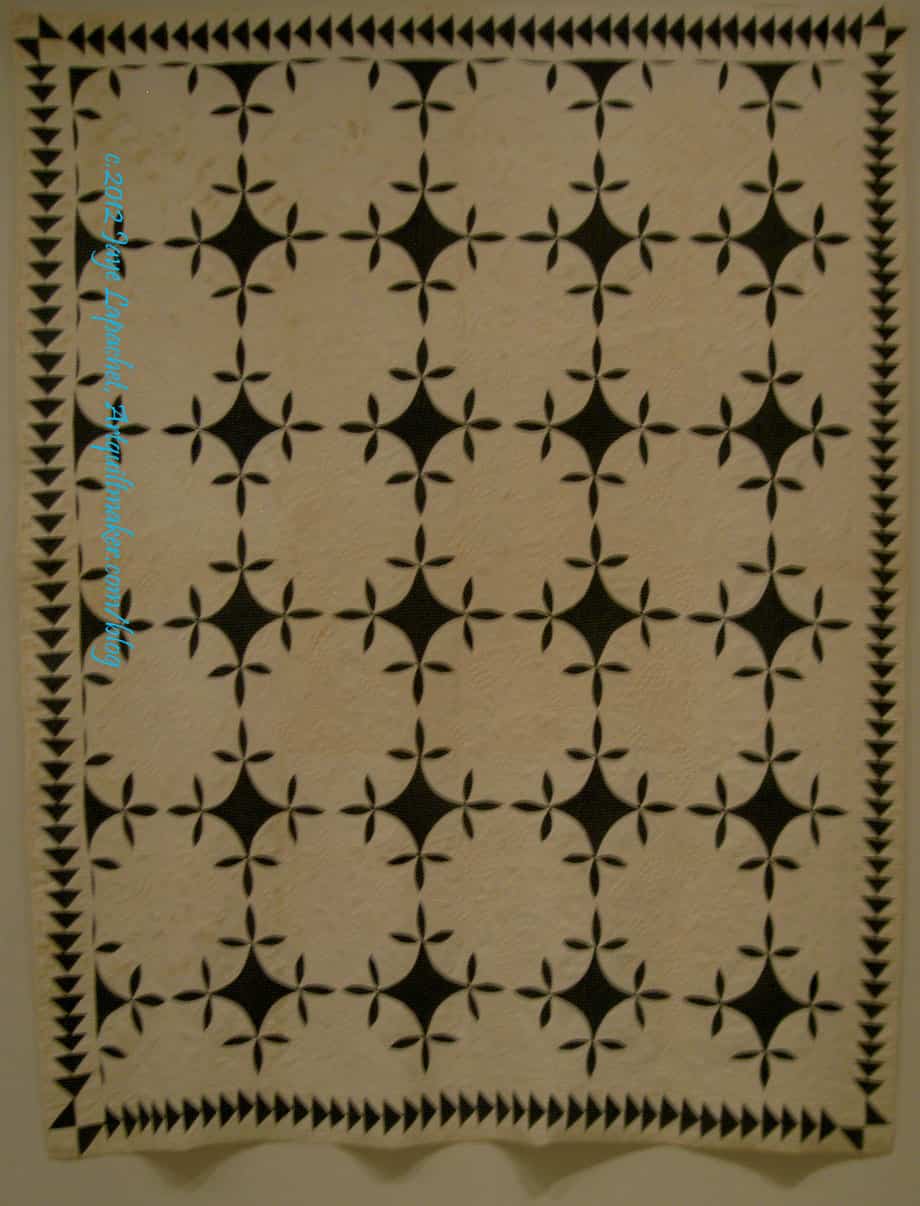
Pincushion & Burrs, 1830
I have never heard of this pattern with the name Pincushion and Burrs. It is also, according to the information card, called Square and Swallows, which sounds familiar, but not very much. I am pretty good with blocks, but I haven’t paid a lot of attention to quilt designs that have an all over name. Something to put on my bucket list, I guess.
I really like the border on this quilt, but the overall quilt is a great blue and white quilt. The little bird feet add movement and interest to this piece. I am not a huge fan of two color quilts; I don’t hate them, but I just think there is so much good fabric, why stick with just two? However, when I see a quilt like this, I think about making a two color quilt.
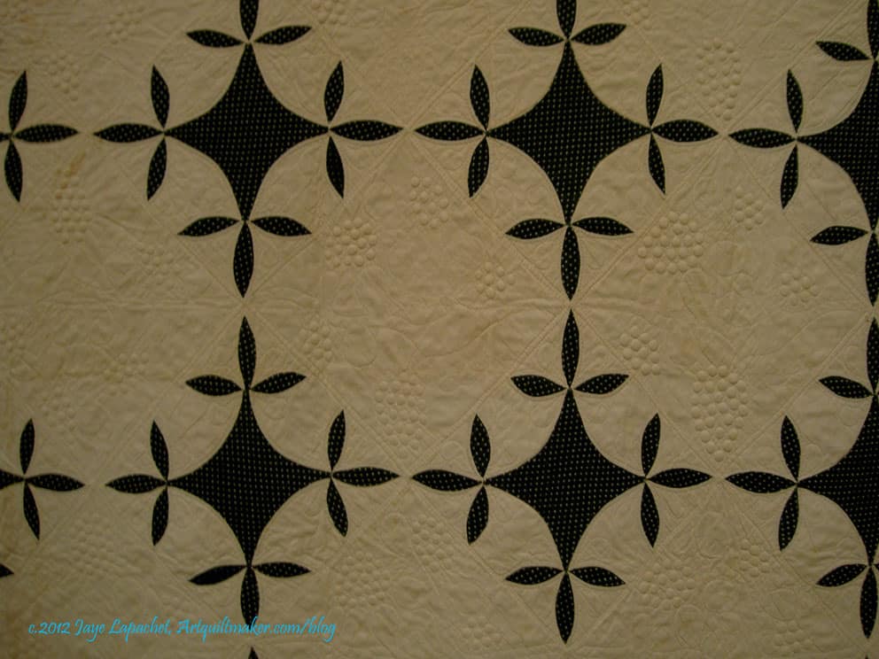
Pincushion & Burrs, 1830, detail
In addition to showing you the birds’ feet in this photo, you can also see the quilting. The quilting includes bunches of grapes, which are difficult in the best of circumstances. These are well done. The thing I like about this quilting is the double row of stitching that border the plain blocks. You may have to enlarge the photo to see them.
I also like the slight curves in the center of pieced blocks (applique’). I think this could be made, partially, like a Drunkard’s Path is made.
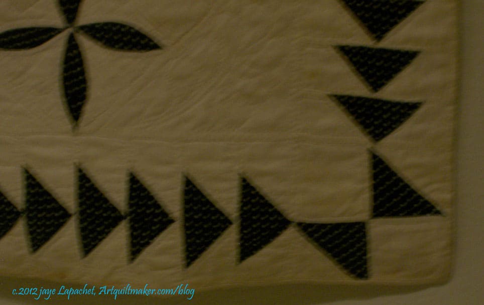
Pincushion & Burrs, 1830, corner
Again, here is a border corner. this is an interesting treatment-Flying Geese border and then a kind of Double Four Patch with Half Square Triangles. I like. It works, even if it isn’t perfect. It does look a bit like a butterfly.
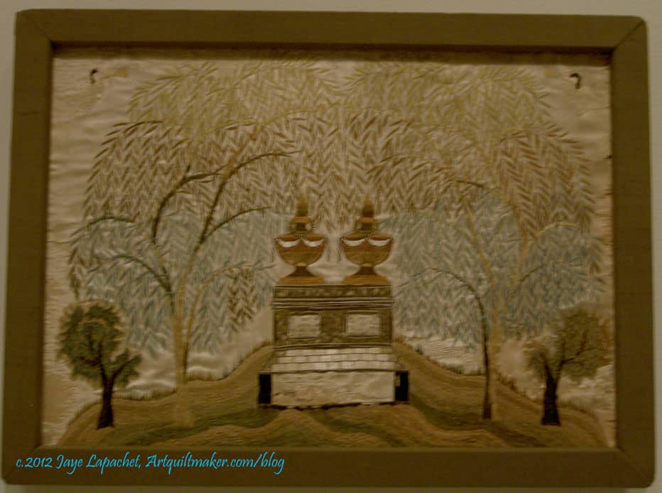
The exhibit included some quilts and several examples of needlework. One type of needlework I like are samplers. I like them because they are so personal. They often include initials or names and dates. The ones I know best are cross stitch samplers. I have made a few, including one I posted here previously. The ones at the Art Institute were different. These were not cross stitch, but more emboridery/needlework samplers and they were mourning samplers.
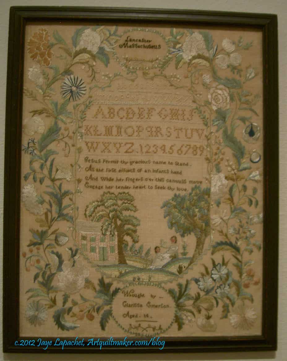
AIC Mourning Sampler
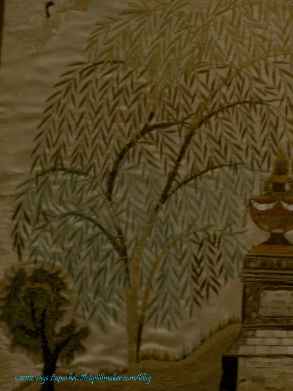
At a certain point in time and space, I guess there was no way to remember people unless a woman stitched a mourning sampler. I felt odd staring at this sampler, it felt indecent for some reason. I couldn’t stop, though. The stitches shone, glittered in the harsh fluorescent light. The thread was silk and it was like a whole bunch of puzzle pieces clicked into place in my mind. The thread was gorgeous and it made me realize that I need to get some of this thread and try it out on one of my pieces.
I also liked this tree. I like the curves of the limbs and the shape of the leaves. The colors are very soothing, but I always wonder whether the colors have faded?
I enjoy looking at older textiles because I always get inspired. I see something that sparks a thought in my mind. I also like thinking about the women who made them. It always makes me sad when I read a tag next to a beautiful Sampler and it says ‘unknown.’ I am glad we have blogs, because we won’t be so anonymous in the future.
1791 Sampler by Lucy Potter
I thought the Sampler by Lucy Potter was very fine. It isn’t exactly my style, but the stitching was exquisite. I like the writing, but it is hard to see.
Nota bene: we were allowed to take photos as long as they were taken without the flash. That is why these photos are so dark.
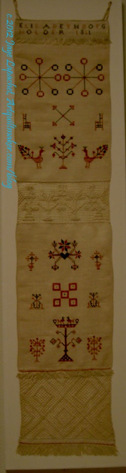
Elizabeth Bogfholder Towel, 1831
The Bogfholder Towel is a cross stitch sampler. I like the simple shapes and bright colors of this sampler.
I have trees on the mind, too, so I was particularly interested in the way the artist stitched the trees.
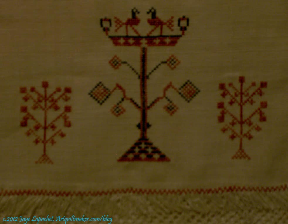
Elizabeth Bogfholder Towel, 1831, detail
I know that thedetail of the towel isn’t exactly a tree, but I thought the motif had an interesting shape. It is, perhaps a candelabrum? The birds or griffins on the top intrigue and I wonder about the symbolism for all of these motifs.
I also think I could make a good argument that the smaller motifs on the left and right are stylized trees.
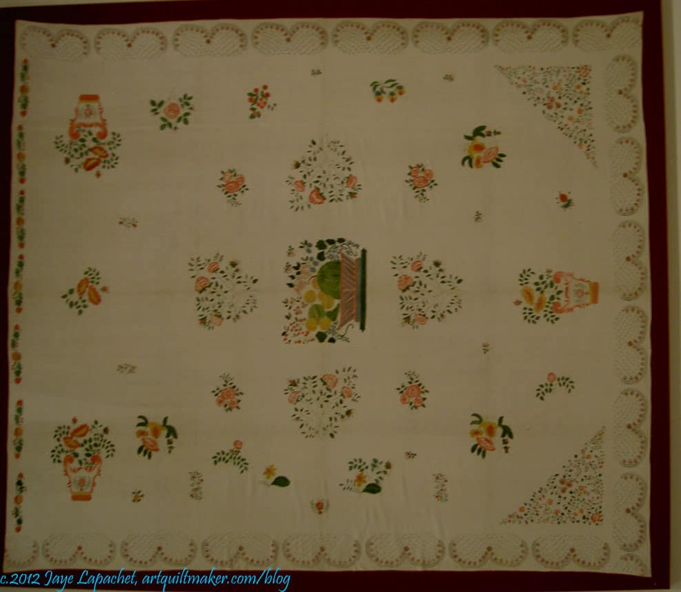
Stencilled bedcover
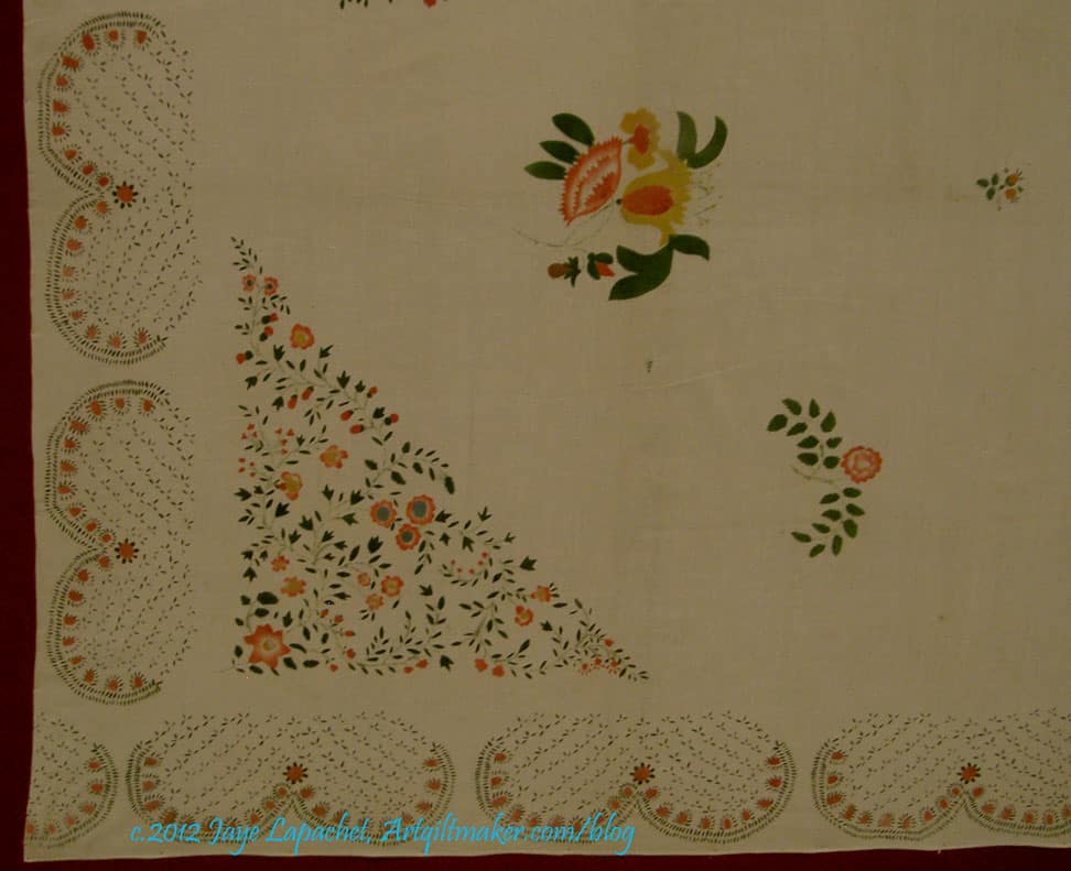
When I first saw this piece the exhibit was transitioning from needlework to quilts and I thought this was a quilt or an embroidered bed cover. It is a bed cover, but it is stenciled. The stenciling was very fine and detailed. I was amazed when I got up close to it, because I really couldn’t tell from even 3 feet away.
I had no idea that stenciling was done in the covered by this exhibit. I always think it is a good day when I learn something new.
Stenciled bedcover, detail
I think some of the motifs of the stenciling could be enlarged and used as applique’.
The description of the exhibit is “Featuring over 45 bedcovers, coverlets, needlework, printed handkerchiefs, and other household textiles from the permanent collection of the Department of Textiles, this exhibition explores the evolution of an American textile tradition as home creation, cottage industry, and commercial production developed between the years 1776 and 1840. While some needlework and textiles during this period were born out of necessity, others evoke refinement and sophistication, reflecting the overall growth, ingenuity, and prosperity of a new nation.
Traditionally textiles, whether made in the home or commercially, were considered prized possessions, but their value was not merely monetary; they often held special significance for the makers and their descendants. Many such textiles bear the maker’s name, and as treasured heirlooms were passed from one generation to the next serving as family record.
The sewing of textiles was also vital to the maintenance of a household. This important female skill not only provided the necessities of clothing and bedding but also a socially acceptable activity for women. The sewn and embroidered textiles in this exhibition represent the work of schoolgirls and women who had the means and time to pursue the needle arts. The works’ highly skilled execution and complex designs are evidence of the artistic and personal expression they provided.
A bridge from home to commercial production can be seen in the exhibition’s woven coverlets. Coverlet weavers in homes and separate workshops formed a cottage industry that would eventually grow into a full-scale commercial business by the mid-19th century. Printed textiles, on the other hand, were a product of the innovations and technological advancements of the Industrial Revolution, part of the commercial manufacturing industry that disseminated affordable textiles to a wider audience. With the mechanization of production and printing, textiles were able to keep pace with fashion and current events.
Whether sewn, woven, or printed, the textiles in this exhibition trace the development of an American textile tradition—one in which industrialization played a dominant role transforming raw materials into finished products but one that was also impacted by changes in the American home from creation out of necessity to a burgeoning consumer economy. Within these diverse textiles and their development, one can witness the innovation and progress of an early but thriving new United States.”
I was thrilled to see some textiles and hope that you enjoyed this review.