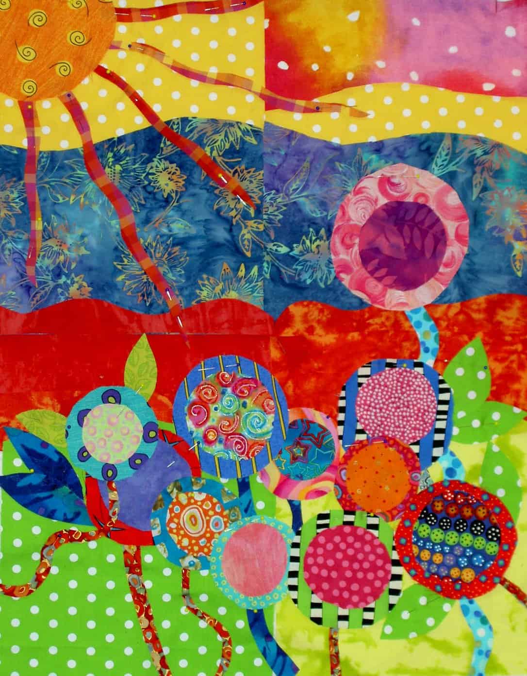
If you need a dose of Daily Art, check this out.
And here is another daily dose of my self made ‘art’.
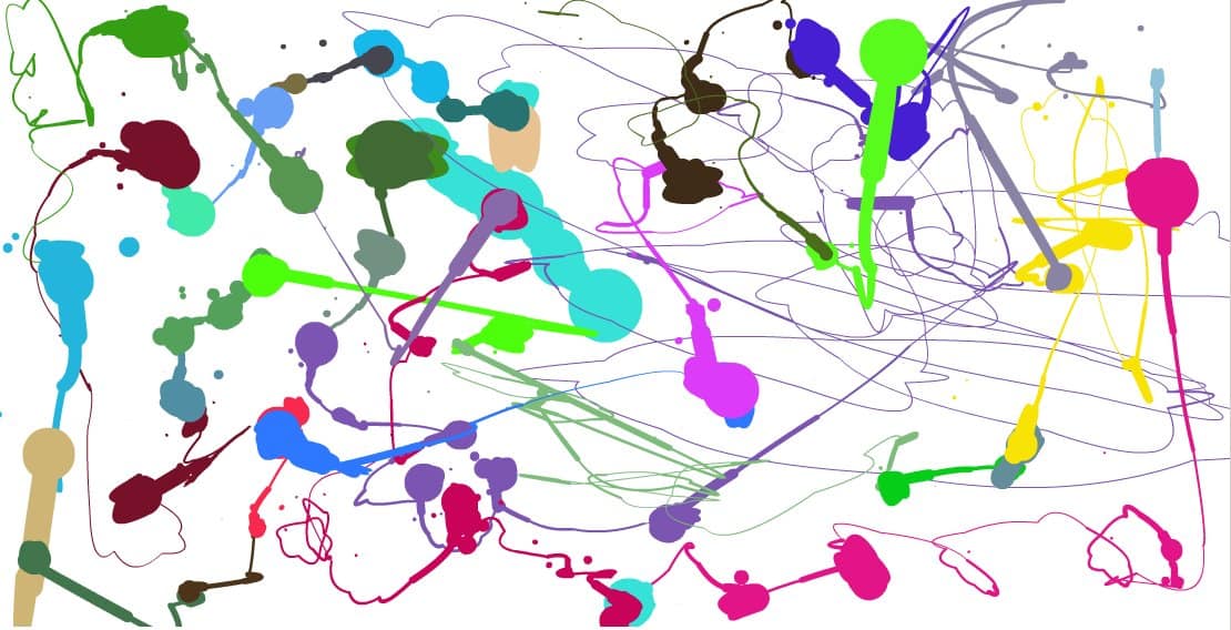
Perhaps someone wants to buy it for millions and I can use the money to move out while the construction is completed?
Jaye
Commentary about works in progress, design & creativity
If you need a dose of Daily Art, check this out.
And here is another daily dose of my self made ‘art’.
Perhaps someone wants to buy it for millions and I can use the money to move out while the construction is completed?
Jaye
I had a few hours in Baltimore on Thursday June 16, so I went up to the Mt. Vernon District and looked around. While I was there I visited the Walters. I like their tag line: experience 55 centuries of art. I can’t even conceive of 55 centuries. How wonderful it is that people have been making art for 55 centuries!
The Walters is in an interesting space. It is a blend of old and new. The old really appeals to me, but I also liked the new staircase that they have built recently (I understand). The sculpture courtyard, on the first floor, was modeled after an Italian palazzo. It was very light and airy and I enjoyed being in there. I would have liked to have sat there for awhile with some cappucino and written in my journal. Alas, it was not to be. An activity for another day. There were two elderly people sitting and seemed to be enjoying themselves. I will take their enjoyment as my own.
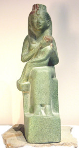
Hands down, my favorite piece was in the Egypt gallery. It was a statute of Isis sitting with Horus on her lap. It was called Isis Nursing Horus. First, I liked the subject matter. It was very feminine, but also showed what a strong woman Isis was. She was a goddess in her own right as well as being the wife of Osiris and the mother of Horus, two other strong gods. Despite the fact that she was a goddess, she was also a mother, which, on some level, I find very profound. In terms of the actual piece, I like the simple lines, sort of Bufano-esque. There are other pieces that I saw while surfing which are much more detailed and painted. This version is my preference. It looks like I could buy a copy of this statue at The Virtual Khan el Khalili. I’ll have to consider it once the construction is finished.
I also liked a painting near the Impressionist Gallery called The Christian Martyrs’ Last Prayer by Jean-Leon Gerome. While I wasn’t thrilled with the subject matter, (Christians praying right before they were going to be killed for sport at the Circus) the thing I liked about it was the detail. The way the lion was painted, the beard of the man saying the prayer, the stone on the structure. The lion looked like it could have turned it’s head and roared. I was also quite taken with the pad on the lion’s paws. You can’t really see the paw and the pad very well in the ‘Net image, but it is amazing. I guess this is a good reason not to rely completely on the web for everything. We still need to go to art museums.
Another piece I loved was a sculpture of a little girl. It was so realistic that it was nearly impossible for me not to touch it. It was called First Disappointment by Erastus Dow Palmer. This piece is not available in image format on the web, nor was there a postcard of the piece. What a shame.
I really think that museums should make more of their works available either in postcard or image format. I think it would allow more access to their collections. I understand the concept of inventory, but inventory vs marketing…. Frankly, I just want access…
I only had a few minutes to look at the Treasury, which had all of the china, crystal and silver. It was one spot that I wish I had spent more time in, but I didn’t see that it was available until I wandered past it. I love china, crystal and silver. I spent a few minutes looking at a chocolate pot. I know it is a silly piece of dishware, but I love the way the handle is perpendicular to the spout.

Pamelala is Pamela Allen, an artist who has come into her own in recent years using fabric and through quilts. Pamela came from a painting and assemblage/mixed media background. Her background includes classes that many quiltmakers never take: college level design classes. She brought this background and shared it with students at Quilting Adventures on Staples Mill Road in Richmond Virginia.
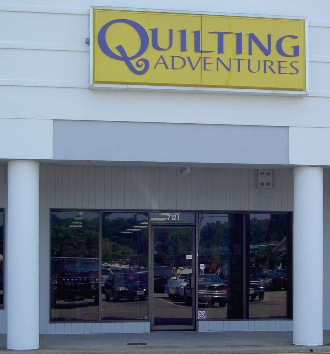
If you haven’t been to Quilting Adventures, make the trek. Joyce and her team have done a fantastic job selecting fabrics that speak to those of us who don’t do reproductions, small calicos or brown. You won’t see these varieties of fabrics at Quilting Adventures. If repros and brown are what you are looking for, Joyce and her staff will cheerfully direct you to other stores in the area that have the fabrics you need. There are lots of bright fabrics as well as many, many tone-on-tones. I could have bought the entire store. I did my best.;-) In addition to fabrics, Joyce also carries a nice selection of fabric alteration supplies: dyes, paints, fabric crayons. She carries the supplies, but also has samples of what happens to the fabric when you use the various supplies.
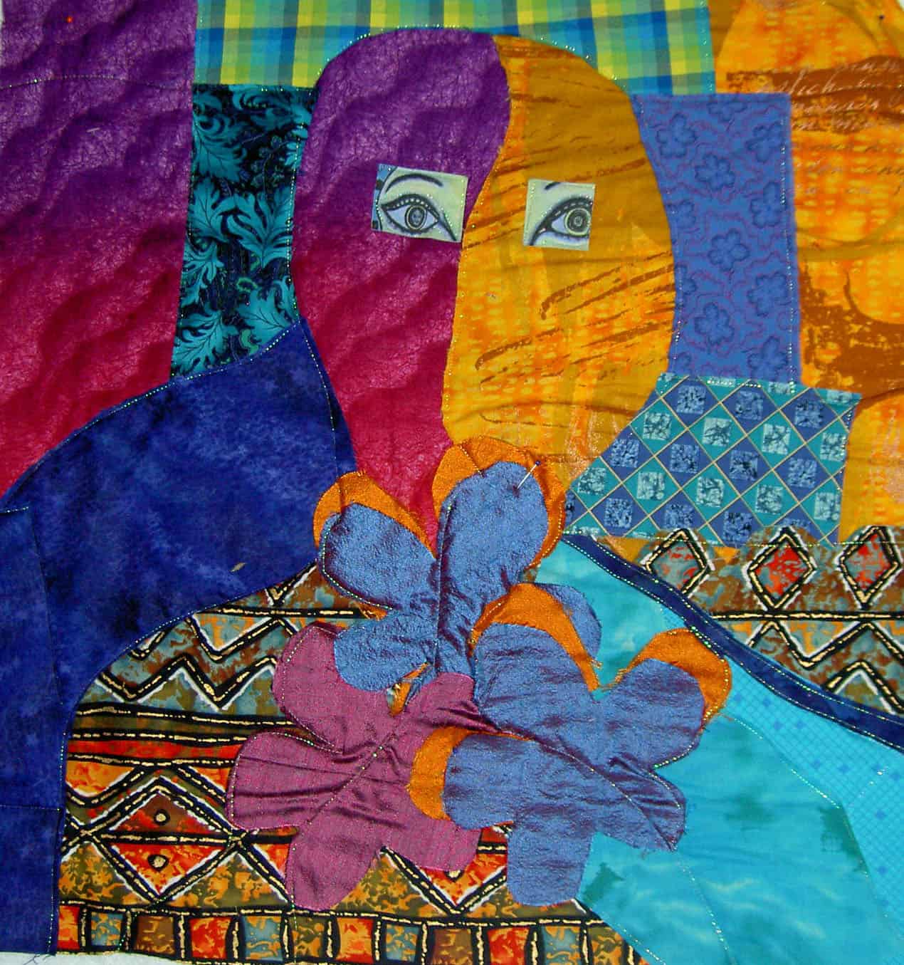
I took two classes from Pamela. The first, a fabric portrait class, was an exercise in negative space. The portrait I made is NOT a self portrait. We were given the assignment of working with the negative space first and later filling in the details. It was interesting to think about the fabric of the negative space defining the portrait. I have a hard time seeing the negative space, but I got some practice in during this class. I was able to use the Glitter thread from Superior on Joyce’s Babylock machine to appliquilt the pieces down. I have to figure out the hair (if any), the mouth and the nose (OH GOODNESS!!!). Pamela has a gentle manner in directing her students without being a doormat. She also has firm boundaries, which I appreciate and takes care of herself. I probably could have spent a week with her working on this piece. Of course, I didn’t finish, but am well on my way.
The second class was a class on composition. My piece is a garden and was limited by the distance I had to travel and the supplies I was able to bring. It also helps to remember to bring your supplies. 😉 Mrs. Kristen, a fellow Mavette, was quite generous in sharing her stash with me, so I was able to make a small piece.
First we assembled the background and then we laid our design on top of it. I used some of the leftover circles from the bullseye quilts and created a garden. This piece lends itself to hand stitching and I hope to be able to do some and complete this piece. During this time when the machine is better left under plastic, the timing is perfect. I’ll try to get to it. The piece is on its way to completion, but also not completed.
I would recommend classes with Pamela. She is a teacher who forces her students to think, is diplomatic about student work and gives the class the opportunity to work in a positive critique situation. She is an artist and also a teacher, not an artist who thinks s/he can teach. You can find more of Pamela’s work at her website.
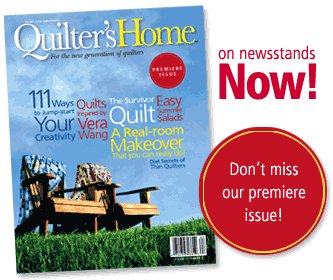
Mark Lipinski is the editor and, presumably, creative genius, behind Quilter’s Home, a new quilt lifestyle magazine from Primedia. Lipinski is a fellow Quilt Maverick. In an effort at full disclosure I have to say that despite sharing cyberspace on this venerable list, I haven’t met Mark. I have also, unfortunately, only read a few of his posts.
Airplane rides are good magazine reading time so I picked up a copy of the premiere issue of his magazine at Joann’s after ordering one from my friends at Quilting Adventures. Yes, I know I will have two copies, but either I will cut one up or send one to St. JCN or both and really, I just couldn’t wait!
In general, I like the magazine. I think it gives a different twist to quilt magazines and brings quiltmaking out of the ‘hobby for quilters only’ area and into the mainstream decorating world. In addition to a few patterns, techniques and reviews, the magazine shows using quilts as decorative objects. The magazine is billed as being for quiltmakers, but I think it would appeal to non quiltmakers, especially home dec fans, as well.
One aspect that I especially appreciated was the writing. There is a cohesive voice in this first issue, but the writers also tied their styles together well. Perhaps this is what editors do?
The layout and colors were really well done as well. I liked the scrapbook like splashes of color across the pages. It draws your eye around and makes the layout interesting. I especially noticed this on the “Souvenir Hankies” article. The color of the title picks up the color in some of the hankies.
I thought there was a nice range of articles related to quiltmaking, if not completely about quiltmaking. The big YAYs were the fact that there was NO section on how to make a quilt. Thank goodness Mark resisted Primedia’s probable pressure to include two paragraphs on quilting your quilt. There are enough magazines and books out there telling beginners how to make a quilt in 3 paragraphs. I am in favor as much as the next girl of getting people into quiltmaking, but how often do we have to publish incomplete directions on how to make a quilt? [Come back and look at this post, because I know this is a soapbox that I will have to stand on one day. When I do, I will put the link HERE as well]
Of course, the mag doesn’t serve all of my “needs.” One thing I would like to see is a review of blogs. Mark and crew did have a list of quilt related podcasts, which is COOL. I can’t wait to see what they are about. Perhaps, Quilter’s Home will choose blogs as their next medium to review? I think there are way too many blogs to include in one issue. I hope that it would be a short regular piece of the magazine… at least for a as long as blogs are around.
While there was only one pattern (YAY again, go somewhere else for patterns!), I thought it was an interesting and unusual pattern. Not a difficult pattern, but also not a 9 patch or an Ohio Star. They tied the pattern into an article that covered the Great San Francisco Earthquake and Fire as well as genealogy. I thought this approach was very well done. I would like them to continu, if not expand this aspect. My ideal would be a column or regular feature on how to take a pattern you find in everyday life (Gradma’s quilt, a mosaic stoop or an ad in the newspaper) and make it your own. Another aspect could be how to take a block you like, change the size and turn it into a quilt or wallhanging. There are enough patterns in this world to choke a horse. I don’t need anymore.
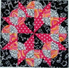
Additionally, I would like to see some of the more complex, unusual and interesting blocks highlighted in their historical context as well as, perhaps, a gallery of quilts or wallhangings or sample blocks made by readers in that pattern. I am thinking of the Laura Wheeler Snowball Wreath block I found on eBay. See a photo below of my rendition of this block pattern.
Mark did have an article on diet and exercise for quiltmakers, which I thought was a) an enlightened idea for an article; b) a great public service; and c) listed good ideas for keeping the weight off. I did, however, get the impression (and correct me if I am wrong) that it set an underlying tone of self deprecation for the entire issue. I don’t like self deprecation in anyone and don’t want to see it in a magazine. I believe that everyone is fabulous the way they are. If a person wants to improve themselves, more power to them, but nobody should be made to feel like a lesser person because someone else says they should be fatter, thinner, prettier, uglier, etc. I am sure that Mark is struggling with the difficult position of being a man in a predominantly female hobby and doesn’t want to come across as too arrogant. Mark, you ROCK the way you are!
I was pleased to see some sources of creativity and inspiration displayed, such as Vera Wang. It is great to think about how another media or designer can influence a quiltmaker or quiltmaking. Not enough attention is given to inspiration and creativity, so this was a great choice of article.
In that vein, the article entitled 111 Ways to Jumpstart your Creativity was excellent. As you have probably noticed from some entries here on Artquiltmaker, I am adamant that you have to look at everything in order to get inspiration. The Greek embroideries at the Textile Museum were very interesting. There is a turquoise, hot pink and seafoam green quilt in my future, I think, as a result of looking at them. Many of the sources listed in the article were sources already on my radar, but it is great to get a reminder. I would have liked to have seen more visual examples of the sources of creativity. Little squares to the right of the text showing examples of the editors’ entries would have added to the article. It may, however, have cluttered up the fine layout of the page. They mention holiday ornaments, why not have a picture of one? Mosaic-show an example of a piece of the mosaic and give a URL for the whole piece. The end part of the article discusses flea markets, which confused me a bit. Do the editors mean that we should be inspired by a flea market or what we find there? The latter, I assume, but one can never tell. One thing I didn’t see on the list was grillwork. Did I miss it?
I also liked the concept of the real room makeover. I would have liked to know to whom the room belonged. Was it a real room or a staged room? Was it the master bedroom of one of the editors? Was it Mark’s guest room? More info, please. Perhaps he could take readers rooms and have his designers make them over? After my construciton is finished, I would volunteer one of my rooms. Heck! They need redoing anyway!
I am not really sure what to think about the article about the medium talking with Jane Stickle. Was it for real? It was definitely different. If true, it is very interesting. I am inclined to lean towards true since the “discussion” with Jane Stickle was rather vague.I have no experience in that area, so I’ll let my faithful readers draw their own conclusions.
One ad displayed Martha Negley fabric and shows an interesting coffee print. I have o shortage of coffee prints that I am not using, so I will have to see if it comes in different colorways for curtains or napkins or something. I didn’t find any of the other ads particularly interesting. They are the same as in QNM and the AQS magazine. No big surprise there.
The book reviews are placed in interesting locations, which draw your eye around the different pages.
I couldn’t appreciate the cat in the studio article as I am petless and wouldn’t stand for the rummaging around that pets do. I don’t allow it for anyone else so why would I allow it for a pet? I have to say that the article was well written and had an interesting voice. I know there are many quiltmakers with pets and I refuse to judge the whole magazine by one article.
The rotary cutter comparison article was great. I had a hard time finding the detailed review descriptions, but once I did the information was really helpful. They make an important point upfront about people never testing rotary cutters themselves, because of the cost of rotary cutters. I especially liked the Mark’s Posse aspect. I think that idea epitomizes the way people learn about stuff: from their friends.
The Souvenir hankies article reminded me of a feature in the Mary Englebreit magazine. It was nice to see it, but it is not an aspect of the magazine that I think is critical. Could I use these hankies in a quilt? Should I use these hankies in a quilt?
I have to say that I am disconcerted by the fact that this mag is published by Primedia. Primedia has nearly ruined Quilter’s Newsletter Magazine. In all fairness, the decline started after Bonnie Leman left. Some freshening up of the layout has been good, but I fear that venerable lady will be dead soon. I hope that Primedia doesn’t have too much say in the direction of Quilter’s Home.
In any case I would buy another copy or the next issues. No subscription card for this mag was included in the issue. We’ll have to stay tuned. Thanks and NICE WORK to Mark and the gang.
