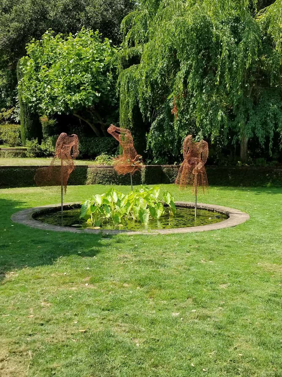
Who Am I? is hanging at the Twin Pines Art Center in Belmont. I am very excited.
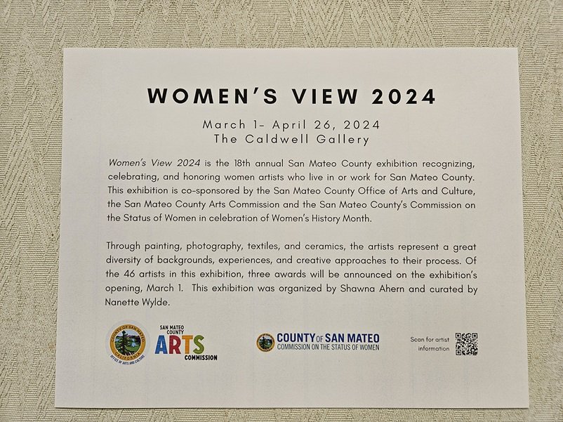
Women’s View is an annual San Mateo County exhibition recognizing, celebrating, and honoring women artists who live or work in San Mateo County. The exhibition is co-sponsored by the San Mateo County Arts Commission, the Commission on the Status of Women, and the Twin Pines Art Center in celebration of Women’s History Month.

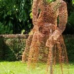
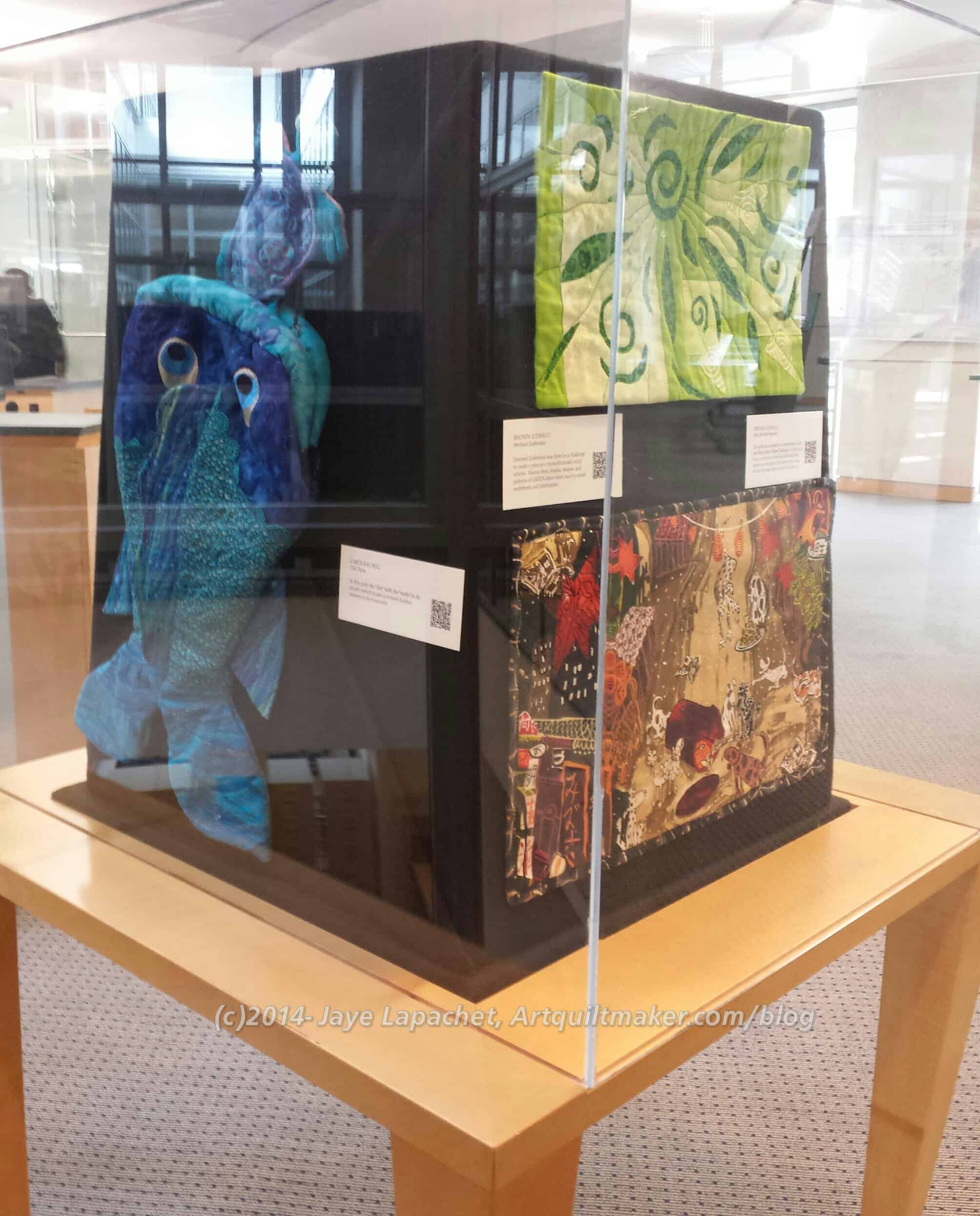
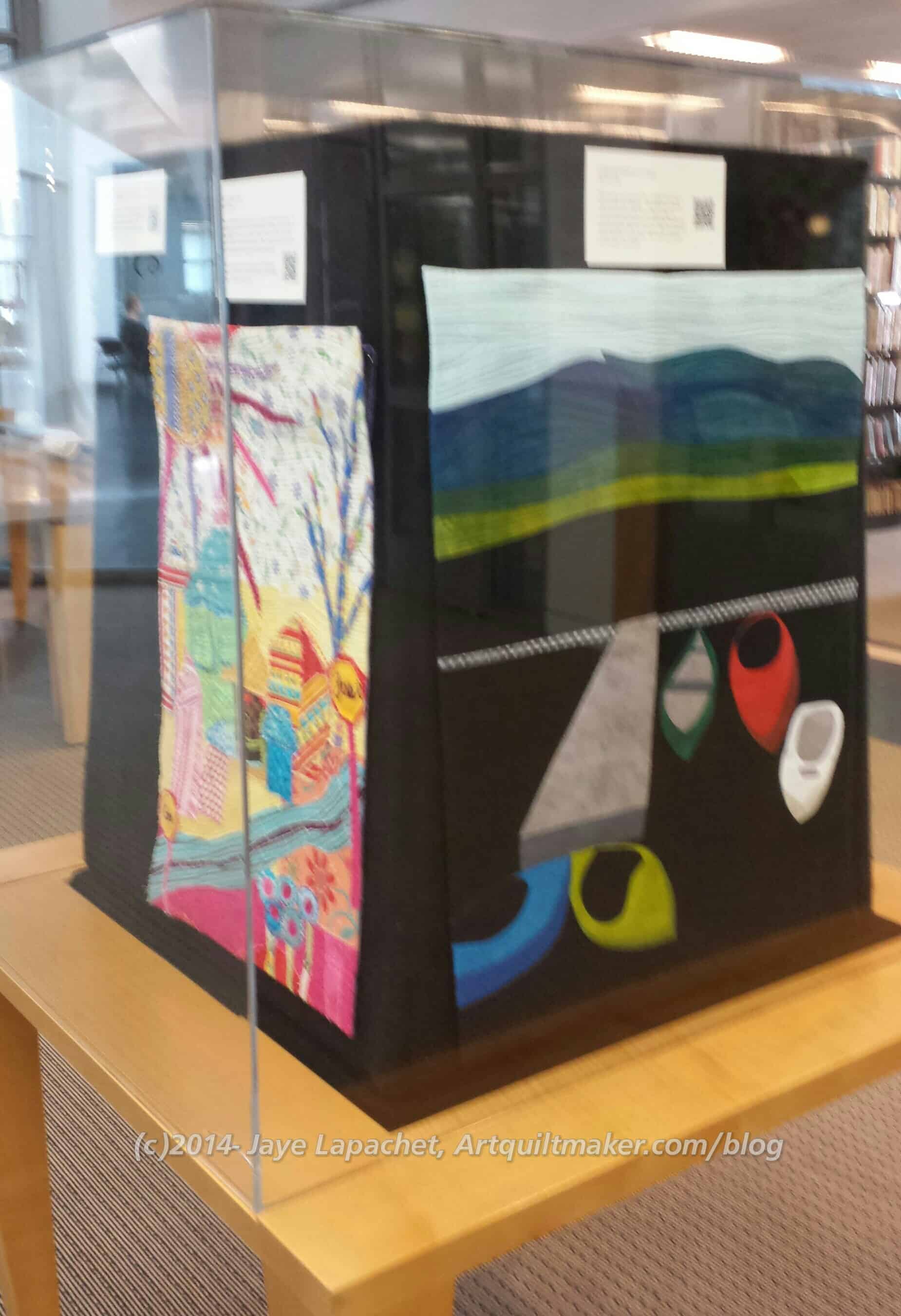
This is the 19th year of the exhibition and features over 60 artists who have expressed themselves in photography, painting, textiles (me!), and ceramics.
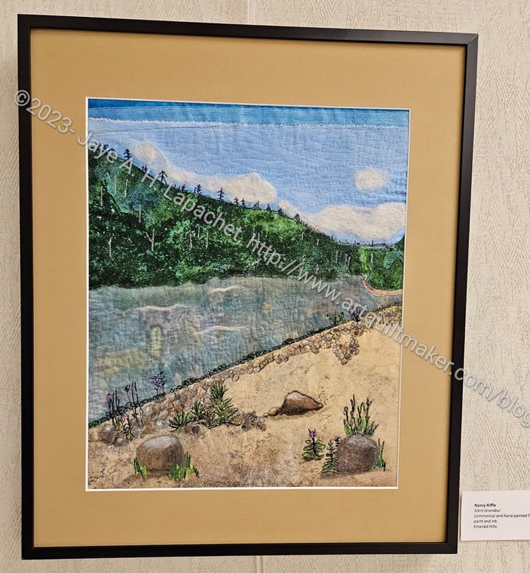
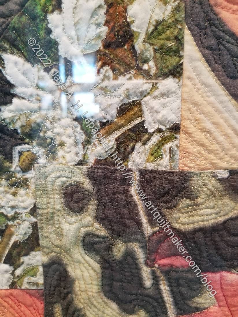
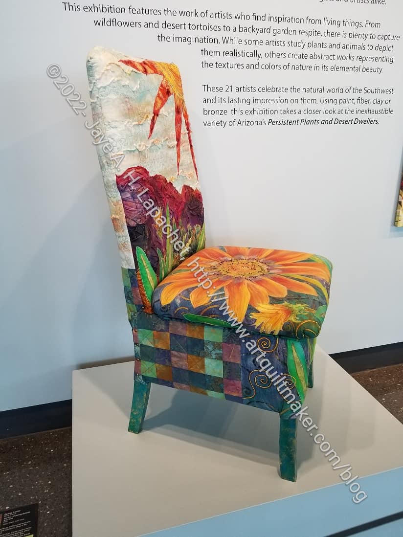
I was impressed with the variety of media this year in contrast to last year. I may be mistaken, but I thought there was a wider variety of media this year. I saw quite a few mixed media pieces, which I thought were interesting.


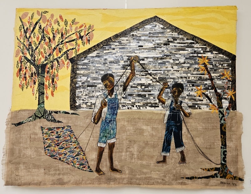
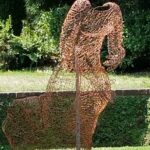
My piece, Who Am I?, was the only quilt. It had a great location in the largest gallery. I saw a lot of people stopping to look at it and talk about it. I tried to listen in to conversations (sshh!), but I either couldn’t understand what people were saying or kept getting distracted.
Although I have entered pieces I already had finished or in progress during the last two shows, I only entered pieces that I thought fit the theme. I looking at the various pieces, I wonder if my interpretation of the theme is too narrow? My interpretation for both exhibits was about how I am affected by the world or what my role is in the world. Many of the other artists chose flowers or other parts of nature. It made me think that, perhaps, my idea of the theme was too narrow. You can review the gallery guide and decide for yourself.
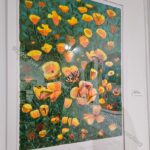

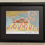
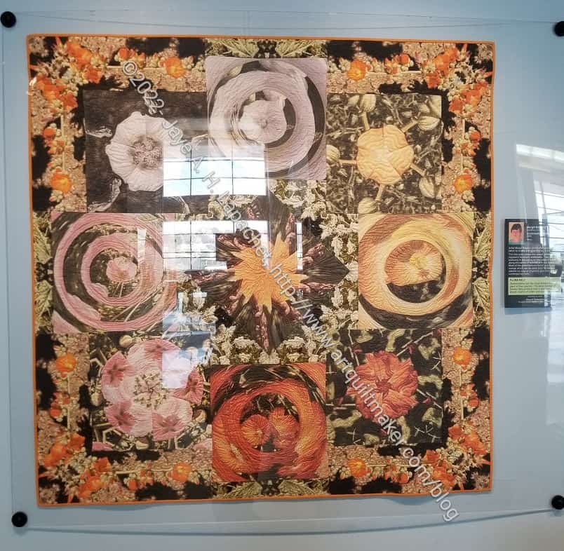
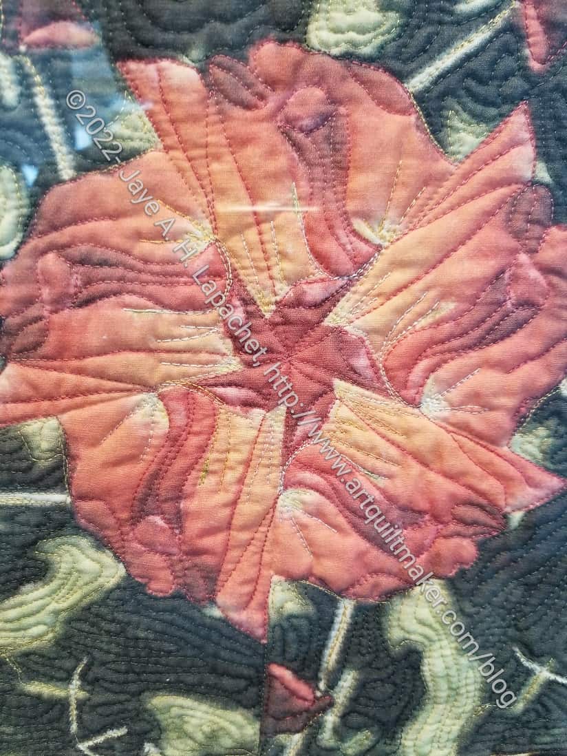
I did notice that there were some details that I would consider stereotypically female, as in the Amapolos de California piece above. Elizabeth Gomez has stitched a bit of the edge of the poppy with embroidery floss or thread. One of the winners did the same on a photograph of a hummingbird.

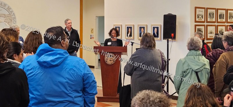
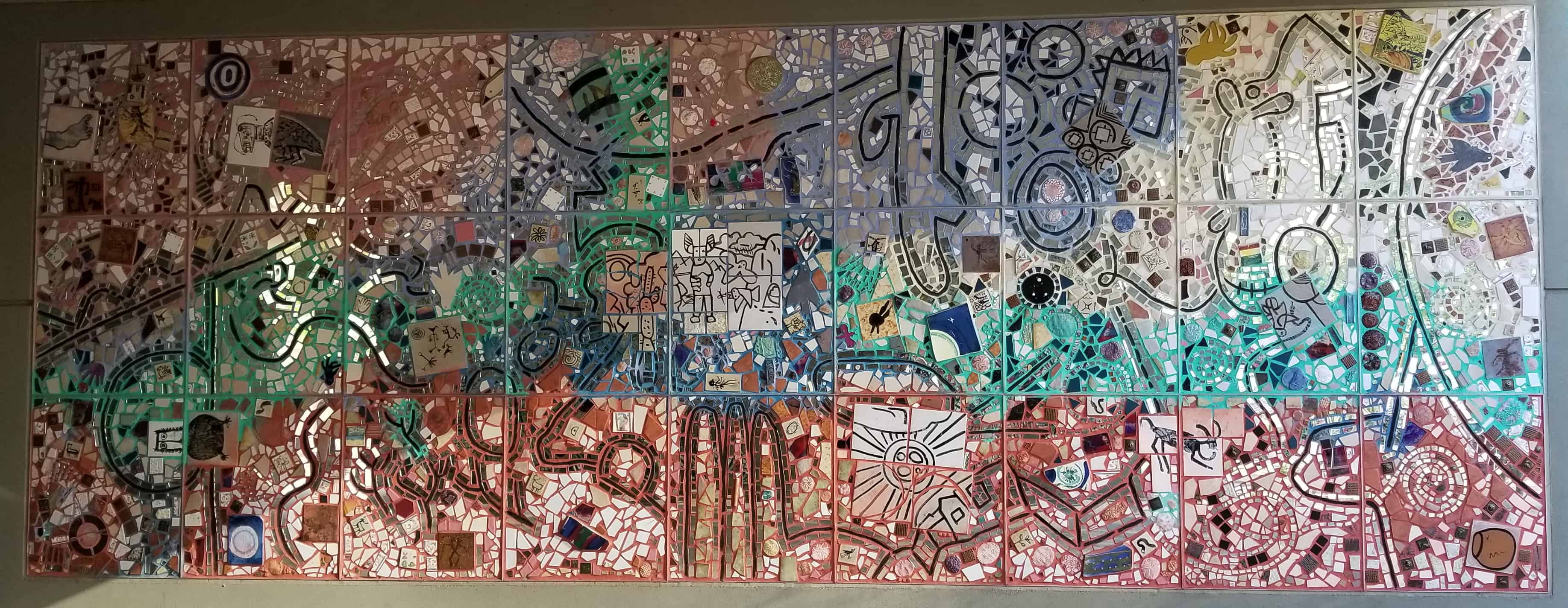
I did not win a prize this time. Prizes were awarded by the president of the Commission on the Status of Women. One of the winning pieces was a mosaic table, which I thought did not fit the theme at all. But, if I am generous, it could be her view of the world. It was a beautiful piece. Still, I do like to win. 😉
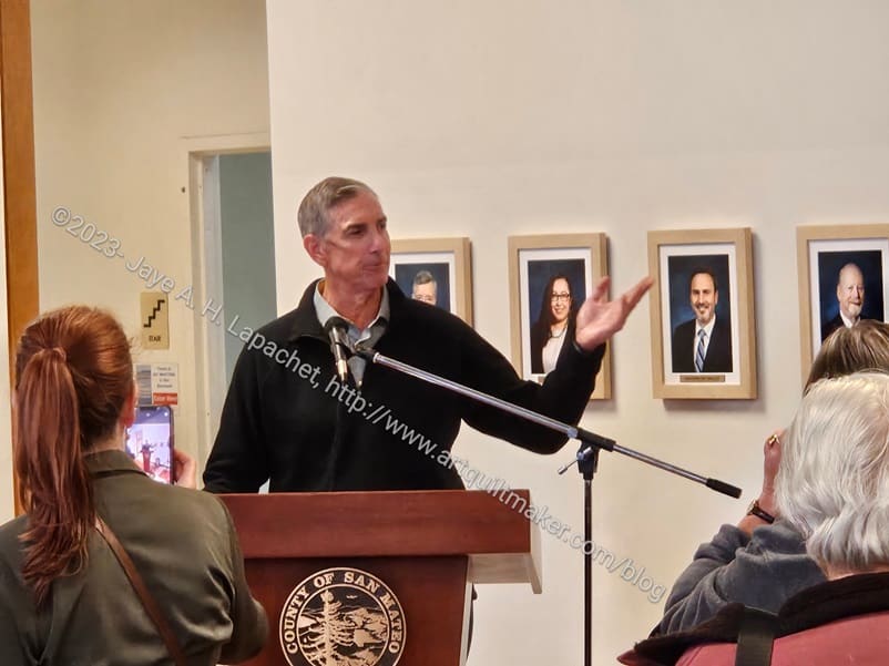
Mom, DH and I went to the opening on Sunday and it was a very nice event. The show ends on March 30, so I hope, if you are local, you get to see it.