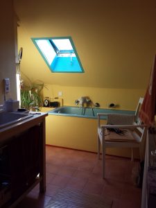
I have been thinking about my trip a lot lately, so I am back to one of my Austria photos. I wanted an image that was bright and cheerful. This is my friend’s bath. I have to say that one of the things I looked forward to on my trip was a deep soak in that tub. It is is easily 3 feet deep and after a 5 year California drought, a long soak in a tub filled to the brim with water seemed like a fantasy.
When the YM was about 4 we visited and I kept a strict eye on him in that tub in case of drowning. He was a good swimmer, but that tub holds a lot of water.

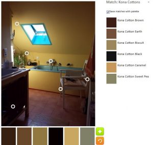
While I wouldn’t say that the yellow in the photo is neon, I would say that it is bright and dominates the room, thus you can imagine my shock when I saw the first iteration of the color palette for this post.
Talk about neutral!?!? This palette has no color! I can’t even think about whether this neutral palette is interesting or not. It needs pink and yellow.

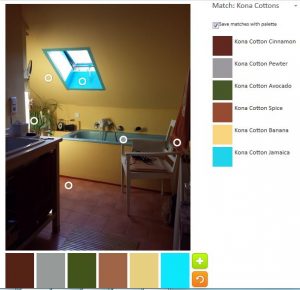
My second attempt was marginally better. Kona Banana was the closest I could get to the yellow, which is decidedly not the color of a banana. The choice isn’t terrible and it is better than the Kona Caramel in my first attempt. I was pleased that the turquoise showed up as Kona Jamaica. The towel is no better than Kona Spice, which is not pink and I could get a nice white (chair and radiator) to save my life.

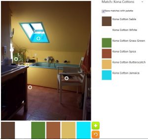
I made one more attempt. I made sure to keep the Kona Jamaica, but tried for a better yellow. Banana is probably the best as the only actual yellow alternative I could come up with was Kona Butterscotch, which is only marginally yellow in my mind. The Grass Green is a good addition.
I think, in general, the shadows in this photo obscure the true colors.
Let me know about your efforts as creating a palette.