Monday was a day of outings. Friend Julie came up on Sunday night to stay. She, DH and I headed off to the SFMOMA at the crack of dawn (ok, 9:30, but it was a holiday) for our appointment to see the Diebenkorn/Matisse exhibit that was closing that day.
We had a 10:30 appointment to get into the exhibit and arrived at the museum before the galleries opened. We had about 20 minutes to look at the other galleries on the 4th floor before our entrance time. One of the artists at which I looked was Ellsworth Kelly.
Kelly has a long history with the SFMOMA. The Fishers (founders of the Gap) bought many of his works and donated (or loaned) them to the museum. The SFMOMA has also bought pieces of his.
I have a checkered history with Kelly. A number of his works I have seen in the past were “color fields,” a canvas of one color. I am sure critics and art historians have a lot of positive things to say about such work, but I have never liked them. No matter how famous the artist I see these types of work as works they made phoning it in. This view comes from a very limited knowledge.

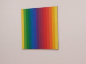
There were different works on the walls by Kelly this time. There were two that I particularly liked. One was Spectrum I from 1953.
As you can see, Kelly gradates the color from yellow to yellow. The information said that the yellow is the same on both sides. It doesn’t look like it because of hte influence of the green on one side and the light orange on the other. I also like the series of violets in the middles -an indigo with a touch of violet, a violet and a red violet. The canvas looks like it bows in the middle, which is an added bonus.

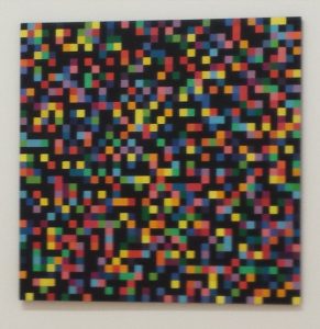
Second, was a piece called Spectrum Colors Arranged by Chance, 1951-53. He did not phone this one in and I don’t think that blue tape was available at the time (though I really have no idea) to help keep the lines straight. DH found it hard to look at, but I found it inspiring.
You might have noticed that June is nearly upon us and I have not sewn FOTY 2016 together yet. I wasn’t feeling the love. After seeing “Spectrum Colors” I feel a renewed sense of purpose. I am seriously thinking of putting charcoal (not black) in between the colors, but doing it like he has done so there is some interaction between the colors. He uses solids and not all of my fabrics are solids. Still, I think using a solid charcoal or even the cool grey of which I bought about 1000 yards might make an interesting piece.
There are some issues:
- Another quilt with a gazillion pieces. Sigh. What has gotten into me.
- The squares I cut are 3″. Doubling the number I have might lead to a quilt sized large enough to cover my house. I could cut the squares and might do that. I’ll have to try out a bit and see.
- I don’t want to completely depart from the color gradation idea, so I might gradate the colors within the design field even though a solid might be in between some of the colors.
This is why it is good to go to art museums or see exhibits outside of your field. You never know when you will get inspired by an artist or piece of art.