I got back from a trip with my SILs and nieces to Disneyland and California Adventure on Sunday. As usual, I was overwhelmed by visual stimulation. I have previously written in couple of places about the colors and motifs I see at the parks.
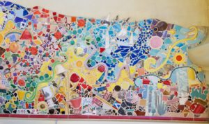
I do think I posted a photo of this mosaic/tile before, but I can’t find it, so we are doing it again with PlayCrafts, though we will just be using a small piece as I may need to use another piece in the future.
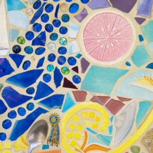
I will call the piece we are using the ‘Grapefruit Experience’.
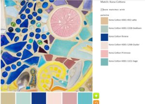
The default, surprisingly, was not all neutrals and included some quite lovely blues.
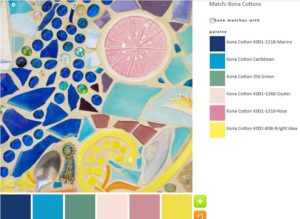
The first palette was created with just a few tweaks to the default palette. I like the Kona Marine and Caribbean combination. I am not very fond of the other colors, though Bright Idea is interesting.
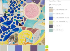
In palette n.2, I tried to go for a light palette without being a neutral palette. In the end I kept the Hyacinth and Coal. I like both of those hues, which look like tones of purple to me.
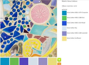
The green I added to palette n.3 was inspired by the #GirlScoutHearts project on Instagram. I am not much of a green fan, but this palette might be a favorite. I like the Turquoise, the Royal and the Lavender, especially. I think the whole palette hangs together well.
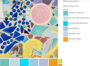
With a little tweaking, I got a nice golden yellow. It goes well with the Kona Jamaica, which is one of my favorite tones.
This image had just the right amount of opportunity for playing with color.
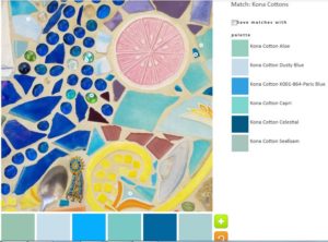
I really, REALLY wish Kona had less ravely greige goods. some of their blues are fantastic, even adjusting for computer differences. N.5 is the monochromatic effort.
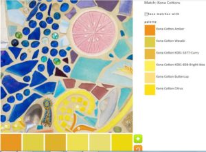
I realized I would be able to create a yellow palette as well.
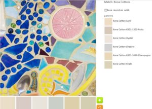
I also tried on a neutral palette. I could resist.
What will you make?