I finished all the blocks and began to think about the color of the plain blocks. Tim doesn’t like white backgrounds and since he will most likely quilt this top, I decided to look for something else.
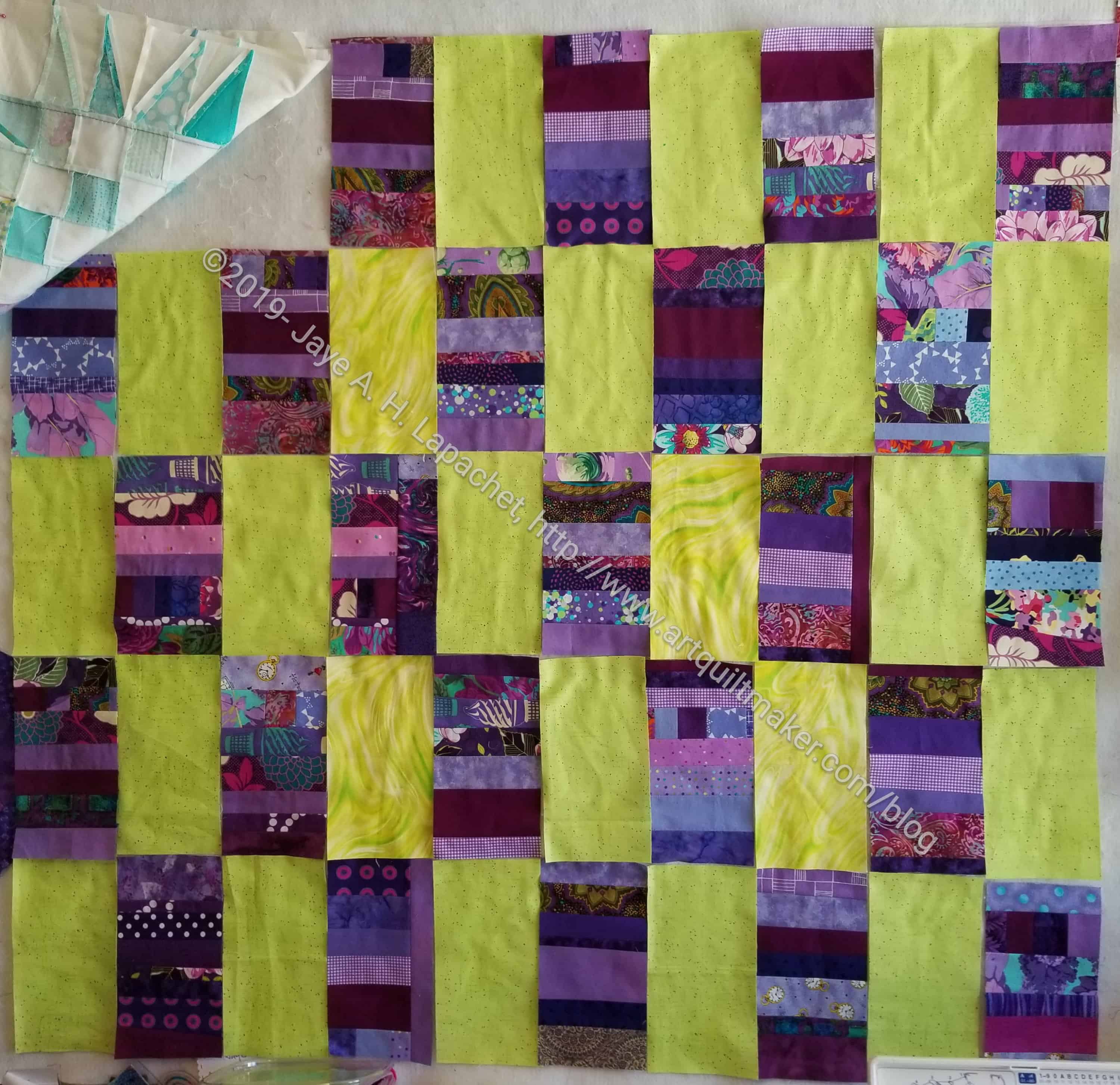
Across from purple on my Studio Color Wheel is chartreuse. I admit this is a bold choice and I was thinking about it quite a bit before I went hunting for fabric. Finally, I decided that I needed to make visual decisions visually and cut up some fabric.
I like the boldness of the color combination, but something wasn’t quite right.
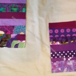
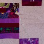
I was just about to sew it together when Tim saw the photo and suggested grey. Purple is hard for me to work with, because it really darkens my workroom to a depressing state. Adding grey made me think it would just get worse. I knew the yellow-green was the right color for the purple, so I found a couple of greys and tried it.
I chose the greys based on fabrics I didn’t think I would use for something else. These were both in that category because they have a taupe cast too them, which is not my preference for grey. I prefer the cooler white-greys.

Immediately, I knew that the grey solid (#1) was a much better choice. It will be suitable for a boy and isn’t too depressing.
I have begun sewing the plain blocks to the strip blocks.
I saved the green for another day.