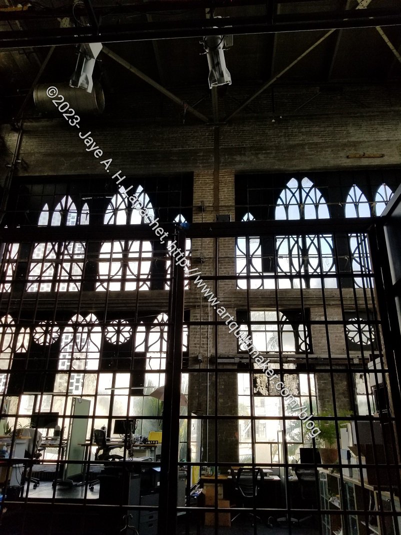
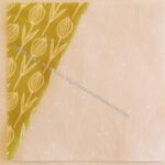
I went to a read-through of a new play yesterday. It was held at a place called Z Space, which has theater and related productions. I don’t know what this space was before, but I really liked the windows.
Commentary about works in progress, design & creativity
I went to a read-through of a new play yesterday. It was held at a place called Z Space, which has theater and related productions. I don’t know what this space was before, but I really liked the windows.
Here’s a little opportunity to relax a bit.
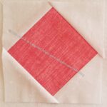
The other day I talked about selecting a large print fabric to add to the Metro Twist. After that whole selection process, I pieced some blocks using one strip of fabric to see how they would look.
Here is the before and after:

The veggie print makes the quilt look darker. The quilt will be given to one of my nephews so I think the darker look works.
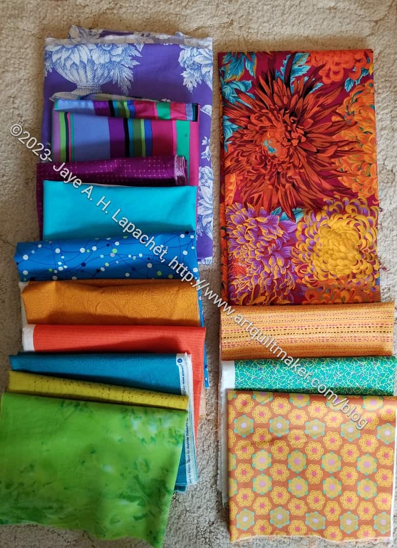
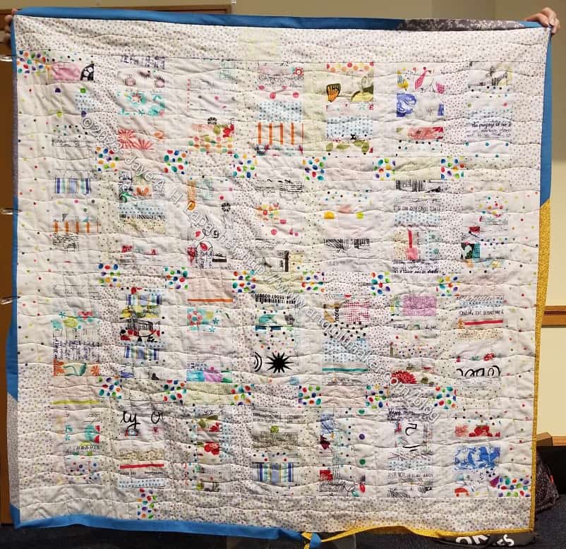
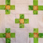
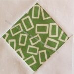
I was going through my phone the other night and found this great picture of the group of fabrics I used for Scrappy Celebration. I am glad, because I forgot to take a picture before I started making blocks.
I thought I bought them in Mt. Vernon, but I don’t see them in the photo. Who knows?
Anyway, I am finally putting them to good use.
As promised, I got back in the Metro Twist groove last weekend. I cut up some of the foreground fabrics I selected and made more blocks. I didn’t work my way completely through the stack I had cut, but I made a dent. The blocks are somewhat time consuming and I didn’t want to cut out a bunch of pieces all at once.
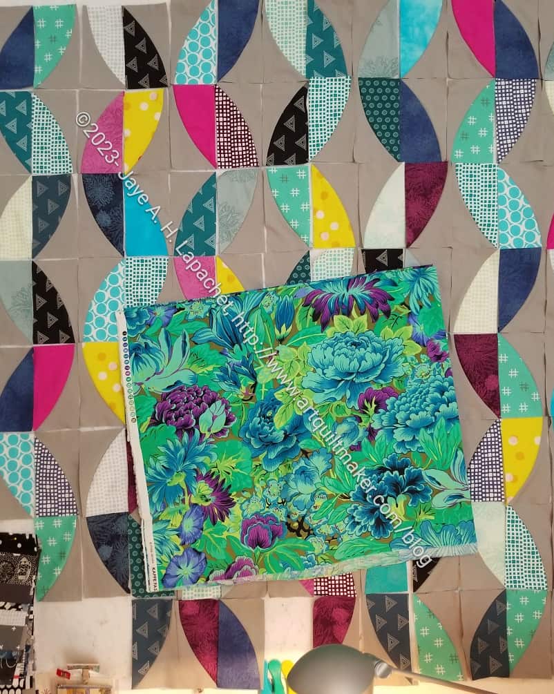
As I did so, I thought the of large print fabric I had selected. I thought the green would work very well with the overall color scheme. Also, I thought the scale of the print, when cut up, would add interest, but not be too girly looking.
I never cut up pieces when I cut the other foregrounds out. There was something not quite right about it, though generally the look was good.
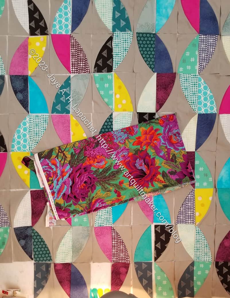
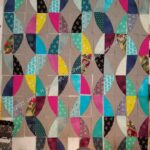
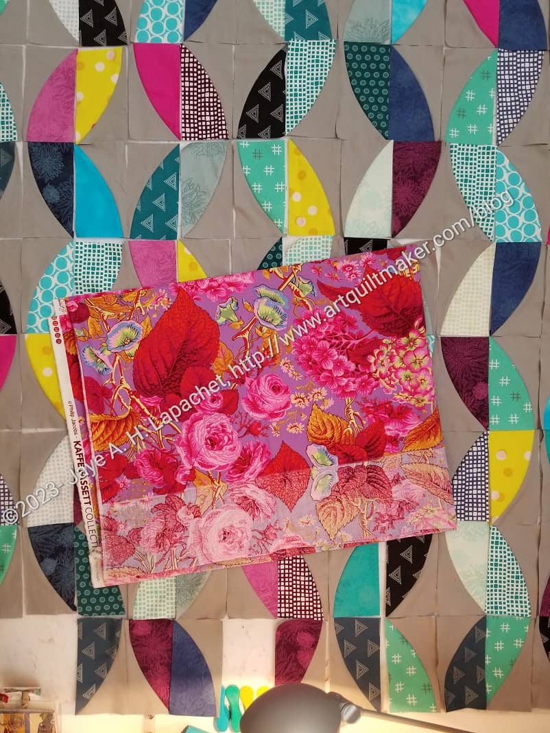
On Sunday, I decided that I really needed to add a fabric with the large scale. At the same time, I decided that I would confirm that this was the print for the job. I have quite a few large print fabrics, so I dragged a few out, though I looked through a lot more.
I thought the dark green in the second photo might be better. I thought the dark green would pick up the other dark greens in the tone-on-tone foreground fabrics.. This one was my front runner for awhile.
I tried some other darks, then gave up. I wasn’t able to find anything better than the one above.
For kicks, I tried some fabrics with more pinks. I didn’t want girly, but there are already a few pinks and they don’t make the quilt abhorrent to men, I don’t think.
I like this fabric a lot and I liked the lavender background. I thought it added something to the quilt. However, I didn’t like the red for this quilt. The red works well in the fabric, but with all of the burgundies and red-purples, I want to keep that clear red out of the quilt for now.
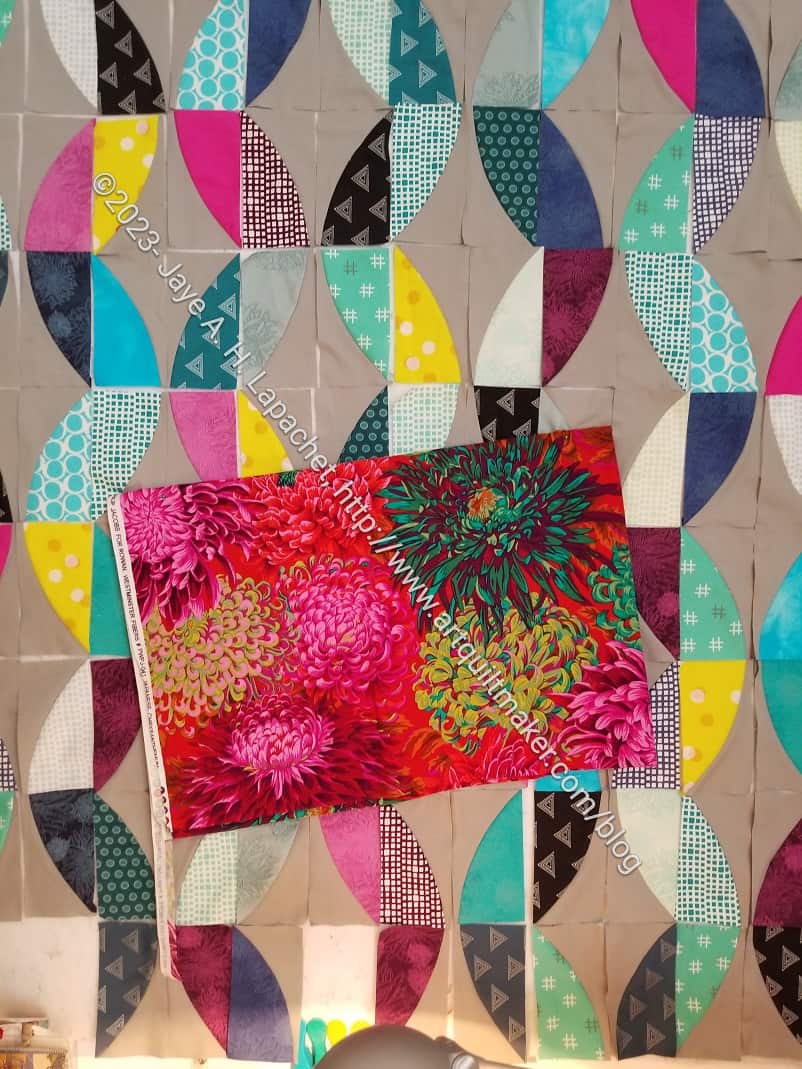
Finally, I tried one of the lush Chrysanthemum prints. This was better than the dark green and I liked the way the print pulled out the other pink foreground fabrics. I also liked the mustard-y color (see lower right of the Philip Jacobs print). The problem, again, was the red.
By now, I was kind of desperate. I thought I would go with my original choice or the Floral Burst, but I wasn’t 100% on board with those. I took another look through my large print fabrics and came up with the perfect, if unorthodox, choice.
I don’t even know why I have this fabric. I loved some of the other colorways of this print and probably just snapped it up because of the imagery. It has been in my palette for awhile. There are certain colors, which are perfect for this quilt. The burgundy and fuschia are obvious. The greens and that little bit of blue used as a shadow are also good.
I am pleased with this choice, if a little unorthodox.
Leann brought the White Strip Donation Quilt to the meeting last weekend. It has been a long while in coming, but she quilted it and was finishing the binding. I am so pleased to see it done.
I finished the top in 2019, so it has been languishing for awhile. Fortunately, fabric doesn’t go bad. There is something about this one that I really like. Soon, I will have enough scraps to make another.
I decided that I would try to make the Metro Twist larger.I have a possible recipient for this quilt and I want it to, at least be lap sized.
I have plenty of foreground fabrics, even though most are fat quarters. I needed to find more of the background fabric. It is always a challenge with solids. Since I buy limited solid brands, I thought it was doable.
Normally, I write the brand and color in Sharpie on the selvedge, but the grey I used for Metro Twist didn’t have it. Either I cut it off and tossed it or never wrote it down.
I also didn’t have a picture of the grey with other purchases. Usually, I photograph my purchases so I have some hope of finding fabric and supplies again.
I looked at my color cards and thought the background might be from Pure Elements. I bought some Pure Elements Ash first, but when it arrived, I could see that it wasn’t quite right. I can use it for something else, but disappointing nonetheless.
Back to the color cards. This time I pulled them all out, but immediately put back the Kona color card. I very rarely buy Kona and I knew this wasn’t it. I have the American Made Brands color card. Bingo! I bought some of one of their Gray. I am pretty sure that is the right fabric. I suppose I’ll see when it arrives.
I haven’t worked on the Metro Twist for a few weeks as I tried to catch up on Scrappy Celebration and The Pantone Project. I was able to make some progress this past weekend with the background pieces I have already cut. I have a bit of the background left and want to save it until the reinforcements arrive in case I need it and can’t find the right solid.
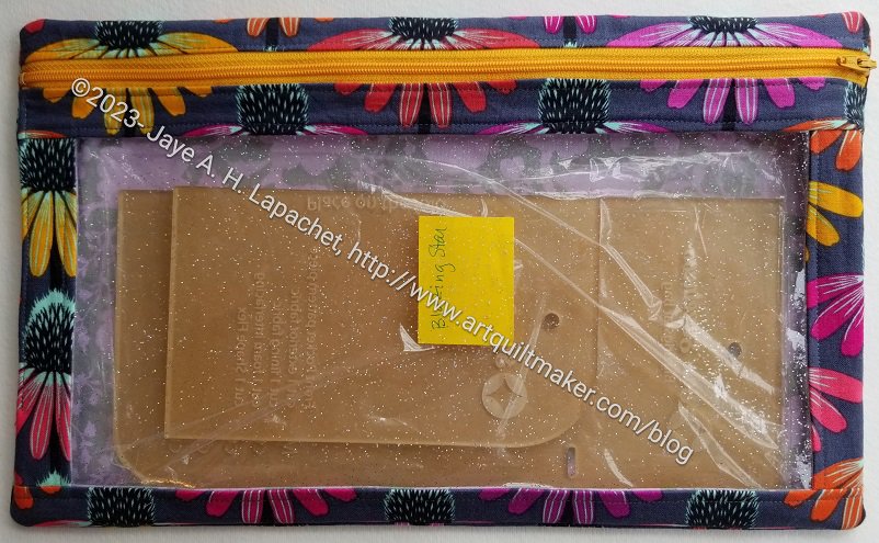
I finally finished the Enlarged I Spy (AKA Blazing Star I Spy). It is too big for the Blazing Star templates, but I can always use it for a different set of templates or for something else. It won’t go to waste.
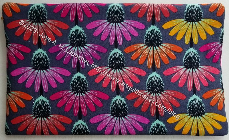
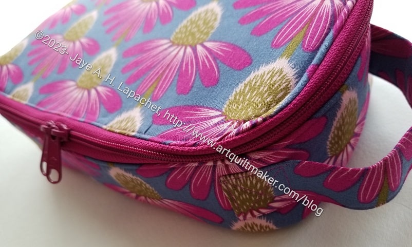
I am pleased with how I matched the coneflowers on the top around the zipper. The process, in general, however, wasn’t as smooth as I would have guessed. I suppose I was distracted a bit. From what, I don’t know.
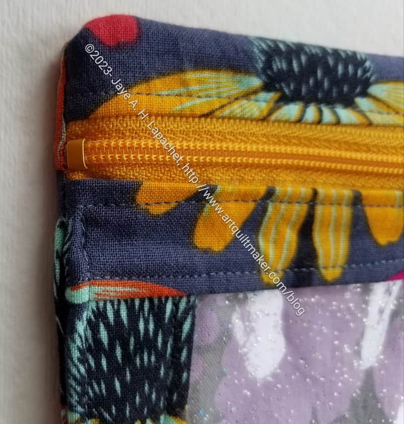
One thing I am determined to remember to do is to cut off the ends of the zippers and use zipper tabs. I really don’t know how I missed that bit of metal with my sewing machine needle. Sheer good luck.
You can also see, in this picture, that I used glitter vinyl. I love it!
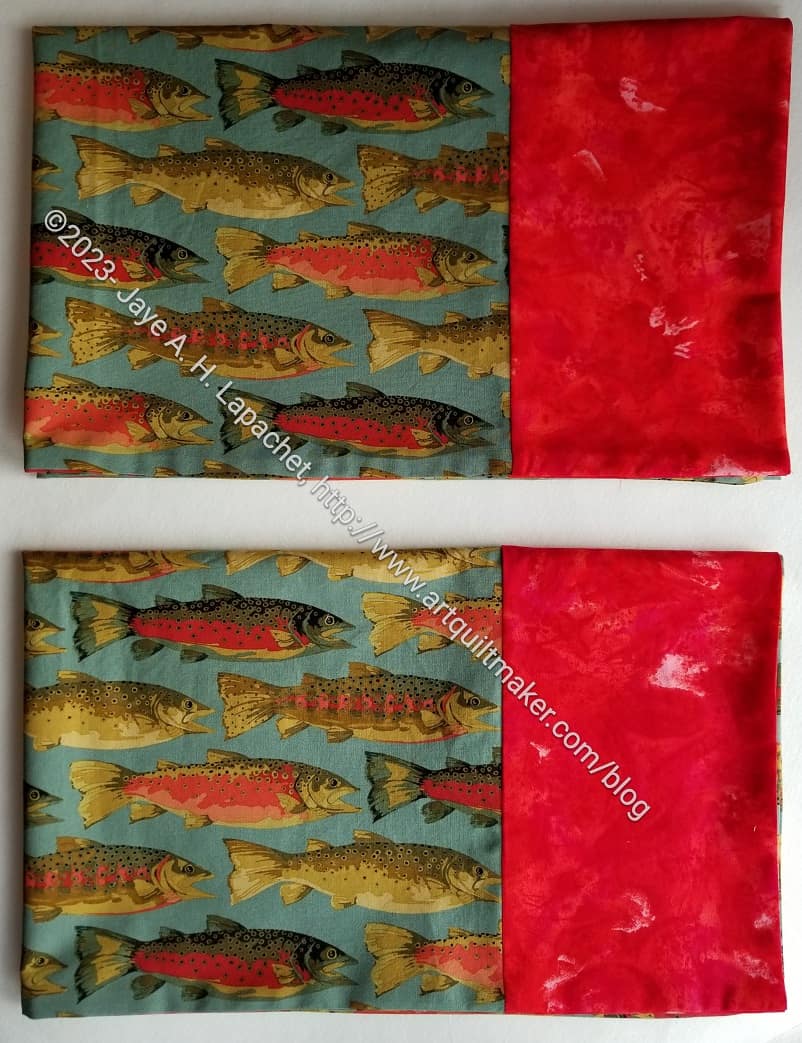
My Dad’s birthday is today. I got him a gift card, which is boring. I also made him these trout pillowcases. As soon as I saw the fabric, I knew I had to make him something.
The main fabric is a recent Martha Negley. The red is the last of an old Robert Kaufman Reflections collection. I think it might
Friend Julie has been diligently handing me groups of blocks whenever I see her.
Here is the latest batch. While it may look paltry compared to my bonanza, keep in mind that she has been keeping up and I haven’t. She gives me a few at a time whereas I procrastinate by making bags. I tried to work on a block or two during my lunch hours and after work. That works pretty well when I have the colors already matched to the postcards.
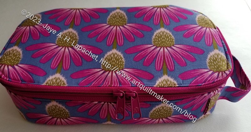
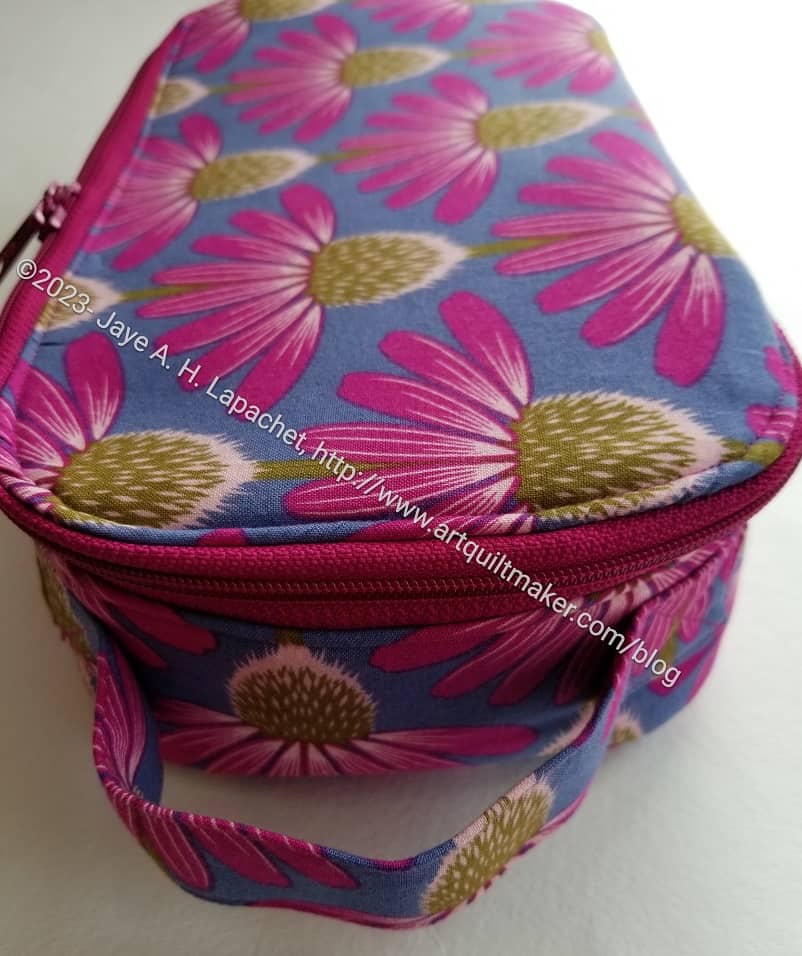
Another Hackney is in the books. The Coneflower Hackney #2 is finished and the recipient should have received it by now.
Remember how I talked about DecorBond in my last post about this bag? You can see how great the top looks in the photo – flat and smooth. I love it! I am so pleased that it looks that good.
It really surprises me how different a bag can look with different interfacing.
In this version, I sewed the top stitching, to close the turning gap on the inside, from the top. I wanted the top stitching to look good from the outside as well as close the gap. This is something I have trouble with repeatedly, so I did it slowly and with care. I think it looks good this time. Still not perfect, but I am getting there.
I think I have finally gotten the handle placement down. I think these bags are just way more useful with a handle. I wonder what inspired Sara to make this bag without a handle? I suppose it could be used in the bottom of a suitcase to corral all of those random items one needs on trips that aren’t clothes. Maybe the Minikins Season 3 video says something about that. I don’t really remember.
I have seen Gerre carrying hers by the handle to Sew Day, so I know the handle isn’t superfluous.
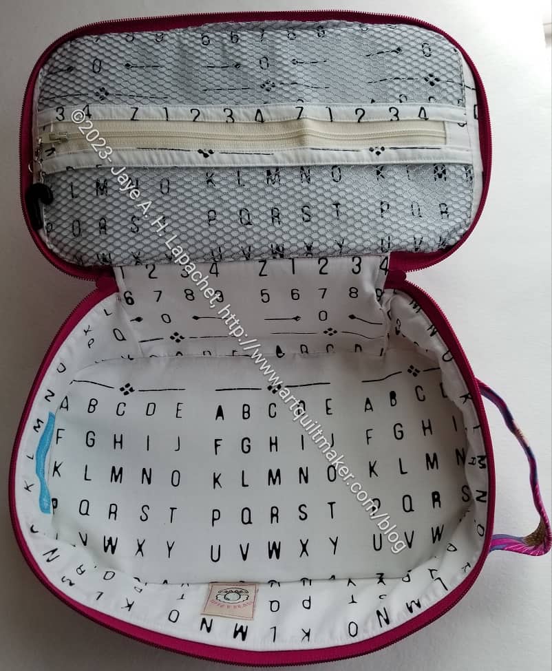
I had a little trouble with the back panel on this one, but the inside still looks good. I really like that bright white fabric.
I also remembered to put labels into the lining front panel this time.
I have made a number of these Hackneys and haven’t gotten one perfect yet. I really worry that I will never be able to make a perfect bag the first time through.
I am not finished with this pattern yet. I just cut one out for my Dad using the leftovers from his birthday pillowcases.
Happy Birthday, Angela! 😉
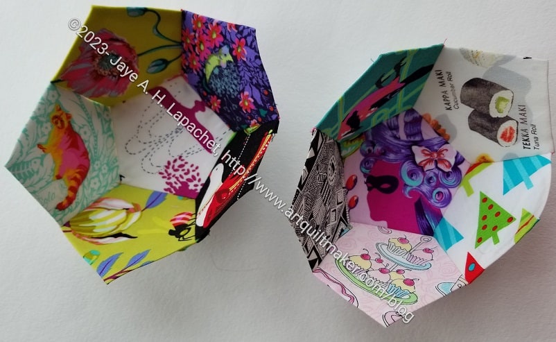
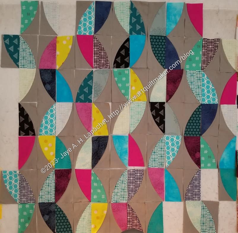
I dragged out the Pentagon Ball I have been taking on car rides so I could share it with you.
This one uses a lot of fabrics that could be considered novelty fabrics, though I would necessarily include most of them in that category. You can see that many are Tula fabrics. I also included a few others. I wanted the recipient to be able to identify items on the ball as well as roll it and toss it.
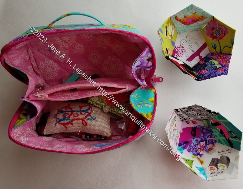
Even sewed into cups (as shown), this project fits well into the Enigma bag. The fact that the pocket doesn’t go all the way to the bottom works in the 3D project’s favor. I can slip the ‘cups’ in on their sides and still zip the Enigma Bag. It won’t be the same once I start sewing the two halves together.
This project went too fast. I arrived at this point before I was ready as I don’t have any other handwork projects at the moment, which means nothing to do while I watch TV. I guess I have to get busy figuring out the border on La Pass.

I set myself a goal during the past two weekends of making progress on this quilt. I didn’t make much progress, but progress is progress.
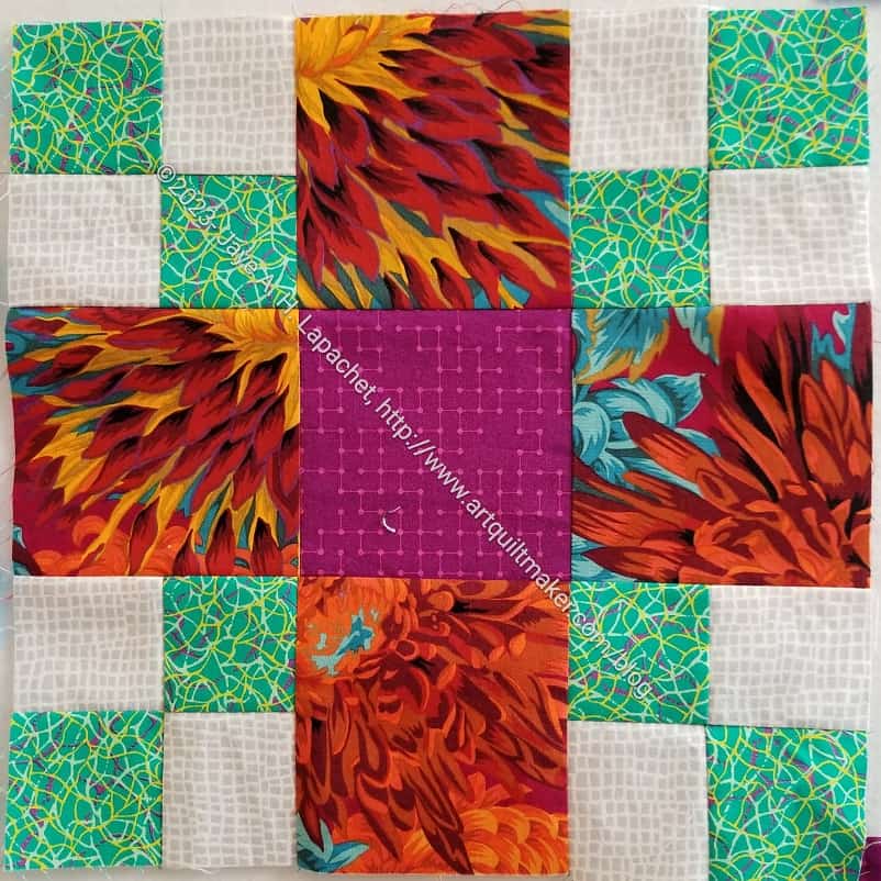
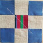
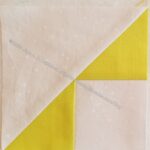
First, I made this orange block. There is a little too much orange in it and I may change the centers of the mini-9 patches to something else. Maybe blue like in G2. We’ll see how I feel.
I really like this block. I think I might have made all of them the pattern calls for, but I really like it. I may have to make more. I kept looking at D6 and wanting to make the same block with the center and corner fabrics reversed. I really like that violet and the emerald green. I don’t use a lot of green in my quilts, so that is odd. I might like this block, because I get to use big amounts of that Shaggy Chrysanthemum print. That is definitely a favorite even thought those autumn colors aren’t my normal colors.
Yes, I am making the blocks that are the easiest to get as many of them done as possible. Then I get mad at myself for being ridiculous and make a block with a lot of pieces. None of these blocks are difficult; some of them just have a lot of pieces.
In total, I made 5 blocks. I am now up to 28/56 total. I have enough blocks completed to make a good sized lap quilt, which is what I will do if (when) I run out of background fabric.
Cyndi brought her Essential Tote to Sew Day. I really like that pattern and am so pleased that she finds a use for it.
One of the things I like about that bag is the way the maker can showcase a large print fabric.
I really want to make some more of those. The pattern* is really great. You should buy one!
*no affiliation. Just a happy customer!
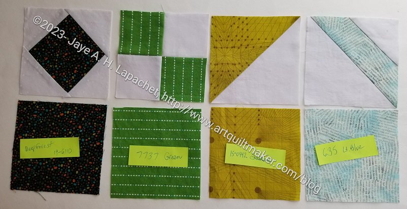
I took a break from making bags, Metro Twist and Scrappy Celebration to make some progress. Thus, I made some good progress over the weekend on making Pantone blocks.
I had already chosen quite a few fabrics, which made the task easier. Foundation piecing, not my strength, gave me pains on the first block.
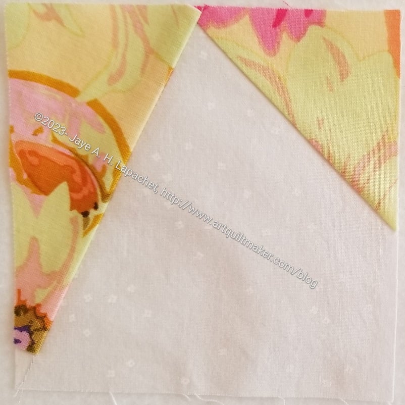
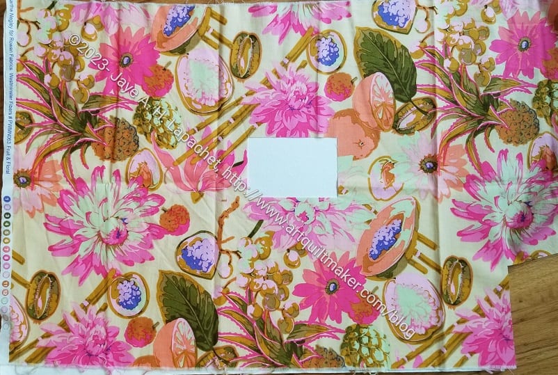
The background of this fabric, a Martha Negley fruit and floral print from a few years ago, was the right hue for Pantone 4545 (not all the colors have names. Some only have numbers, which is a little annoying). I only had a half yard of this fabric and these fruit and florals don’t always have a lot of background. In this case, I only had a few bits to work with.
Of course, I cut a piece that was the wrong shape (remember: foundation piecing needs backwards and upside down pieces), so I had to Swiss cheese cut the last bit of background. Sigh. Fortunately, I don’t have enough of this to use for a back or a bag, so it really shouldn’t matter. Still it is painful to see one of these prints with a hunk out of the middle. Fortunately, this project (and Friend Julie) are worth it.
As an aside, you know how Tula Pink is doing Deja Vu prints? I wish Free Spirit would do them for Martha Negley as well. Maybe I should start fan club for Martha? I love those fruit and veg prints.
I went to town making blocks. I got into a rhythm that was only interrupted by not having selected anymore fabric. I thought I made a wider variety, but, looking at them like this, apparently not.
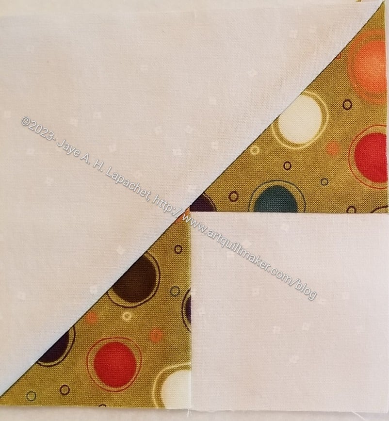
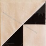
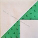
I was planning to make Flying Geese for Pantone 3985, a kind of olive green, but ran out of fabric. When I selected the fabric, I didn’t realize I only had about half of a fat quarter, so mid-block, I pivoted and made another Storm Center, which would work with the size triangles I had already cut.
I needed a template, so I cut the Pirate Black Storm Corner so I could use the triangles as a template, thus I ended up with four of these. In the grand scheme of the whole quilt it will be ok. It just looks a little odd now.
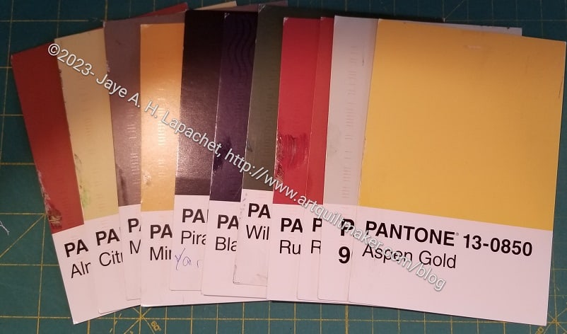
I suppose I shouldn’t have called this “August Progress” as it assumes I won’t make any additional progress, though I hope I do. I still have a number of colors to match and turn into blocks. Note they are all kind of dull, though looking at them like this reminds me they are not all beige.
I am also happy I made some good progress as I was feeling quite guilty at my tardiness. The hardest part of this project is selecting the fabrics. Aside from hauling the fabric bins down from the top of the fabric closet, the inks on the postcards seem to be different from the dyes used in fabric. I know that is true, however the actual hues and shades seem to be really different.