As promised, I got back in the Metro Twist groove last weekend. I cut up some of the foreground fabrics I selected and made more blocks. I didn’t work my way completely through the stack I had cut, but I made a dent. The blocks are somewhat time consuming and I didn’t want to cut out a bunch of pieces all at once.
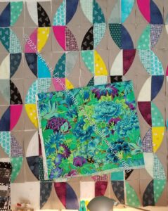
As I did so, I thought the of large print fabric I had selected. I thought the green would work very well with the overall color scheme. Also, I thought the scale of the print, when cut up, would add interest, but not be too girly looking.
I never cut up pieces when I cut the other foregrounds out. There was something not quite right about it, though generally the look was good.
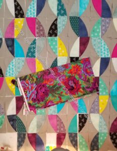
On Sunday, I decided that I really needed to add a fabric with the large scale. At the same time, I decided that I would confirm that this was the print for the job. I have quite a few large print fabrics, so I dragged a few out, though I looked through a lot more.
I thought the dark green in the second photo might be better. I thought the dark green would pick up the other dark greens in the tone-on-tone foreground fabrics.. This one was my front runner for awhile.
I tried some other darks, then gave up. I wasn’t able to find anything better than the one above.
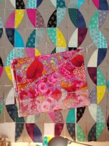
For kicks, I tried some fabrics with more pinks. I didn’t want girly, but there are already a few pinks and they don’t make the quilt abhorrent to men, I don’t think.
I like this fabric a lot and I liked the lavender background. I thought it added something to the quilt. However, I didn’t like the red for this quilt. The red works well in the fabric, but with all of the burgundies and red-purples, I want to keep that clear red out of the quilt for now.
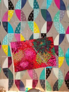
Finally, I tried one of the lush Chrysanthemum prints. This was better than the dark green and I liked the way the print pulled out the other pink foreground fabrics. I also liked the mustard-y color (see lower right of the Philip Jacobs print). The problem, again, was the red.
By now, I was kind of desperate. I thought I would go with my original choice or the Floral Burst, but I wasn’t 100% on board with those. I took another look through my large print fabrics and came up with the perfect, if unorthodox, choice.
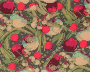
I don’t even know why I have this fabric. I loved some of the other colorways of this print and probably just snapped it up because of the imagery. It has been in my palette for awhile. There are certain colors, which are perfect for this quilt. The burgundy and fuschia are obvious. The greens and that little bit of blue used as a shadow are also good.
I am pleased with this choice, if a little unorthodox.